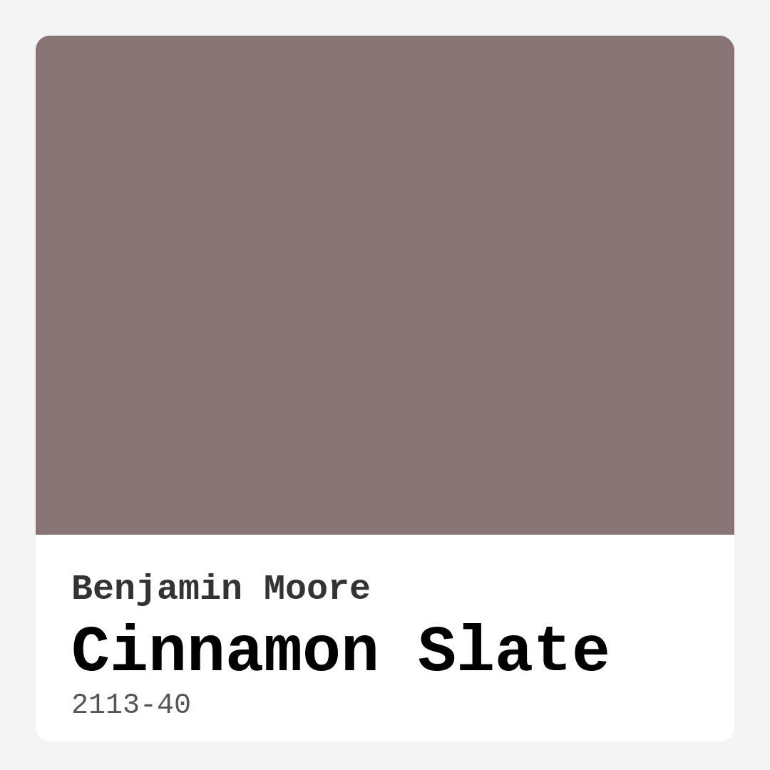
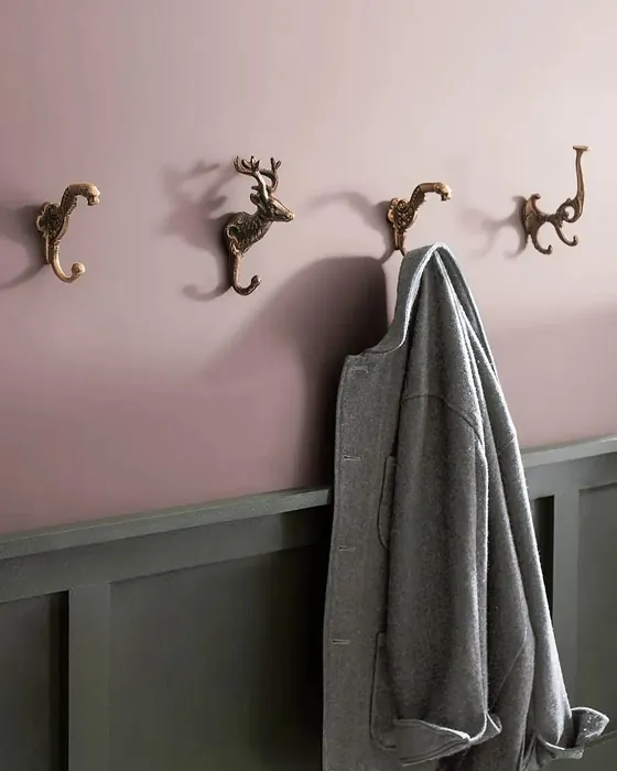
Color Preview & Key Details
| HEX Code | #897475 |
| RGB | 137, 116, 117 |
| LRV | 19.71% |
| Undertone | Red |
| Finish Options | Eggshell, Matte, Satin |
If you’re searching for a paint color that effortlessly blends warmth, sophistication, and versatility, let me introduce you to Benjamin Moore’s Cinnamon Slate (2113-40). This rich, earthy hue is one of those rare shades that feels both timeless and fresh—perfect for creating a space that’s cozy yet polished. Whether you’re refreshing a single room or reimagining your entire home, Cinnamon Slate has the depth and character to make a lasting impression.
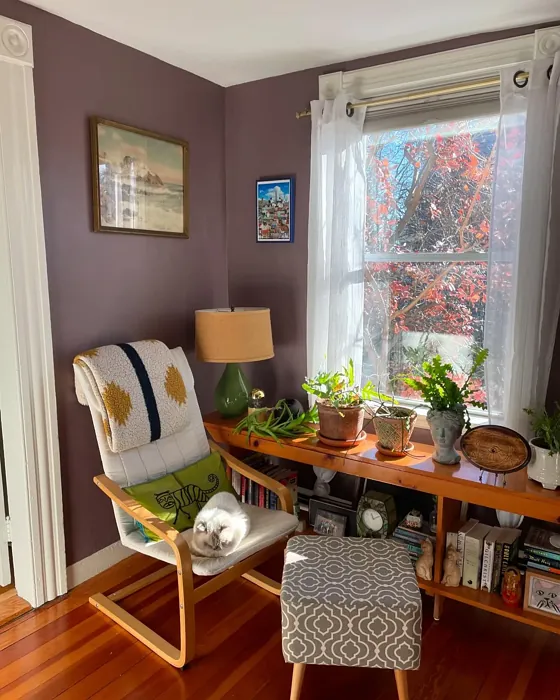
At first glance, Cinnamon Slate strikes a beautiful balance between cinnamon’s warmth and slate’s muted elegance. Its red undertones give it a welcoming, almost enveloping quality, making it ideal for spaces where you want to foster relaxation and connection. Think living rooms where conversations flow late into the evening, bedrooms that feel like a retreat, or dining rooms that invite lingering over meals. The color’s medium-dark LRV (19.71%) means it reflects very little light, so it naturally creates an intimate atmosphere. But don’t let that scare you—paired with the right lighting and finishes, it won’t overwhelm a room.
One of the standout features of Cinnamon Slate is its adaptability. It plays well with a range of decor styles, from modern and contemporary to rustic and industrial. In a sleek, minimalist space, it adds just enough warmth to keep things from feeling sterile. In a more traditional or rustic setting, it enhances the organic, lived-in vibe. And because it’s a muted tone, it won’t clash with bold furniture or artwork—instead, it provides a grounded backdrop that lets other elements shine.
When it comes to application, Cinnamon Slate is a dream. Benjamin Moore’s formulation offers high coverage, so you’ll likely need just one or two coats for a flawless finish. It’s beginner-friendly, roller-ready, and low-splatter, which means less mess and frustration. Plus, it’s touch-up friendly, so if life happens (and let’s be honest, it always does), fixing small scuffs or marks is a breeze. The finish options—matte, eggshell, and satin—give you flexibility depending on the room’s use. Eggshell is a great all-around choice for living areas, while satin works well in spaces that need a bit more durability, like a home office.
Now, let’s talk lighting. Cinnamon Slate is a chameleon in the best way. In a sun-drenched room, the cinnamon tones come forward, casting a warm, golden glow. In lower light, the slate undertones take center stage, creating a moody, sophisticated ambiance. This makes it a fantastic choice for rooms with varying light throughout the day. If you’re working with a smaller or darker space, though, consider using it as an accent wall rather than painting the entire room. Pair it with lighter trim—like Benjamin Moore’s Simply White or Chantilly Lace—to keep the space feeling open and balanced.
Worried about pairing it with your existing decor? Cinnamon Slate’s red undertones mean it harmonizes beautifully with warm neutrals, wood finishes, and even pops of green (its complementary hue). Imagine it with a leather sofa, brass accents, and lush indoor plants—pure magic. For a more monochromatic look, layer it with deeper shades like Benjamin Moore’s Wrought Iron or lighter variations from the same family.
A few things to keep in mind: Cinnamon Slate isn’t the best fit for high-gloss finishes, as its subtle complexity shines best in matte or low-sheen options. And while it’s versatile, it’s not the go-to for tiny, windowless rooms where a darker color might feel oppressive. But in the right space, it’s transformative.
So, is Cinnamon Slate the right choice for your home? If you’re after a color that’s warm but not overwhelming, sophisticated but not stuffy, and adaptable enough to grow with your style, the answer is a resounding yes. Test it out with a sample pot, observe it at different times of day, and see how it makes you feel. Because the best paint colors aren’t just about aesthetics—they’re about creating a space that feels uniquely yours. And Cinnamon Slate? It’s ready to help you do just that.
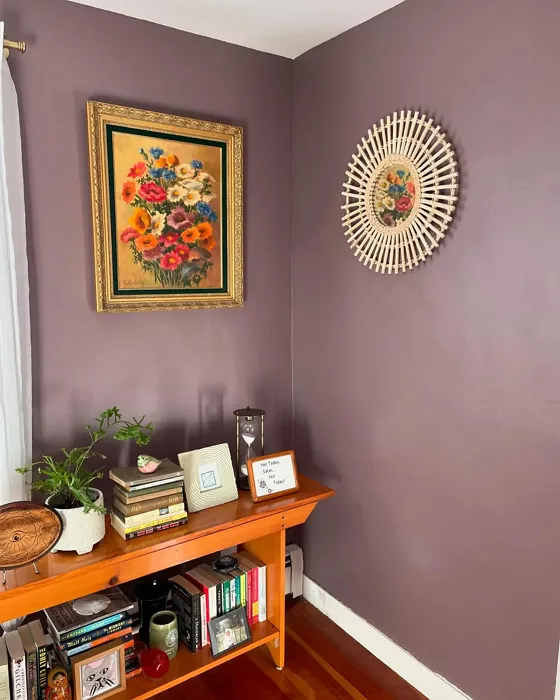
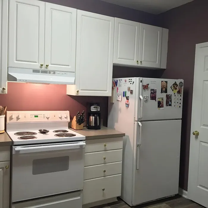
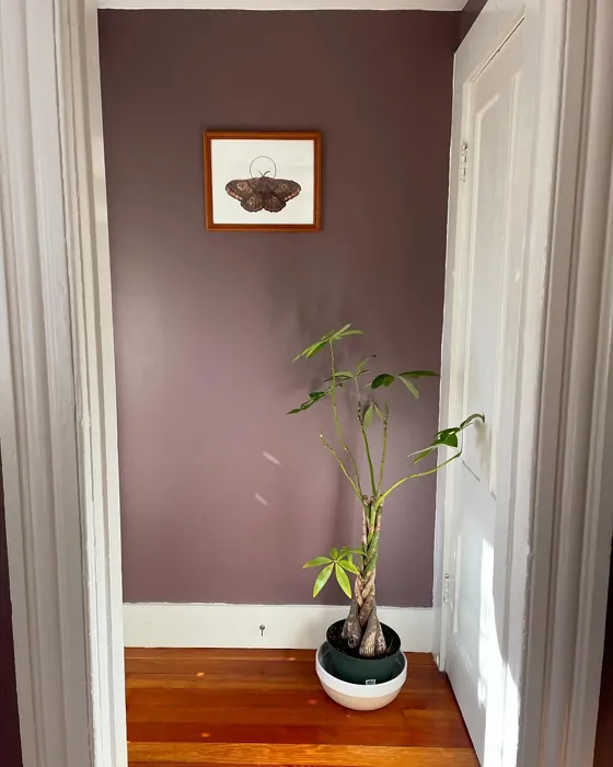
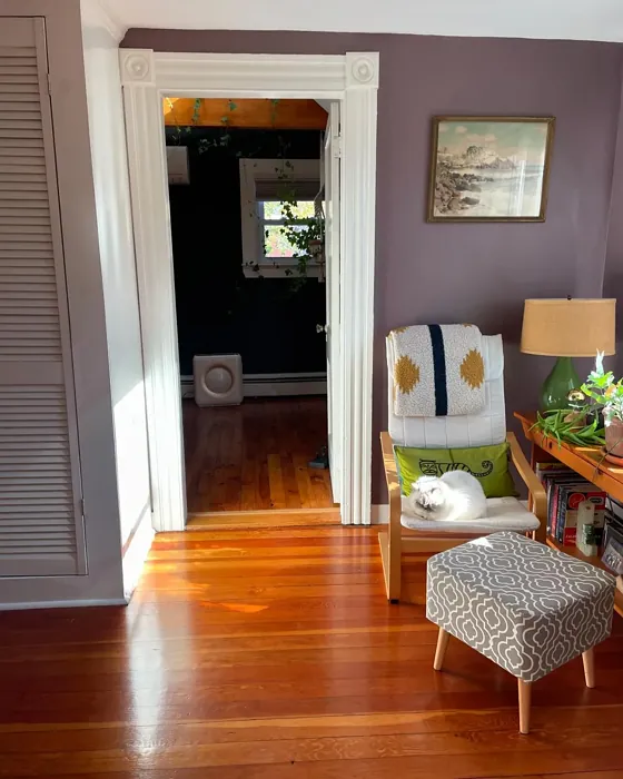
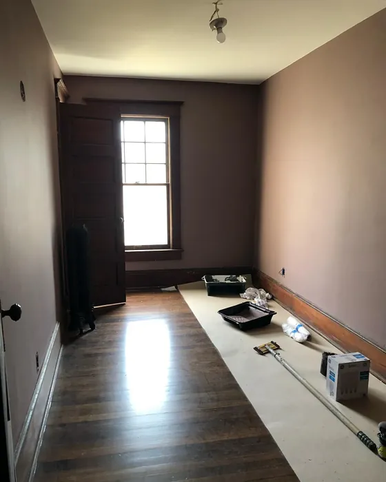
Real Room Photo of Cinnamon Slate 2113-40
Undertones of Cinnamon Slate ?
The undertones of Cinnamon Slate are a key aspect of its character, leaning towards Red. These subtle underlying hues are what give the color its depth and complexity. For example, a gray with a blue undertone will feel cooler and more modern, while one with a brown undertone will feel warmer and more traditional. It’s essential to test this paint in your home and observe it next to your existing furniture, flooring, and decor to see how these undertones interact and reveal themselves throughout the day.
HEX value: #897475
RGB code: 137, 116, 117
Is Cinnamon Slate Cool or Warm?
Cinnamon Slate is decidedly warm, thanks to its cinnamon hue. This warmth is ideal for creating inviting and cozy spaces, making it a favorite for living rooms and bedrooms. While it’s predominantly warm, the slate element adds a touch of balance, preventing the color from feeling overly intense. This blend ensures the paint remains versatile and adaptable to various decor styles.
Understanding Color Properties and Interior Design Tips
Hue refers to a specific position on the color wheel, measured in degrees from 0 to 360. Each degree represents a different pure color:
- 0° represents red
- 120° represents green
- 240° represents blue
Saturation describes the intensity or purity of a color and is expressed as a percentage:
- At 0%, the color appears completely desaturated—essentially a shade of gray
- At 100%, the color is at its most vivid and vibrant
Lightness indicates how light or dark a color is, also expressed as a percentage:
- 0% lightness results in black
- 100% lightness results in white
Using Warm Colors in Interior Design
Warm hues—such as reds, oranges, yellows, warm beiges, and greiges—are excellent choices for creating inviting and energetic spaces. These colors are particularly well-suited for:
- Kitchens, living rooms, and bathrooms, where warmth enhances comfort and sociability
- Large rooms, where warm tones can help reduce the sense of emptiness and make the space feel more intimate
For example:
- Warm beige shades provide a cozy, inviting atmosphere, ideal for living rooms, bedrooms, and hallways.
- Warm greige (a mix of beige and gray) offers the warmth of beige with the modern appeal of gray, making it a versatile backdrop for dining areas, bedrooms, and living spaces.
However, be mindful when using warm light tones in rooms with limited natural light. These shades may appear muted or even take on an unpleasant yellowish tint. To avoid a dull or flat appearance:
- Add depth by incorporating richer tones like deep greens, charcoal, or chocolate brown
- Use textured elements such as curtains, rugs, or cushions to bring dimension to the space
Pro Tip: Achieving Harmony with Warm and Cool Color Balance
To create a well-balanced and visually interesting interior, mix warm and cool tones strategically. This contrast adds depth and harmony to your design.
- If your walls feature warm hues, introduce cool-colored accents such as blue or green furniture, artwork, or accessories to create contrast.
- For a polished look, consider using a complementary color scheme, which pairs colors opposite each other on the color wheel (e.g., red with green, orange with blue).
This thoughtful mix not only enhances visual appeal but also creates a space that feels both dynamic and cohesive.
Light Temperature Affects on Cinnamon Slate
Natural Light
Natural daylight changes in color temperature as the sun moves across the sky. At sunrise and sunset, the light tends to have a warm, golden tone with a color temperature around 2000 Kelvin (K). As the day progresses and the sun rises higher, the light becomes cooler and more neutral. Around midday, especially when the sky is clear, natural light typically reaches its peak brightness and shifts to a cooler tone, ranging from 5500 to 6500 Kelvin. This midday light is close to what we perceive as pure white or daylight-balanced light.
These shifts in natural light can significantly influence how colors appear in a space, which is why designers often consider both the time of day and the orientation of windows when planning interior color schemes.
Artificial Light
When choosing artificial lighting, pay close attention to the color temperature, measured in Kelvin (K). This determines how warm or cool the light will appear. Lower temperatures, around 2700K, give off a warm, yellow glow often used in living rooms or bedrooms. Higher temperatures, above 5000K, create a cool, bluish light similar to daylight, commonly used in kitchens, offices, or task areas.
Use the slider to see how lighting temperature can affect the appearance of a surface or color throughout a space.


4800K
LRV of Cinnamon Slate
The Light Reflectance Value (LRV) of Cinnamon Slate is 19.71%, which places it in the Medium Dark category. This means it reflects very little light. Understanding a paint’s LRV is crucial for predicting how it will look in your space. A higher LRV indicates a lighter color that reflects more light, making rooms feel larger and brighter. A lower LRV signifies a darker color that absorbs more light, creating a cozier, more intimate atmosphere. Always consider the natural and artificial lighting in your room when selecting a paint color based on its LRV.
Detailed Review of Cinnamon Slate
Additional Paint Characteristics
Ideal Rooms
Bedroom, Dining Room, Home Office, Living Room
Decor Styles
Contemporary, Industrial, Modern, Rustic
Coverage
Good (1–2 Coats), High Hide, Touch-Up Friendly
Ease of Application
Beginner Friendly, Brush Smooth, Low Splatter, Roller-Ready
Washability
Scrubbable, Stain Resistant, Washable
VOC Level
Eco-Certified, Low VOC
Best Use
Accent Wall, Interior Walls, Large Spaces, Open Concept Spaces
Room Suitability
Bedroom, Dining Room, Living Room
Tone Tag
Cozy, Earthy, Muted, Warm
Finish Type
Eggshell, Matte, Satin
Paint Performance
Easy Touch-Up, Fade Resistant, High Coverage, Low Odor
Use Cases
Best for Low Light Rooms, Best for Selling Your Home, Classic Favorite
Mood
Cozy, Grounding, Inviting, Sophisticated
Trim Pairing
Complements Warm Trim, Good with Wood Trim, Matches Chantilly Lace Trim, Pairs with Simply White
Cinnamon Slate is a versatile color that can easily become a staple in your home decor. Its balanced blend of warm cinnamon tones with a hint of slate makes it perfect for creating a cozy atmosphere without overpowering your space. The paint’s high hide and good coverage mean you won’t need as many coats to achieve a rich, even finish. This color works beautifully in spaces where relaxation is key, such as living rooms and bedrooms. Pair it with lighter trims to create a striking contrast, or keep it subtle with similarly warm-toned furnishings. Its adaptability to different lighting conditions makes it a favorite among decorators.
Pros & Cons of 2113-40 Cinnamon Slate
Pros
Cons
Colors that go with Benjamin Moore Cinnamon Slate
FAQ on 2113-40 Cinnamon Slate
Is Cinnamon Slate suitable for all rooms?
Cinnamon Slate is indeed a versatile color that can work in a variety of rooms. Its warm, earthy tones make it especially well-suited for living rooms, bedrooms, and dining areas where a cozy and inviting atmosphere is desired. However, it might not be the best choice for small spaces with limited natural light, as it could make them feel a bit more enclosed. Pairing it with lighter trims and furnishings can help mitigate this effect and maintain a balanced look. Overall, Cinnamon Slate offers a lot of flexibility, allowing you to tailor its use to your specific room needs and decor style.
What trim colors work best with Cinnamon Slate?
When it comes to pairing trims with Cinnamon Slate, you have several excellent options that can enhance its warm and inviting character. For a classic look, consider using a crisp, bright white like ‘Simply White’ or ‘Chantilly Lace.’ These provide a clean contrast that highlights the richness of Cinnamon Slate. If you prefer a more unified and sophisticated appearance, you might opt for warm, neutral trims that complement the undertones of the paint. Additionally, wood trims can add a natural element that harmonizes beautifully with Cinnamon Slate, maintaining a seamless flow throughout your space. Ultimately, the best choice depends on the overall aesthetic you wish to achieve.
Comparisons Cinnamon Slate with other colors
Cinnamon Slate 2113-40 vs Exclusive Plum SW 6263
| Attribute | Cinnamon Slate 2113-40 | Exclusive Plum SW 6263 |
|---|---|---|
| Color Name | Cinnamon Slate 2113-40 | Exclusive Plum SW 6263 |
| Color | ||
| Hue | Purple | Purple |
| Brightness | Dark | Dark |
| RGB | 137, 116, 117 | 115, 111, 120 |
| LRV | 19.71% | 15% |
| Finish Type | Eggshell, Matte, Satin | Eggshell, Matte, Satin |
| Finish Options | Eggshell, Matte, Satin | Eggshell, Matte, Satin |
| Ideal Rooms | Bedroom, Dining Room, Home Office, Living Room | Bedroom, Dining Room, Home Office, Living Room |
| Decor Styles | Contemporary, Industrial, Modern, Rustic | Contemporary, Eclectic, Modern, Traditional |
| Coverage | Good (1–2 Coats), High Hide, Touch-Up Friendly | Good (1–2 Coats), Touch-Up Friendly |
| Ease of Application | Beginner Friendly, Brush Smooth, Low Splatter, Roller-Ready | Beginner Friendly, Brush Smooth, Fast-Drying, Roller-Ready |
| Washability | Scrubbable, Stain Resistant, Washable | Washable, Wipeable |
| Room Suitability | Bedroom, Dining Room, Living Room | Bedroom, Dining Room, Home Office, Living Room |
| Tone | Cozy, Earthy, Muted, Warm | Deep, Dusty, Warm |
| Paint Performance | Easy Touch-Up, Fade Resistant, High Coverage, Low Odor | Easy Touch-Up, High Coverage, Low Odor |
Cinnamon Slate 2113-40 vs Blackberry SW 7577
| Attribute | Cinnamon Slate 2113-40 | Blackberry SW 7577 |
|---|---|---|
| Color Name | Cinnamon Slate 2113-40 | Blackberry SW 7577 |
| Color | ||
| Hue | Purple | Purple |
| Brightness | Dark | Dark |
| RGB | 137, 116, 117 | 83, 54, 64 |
| LRV | 19.71% | 5% |
| Finish Type | Eggshell, Matte, Satin | Eggshell, Matte |
| Finish Options | Eggshell, Matte, Satin | Eggshell, Matte, Satin |
| Ideal Rooms | Bedroom, Dining Room, Home Office, Living Room | Bedroom, Dining Room, Home Office, Living Room |
| Decor Styles | Contemporary, Industrial, Modern, Rustic | Bohemian, Contemporary, Modern, Rustic |
| Coverage | Good (1–2 Coats), High Hide, Touch-Up Friendly | Good (1–2 Coats), Touch-Up Friendly |
| Ease of Application | Beginner Friendly, Brush Smooth, Low Splatter, Roller-Ready | Beginner Friendly, Brush Smooth, Roller-Ready |
| Washability | Scrubbable, Stain Resistant, Washable | Washable, Wipeable |
| Room Suitability | Bedroom, Dining Room, Living Room | Bedroom, Dining Room, Home Office, Living Room |
| Tone | Cozy, Earthy, Muted, Warm | Deep, Moody, Warm |
| Paint Performance | Easy Touch-Up, Fade Resistant, High Coverage, Low Odor | Easy Touch-Up, High Coverage, Low Odor |
Cinnamon Slate 2113-40 vs Expressive Plum SW 6271
| Attribute | Cinnamon Slate 2113-40 | Expressive Plum SW 6271 |
|---|---|---|
| Color Name | Cinnamon Slate 2113-40 | Expressive Plum SW 6271 |
| Color | ||
| Hue | Purple | Purple |
| Brightness | Dark | Dark |
| RGB | 137, 116, 117 | 105, 92, 98 |
| LRV | 19.71% | 15% |
| Finish Type | Eggshell, Matte, Satin | Eggshell, Matte, Satin |
| Finish Options | Eggshell, Matte, Satin | Eggshell, Matte, Satin |
| Ideal Rooms | Bedroom, Dining Room, Home Office, Living Room | Bedroom, Dining Room, Home Office, Living Room |
| Decor Styles | Contemporary, Industrial, Modern, Rustic | Eclectic, Modern, Traditional, Transitional |
| Coverage | Good (1–2 Coats), High Hide, Touch-Up Friendly | Good (1–2 Coats) |
| Ease of Application | Beginner Friendly, Brush Smooth, Low Splatter, Roller-Ready | Beginner Friendly, Brush Smooth, Roller-Ready |
| Washability | Scrubbable, Stain Resistant, Washable | Washable, Wipeable |
| Room Suitability | Bedroom, Dining Room, Living Room | Bedroom, Dining Room, Home Office, Living Room |
| Tone | Cozy, Earthy, Muted, Warm | Deep, Muted, Warm |
| Paint Performance | Easy Touch-Up, Fade Resistant, High Coverage, Low Odor | Easy Touch-Up, High Coverage, Low Odor |
Cinnamon Slate 2113-40 vs Plum Brown SW 6272
| Attribute | Cinnamon Slate 2113-40 | Plum Brown SW 6272 |
|---|---|---|
| Color Name | Cinnamon Slate 2113-40 | Plum Brown SW 6272 |
| Color | ||
| Hue | Purple | Purple |
| Brightness | Dark | Dark |
| RGB | 137, 116, 117 | 78, 66, 71 |
| LRV | 19.71% | 6% |
| Finish Type | Eggshell, Matte, Satin | Eggshell, Matte, Satin |
| Finish Options | Eggshell, Matte, Satin | Eggshell, Matte, Satin |
| Ideal Rooms | Bedroom, Dining Room, Home Office, Living Room | Bedroom, Dining Room, Home Office, Living Room |
| Decor Styles | Contemporary, Industrial, Modern, Rustic | Eclectic, Modern, Rustic, Traditional |
| Coverage | Good (1–2 Coats), High Hide, Touch-Up Friendly | Good (1–2 Coats), Touch-Up Friendly |
| Ease of Application | Beginner Friendly, Brush Smooth, Low Splatter, Roller-Ready | Beginner Friendly, Brush Smooth, Roller-Ready |
| Washability | Scrubbable, Stain Resistant, Washable | Washable, Wipeable |
| Room Suitability | Bedroom, Dining Room, Living Room | Bedroom, Dining Room, Home Office, Living Room |
| Tone | Cozy, Earthy, Muted, Warm | Deep, Earthy, Warm |
| Paint Performance | Easy Touch-Up, Fade Resistant, High Coverage, Low Odor | Easy Touch-Up, High Coverage, Low Odor |
Cinnamon Slate 2113-40 vs Soulmate SW 6270
| Attribute | Cinnamon Slate 2113-40 | Soulmate SW 6270 |
|---|---|---|
| Color Name | Cinnamon Slate 2113-40 | Soulmate SW 6270 |
| Color | ||
| Hue | Purple | Purple |
| Brightness | Dark | Dark |
| RGB | 137, 116, 117 | 133, 119, 123 |
| LRV | 19.71% | 24% |
| Finish Type | Eggshell, Matte, Satin | Eggshell, Matte, Satin |
| Finish Options | Eggshell, Matte, Satin | Eggshell, Matte, Satin |
| Ideal Rooms | Bedroom, Dining Room, Home Office, Living Room | Bedroom, Hallway, Home Office, Living Room |
| Decor Styles | Contemporary, Industrial, Modern, Rustic | Bohemian, Modern, Rustic, Transitional |
| Coverage | Good (1–2 Coats), High Hide, Touch-Up Friendly | Good (1–2 Coats), Touch-Up Friendly |
| Ease of Application | Beginner Friendly, Brush Smooth, Low Splatter, Roller-Ready | Beginner Friendly, Brush Smooth, Roller-Ready |
| Washability | Scrubbable, Stain Resistant, Washable | Washable, Wipeable |
| Room Suitability | Bedroom, Dining Room, Living Room | Bedroom, Hallway, Home Office, Living Room |
| Tone | Cozy, Earthy, Muted, Warm | Earthy, Muted, Warm |
| Paint Performance | Easy Touch-Up, Fade Resistant, High Coverage, Low Odor | Easy Touch-Up, Low Odor, Quick Drying |
Cinnamon Slate 2113-40 vs Quixotic Plum SW 6265
| Attribute | Cinnamon Slate 2113-40 | Quixotic Plum SW 6265 |
|---|---|---|
| Color Name | Cinnamon Slate 2113-40 | Quixotic Plum SW 6265 |
| Color | ||
| Hue | Purple | Purple |
| Brightness | Dark | Dark |
| RGB | 137, 116, 117 | 74, 70, 83 |
| LRV | 19.71% | 12% |
| Finish Type | Eggshell, Matte, Satin | Eggshell, Matte, Satin |
| Finish Options | Eggshell, Matte, Satin | Eggshell, Matte, Satin |
| Ideal Rooms | Bedroom, Dining Room, Home Office, Living Room | Bedroom, Dining Room, Home Office, Living Room |
| Decor Styles | Contemporary, Industrial, Modern, Rustic | Bohemian, Contemporary, Eclectic, Modern, Traditional |
| Coverage | Good (1–2 Coats), High Hide, Touch-Up Friendly | Good (1–2 Coats), Touch-Up Friendly |
| Ease of Application | Beginner Friendly, Brush Smooth, Low Splatter, Roller-Ready | Brush Smooth, Fast-Drying, Roller-Ready |
| Washability | Scrubbable, Stain Resistant, Washable | Highly Washable, Washable |
| Room Suitability | Bedroom, Dining Room, Living Room | Bedroom, Dining Room, Home Office, Living Room |
| Tone | Cozy, Earthy, Muted, Warm | Deep, Moody, Warm |
| Paint Performance | Easy Touch-Up, Fade Resistant, High Coverage, Low Odor | High Coverage, Low Odor, Scuff Resistant |
Cinnamon Slate 2113-40 vs Midnight SW 6264
| Attribute | Cinnamon Slate 2113-40 | Midnight SW 6264 |
|---|---|---|
| Color Name | Cinnamon Slate 2113-40 | Midnight SW 6264 |
| Color | ||
| Hue | Purple | Purple |
| Brightness | Dark | Dark |
| RGB | 137, 116, 117 | 93, 89, 98 |
| LRV | 19.71% | 6% |
| Finish Type | Eggshell, Matte, Satin | Eggshell, Matte, Satin |
| Finish Options | Eggshell, Matte, Satin | Eggshell, Matte, Satin |
| Ideal Rooms | Bedroom, Dining Room, Home Office, Living Room | Bedroom, Dining Room, Hallway, Home Office, Living Room |
| Decor Styles | Contemporary, Industrial, Modern, Rustic | Bohemian, Contemporary, Industrial, Modern |
| Coverage | Good (1–2 Coats), High Hide, Touch-Up Friendly | Good (1–2 Coats), High Hide, Touch-Up Friendly |
| Ease of Application | Beginner Friendly, Brush Smooth, Low Splatter, Roller-Ready | Beginner Friendly, Brush Smooth, Roller-Ready |
| Washability | Scrubbable, Stain Resistant, Washable | Scrubbable, Stain Resistant, Washable |
| Room Suitability | Bedroom, Dining Room, Living Room | Bedroom, Dining Room, Home Office, Living Room |
| Tone | Cozy, Earthy, Muted, Warm | Balanced, Deep, Moody |
| Paint Performance | Easy Touch-Up, Fade Resistant, High Coverage, Low Odor | Easy Touch-Up, Long Lasting, Low Odor, Scuff Resistant |
Cinnamon Slate 2113-40 vs Framboise SW 6566
| Attribute | Cinnamon Slate 2113-40 | Framboise SW 6566 |
|---|---|---|
| Color Name | Cinnamon Slate 2113-40 | Framboise SW 6566 |
| Color | ||
| Hue | Purple | Purple |
| Brightness | Dark | Dark |
| RGB | 137, 116, 117 | 124, 54, 85 |
| LRV | 19.71% | 6% |
| Finish Type | Eggshell, Matte, Satin | Matte, Satin, Semi-Gloss |
| Finish Options | Eggshell, Matte, Satin | Matte, Satin, Semi-Gloss |
| Ideal Rooms | Bedroom, Dining Room, Home Office, Living Room | Bedroom, Dining Room, Home Office, Living Room |
| Decor Styles | Contemporary, Industrial, Modern, Rustic | Bohemian, Contemporary, Eclectic, Modern |
| Coverage | Good (1–2 Coats), High Hide, Touch-Up Friendly | Good (1–2 Coats), Touch-Up Friendly |
| Ease of Application | Beginner Friendly, Brush Smooth, Low Splatter, Roller-Ready | Beginner Friendly, Brush Smooth, Fast-Drying, Roller-Ready |
| Washability | Scrubbable, Stain Resistant, Washable | Highly Washable, Washable |
| Room Suitability | Bedroom, Dining Room, Living Room | Bedroom, Dining Room, Home Office, Living Room |
| Tone | Cozy, Earthy, Muted, Warm | Bold, Deep, Warm |
| Paint Performance | Easy Touch-Up, Fade Resistant, High Coverage, Low Odor | Easy Touch-Up, High Coverage, Low Odor, Quick Drying |
Cinnamon Slate 2113-40 vs Poetry Plum SW 6019
| Attribute | Cinnamon Slate 2113-40 | Poetry Plum SW 6019 |
|---|---|---|
| Color Name | Cinnamon Slate 2113-40 | Poetry Plum SW 6019 |
| Color | ||
| Hue | Purple | Purple |
| Brightness | Dark | Dark |
| RGB | 137, 116, 117 | 111, 92, 95 |
| LRV | 19.71% | 10% |
| Finish Type | Eggshell, Matte, Satin | Eggshell, Matte, Satin |
| Finish Options | Eggshell, Matte, Satin | Eggshell, Matte, Satin |
| Ideal Rooms | Bedroom, Dining Room, Home Office, Living Room | Bedroom, Dining Room, Home Office, Living Room |
| Decor Styles | Contemporary, Industrial, Modern, Rustic | Bohemian, Modern, Rustic, Transitional |
| Coverage | Good (1–2 Coats), High Hide, Touch-Up Friendly | Good (1–2 Coats), Touch-Up Friendly |
| Ease of Application | Beginner Friendly, Brush Smooth, Low Splatter, Roller-Ready | Beginner Friendly, Brush Smooth, Roller-Ready |
| Washability | Scrubbable, Stain Resistant, Washable | Highly Washable, Washable |
| Room Suitability | Bedroom, Dining Room, Living Room | Bedroom, Dining Room, Home Office, Living Room |
| Tone | Cozy, Earthy, Muted, Warm | Deep, Muted, Warm |
| Paint Performance | Easy Touch-Up, Fade Resistant, High Coverage, Low Odor | Easy Touch-Up, High Coverage, Low Odor |
Cinnamon Slate 2113-40 vs Mature Grape SW 6286
| Attribute | Cinnamon Slate 2113-40 | Mature Grape SW 6286 |
|---|---|---|
| Color Name | Cinnamon Slate 2113-40 | Mature Grape SW 6286 |
| Color | ||
| Hue | Purple | Purple |
| Brightness | Dark | Dark |
| RGB | 137, 116, 117 | 95, 63, 84 |
| LRV | 19.71% | 15% |
| Finish Type | Eggshell, Matte, Satin | Eggshell, Matte, Satin |
| Finish Options | Eggshell, Matte, Satin | Eggshell, Matte, Satin |
| Ideal Rooms | Bedroom, Dining Room, Home Office, Living Room | Bedroom, Dining Room, Home Office, Living Room |
| Decor Styles | Contemporary, Industrial, Modern, Rustic | Art Deco, Bohemian, Modern, Rustic |
| Coverage | Good (1–2 Coats), High Hide, Touch-Up Friendly | Good (1–2 Coats), Touch-Up Friendly |
| Ease of Application | Beginner Friendly, Brush Smooth, Low Splatter, Roller-Ready | Brush Smooth, Fast-Drying, Roller-Ready |
| Washability | Scrubbable, Stain Resistant, Washable | Stain Resistant, Washable, Wipeable |
| Room Suitability | Bedroom, Dining Room, Living Room | Bedroom, Dining Room, Home Office, Living Room |
| Tone | Cozy, Earthy, Muted, Warm | Deep, Earthy, Warm |
| Paint Performance | Easy Touch-Up, Fade Resistant, High Coverage, Low Odor | Easy Touch-Up, Low Odor, Stain Resistant |
Official Page of Benjamin Moore Cinnamon Slate 2113-40