Color Preview & Key Details
| LRV | 72.43% |
| Finish Options | Eggshell, Matte, Satin |
Ever walked into a room and immediately felt at ease? Like the walls were wrapping you in a soft, warm hug? That’s the magic of the right paint color—and if you’re searching for a shade that balances elegance with comfort, let’s talk about Benjamin Moore’s Antique Pearl. This isn’t just another off-white or beige. It’s a whisper of warmth, a muted pink with a beige undertone that feels both timeless and fresh. Whether you’re refreshing a bedroom, reimagining a living room, or crafting a serene home office, this color might just be your perfect match.
Antique Pearl (2113-70) is one of those rare hues that adapts effortlessly to its surroundings. With an LRV of 72.43%, it reflects plenty of light, making it ideal for spaces that need a little brightness without feeling stark. Picture it in a north-facing room where natural light is scarce—it won’t turn cold or dull. Instead, it’ll glow softly, pulling in warmth from its subtle red undertones. And in a sun-drenched space? It’ll feel airy and inviting, never washed out. That versatility is why it’s a favorite for living rooms, bedrooms, and even kitchens where you want a touch of sophistication without overpowering the senses.
Let’s talk finishes. Antique Pearl comes in matte, eggshell, and satin, so you can tailor the look to your lifestyle. Matte is perfect for hiding imperfections on walls and creating a velvety, refined vibe—great for low-traffic areas like bedrooms. Eggshell adds a hint of sheen, making it more durable for spaces like dining rooms where you might need to wipe down walls occasionally. Satin? That’s your go-to for high-traffic zones. It’s scrubbable, stain-resistant, and has just enough shine to make the color pop. No matter which you choose, application is a breeze. It’s beginner-friendly, roller-ready, and covers well in one to two coats. Even touch-ups blend seamlessly, so you won’t stress over every little scuff.
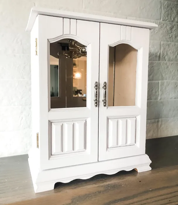
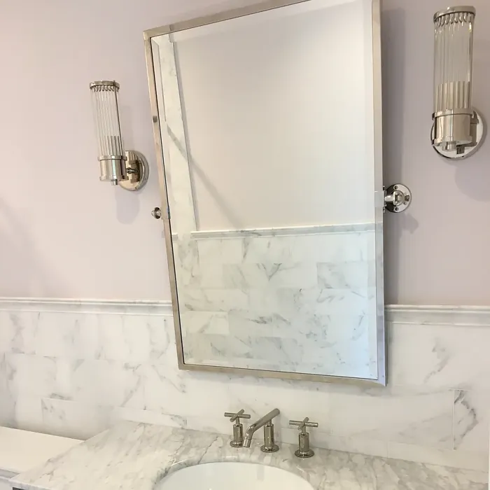
Now, the fun part: styling. Antique Pearl plays well with so many decor styles. In a traditional space, it feels classic paired with rich wood tones and brass fixtures. Try it with Benjamin Moore’s White Dove trim for a crisp, clean contrast. In a modern farmhouse setting, layer it with woven textures and black iron accents for that cozy-yet-polished look. And if you’re going transitional? Mix in sleek furniture and a few vintage pieces—this color bridges the gap effortlessly. For a pop of contrast, lean into its complementary green hues. Think olive throw pillows, a sage armchair, or even a statement emerald wall in an adjoining room. The balance is stunning.
Lighting is key with Antique Pearl. Because it’s warm and muted, it can shift slightly depending on the time of day or your bulb choice. In soft, incandescent light, it’ll feel extra cozy. With cool LEDs, it stays neutral but never sterile. Pro tip: Always test a swatch on your wall and observe it at different times before committing. And if you’re worried it might be too subtle, remember: sometimes the quietest colors make the biggest impact. It’s not here to scream for attention—it’s here to create a backdrop that makes your furniture, art, and life look its best.
Worried about maintenance? Don’t be. This is a practical choice, especially in satin or eggshell. It’s low-VOC, eco-friendly, and stands up to daily life. Kids, pets, or just the hustle and bustle of a busy home? It’ll handle it. And if you’re a renter looking to add personality without a major overhaul, Antique Pearl is landlord-friendly—neutral enough to please, unique enough to feel like yours.
So, is Antique Pearl right for you? If you love colors that feel lived-in but luxurious, if you want a shade that adapts instead of clashes, and if you’re after a paint that’s as easy to live with as it is to apply—then yes. This isn’t just a color; it’s a mood. Cozy, calm, and inviting. It’s the kind of hue that makes a house feel like a home. And really, isn’t that what we all want?
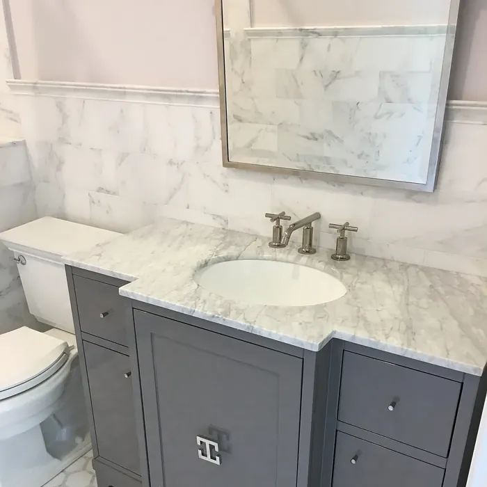
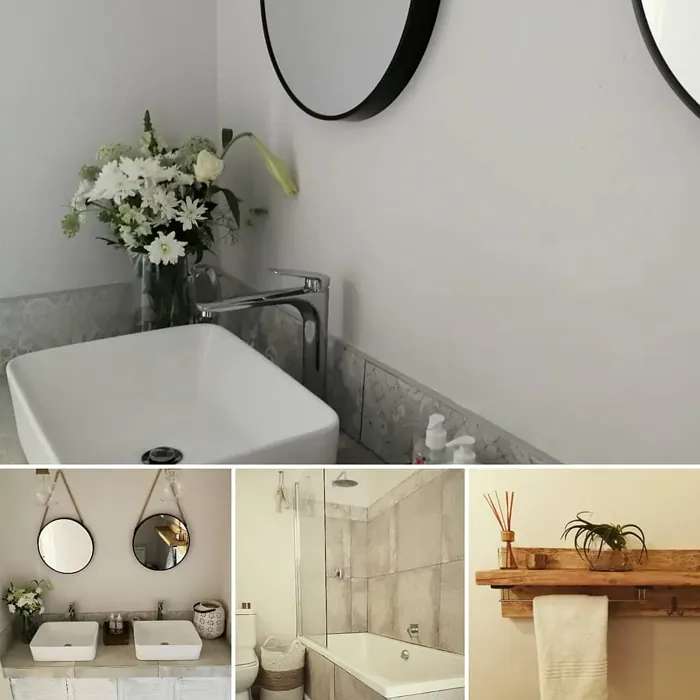
Real Room Photo of Antique Pearl 2113-70
Undertones of Antique Pearl ?
The understone of Antique Pearl leans towards a soft beige, giving it a warm and inviting presence. This subtle undertone ensures that the color feels welcoming in various lighting conditions, enhancing the warmth of the room.
Invalid or missing HEX color. Please ensure the ACF field "hex_code" has a value (e.g., #897d6d).
Is Antique Pearl Cool or Warm?
Antique Pearl has a warm tone that can brighten up any space while still feeling grounded. It’s perfect for creating a cozy atmosphere, especially in areas where you want to relax and unwind.
Understanding Color Properties and Interior Design Tips
Hue refers to a specific position on the color wheel, measured in degrees from 0 to 360. Each degree represents a different pure color:
- 0° represents red
- 120° represents green
- 240° represents blue
Saturation describes the intensity or purity of a color and is expressed as a percentage:
- At 0%, the color appears completely desaturated—essentially a shade of gray
- At 100%, the color is at its most vivid and vibrant
Lightness indicates how light or dark a color is, also expressed as a percentage:
- 0% lightness results in black
- 100% lightness results in white
Using Warm Colors in Interior Design
Warm hues—such as reds, oranges, yellows, warm beiges, and greiges—are excellent choices for creating inviting and energetic spaces. These colors are particularly well-suited for:
- Kitchens, living rooms, and bathrooms, where warmth enhances comfort and sociability
- Large rooms, where warm tones can help reduce the sense of emptiness and make the space feel more intimate
For example:
- Warm beige shades provide a cozy, inviting atmosphere, ideal for living rooms, bedrooms, and hallways.
- Warm greige (a mix of beige and gray) offers the warmth of beige with the modern appeal of gray, making it a versatile backdrop for dining areas, bedrooms, and living spaces.
However, be mindful when using warm light tones in rooms with limited natural light. These shades may appear muted or even take on an unpleasant yellowish tint. To avoid a dull or flat appearance:
- Add depth by incorporating richer tones like deep greens, charcoal, or chocolate brown
- Use textured elements such as curtains, rugs, or cushions to bring dimension to the space
Pro Tip: Achieving Harmony with Warm and Cool Color Balance
To create a well-balanced and visually interesting interior, mix warm and cool tones strategically. This contrast adds depth and harmony to your design.
- If your walls feature warm hues, introduce cool-colored accents such as blue or green furniture, artwork, or accessories to create contrast.
- For a polished look, consider using a complementary color scheme, which pairs colors opposite each other on the color wheel (e.g., red with green, orange with blue).
This thoughtful mix not only enhances visual appeal but also creates a space that feels both dynamic and cohesive.
Light Temperature Affects on Antique Pearl
Natural Light
Natural daylight changes in color temperature as the sun moves across the sky. At sunrise and sunset, the light tends to have a warm, golden tone with a color temperature around 2000 Kelvin (K). As the day progresses and the sun rises higher, the light becomes cooler and more neutral. Around midday, especially when the sky is clear, natural light typically reaches its peak brightness and shifts to a cooler tone, ranging from 5500 to 6500 Kelvin. This midday light is close to what we perceive as pure white or daylight-balanced light.
These shifts in natural light can significantly influence how colors appear in a space, which is why designers often consider both the time of day and the orientation of windows when planning interior color schemes.
Artificial Light
When choosing artificial lighting, pay close attention to the color temperature, measured in Kelvin (K). This determines how warm or cool the light will appear. Lower temperatures, around 2700K, give off a warm, yellow glow often used in living rooms or bedrooms. Higher temperatures, above 5000K, create a cool, bluish light similar to daylight, commonly used in kitchens, offices, or task areas.
Use the slider to see how lighting temperature can affect the appearance of a surface or color throughout a space.


4800K
LRV of Antique Pearl
The Light Reflectance Value (LRV) of Antique Pearl is 72.43%, which places it in the Off‑White colors category. This means it reflect a lot of light. Understanding a paint’s LRV is crucial for predicting how it will look in your space. A higher LRV indicates a lighter color that reflects more light, making rooms feel larger and brighter. A lower LRV signifies a darker color that absorbs more light, creating a cozier, more intimate atmosphere. Always consider the natural and artificial lighting in your room when selecting a paint color based on its LRV.
Detailed Review of Antique Pearl
Additional Paint Characteristics
Ideal Rooms
Bedroom, Dining Room, Home Office, Kitchen, Living Room
Decor Styles
Modern Farmhouse, Traditional, Transitional, Vintage
Coverage
Good (1–2 Coats), Touch-Up Friendly
Ease of Application
Beginner Friendly, Brush Smooth, Roller-Ready
Washability
Scrubbable, Stain Resistant, Washable
VOC Level
Eco-Certified, Low VOC
Best Use
Accent Wall, Home Office, Interior Walls
Room Suitability
Bedroom, Dining Room, Home Office, Living Room
Tone Tag
Earthy, Muted, Warm
Finish Type
Eggshell, Matte, Satin
Paint Performance
Long Lasting, Low Odor, Scuff Resistant
Use Cases
Best for Low Light Rooms, Best for Rentals, Classic Favorite
Mood
Calm, Cozy, Inviting
Trim Pairing
Complements Brass Fixtures, Good with Wood Trim, Pairs with White Dove
Antique Pearl is a delightful choice for homeowners looking to infuse their spaces with a classic touch. The color’s soft, muted undertones provide a versatile backdrop that complements a wide range of decor styles, from traditional to modern farmhouse. When applied, it offers a smooth finish that enhances the overall ambiance of a room without dominating the aesthetic. It works beautifully in both natural and artificial light, maintaining its elegance throughout the day.
In terms of application, Antique Pearl is user-friendly, making it suitable for DIY enthusiasts and professionals alike. It’s recommended to apply it with a roller for a more uniform look, and the coverage is satisfactory, generally requiring just one to two coats. The color also lends itself well to touch-ups, so you can easily maintain its pristine appearance over time. Overall, Antique Pearl is a fantastic choice for those looking to create a cozy yet sophisticated environment.
Pros & Cons of 2113-70 Antique Pearl
Pros
Cons
Colors that go with Benjamin Moore Antique Pearl
FAQ on 2113-70 Antique Pearl
What types of finishes are available for Antique Pearl?
Antique Pearl is available in several finishes, including Matte, Eggshell, and Satin. Each finish provides a different level of sheen and durability, allowing you to choose the best option for your space. Matte offers a flat, non-reflective surface perfect for walls, while Eggshell and Satin provide a subtle sheen that can enhance the color and make cleaning easier. Depending on your project, any of these finishes can work beautifully to achieve the desired look.
Is Antique Pearl suitable for high-traffic areas?
Yes, Antique Pearl is a great option for high-traffic areas, particularly when selected in a satin or eggshell finish. These finishes are more durable and easier to clean, allowing you to maintain the beauty of your walls despite wear and tear. Additionally, its stain-resistant properties make it a practical choice for spaces prone to scuffs and marks, ensuring that it remains looking fresh and inviting over time.
Comparisons Antique Pearl with other colors
Antique Pearl 2113-70 vs Malted Milk SW 6057
| Attribute | Antique Pearl 2113-70 | Malted Milk SW 6057 |
|---|---|---|
| Color Name | Antique Pearl 2113-70 | Malted Milk SW 6057 |
| Color | ||
| Hue | Pink | Pink |
| Brightness | Light | Light |
| RGB | N/A | 222, 202, 189 |
| LRV | 72.43% | 74% |
| Finish Type | Eggshell, Matte, Satin | Eggshell, Satin |
| Finish Options | Eggshell, Matte, Satin | Eggshell, Matte, Satin |
| Ideal Rooms | Bedroom, Dining Room, Home Office, Kitchen, Living Room | Bedroom, Dining Room, Kitchen, Living Room, Nursery |
| Decor Styles | Modern Farmhouse, Traditional, Transitional, Vintage | Coastal, Farmhouse, Modern, Scandinavian, Transitional |
| Coverage | Good (1–2 Coats), Touch-Up Friendly | Good (1–2 Coats), Touch-Up Friendly |
| Ease of Application | Beginner Friendly, Brush Smooth, Roller-Ready | Beginner Friendly, Brush Smooth, Fast-Drying, Roller-Ready |
| Washability | Scrubbable, Stain Resistant, Washable | Washable, Wipeable |
| Room Suitability | Bedroom, Dining Room, Home Office, Living Room | Bedroom, Dining Room, Kitchen, Living Room, Nursery |
| Tone | Earthy, Muted, Warm | Creamy, Neutral, Warm |
| Paint Performance | Long Lasting, Low Odor, Scuff Resistant | High Coverage, Low Odor, Quick Drying |
Antique Pearl 2113-70 vs Intimate White SW 6322
| Attribute | Antique Pearl 2113-70 | Intimate White SW 6322 |
|---|---|---|
| Color Name | Antique Pearl 2113-70 | Intimate White SW 6322 |
| Color | ||
| Hue | Pink | Pink |
| Brightness | Light | Light |
| RGB | N/A | 240, 225, 216 |
| LRV | 72.43% | 75% |
| Finish Type | Eggshell, Matte, Satin | Eggshell, Matte, Satin |
| Finish Options | Eggshell, Matte, Satin | Eggshell, Matte, Satin |
| Ideal Rooms | Bedroom, Dining Room, Home Office, Kitchen, Living Room | Bedroom, Hallway, Home Office, Living Room, Nursery |
| Decor Styles | Modern Farmhouse, Traditional, Transitional, Vintage | Farmhouse, Minimalist, Modern, Traditional |
| Coverage | Good (1–2 Coats), Touch-Up Friendly | Good (1–2 Coats) |
| Ease of Application | Beginner Friendly, Brush Smooth, Roller-Ready | Beginner Friendly, Brush Smooth, Roller-Ready |
| Washability | Scrubbable, Stain Resistant, Washable | Highly Washable, Washable |
| Room Suitability | Bedroom, Dining Room, Home Office, Living Room | Bedroom, Hallway, Living Room, Nursery |
| Tone | Earthy, Muted, Warm | Creamy, Muted, Warm |
| Paint Performance | Long Lasting, Low Odor, Scuff Resistant | Easy Touch-Up, Fade Resistant, Low Odor |
Antique Pearl 2113-70 vs Abalone Shell SW 6050
| Attribute | Antique Pearl 2113-70 | Abalone Shell SW 6050 |
|---|---|---|
| Color Name | Antique Pearl 2113-70 | Abalone Shell SW 6050 |
| Color | ||
| Hue | Pink | Pink |
| Brightness | Light | Light |
| RGB | N/A | 219, 199, 189 |
| LRV | 72.43% | 30% |
| Finish Type | Eggshell, Matte, Satin | Eggshell, Matte, Satin |
| Finish Options | Eggshell, Matte, Satin | Eggshell, Matte, Satin |
| Ideal Rooms | Bedroom, Dining Room, Home Office, Kitchen, Living Room | Bedroom, Dining Room, Home Office, Living Room |
| Decor Styles | Modern Farmhouse, Traditional, Transitional, Vintage | Coastal, Farmhouse, Minimalist, Modern, Traditional |
| Coverage | Good (1–2 Coats), Touch-Up Friendly | Good (1–2 Coats), Touch-Up Friendly |
| Ease of Application | Beginner Friendly, Brush Smooth, Roller-Ready | Beginner Friendly, Brush Smooth, Fast-Drying, Roller-Ready |
| Washability | Scrubbable, Stain Resistant, Washable | Washable, Wipeable |
| Room Suitability | Bedroom, Dining Room, Home Office, Living Room | Bedroom, Dining Room, Home Office, Living Room |
| Tone | Earthy, Muted, Warm | Balanced, Muted, Warm |
| Paint Performance | Long Lasting, Low Odor, Scuff Resistant | Easy Touch-Up, Fade Resistant, Low Odor, Quick Drying |
Antique Pearl 2113-70 vs White Truffle SW 6029
| Attribute | Antique Pearl 2113-70 | White Truffle SW 6029 |
|---|---|---|
| Color Name | Antique Pearl 2113-70 | White Truffle SW 6029 |
| Color | ||
| Hue | Pink | Pink |
| Brightness | Light | Light |
| RGB | N/A | 215, 200, 194 |
| LRV | 72.43% | 48% |
| Finish Type | Eggshell, Matte, Satin | Eggshell, Satin |
| Finish Options | Eggshell, Matte, Satin | Eggshell, Flat, Matte, Satin |
| Ideal Rooms | Bedroom, Dining Room, Home Office, Kitchen, Living Room | Bedroom, Dining Room, Hallway, Kitchen, Living Room |
| Decor Styles | Modern Farmhouse, Traditional, Transitional, Vintage | Eclectic, Farmhouse, Modern, Traditional |
| Coverage | Good (1–2 Coats), Touch-Up Friendly | Good (1–2 Coats), Touch-Up Friendly |
| Ease of Application | Beginner Friendly, Brush Smooth, Roller-Ready | Beginner Friendly, Brush Smooth, Roller-Ready |
| Washability | Scrubbable, Stain Resistant, Washable | Washable, Wipeable |
| Room Suitability | Bedroom, Dining Room, Home Office, Living Room | Bedroom, Dining Room, Hallway, Living Room |
| Tone | Earthy, Muted, Warm | Earthy, Neutral, Warm |
| Paint Performance | Long Lasting, Low Odor, Scuff Resistant | Easy Touch-Up, Low Odor, Scuff Resistant |
Antique Pearl 2113-70 vs Faint Coral SW 6329
| Attribute | Antique Pearl 2113-70 | Faint Coral SW 6329 |
|---|---|---|
| Color Name | Antique Pearl 2113-70 | Faint Coral SW 6329 |
| Color | ||
| Hue | Pink | Pink |
| Brightness | Light | Light |
| RGB | N/A | 238, 222, 213 |
| LRV | 72.43% | 66% |
| Finish Type | Eggshell, Matte, Satin | Eggshell, Matte, Satin |
| Finish Options | Eggshell, Matte, Satin | Eggshell, Matte, Satin |
| Ideal Rooms | Bedroom, Dining Room, Home Office, Kitchen, Living Room | Bedroom, Dining Room, Hallway, Living Room, Nursery |
| Decor Styles | Modern Farmhouse, Traditional, Transitional, Vintage | Bohemian, Coastal, Modern Farmhouse, Scandinavian, Vintage |
| Coverage | Good (1–2 Coats), Touch-Up Friendly | Good (1–2 Coats), Touch-Up Friendly |
| Ease of Application | Beginner Friendly, Brush Smooth, Roller-Ready | Beginner Friendly, Brush Smooth, Fast-Drying, Roller-Ready |
| Washability | Scrubbable, Stain Resistant, Washable | Washable, Wipeable |
| Room Suitability | Bedroom, Dining Room, Home Office, Living Room | Bedroom, Dining Room, Hallway, Living Room, Nursery |
| Tone | Earthy, Muted, Warm | Airy, Muted, Pastel, Warm |
| Paint Performance | Long Lasting, Low Odor, Scuff Resistant | Easy Touch-Up, Low Odor, Quick Drying |
Antique Pearl 2113-70 vs Romance SW 6323
| Attribute | Antique Pearl 2113-70 | Romance SW 6323 |
|---|---|---|
| Color Name | Antique Pearl 2113-70 | Romance SW 6323 |
| Color | ||
| Hue | Pink | Pink |
| Brightness | Light | Light |
| RGB | N/A | 235, 207, 195 |
| LRV | 72.43% | 69% |
| Finish Type | Eggshell, Matte, Satin | Eggshell, Matte |
| Finish Options | Eggshell, Matte, Satin | Eggshell, Flat, Matte, Satin |
| Ideal Rooms | Bedroom, Dining Room, Home Office, Kitchen, Living Room | Bedroom, Dining Room, Living Room, Nursery |
| Decor Styles | Modern Farmhouse, Traditional, Transitional, Vintage | Bohemian, Modern, Shabby Chic, Vintage |
| Coverage | Good (1–2 Coats), Touch-Up Friendly | Good (1–2 Coats), Touch-Up Friendly |
| Ease of Application | Beginner Friendly, Brush Smooth, Roller-Ready | Beginner Friendly, Brush Smooth, Fast-Drying, Roller-Ready |
| Washability | Scrubbable, Stain Resistant, Washable | Washable, Wipeable |
| Room Suitability | Bedroom, Dining Room, Home Office, Living Room | Bedroom, Dining Room, Living Room, Nursery |
| Tone | Earthy, Muted, Warm | Pastel, Soft, Warm |
| Paint Performance | Long Lasting, Low Odor, Scuff Resistant | Easy Touch-Up, Low Odor, Quick Drying |
Antique Pearl 2113-70 vs Innocence SW 6302
| Attribute | Antique Pearl 2113-70 | Innocence SW 6302 |
|---|---|---|
| Color Name | Antique Pearl 2113-70 | Innocence SW 6302 |
| Color | ||
| Hue | Pink | Pink |
| Brightness | Light | Light |
| RGB | N/A | 235, 209, 207 |
| LRV | 72.43% | 75% |
| Finish Type | Eggshell, Matte, Satin | Eggshell, Matte |
| Finish Options | Eggshell, Matte, Satin | Eggshell, Matte, Satin |
| Ideal Rooms | Bedroom, Dining Room, Home Office, Kitchen, Living Room | Bedroom, Dining Room, Living Room, Nursery |
| Decor Styles | Modern Farmhouse, Traditional, Transitional, Vintage | Bohemian, Modern Farmhouse, Scandinavian, Shabby Chic |
| Coverage | Good (1–2 Coats), Touch-Up Friendly | Good (1–2 Coats), Touch-Up Friendly |
| Ease of Application | Beginner Friendly, Brush Smooth, Roller-Ready | Beginner Friendly, Brush Smooth, Roller-Ready |
| Washability | Scrubbable, Stain Resistant, Washable | Washable, Wipeable |
| Room Suitability | Bedroom, Dining Room, Home Office, Living Room | Bedroom, Dining Room, Living Room, Nursery |
| Tone | Earthy, Muted, Warm | Pastel, Soft, Warm |
| Paint Performance | Long Lasting, Low Odor, Scuff Resistant | Easy Touch-Up, Fade Resistant, Low Odor |
Antique Pearl 2113-70 vs Angelic SW 6602
| Attribute | Antique Pearl 2113-70 | Angelic SW 6602 |
|---|---|---|
| Color Name | Antique Pearl 2113-70 | Angelic SW 6602 |
| Color | ||
| Hue | Pink | Pink |
| Brightness | Light | Light |
| RGB | N/A | 242, 220, 215 |
| LRV | 72.43% | 75% |
| Finish Type | Eggshell, Matte, Satin | Eggshell, Satin |
| Finish Options | Eggshell, Matte, Satin | Eggshell, Flat, Matte, Satin |
| Ideal Rooms | Bedroom, Dining Room, Home Office, Kitchen, Living Room | Bedroom, Dining Room, Home Office, Living Room, Nursery |
| Decor Styles | Modern Farmhouse, Traditional, Transitional, Vintage | Bohemian, Farmhouse, Modern, Transitional |
| Coverage | Good (1–2 Coats), Touch-Up Friendly | Good (1–2 Coats), Touch-Up Friendly |
| Ease of Application | Beginner Friendly, Brush Smooth, Roller-Ready | Beginner Friendly, Brush Smooth, Roller-Ready |
| Washability | Scrubbable, Stain Resistant, Washable | Washable, Wipeable |
| Room Suitability | Bedroom, Dining Room, Home Office, Living Room | Bedroom, Home Office, Living Room, Nursery |
| Tone | Earthy, Muted, Warm | Airy, Pastel, Warm |
| Paint Performance | Long Lasting, Low Odor, Scuff Resistant | Easy Touch-Up, Fade Resistant, Low Odor |
Antique Pearl 2113-70 vs Rosy Outlook SW 6316
| Attribute | Antique Pearl 2113-70 | Rosy Outlook SW 6316 |
|---|---|---|
| Color Name | Antique Pearl 2113-70 | Rosy Outlook SW 6316 |
| Color | ||
| Hue | Pink | Pink |
| Brightness | Light | Light |
| RGB | N/A | 235, 206, 203 |
| LRV | 72.43% | 45% |
| Finish Type | Eggshell, Matte, Satin | Eggshell, Matte, Satin |
| Finish Options | Eggshell, Matte, Satin | Eggshell, Matte, Satin |
| Ideal Rooms | Bedroom, Dining Room, Home Office, Kitchen, Living Room | Bedroom, Home Office, Living Room, Nursery |
| Decor Styles | Modern Farmhouse, Traditional, Transitional, Vintage | Bohemian, Cottage, Modern, Traditional |
| Coverage | Good (1–2 Coats), Touch-Up Friendly | Good (1–2 Coats), Touch-Up Friendly |
| Ease of Application | Beginner Friendly, Brush Smooth, Roller-Ready | Beginner Friendly, Brush Smooth, Roller-Ready |
| Washability | Scrubbable, Stain Resistant, Washable | Scuff Resistant, Washable, Wipeable |
| Room Suitability | Bedroom, Dining Room, Home Office, Living Room | Bedroom, Home Office, Living Room, Nursery |
| Tone | Earthy, Muted, Warm | Muted, Pastel, Warm |
| Paint Performance | Long Lasting, Low Odor, Scuff Resistant | High Coverage, Low Odor, Quick Drying |
Antique Pearl 2113-70 vs Demure SW 6295
| Attribute | Antique Pearl 2113-70 | Demure SW 6295 |
|---|---|---|
| Color Name | Antique Pearl 2113-70 | Demure SW 6295 |
| Color | ||
| Hue | Pink | Pink |
| Brightness | Light | Light |
| RGB | N/A | 232, 212, 213 |
| LRV | 72.43% | 50% |
| Finish Type | Eggshell, Matte, Satin | Eggshell, Matte |
| Finish Options | Eggshell, Matte, Satin | Eggshell, Matte, Satin |
| Ideal Rooms | Bedroom, Dining Room, Home Office, Kitchen, Living Room | Bedroom, Home Office, Living Room, Nursery |
| Decor Styles | Modern Farmhouse, Traditional, Transitional, Vintage | Minimalist, Modern, Shabby Chic, Transitional |
| Coverage | Good (1–2 Coats), Touch-Up Friendly | Good (1–2 Coats), Touch-Up Friendly |
| Ease of Application | Beginner Friendly, Brush Smooth, Roller-Ready | Beginner Friendly, Brush Smooth, Roller-Ready |
| Washability | Scrubbable, Stain Resistant, Washable | Washable, Wipeable |
| Room Suitability | Bedroom, Dining Room, Home Office, Living Room | Bedroom, Home Office, Living Room, Nursery |
| Tone | Earthy, Muted, Warm | Muted, Pastel, Warm |
| Paint Performance | Long Lasting, Low Odor, Scuff Resistant | Easy Touch-Up, Low Odor, Quick Drying |
Official Page of Benjamin Moore Antique Pearl 2113-70