
Color Preview & Key Details
| HEX Code | #C2B5B7 |
| RGB | 194, 181, 183 |
| LRV | 48.07% |
| Undertone | Red |
| Finish Options | Eggshell, Matte, Satin |
Imagine walking into a room that wraps you in warmth and nostalgia, a space where every corner invites you to linger just a little longer. That’s the magic of Victorian Mauve, a paint color that effortlessly blends soft pink and muted purple, creating an atmosphere that’s both elegant and inviting. It’s not just a color; it’s a feeling, a mood, a backdrop for memories waiting to be made.
Victorian Mauve, with its color code 2114-50 from Benjamin Moore, brings a unique charm to your home. This hue is like a cozy hug for your walls, perfect for a living room where friends gather, a bedroom that beckons relaxation, or a nursery that needs just the right touch of warmth. You might wonder about its versatility, and let me assure you—it fits beautifully into various decor styles. Whether you’re embracing Victorian elegance, modern minimalism, bohemian flair, or a transitional aesthetic, this color has the adaptability to shine.
With an LRV (Light Reflectance Value) of 48.07%, Victorian Mauve falls into the light medium category, reflecting about half of the light that hits it. This makes it a great option for spaces that need a cozy touch without feeling confined. In bright settings, the color reveals its pinkish undertones, giving a lively yet gentle ambiance. In contrast, when the light dims, it takes on a more subdued and romantic quality, enhancing the intimacy of your surroundings.
One of the most striking features of Victorian Mauve is its undertone—a subtle hint of red that adds depth and character. This is where the color truly comes alive. It allows the hue to dance between warm and cool, making it versatile for different lighting conditions. You’ll find that it can feel inviting and cozy during the day while providing a calming atmosphere at night. It’s perfect for anyone looking to maintain that cozy feel without the color becoming too warm.
When applying Victorian Mauve, you’re in for a treat. It’s beginner-friendly, offering a smooth application that dries quickly. Typically, you’ll find that one to two coats will do the trick, providing excellent coverage with minimal effort. That means less time painting and more time enjoying your beautifully transformed space. And if you ever need to touch up the color, it’s designed to be touch-up friendly, so you can keep your walls looking pristine without stress.
Now, let’s talk about maintenance. Life can get messy, especially in spaces like dining rooms or nurseries. The good news? Victorian Mauve is wipeable and washable, making it easy to care for your walls while keeping that soft, inviting look intact. Plus, it’s low in VOCs, which means you can breathe easy about the air quality in your home.
Of course, like any color, Victorian Mauve has its considerations. In smaller spaces, it might darken the room slightly, creating a cozy, intimate vibe. If you’re concerned about this, pair it with lighter trims or accents to keep the space feeling airy. Good lighting can also enhance its beauty, making it adaptable to various room sizes.
Pairing Victorian Mauve with complementary colors is an exciting venture. Soft whites and creams can provide a fresh contrast, while deeper shades like navy or charcoal offer a striking combination. This color works well with both warm and cool palettes, giving you the freedom to experiment until you find the perfect balance. Imagine a dining room painted in Victorian Mauve complemented by crisp white trim and navy accents—it’s a sophisticated yet inviting look that can elevate any gathering.
In the realm of decor styles, Victorian Mauve shines in many settings. It’s a favorite among those who appreciate classic and timeless aesthetics, but it also fits snugly into modern and eclectic spaces. Whether you’re decorating a cozy home office or a chic nursery, this hue can serve as a versatile backdrop that allows your furniture and decor to take center stage.
If you’re looking to enhance the beauty of Victorian Mauve, consider using it on walls, furniture, or even as an accent wall. Each application can evoke a different emotion and serve a unique purpose in your home. It creates a lovely focal point in a living room or a serene sanctuary in a bedroom. The opportunities are endless, limited only by your imagination.
Now, what about pairing with trim? White Dove is an excellent choice for trim with Victorian Mauve, providing a crisp contrast that keeps the overall look fresh and clean. If you’re leaning towards a more modern vibe, consider using cool trims that complement its purple undertones. On the other hand, warm trims can accentuate the inviting qualities of the color, creating a cozy retreat.
In terms of style inspirations, Victorian Mauve pairs beautifully with various design themes. Picture a Victorian-style room adorned with rich fabrics and vintage accents, or a modern space filled with minimalist furniture and geometric decor—both can benefit from this lovely hue. It’s a great connector, bridging the gap between different styles and eras, adding a touch of personality to your home.
As you contemplate your next project, take a moment to envision Victorian Mauve in your space. It’s a color that invites conversation and sparks creativity. A warm and inviting hue that’s easy to apply and maintain, Victorian Mauve stands tall as a timeless option for anyone looking to refresh their home. So, take a leap, grab a sample, and see how this charming shade can transform your living space into the cozy retreat you’ve always dreamed of.
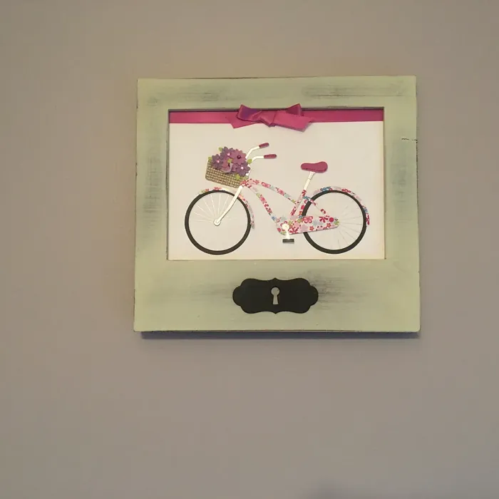
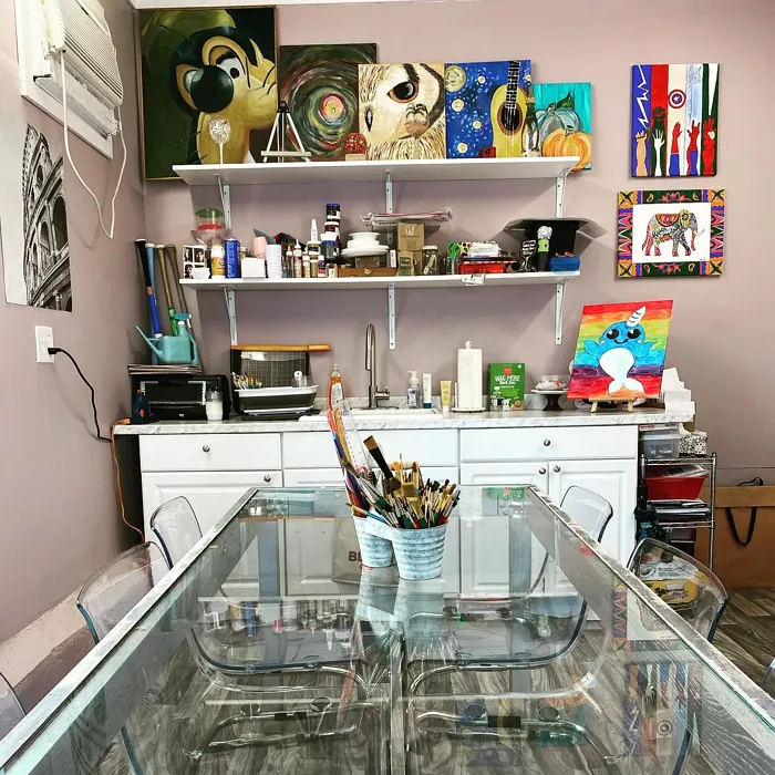
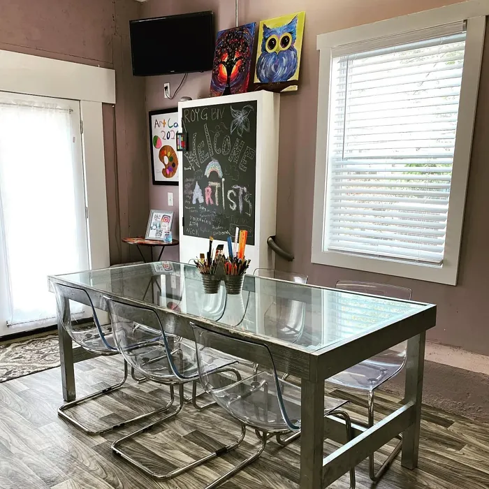
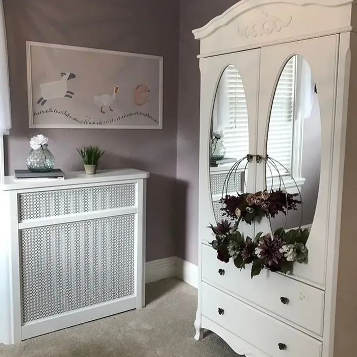
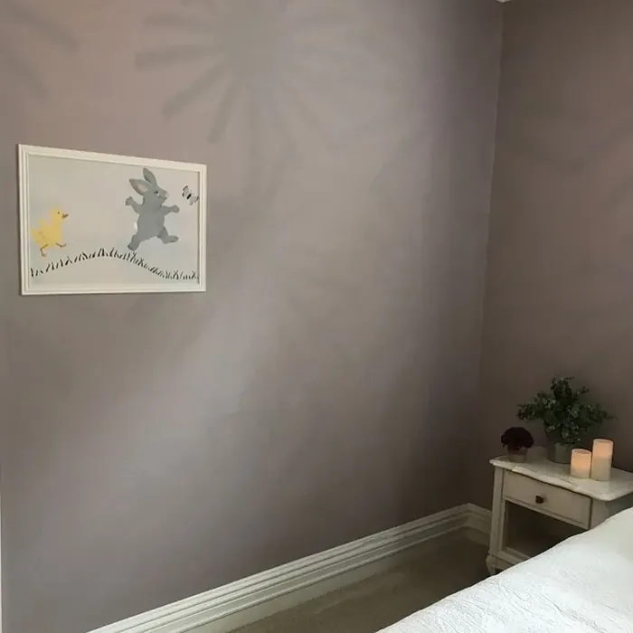
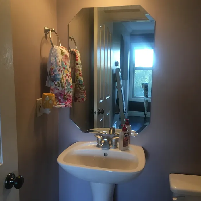
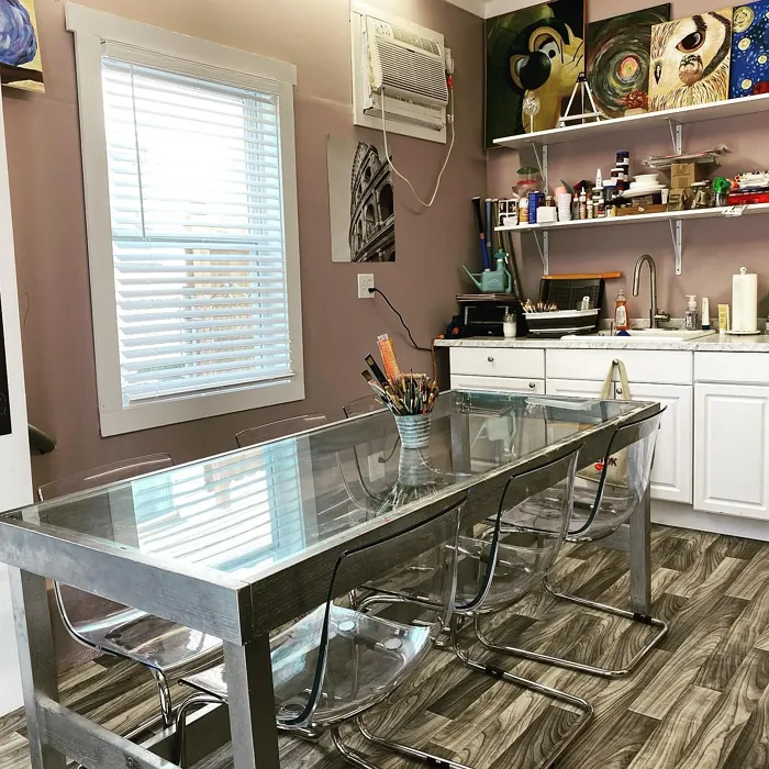
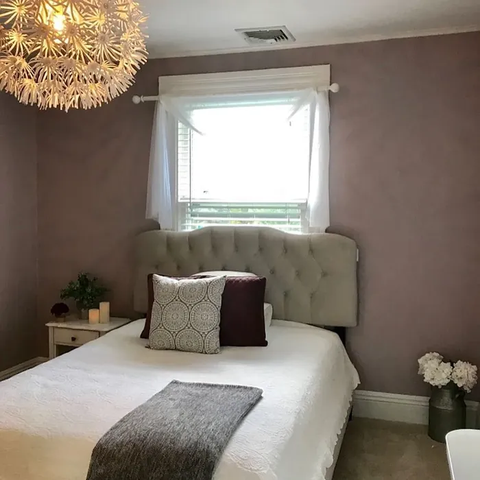
Real Room Photo of Victorian Mauve 2114-50
Undertones of Victorian Mauve ?
The undertones of Victorian Mauve are a key aspect of its character, leaning towards Red. These subtle underlying hues are what give the color its depth and complexity. For example, a gray with a blue undertone will feel cooler and more modern, while one with a brown undertone will feel warmer and more traditional. It’s essential to test this paint in your home and observe it next to your existing furniture, flooring, and decor to see how these undertones interact and reveal themselves throughout the day.
HEX value: #C2B5B7
RGB code: 194, 181, 183
Is Victorian Mauve Cool or Warm?
This color leans slightly cool due to its purple undertones but is grounded by warm pink hues. This unique blend means Victorian Mauve can adapt to different lighting conditions, making it feel warm and inviting in some settings while appearing more tranquil and calming in others. It’s a great choice if you want to maintain a cozy feel without the color feeling too warm.
Understanding Color Properties and Interior Design Tips
Hue refers to a specific position on the color wheel, measured in degrees from 0 to 360. Each degree represents a different pure color:
- 0° represents red
- 120° represents green
- 240° represents blue
Saturation describes the intensity or purity of a color and is expressed as a percentage:
- At 0%, the color appears completely desaturated—essentially a shade of gray
- At 100%, the color is at its most vivid and vibrant
Lightness indicates how light or dark a color is, also expressed as a percentage:
- 0% lightness results in black
- 100% lightness results in white
Using Warm Colors in Interior Design
Warm hues—such as reds, oranges, yellows, warm beiges, and greiges—are excellent choices for creating inviting and energetic spaces. These colors are particularly well-suited for:
- Kitchens, living rooms, and bathrooms, where warmth enhances comfort and sociability
- Large rooms, where warm tones can help reduce the sense of emptiness and make the space feel more intimate
For example:
- Warm beige shades provide a cozy, inviting atmosphere, ideal for living rooms, bedrooms, and hallways.
- Warm greige (a mix of beige and gray) offers the warmth of beige with the modern appeal of gray, making it a versatile backdrop for dining areas, bedrooms, and living spaces.
However, be mindful when using warm light tones in rooms with limited natural light. These shades may appear muted or even take on an unpleasant yellowish tint. To avoid a dull or flat appearance:
- Add depth by incorporating richer tones like deep greens, charcoal, or chocolate brown
- Use textured elements such as curtains, rugs, or cushions to bring dimension to the space
Pro Tip: Achieving Harmony with Warm and Cool Color Balance
To create a well-balanced and visually interesting interior, mix warm and cool tones strategically. This contrast adds depth and harmony to your design.
- If your walls feature warm hues, introduce cool-colored accents such as blue or green furniture, artwork, or accessories to create contrast.
- For a polished look, consider using a complementary color scheme, which pairs colors opposite each other on the color wheel (e.g., red with green, orange with blue).
This thoughtful mix not only enhances visual appeal but also creates a space that feels both dynamic and cohesive.
Light Temperature Affects on Victorian Mauve
Natural Light
Natural daylight changes in color temperature as the sun moves across the sky. At sunrise and sunset, the light tends to have a warm, golden tone with a color temperature around 2000 Kelvin (K). As the day progresses and the sun rises higher, the light becomes cooler and more neutral. Around midday, especially when the sky is clear, natural light typically reaches its peak brightness and shifts to a cooler tone, ranging from 5500 to 6500 Kelvin. This midday light is close to what we perceive as pure white or daylight-balanced light.
These shifts in natural light can significantly influence how colors appear in a space, which is why designers often consider both the time of day and the orientation of windows when planning interior color schemes.
Artificial Light
When choosing artificial lighting, pay close attention to the color temperature, measured in Kelvin (K). This determines how warm or cool the light will appear. Lower temperatures, around 2700K, give off a warm, yellow glow often used in living rooms or bedrooms. Higher temperatures, above 5000K, create a cool, bluish light similar to daylight, commonly used in kitchens, offices, or task areas.
Use the slider to see how lighting temperature can affect the appearance of a surface or color throughout a space.


4800K
LRV of Victorian Mauve
The Light Reflectance Value (LRV) of Victorian Mauve is 48.07%, which places it in the Light Medium colors category. This means it reflect half of the incident light. Understanding a paint’s LRV is crucial for predicting how it will look in your space. A higher LRV indicates a lighter color that reflects more light, making rooms feel larger and brighter. A lower LRV signifies a darker color that absorbs more light, creating a cozier, more intimate atmosphere. Always consider the natural and artificial lighting in your room when selecting a paint color based on its LRV.
Detailed Review of Victorian Mauve
Additional Paint Characteristics
Ideal Rooms
Bedroom, Dining Room, Home Office, Living Room, Nursery
Decor Styles
Bohemian, Eclectic, Modern, Transitional, Victorian
Coverage
Good (1–2 Coats), Touch-Up Friendly
Ease of Application
Beginner Friendly, Brush Smooth, Fast-Drying
Washability
Washable, Wipeable
VOC Level
Eco-Certified, Low VOC
Best Use
Accent Wall, Furniture, Interior Walls
Room Suitability
Bedroom, Dining Room, Home Office, Living Room, Nursery
Tone Tag
Dusty, Muted, Warm
Finish Type
Eggshell, Matte
Paint Performance
Easy Touch-Up, High Coverage, Low Odor
Use Cases
Best for Small Spaces, Classic Favorite, Designer Favorite
Mood
Cozy, Inviting, Restful
Trim Pairing
Complements Cool Trim, Pairs with White Dove, Works with Warm Trim
Victorian Mauve is a delightful choice for anyone looking to create a warm and inviting atmosphere. Its muted tones allow it to blend seamlessly into both modern and traditional spaces. The color works particularly well in living areas and bedrooms, where it can evoke feelings of comfort and relaxation. When applied, it offers excellent coverage, typically requiring only one to two coats for full opacity. This makes it an efficient option for those who want to revamp their space without spending too much time on the project. In terms of finish, it shines in matte or eggshell, enhancing its soft appeal while still being easy to maintain. Overall, Victorian Mauve strikes a perfect balance between elegance and approachability.
Pros & Cons of 2114-50 Victorian Mauve
Pros
Cons
Colors that go with Benjamin Moore Victorian Mauve
FAQ on 2114-50 Victorian Mauve
Is Victorian Mauve suitable for small spaces?
Absolutely! While Victorian Mauve can darken smaller areas, it also adds a sense of warmth and coziness that can be inviting. To keep the space feeling open, consider pairing it with lighter trims or accents. Using good lighting can also help enhance its beauty in smaller rooms.
How does Victorian Mauve work with other colors?
Victorian Mauve pairs beautifully with soft whites, creams, and even deeper hues like navy or charcoal for a striking contrast. It’s versatile enough to complement both warm and cool palettes, making it an excellent choice for creating a harmonious color scheme. Experimenting with different accents can lead to stunning results.
Comparisons Victorian Mauve with other colors
Victorian Mauve 2114-50 vs Dusty Heather SW 9073
| Attribute | Victorian Mauve 2114-50 | Dusty Heather SW 9073 |
|---|---|---|
| Color Name | Victorian Mauve 2114-50 | Dusty Heather SW 9073 |
| Color | ||
| Hue | Purple | Purple |
| Brightness | Medium | Medium |
| RGB | 194, 181, 183 | 137, 144, 163 |
| LRV | 48.07% | 30% |
| Finish Type | Eggshell, Matte | Eggshell, Matte, Satin |
| Finish Options | Eggshell, Matte, Satin | Eggshell, Matte, Satin |
| Ideal Rooms | Bedroom, Dining Room, Home Office, Living Room, Nursery | Bedroom, Home Office, Living Room, Nursery |
| Decor Styles | Bohemian, Eclectic, Modern, Transitional, Victorian | Modern, Rustic, Scandinavian, Transitional |
| Coverage | Good (1–2 Coats), Touch-Up Friendly | Good (1–2 Coats), Touch-Up Friendly |
| Ease of Application | Beginner Friendly, Brush Smooth, Fast-Drying | Beginner Friendly, Brush Smooth, Roller-Ready |
| Washability | Washable, Wipeable | Washable, Wipeable |
| Room Suitability | Bedroom, Dining Room, Home Office, Living Room, Nursery | Bedroom, Home Office, Living Room, Nursery |
| Tone | Dusty, Muted, Warm | Cool, Dusty, Muted |
| Paint Performance | Easy Touch-Up, High Coverage, Low Odor | Easy Touch-Up, High Coverage, Low Odor |
Victorian Mauve 2114-50 vs Chaise Mauve SW 6016
| Attribute | Victorian Mauve 2114-50 | Chaise Mauve SW 6016 |
|---|---|---|
| Color Name | Victorian Mauve 2114-50 | Chaise Mauve SW 6016 |
| Color | ||
| Hue | Purple | Purple |
| Brightness | Medium | Medium |
| RGB | 194, 181, 183 | 193, 178, 179 |
| LRV | 48.07% | 24% |
| Finish Type | Eggshell, Matte | Eggshell, Matte, Satin |
| Finish Options | Eggshell, Matte, Satin | Eggshell, Matte, Satin |
| Ideal Rooms | Bedroom, Dining Room, Home Office, Living Room, Nursery | Bedroom, Dining Room, Home Office, Living Room, Nursery |
| Decor Styles | Bohemian, Eclectic, Modern, Transitional, Victorian | Eclectic, Minimalist, Modern, Transitional, Vintage |
| Coverage | Good (1–2 Coats), Touch-Up Friendly | Good (1–2 Coats) |
| Ease of Application | Beginner Friendly, Brush Smooth, Fast-Drying | Beginner Friendly, Brush Smooth, Fast-Drying, Roller-Ready |
| Washability | Washable, Wipeable | Highly Washable, Washable, Wipeable |
| Room Suitability | Bedroom, Dining Room, Home Office, Living Room, Nursery | Bedroom, Dining Room, Home Office, Living Room, Nursery |
| Tone | Dusty, Muted, Warm | Balanced, Dusty, Muted, Warm |
| Paint Performance | Easy Touch-Up, High Coverage, Low Odor | Easy Touch-Up, Fade Resistant, Low Odor, Quick Drying |
Victorian Mauve 2114-50 vs Vesper Violet SW 6542
| Attribute | Victorian Mauve 2114-50 | Vesper Violet SW 6542 |
|---|---|---|
| Color Name | Victorian Mauve 2114-50 | Vesper Violet SW 6542 |
| Color | ||
| Hue | Purple | Purple |
| Brightness | Medium | Medium |
| RGB | 194, 181, 183 | 153, 160, 178 |
| LRV | 48.07% | 24% |
| Finish Type | Eggshell, Matte | Eggshell, Satin |
| Finish Options | Eggshell, Matte, Satin | Eggshell, Flat, Satin |
| Ideal Rooms | Bedroom, Dining Room, Home Office, Living Room, Nursery | Bedroom, Home Office, Living Room, Nursery |
| Decor Styles | Bohemian, Eclectic, Modern, Transitional, Victorian | Bohemian, Modern, Scandinavian, Transitional |
| Coverage | Good (1–2 Coats), Touch-Up Friendly | Good (1–2 Coats), Touch-Up Friendly |
| Ease of Application | Beginner Friendly, Brush Smooth, Fast-Drying | Beginner Friendly, Brush Smooth, Roller-Ready |
| Washability | Washable, Wipeable | Stain Resistant, Washable |
| Room Suitability | Bedroom, Dining Room, Home Office, Living Room, Nursery | Bedroom, Home Office, Living Room, Nursery |
| Tone | Dusty, Muted, Warm | Cool, Dusty, Muted |
| Paint Performance | Easy Touch-Up, High Coverage, Low Odor | Easy Touch-Up, Fade Resistant, Low Odor |
Victorian Mauve 2114-50 vs Moonlit Orchid SW 9153
| Attribute | Victorian Mauve 2114-50 | Moonlit Orchid SW 9153 |
|---|---|---|
| Color Name | Victorian Mauve 2114-50 | Moonlit Orchid SW 9153 |
| Color | ||
| Hue | Purple | Purple |
| Brightness | Medium | Medium |
| RGB | 194, 181, 183 | 148, 145, 148 |
| LRV | 48.07% | 15% |
| Finish Type | Eggshell, Matte | Eggshell, Matte |
| Finish Options | Eggshell, Matte, Satin | Eggshell, Matte, Satin |
| Ideal Rooms | Bedroom, Dining Room, Home Office, Living Room, Nursery | Bedroom, Home Office, Living Room, Nursery |
| Decor Styles | Bohemian, Eclectic, Modern, Transitional, Victorian | Bohemian, Minimalist, Modern, Transitional |
| Coverage | Good (1–2 Coats), Touch-Up Friendly | Good (1–2 Coats), Touch-Up Friendly |
| Ease of Application | Beginner Friendly, Brush Smooth, Fast-Drying | Beginner Friendly, Brush Smooth, Roller-Ready |
| Washability | Washable, Wipeable | Spot Clean Only, Washable |
| Room Suitability | Bedroom, Dining Room, Home Office, Living Room, Nursery | Bedroom, Home Office, Living Room, Nursery |
| Tone | Dusty, Muted, Warm | Balanced, Cool, Muted |
| Paint Performance | Easy Touch-Up, High Coverage, Low Odor | Easy Touch-Up, High Coverage, Low Odor |
Victorian Mauve 2114-50 vs Thistle SW 6283
| Attribute | Victorian Mauve 2114-50 | Thistle SW 6283 |
|---|---|---|
| Color Name | Victorian Mauve 2114-50 | Thistle SW 6283 |
| Color | ||
| Hue | Purple | Purple |
| Brightness | Medium | Medium |
| RGB | 194, 181, 183 | 170, 142, 154 |
| LRV | 48.07% | 66% |
| Finish Type | Eggshell, Matte | Eggshell, Matte, Satin |
| Finish Options | Eggshell, Matte, Satin | Eggshell, Matte, Satin |
| Ideal Rooms | Bedroom, Dining Room, Home Office, Living Room, Nursery | Bedroom, Dining Room, Home Office, Living Room, Nursery |
| Decor Styles | Bohemian, Eclectic, Modern, Transitional, Victorian | Bohemian, Modern, Scandinavian, Vintage |
| Coverage | Good (1–2 Coats), Touch-Up Friendly | Good (1–2 Coats), Touch-Up Friendly |
| Ease of Application | Beginner Friendly, Brush Smooth, Fast-Drying | Beginner Friendly, Brush Smooth, Fast-Drying, Roller-Ready |
| Washability | Washable, Wipeable | Spot Clean Only, Washable, Wipeable |
| Room Suitability | Bedroom, Dining Room, Home Office, Living Room, Nursery | Bedroom, Home Office, Living Room, Nursery |
| Tone | Dusty, Muted, Warm | Dusty, Muted, Warm |
| Paint Performance | Easy Touch-Up, High Coverage, Low Odor | Easy Touch-Up, Fade Resistant, Long Lasting, Low Odor |
Victorian Mauve 2114-50 vs Grape Mist SW 6548
| Attribute | Victorian Mauve 2114-50 | Grape Mist SW 6548 |
|---|---|---|
| Color Name | Victorian Mauve 2114-50 | Grape Mist SW 6548 |
| Color | ||
| Hue | Purple | Purple |
| Brightness | Medium | Medium |
| RGB | 194, 181, 183 | 197, 192, 201 |
| LRV | 48.07% | 24% |
| Finish Type | Eggshell, Matte | Eggshell, Matte |
| Finish Options | Eggshell, Matte, Satin | Eggshell, Matte, Satin |
| Ideal Rooms | Bedroom, Dining Room, Home Office, Living Room, Nursery | Bedroom, Home Office, Living Room, Nursery |
| Decor Styles | Bohemian, Eclectic, Modern, Transitional, Victorian | Modern, Rustic, Scandinavian, Transitional |
| Coverage | Good (1–2 Coats), Touch-Up Friendly | Good (1–2 Coats), Touch-Up Friendly |
| Ease of Application | Beginner Friendly, Brush Smooth, Fast-Drying | Beginner Friendly, Brush Smooth, Roller-Ready |
| Washability | Washable, Wipeable | Washable, Wipeable |
| Room Suitability | Bedroom, Dining Room, Home Office, Living Room, Nursery | Bedroom, Home Office, Living Room, Nursery |
| Tone | Dusty, Muted, Warm | Cool, Muted, Pastel |
| Paint Performance | Easy Touch-Up, High Coverage, Low Odor | Easy Touch-Up, Fade Resistant, Low Odor |
Victorian Mauve 2114-50 vs Agapanthus SW 9066
| Attribute | Victorian Mauve 2114-50 | Agapanthus SW 9066 |
|---|---|---|
| Color Name | Victorian Mauve 2114-50 | Agapanthus SW 9066 |
| Color | ||
| Hue | Purple | Purple |
| Brightness | Medium | Medium |
| RGB | 194, 181, 183 | 187, 197, 222 |
| LRV | 48.07% | 15% |
| Finish Type | Eggshell, Matte | Eggshell, Matte, Satin |
| Finish Options | Eggshell, Matte, Satin | Eggshell, Matte, Satin |
| Ideal Rooms | Bedroom, Dining Room, Home Office, Living Room, Nursery | Bedroom, Hallway, Home Office, Living Room, Nursery |
| Decor Styles | Bohemian, Eclectic, Modern, Transitional, Victorian | Coastal, Minimalist, Modern, Scandinavian |
| Coverage | Good (1–2 Coats), Touch-Up Friendly | Good (1–2 Coats), Touch-Up Friendly |
| Ease of Application | Beginner Friendly, Brush Smooth, Fast-Drying | Beginner Friendly, Brush Smooth, Roller-Ready |
| Washability | Washable, Wipeable | Washable, Wipeable |
| Room Suitability | Bedroom, Dining Room, Home Office, Living Room, Nursery | Bedroom, Home Office, Living Room, Nursery |
| Tone | Dusty, Muted, Warm | Airy, Cool, Muted |
| Paint Performance | Easy Touch-Up, High Coverage, Low Odor | Easy Touch-Up, Fade Resistant, Low Odor, Quick Drying |
Victorian Mauve 2114-50 vs Intuitive SW 6017
| Attribute | Victorian Mauve 2114-50 | Intuitive SW 6017 |
|---|---|---|
| Color Name | Victorian Mauve 2114-50 | Intuitive SW 6017 |
| Color | ||
| Hue | Purple | Purple |
| Brightness | Medium | Medium |
| RGB | 194, 181, 183 | 179, 163, 165 |
| LRV | 48.07% | 30% |
| Finish Type | Eggshell, Matte | Eggshell, Matte, Satin |
| Finish Options | Eggshell, Matte, Satin | Eggshell, Matte, Satin |
| Ideal Rooms | Bedroom, Dining Room, Home Office, Living Room, Nursery | Bedroom, Dining Room, Home Office, Living Room, Nursery |
| Decor Styles | Bohemian, Eclectic, Modern, Transitional, Victorian | Minimalist, Modern, Scandinavian, Transitional |
| Coverage | Good (1–2 Coats), Touch-Up Friendly | Good (1–2 Coats) |
| Ease of Application | Beginner Friendly, Brush Smooth, Fast-Drying | Beginner Friendly, Brush Smooth, Roller-Ready |
| Washability | Washable, Wipeable | Washable, Wipeable |
| Room Suitability | Bedroom, Dining Room, Home Office, Living Room, Nursery | Bedroom, Dining Room, Home Office, Living Room |
| Tone | Dusty, Muted, Warm | Balanced, Muted, Warm |
| Paint Performance | Easy Touch-Up, High Coverage, Low Odor | Easy Touch-Up, Low Odor, Quick Drying |
Victorian Mauve 2114-50 vs Veiled Violet SW 6268
| Attribute | Victorian Mauve 2114-50 | Veiled Violet SW 6268 |
|---|---|---|
| Color Name | Victorian Mauve 2114-50 | Veiled Violet SW 6268 |
| Color | ||
| Hue | Purple | Purple |
| Brightness | Medium | Medium |
| RGB | 194, 181, 183 | 189, 181, 185 |
| LRV | 48.07% | 24% |
| Finish Type | Eggshell, Matte | Eggshell, Matte, Satin |
| Finish Options | Eggshell, Matte, Satin | Eggshell, Matte, Satin |
| Ideal Rooms | Bedroom, Dining Room, Home Office, Living Room, Nursery | Bedroom, Home Office, Living Room, Nursery |
| Decor Styles | Bohemian, Eclectic, Modern, Transitional, Victorian | Bohemian, Minimalist, Modern, Transitional |
| Coverage | Good (1–2 Coats), Touch-Up Friendly | Good (1–2 Coats), Touch-Up Friendly |
| Ease of Application | Beginner Friendly, Brush Smooth, Fast-Drying | Beginner Friendly, Brush Smooth, Fast-Drying, Roller-Ready |
| Washability | Washable, Wipeable | Highly Washable, Washable |
| Room Suitability | Bedroom, Dining Room, Home Office, Living Room, Nursery | Bedroom, Home Office, Living Room, Nursery |
| Tone | Dusty, Muted, Warm | Airy, Cool, Dusty, Muted |
| Paint Performance | Easy Touch-Up, High Coverage, Low Odor | Easy Touch-Up, Fade Resistant, Low Odor, Quick Drying |
Victorian Mauve 2114-50 vs Gris Morado SW 9156
| Attribute | Victorian Mauve 2114-50 | Gris Morado SW 9156 |
|---|---|---|
| Color Name | Victorian Mauve 2114-50 | Gris Morado SW 9156 |
| Color | ||
| Hue | Purple | Purple |
| Brightness | Medium | Medium |
| RGB | 194, 181, 183 | 143, 138, 145 |
| LRV | 48.07% | 20% |
| Finish Type | Eggshell, Matte | Eggshell, Matte, Satin |
| Finish Options | Eggshell, Matte, Satin | Eggshell, Matte, Satin |
| Ideal Rooms | Bedroom, Dining Room, Home Office, Living Room, Nursery | Bedroom, Dining Room, Home Office, Living Room |
| Decor Styles | Bohemian, Eclectic, Modern, Transitional, Victorian | Contemporary, Minimalist, Modern, Scandinavian |
| Coverage | Good (1–2 Coats), Touch-Up Friendly | Good (1–2 Coats), Touch-Up Friendly |
| Ease of Application | Beginner Friendly, Brush Smooth, Fast-Drying | Beginner Friendly, Brush Smooth, Fast-Drying, Roller-Ready |
| Washability | Washable, Wipeable | Washable, Wipeable |
| Room Suitability | Bedroom, Dining Room, Home Office, Living Room, Nursery | Bedroom, Dining Room, Home Office, Living Room |
| Tone | Dusty, Muted, Warm | Cool, Muted, Sophisticated |
| Paint Performance | Easy Touch-Up, High Coverage, Low Odor | Easy Touch-Up, Fade Resistant, Low Odor |
Official Page of Benjamin Moore Victorian Mauve 2114-50