
Color Preview & Key Details
| HEX Code | #DCD4D3 |
| RGB | 220, 212, 211 |
| LRV | 66.18% |
| Undertone | Red |
| Finish Options | Eggshell, Matte, Satin |
Have you ever walked into a room and immediately felt a sense of calm wash over you? It’s not just the furniture or the layout—it’s the color on the walls. The right shade can transform a space from chaotic to serene, from impersonal to inviting. That’s the magic of Benjamin Moore’s Hint of Violet (2114-60). This soft, delicate hue is like a whisper of elegance, offering just enough color to make a statement without overwhelming your senses. If you’re considering a refresh for your home but aren’t sure where to start, let’s dive into why this might be the perfect choice for your next project.
Hint of Violet is a light, muted purple with a subtle warmth that comes from its red undertones. It’s not overly bold or dramatic, which makes it incredibly versatile. Whether you’re aiming for a modern, Scandinavian, or transitional look, this color adapts effortlessly. The hex code (#DCD4D3) and RGB values (220, 212, 211) reveal its gentle, almost neutral quality—it’s more of a suggestion of color than a full-on declaration. That’s what makes it so easy to live with. You won’t tire of it quickly, and it won’t clash with your existing decor.
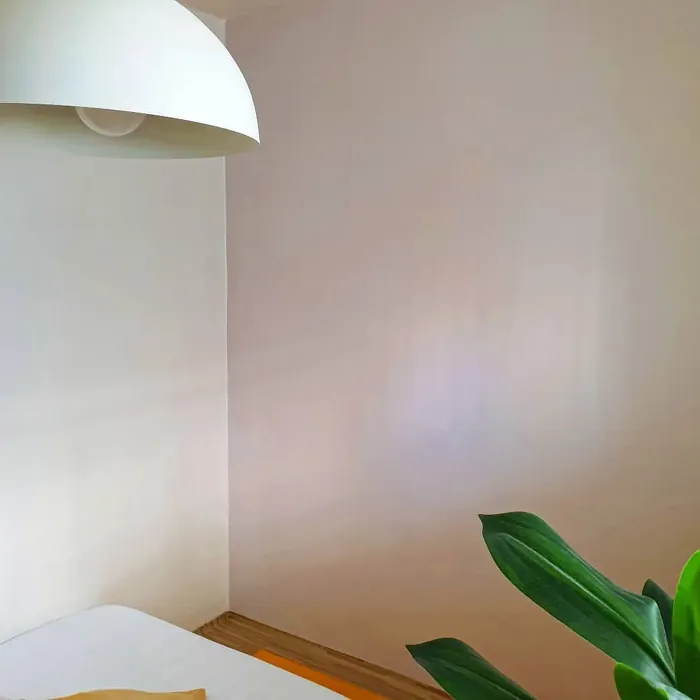
One of the standout features of this paint is its light reflectance value (LRV) of 66.18%, meaning it reflects most of the light that hits it. This is a game-changer for smaller rooms or spaces with limited natural light. It brightens without feeling stark or cold, creating an airy, open feel. In a north-facing room, it might lean slightly cooler, while in a south-facing space, the warmth of its red undertones will shine through. That subtle shift throughout the day adds depth and interest to your walls, making the color feel alive rather than flat.
When it comes to application, Hint of Violet is beginner-friendly. It rolls on smoothly, doesn’t streak, and typically covers well in one to two coats. If you’re painting over a darker color or an uneven surface, a primer or second coat might be necessary, but that’s true of most lighter shades. The finish options—matte, eggshell, or satin—give you flexibility depending on the room’s function. Eggshell is a great middle ground for most spaces, offering a slight sheen that’s easy to clean without being too glossy.
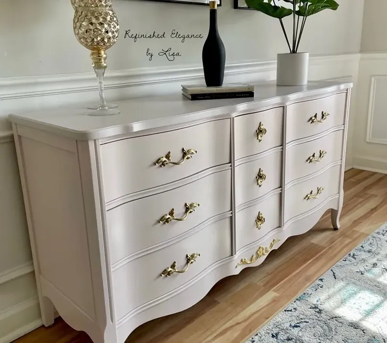
This color excels in bedrooms, living rooms, home offices, and even nurseries. It’s restful without being boring, sophisticated without being stuffy. Pair it with crisp white trim like Benjamin Moore’s White Dove for a classic look, or let it play off natural wood tones for a warmer, more organic vibe. If you’re feeling adventurous, try it on an accent wall paired with deeper shades from its complementary palette, like HC-145 or 2135-30, for a touch of contrast.
Of course, no color is perfect for every situation. Lighter shades like Hint of Violet can show dirt and scuffs more easily, so it might not be the best pick for a high-traffic hallway or a kid’s playroom. But in lower-traffic areas, its washability makes maintenance a breeze. And because it’s low-VOC and eco-certified, you can feel good about using it in your home, especially in spaces where you spend a lot of time, like a bedroom or office.
The mood this color creates is undeniably calming. It’s the kind of shade that makes you want to curl up with a book or linger over a cup of coffee. It doesn’t demand attention but quietly enhances everything around it. If you’re someone who loves the idea of color but is nervous about committing to something too bold, Hint of Violet is a safe bet that still feels special.
Before you commit, though, always test it in your space. Paint a large swatch on the wall and observe it at different times of day. Notice how it interacts with your furniture, flooring, and lighting. Colors can look dramatically different from the swatch once they’re on your walls, and Hint of Violet is no exception. Its chameleon-like quality is part of its charm, but you’ll want to make sure it works with your specific environment.
At the end of the day, choosing a paint color is about how it makes you feel. Hint of Violet has a way of making spaces feel intentional yet effortless, polished yet relaxed. It’s a color that doesn’t try too hard, and that’s exactly why it works so well. Whether you’re refreshing a single room or reimagining your entire home, this shade is worth considering. It’s the kind of color you’ll love living with—quietly beautiful, endlessly adaptable, and just a little bit magical.
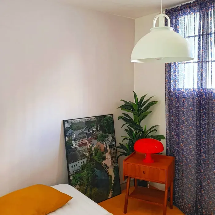
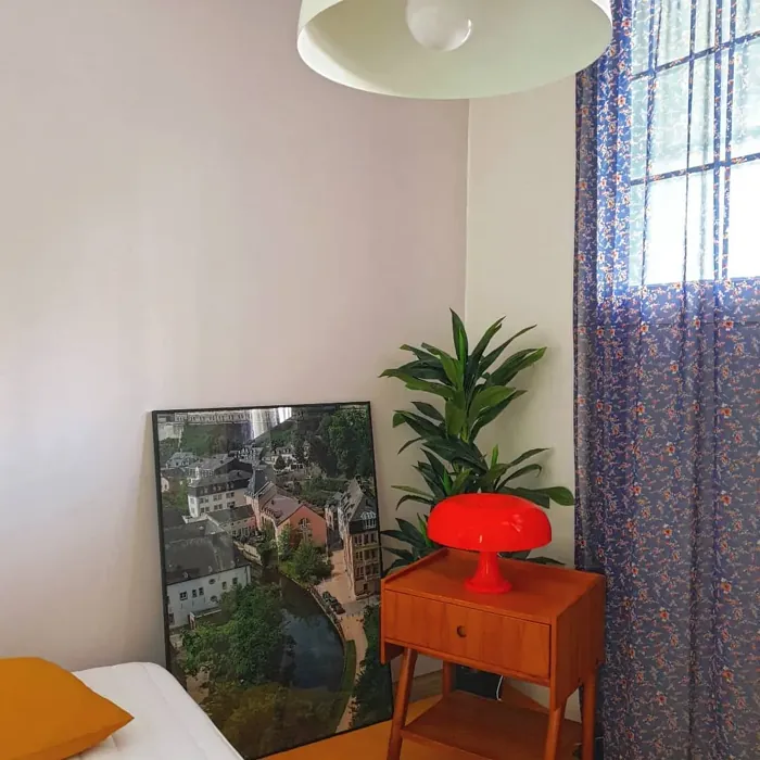
Real Room Photo of Hint of Violet 2114-60
Undertones of Hint of Violet ?
The undertones of Hint of Violet are a key aspect of its character, leaning towards Red. These subtle underlying hues are what give the color its depth and complexity. For example, a gray with a blue undertone will feel cooler and more modern, while one with a brown undertone will feel warmer and more traditional. It’s essential to test this paint in your home and observe it next to your existing furniture, flooring, and decor to see how these undertones interact and reveal themselves throughout the day.
HEX value: #DCD4D3
RGB code: 220, 212, 211
Is Hint of Violet Cool or Warm?
Hint of Violet is primarily a cool color, but its soft warmth keeps it feeling inviting. This balance makes it suitable for various decor styles, allowing it to adapt beautifully to both contemporary and traditional settings.
Understanding Color Properties and Interior Design Tips
Hue refers to a specific position on the color wheel, measured in degrees from 0 to 360. Each degree represents a different pure color:
- 0° represents red
- 120° represents green
- 240° represents blue
Saturation describes the intensity or purity of a color and is expressed as a percentage:
- At 0%, the color appears completely desaturated—essentially a shade of gray
- At 100%, the color is at its most vivid and vibrant
Lightness indicates how light or dark a color is, also expressed as a percentage:
- 0% lightness results in black
- 100% lightness results in white
Using Warm Colors in Interior Design
Warm hues—such as reds, oranges, yellows, warm beiges, and greiges—are excellent choices for creating inviting and energetic spaces. These colors are particularly well-suited for:
- Kitchens, living rooms, and bathrooms, where warmth enhances comfort and sociability
- Large rooms, where warm tones can help reduce the sense of emptiness and make the space feel more intimate
For example:
- Warm beige shades provide a cozy, inviting atmosphere, ideal for living rooms, bedrooms, and hallways.
- Warm greige (a mix of beige and gray) offers the warmth of beige with the modern appeal of gray, making it a versatile backdrop for dining areas, bedrooms, and living spaces.
However, be mindful when using warm light tones in rooms with limited natural light. These shades may appear muted or even take on an unpleasant yellowish tint. To avoid a dull or flat appearance:
- Add depth by incorporating richer tones like deep greens, charcoal, or chocolate brown
- Use textured elements such as curtains, rugs, or cushions to bring dimension to the space
Pro Tip: Achieving Harmony with Warm and Cool Color Balance
To create a well-balanced and visually interesting interior, mix warm and cool tones strategically. This contrast adds depth and harmony to your design.
- If your walls feature warm hues, introduce cool-colored accents such as blue or green furniture, artwork, or accessories to create contrast.
- For a polished look, consider using a complementary color scheme, which pairs colors opposite each other on the color wheel (e.g., red with green, orange with blue).
This thoughtful mix not only enhances visual appeal but also creates a space that feels both dynamic and cohesive.
Light Temperature Affects on Hint of Violet
Natural Light
Natural daylight changes in color temperature as the sun moves across the sky. At sunrise and sunset, the light tends to have a warm, golden tone with a color temperature around 2000 Kelvin (K). As the day progresses and the sun rises higher, the light becomes cooler and more neutral. Around midday, especially when the sky is clear, natural light typically reaches its peak brightness and shifts to a cooler tone, ranging from 5500 to 6500 Kelvin. This midday light is close to what we perceive as pure white or daylight-balanced light.
These shifts in natural light can significantly influence how colors appear in a space, which is why designers often consider both the time of day and the orientation of windows when planning interior color schemes.
Artificial Light
When choosing artificial lighting, pay close attention to the color temperature, measured in Kelvin (K). This determines how warm or cool the light will appear. Lower temperatures, around 2700K, give off a warm, yellow glow often used in living rooms or bedrooms. Higher temperatures, above 5000K, create a cool, bluish light similar to daylight, commonly used in kitchens, offices, or task areas.
Use the slider to see how lighting temperature can affect the appearance of a surface or color throughout a space.


4800K
LRV of Hint of Violet
The Light Reflectance Value (LRV) of Hint of Violet is 66.18%, which places it in the Light colors category. This means it reflect most of the incident light. Understanding a paint’s LRV is crucial for predicting how it will look in your space. A higher LRV indicates a lighter color that reflects more light, making rooms feel larger and brighter. A lower LRV signifies a darker color that absorbs more light, creating a cozier, more intimate atmosphere. Always consider the natural and artificial lighting in your room when selecting a paint color based on its LRV.
Detailed Review of Hint of Violet
Additional Paint Characteristics
Ideal Rooms
Bedroom, Home Office, Living Room, Nursery
Decor Styles
Minimalist, Modern, Scandinavian, Transitional
Coverage
Good (1–2 Coats), Touch-Up Friendly
Ease of Application
Beginner Friendly, Brush Smooth, Roller-Ready
Washability
Washable, Wipeable
VOC Level
Eco-Certified, Low VOC
Best Use
Accent Wall, Interior Walls, Small Spaces
Room Suitability
Bedroom, Home Office, Living Room, Nursery
Tone Tag
Muted, Pastel, Warm
Finish Type
Eggshell, Matte
Paint Performance
Easy Touch-Up, Low Odor, Quick Drying
Use Cases
Best for Rentals, Best for Small Spaces, Classic Favorite
Mood
Calm, Inviting, Restful
Trim Pairing
Complements Cool Trim, Good with Wood Trim, Pairs with White Dove
Using Hint of Violet is a delightful experience that transforms your space effortlessly. The shade works wonders in various lighting, revealing its nuanced tones that can shift from soft lavender to a gentle gray, depending on the light. When applied, it goes on smoothly, providing a lovely finish that doesn’t clump or streak. This paint is particularly great for smaller rooms, as it can create an airy feel without feeling cold. Whether you’re going for a serene bedroom or a chic office, this color sets the perfect backdrop.
One of the standout features of Hint of Violet is its versatility. It pairs well with both warm and cool tones, making it easy to incorporate into existing decor. Overall, if you’re aiming for a fresh, inviting atmosphere, this paint is a fantastic choice.
Pros & Cons of 2114-60 Hint of Violet
Pros
Cons
Colors that go with Benjamin Moore Hint of Violet
FAQ on 2114-60 Hint of Violet
How many coats of Hint of Violet do I need?
Typically, Hint of Violet provides good coverage with just one to two coats, depending on the surface you’re painting. For previously painted or darker surfaces, you might want to apply a primer or a second coat to achieve the desired depth of color. Always test a small area first to gauge how it looks under your specific lighting conditions.
Is Hint of Violet suitable for high-traffic areas?
While Hint of Violet is a lovely choice for many spaces, it is best suited for areas with moderate traffic, like bedrooms or home offices. In high-traffic areas, you may want to consider a more durable finish or a darker color that can hide wear and tear more effectively. However, with proper care, it can still work in these areas if you’re willing to touch up as needed.
Comparisons Hint of Violet with other colors
Hint of Violet 2114-60 vs Silver Peony SW 6547
| Attribute | Hint of Violet 2114-60 | Silver Peony SW 6547 |
|---|---|---|
| Color Name | Hint of Violet 2114-60 | Silver Peony SW 6547 |
| Color | ||
| Hue | Purple | Purple |
| Brightness | Light | Light |
| RGB | 220, 212, 211 | 218, 214, 219 |
| LRV | 66.18% | 69% |
| Finish Type | Eggshell, Matte | Eggshell, Matte |
| Finish Options | Eggshell, Matte, Satin | Eggshell, Matte, Satin |
| Ideal Rooms | Bedroom, Home Office, Living Room, Nursery | Bedroom, Home Office, Kitchen, Living Room, Nursery |
| Decor Styles | Minimalist, Modern, Scandinavian, Transitional | Minimalist, Modern, Scandinavian, Transitional |
| Coverage | Good (1–2 Coats), Touch-Up Friendly | Good (1–2 Coats), Touch-Up Friendly |
| Ease of Application | Beginner Friendly, Brush Smooth, Roller-Ready | Beginner Friendly, Brush Smooth, Roller-Ready |
| Washability | Washable, Wipeable | Washable, Wipeable |
| Room Suitability | Bedroom, Home Office, Living Room, Nursery | Bedroom, Home Office, Living Room, Nursery |
| Tone | Muted, Pastel, Warm | Airy, Balanced, Cool, Muted |
| Paint Performance | Easy Touch-Up, Low Odor, Quick Drying | Easy Touch-Up, Fade Resistant, High Coverage, Low Odor |
Hint of Violet 2114-60 vs Starry Night SW 6540
| Attribute | Hint of Violet 2114-60 | Starry Night SW 6540 |
|---|---|---|
| Color Name | Hint of Violet 2114-60 | Starry Night SW 6540 |
| Color | ||
| Hue | Purple | Purple |
| Brightness | Light | Light |
| RGB | 220, 212, 211 | 214, 217, 222 |
| LRV | 66.18% | 6% |
| Finish Type | Eggshell, Matte | Eggshell, Matte, Satin |
| Finish Options | Eggshell, Matte, Satin | Eggshell, Matte, Satin |
| Ideal Rooms | Bedroom, Home Office, Living Room, Nursery | Bedroom, Dining Room, Home Office, Living Room, Nursery |
| Decor Styles | Minimalist, Modern, Scandinavian, Transitional | Minimalist, Modern, Scandinavian, Transitional |
| Coverage | Good (1–2 Coats), Touch-Up Friendly | Good (1–2 Coats), Touch-Up Friendly |
| Ease of Application | Beginner Friendly, Brush Smooth, Roller-Ready | Beginner Friendly, Brush Smooth, Roller-Ready |
| Washability | Washable, Wipeable | Highly Washable, Washable |
| Room Suitability | Bedroom, Home Office, Living Room, Nursery | Bedroom, Home Office, Living Room, Nursery |
| Tone | Muted, Pastel, Warm | Balanced, Cool, Muted |
| Paint Performance | Easy Touch-Up, Low Odor, Quick Drying | Easy Touch-Up, Low Odor, Quick Drying |
Hint of Violet 2114-60 vs Inspired Lilac SW 6820
| Attribute | Hint of Violet 2114-60 | Inspired Lilac SW 6820 |
|---|---|---|
| Color Name | Hint of Violet 2114-60 | Inspired Lilac SW 6820 |
| Color | ||
| Hue | Purple | Purple |
| Brightness | Light | Light |
| RGB | 220, 212, 211 | 223, 217, 228 |
| LRV | 66.18% | 30% |
| Finish Type | Eggshell, Matte | Eggshell, Matte, Satin |
| Finish Options | Eggshell, Matte, Satin | Eggshell, Matte, Satin |
| Ideal Rooms | Bedroom, Home Office, Living Room, Nursery | Bedroom, Hallway, Living Room, Nursery |
| Decor Styles | Minimalist, Modern, Scandinavian, Transitional | Bohemian, Cottage, Modern, Transitional |
| Coverage | Good (1–2 Coats), Touch-Up Friendly | Good (1–2 Coats) |
| Ease of Application | Beginner Friendly, Brush Smooth, Roller-Ready | Beginner Friendly, Brush Smooth, Roller-Ready |
| Washability | Washable, Wipeable | Washable, Wipeable |
| Room Suitability | Bedroom, Home Office, Living Room, Nursery | Bedroom, Hallway, Living Room, Nursery |
| Tone | Muted, Pastel, Warm | Cool, Muted, Pastel |
| Paint Performance | Easy Touch-Up, Low Odor, Quick Drying | Easy Touch-Up, Low Odor, Quick Drying |
Hint of Violet 2114-60 vs Lite Lavender SW 6554
| Attribute | Hint of Violet 2114-60 | Lite Lavender SW 6554 |
|---|---|---|
| Color Name | Hint of Violet 2114-60 | Lite Lavender SW 6554 |
| Color | ||
| Hue | Purple | Purple |
| Brightness | Light | Light |
| RGB | 220, 212, 211 | 224, 218, 223 |
| LRV | 66.18% | 66% |
| Finish Type | Eggshell, Matte | Eggshell, Matte, Satin |
| Finish Options | Eggshell, Matte, Satin | Eggshell, Matte, Satin |
| Ideal Rooms | Bedroom, Home Office, Living Room, Nursery | Bedroom, Dining Room, Home Office, Living Room, Nursery |
| Decor Styles | Minimalist, Modern, Scandinavian, Transitional | Bohemian, Farmhouse, Modern, Scandinavian |
| Coverage | Good (1–2 Coats), Touch-Up Friendly | Good (1–2 Coats), Touch-Up Friendly |
| Ease of Application | Beginner Friendly, Brush Smooth, Roller-Ready | Beginner Friendly, Brush Smooth, Fast-Drying, Roller-Ready |
| Washability | Washable, Wipeable | Washable, Wipeable |
| Room Suitability | Bedroom, Home Office, Living Room, Nursery | Bedroom, Home Office, Living Room, Nursery |
| Tone | Muted, Pastel, Warm | Airy, Cool, Pastel |
| Paint Performance | Easy Touch-Up, Low Odor, Quick Drying | Easy Touch-Up, High Coverage, Low Odor, Quick Drying |
Hint of Violet 2114-60 vs Breathtaking SW 6814
| Attribute | Hint of Violet 2114-60 | Breathtaking SW 6814 |
|---|---|---|
| Color Name | Hint of Violet 2114-60 | Breathtaking SW 6814 |
| Color | ||
| Hue | Purple | Purple |
| Brightness | Light | Light |
| RGB | 220, 212, 211 | 199, 209, 226 |
| LRV | 66.18% | 45% |
| Finish Type | Eggshell, Matte | Eggshell, Matte, Satin |
| Finish Options | Eggshell, Matte, Satin | Eggshell, Matte, Satin |
| Ideal Rooms | Bedroom, Home Office, Living Room, Nursery | Bedroom, Home Office, Living Room, Nursery |
| Decor Styles | Minimalist, Modern, Scandinavian, Transitional | Coastal, Modern, Scandinavian, Transitional |
| Coverage | Good (1–2 Coats), Touch-Up Friendly | Good (1–2 Coats), Touch-Up Friendly |
| Ease of Application | Beginner Friendly, Brush Smooth, Roller-Ready | Beginner Friendly, Brush Smooth, Fast-Drying, Roller-Ready |
| Washability | Washable, Wipeable | Highly Washable, Washable |
| Room Suitability | Bedroom, Home Office, Living Room, Nursery | Bedroom, Home Office, Living Room, Nursery |
| Tone | Muted, Pastel, Warm | Airy, Cool, Soft |
| Paint Performance | Easy Touch-Up, Low Odor, Quick Drying | Easy Touch-Up, Fade Resistant, Low Odor, Quick Drying |
Hint of Violet 2114-60 vs Individual White SW 6008
| Attribute | Hint of Violet 2114-60 | Individual White SW 6008 |
|---|---|---|
| Color Name | Hint of Violet 2114-60 | Individual White SW 6008 |
| Color | ||
| Hue | Purple | Purple |
| Brightness | Light | Light |
| RGB | 220, 212, 211 | 212, 205, 202 |
| LRV | 66.18% | 82% |
| Finish Type | Eggshell, Matte | Eggshell, Matte |
| Finish Options | Eggshell, Matte, Satin | Eggshell, Matte, Satin |
| Ideal Rooms | Bedroom, Home Office, Living Room, Nursery | Bedroom, Dining Room, Hallway, Home Office, Kitchen, Living Room |
| Decor Styles | Minimalist, Modern, Scandinavian, Transitional | Farmhouse, Minimalist, Modern, Scandinavian |
| Coverage | Good (1–2 Coats), Touch-Up Friendly | Good (1–2 Coats) |
| Ease of Application | Beginner Friendly, Brush Smooth, Roller-Ready | Beginner Friendly, Brush Smooth, Fast-Drying, Roller-Ready |
| Washability | Washable, Wipeable | Highly Washable, Washable |
| Room Suitability | Bedroom, Home Office, Living Room, Nursery | Bedroom, Dining Room, Home Office, Living Room |
| Tone | Muted, Pastel, Warm | Balanced, Cool, Muted |
| Paint Performance | Easy Touch-Up, Low Odor, Quick Drying | Easy Touch-Up, Low Odor, Quick Drying, Scuff Resistant |
Hint of Violet 2114-60 vs Elation SW 6827
| Attribute | Hint of Violet 2114-60 | Elation SW 6827 |
|---|---|---|
| Color Name | Hint of Violet 2114-60 | Elation SW 6827 |
| Color | ||
| Hue | Purple | Purple |
| Brightness | Light | Light |
| RGB | 220, 212, 211 | 223, 220, 229 |
| LRV | 66.18% | 66% |
| Finish Type | Eggshell, Matte | Matte, Satin |
| Finish Options | Eggshell, Matte, Satin | Matte, Satin |
| Ideal Rooms | Bedroom, Home Office, Living Room, Nursery | Bedroom, Home Office, Kitchen, Living Room |
| Decor Styles | Minimalist, Modern, Scandinavian, Transitional | Minimalist, Modern, Scandinavian, Transitional |
| Coverage | Good (1–2 Coats), Touch-Up Friendly | Good (1–2 Coats) |
| Ease of Application | Beginner Friendly, Brush Smooth, Roller-Ready | Beginner Friendly, Brush Smooth, Fast-Drying, Roller-Ready |
| Washability | Washable, Wipeable | Washable, Wipeable |
| Room Suitability | Bedroom, Home Office, Living Room, Nursery | Bedroom, Home Office, Living Room, Nursery |
| Tone | Muted, Pastel, Warm | Muted, Neutral, Warm |
| Paint Performance | Easy Touch-Up, Low Odor, Quick Drying | High Coverage, Low Odor, Quick Drying |
Hint of Violet 2114-60 vs Euphoric Lilac SW 6835
| Attribute | Hint of Violet 2114-60 | Euphoric Lilac SW 6835 |
|---|---|---|
| Color Name | Hint of Violet 2114-60 | Euphoric Lilac SW 6835 |
| Color | ||
| Hue | Purple | Purple |
| Brightness | Light | Light |
| RGB | 220, 212, 211 | 218, 199, 218 |
| LRV | 66.18% | 24% |
| Finish Type | Eggshell, Matte | Eggshell, Satin |
| Finish Options | Eggshell, Matte, Satin | Eggshell, Flat, Satin |
| Ideal Rooms | Bedroom, Home Office, Living Room, Nursery | Bedroom, Hallway, Living Room, Nursery |
| Decor Styles | Minimalist, Modern, Scandinavian, Transitional | Bohemian, Modern, Scandinavian, Transitional |
| Coverage | Good (1–2 Coats), Touch-Up Friendly | Good (1–2 Coats), Touch-Up Friendly |
| Ease of Application | Beginner Friendly, Brush Smooth, Roller-Ready | Beginner Friendly, Brush Smooth, Fast-Drying, Roller-Ready |
| Washability | Washable, Wipeable | Washable, Wipeable |
| Room Suitability | Bedroom, Home Office, Living Room, Nursery | Bedroom, Hallway, Living Room, Nursery |
| Tone | Muted, Pastel, Warm | Airy, Cool, Muted, Pastel |
| Paint Performance | Easy Touch-Up, Low Odor, Quick Drying | Easy Touch-Up, Low Odor, Quick Drying |
Hint of Violet 2114-60 vs Rhapsody Lilac SW 6828
| Attribute | Hint of Violet 2114-60 | Rhapsody Lilac SW 6828 |
|---|---|---|
| Color Name | Hint of Violet 2114-60 | Rhapsody Lilac SW 6828 |
| Color | ||
| Hue | Purple | Purple |
| Brightness | Light | Light |
| RGB | 220, 212, 211 | 210, 200, 221 |
| LRV | 66.18% | 24% |
| Finish Type | Eggshell, Matte | Eggshell, Matte, Satin |
| Finish Options | Eggshell, Matte, Satin | Eggshell, Matte, Satin |
| Ideal Rooms | Bedroom, Home Office, Living Room, Nursery | Bedroom, Home Office, Living Room, Nursery |
| Decor Styles | Minimalist, Modern, Scandinavian, Transitional | Bohemian, Modern, Scandinavian, Vintage |
| Coverage | Good (1–2 Coats), Touch-Up Friendly | Good (1–2 Coats), Touch-Up Friendly |
| Ease of Application | Beginner Friendly, Brush Smooth, Roller-Ready | Beginner Friendly, Brush Smooth, Roller-Ready |
| Washability | Washable, Wipeable | Washable, Wipeable |
| Room Suitability | Bedroom, Home Office, Living Room, Nursery | Bedroom, Home Office, Living Room, Nursery |
| Tone | Muted, Pastel, Warm | Cool, Muted, Pastel |
| Paint Performance | Easy Touch-Up, Low Odor, Quick Drying | Easy Touch-Up, High Coverage, Low Odor |
Hint of Violet 2114-60 vs Joyful Lilac SW 6972
| Attribute | Hint of Violet 2114-60 | Joyful Lilac SW 6972 |
|---|---|---|
| Color Name | Hint of Violet 2114-60 | Joyful Lilac SW 6972 |
| Color | ||
| Hue | Purple | Purple |
| Brightness | Light | Light |
| RGB | 220, 212, 211 | 228, 212, 226 |
| LRV | 66.18% | 30% |
| Finish Type | Eggshell, Matte | Eggshell, Matte |
| Finish Options | Eggshell, Matte, Satin | Eggshell, Matte, Satin |
| Ideal Rooms | Bedroom, Home Office, Living Room, Nursery | Bedroom, Home Office, Living Room, Nursery |
| Decor Styles | Minimalist, Modern, Scandinavian, Transitional | Bohemian, Modern, Scandinavian, Vintage |
| Coverage | Good (1–2 Coats), Touch-Up Friendly | Good (1–2 Coats) |
| Ease of Application | Beginner Friendly, Brush Smooth, Roller-Ready | Beginner Friendly, Brush Smooth, Fast-Drying, Roller-Ready |
| Washability | Washable, Wipeable | Highly Washable, Washable |
| Room Suitability | Bedroom, Home Office, Living Room, Nursery | Bedroom, Home Office, Living Room, Nursery |
| Tone | Muted, Pastel, Warm | Muted, Pastel, Warm |
| Paint Performance | Easy Touch-Up, Low Odor, Quick Drying | Easy Touch-Up, Low Odor, Quick Drying |
Official Page of Benjamin Moore Hint of Violet 2114-60