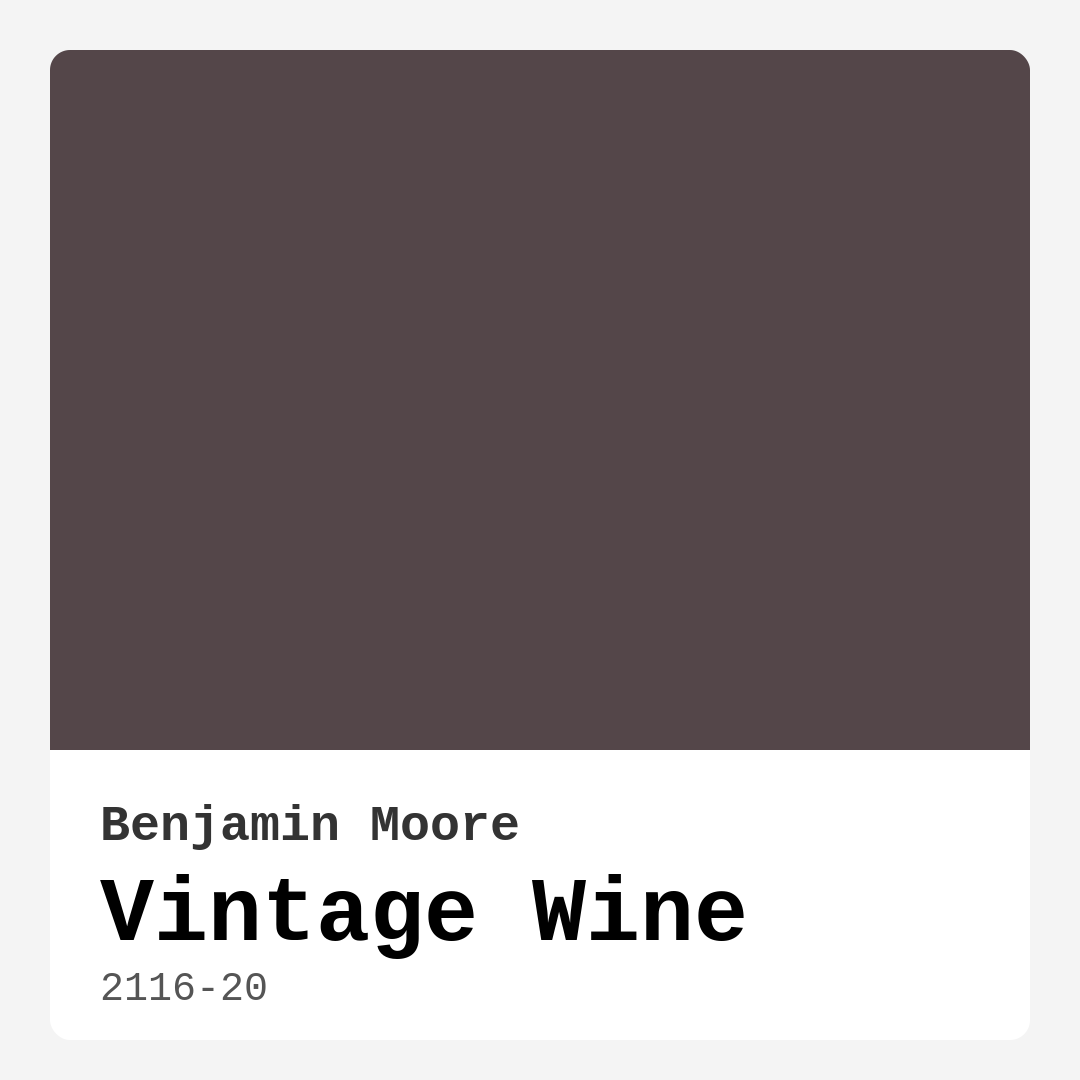
Color Preview & Key Details
| HEX Code | #544649 |
| RGB | 84, 70, 73 |
| LRV | 8.20% |
| Undertone | Red |
| Finish Options | Eggshell, Matte, Satin |
There’s something undeniably captivating about a deep, moody paint color that instantly transforms a room into a warm, inviting sanctuary. Benjamin Moore’s Vintage Wine (2116-20) is one of those shades—a luxurious, dark purple with rich red undertones that evoke the elegance of aged red wine. If you’re considering this color for your home, you’re in for a treat. It’s a hue that brings depth, sophistication, and a touch of drama to any space, making it perfect for creating a cozy, intimate atmosphere. But before you commit, let’s dive into everything you need to know about Vintage Wine, from its undertones to its best applications, so you can decide if it’s the right fit for your project.
First, let’s talk about the color itself. Vintage Wine sits firmly in the dark category with a Light Reflectance Value (LRV) of just 8.20%, meaning it absorbs light rather than reflecting it. This makes it an excellent choice for rooms where you want to create a sense of warmth and intimacy. Its red undertones give it a distinctly warm character, so if you’re looking for a cool, modern vibe, this might not be the one. But if you love the idea of a space that feels rich and enveloping—like a cozy library or a romantic dining room—this color delivers in spades.
One of the standout features of Vintage Wine is its versatility. It works beautifully in traditional settings, where its depth complements classic wood furniture and ornate details, but it also holds its own in contemporary or industrial spaces, especially when paired with sleek metals like brass or matte black. Imagine it on an accent wall in a modern living room, grounding the space and making lighter furnishings pop. Or picture it in a rustic bedroom, where it adds a layer of warmth against natural wood beams and linen textiles. The possibilities are endless, and that’s part of what makes this color so special.
When it comes to application, Vintage Wine is surprisingly beginner-friendly. It offers excellent coverage, often requiring just one or two coats to achieve full opacity, and it’s touch-up friendly, so minor imperfections are easy to fix. The paint is formulated to be low-splatter and roller-ready, which means less mess and frustration during the painting process. Plus, it’s available in matte, satin, and eggshell finishes, giving you flexibility depending on the look and durability you need. If you’re painting a high-traffic area like a dining room or home office, satin or eggshell might be the way to go for added washability.
Speaking of durability, this paint is a winner. It’s scrubbable, stain-resistant, and designed to stand up to everyday wear and tear. That makes it a great option for spaces where life happens—whether that’s a busy entryway, a family living room, or a home office that doubles as a creative studio. You won’t have to worry about scuffs or spills ruining your beautiful walls, which is always a plus.
Now, let’s address the elephant in the room: Vintage Wine’s effect on small spaces. Because it’s such a dark color, it can make a room feel smaller if not balanced properly. If you’re working with a tight space or a room that lacks natural light, you’ll want to be strategic. Consider using it on a single accent wall rather than all four, or pair it with lighter furniture and reflective surfaces like mirrors or metallic accents to keep the room from feeling too closed in. That said, if you’re going for a snug, cocoon-like vibe—say, in a bedroom or a reading nook—embracing the darkness can actually work in your favor.
Lighting is another critical factor. In natural light, Vintage Wine reveals its red undertones, giving it a warm, almost velvety appearance. Under artificial lighting, especially warm-toned bulbs, it deepens further, creating a moody, sophisticated ambiance. If you’re unsure how it will look in your space, grab a sample and test it at different times of day. Paint a small section and observe how it changes with the light—you might be surprised by how dynamic it is.
As for pairings, Vintage Wine plays well with a range of colors. For a classic look, try it with crisp whites like Benjamin Moore’s Simply White on trim and ceilings. The contrast keeps the space feeling fresh and balanced. If you’re feeling bold, pair it with deep greens or muted golds for a regal, autumnal palette. And don’t overlook metallics—brass fixtures, gold frames, or even copper accents can elevate the richness of this color beautifully.
So, is Vintage Wine right for you? If you’re drawn to warm, deep hues and want a color that adds instant sophistication to your home, absolutely. It’s a fantastic choice for living rooms, bedrooms, dining rooms, and even home offices where you want to create a focused, intimate atmosphere. Just be mindful of your space’s size and lighting, and don’t be afraid to experiment with finishes and pairings to make it your own. At the end of the day, paint is one of the most transformative tools in home design, and Vintage Wine is a shade that promises to make a statement. Whether you go all-in or use it sparingly, it’s a color that will leave a lasting impression.
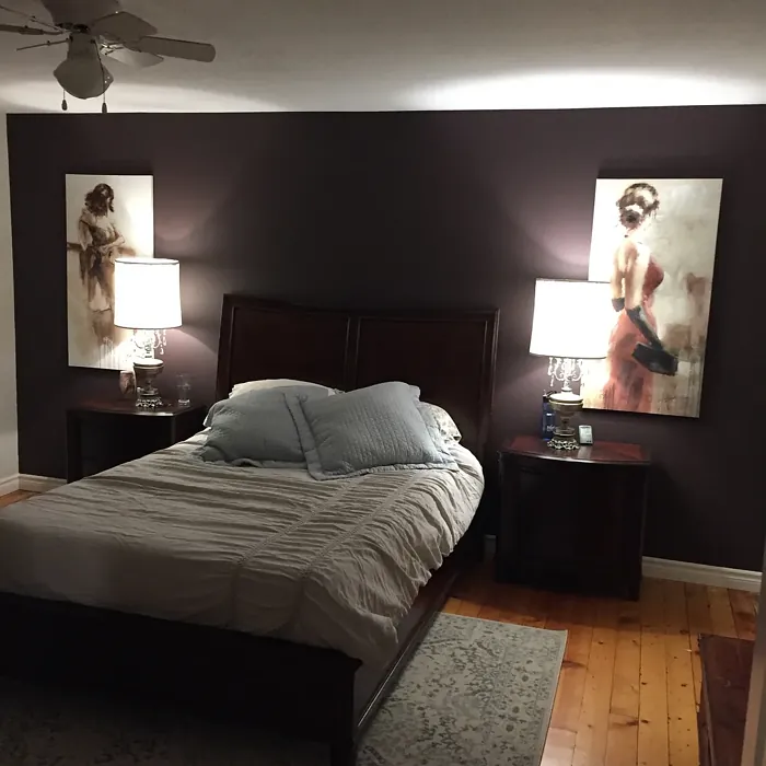
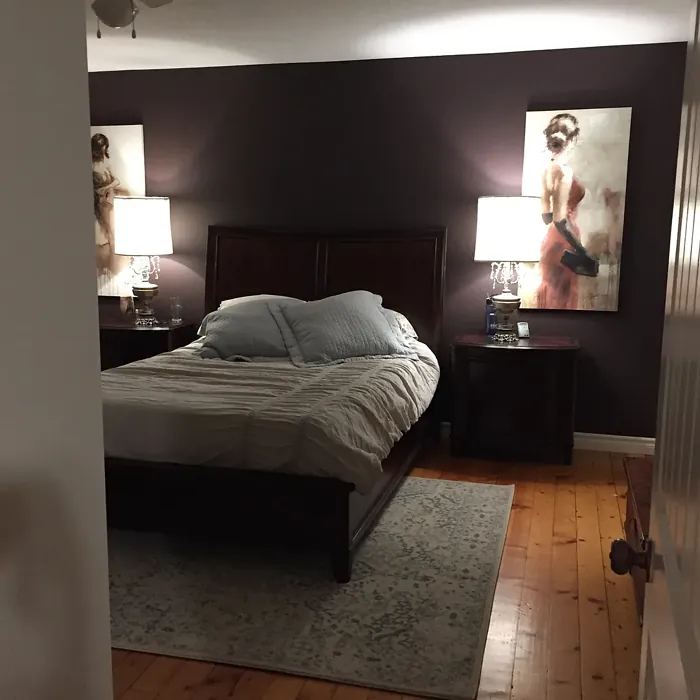
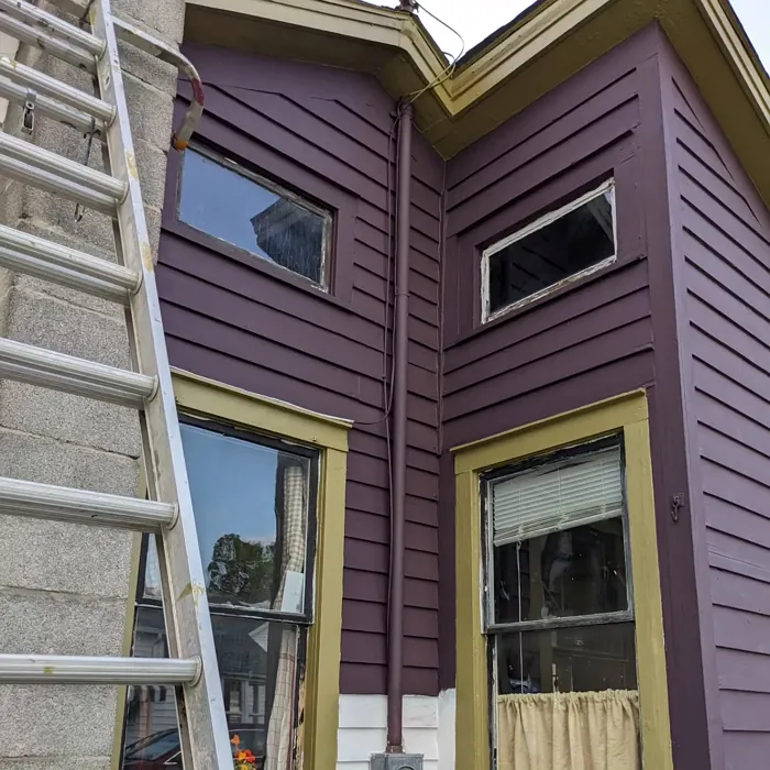
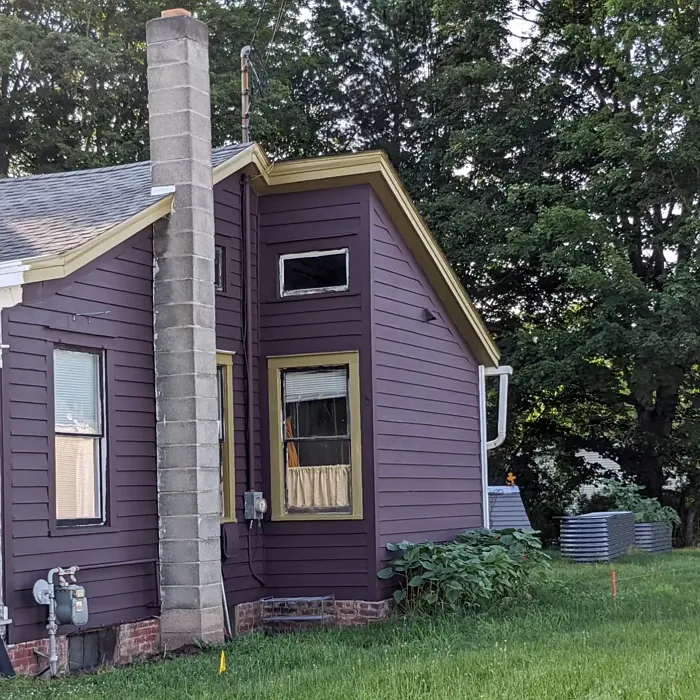
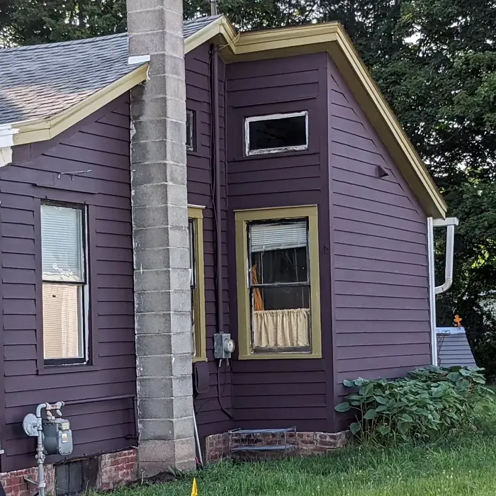
Real Room Photo of Vintage Wine 2116-20
Undertones of Vintage Wine ?
The undertones of Vintage Wine are a key aspect of its character, leaning towards Red. These subtle underlying hues are what give the color its depth and complexity. For example, a gray with a blue undertone will feel cooler and more modern, while one with a brown undertone will feel warmer and more traditional. It’s essential to test this paint in your home and observe it next to your existing furniture, flooring, and decor to see how these undertones interact and reveal themselves throughout the day.
HEX value: #544649
RGB code: 84, 70, 73
Is Vintage Wine Cool or Warm?
This paint is decidedly on the warmer side of the spectrum. Its warmth comes from the deep red and brown base tones, which create a cozy and inviting atmosphere in any room. It’s ideal for spaces where you want to evoke feelings of comfort and warmth.
Understanding Color Properties and Interior Design Tips
Hue refers to a specific position on the color wheel, measured in degrees from 0 to 360. Each degree represents a different pure color:
- 0° represents red
- 120° represents green
- 240° represents blue
Saturation describes the intensity or purity of a color and is expressed as a percentage:
- At 0%, the color appears completely desaturated—essentially a shade of gray
- At 100%, the color is at its most vivid and vibrant
Lightness indicates how light or dark a color is, also expressed as a percentage:
- 0% lightness results in black
- 100% lightness results in white
Using Warm Colors in Interior Design
Warm hues—such as reds, oranges, yellows, warm beiges, and greiges—are excellent choices for creating inviting and energetic spaces. These colors are particularly well-suited for:
- Kitchens, living rooms, and bathrooms, where warmth enhances comfort and sociability
- Large rooms, where warm tones can help reduce the sense of emptiness and make the space feel more intimate
For example:
- Warm beige shades provide a cozy, inviting atmosphere, ideal for living rooms, bedrooms, and hallways.
- Warm greige (a mix of beige and gray) offers the warmth of beige with the modern appeal of gray, making it a versatile backdrop for dining areas, bedrooms, and living spaces.
However, be mindful when using warm light tones in rooms with limited natural light. These shades may appear muted or even take on an unpleasant yellowish tint. To avoid a dull or flat appearance:
- Add depth by incorporating richer tones like deep greens, charcoal, or chocolate brown
- Use textured elements such as curtains, rugs, or cushions to bring dimension to the space
Pro Tip: Achieving Harmony with Warm and Cool Color Balance
To create a well-balanced and visually interesting interior, mix warm and cool tones strategically. This contrast adds depth and harmony to your design.
- If your walls feature warm hues, introduce cool-colored accents such as blue or green furniture, artwork, or accessories to create contrast.
- For a polished look, consider using a complementary color scheme, which pairs colors opposite each other on the color wheel (e.g., red with green, orange with blue).
This thoughtful mix not only enhances visual appeal but also creates a space that feels both dynamic and cohesive.
Light Temperature Affects on Vintage Wine
Natural Light
Natural daylight changes in color temperature as the sun moves across the sky. At sunrise and sunset, the light tends to have a warm, golden tone with a color temperature around 2000 Kelvin (K). As the day progresses and the sun rises higher, the light becomes cooler and more neutral. Around midday, especially when the sky is clear, natural light typically reaches its peak brightness and shifts to a cooler tone, ranging from 5500 to 6500 Kelvin. This midday light is close to what we perceive as pure white or daylight-balanced light.
These shifts in natural light can significantly influence how colors appear in a space, which is why designers often consider both the time of day and the orientation of windows when planning interior color schemes.
Artificial Light
When choosing artificial lighting, pay close attention to the color temperature, measured in Kelvin (K). This determines how warm or cool the light will appear. Lower temperatures, around 2700K, give off a warm, yellow glow often used in living rooms or bedrooms. Higher temperatures, above 5000K, create a cool, bluish light similar to daylight, commonly used in kitchens, offices, or task areas.
Use the slider to see how lighting temperature can affect the appearance of a surface or color throughout a space.


4800K
LRV of Vintage Wine
The Light Reflectance Value (LRV) of Vintage Wine is 8.20%, which places it in the Dark colors category. This means it does not reflect light. Understanding a paint’s LRV is crucial for predicting how it will look in your space. A higher LRV indicates a lighter color that reflects more light, making rooms feel larger and brighter. A lower LRV signifies a darker color that absorbs more light, creating a cozier, more intimate atmosphere. Always consider the natural and artificial lighting in your room when selecting a paint color based on its LRV.
Detailed Review of Vintage Wine
Additional Paint Characteristics
Ideal Rooms
Bedroom, Dining Room, Entryway, Home Office, Living Room
Decor Styles
Contemporary, Industrial, Rustic, Traditional
Coverage
Good (1–2 Coats), High Hide, Touch-Up Friendly
Ease of Application
Beginner Friendly, Brush Smooth, Low Splatter, Roller-Ready
Washability
Scrubbable, Stain Resistant, Washable
VOC Level
Low VOC, Odor-Free
Best Use
Accent Wall, Doors, Furniture, Interior Walls, Trim
Room Suitability
Bedroom, Dining Room, Home Office, Living Room
Tone Tag
Deep, Moody, Sophisticated, Warm
Finish Type
Eggshell, Matte, Satin
Paint Performance
Easy Touch-Up, High Coverage, Low Odor, Stain Resistant
Use Cases
Best for High Traffic Areas, Best for Low Light Rooms, Classic Favorite, Designer Favorite
Mood
Cozy, Inviting, Romantic, Sophisticated, Warm
Trim Pairing
Complements Brass Fixtures, Good with Wood Trim, Pairs with Simply White
Vintage Wine is more than just a color; it’s an experience that transforms any room into a sophisticated and warm haven. Its deep, rich tones make it a perfect choice for spaces where you want to create a moody and inviting atmosphere. This paint offers excellent coverage, usually requiring only one to two coats to achieve its full color depth. It’s versatile enough to pair with various decor styles, from traditional to modern. In terms of application, it’s relatively easy to apply with minimal splatter, making it a favorite for both DIY enthusiasts and professional painters. While it excels in coverage, its dark hue may not be suitable for smaller spaces or those lacking natural light, as it can make them feel even more enclosed. However, in larger spaces or as an accent wall, Vintage Wine truly shines, offering a rich backdrop that enhances furnishings and decor.
Pros & Cons of 2116-20 Vintage Wine
Pros
Cons
Colors that go with Benjamin Moore Vintage Wine
FAQ on 2116-20 Vintage Wine
Is Vintage Wine suitable for small spaces?
Vintage Wine, with its deep and rich tones, can be a bold choice for small spaces. While it creates a cozy and intimate atmosphere, it’s essential to consider the lighting and decor in the room. In areas with limited natural light, this color may make the space feel smaller and more enclosed. However, if you’re aiming for a warm and inviting nook, such as a reading corner or a feature wall, Vintage Wine can be an excellent choice. Pair it with lighter-colored furnishings and reflective surfaces to balance the dark tone and enhance the space’s overall ambiance.
How does Vintage Wine perform in terms of durability?
Vintage Wine stands out for its durability and washability. It’s a scrubbable paint, which means it’s designed to withstand everyday wear and tear. This makes it an ideal choice for high-traffic areas or homes with children and pets. The paint’s surface resists stains and can be easily cleaned without losing its rich color or finish. Additionally, it’s formulated to be stain-resistant, ensuring that any minor spills or marks can be wiped away with ease. This durability extends the life of the paint, maintaining its fresh appearance for years.
Comparisons Vintage Wine with other colors
Vintage Wine 2116-20 vs Exclusive Plum SW 6263
| Attribute | Vintage Wine 2116-20 | Exclusive Plum SW 6263 |
|---|---|---|
| Color Name | Vintage Wine 2116-20 | Exclusive Plum SW 6263 |
| Color | ||
| Hue | Purple | Purple |
| Brightness | Dark | Dark |
| RGB | 84, 70, 73 | 115, 111, 120 |
| LRV | 8.20% | 15% |
| Finish Type | Eggshell, Matte, Satin | Eggshell, Matte, Satin |
| Finish Options | Eggshell, Matte, Satin | Eggshell, Matte, Satin |
| Ideal Rooms | Bedroom, Dining Room, Entryway, Home Office, Living Room | Bedroom, Dining Room, Home Office, Living Room |
| Decor Styles | Contemporary, Industrial, Rustic, Traditional | Contemporary, Eclectic, Modern, Traditional |
| Coverage | Good (1–2 Coats), High Hide, Touch-Up Friendly | Good (1–2 Coats), Touch-Up Friendly |
| Ease of Application | Beginner Friendly, Brush Smooth, Low Splatter, Roller-Ready | Beginner Friendly, Brush Smooth, Fast-Drying, Roller-Ready |
| Washability | Scrubbable, Stain Resistant, Washable | Washable, Wipeable |
| Room Suitability | Bedroom, Dining Room, Home Office, Living Room | Bedroom, Dining Room, Home Office, Living Room |
| Tone | Deep, Moody, Sophisticated, Warm | Deep, Dusty, Warm |
| Paint Performance | Easy Touch-Up, High Coverage, Low Odor, Stain Resistant | Easy Touch-Up, High Coverage, Low Odor |
Vintage Wine 2116-20 vs Blackberry SW 7577
| Attribute | Vintage Wine 2116-20 | Blackberry SW 7577 |
|---|---|---|
| Color Name | Vintage Wine 2116-20 | Blackberry SW 7577 |
| Color | ||
| Hue | Purple | Purple |
| Brightness | Dark | Dark |
| RGB | 84, 70, 73 | 83, 54, 64 |
| LRV | 8.20% | 5% |
| Finish Type | Eggshell, Matte, Satin | Eggshell, Matte |
| Finish Options | Eggshell, Matte, Satin | Eggshell, Matte, Satin |
| Ideal Rooms | Bedroom, Dining Room, Entryway, Home Office, Living Room | Bedroom, Dining Room, Home Office, Living Room |
| Decor Styles | Contemporary, Industrial, Rustic, Traditional | Bohemian, Contemporary, Modern, Rustic |
| Coverage | Good (1–2 Coats), High Hide, Touch-Up Friendly | Good (1–2 Coats), Touch-Up Friendly |
| Ease of Application | Beginner Friendly, Brush Smooth, Low Splatter, Roller-Ready | Beginner Friendly, Brush Smooth, Roller-Ready |
| Washability | Scrubbable, Stain Resistant, Washable | Washable, Wipeable |
| Room Suitability | Bedroom, Dining Room, Home Office, Living Room | Bedroom, Dining Room, Home Office, Living Room |
| Tone | Deep, Moody, Sophisticated, Warm | Deep, Moody, Warm |
| Paint Performance | Easy Touch-Up, High Coverage, Low Odor, Stain Resistant | Easy Touch-Up, High Coverage, Low Odor |
Vintage Wine 2116-20 vs Expressive Plum SW 6271
| Attribute | Vintage Wine 2116-20 | Expressive Plum SW 6271 |
|---|---|---|
| Color Name | Vintage Wine 2116-20 | Expressive Plum SW 6271 |
| Color | ||
| Hue | Purple | Purple |
| Brightness | Dark | Dark |
| RGB | 84, 70, 73 | 105, 92, 98 |
| LRV | 8.20% | 15% |
| Finish Type | Eggshell, Matte, Satin | Eggshell, Matte, Satin |
| Finish Options | Eggshell, Matte, Satin | Eggshell, Matte, Satin |
| Ideal Rooms | Bedroom, Dining Room, Entryway, Home Office, Living Room | Bedroom, Dining Room, Home Office, Living Room |
| Decor Styles | Contemporary, Industrial, Rustic, Traditional | Eclectic, Modern, Traditional, Transitional |
| Coverage | Good (1–2 Coats), High Hide, Touch-Up Friendly | Good (1–2 Coats) |
| Ease of Application | Beginner Friendly, Brush Smooth, Low Splatter, Roller-Ready | Beginner Friendly, Brush Smooth, Roller-Ready |
| Washability | Scrubbable, Stain Resistant, Washable | Washable, Wipeable |
| Room Suitability | Bedroom, Dining Room, Home Office, Living Room | Bedroom, Dining Room, Home Office, Living Room |
| Tone | Deep, Moody, Sophisticated, Warm | Deep, Muted, Warm |
| Paint Performance | Easy Touch-Up, High Coverage, Low Odor, Stain Resistant | Easy Touch-Up, High Coverage, Low Odor |
Vintage Wine 2116-20 vs Plum Brown SW 6272
| Attribute | Vintage Wine 2116-20 | Plum Brown SW 6272 |
|---|---|---|
| Color Name | Vintage Wine 2116-20 | Plum Brown SW 6272 |
| Color | ||
| Hue | Purple | Purple |
| Brightness | Dark | Dark |
| RGB | 84, 70, 73 | 78, 66, 71 |
| LRV | 8.20% | 6% |
| Finish Type | Eggshell, Matte, Satin | Eggshell, Matte, Satin |
| Finish Options | Eggshell, Matte, Satin | Eggshell, Matte, Satin |
| Ideal Rooms | Bedroom, Dining Room, Entryway, Home Office, Living Room | Bedroom, Dining Room, Home Office, Living Room |
| Decor Styles | Contemporary, Industrial, Rustic, Traditional | Eclectic, Modern, Rustic, Traditional |
| Coverage | Good (1–2 Coats), High Hide, Touch-Up Friendly | Good (1–2 Coats), Touch-Up Friendly |
| Ease of Application | Beginner Friendly, Brush Smooth, Low Splatter, Roller-Ready | Beginner Friendly, Brush Smooth, Roller-Ready |
| Washability | Scrubbable, Stain Resistant, Washable | Washable, Wipeable |
| Room Suitability | Bedroom, Dining Room, Home Office, Living Room | Bedroom, Dining Room, Home Office, Living Room |
| Tone | Deep, Moody, Sophisticated, Warm | Deep, Earthy, Warm |
| Paint Performance | Easy Touch-Up, High Coverage, Low Odor, Stain Resistant | Easy Touch-Up, High Coverage, Low Odor |
Vintage Wine 2116-20 vs Soulmate SW 6270
| Attribute | Vintage Wine 2116-20 | Soulmate SW 6270 |
|---|---|---|
| Color Name | Vintage Wine 2116-20 | Soulmate SW 6270 |
| Color | ||
| Hue | Purple | Purple |
| Brightness | Dark | Dark |
| RGB | 84, 70, 73 | 133, 119, 123 |
| LRV | 8.20% | 24% |
| Finish Type | Eggshell, Matte, Satin | Eggshell, Matte, Satin |
| Finish Options | Eggshell, Matte, Satin | Eggshell, Matte, Satin |
| Ideal Rooms | Bedroom, Dining Room, Entryway, Home Office, Living Room | Bedroom, Hallway, Home Office, Living Room |
| Decor Styles | Contemporary, Industrial, Rustic, Traditional | Bohemian, Modern, Rustic, Transitional |
| Coverage | Good (1–2 Coats), High Hide, Touch-Up Friendly | Good (1–2 Coats), Touch-Up Friendly |
| Ease of Application | Beginner Friendly, Brush Smooth, Low Splatter, Roller-Ready | Beginner Friendly, Brush Smooth, Roller-Ready |
| Washability | Scrubbable, Stain Resistant, Washable | Washable, Wipeable |
| Room Suitability | Bedroom, Dining Room, Home Office, Living Room | Bedroom, Hallway, Home Office, Living Room |
| Tone | Deep, Moody, Sophisticated, Warm | Earthy, Muted, Warm |
| Paint Performance | Easy Touch-Up, High Coverage, Low Odor, Stain Resistant | Easy Touch-Up, Low Odor, Quick Drying |
Vintage Wine 2116-20 vs Quixotic Plum SW 6265
| Attribute | Vintage Wine 2116-20 | Quixotic Plum SW 6265 |
|---|---|---|
| Color Name | Vintage Wine 2116-20 | Quixotic Plum SW 6265 |
| Color | ||
| Hue | Purple | Purple |
| Brightness | Dark | Dark |
| RGB | 84, 70, 73 | 74, 70, 83 |
| LRV | 8.20% | 12% |
| Finish Type | Eggshell, Matte, Satin | Eggshell, Matte, Satin |
| Finish Options | Eggshell, Matte, Satin | Eggshell, Matte, Satin |
| Ideal Rooms | Bedroom, Dining Room, Entryway, Home Office, Living Room | Bedroom, Dining Room, Home Office, Living Room |
| Decor Styles | Contemporary, Industrial, Rustic, Traditional | Bohemian, Contemporary, Eclectic, Modern, Traditional |
| Coverage | Good (1–2 Coats), High Hide, Touch-Up Friendly | Good (1–2 Coats), Touch-Up Friendly |
| Ease of Application | Beginner Friendly, Brush Smooth, Low Splatter, Roller-Ready | Brush Smooth, Fast-Drying, Roller-Ready |
| Washability | Scrubbable, Stain Resistant, Washable | Highly Washable, Washable |
| Room Suitability | Bedroom, Dining Room, Home Office, Living Room | Bedroom, Dining Room, Home Office, Living Room |
| Tone | Deep, Moody, Sophisticated, Warm | Deep, Moody, Warm |
| Paint Performance | Easy Touch-Up, High Coverage, Low Odor, Stain Resistant | High Coverage, Low Odor, Scuff Resistant |
Vintage Wine 2116-20 vs Midnight SW 6264
| Attribute | Vintage Wine 2116-20 | Midnight SW 6264 |
|---|---|---|
| Color Name | Vintage Wine 2116-20 | Midnight SW 6264 |
| Color | ||
| Hue | Purple | Purple |
| Brightness | Dark | Dark |
| RGB | 84, 70, 73 | 93, 89, 98 |
| LRV | 8.20% | 6% |
| Finish Type | Eggshell, Matte, Satin | Eggshell, Matte, Satin |
| Finish Options | Eggshell, Matte, Satin | Eggshell, Matte, Satin |
| Ideal Rooms | Bedroom, Dining Room, Entryway, Home Office, Living Room | Bedroom, Dining Room, Hallway, Home Office, Living Room |
| Decor Styles | Contemporary, Industrial, Rustic, Traditional | Bohemian, Contemporary, Industrial, Modern |
| Coverage | Good (1–2 Coats), High Hide, Touch-Up Friendly | Good (1–2 Coats), High Hide, Touch-Up Friendly |
| Ease of Application | Beginner Friendly, Brush Smooth, Low Splatter, Roller-Ready | Beginner Friendly, Brush Smooth, Roller-Ready |
| Washability | Scrubbable, Stain Resistant, Washable | Scrubbable, Stain Resistant, Washable |
| Room Suitability | Bedroom, Dining Room, Home Office, Living Room | Bedroom, Dining Room, Home Office, Living Room |
| Tone | Deep, Moody, Sophisticated, Warm | Balanced, Deep, Moody |
| Paint Performance | Easy Touch-Up, High Coverage, Low Odor, Stain Resistant | Easy Touch-Up, Long Lasting, Low Odor, Scuff Resistant |
Vintage Wine 2116-20 vs Framboise SW 6566
| Attribute | Vintage Wine 2116-20 | Framboise SW 6566 |
|---|---|---|
| Color Name | Vintage Wine 2116-20 | Framboise SW 6566 |
| Color | ||
| Hue | Purple | Purple |
| Brightness | Dark | Dark |
| RGB | 84, 70, 73 | 124, 54, 85 |
| LRV | 8.20% | 6% |
| Finish Type | Eggshell, Matte, Satin | Matte, Satin, Semi-Gloss |
| Finish Options | Eggshell, Matte, Satin | Matte, Satin, Semi-Gloss |
| Ideal Rooms | Bedroom, Dining Room, Entryway, Home Office, Living Room | Bedroom, Dining Room, Home Office, Living Room |
| Decor Styles | Contemporary, Industrial, Rustic, Traditional | Bohemian, Contemporary, Eclectic, Modern |
| Coverage | Good (1–2 Coats), High Hide, Touch-Up Friendly | Good (1–2 Coats), Touch-Up Friendly |
| Ease of Application | Beginner Friendly, Brush Smooth, Low Splatter, Roller-Ready | Beginner Friendly, Brush Smooth, Fast-Drying, Roller-Ready |
| Washability | Scrubbable, Stain Resistant, Washable | Highly Washable, Washable |
| Room Suitability | Bedroom, Dining Room, Home Office, Living Room | Bedroom, Dining Room, Home Office, Living Room |
| Tone | Deep, Moody, Sophisticated, Warm | Bold, Deep, Warm |
| Paint Performance | Easy Touch-Up, High Coverage, Low Odor, Stain Resistant | Easy Touch-Up, High Coverage, Low Odor, Quick Drying |
Vintage Wine 2116-20 vs Poetry Plum SW 6019
| Attribute | Vintage Wine 2116-20 | Poetry Plum SW 6019 |
|---|---|---|
| Color Name | Vintage Wine 2116-20 | Poetry Plum SW 6019 |
| Color | ||
| Hue | Purple | Purple |
| Brightness | Dark | Dark |
| RGB | 84, 70, 73 | 111, 92, 95 |
| LRV | 8.20% | 10% |
| Finish Type | Eggshell, Matte, Satin | Eggshell, Matte, Satin |
| Finish Options | Eggshell, Matte, Satin | Eggshell, Matte, Satin |
| Ideal Rooms | Bedroom, Dining Room, Entryway, Home Office, Living Room | Bedroom, Dining Room, Home Office, Living Room |
| Decor Styles | Contemporary, Industrial, Rustic, Traditional | Bohemian, Modern, Rustic, Transitional |
| Coverage | Good (1–2 Coats), High Hide, Touch-Up Friendly | Good (1–2 Coats), Touch-Up Friendly |
| Ease of Application | Beginner Friendly, Brush Smooth, Low Splatter, Roller-Ready | Beginner Friendly, Brush Smooth, Roller-Ready |
| Washability | Scrubbable, Stain Resistant, Washable | Highly Washable, Washable |
| Room Suitability | Bedroom, Dining Room, Home Office, Living Room | Bedroom, Dining Room, Home Office, Living Room |
| Tone | Deep, Moody, Sophisticated, Warm | Deep, Muted, Warm |
| Paint Performance | Easy Touch-Up, High Coverage, Low Odor, Stain Resistant | Easy Touch-Up, High Coverage, Low Odor |
Vintage Wine 2116-20 vs Mature Grape SW 6286
| Attribute | Vintage Wine 2116-20 | Mature Grape SW 6286 |
|---|---|---|
| Color Name | Vintage Wine 2116-20 | Mature Grape SW 6286 |
| Color | ||
| Hue | Purple | Purple |
| Brightness | Dark | Dark |
| RGB | 84, 70, 73 | 95, 63, 84 |
| LRV | 8.20% | 15% |
| Finish Type | Eggshell, Matte, Satin | Eggshell, Matte, Satin |
| Finish Options | Eggshell, Matte, Satin | Eggshell, Matte, Satin |
| Ideal Rooms | Bedroom, Dining Room, Entryway, Home Office, Living Room | Bedroom, Dining Room, Home Office, Living Room |
| Decor Styles | Contemporary, Industrial, Rustic, Traditional | Art Deco, Bohemian, Modern, Rustic |
| Coverage | Good (1–2 Coats), High Hide, Touch-Up Friendly | Good (1–2 Coats), Touch-Up Friendly |
| Ease of Application | Beginner Friendly, Brush Smooth, Low Splatter, Roller-Ready | Brush Smooth, Fast-Drying, Roller-Ready |
| Washability | Scrubbable, Stain Resistant, Washable | Stain Resistant, Washable, Wipeable |
| Room Suitability | Bedroom, Dining Room, Home Office, Living Room | Bedroom, Dining Room, Home Office, Living Room |
| Tone | Deep, Moody, Sophisticated, Warm | Deep, Earthy, Warm |
| Paint Performance | Easy Touch-Up, High Coverage, Low Odor, Stain Resistant | Easy Touch-Up, Low Odor, Stain Resistant |
Official Page of Benjamin Moore Vintage Wine 2116-20