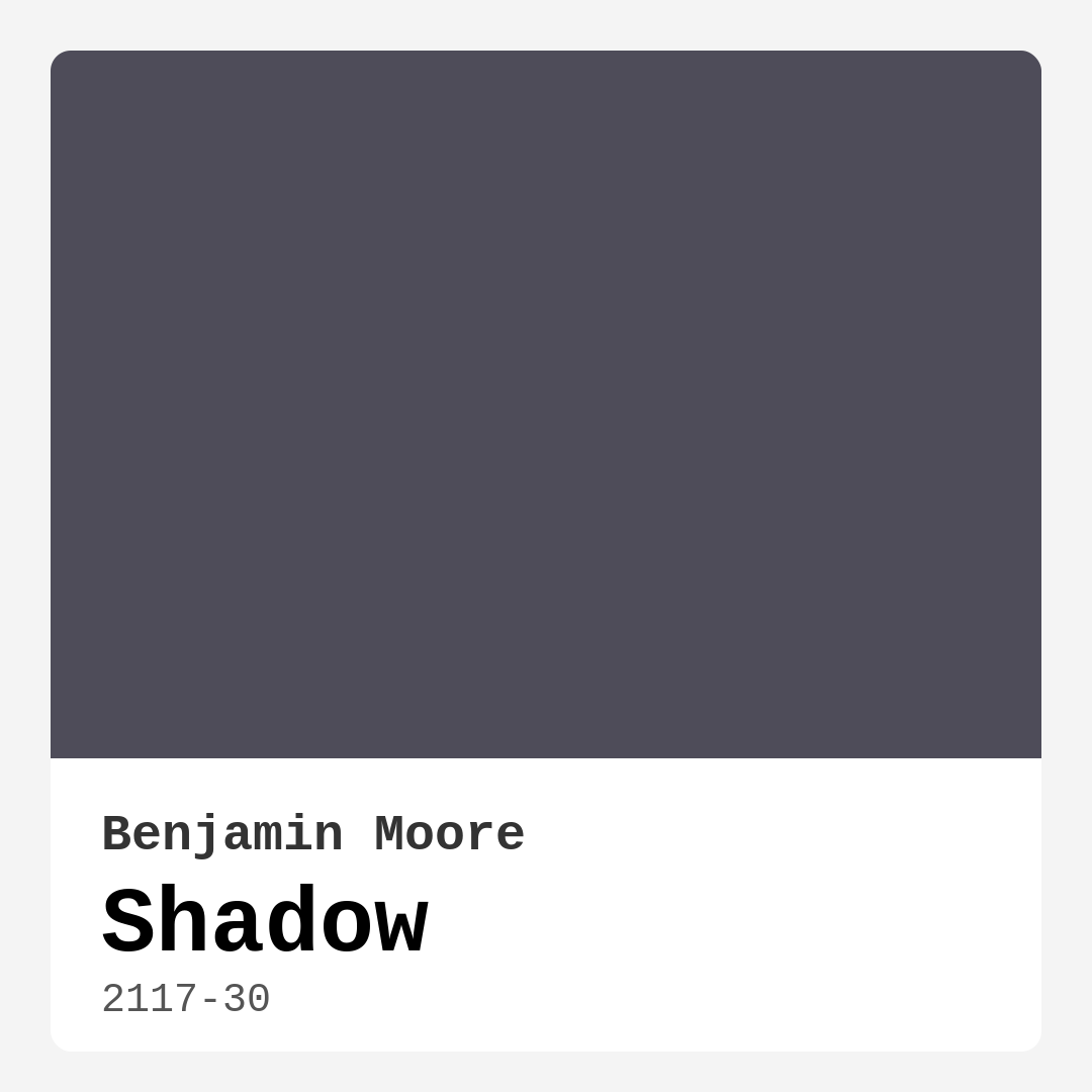
Color Preview & Key Details
| HEX Code | #4E4C59 |
| RGB | 78, 76, 89 |
| LRV | 6.70% |
| Undertone | Blue and Purple |
| Finish Options | Eggshell, Flat, Matte, Satin |
If you’re looking for a paint color that brings depth, sophistication, and a touch of mystery to your home, Benjamin Moore’s Shadow (2117-30) might just be your perfect match. This dark, moody hue is a masterclass in elegance, blending gray with subtle purple and blue undertones to create a shade that’s as versatile as it is striking. Whether you’re aiming for a cozy bedroom retreat, a dramatic living room, or a refined home office, Shadow has the power to transform your space into something truly special.
One of the first things you’ll notice about Shadow is its rich, almost enigmatic presence. With an LRV (Light Reflectance Value) of just 6.70%, this color absorbs light rather than reflecting it, making it ideal for creating intimate, cocoon-like spaces. That said, it’s not a color that will make a room feel cramped if used thoughtfully. Pair it with ample lighting—whether natural or artificial—and you’ll find that it actually enhances the room’s atmosphere, adding warmth and dimension. The purple undertones come alive in daylight, while the cooler gray tones take center stage under artificial light, giving the color a chameleon-like quality that keeps it interesting.
When it comes to application, Shadow is a dream to work with. It’s a high-hide, self-priming paint, which means you’ll likely achieve full coverage in just one or two coats. Whether you’re rolling it on or brushing it smooth, the finish is consistently even, with minimal splatter. It’s available in a range of finishes, from flat to satin, so you can choose the level of sheen that best suits your space. A matte finish will emphasize its depth and sophistication, while an eggshell or satin finish can add a subtle glow, especially in rooms with plenty of light.
So where does Shadow shine brightest? Think living rooms with high ceilings, bedrooms where you want to cultivate a sense of calm, or dining rooms that call for a touch of drama. It’s also a fantastic choice for home offices, where its cool, grounding tones can help foster focus and creativity. If you’re hesitant about committing to an all-over dark color, consider using Shadow as an accent. A single feature wall in this hue can instantly elevate a room, especially when paired with crisp white trim or warm metallic accents like brass or gold.
Decorating with Shadow is where the fun really begins. Its cool undertones make it a natural partner for other cool colors—think deep blues, soft greens, and crisp whites. But don’t shy away from contrast. Because it has a complementary hue of orange, touches of burnt sienna, terracotta, or even blush pink can create a stunning visual balance. For a modern look, pair it with sleek, minimalist furniture and metallic finishes. If your style leans more traditional, rich wood tones and plush textiles will bring out its warmth. And if industrial is more your vibe, Shadow’s moody depth pairs perfectly with exposed brick and blackened steel.
A few practical tips to keep in mind: Shadow’s dark nature means it can make small spaces feel cozier, which can be a pro or a con depending on your goals. If you’re working with a smaller room, balance it out with lighter furnishings and plenty of lighting. Also, always test the color in your space before committing. Paint a large swatch and observe it at different times of day to see how the undertones shift with the light. You might be surprised at how much the color changes from morning to night.
One of the best things about Shadow is its versatility across design styles. It’s equally at home in a contemporary loft as it is in a classic, traditional home. Its timeless appeal means it won’t feel dated in a few years, and its sophisticated vibe can even add value if you’re thinking about selling your home. Dark, moody colors are having a moment, and Shadow is a standout choice for anyone looking to make a bold yet refined statement.
Finally, let’s talk maintenance. Shadow is washable, scrubbable, and stain-resistant, making it a practical choice for high-traffic areas. Its low VOC content means it’s safe to use indoors without worrying about strong odors or harmful fumes. Whether you’re painting a single wall or an entire room, you can trust that this color will hold up beautifully over time.
At the end of the day, Shadow is more than just a paint color—it’s a design tool that can help you create a space that feels intentional, elegant, and uniquely yours. If you’re ready to embrace the drama and sophistication of a deep, moody hue, this might just be the perfect shade for your next project. So grab a sample, test it out, and see how Shadow can transform your home into a haven of style and comfort.
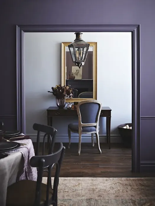
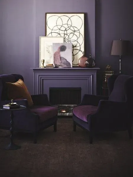
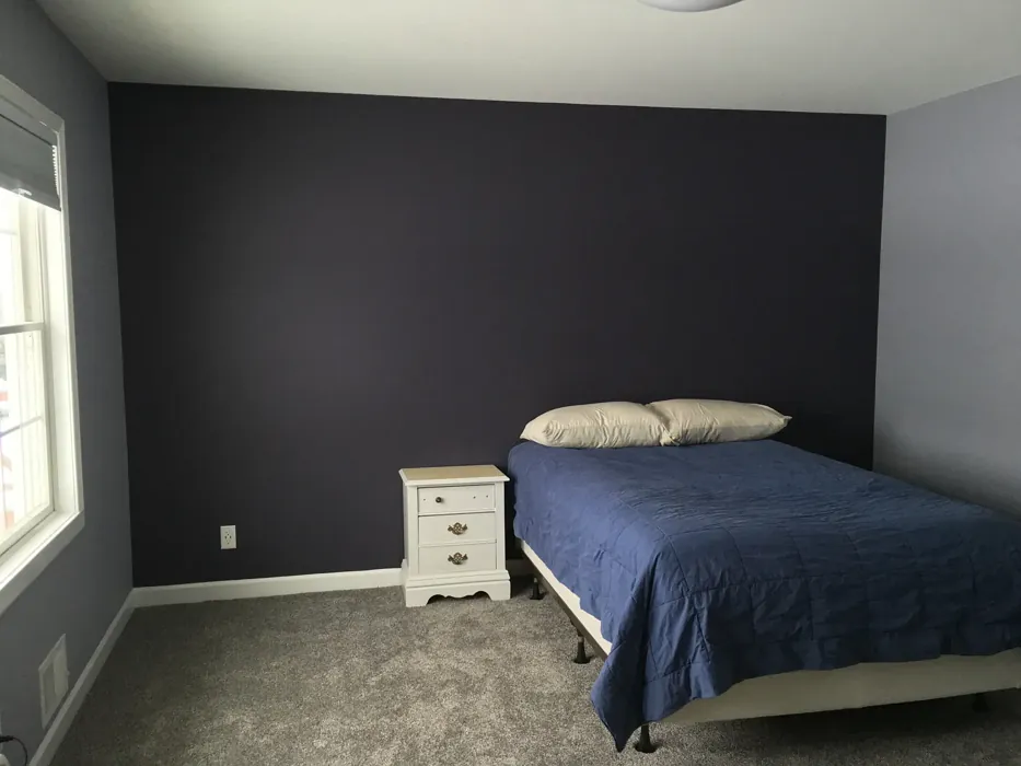
Real Room Photo of Shadow 2117-30
Undertones of Shadow ?
The undertones of Shadow are a key aspect of its character, leaning towards Blue and Purple. These subtle underlying hues are what give the color its depth and complexity. For example, a gray with a blue undertone will feel cooler and more modern, while one with a brown undertone will feel warmer and more traditional. It’s essential to test this paint in your home and observe it next to your existing furniture, flooring, and decor to see how these undertones interact and reveal themselves throughout the day.
HEX value: #4E4C59
RGB code: 78, 76, 89
Is Shadow Cool or Warm?
Shadow is a cool-toned color, thanks to its gray and purple undertones. This coolness gives it a calming and sophisticated vibe, perfect for creating a serene atmosphere in any room. The cool tones also allow it to pair well with other cool colors, such as blues and greens, as well as with crisp whites and metallic accents. Its cool nature can help to visually expand a space, making it a great option for smaller rooms or areas with lower natural light.
Understanding Color Properties and Interior Design Tips
Hue refers to a specific position on the color wheel, measured in degrees from 0 to 360. Each degree represents a different pure color:
- 0° represents red
- 120° represents green
- 240° represents blue
Saturation describes the intensity or purity of a color and is expressed as a percentage:
- At 0%, the color appears completely desaturated—essentially a shade of gray
- At 100%, the color is at its most vivid and vibrant
Lightness indicates how light or dark a color is, also expressed as a percentage:
- 0% lightness results in black
- 100% lightness results in white
Using Warm Colors in Interior Design
Warm hues—such as reds, oranges, yellows, warm beiges, and greiges—are excellent choices for creating inviting and energetic spaces. These colors are particularly well-suited for:
- Kitchens, living rooms, and bathrooms, where warmth enhances comfort and sociability
- Large rooms, where warm tones can help reduce the sense of emptiness and make the space feel more intimate
For example:
- Warm beige shades provide a cozy, inviting atmosphere, ideal for living rooms, bedrooms, and hallways.
- Warm greige (a mix of beige and gray) offers the warmth of beige with the modern appeal of gray, making it a versatile backdrop for dining areas, bedrooms, and living spaces.
However, be mindful when using warm light tones in rooms with limited natural light. These shades may appear muted or even take on an unpleasant yellowish tint. To avoid a dull or flat appearance:
- Add depth by incorporating richer tones like deep greens, charcoal, or chocolate brown
- Use textured elements such as curtains, rugs, or cushions to bring dimension to the space
Pro Tip: Achieving Harmony with Warm and Cool Color Balance
To create a well-balanced and visually interesting interior, mix warm and cool tones strategically. This contrast adds depth and harmony to your design.
- If your walls feature warm hues, introduce cool-colored accents such as blue or green furniture, artwork, or accessories to create contrast.
- For a polished look, consider using a complementary color scheme, which pairs colors opposite each other on the color wheel (e.g., red with green, orange with blue).
This thoughtful mix not only enhances visual appeal but also creates a space that feels both dynamic and cohesive.
Light Temperature Affects on Shadow
Natural Light
Natural daylight changes in color temperature as the sun moves across the sky. At sunrise and sunset, the light tends to have a warm, golden tone with a color temperature around 2000 Kelvin (K). As the day progresses and the sun rises higher, the light becomes cooler and more neutral. Around midday, especially when the sky is clear, natural light typically reaches its peak brightness and shifts to a cooler tone, ranging from 5500 to 6500 Kelvin. This midday light is close to what we perceive as pure white or daylight-balanced light.
These shifts in natural light can significantly influence how colors appear in a space, which is why designers often consider both the time of day and the orientation of windows when planning interior color schemes.
Artificial Light
When choosing artificial lighting, pay close attention to the color temperature, measured in Kelvin (K). This determines how warm or cool the light will appear. Lower temperatures, around 2700K, give off a warm, yellow glow often used in living rooms or bedrooms. Higher temperatures, above 5000K, create a cool, bluish light similar to daylight, commonly used in kitchens, offices, or task areas.
Use the slider to see how lighting temperature can affect the appearance of a surface or color throughout a space.


4800K
LRV of Shadow
The Light Reflectance Value (LRV) of Shadow is 6.70%, which places it in the Dark colors category. This means it does not reflect light. Understanding a paint’s LRV is crucial for predicting how it will look in your space. A higher LRV indicates a lighter color that reflects more light, making rooms feel larger and brighter. A lower LRV signifies a darker color that absorbs more light, creating a cozier, more intimate atmosphere. Always consider the natural and artificial lighting in your room when selecting a paint color based on its LRV.
Detailed Review of Shadow
Additional Paint Characteristics
Ideal Rooms
Bedroom, Dining Room, Entryway, Home Office, Living Room
Decor Styles
Contemporary, Industrial, Modern, Traditional
Coverage
Good (1–2 Coats), High Hide, Self-Priming
Ease of Application
Brush Smooth, Low Splatter, Professional Application Recommended, Roller-Ready
Washability
Scrubbable, Stain Resistant, Washable
VOC Level
Low VOC, Odor-Free
Best Use
Accent Wall, Furniture, Interior Walls, Trim
Room Suitability
Bedroom, Dining Room, Home Office, Living Room
Tone Tag
Cool, Deep, Moody, Sophisticated
Finish Type
Eggshell, Low Sheen, Matte, Satin
Paint Performance
Fade Resistant, High Coverage, Low Odor, Stain Resistant
Use Cases
Best for Low Light Rooms, Best for Selling Your Home, Designer Favorite
Mood
Calm, Cozy, Grounding, Sophisticated
Trim Pairing
Complements Brass Fixtures, Complements Cool Trim, Pairs with Simply White
Shadow is an enigmatic color that brings depth and sophistication to any room. Its dark gray base is subtly infused with purple undertones, making it a versatile choice for both modern and traditional decor styles. This color works beautifully in spaces where you want to create a moody, intimate atmosphere, such as bedrooms or dining rooms. The richness of Shadow makes it a standout choice for accent walls, especially when paired with lighter, contrasting colors. When applying, you’ll find that it offers excellent coverage, often requiring just one to two coats. Its self-priming nature ensures a smooth, even finish, while its high hide quality means that imperfections are easily masked. Overall, Shadow is a timeless hue that can elevate the aesthetic of any home.
Pros & Cons of 2117-30 Shadow
Pros
Cons
Colors that go with Benjamin Moore Shadow
FAQ on 2117-30 Shadow
What are the best rooms to use Shadow in?
Shadow is a versatile color that works well in a variety of spaces. Its deep, rich hue is perfect for creating a cozy and intimate atmosphere, making it an ideal choice for living rooms and bedrooms. The color’s sophistication also lends itself well to dining rooms and home offices, where you might want to cultivate a more formal or elegant feel. Because of its cool undertones, it can help to create a soothing and calming environment, which is particularly beneficial in spaces where relaxation is a priority. However, due to its dark nature, it’s advisable to use it in rooms that receive ample natural light or to balance it with lighter colors and furnishings.
Can Shadow be used as an accent color?
Absolutely! Shadow makes for a stunning accent color. Its rich, deep tone can add a dramatic flair to any room, especially when used on an accent wall. It pairs beautifully with lighter, neutral colors, which can help to highlight its depth and complexity. Consider using Shadow on a feature wall in a living room or dining room to draw the eye and create a focal point. It can also be used to accentuate architectural features such as built-in bookshelves or fireplaces. When used in this way, Shadow provides a sophisticated contrast that elevates the overall aesthetic of your space.
Comparisons Shadow with other colors
Shadow 2117-30 vs Exclusive Plum SW 6263
| Attribute | Shadow 2117-30 | Exclusive Plum SW 6263 |
|---|---|---|
| Color Name | Shadow 2117-30 | Exclusive Plum SW 6263 |
| Color | ||
| Hue | Purple | Purple |
| Brightness | Dark | Dark |
| RGB | 78, 76, 89 | 115, 111, 120 |
| LRV | 6.70% | 15% |
| Finish Type | Eggshell, Low Sheen, Matte, Satin | Eggshell, Matte, Satin |
| Finish Options | Eggshell, Flat, Matte, Satin | Eggshell, Matte, Satin |
| Ideal Rooms | Bedroom, Dining Room, Entryway, Home Office, Living Room | Bedroom, Dining Room, Home Office, Living Room |
| Decor Styles | Contemporary, Industrial, Modern, Traditional | Contemporary, Eclectic, Modern, Traditional |
| Coverage | Good (1–2 Coats), High Hide, Self-Priming | Good (1–2 Coats), Touch-Up Friendly |
| Ease of Application | Brush Smooth, Low Splatter, Professional Application Recommended, Roller-Ready | Beginner Friendly, Brush Smooth, Fast-Drying, Roller-Ready |
| Washability | Scrubbable, Stain Resistant, Washable | Washable, Wipeable |
| Room Suitability | Bedroom, Dining Room, Home Office, Living Room | Bedroom, Dining Room, Home Office, Living Room |
| Tone | Cool, Deep, Moody, Sophisticated | Deep, Dusty, Warm |
| Paint Performance | Fade Resistant, High Coverage, Low Odor, Stain Resistant | Easy Touch-Up, High Coverage, Low Odor |
Shadow 2117-30 vs Blackberry SW 7577
| Attribute | Shadow 2117-30 | Blackberry SW 7577 |
|---|---|---|
| Color Name | Shadow 2117-30 | Blackberry SW 7577 |
| Color | ||
| Hue | Purple | Purple |
| Brightness | Dark | Dark |
| RGB | 78, 76, 89 | 83, 54, 64 |
| LRV | 6.70% | 5% |
| Finish Type | Eggshell, Low Sheen, Matte, Satin | Eggshell, Matte |
| Finish Options | Eggshell, Flat, Matte, Satin | Eggshell, Matte, Satin |
| Ideal Rooms | Bedroom, Dining Room, Entryway, Home Office, Living Room | Bedroom, Dining Room, Home Office, Living Room |
| Decor Styles | Contemporary, Industrial, Modern, Traditional | Bohemian, Contemporary, Modern, Rustic |
| Coverage | Good (1–2 Coats), High Hide, Self-Priming | Good (1–2 Coats), Touch-Up Friendly |
| Ease of Application | Brush Smooth, Low Splatter, Professional Application Recommended, Roller-Ready | Beginner Friendly, Brush Smooth, Roller-Ready |
| Washability | Scrubbable, Stain Resistant, Washable | Washable, Wipeable |
| Room Suitability | Bedroom, Dining Room, Home Office, Living Room | Bedroom, Dining Room, Home Office, Living Room |
| Tone | Cool, Deep, Moody, Sophisticated | Deep, Moody, Warm |
| Paint Performance | Fade Resistant, High Coverage, Low Odor, Stain Resistant | Easy Touch-Up, High Coverage, Low Odor |
Shadow 2117-30 vs Expressive Plum SW 6271
| Attribute | Shadow 2117-30 | Expressive Plum SW 6271 |
|---|---|---|
| Color Name | Shadow 2117-30 | Expressive Plum SW 6271 |
| Color | ||
| Hue | Purple | Purple |
| Brightness | Dark | Dark |
| RGB | 78, 76, 89 | 105, 92, 98 |
| LRV | 6.70% | 15% |
| Finish Type | Eggshell, Low Sheen, Matte, Satin | Eggshell, Matte, Satin |
| Finish Options | Eggshell, Flat, Matte, Satin | Eggshell, Matte, Satin |
| Ideal Rooms | Bedroom, Dining Room, Entryway, Home Office, Living Room | Bedroom, Dining Room, Home Office, Living Room |
| Decor Styles | Contemporary, Industrial, Modern, Traditional | Eclectic, Modern, Traditional, Transitional |
| Coverage | Good (1–2 Coats), High Hide, Self-Priming | Good (1–2 Coats) |
| Ease of Application | Brush Smooth, Low Splatter, Professional Application Recommended, Roller-Ready | Beginner Friendly, Brush Smooth, Roller-Ready |
| Washability | Scrubbable, Stain Resistant, Washable | Washable, Wipeable |
| Room Suitability | Bedroom, Dining Room, Home Office, Living Room | Bedroom, Dining Room, Home Office, Living Room |
| Tone | Cool, Deep, Moody, Sophisticated | Deep, Muted, Warm |
| Paint Performance | Fade Resistant, High Coverage, Low Odor, Stain Resistant | Easy Touch-Up, High Coverage, Low Odor |
Shadow 2117-30 vs Plum Brown SW 6272
| Attribute | Shadow 2117-30 | Plum Brown SW 6272 |
|---|---|---|
| Color Name | Shadow 2117-30 | Plum Brown SW 6272 |
| Color | ||
| Hue | Purple | Purple |
| Brightness | Dark | Dark |
| RGB | 78, 76, 89 | 78, 66, 71 |
| LRV | 6.70% | 6% |
| Finish Type | Eggshell, Low Sheen, Matte, Satin | Eggshell, Matte, Satin |
| Finish Options | Eggshell, Flat, Matte, Satin | Eggshell, Matte, Satin |
| Ideal Rooms | Bedroom, Dining Room, Entryway, Home Office, Living Room | Bedroom, Dining Room, Home Office, Living Room |
| Decor Styles | Contemporary, Industrial, Modern, Traditional | Eclectic, Modern, Rustic, Traditional |
| Coverage | Good (1–2 Coats), High Hide, Self-Priming | Good (1–2 Coats), Touch-Up Friendly |
| Ease of Application | Brush Smooth, Low Splatter, Professional Application Recommended, Roller-Ready | Beginner Friendly, Brush Smooth, Roller-Ready |
| Washability | Scrubbable, Stain Resistant, Washable | Washable, Wipeable |
| Room Suitability | Bedroom, Dining Room, Home Office, Living Room | Bedroom, Dining Room, Home Office, Living Room |
| Tone | Cool, Deep, Moody, Sophisticated | Deep, Earthy, Warm |
| Paint Performance | Fade Resistant, High Coverage, Low Odor, Stain Resistant | Easy Touch-Up, High Coverage, Low Odor |
Shadow 2117-30 vs Soulmate SW 6270
| Attribute | Shadow 2117-30 | Soulmate SW 6270 |
|---|---|---|
| Color Name | Shadow 2117-30 | Soulmate SW 6270 |
| Color | ||
| Hue | Purple | Purple |
| Brightness | Dark | Dark |
| RGB | 78, 76, 89 | 133, 119, 123 |
| LRV | 6.70% | 24% |
| Finish Type | Eggshell, Low Sheen, Matte, Satin | Eggshell, Matte, Satin |
| Finish Options | Eggshell, Flat, Matte, Satin | Eggshell, Matte, Satin |
| Ideal Rooms | Bedroom, Dining Room, Entryway, Home Office, Living Room | Bedroom, Hallway, Home Office, Living Room |
| Decor Styles | Contemporary, Industrial, Modern, Traditional | Bohemian, Modern, Rustic, Transitional |
| Coverage | Good (1–2 Coats), High Hide, Self-Priming | Good (1–2 Coats), Touch-Up Friendly |
| Ease of Application | Brush Smooth, Low Splatter, Professional Application Recommended, Roller-Ready | Beginner Friendly, Brush Smooth, Roller-Ready |
| Washability | Scrubbable, Stain Resistant, Washable | Washable, Wipeable |
| Room Suitability | Bedroom, Dining Room, Home Office, Living Room | Bedroom, Hallway, Home Office, Living Room |
| Tone | Cool, Deep, Moody, Sophisticated | Earthy, Muted, Warm |
| Paint Performance | Fade Resistant, High Coverage, Low Odor, Stain Resistant | Easy Touch-Up, Low Odor, Quick Drying |
Shadow 2117-30 vs Quixotic Plum SW 6265
| Attribute | Shadow 2117-30 | Quixotic Plum SW 6265 |
|---|---|---|
| Color Name | Shadow 2117-30 | Quixotic Plum SW 6265 |
| Color | ||
| Hue | Purple | Purple |
| Brightness | Dark | Dark |
| RGB | 78, 76, 89 | 74, 70, 83 |
| LRV | 6.70% | 12% |
| Finish Type | Eggshell, Low Sheen, Matte, Satin | Eggshell, Matte, Satin |
| Finish Options | Eggshell, Flat, Matte, Satin | Eggshell, Matte, Satin |
| Ideal Rooms | Bedroom, Dining Room, Entryway, Home Office, Living Room | Bedroom, Dining Room, Home Office, Living Room |
| Decor Styles | Contemporary, Industrial, Modern, Traditional | Bohemian, Contemporary, Eclectic, Modern, Traditional |
| Coverage | Good (1–2 Coats), High Hide, Self-Priming | Good (1–2 Coats), Touch-Up Friendly |
| Ease of Application | Brush Smooth, Low Splatter, Professional Application Recommended, Roller-Ready | Brush Smooth, Fast-Drying, Roller-Ready |
| Washability | Scrubbable, Stain Resistant, Washable | Highly Washable, Washable |
| Room Suitability | Bedroom, Dining Room, Home Office, Living Room | Bedroom, Dining Room, Home Office, Living Room |
| Tone | Cool, Deep, Moody, Sophisticated | Deep, Moody, Warm |
| Paint Performance | Fade Resistant, High Coverage, Low Odor, Stain Resistant | High Coverage, Low Odor, Scuff Resistant |
Shadow 2117-30 vs Midnight SW 6264
| Attribute | Shadow 2117-30 | Midnight SW 6264 |
|---|---|---|
| Color Name | Shadow 2117-30 | Midnight SW 6264 |
| Color | ||
| Hue | Purple | Purple |
| Brightness | Dark | Dark |
| RGB | 78, 76, 89 | 93, 89, 98 |
| LRV | 6.70% | 6% |
| Finish Type | Eggshell, Low Sheen, Matte, Satin | Eggshell, Matte, Satin |
| Finish Options | Eggshell, Flat, Matte, Satin | Eggshell, Matte, Satin |
| Ideal Rooms | Bedroom, Dining Room, Entryway, Home Office, Living Room | Bedroom, Dining Room, Hallway, Home Office, Living Room |
| Decor Styles | Contemporary, Industrial, Modern, Traditional | Bohemian, Contemporary, Industrial, Modern |
| Coverage | Good (1–2 Coats), High Hide, Self-Priming | Good (1–2 Coats), High Hide, Touch-Up Friendly |
| Ease of Application | Brush Smooth, Low Splatter, Professional Application Recommended, Roller-Ready | Beginner Friendly, Brush Smooth, Roller-Ready |
| Washability | Scrubbable, Stain Resistant, Washable | Scrubbable, Stain Resistant, Washable |
| Room Suitability | Bedroom, Dining Room, Home Office, Living Room | Bedroom, Dining Room, Home Office, Living Room |
| Tone | Cool, Deep, Moody, Sophisticated | Balanced, Deep, Moody |
| Paint Performance | Fade Resistant, High Coverage, Low Odor, Stain Resistant | Easy Touch-Up, Long Lasting, Low Odor, Scuff Resistant |
Shadow 2117-30 vs Framboise SW 6566
| Attribute | Shadow 2117-30 | Framboise SW 6566 |
|---|---|---|
| Color Name | Shadow 2117-30 | Framboise SW 6566 |
| Color | ||
| Hue | Purple | Purple |
| Brightness | Dark | Dark |
| RGB | 78, 76, 89 | 124, 54, 85 |
| LRV | 6.70% | 6% |
| Finish Type | Eggshell, Low Sheen, Matte, Satin | Matte, Satin, Semi-Gloss |
| Finish Options | Eggshell, Flat, Matte, Satin | Matte, Satin, Semi-Gloss |
| Ideal Rooms | Bedroom, Dining Room, Entryway, Home Office, Living Room | Bedroom, Dining Room, Home Office, Living Room |
| Decor Styles | Contemporary, Industrial, Modern, Traditional | Bohemian, Contemporary, Eclectic, Modern |
| Coverage | Good (1–2 Coats), High Hide, Self-Priming | Good (1–2 Coats), Touch-Up Friendly |
| Ease of Application | Brush Smooth, Low Splatter, Professional Application Recommended, Roller-Ready | Beginner Friendly, Brush Smooth, Fast-Drying, Roller-Ready |
| Washability | Scrubbable, Stain Resistant, Washable | Highly Washable, Washable |
| Room Suitability | Bedroom, Dining Room, Home Office, Living Room | Bedroom, Dining Room, Home Office, Living Room |
| Tone | Cool, Deep, Moody, Sophisticated | Bold, Deep, Warm |
| Paint Performance | Fade Resistant, High Coverage, Low Odor, Stain Resistant | Easy Touch-Up, High Coverage, Low Odor, Quick Drying |
Shadow 2117-30 vs Poetry Plum SW 6019
| Attribute | Shadow 2117-30 | Poetry Plum SW 6019 |
|---|---|---|
| Color Name | Shadow 2117-30 | Poetry Plum SW 6019 |
| Color | ||
| Hue | Purple | Purple |
| Brightness | Dark | Dark |
| RGB | 78, 76, 89 | 111, 92, 95 |
| LRV | 6.70% | 10% |
| Finish Type | Eggshell, Low Sheen, Matte, Satin | Eggshell, Matte, Satin |
| Finish Options | Eggshell, Flat, Matte, Satin | Eggshell, Matte, Satin |
| Ideal Rooms | Bedroom, Dining Room, Entryway, Home Office, Living Room | Bedroom, Dining Room, Home Office, Living Room |
| Decor Styles | Contemporary, Industrial, Modern, Traditional | Bohemian, Modern, Rustic, Transitional |
| Coverage | Good (1–2 Coats), High Hide, Self-Priming | Good (1–2 Coats), Touch-Up Friendly |
| Ease of Application | Brush Smooth, Low Splatter, Professional Application Recommended, Roller-Ready | Beginner Friendly, Brush Smooth, Roller-Ready |
| Washability | Scrubbable, Stain Resistant, Washable | Highly Washable, Washable |
| Room Suitability | Bedroom, Dining Room, Home Office, Living Room | Bedroom, Dining Room, Home Office, Living Room |
| Tone | Cool, Deep, Moody, Sophisticated | Deep, Muted, Warm |
| Paint Performance | Fade Resistant, High Coverage, Low Odor, Stain Resistant | Easy Touch-Up, High Coverage, Low Odor |
Shadow 2117-30 vs Mature Grape SW 6286
| Attribute | Shadow 2117-30 | Mature Grape SW 6286 |
|---|---|---|
| Color Name | Shadow 2117-30 | Mature Grape SW 6286 |
| Color | ||
| Hue | Purple | Purple |
| Brightness | Dark | Dark |
| RGB | 78, 76, 89 | 95, 63, 84 |
| LRV | 6.70% | 15% |
| Finish Type | Eggshell, Low Sheen, Matte, Satin | Eggshell, Matte, Satin |
| Finish Options | Eggshell, Flat, Matte, Satin | Eggshell, Matte, Satin |
| Ideal Rooms | Bedroom, Dining Room, Entryway, Home Office, Living Room | Bedroom, Dining Room, Home Office, Living Room |
| Decor Styles | Contemporary, Industrial, Modern, Traditional | Art Deco, Bohemian, Modern, Rustic |
| Coverage | Good (1–2 Coats), High Hide, Self-Priming | Good (1–2 Coats), Touch-Up Friendly |
| Ease of Application | Brush Smooth, Low Splatter, Professional Application Recommended, Roller-Ready | Brush Smooth, Fast-Drying, Roller-Ready |
| Washability | Scrubbable, Stain Resistant, Washable | Stain Resistant, Washable, Wipeable |
| Room Suitability | Bedroom, Dining Room, Home Office, Living Room | Bedroom, Dining Room, Home Office, Living Room |
| Tone | Cool, Deep, Moody, Sophisticated | Deep, Earthy, Warm |
| Paint Performance | Fade Resistant, High Coverage, Low Odor, Stain Resistant | Easy Touch-Up, Low Odor, Stain Resistant |
Official Page of Benjamin Moore Shadow 2117-30