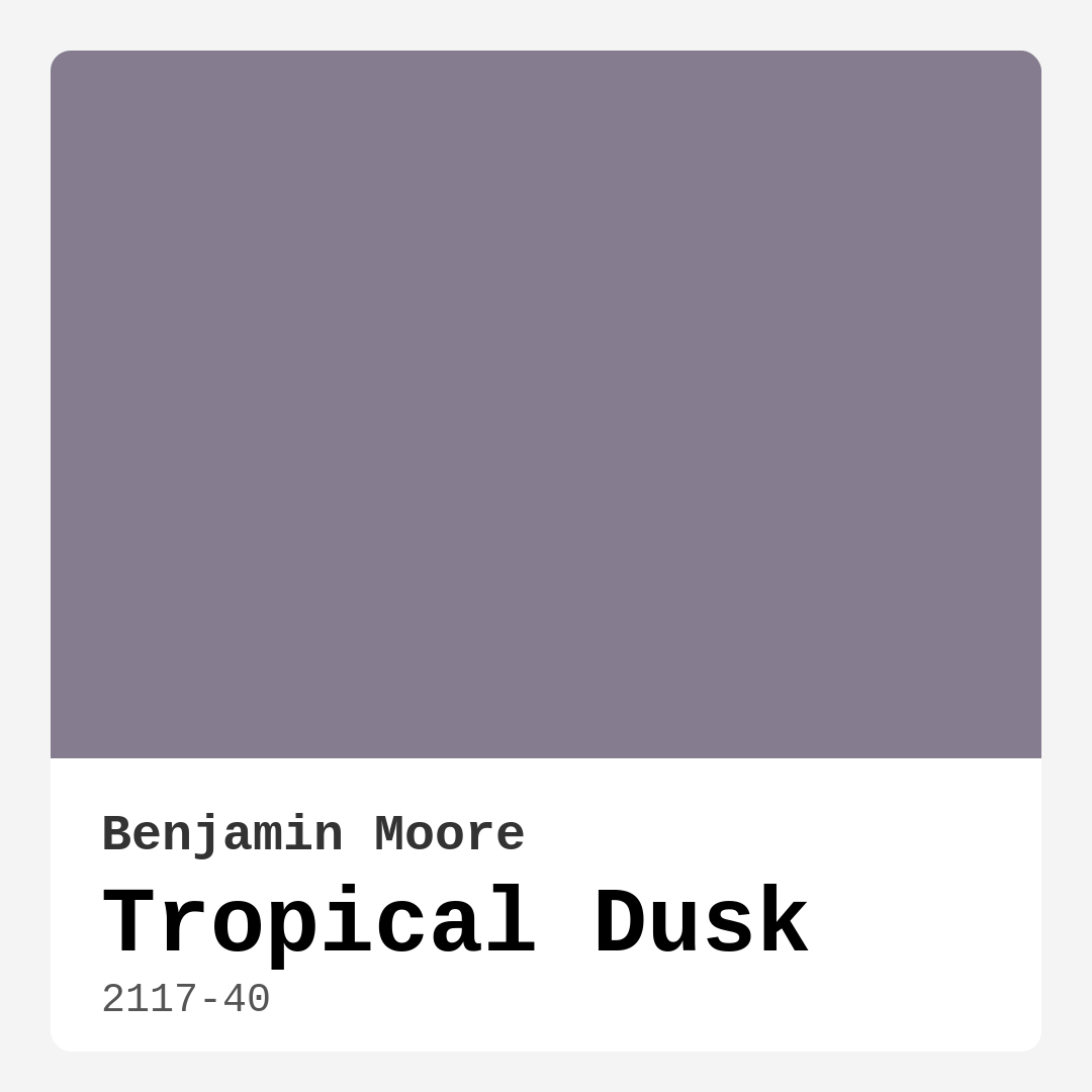
Color Preview & Key Details
| HEX Code | #857D8F |
| RGB | 133, 125, 143 |
| LRV | 23.32% |
| Undertone | Purple |
| Finish Options | Eggshell, Matte, Satin |
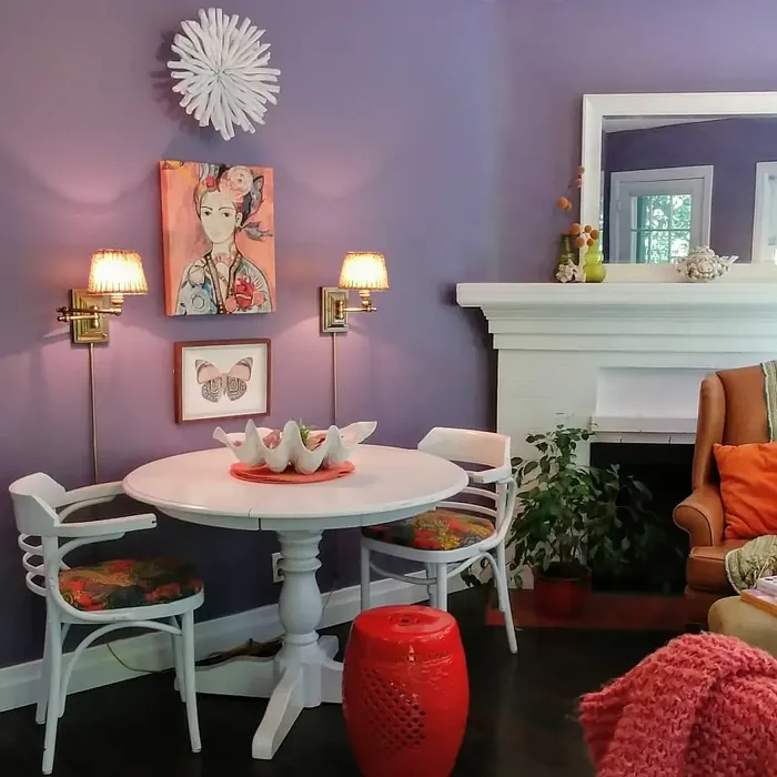
If you’re searching for a paint color that effortlessly blends sophistication with tranquility, Benjamin Moore’s Tropical Dusk (2117-40) might just be your perfect match. This stunning shade sits at the intersection of gray and lavender, offering a muted yet dynamic hue that brings a sense of calm and elegance to any space. Whether you’re refreshing a bedroom, living room, or home office, Tropical Dusk has the versatility to adapt to your vision while creating a cohesive, polished look.
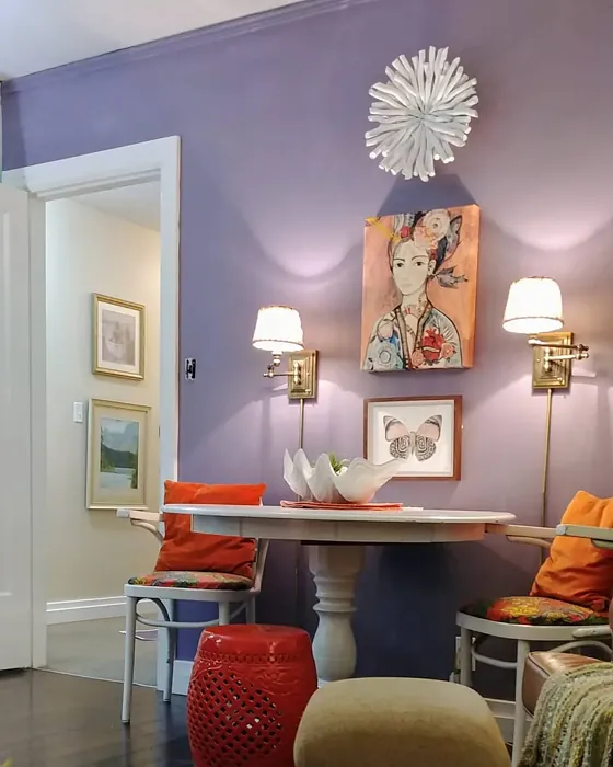
One of the standout qualities of Tropical Dusk is its ability to shift subtly depending on the light. In natural daylight, the lavender undertones peek through, adding a soft warmth to the cool gray base. As the light dims, the color deepens, emphasizing its moodier, more introspective side. This chameleon-like quality makes it ideal for rooms that experience varying light throughout the day, ensuring your space always feels balanced and intentional. With a Light Reflectance Value (LRV) of 23.32%, it reflects a good amount of light—enough to keep a room from feeling too dark but still rich enough to create a cozy, enveloping atmosphere.
When it comes to application, Tropical Dusk is a dream to work with. It offers excellent coverage, often needing just one or two coats, and its self-priming formula cuts down on prep time. Whether you’re a DIY beginner or a seasoned painter, you’ll appreciate how smoothly it rolls on with minimal splatter. Plus, it’s touch-up friendly, so any accidental scuffs or marks can be easily blended without leaving obvious patches. The low VOC and odor-free formula make it a great choice for those who want a fresh, healthy home environment without the harsh chemical smell.
Now, let’s talk about where this color shines. Tropical Dusk is a natural fit for bedrooms, where its calming presence encourages relaxation. Pair it with crisp white trim—like Benjamin Moore’s White Dove—for a clean, modern contrast. In a living room, it sets a sophisticated backdrop for both neutral and bold furnishings. Try combining it with muted blues or deep greens for a serene, nature-inspired palette, or introduce metallic accents in silver or brushed nickel to elevate the elegance. For a home office, it strikes the right balance between focus and creativity, making it easier to stay productive without feeling sterile.
Small rooms can absolutely handle Tropical Dusk, especially if you’re aiming for a cozy, intimate vibe. To prevent the space from feeling too dark, balance it with lighter furniture, mirrors, and plenty of layered lighting. The cool undertones help keep the room feeling airy, while the depth of the color adds character. If you’re hesitant, test a swatch on your wall and observe how it changes throughout the day—you might be surprised at how adaptable it is.
As for complementary colors, Tropical Dusk plays well with a wide range of shades. Soft whites and light grays enhance its serenity, while deeper purples or navy blues create a dramatic contrast. If you’re feeling adventurous, a touch of warm orange—its complementary hue—can add a striking pop without overwhelming the space. The key is to let Tropical Dusk anchor the room while experimenting with accents that highlight its unique personality.
There are a few things to keep in mind before committing. In low-light spaces, it can appear darker than expected, so if your room lacks natural light, consider supplementing with ample artificial lighting. The cool undertones might not suit every space, especially if your decor leans heavily toward warm woods or earthy tones. And while it’s a fantastic interior choice, it’s not the best pick for exterior use—stick to indoor applications where its subtle beauty can truly shine.
If you love Tropical Dusk but want something slightly lighter or darker, Benjamin Moore offers a range of similar shades. For a softer take, try CC-38 or AF-590. If you’re craving more depth, explore darker options like 1569 or 1408. And if you’re considering equivalents from other brands, Sherwin-Williams’ Exclusive Plum or Behr’s Evening Hush are close matches worth swatching.
At its core, Tropical Dusk is more than just a paint color—it’s a mood. It evokes the quiet magic of twilight, wrapping your space in a sense of calm sophistication. Whether you’re going for modern minimalism, transitional elegance, or contemporary flair, this shade adapts seamlessly. So if you’re ready to transform your home with a color that’s as versatile as it is beautiful, Tropical Dusk might just be the perfect place to start. Grab a sample, test it in your space, and see how it brings your vision to life.
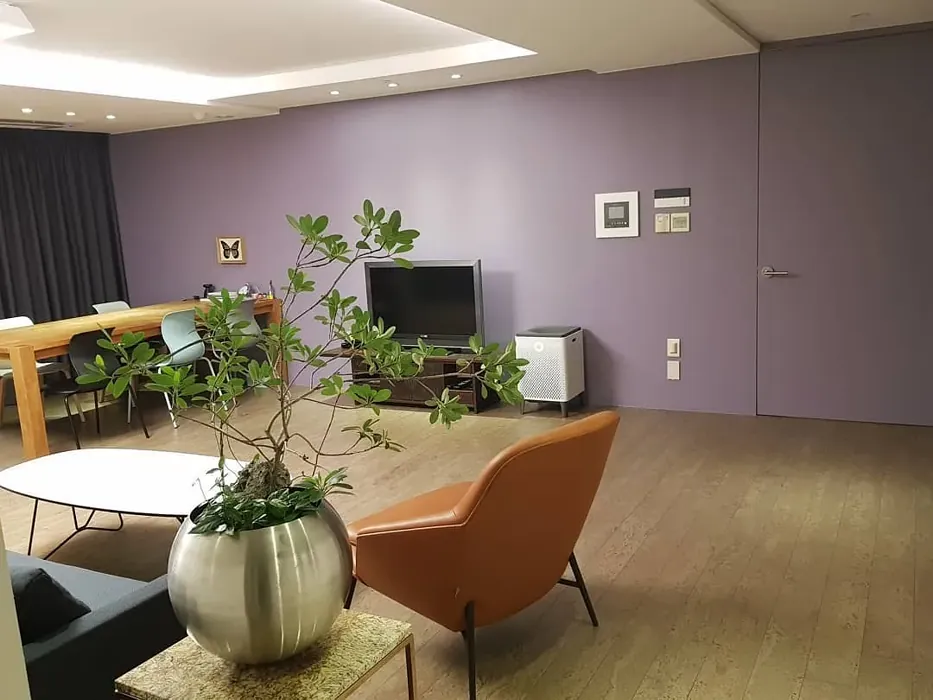
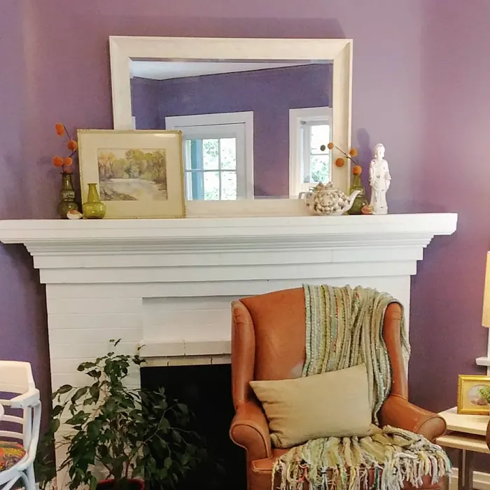
Real Room Photo of Tropical Dusk 2117-40

Undertones of Tropical Dusk ?
The undertones of Tropical Dusk are a key aspect of its character, leaning towards Purple. These subtle underlying hues are what give the color its depth and complexity. For example, a gray with a blue undertone will feel cooler and more modern, while one with a brown undertone will feel warmer and more traditional. It’s essential to test this paint in your home and observe it next to your existing furniture, flooring, and decor to see how these undertones interact and reveal themselves throughout the day.
HEX value: #857D8F
RGB code: 133, 125, 143
Is Tropical Dusk Cool or Warm?
Tropical Dusk leans towards the cool end of the spectrum due to its underlying lavender tones. This coolness brings a refreshing and calm vibe to spaces, making it ideal for creating tranquil environments. Despite its cool nature, the shade remains welcoming and balanced, avoiding the starkness that some cool colors can have. It pairs well with other cool colors like blues and greens, as well as warmer tones for contrast, providing flexibility in design choices.
Understanding Color Properties and Interior Design Tips
Hue refers to a specific position on the color wheel, measured in degrees from 0 to 360. Each degree represents a different pure color:
- 0° represents red
- 120° represents green
- 240° represents blue
Saturation describes the intensity or purity of a color and is expressed as a percentage:
- At 0%, the color appears completely desaturated—essentially a shade of gray
- At 100%, the color is at its most vivid and vibrant
Lightness indicates how light or dark a color is, also expressed as a percentage:
- 0% lightness results in black
- 100% lightness results in white
Using Warm Colors in Interior Design
Warm hues—such as reds, oranges, yellows, warm beiges, and greiges—are excellent choices for creating inviting and energetic spaces. These colors are particularly well-suited for:
- Kitchens, living rooms, and bathrooms, where warmth enhances comfort and sociability
- Large rooms, where warm tones can help reduce the sense of emptiness and make the space feel more intimate
For example:
- Warm beige shades provide a cozy, inviting atmosphere, ideal for living rooms, bedrooms, and hallways.
- Warm greige (a mix of beige and gray) offers the warmth of beige with the modern appeal of gray, making it a versatile backdrop for dining areas, bedrooms, and living spaces.
However, be mindful when using warm light tones in rooms with limited natural light. These shades may appear muted or even take on an unpleasant yellowish tint. To avoid a dull or flat appearance:
- Add depth by incorporating richer tones like deep greens, charcoal, or chocolate brown
- Use textured elements such as curtains, rugs, or cushions to bring dimension to the space
Pro Tip: Achieving Harmony with Warm and Cool Color Balance
To create a well-balanced and visually interesting interior, mix warm and cool tones strategically. This contrast adds depth and harmony to your design.
- If your walls feature warm hues, introduce cool-colored accents such as blue or green furniture, artwork, or accessories to create contrast.
- For a polished look, consider using a complementary color scheme, which pairs colors opposite each other on the color wheel (e.g., red with green, orange with blue).
This thoughtful mix not only enhances visual appeal but also creates a space that feels both dynamic and cohesive.
Light Temperature Affects on Tropical Dusk
Natural Light
Natural daylight changes in color temperature as the sun moves across the sky. At sunrise and sunset, the light tends to have a warm, golden tone with a color temperature around 2000 Kelvin (K). As the day progresses and the sun rises higher, the light becomes cooler and more neutral. Around midday, especially when the sky is clear, natural light typically reaches its peak brightness and shifts to a cooler tone, ranging from 5500 to 6500 Kelvin. This midday light is close to what we perceive as pure white or daylight-balanced light.
These shifts in natural light can significantly influence how colors appear in a space, which is why designers often consider both the time of day and the orientation of windows when planning interior color schemes.
Artificial Light
When choosing artificial lighting, pay close attention to the color temperature, measured in Kelvin (K). This determines how warm or cool the light will appear. Lower temperatures, around 2700K, give off a warm, yellow glow often used in living rooms or bedrooms. Higher temperatures, above 5000K, create a cool, bluish light similar to daylight, commonly used in kitchens, offices, or task areas.
Use the slider to see how lighting temperature can affect the appearance of a surface or color throughout a space.


4800K
LRV of Tropical Dusk
The Light Reflectance Value (LRV) of Tropical Dusk is 23.32%, which places it in the Medium colors category. This means it reflect a lot of light. Understanding a paint’s LRV is crucial for predicting how it will look in your space. A higher LRV indicates a lighter color that reflects more light, making rooms feel larger and brighter. A lower LRV signifies a darker color that absorbs more light, creating a cozier, more intimate atmosphere. Always consider the natural and artificial lighting in your room when selecting a paint color based on its LRV.
Detailed Review of Tropical Dusk
Additional Paint Characteristics
Ideal Rooms
Bedroom, Hallway, Home Office, Living Room
Decor Styles
Contemporary, Minimalist, Modern, Transitional
Coverage
Good (1–2 Coats), Self-Priming, Touch-Up Friendly
Ease of Application
Beginner Friendly, Brush Smooth, Low Splatter, Roller-Ready
Washability
Stain Resistant, Washable, Wipeable
VOC Level
Low VOC, Odor-Free
Best Use
Accent Wall, Bedroom, Home Office, Interior Walls, Living Room
Room Suitability
Bedroom, Home Office, Living Room
Tone Tag
Cool, Dusty, Muted, Sophisticated
Finish Type
Eggshell, Matte, Satin
Paint Performance
Easy Touch-Up, Fade Resistant, Low Odor, Stain Resistant
Use Cases
Best for Low Light Rooms, Best for Small Spaces, Classic Favorite, Designer Favorite
Mood
Calm, Grounding, Restful, Sophisticated
Trim Pairing
Complements Cool Trim, Pairs with White Dove, Works with Warm Trim
Tropical Dusk is a unique and versatile shade that straddles the line between gray and purple, offering a subtle complexity that can transform a room. Its muted tone makes it perfect for creating a calming environment, ideal for bedrooms or living spaces where relaxation is key. The color’s adaptability across different lighting conditions ensures it remains consistent, providing a reliable backdrop for various design elements. With a good coverage that often requires only 1–2 coats, Tropical Dusk is a practical choice for both novice and experienced painters. The paint’s self-priming nature reduces prep time, while its ability to handle touch-ups with ease ensures long-term satisfaction. Whether paired with light or dark accents, Tropical Dusk complements a wide range of decor styles, making it a timeless addition to any home.
Pros & Cons of 2117-40 Tropical Dusk
Pros
Cons
Colors that go with Benjamin Moore Tropical Dusk
FAQ on 2117-40 Tropical Dusk
Can Tropical Dusk be used in a small room?
Absolutely! Tropical Dusk can be a great choice for small rooms, especially when you want to create a cozy and intimate atmosphere. Its cool undertones can make a small space feel more open and airy without overwhelming the room. Pairing it with lighter trims and decor can help prevent the space from feeling too dark. Additionally, using mirrors or reflective surfaces can enhance the light in the room, allowing Tropical Dusk to shine beautifully. It’s a versatile color that can adapt to various room sizes when styled appropriately.
What colors pair well with Tropical Dusk?
Tropical Dusk pairs beautifully with a range of colors. For a serene and cohesive look, consider pairing it with soft whites or light grays. If you’re looking to add a pop of color, muted blues or greens can complement its cool undertones. For a more dramatic effect, deep purples or navy blues can create a striking contrast. You can also incorporate metallic accents, like silver or brushed nickel, to enhance its sophistication. Overall, Tropical Dusk is versatile enough to work with both neutral and bold colors, offering endless styling possibilities.
Comparisons Tropical Dusk with other colors
Tropical Dusk 2117-40 vs Exclusive Plum SW 6263
| Attribute | Tropical Dusk 2117-40 | Exclusive Plum SW 6263 |
|---|---|---|
| Color Name | Tropical Dusk 2117-40 | Exclusive Plum SW 6263 |
| Color | ||
| Hue | Purple | Purple |
| Brightness | Dark | Dark |
| RGB | 133, 125, 143 | 115, 111, 120 |
| LRV | 23.32% | 15% |
| Finish Type | Eggshell, Matte, Satin | Eggshell, Matte, Satin |
| Finish Options | Eggshell, Matte, Satin | Eggshell, Matte, Satin |
| Ideal Rooms | Bedroom, Hallway, Home Office, Living Room | Bedroom, Dining Room, Home Office, Living Room |
| Decor Styles | Contemporary, Minimalist, Modern, Transitional | Contemporary, Eclectic, Modern, Traditional |
| Coverage | Good (1–2 Coats), Self-Priming, Touch-Up Friendly | Good (1–2 Coats), Touch-Up Friendly |
| Ease of Application | Beginner Friendly, Brush Smooth, Low Splatter, Roller-Ready | Beginner Friendly, Brush Smooth, Fast-Drying, Roller-Ready |
| Washability | Stain Resistant, Washable, Wipeable | Washable, Wipeable |
| Room Suitability | Bedroom, Home Office, Living Room | Bedroom, Dining Room, Home Office, Living Room |
| Tone | Cool, Dusty, Muted, Sophisticated | Deep, Dusty, Warm |
| Paint Performance | Easy Touch-Up, Fade Resistant, Low Odor, Stain Resistant | Easy Touch-Up, High Coverage, Low Odor |
Tropical Dusk 2117-40 vs Blackberry SW 7577
| Attribute | Tropical Dusk 2117-40 | Blackberry SW 7577 |
|---|---|---|
| Color Name | Tropical Dusk 2117-40 | Blackberry SW 7577 |
| Color | ||
| Hue | Purple | Purple |
| Brightness | Dark | Dark |
| RGB | 133, 125, 143 | 83, 54, 64 |
| LRV | 23.32% | 5% |
| Finish Type | Eggshell, Matte, Satin | Eggshell, Matte |
| Finish Options | Eggshell, Matte, Satin | Eggshell, Matte, Satin |
| Ideal Rooms | Bedroom, Hallway, Home Office, Living Room | Bedroom, Dining Room, Home Office, Living Room |
| Decor Styles | Contemporary, Minimalist, Modern, Transitional | Bohemian, Contemporary, Modern, Rustic |
| Coverage | Good (1–2 Coats), Self-Priming, Touch-Up Friendly | Good (1–2 Coats), Touch-Up Friendly |
| Ease of Application | Beginner Friendly, Brush Smooth, Low Splatter, Roller-Ready | Beginner Friendly, Brush Smooth, Roller-Ready |
| Washability | Stain Resistant, Washable, Wipeable | Washable, Wipeable |
| Room Suitability | Bedroom, Home Office, Living Room | Bedroom, Dining Room, Home Office, Living Room |
| Tone | Cool, Dusty, Muted, Sophisticated | Deep, Moody, Warm |
| Paint Performance | Easy Touch-Up, Fade Resistant, Low Odor, Stain Resistant | Easy Touch-Up, High Coverage, Low Odor |
Tropical Dusk 2117-40 vs Expressive Plum SW 6271
| Attribute | Tropical Dusk 2117-40 | Expressive Plum SW 6271 |
|---|---|---|
| Color Name | Tropical Dusk 2117-40 | Expressive Plum SW 6271 |
| Color | ||
| Hue | Purple | Purple |
| Brightness | Dark | Dark |
| RGB | 133, 125, 143 | 105, 92, 98 |
| LRV | 23.32% | 15% |
| Finish Type | Eggshell, Matte, Satin | Eggshell, Matte, Satin |
| Finish Options | Eggshell, Matte, Satin | Eggshell, Matte, Satin |
| Ideal Rooms | Bedroom, Hallway, Home Office, Living Room | Bedroom, Dining Room, Home Office, Living Room |
| Decor Styles | Contemporary, Minimalist, Modern, Transitional | Eclectic, Modern, Traditional, Transitional |
| Coverage | Good (1–2 Coats), Self-Priming, Touch-Up Friendly | Good (1–2 Coats) |
| Ease of Application | Beginner Friendly, Brush Smooth, Low Splatter, Roller-Ready | Beginner Friendly, Brush Smooth, Roller-Ready |
| Washability | Stain Resistant, Washable, Wipeable | Washable, Wipeable |
| Room Suitability | Bedroom, Home Office, Living Room | Bedroom, Dining Room, Home Office, Living Room |
| Tone | Cool, Dusty, Muted, Sophisticated | Deep, Muted, Warm |
| Paint Performance | Easy Touch-Up, Fade Resistant, Low Odor, Stain Resistant | Easy Touch-Up, High Coverage, Low Odor |
Tropical Dusk 2117-40 vs Plum Brown SW 6272
| Attribute | Tropical Dusk 2117-40 | Plum Brown SW 6272 |
|---|---|---|
| Color Name | Tropical Dusk 2117-40 | Plum Brown SW 6272 |
| Color | ||
| Hue | Purple | Purple |
| Brightness | Dark | Dark |
| RGB | 133, 125, 143 | 78, 66, 71 |
| LRV | 23.32% | 6% |
| Finish Type | Eggshell, Matte, Satin | Eggshell, Matte, Satin |
| Finish Options | Eggshell, Matte, Satin | Eggshell, Matte, Satin |
| Ideal Rooms | Bedroom, Hallway, Home Office, Living Room | Bedroom, Dining Room, Home Office, Living Room |
| Decor Styles | Contemporary, Minimalist, Modern, Transitional | Eclectic, Modern, Rustic, Traditional |
| Coverage | Good (1–2 Coats), Self-Priming, Touch-Up Friendly | Good (1–2 Coats), Touch-Up Friendly |
| Ease of Application | Beginner Friendly, Brush Smooth, Low Splatter, Roller-Ready | Beginner Friendly, Brush Smooth, Roller-Ready |
| Washability | Stain Resistant, Washable, Wipeable | Washable, Wipeable |
| Room Suitability | Bedroom, Home Office, Living Room | Bedroom, Dining Room, Home Office, Living Room |
| Tone | Cool, Dusty, Muted, Sophisticated | Deep, Earthy, Warm |
| Paint Performance | Easy Touch-Up, Fade Resistant, Low Odor, Stain Resistant | Easy Touch-Up, High Coverage, Low Odor |
Tropical Dusk 2117-40 vs Soulmate SW 6270
| Attribute | Tropical Dusk 2117-40 | Soulmate SW 6270 |
|---|---|---|
| Color Name | Tropical Dusk 2117-40 | Soulmate SW 6270 |
| Color | ||
| Hue | Purple | Purple |
| Brightness | Dark | Dark |
| RGB | 133, 125, 143 | 133, 119, 123 |
| LRV | 23.32% | 24% |
| Finish Type | Eggshell, Matte, Satin | Eggshell, Matte, Satin |
| Finish Options | Eggshell, Matte, Satin | Eggshell, Matte, Satin |
| Ideal Rooms | Bedroom, Hallway, Home Office, Living Room | Bedroom, Hallway, Home Office, Living Room |
| Decor Styles | Contemporary, Minimalist, Modern, Transitional | Bohemian, Modern, Rustic, Transitional |
| Coverage | Good (1–2 Coats), Self-Priming, Touch-Up Friendly | Good (1–2 Coats), Touch-Up Friendly |
| Ease of Application | Beginner Friendly, Brush Smooth, Low Splatter, Roller-Ready | Beginner Friendly, Brush Smooth, Roller-Ready |
| Washability | Stain Resistant, Washable, Wipeable | Washable, Wipeable |
| Room Suitability | Bedroom, Home Office, Living Room | Bedroom, Hallway, Home Office, Living Room |
| Tone | Cool, Dusty, Muted, Sophisticated | Earthy, Muted, Warm |
| Paint Performance | Easy Touch-Up, Fade Resistant, Low Odor, Stain Resistant | Easy Touch-Up, Low Odor, Quick Drying |
Tropical Dusk 2117-40 vs Quixotic Plum SW 6265
| Attribute | Tropical Dusk 2117-40 | Quixotic Plum SW 6265 |
|---|---|---|
| Color Name | Tropical Dusk 2117-40 | Quixotic Plum SW 6265 |
| Color | ||
| Hue | Purple | Purple |
| Brightness | Dark | Dark |
| RGB | 133, 125, 143 | 74, 70, 83 |
| LRV | 23.32% | 12% |
| Finish Type | Eggshell, Matte, Satin | Eggshell, Matte, Satin |
| Finish Options | Eggshell, Matte, Satin | Eggshell, Matte, Satin |
| Ideal Rooms | Bedroom, Hallway, Home Office, Living Room | Bedroom, Dining Room, Home Office, Living Room |
| Decor Styles | Contemporary, Minimalist, Modern, Transitional | Bohemian, Contemporary, Eclectic, Modern, Traditional |
| Coverage | Good (1–2 Coats), Self-Priming, Touch-Up Friendly | Good (1–2 Coats), Touch-Up Friendly |
| Ease of Application | Beginner Friendly, Brush Smooth, Low Splatter, Roller-Ready | Brush Smooth, Fast-Drying, Roller-Ready |
| Washability | Stain Resistant, Washable, Wipeable | Highly Washable, Washable |
| Room Suitability | Bedroom, Home Office, Living Room | Bedroom, Dining Room, Home Office, Living Room |
| Tone | Cool, Dusty, Muted, Sophisticated | Deep, Moody, Warm |
| Paint Performance | Easy Touch-Up, Fade Resistant, Low Odor, Stain Resistant | High Coverage, Low Odor, Scuff Resistant |
Tropical Dusk 2117-40 vs Midnight SW 6264
| Attribute | Tropical Dusk 2117-40 | Midnight SW 6264 |
|---|---|---|
| Color Name | Tropical Dusk 2117-40 | Midnight SW 6264 |
| Color | ||
| Hue | Purple | Purple |
| Brightness | Dark | Dark |
| RGB | 133, 125, 143 | 93, 89, 98 |
| LRV | 23.32% | 6% |
| Finish Type | Eggshell, Matte, Satin | Eggshell, Matte, Satin |
| Finish Options | Eggshell, Matte, Satin | Eggshell, Matte, Satin |
| Ideal Rooms | Bedroom, Hallway, Home Office, Living Room | Bedroom, Dining Room, Hallway, Home Office, Living Room |
| Decor Styles | Contemporary, Minimalist, Modern, Transitional | Bohemian, Contemporary, Industrial, Modern |
| Coverage | Good (1–2 Coats), Self-Priming, Touch-Up Friendly | Good (1–2 Coats), High Hide, Touch-Up Friendly |
| Ease of Application | Beginner Friendly, Brush Smooth, Low Splatter, Roller-Ready | Beginner Friendly, Brush Smooth, Roller-Ready |
| Washability | Stain Resistant, Washable, Wipeable | Scrubbable, Stain Resistant, Washable |
| Room Suitability | Bedroom, Home Office, Living Room | Bedroom, Dining Room, Home Office, Living Room |
| Tone | Cool, Dusty, Muted, Sophisticated | Balanced, Deep, Moody |
| Paint Performance | Easy Touch-Up, Fade Resistant, Low Odor, Stain Resistant | Easy Touch-Up, Long Lasting, Low Odor, Scuff Resistant |
Tropical Dusk 2117-40 vs Framboise SW 6566
| Attribute | Tropical Dusk 2117-40 | Framboise SW 6566 |
|---|---|---|
| Color Name | Tropical Dusk 2117-40 | Framboise SW 6566 |
| Color | ||
| Hue | Purple | Purple |
| Brightness | Dark | Dark |
| RGB | 133, 125, 143 | 124, 54, 85 |
| LRV | 23.32% | 6% |
| Finish Type | Eggshell, Matte, Satin | Matte, Satin, Semi-Gloss |
| Finish Options | Eggshell, Matte, Satin | Matte, Satin, Semi-Gloss |
| Ideal Rooms | Bedroom, Hallway, Home Office, Living Room | Bedroom, Dining Room, Home Office, Living Room |
| Decor Styles | Contemporary, Minimalist, Modern, Transitional | Bohemian, Contemporary, Eclectic, Modern |
| Coverage | Good (1–2 Coats), Self-Priming, Touch-Up Friendly | Good (1–2 Coats), Touch-Up Friendly |
| Ease of Application | Beginner Friendly, Brush Smooth, Low Splatter, Roller-Ready | Beginner Friendly, Brush Smooth, Fast-Drying, Roller-Ready |
| Washability | Stain Resistant, Washable, Wipeable | Highly Washable, Washable |
| Room Suitability | Bedroom, Home Office, Living Room | Bedroom, Dining Room, Home Office, Living Room |
| Tone | Cool, Dusty, Muted, Sophisticated | Bold, Deep, Warm |
| Paint Performance | Easy Touch-Up, Fade Resistant, Low Odor, Stain Resistant | Easy Touch-Up, High Coverage, Low Odor, Quick Drying |
Tropical Dusk 2117-40 vs Poetry Plum SW 6019
| Attribute | Tropical Dusk 2117-40 | Poetry Plum SW 6019 |
|---|---|---|
| Color Name | Tropical Dusk 2117-40 | Poetry Plum SW 6019 |
| Color | ||
| Hue | Purple | Purple |
| Brightness | Dark | Dark |
| RGB | 133, 125, 143 | 111, 92, 95 |
| LRV | 23.32% | 10% |
| Finish Type | Eggshell, Matte, Satin | Eggshell, Matte, Satin |
| Finish Options | Eggshell, Matte, Satin | Eggshell, Matte, Satin |
| Ideal Rooms | Bedroom, Hallway, Home Office, Living Room | Bedroom, Dining Room, Home Office, Living Room |
| Decor Styles | Contemporary, Minimalist, Modern, Transitional | Bohemian, Modern, Rustic, Transitional |
| Coverage | Good (1–2 Coats), Self-Priming, Touch-Up Friendly | Good (1–2 Coats), Touch-Up Friendly |
| Ease of Application | Beginner Friendly, Brush Smooth, Low Splatter, Roller-Ready | Beginner Friendly, Brush Smooth, Roller-Ready |
| Washability | Stain Resistant, Washable, Wipeable | Highly Washable, Washable |
| Room Suitability | Bedroom, Home Office, Living Room | Bedroom, Dining Room, Home Office, Living Room |
| Tone | Cool, Dusty, Muted, Sophisticated | Deep, Muted, Warm |
| Paint Performance | Easy Touch-Up, Fade Resistant, Low Odor, Stain Resistant | Easy Touch-Up, High Coverage, Low Odor |
Tropical Dusk 2117-40 vs Mature Grape SW 6286
| Attribute | Tropical Dusk 2117-40 | Mature Grape SW 6286 |
|---|---|---|
| Color Name | Tropical Dusk 2117-40 | Mature Grape SW 6286 |
| Color | ||
| Hue | Purple | Purple |
| Brightness | Dark | Dark |
| RGB | 133, 125, 143 | 95, 63, 84 |
| LRV | 23.32% | 15% |
| Finish Type | Eggshell, Matte, Satin | Eggshell, Matte, Satin |
| Finish Options | Eggshell, Matte, Satin | Eggshell, Matte, Satin |
| Ideal Rooms | Bedroom, Hallway, Home Office, Living Room | Bedroom, Dining Room, Home Office, Living Room |
| Decor Styles | Contemporary, Minimalist, Modern, Transitional | Art Deco, Bohemian, Modern, Rustic |
| Coverage | Good (1–2 Coats), Self-Priming, Touch-Up Friendly | Good (1–2 Coats), Touch-Up Friendly |
| Ease of Application | Beginner Friendly, Brush Smooth, Low Splatter, Roller-Ready | Brush Smooth, Fast-Drying, Roller-Ready |
| Washability | Stain Resistant, Washable, Wipeable | Stain Resistant, Washable, Wipeable |
| Room Suitability | Bedroom, Home Office, Living Room | Bedroom, Dining Room, Home Office, Living Room |
| Tone | Cool, Dusty, Muted, Sophisticated | Deep, Earthy, Warm |
| Paint Performance | Easy Touch-Up, Fade Resistant, Low Odor, Stain Resistant | Easy Touch-Up, Low Odor, Stain Resistant |
Official Page of Benjamin Moore Tropical Dusk 2117-40