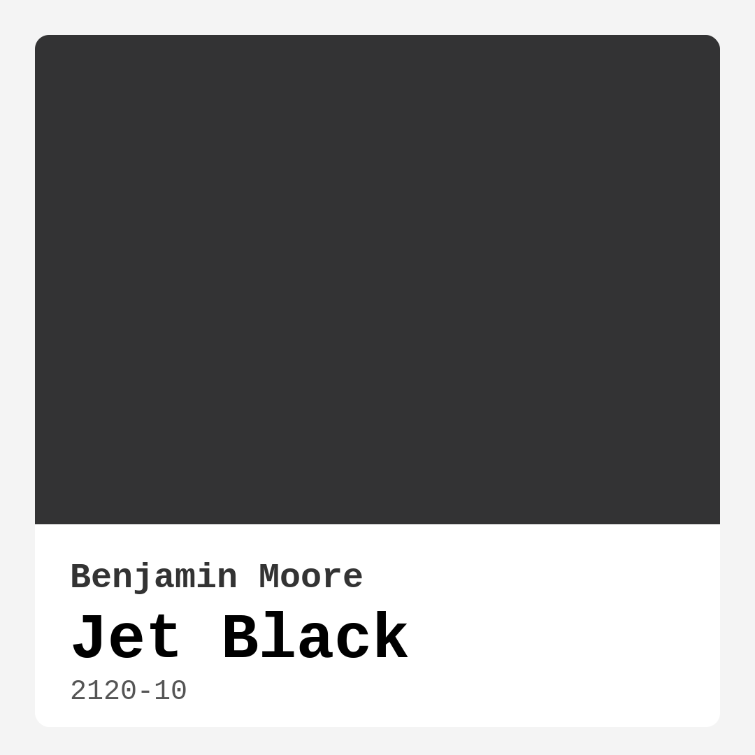
Color Preview & Key Details
| HEX Code | #333334 |
| RGB | 51, 51, 52 |
| LRV | 4.71% |
| Undertone | Blue and Purple |
| Finish Options | Matte, Satin, Semi-Gloss |
If you’re looking for a paint color that oozes sophistication and makes a bold statement, Benjamin Moore’s Jet Black (2120-10) might just be your perfect match. This isn’t your average black—it’s a deep, rich hue with subtle blue and purple undertones that give it a unique depth and complexity. Whether you’re aiming for a modern, industrial, or classic look, Jet Black has the versatility to elevate any space. But before you grab a brush, let’s dive into everything you need to know to decide if this is the right color for your home.
First, let’s talk about the undertones. Jet Black leans cool, thanks to those hints of blue and purple, but don’t let that fool you into thinking it won’t work in a warm setting. It actually plays beautifully with warm wood tones, brass fixtures, and even vibrant accent colors. The key is balance. Pair it with creamy whites like Benjamin Moore’s White Dove for trim, or let it anchor a room with lighter furniture and textiles to keep things from feeling too heavy. The undertones also mean this black won’t read flat—it has a dynamic quality that shifts slightly depending on the light, giving your space a layered, designer feel.
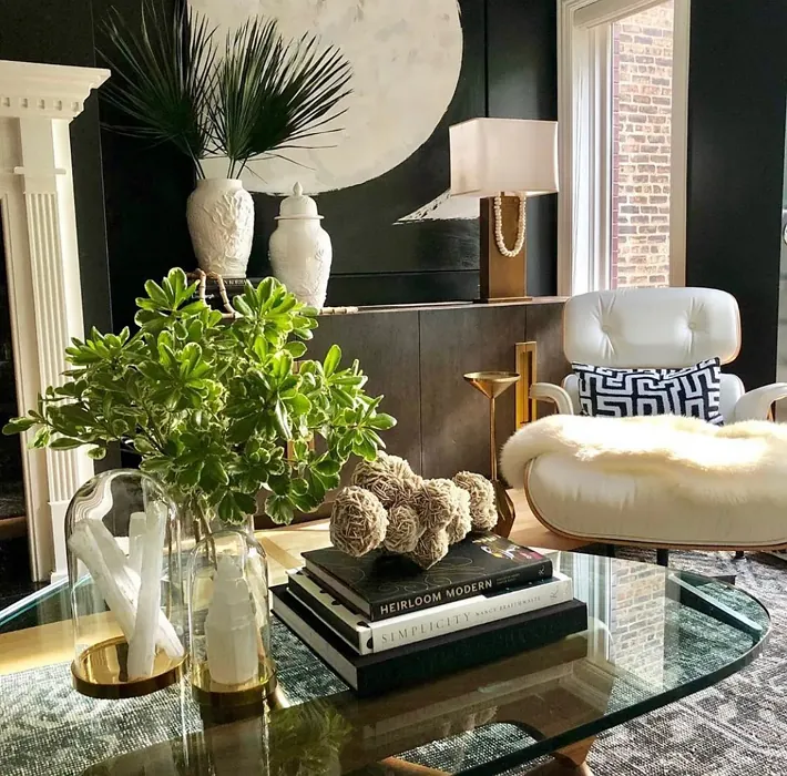
Speaking of light, Jet Black has a Light Reflectance Value (LRV) of just 4.71%, which means it absorbs almost all the light that hits it. This makes it a fantastic choice for creating a cozy, intimate atmosphere, but it also means you’ll want to be mindful of your lighting setup. In a room with plenty of natural or artificial light, Jet Black will look rich and luxurious. In a darker space, it can feel a bit cave-like if you’re not careful. The fix? Layer your lighting—think floor lamps, sconces, and even candles—to add warmth and dimension. And if you’re worried about a small room feeling too closed in, consider using Jet Black on an accent wall or just the lower half of the room (like wainscoting) to keep things airy.
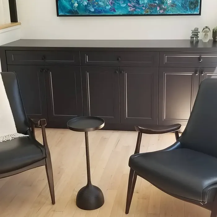
One of the best things about Jet Black is how easy it is to work with. It’s a high-coverage paint, so you’ll likely only need one or two coats to get a flawless finish. It’s also touch-up friendly, which is a lifesaver if you have kids, pets, or just a habit of rearranging furniture. The finish options—matte, satin, or semi-gloss—give you flexibility depending on the vibe you’re going for. Matte is my personal favorite for walls because it gives that velvety, high-end look, while satin or semi-gloss works wonders on trim, doors, or even furniture for a bit of sheen.
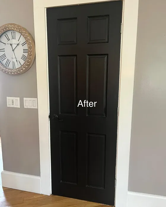
Now, let’s talk about where to use it. Jet Black shines in living rooms, bedrooms, home offices, and dining rooms—anywhere you want to create a sense of drama and sophistication. It’s a designer favorite for a reason. Picture it in a modern farmhouse dining room with a rustic wood table and brass pendant lights, or in a minimalist bedroom with crisp white bedding and a single piece of bold artwork. It also makes a stunning backdrop for gallery walls, letting your photos or paintings pop. And don’t overlook smaller spaces like entryways or powder rooms—Jet Black can turn these often-overlooked areas into unforgettable moments in your home.
Of course, no color is perfect for every situation. Jet Black’s depth means it can show dust and fingerprints more easily than lighter colors, especially in high-traffic areas. If that’s a concern, opt for a satin or semi-gloss finish, which is more scrubbable and forgiving. And while it’s a versatile color, it’s not the best choice if you’re going for a light, airy, or beachy vibe—this is a color that demands attention and isn’t afraid to own the room.
If you’re still on the fence, here’s a pro tip: test it out. Paint a large swatch on your wall and live with it for a few days. Watch how it changes in different lighting, and see how it plays with your furniture and decor. You might be surprised at how much you love it. And if you decide Jet Black isn’t quite right, Benjamin Moore offers lighter shades in the same family, like 2127-10 or 2133-20, that might hit the mark.
At the end of the day, Jet Black is more than just a paint color—it’s a design tool. It can ground a room, highlight your favorite pieces, and create a mood that’s both sophisticated and inviting. Whether you’re going for modern edge or timeless elegance, this color delivers. So if you’re ready to take the plunge, grab a brush and get ready to fall in love with your space all over again.

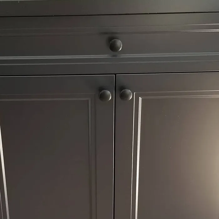
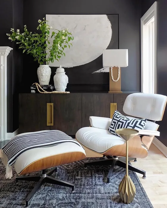
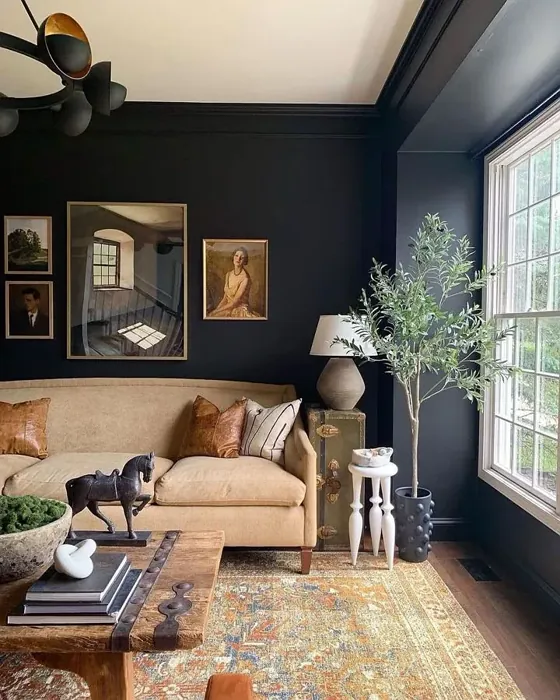
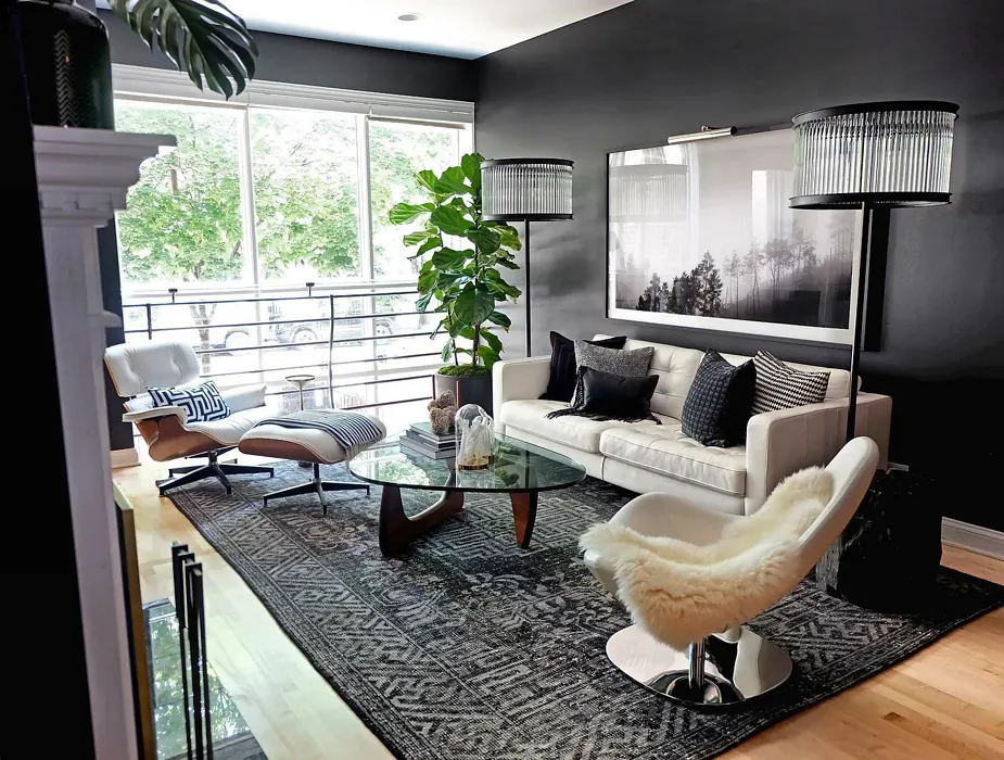
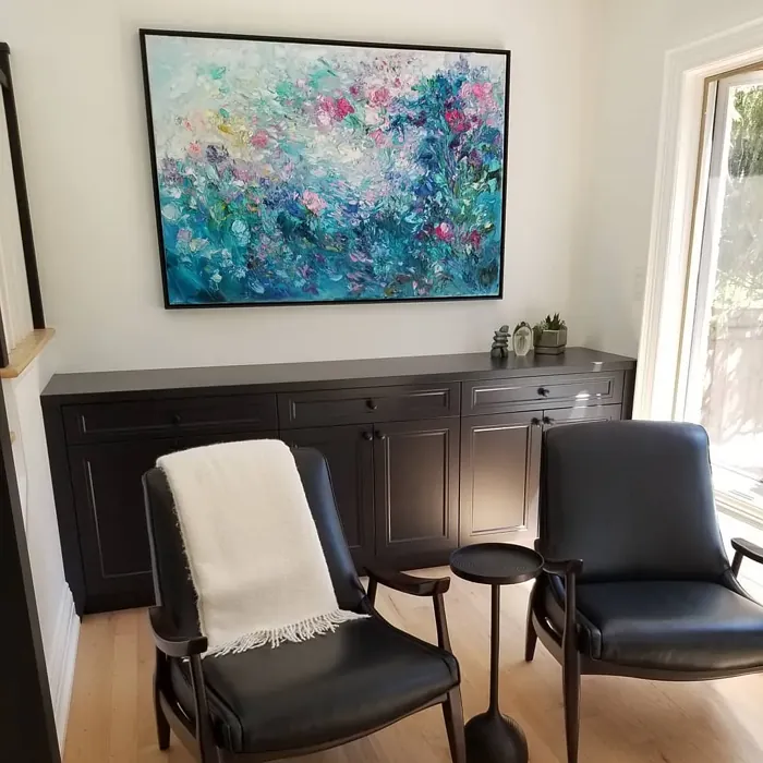
Real Room Photo of Jet Black 2120-10
Undertones of Jet Black ?
The undertones of Jet Black are a key aspect of its character, leaning towards Blue and Purple. These subtle underlying hues are what give the color its depth and complexity. For example, a gray with a blue undertone will feel cooler and more modern, while one with a brown undertone will feel warmer and more traditional. It’s essential to test this paint in your home and observe it next to your existing furniture, flooring, and decor to see how these undertones interact and reveal themselves throughout the day.
HEX value: #333334
RGB code: 51, 51, 52
Is Jet Black Cool or Warm?
While Jet Black tends to lean towards a cooler spectrum, its adaptability allows it to work well in warm settings too. It can ground a space, enhancing warm wood tones or vibrant colors.
Understanding Color Properties and Interior Design Tips
Hue refers to a specific position on the color wheel, measured in degrees from 0 to 360. Each degree represents a different pure color:
- 0° represents red
- 120° represents green
- 240° represents blue
Saturation describes the intensity or purity of a color and is expressed as a percentage:
- At 0%, the color appears completely desaturated—essentially a shade of gray
- At 100%, the color is at its most vivid and vibrant
Lightness indicates how light or dark a color is, also expressed as a percentage:
- 0% lightness results in black
- 100% lightness results in white
Using Warm Colors in Interior Design
Warm hues—such as reds, oranges, yellows, warm beiges, and greiges—are excellent choices for creating inviting and energetic spaces. These colors are particularly well-suited for:
- Kitchens, living rooms, and bathrooms, where warmth enhances comfort and sociability
- Large rooms, where warm tones can help reduce the sense of emptiness and make the space feel more intimate
For example:
- Warm beige shades provide a cozy, inviting atmosphere, ideal for living rooms, bedrooms, and hallways.
- Warm greige (a mix of beige and gray) offers the warmth of beige with the modern appeal of gray, making it a versatile backdrop for dining areas, bedrooms, and living spaces.
However, be mindful when using warm light tones in rooms with limited natural light. These shades may appear muted or even take on an unpleasant yellowish tint. To avoid a dull or flat appearance:
- Add depth by incorporating richer tones like deep greens, charcoal, or chocolate brown
- Use textured elements such as curtains, rugs, or cushions to bring dimension to the space
Pro Tip: Achieving Harmony with Warm and Cool Color Balance
To create a well-balanced and visually interesting interior, mix warm and cool tones strategically. This contrast adds depth and harmony to your design.
- If your walls feature warm hues, introduce cool-colored accents such as blue or green furniture, artwork, or accessories to create contrast.
- For a polished look, consider using a complementary color scheme, which pairs colors opposite each other on the color wheel (e.g., red with green, orange with blue).
This thoughtful mix not only enhances visual appeal but also creates a space that feels both dynamic and cohesive.

Light Temperature Affects on Jet Black
Natural Light
Natural daylight changes in color temperature as the sun moves across the sky. At sunrise and sunset, the light tends to have a warm, golden tone with a color temperature around 2000 Kelvin (K). As the day progresses and the sun rises higher, the light becomes cooler and more neutral. Around midday, especially when the sky is clear, natural light typically reaches its peak brightness and shifts to a cooler tone, ranging from 5500 to 6500 Kelvin. This midday light is close to what we perceive as pure white or daylight-balanced light.
These shifts in natural light can significantly influence how colors appear in a space, which is why designers often consider both the time of day and the orientation of windows when planning interior color schemes.
Artificial Light
When choosing artificial lighting, pay close attention to the color temperature, measured in Kelvin (K). This determines how warm or cool the light will appear. Lower temperatures, around 2700K, give off a warm, yellow glow often used in living rooms or bedrooms. Higher temperatures, above 5000K, create a cool, bluish light similar to daylight, commonly used in kitchens, offices, or task areas.
Use the slider to see how lighting temperature can affect the appearance of a surface or color throughout a space.


4800K
LRV of Jet Black
The Light Reflectance Value (LRV) of Jet Black is 4.71%, which places it in the Dark colors category. This means it does not reflect light. Understanding a paint’s LRV is crucial for predicting how it will look in your space. A higher LRV indicates a lighter color that reflects more light, making rooms feel larger and brighter. A lower LRV signifies a darker color that absorbs more light, creating a cozier, more intimate atmosphere. Always consider the natural and artificial lighting in your room when selecting a paint color based on its LRV.
Detailed Review of Jet Black
Additional Paint Characteristics
Ideal Rooms
Bedroom, Dining Room, Entryway, Home Office, Living Room
Decor Styles
Classic, Contemporary, Industrial, Minimalist, Modern
Coverage
Good (1–2 Coats), Touch-Up Friendly
Ease of Application
Brush Smooth, Fast-Drying, Roller-Ready
Washability
Scrubbable, Washable
VOC Level
Low VOC
Best Use
Accent Wall, Doors, Furniture, Interior Walls, Trim
Room Suitability
Bedroom, Dining Room, Home Office, Living Room
Tone Tag
Bold, Cool, Deep
Finish Type
Matte, Satin, Semi-Gloss
Paint Performance
Easy Touch-Up, High Coverage, Low Odor
Use Cases
Best for Low Light Rooms, Best for Modern Farmhouse, Classic Favorite, Designer Favorite
Mood
Cozy, Grounding, Sophisticated
Trim Pairing
Complements Brass Fixtures, Matches Pure White, Pairs with White Dove
Jet Black is more than just a paint color; it’s a statement. With its deep hue, it can transform your space, creating a dramatic backdrop for art or furniture. The versatility of Jet Black allows it to shine in various decor styles, from minimalist to industrial chic. When applying, it glides on smoothly, providing good coverage in just one to two coats. It also pairs beautifully with lighter colors, making it a fantastic choice for accent walls or trim. Keep in mind that while it adds depth and sophistication, it can absorb light, so ensure your space has adequate lighting to prevent it from feeling too enclosed.
Pros & Cons of 2120-10 Jet Black
Pros
Cons
Colors that go with Benjamin Moore Jet Black
FAQ on 2120-10 Jet Black
Can Jet Black be used in small spaces?
Yes, Jet Black can be used in small spaces, but it’s essential to consider your lighting. While it can create a cozy and intimate atmosphere, it may also make a room feel smaller if there isn’t enough natural light. To counteract this, pair it with lighter furniture or accents to create balance.
What finishes work best with Jet Black?
Jet Black works beautifully in a variety of finishes. A matte finish offers a sophisticated, velvety look, while satin or semi-gloss finishes can add a touch of sheen that reflects light. The choice of finish depends on the overall aesthetic you’re aiming for; matte is perfect for a soft look, whereas satin is ideal for more contemporary spaces.
Comparisons Jet Black with other colors
Jet Black 2120-10 vs Night Owl SW 7061
| Attribute | Jet Black 2120-10 | Night Owl SW 7061 |
|---|---|---|
| Color Name | Jet Black 2120-10 | Night Owl SW 7061 |
| Color | ||
| Hue | Grey | Grey |
| Brightness | Dark | Dark |
| RGB | 51, 51, 52 | 99, 101, 95 |
| LRV | 4.71% | 24% |
| Finish Type | Matte, Satin, Semi-Gloss | Eggshell, Matte, Satin |
| Finish Options | Matte, Satin, Semi-Gloss | Eggshell, Matte, Satin |
| Ideal Rooms | Bedroom, Dining Room, Entryway, Home Office, Living Room | Bedroom, Dining Room, Hallway, Home Office, Living Room |
| Decor Styles | Classic, Contemporary, Industrial, Minimalist, Modern | Industrial, Minimalist, Modern, Rustic, Scandinavian |
| Coverage | Good (1–2 Coats), Touch-Up Friendly | Good (1–2 Coats), Touch-Up Friendly |
| Ease of Application | Brush Smooth, Fast-Drying, Roller-Ready | Beginner Friendly, Brush Smooth, Fast-Drying, Roller-Ready |
| Washability | Scrubbable, Washable | Scrubbable, Washable |
| Room Suitability | Bedroom, Dining Room, Home Office, Living Room | Bedroom, Dining Room, Home Office, Living Room |
| Tone | Bold, Cool, Deep | Balanced, Deep, Earthy, Muted |
| Paint Performance | Easy Touch-Up, High Coverage, Low Odor | Easy Touch-Up, Fade Resistant, High Coverage, Low Odor |
Jet Black 2120-10 vs Urbane Bronze SW 7048
| Attribute | Jet Black 2120-10 | Urbane Bronze SW 7048 |
|---|---|---|
| Color Name | Jet Black 2120-10 | Urbane Bronze SW 7048 |
| Color | ||
| Hue | Grey | Grey |
| Brightness | Dark | Dark |
| RGB | 51, 51, 52 | 84, 80, 74 |
| LRV | 4.71% | 20% |
| Finish Type | Matte, Satin, Semi-Gloss | Eggshell, Matte, Satin |
| Finish Options | Matte, Satin, Semi-Gloss | Eggshell, Matte, Satin |
| Ideal Rooms | Bedroom, Dining Room, Entryway, Home Office, Living Room | Bedroom, Dining Room, Home Office, Living Room |
| Decor Styles | Classic, Contemporary, Industrial, Minimalist, Modern | Contemporary, Industrial, Modern, Rustic, Transitional |
| Coverage | Good (1–2 Coats), Touch-Up Friendly | Good (1–2 Coats) |
| Ease of Application | Brush Smooth, Fast-Drying, Roller-Ready | Beginner Friendly, Brush Smooth, Roller-Ready |
| Washability | Scrubbable, Washable | Highly Washable, Washable |
| Room Suitability | Bedroom, Dining Room, Home Office, Living Room | Bedroom, Dining Room, Home Office, Living Room |
| Tone | Bold, Cool, Deep | Deep, Earthy, Warm |
| Paint Performance | Easy Touch-Up, High Coverage, Low Odor | Easy Touch-Up, Fade Resistant, High Coverage, Low Odor |
Jet Black 2120-10 vs Succulent SW 9650
| Attribute | Jet Black 2120-10 | Succulent SW 9650 |
|---|---|---|
| Color Name | Jet Black 2120-10 | Succulent SW 9650 |
| Color | ||
| Hue | Grey | Grey |
| Brightness | Dark | Dark |
| RGB | 51, 51, 52 | 97, 108, 100 |
| LRV | 4.71% | 30% |
| Finish Type | Matte, Satin, Semi-Gloss | Eggshell, Matte, Satin |
| Finish Options | Matte, Satin, Semi-Gloss | Eggshell, Matte, Satin |
| Ideal Rooms | Bedroom, Dining Room, Entryway, Home Office, Living Room | Bathroom, Bedroom, Dining Room, Entryway, Kitchen, Living Room |
| Decor Styles | Classic, Contemporary, Industrial, Minimalist, Modern | Bohemian, Contemporary, Eclectic, Minimalist, Modern Farmhouse |
| Coverage | Good (1–2 Coats), Touch-Up Friendly | Good (1–2 Coats), Touch-Up Friendly |
| Ease of Application | Brush Smooth, Fast-Drying, Roller-Ready | Beginner Friendly, Brush Smooth, Roller-Ready |
| Washability | Scrubbable, Washable | Highly Washable, Washable |
| Room Suitability | Bedroom, Dining Room, Home Office, Living Room | Bathroom, Bedroom, Dining Room, Kitchen, Living Room |
| Tone | Bold, Cool, Deep | Cool, Earthy, Muted |
| Paint Performance | Easy Touch-Up, High Coverage, Low Odor | Easy Touch-Up, Low Odor, Quick Drying, Scuff Resistant |
Jet Black 2120-10 vs Grizzle Gray SW 7068
| Attribute | Jet Black 2120-10 | Grizzle Gray SW 7068 |
|---|---|---|
| Color Name | Jet Black 2120-10 | Grizzle Gray SW 7068 |
| Color | ||
| Hue | Grey | Grey |
| Brightness | Dark | Dark |
| RGB | 51, 51, 52 | 99, 101, 98 |
| LRV | 4.71% | 24% |
| Finish Type | Matte, Satin, Semi-Gloss | Eggshell, Satin |
| Finish Options | Matte, Satin, Semi-Gloss | Eggshell, Matte, Satin |
| Ideal Rooms | Bedroom, Dining Room, Entryway, Home Office, Living Room | Bedroom, Dining Room, Home Office, Living Room |
| Decor Styles | Classic, Contemporary, Industrial, Minimalist, Modern | Industrial, Modern, Rustic, Scandinavian |
| Coverage | Good (1–2 Coats), Touch-Up Friendly | Good (1–2 Coats), Touch-Up Friendly |
| Ease of Application | Brush Smooth, Fast-Drying, Roller-Ready | Beginner Friendly, Brush Smooth, Roller-Ready |
| Washability | Scrubbable, Washable | Washable, Wipeable |
| Room Suitability | Bedroom, Dining Room, Home Office, Living Room | Bedroom, Dining Room, Home Office, Living Room |
| Tone | Bold, Cool, Deep | Balanced, Cool, Muted |
| Paint Performance | Easy Touch-Up, High Coverage, Low Odor | Easy Touch-Up, High Coverage, Low Odor |
Jet Black 2120-10 vs Iron Ore SW 7069
| Attribute | Jet Black 2120-10 | Iron Ore SW 7069 |
|---|---|---|
| Color Name | Jet Black 2120-10 | Iron Ore SW 7069 |
| Color | ||
| Hue | Grey | Grey |
| Brightness | Dark | Dark |
| RGB | 51, 51, 52 | 67, 67, 65 |
| LRV | 4.71% | 6% |
| Finish Type | Matte, Satin, Semi-Gloss | Eggshell, Matte, Satin |
| Finish Options | Matte, Satin, Semi-Gloss | Eggshell, Matte, Satin |
| Ideal Rooms | Bedroom, Dining Room, Entryway, Home Office, Living Room | Bedroom, Dining Room, Entryway, Home Office, Living Room |
| Decor Styles | Classic, Contemporary, Industrial, Minimalist, Modern | Contemporary, Industrial, Minimalist, Modern, Rustic |
| Coverage | Good (1–2 Coats), Touch-Up Friendly | Good (1–2 Coats), High Hide |
| Ease of Application | Brush Smooth, Fast-Drying, Roller-Ready | Brush Smooth, Fast-Drying, Roller-Ready |
| Washability | Scrubbable, Washable | Highly Washable, Washable |
| Room Suitability | Bedroom, Dining Room, Home Office, Living Room | Bedroom, Dining Room, Entryway, Home Office, Living Room |
| Tone | Bold, Cool, Deep | Balanced, Deep, Muted, Warm |
| Paint Performance | Easy Touch-Up, High Coverage, Low Odor | Easy Touch-Up, High Coverage, Low Odor |
Jet Black 2120-10 vs Peppercorn SW 7674
| Attribute | Jet Black 2120-10 | Peppercorn SW 7674 |
|---|---|---|
| Color Name | Jet Black 2120-10 | Peppercorn SW 7674 |
| Color | ||
| Hue | Grey | Grey |
| Brightness | Dark | Dark |
| RGB | 51, 51, 52 | 88, 88, 88 |
| LRV | 4.71% | 10% |
| Finish Type | Matte, Satin, Semi-Gloss | Eggshell, Matte, Satin |
| Finish Options | Matte, Satin, Semi-Gloss | Eggshell, Matte, Satin |
| Ideal Rooms | Bedroom, Dining Room, Entryway, Home Office, Living Room | Bedroom, Dining Room, Home Office, Living Room |
| Decor Styles | Classic, Contemporary, Industrial, Minimalist, Modern | Contemporary, Industrial, Minimalist, Modern |
| Coverage | Good (1–2 Coats), Touch-Up Friendly | Good (1–2 Coats), Touch-Up Friendly |
| Ease of Application | Brush Smooth, Fast-Drying, Roller-Ready | Beginner Friendly, Brush Smooth, Roller-Ready |
| Washability | Scrubbable, Washable | Highly Washable, Washable |
| Room Suitability | Bedroom, Dining Room, Home Office, Living Room | Bedroom, Dining Room, Home Office, Living Room |
| Tone | Bold, Cool, Deep | Balanced, Deep, Moody, Neutral |
| Paint Performance | Easy Touch-Up, High Coverage, Low Odor | Easy Touch-Up, Low Odor, Quick Drying, Scuff Resistant |
Jet Black 2120-10 vs Slate Tile SW 7624
| Attribute | Jet Black 2120-10 | Slate Tile SW 7624 |
|---|---|---|
| Color Name | Jet Black 2120-10 | Slate Tile SW 7624 |
| Color | ||
| Hue | Grey | Grey |
| Brightness | Dark | Dark |
| RGB | 51, 51, 52 | 96, 110, 116 |
| LRV | 4.71% | 15% |
| Finish Type | Matte, Satin, Semi-Gloss | Eggshell, Matte, Satin |
| Finish Options | Matte, Satin, Semi-Gloss | Eggshell, Matte, Satin |
| Ideal Rooms | Bedroom, Dining Room, Entryway, Home Office, Living Room | Bathroom, Bedroom, Home Office, Kitchen, Living Room |
| Decor Styles | Classic, Contemporary, Industrial, Minimalist, Modern | Industrial, Minimalist, Modern, Rustic |
| Coverage | Good (1–2 Coats), Touch-Up Friendly | Good (1–2 Coats) |
| Ease of Application | Brush Smooth, Fast-Drying, Roller-Ready | Beginner Friendly, Brush Smooth, Fast-Drying, Roller-Ready |
| Washability | Scrubbable, Washable | Scrubbable, Washable |
| Room Suitability | Bedroom, Dining Room, Home Office, Living Room | Bathroom, Bedroom, Kitchen, Living Room |
| Tone | Bold, Cool, Deep | Balanced, Cool, Muted |
| Paint Performance | Easy Touch-Up, High Coverage, Low Odor | Easy Touch-Up, High Coverage, Low Odor, Quick Drying |
Jet Black 2120-10 vs Blustery Sky SW 9140
| Attribute | Jet Black 2120-10 | Blustery Sky SW 9140 |
|---|---|---|
| Color Name | Jet Black 2120-10 | Blustery Sky SW 9140 |
| Color | ||
| Hue | Grey | Grey |
| Brightness | Dark | Dark |
| RGB | 51, 51, 52 | 111, 132, 140 |
| LRV | 4.71% | 48% |
| Finish Type | Matte, Satin, Semi-Gloss | Eggshell, Matte |
| Finish Options | Matte, Satin, Semi-Gloss | Eggshell, Matte, Satin |
| Ideal Rooms | Bedroom, Dining Room, Entryway, Home Office, Living Room | Bedroom, Dining Room, Home Office, Living Room, Nursery |
| Decor Styles | Classic, Contemporary, Industrial, Minimalist, Modern | Coastal, Modern Farmhouse, Scandinavian, Transitional |
| Coverage | Good (1–2 Coats), Touch-Up Friendly | Good (1–2 Coats), Touch-Up Friendly |
| Ease of Application | Brush Smooth, Fast-Drying, Roller-Ready | Beginner Friendly, Fast-Drying, Low Splatter, Roller-Ready |
| Washability | Scrubbable, Washable | Washable, Wipeable |
| Room Suitability | Bedroom, Dining Room, Home Office, Living Room | Bedroom, Home Office, Living Room, Nursery |
| Tone | Bold, Cool, Deep | Balanced, Cool, Muted |
| Paint Performance | Easy Touch-Up, High Coverage, Low Odor | Easy Touch-Up, Fade Resistant, Low Odor, Quick Drying |
Jet Black 2120-10 vs Gauntlet Gray SW 7019
| Attribute | Jet Black 2120-10 | Gauntlet Gray SW 7019 |
|---|---|---|
| Color Name | Jet Black 2120-10 | Gauntlet Gray SW 7019 |
| Color | ||
| Hue | Grey | Grey |
| Brightness | Dark | Dark |
| RGB | 51, 51, 52 | 120, 115, 110 |
| LRV | 4.71% | 24% |
| Finish Type | Matte, Satin, Semi-Gloss | Eggshell, Matte, Satin |
| Finish Options | Matte, Satin, Semi-Gloss | Eggshell, Matte, Satin |
| Ideal Rooms | Bedroom, Dining Room, Entryway, Home Office, Living Room | Bedroom, Dining Room, Hallway, Home Office, Living Room |
| Decor Styles | Classic, Contemporary, Industrial, Minimalist, Modern | Industrial, Modern, Rustic, Transitional |
| Coverage | Good (1–2 Coats), Touch-Up Friendly | Good (1–2 Coats), Touch-Up Friendly |
| Ease of Application | Brush Smooth, Fast-Drying, Roller-Ready | Beginner Friendly, Brush Smooth, Roller-Ready |
| Washability | Scrubbable, Washable | Scrubbable, Washable |
| Room Suitability | Bedroom, Dining Room, Home Office, Living Room | Bedroom, Dining Room, Home Office, Living Room |
| Tone | Bold, Cool, Deep | Dusty, Earthy, Muted, Warm |
| Paint Performance | Easy Touch-Up, High Coverage, Low Odor | Easy Touch-Up, High Coverage, Low Odor |
Jet Black 2120-10 vs Cast Iron SW 6202
| Attribute | Jet Black 2120-10 | Cast Iron SW 6202 |
|---|---|---|
| Color Name | Jet Black 2120-10 | Cast Iron SW 6202 |
| Color | ||
| Hue | Grey | Grey |
| Brightness | Dark | Dark |
| RGB | 51, 51, 52 | 100, 100, 90 |
| LRV | 4.71% | 6% |
| Finish Type | Matte, Satin, Semi-Gloss | Eggshell, Matte, Satin |
| Finish Options | Matte, Satin, Semi-Gloss | Eggshell, Matte, Satin |
| Ideal Rooms | Bedroom, Dining Room, Entryway, Home Office, Living Room | Bedroom, Dining Room, Hallway, Home Office, Kitchen, Living Room |
| Decor Styles | Classic, Contemporary, Industrial, Minimalist, Modern | Contemporary, Farmhouse, Industrial, Minimalist, Modern |
| Coverage | Good (1–2 Coats), Touch-Up Friendly | Good (1–2 Coats), High Hide, Touch-Up Friendly |
| Ease of Application | Brush Smooth, Fast-Drying, Roller-Ready | Beginner Friendly, Brush Smooth, Fast-Drying, Roller-Ready |
| Washability | Scrubbable, Washable | Highly Washable, Washable, Wipeable |
| Room Suitability | Bedroom, Dining Room, Home Office, Living Room | Bedroom, Dining Room, Home Office, Kitchen, Living Room |
| Tone | Bold, Cool, Deep | Balanced, Deep, Dusty, Earthy, Warm |
| Paint Performance | Easy Touch-Up, High Coverage, Low Odor | Easy Touch-Up, High Coverage, Low Odor, Stain Resistant |
Official Page of Benjamin Moore Jet Black 2120-10