
Color Preview & Key Details
| HEX Code | #373A3D |
| RGB | 55, 58, 61 |
| LRV | 5.81% |
| Undertone | Blue |
| Finish Options | Matte, Satin, Semi-Gloss |
If you’re looking for a paint color that instantly adds depth, drama, and sophistication to your home, Benjamin Moore’s Black Ink (2127-20) might just be your perfect match. This isn’t your average dark gray—it’s a rich, moody hue with a subtle blue undertone that gives it a modern edge while remaining timeless. Whether you’re aiming for a cozy bedroom retreat, a sleek home office, or a striking accent wall in your living room, Black Ink delivers a bold statement without feeling overwhelming.
One of the first things you’ll notice about Black Ink is how effortlessly it transforms a space. With an LRV (Light Reflectance Value) of just 5.81%, this color absorbs light rather than reflecting it, creating an intimate, enveloping atmosphere. In a sunlit room, it reads as a deep charcoal, while in lower light, it takes on an almost inky depth. That interplay with light makes it incredibly dynamic—perfect for rooms where you want the walls to feel alive rather than flat.
Application is a breeze, thanks to its smooth, fast-drying formula. Whether you’re rolling it on or brushing it, the coverage is excellent—one to two coats should do the trick. And because it’s low-VOC, you won’t have to worry about strong fumes lingering in your home. The finish options (matte, satin, or semi-gloss) let you customize the look based on your needs. Prefer a velvety, non-reflective finish? Go matte. Want something more durable for high-traffic areas? Satin or semi-gloss will hold up beautifully.
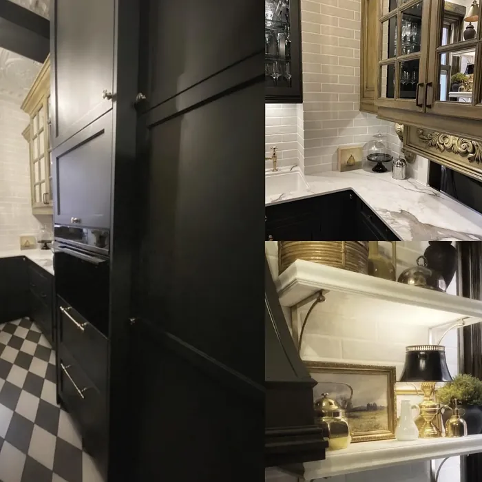
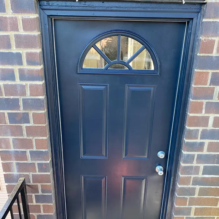
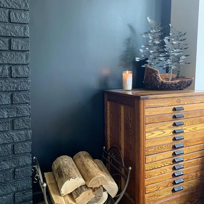
Now, let’s talk about where this color shines. Black Ink is a natural fit for modern, industrial, and minimalist spaces, but don’t let that limit you. It pairs stunningly with warm wood tones, crisp white trim (try White Dove for a classic contrast), or even brass fixtures for a touch of luxe. If you’re worried about using it in a small room, don’t be—just balance it with lighter furnishings or plenty of natural light. An accent wall in a home office can make the space feel focused and sophisticated, while a full coat in a dining room sets the stage for intimate dinners.
Of course, no color is without its quirks. Darker paints like Black Ink can show dust and fingerprints more easily, especially in high-touch areas like doors or cabinetry. A quick wipe-down with a damp cloth usually does the trick, but it’s something to keep in mind if you’re painting a kid’s room or a busy hallway. And while it’s versatile, you’ll want to test it in your space first—those blue undertones can shift slightly depending on your lighting and surrounding colors.
If you love Black Ink but aren’t ready to commit to an entire room, consider using it on furniture or built-ins. A matte black bookshelf or a satin-finish accent table can add just the right amount of drama without overpowering the space. And if you’re playing with complementary colors, lean into warm oranges or soft creams to create balance. The contrast will make Black Ink pop even more.
At the end of the day, this is a color for those who aren’t afraid to make a statement. It’s bold but not brash, sophisticated but never stuffy. Whether you’re going for a moody bedroom, a sleek modern living room, or a home office that inspires focus, Black Ink brings a depth and richness that few other colors can match. So grab a sample, test it in different lights, and see how it transforms your space. You might just fall in love with the drama it brings.

Real Room Photo of Black Ink 2127-20


Undertones of Black Ink ?
The undertones of Black Ink are a key aspect of its character, leaning towards Blue. These subtle underlying hues are what give the color its depth and complexity. For example, a gray with a blue undertone will feel cooler and more modern, while one with a brown undertone will feel warmer and more traditional. It’s essential to test this paint in your home and observe it next to your existing furniture, flooring, and decor to see how these undertones interact and reveal themselves throughout the day.
HEX value: #373A3D
RGB code: 55, 58, 61
Is Black Ink Cool or Warm?
While Black Ink leans towards a cooler tone, its depth allows it to adapt to various lighting scenarios. This means it can feel cozy in some settings and crisp in others, making it an adaptable choice for any room.
Understanding Color Properties and Interior Design Tips
Hue refers to a specific position on the color wheel, measured in degrees from 0 to 360. Each degree represents a different pure color:
- 0° represents red
- 120° represents green
- 240° represents blue
Saturation describes the intensity or purity of a color and is expressed as a percentage:
- At 0%, the color appears completely desaturated—essentially a shade of gray
- At 100%, the color is at its most vivid and vibrant
Lightness indicates how light or dark a color is, also expressed as a percentage:
- 0% lightness results in black
- 100% lightness results in white
Using Warm Colors in Interior Design
Warm hues—such as reds, oranges, yellows, warm beiges, and greiges—are excellent choices for creating inviting and energetic spaces. These colors are particularly well-suited for:
- Kitchens, living rooms, and bathrooms, where warmth enhances comfort and sociability
- Large rooms, where warm tones can help reduce the sense of emptiness and make the space feel more intimate
For example:
- Warm beige shades provide a cozy, inviting atmosphere, ideal for living rooms, bedrooms, and hallways.
- Warm greige (a mix of beige and gray) offers the warmth of beige with the modern appeal of gray, making it a versatile backdrop for dining areas, bedrooms, and living spaces.
However, be mindful when using warm light tones in rooms with limited natural light. These shades may appear muted or even take on an unpleasant yellowish tint. To avoid a dull or flat appearance:
- Add depth by incorporating richer tones like deep greens, charcoal, or chocolate brown
- Use textured elements such as curtains, rugs, or cushions to bring dimension to the space
Pro Tip: Achieving Harmony with Warm and Cool Color Balance
To create a well-balanced and visually interesting interior, mix warm and cool tones strategically. This contrast adds depth and harmony to your design.
- If your walls feature warm hues, introduce cool-colored accents such as blue or green furniture, artwork, or accessories to create contrast.
- For a polished look, consider using a complementary color scheme, which pairs colors opposite each other on the color wheel (e.g., red with green, orange with blue).
This thoughtful mix not only enhances visual appeal but also creates a space that feels both dynamic and cohesive.

Light Temperature Affects on Black Ink
Natural Light
Natural daylight changes in color temperature as the sun moves across the sky. At sunrise and sunset, the light tends to have a warm, golden tone with a color temperature around 2000 Kelvin (K). As the day progresses and the sun rises higher, the light becomes cooler and more neutral. Around midday, especially when the sky is clear, natural light typically reaches its peak brightness and shifts to a cooler tone, ranging from 5500 to 6500 Kelvin. This midday light is close to what we perceive as pure white or daylight-balanced light.
These shifts in natural light can significantly influence how colors appear in a space, which is why designers often consider both the time of day and the orientation of windows when planning interior color schemes.
Artificial Light
When choosing artificial lighting, pay close attention to the color temperature, measured in Kelvin (K). This determines how warm or cool the light will appear. Lower temperatures, around 2700K, give off a warm, yellow glow often used in living rooms or bedrooms. Higher temperatures, above 5000K, create a cool, bluish light similar to daylight, commonly used in kitchens, offices, or task areas.
Use the slider to see how lighting temperature can affect the appearance of a surface or color throughout a space.


4800K
LRV of Black Ink
The Light Reflectance Value (LRV) of Black Ink is 5.81%, which places it in the Dark colors category. This means it does not reflect light. Understanding a paint’s LRV is crucial for predicting how it will look in your space. A higher LRV indicates a lighter color that reflects more light, making rooms feel larger and brighter. A lower LRV signifies a darker color that absorbs more light, creating a cozier, more intimate atmosphere. Always consider the natural and artificial lighting in your room when selecting a paint color based on its LRV.
Detailed Review of Black Ink
Additional Paint Characteristics
Ideal Rooms
Bedroom, Dining Room, Home Office, Living Room
Decor Styles
Contemporary, Industrial, Minimalist, Modern
Coverage
Good (1–2 Coats)
Ease of Application
Brush Smooth, Fast-Drying, Roller-Ready
Washability
Washable, Wipeable
VOC Level
Low VOC
Best Use
Accent Wall, Furniture, Interior Walls
Room Suitability
Bedroom, Dining Room, Home Office, Living Room
Tone Tag
Bold, Deep, Moody
Finish Type
Matte, Satin
Paint Performance
High Coverage, Low Odor, Quick Drying
Use Cases
Best for Open Concept, Classic Favorite, Designer Favorite
Mood
Cozy, Grounding, Sophisticated
Trim Pairing
Complements Brass Fixtures, Good with Wood Trim, Pairs with White Dove
Black Ink is more than just a color; it’s a transformative experience for your home. With its rich, dark tones, it adds depth and character, making it ideal for accent walls or entire rooms. This paint glides on smoothly, providing a sleek finish that’s both modern and timeless. It works wonderfully in spaces designed for relaxation or creativity, like bedrooms or home offices, creating an inviting yet sophisticated ambiance. Users rave about its ability to blend seamlessly with lighter colors, making it perfect for creating contrast without overwhelming a space. Just be mindful that darker shades can sometimes show dust and fingerprints more readily, so a quick wipe-down might be necessary to keep it looking pristine.
Pros & Cons of 2127-20 Black Ink
Pros
Cons
Colors that go with Benjamin Moore Black Ink
FAQ on 2127-20 Black Ink
What finishes are available for Black Ink?
Black Ink is available in a variety of finishes, including matte, satin, and semi-gloss. Each finish offers a unique look and feel, allowing you to choose the perfect sheen for your project. Matte provides a soft, non-reflective finish that’s great for hiding imperfections, while satin and semi-gloss add a subtle shine that can enhance durability, especially in high-traffic areas.
Is Black Ink suitable for small rooms?
Yes, Black Ink can be used in small rooms, but it’s essential to balance it with lighter colors or plenty of natural light to avoid making the space feel cramped. When used thoughtfully, it can create a cozy and inviting atmosphere. Consider using it as an accent wall or paired with lighter decor to maintain an open feel.
Comparisons Black Ink with other colors
Black Ink 2127-20 vs Night Owl SW 7061
| Attribute | Black Ink 2127-20 | Night Owl SW 7061 |
|---|---|---|
| Color Name | Black Ink 2127-20 | Night Owl SW 7061 |
| Color | ||
| Hue | Grey | Grey |
| Brightness | Dark | Dark |
| RGB | 55, 58, 61 | 99, 101, 95 |
| LRV | 5.81% | 24% |
| Finish Type | Matte, Satin | Eggshell, Matte, Satin |
| Finish Options | Matte, Satin, Semi-Gloss | Eggshell, Matte, Satin |
| Ideal Rooms | Bedroom, Dining Room, Home Office, Living Room | Bedroom, Dining Room, Hallway, Home Office, Living Room |
| Decor Styles | Contemporary, Industrial, Minimalist, Modern | Industrial, Minimalist, Modern, Rustic, Scandinavian |
| Coverage | Good (1–2 Coats) | Good (1–2 Coats), Touch-Up Friendly |
| Ease of Application | Brush Smooth, Fast-Drying, Roller-Ready | Beginner Friendly, Brush Smooth, Fast-Drying, Roller-Ready |
| Washability | Washable, Wipeable | Scrubbable, Washable |
| Room Suitability | Bedroom, Dining Room, Home Office, Living Room | Bedroom, Dining Room, Home Office, Living Room |
| Tone | Bold, Deep, Moody | Balanced, Deep, Earthy, Muted |
| Paint Performance | High Coverage, Low Odor, Quick Drying | Easy Touch-Up, Fade Resistant, High Coverage, Low Odor |
Black Ink 2127-20 vs Urbane Bronze SW 7048
| Attribute | Black Ink 2127-20 | Urbane Bronze SW 7048 |
|---|---|---|
| Color Name | Black Ink 2127-20 | Urbane Bronze SW 7048 |
| Color | ||
| Hue | Grey | Grey |
| Brightness | Dark | Dark |
| RGB | 55, 58, 61 | 84, 80, 74 |
| LRV | 5.81% | 20% |
| Finish Type | Matte, Satin | Eggshell, Matte, Satin |
| Finish Options | Matte, Satin, Semi-Gloss | Eggshell, Matte, Satin |
| Ideal Rooms | Bedroom, Dining Room, Home Office, Living Room | Bedroom, Dining Room, Home Office, Living Room |
| Decor Styles | Contemporary, Industrial, Minimalist, Modern | Contemporary, Industrial, Modern, Rustic, Transitional |
| Coverage | Good (1–2 Coats) | Good (1–2 Coats) |
| Ease of Application | Brush Smooth, Fast-Drying, Roller-Ready | Beginner Friendly, Brush Smooth, Roller-Ready |
| Washability | Washable, Wipeable | Highly Washable, Washable |
| Room Suitability | Bedroom, Dining Room, Home Office, Living Room | Bedroom, Dining Room, Home Office, Living Room |
| Tone | Bold, Deep, Moody | Deep, Earthy, Warm |
| Paint Performance | High Coverage, Low Odor, Quick Drying | Easy Touch-Up, Fade Resistant, High Coverage, Low Odor |
Black Ink 2127-20 vs Succulent SW 9650
| Attribute | Black Ink 2127-20 | Succulent SW 9650 |
|---|---|---|
| Color Name | Black Ink 2127-20 | Succulent SW 9650 |
| Color | ||
| Hue | Grey | Grey |
| Brightness | Dark | Dark |
| RGB | 55, 58, 61 | 97, 108, 100 |
| LRV | 5.81% | 30% |
| Finish Type | Matte, Satin | Eggshell, Matte, Satin |
| Finish Options | Matte, Satin, Semi-Gloss | Eggshell, Matte, Satin |
| Ideal Rooms | Bedroom, Dining Room, Home Office, Living Room | Bathroom, Bedroom, Dining Room, Entryway, Kitchen, Living Room |
| Decor Styles | Contemporary, Industrial, Minimalist, Modern | Bohemian, Contemporary, Eclectic, Minimalist, Modern Farmhouse |
| Coverage | Good (1–2 Coats) | Good (1–2 Coats), Touch-Up Friendly |
| Ease of Application | Brush Smooth, Fast-Drying, Roller-Ready | Beginner Friendly, Brush Smooth, Roller-Ready |
| Washability | Washable, Wipeable | Highly Washable, Washable |
| Room Suitability | Bedroom, Dining Room, Home Office, Living Room | Bathroom, Bedroom, Dining Room, Kitchen, Living Room |
| Tone | Bold, Deep, Moody | Cool, Earthy, Muted |
| Paint Performance | High Coverage, Low Odor, Quick Drying | Easy Touch-Up, Low Odor, Quick Drying, Scuff Resistant |
Black Ink 2127-20 vs Grizzle Gray SW 7068
| Attribute | Black Ink 2127-20 | Grizzle Gray SW 7068 |
|---|---|---|
| Color Name | Black Ink 2127-20 | Grizzle Gray SW 7068 |
| Color | ||
| Hue | Grey | Grey |
| Brightness | Dark | Dark |
| RGB | 55, 58, 61 | 99, 101, 98 |
| LRV | 5.81% | 24% |
| Finish Type | Matte, Satin | Eggshell, Satin |
| Finish Options | Matte, Satin, Semi-Gloss | Eggshell, Matte, Satin |
| Ideal Rooms | Bedroom, Dining Room, Home Office, Living Room | Bedroom, Dining Room, Home Office, Living Room |
| Decor Styles | Contemporary, Industrial, Minimalist, Modern | Industrial, Modern, Rustic, Scandinavian |
| Coverage | Good (1–2 Coats) | Good (1–2 Coats), Touch-Up Friendly |
| Ease of Application | Brush Smooth, Fast-Drying, Roller-Ready | Beginner Friendly, Brush Smooth, Roller-Ready |
| Washability | Washable, Wipeable | Washable, Wipeable |
| Room Suitability | Bedroom, Dining Room, Home Office, Living Room | Bedroom, Dining Room, Home Office, Living Room |
| Tone | Bold, Deep, Moody | Balanced, Cool, Muted |
| Paint Performance | High Coverage, Low Odor, Quick Drying | Easy Touch-Up, High Coverage, Low Odor |
Black Ink 2127-20 vs Iron Ore SW 7069
| Attribute | Black Ink 2127-20 | Iron Ore SW 7069 |
|---|---|---|
| Color Name | Black Ink 2127-20 | Iron Ore SW 7069 |
| Color | ||
| Hue | Grey | Grey |
| Brightness | Dark | Dark |
| RGB | 55, 58, 61 | 67, 67, 65 |
| LRV | 5.81% | 6% |
| Finish Type | Matte, Satin | Eggshell, Matte, Satin |
| Finish Options | Matte, Satin, Semi-Gloss | Eggshell, Matte, Satin |
| Ideal Rooms | Bedroom, Dining Room, Home Office, Living Room | Bedroom, Dining Room, Entryway, Home Office, Living Room |
| Decor Styles | Contemporary, Industrial, Minimalist, Modern | Contemporary, Industrial, Minimalist, Modern, Rustic |
| Coverage | Good (1–2 Coats) | Good (1–2 Coats), High Hide |
| Ease of Application | Brush Smooth, Fast-Drying, Roller-Ready | Brush Smooth, Fast-Drying, Roller-Ready |
| Washability | Washable, Wipeable | Highly Washable, Washable |
| Room Suitability | Bedroom, Dining Room, Home Office, Living Room | Bedroom, Dining Room, Entryway, Home Office, Living Room |
| Tone | Bold, Deep, Moody | Balanced, Deep, Muted, Warm |
| Paint Performance | High Coverage, Low Odor, Quick Drying | Easy Touch-Up, High Coverage, Low Odor |
Black Ink 2127-20 vs Peppercorn SW 7674
| Attribute | Black Ink 2127-20 | Peppercorn SW 7674 |
|---|---|---|
| Color Name | Black Ink 2127-20 | Peppercorn SW 7674 |
| Color | ||
| Hue | Grey | Grey |
| Brightness | Dark | Dark |
| RGB | 55, 58, 61 | 88, 88, 88 |
| LRV | 5.81% | 10% |
| Finish Type | Matte, Satin | Eggshell, Matte, Satin |
| Finish Options | Matte, Satin, Semi-Gloss | Eggshell, Matte, Satin |
| Ideal Rooms | Bedroom, Dining Room, Home Office, Living Room | Bedroom, Dining Room, Home Office, Living Room |
| Decor Styles | Contemporary, Industrial, Minimalist, Modern | Contemporary, Industrial, Minimalist, Modern |
| Coverage | Good (1–2 Coats) | Good (1–2 Coats), Touch-Up Friendly |
| Ease of Application | Brush Smooth, Fast-Drying, Roller-Ready | Beginner Friendly, Brush Smooth, Roller-Ready |
| Washability | Washable, Wipeable | Highly Washable, Washable |
| Room Suitability | Bedroom, Dining Room, Home Office, Living Room | Bedroom, Dining Room, Home Office, Living Room |
| Tone | Bold, Deep, Moody | Balanced, Deep, Moody, Neutral |
| Paint Performance | High Coverage, Low Odor, Quick Drying | Easy Touch-Up, Low Odor, Quick Drying, Scuff Resistant |
Black Ink 2127-20 vs Slate Tile SW 7624
| Attribute | Black Ink 2127-20 | Slate Tile SW 7624 |
|---|---|---|
| Color Name | Black Ink 2127-20 | Slate Tile SW 7624 |
| Color | ||
| Hue | Grey | Grey |
| Brightness | Dark | Dark |
| RGB | 55, 58, 61 | 96, 110, 116 |
| LRV | 5.81% | 15% |
| Finish Type | Matte, Satin | Eggshell, Matte, Satin |
| Finish Options | Matte, Satin, Semi-Gloss | Eggshell, Matte, Satin |
| Ideal Rooms | Bedroom, Dining Room, Home Office, Living Room | Bathroom, Bedroom, Home Office, Kitchen, Living Room |
| Decor Styles | Contemporary, Industrial, Minimalist, Modern | Industrial, Minimalist, Modern, Rustic |
| Coverage | Good (1–2 Coats) | Good (1–2 Coats) |
| Ease of Application | Brush Smooth, Fast-Drying, Roller-Ready | Beginner Friendly, Brush Smooth, Fast-Drying, Roller-Ready |
| Washability | Washable, Wipeable | Scrubbable, Washable |
| Room Suitability | Bedroom, Dining Room, Home Office, Living Room | Bathroom, Bedroom, Kitchen, Living Room |
| Tone | Bold, Deep, Moody | Balanced, Cool, Muted |
| Paint Performance | High Coverage, Low Odor, Quick Drying | Easy Touch-Up, High Coverage, Low Odor, Quick Drying |
Black Ink 2127-20 vs Blustery Sky SW 9140
| Attribute | Black Ink 2127-20 | Blustery Sky SW 9140 |
|---|---|---|
| Color Name | Black Ink 2127-20 | Blustery Sky SW 9140 |
| Color | ||
| Hue | Grey | Grey |
| Brightness | Dark | Dark |
| RGB | 55, 58, 61 | 111, 132, 140 |
| LRV | 5.81% | 48% |
| Finish Type | Matte, Satin | Eggshell, Matte |
| Finish Options | Matte, Satin, Semi-Gloss | Eggshell, Matte, Satin |
| Ideal Rooms | Bedroom, Dining Room, Home Office, Living Room | Bedroom, Dining Room, Home Office, Living Room, Nursery |
| Decor Styles | Contemporary, Industrial, Minimalist, Modern | Coastal, Modern Farmhouse, Scandinavian, Transitional |
| Coverage | Good (1–2 Coats) | Good (1–2 Coats), Touch-Up Friendly |
| Ease of Application | Brush Smooth, Fast-Drying, Roller-Ready | Beginner Friendly, Fast-Drying, Low Splatter, Roller-Ready |
| Washability | Washable, Wipeable | Washable, Wipeable |
| Room Suitability | Bedroom, Dining Room, Home Office, Living Room | Bedroom, Home Office, Living Room, Nursery |
| Tone | Bold, Deep, Moody | Balanced, Cool, Muted |
| Paint Performance | High Coverage, Low Odor, Quick Drying | Easy Touch-Up, Fade Resistant, Low Odor, Quick Drying |
Black Ink 2127-20 vs Gauntlet Gray SW 7019
| Attribute | Black Ink 2127-20 | Gauntlet Gray SW 7019 |
|---|---|---|
| Color Name | Black Ink 2127-20 | Gauntlet Gray SW 7019 |
| Color | ||
| Hue | Grey | Grey |
| Brightness | Dark | Dark |
| RGB | 55, 58, 61 | 120, 115, 110 |
| LRV | 5.81% | 24% |
| Finish Type | Matte, Satin | Eggshell, Matte, Satin |
| Finish Options | Matte, Satin, Semi-Gloss | Eggshell, Matte, Satin |
| Ideal Rooms | Bedroom, Dining Room, Home Office, Living Room | Bedroom, Dining Room, Hallway, Home Office, Living Room |
| Decor Styles | Contemporary, Industrial, Minimalist, Modern | Industrial, Modern, Rustic, Transitional |
| Coverage | Good (1–2 Coats) | Good (1–2 Coats), Touch-Up Friendly |
| Ease of Application | Brush Smooth, Fast-Drying, Roller-Ready | Beginner Friendly, Brush Smooth, Roller-Ready |
| Washability | Washable, Wipeable | Scrubbable, Washable |
| Room Suitability | Bedroom, Dining Room, Home Office, Living Room | Bedroom, Dining Room, Home Office, Living Room |
| Tone | Bold, Deep, Moody | Dusty, Earthy, Muted, Warm |
| Paint Performance | High Coverage, Low Odor, Quick Drying | Easy Touch-Up, High Coverage, Low Odor |
Black Ink 2127-20 vs Cast Iron SW 6202
| Attribute | Black Ink 2127-20 | Cast Iron SW 6202 |
|---|---|---|
| Color Name | Black Ink 2127-20 | Cast Iron SW 6202 |
| Color | ||
| Hue | Grey | Grey |
| Brightness | Dark | Dark |
| RGB | 55, 58, 61 | 100, 100, 90 |
| LRV | 5.81% | 6% |
| Finish Type | Matte, Satin | Eggshell, Matte, Satin |
| Finish Options | Matte, Satin, Semi-Gloss | Eggshell, Matte, Satin |
| Ideal Rooms | Bedroom, Dining Room, Home Office, Living Room | Bedroom, Dining Room, Hallway, Home Office, Kitchen, Living Room |
| Decor Styles | Contemporary, Industrial, Minimalist, Modern | Contemporary, Farmhouse, Industrial, Minimalist, Modern |
| Coverage | Good (1–2 Coats) | Good (1–2 Coats), High Hide, Touch-Up Friendly |
| Ease of Application | Brush Smooth, Fast-Drying, Roller-Ready | Beginner Friendly, Brush Smooth, Fast-Drying, Roller-Ready |
| Washability | Washable, Wipeable | Highly Washable, Washable, Wipeable |
| Room Suitability | Bedroom, Dining Room, Home Office, Living Room | Bedroom, Dining Room, Home Office, Kitchen, Living Room |
| Tone | Bold, Deep, Moody | Balanced, Deep, Dusty, Earthy, Warm |
| Paint Performance | High Coverage, Low Odor, Quick Drying | Easy Touch-Up, High Coverage, Low Odor, Stain Resistant |
Official Page of Benjamin Moore Black Ink 2127-20