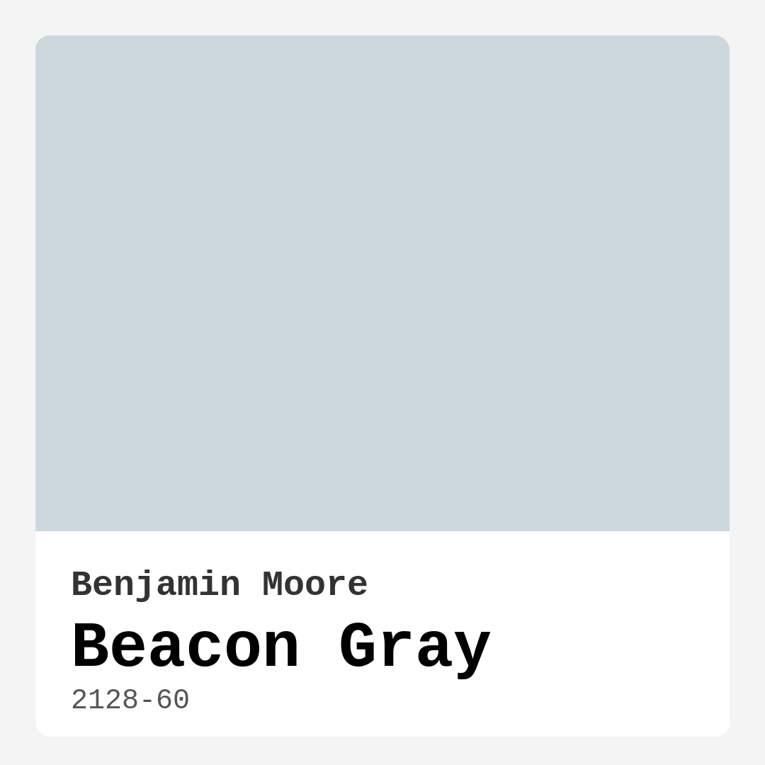
Color Preview & Key Details
| HEX Code | #CDD7DE |
| RGB | 205, 215, 222 |
| LRV | 65.92% |
| Undertone | Blue |
| Finish Options | Eggshell, Matte, Satin |
You walk into your living room, coffee in hand, and pause. Something feels off. The walls are fine—neutral, inoffensive—but they don’t inspire you. They don’t make you want to linger. You’re craving a change, something that transforms the space from just functional to truly inviting. That’s where Beacon Gray by Benjamin Moore comes in. This isn’t just another gray. It’s a soft, serene hue with a whisper of blue that brings calm sophistication to any room. Let’s talk about why this might be the perfect color for your next project.
Beacon Gray (2128-60) is one of those rare colors that feels both timeless and fresh. With an LRV of 65.92%, it sits comfortably in the light color category, meaning it reflects plenty of light to keep your space feeling open and airy. That makes it ideal for smaller rooms or areas with limited natural light. But don’t mistake “light” for “bland.” The blue undertone gives it depth, so it never feels flat or sterile. Instead, it creates a tranquil backdrop that works beautifully in living rooms, bedrooms, and even home offices where you want a sense of calm focus.
One of the best things about Beacon Gray is its versatility. Whether your style leans modern, transitional, or coastal, this color adapts effortlessly. Pair it with crisp white trim—Benjamin Moore’s White Dove is a classic choice—for a clean, polished look. Or let it play off natural wood tones for warmth and contrast. In a minimalist space, it’s the perfect neutral anchor. In a room with bolder decor, it steps back just enough to let other elements shine. And because it’s a true chameleon, it looks just as stunning on an accent wall as it does covering an entire room.
Now, let’s talk application. If you’re new to painting, Beacon Gray is a dream to work with. It offers excellent coverage, often needing just one or two coats, and it’s touch-up friendly, so minor scuffs or marks won’t send you into a panic. The finish you choose can tweak the mood, too. Matte gives it a soft, velvety look—great for bedrooms where you want a cozy vibe. Eggshell adds a subtle sheen that’s easy to clean, making it a smart pick for living areas or hallways. Satin kicks up the reflectivity a notch, which can help brighten darker spaces. No matter which you pick, the low VOC formula means you won’t be overwhelmed by fumes, so you can enjoy your newly painted room sooner.
Lighting plays a big role in how Beacon Gray shows up. In a sun-filled room, those blue undertones come alive, giving the walls a fresh, almost breezy feel. In lower light, it mellows into a more neutral gray, still soft and inviting but with a quieter presence. That’s why it’s so important to test it in your space before committing. Paint a large swatch on a few walls and observe it at different times of day. Notice how it interacts with your furniture, flooring, and even the color of your curtains. You might be surprised how much it shifts—sometimes leaning more blue, other times almost silvery.
As for pairings, Beacon Gray is surprisingly flexible. If you want to lean into its cool side, try it with crisp whites, deep navy, or charcoal accents. For a warmer contrast, add touches of blush pink, taupe, or even a muted terracotta. And if you’re feeling bold? A pop of red—its complementary hue—can create a striking focal point without overwhelming the room. Just remember: because of those blue undertones, pairing it with other cool colors can amplify the chilliness. If that’s not the vibe you’re going for, balance it out with warm metals like brass or wood tones in honey or walnut finishes.
Worried about small spaces? Don’t be. Beacon Gray’s light-reflecting qualities make it a fantastic choice for tight areas. It opens up the room visually, so your hallway or petite home office won’t feel boxed in. Just keep the rest of the palette light and airy to maximize the effect. And if you’re working with an open-concept layout, this color is a seamless way to create flow between spaces without everything blending into one monotonous haze.
Maintenance is a breeze, too. The washability factor means you can wipe away fingerprints or smudges without worrying about damaging the finish. And because it’s fade-resistant, it holds up well in rooms that get a lot of sunlight. Over time, if you do need to touch up a spot here or there, the color blends beautifully, so you won’t end up with obvious patches.
So, is Beacon Gray right for you? If you’re after a color that’s soothing but not sleepy, modern but not trendy, and versatile enough to grow with your style, then yes. It’s the kind of hue that makes a room feel intentional—like you put thought into every detail. Whether you’re refreshing a single wall or reimagining your entire home, this is a color that delivers. Grab a sample, see how it plays in your space, and get ready to fall in love with your walls all over again.
Real Room Photo of Beacon Gray 2128-60
Undertones of Beacon Gray ?
The undertones of Beacon Gray are a key aspect of its character, leaning towards Blue. These subtle underlying hues are what give the color its depth and complexity. For example, a gray with a blue undertone will feel cooler and more modern, while one with a brown undertone will feel warmer and more traditional. It’s essential to test this paint in your home and observe it next to your existing furniture, flooring, and decor to see how these undertones interact and reveal themselves throughout the day.
HEX value: #CDD7DE
RGB code: 205, 215, 222
Is Beacon Gray Cool or Warm?
Beacon Gray is generally perceived as a cool color due to its blue undertones, making it ideal for spaces that benefit from a refreshing ambiance. However, its neutrality allows it to adapt and harmonize with warmer elements in your decor.
Understanding Color Properties and Interior Design Tips
Hue refers to a specific position on the color wheel, measured in degrees from 0 to 360. Each degree represents a different pure color:
- 0° represents red
- 120° represents green
- 240° represents blue
Saturation describes the intensity or purity of a color and is expressed as a percentage:
- At 0%, the color appears completely desaturated—essentially a shade of gray
- At 100%, the color is at its most vivid and vibrant
Lightness indicates how light or dark a color is, also expressed as a percentage:
- 0% lightness results in black
- 100% lightness results in white
Using Warm Colors in Interior Design
Warm hues—such as reds, oranges, yellows, warm beiges, and greiges—are excellent choices for creating inviting and energetic spaces. These colors are particularly well-suited for:
- Kitchens, living rooms, and bathrooms, where warmth enhances comfort and sociability
- Large rooms, where warm tones can help reduce the sense of emptiness and make the space feel more intimate
For example:
- Warm beige shades provide a cozy, inviting atmosphere, ideal for living rooms, bedrooms, and hallways.
- Warm greige (a mix of beige and gray) offers the warmth of beige with the modern appeal of gray, making it a versatile backdrop for dining areas, bedrooms, and living spaces.
However, be mindful when using warm light tones in rooms with limited natural light. These shades may appear muted or even take on an unpleasant yellowish tint. To avoid a dull or flat appearance:
- Add depth by incorporating richer tones like deep greens, charcoal, or chocolate brown
- Use textured elements such as curtains, rugs, or cushions to bring dimension to the space
Pro Tip: Achieving Harmony with Warm and Cool Color Balance
To create a well-balanced and visually interesting interior, mix warm and cool tones strategically. This contrast adds depth and harmony to your design.
- If your walls feature warm hues, introduce cool-colored accents such as blue or green furniture, artwork, or accessories to create contrast.
- For a polished look, consider using a complementary color scheme, which pairs colors opposite each other on the color wheel (e.g., red with green, orange with blue).
This thoughtful mix not only enhances visual appeal but also creates a space that feels both dynamic and cohesive.
Light Temperature Affects on Beacon Gray
Natural Light
Natural daylight changes in color temperature as the sun moves across the sky. At sunrise and sunset, the light tends to have a warm, golden tone with a color temperature around 2000 Kelvin (K). As the day progresses and the sun rises higher, the light becomes cooler and more neutral. Around midday, especially when the sky is clear, natural light typically reaches its peak brightness and shifts to a cooler tone, ranging from 5500 to 6500 Kelvin. This midday light is close to what we perceive as pure white or daylight-balanced light.
These shifts in natural light can significantly influence how colors appear in a space, which is why designers often consider both the time of day and the orientation of windows when planning interior color schemes.
Artificial Light
When choosing artificial lighting, pay close attention to the color temperature, measured in Kelvin (K). This determines how warm or cool the light will appear. Lower temperatures, around 2700K, give off a warm, yellow glow often used in living rooms or bedrooms. Higher temperatures, above 5000K, create a cool, bluish light similar to daylight, commonly used in kitchens, offices, or task areas.
Use the slider to see how lighting temperature can affect the appearance of a surface or color throughout a space.


4800K
LRV of Beacon Gray
The Light Reflectance Value (LRV) of Beacon Gray is 65.92%, which places it in the Light colors category. This means it reflect most of the incident light. Understanding a paint’s LRV is crucial for predicting how it will look in your space. A higher LRV indicates a lighter color that reflects more light, making rooms feel larger and brighter. A lower LRV signifies a darker color that absorbs more light, creating a cozier, more intimate atmosphere. Always consider the natural and artificial lighting in your room when selecting a paint color based on its LRV.
Detailed Review of Beacon Gray
Additional Paint Characteristics
Ideal Rooms
Bedroom, Hallway, Home Office, Kitchen, Living Room
Decor Styles
Coastal, Minimalist, Modern, Transitional
Coverage
Good (1–2 Coats), Touch-Up Friendly
Ease of Application
Beginner Friendly, Brush Smooth, Roller-Ready
Washability
Washable, Wipeable
VOC Level
Low VOC, Ultra Low VOC
Best Use
Accent Wall, Interior Walls, Small Spaces, Trim
Room Suitability
Bedroom, Dining Room, Home Office, Living Room
Tone Tag
Balanced, Cool, Neutral
Finish Type
Eggshell, Matte, Satin
Paint Performance
Easy Touch-Up, Fade Resistant, High Coverage, Low Odor
Use Cases
Best for Low Light Rooms, Best for Modern Farmhouse, Best for Open Concept
Mood
Calm, Inviting, Restful
Trim Pairing
Complements Cool Trim, Good with Wood Trim, Pairs with White Dove
Beacon Gray is a fantastic choice for anyone looking to create a serene and inviting environment. This color is beautifully balanced, offering a soothing vibe that’s perfect for relaxation. The blue undertones shine through in natural light, giving your rooms a refreshing feel. When applied, it provides excellent coverage, typically requiring just one or two coats, which makes it efficient for quick projects. Additionally, its touch-up friendliness means that maintaining your space over time is hassle-free. Whether you’re updating a single room or considering a whole home makeover, Beacon Gray stands out as a timeless option that adapts to your style effortlessly.
Pros & Cons of 2128-60 Beacon Gray
Pros
Cons
Colors that go with Benjamin Moore Beacon Gray
FAQ on 2128-60 Beacon Gray
Can Beacon Gray work in small spaces?
Absolutely! Beacon Gray’s soft tone can make small spaces feel more open and airy. Its light reflectance helps bounce light around the room, creating an inviting atmosphere without feeling cramped. Just be mindful of the undertones when pairing with other colors to ensure a cohesive look.
What finishes work best with Beacon Gray?
Beacon Gray shines in various finishes, especially in matte or eggshell for a soft, sophisticated look. Satin can also be a great choice if you’re looking for a bit of sheen, particularly in high-traffic areas. Each finish will emphasize its beautiful undertones differently, so choose based on the ambiance you want to create.
Comparisons Beacon Gray with other colors
Beacon Gray 2128-60 vs Moonmist SW 9144
| Attribute | Beacon Gray 2128-60 | Moonmist SW 9144 |
|---|---|---|
| Color Name | Beacon Gray 2128-60 | Moonmist SW 9144 |
| Color | ||
| Hue | Blue | Blue |
| Brightness | Light | Light |
| RGB | 205, 215, 222 | 201, 217, 224 |
| LRV | 65.92% | 65% |
| Finish Type | Eggshell, Matte, Satin | Eggshell, Satin |
| Finish Options | Eggshell, Matte, Satin | Eggshell, Flat, Matte, Satin |
| Ideal Rooms | Bedroom, Hallway, Home Office, Kitchen, Living Room | Bathroom, Bedroom, Home Office, Living Room, Nursery |
| Decor Styles | Coastal, Minimalist, Modern, Transitional | Coastal, Minimalist, Modern, Scandinavian |
| Coverage | Good (1–2 Coats), Touch-Up Friendly | Good (1–2 Coats) |
| Ease of Application | Beginner Friendly, Brush Smooth, Roller-Ready | Beginner Friendly, Brush Smooth, Fast-Drying, Roller-Ready |
| Washability | Washable, Wipeable | Washable, Wipeable |
| Room Suitability | Bedroom, Dining Room, Home Office, Living Room | Bathroom, Bedroom, Home Office, Living Room |
| Tone | Balanced, Cool, Neutral | Airy, Cool, Muted |
| Paint Performance | Easy Touch-Up, Fade Resistant, High Coverage, Low Odor | High Coverage, Low Odor, Quick Drying |
Beacon Gray 2128-60 vs North Star SW 6246
| Attribute | Beacon Gray 2128-60 | North Star SW 6246 |
|---|---|---|
| Color Name | Beacon Gray 2128-60 | North Star SW 6246 |
| Color | ||
| Hue | Blue | Blue |
| Brightness | Light | Light |
| RGB | 205, 215, 222 | 202, 208, 210 |
| LRV | 65.92% | 75% |
| Finish Type | Eggshell, Matte, Satin | Eggshell, Satin |
| Finish Options | Eggshell, Matte, Satin | Eggshell, Satin, Semi-Gloss |
| Ideal Rooms | Bedroom, Hallway, Home Office, Kitchen, Living Room | Bedroom, Hallway, Home Office, Living Room, Nursery |
| Decor Styles | Coastal, Minimalist, Modern, Transitional | Coastal, Minimalist, Modern, Scandinavian |
| Coverage | Good (1–2 Coats), Touch-Up Friendly | Good (1–2 Coats) |
| Ease of Application | Beginner Friendly, Brush Smooth, Roller-Ready | Beginner Friendly, Brush Smooth, Roller-Ready |
| Washability | Washable, Wipeable | Highly Washable, Washable |
| Room Suitability | Bedroom, Dining Room, Home Office, Living Room | Bedroom, Home Office, Living Room, Nursery |
| Tone | Balanced, Cool, Neutral | Airy, Balanced, Cool, Muted |
| Paint Performance | Easy Touch-Up, Fade Resistant, High Coverage, Low Odor | Easy Touch-Up, Fade Resistant, Low Odor, Quick Drying |
Beacon Gray 2128-60 vs Lullaby SW 9136
| Attribute | Beacon Gray 2128-60 | Lullaby SW 9136 |
|---|---|---|
| Color Name | Beacon Gray 2128-60 | Lullaby SW 9136 |
| Color | ||
| Hue | Blue | Blue |
| Brightness | Light | Light |
| RGB | 205, 215, 222 | 203, 212, 212 |
| LRV | 65.92% | 66% |
| Finish Type | Eggshell, Matte, Satin | Eggshell, Satin |
| Finish Options | Eggshell, Matte, Satin | Eggshell, Flat, Matte, Satin |
| Ideal Rooms | Bedroom, Hallway, Home Office, Kitchen, Living Room | Bedroom, Home Office, Living Room, Nursery |
| Decor Styles | Coastal, Minimalist, Modern, Transitional | Bohemian, Coastal, Modern, Scandinavian |
| Coverage | Good (1–2 Coats), Touch-Up Friendly | Good (1–2 Coats), Touch-Up Friendly |
| Ease of Application | Beginner Friendly, Brush Smooth, Roller-Ready | Beginner Friendly, Brush Smooth, Roller-Ready |
| Washability | Washable, Wipeable | Spot Clean Only, Washable |
| Room Suitability | Bedroom, Dining Room, Home Office, Living Room | Bedroom, Home Office, Living Room, Nursery |
| Tone | Balanced, Cool, Neutral | Airy, Cool, Muted |
| Paint Performance | Easy Touch-Up, Fade Resistant, High Coverage, Low Odor | Easy Touch-Up, High Coverage, Low Odor |
Beacon Gray 2128-60 vs Hinting Blue SW 6519
| Attribute | Beacon Gray 2128-60 | Hinting Blue SW 6519 |
|---|---|---|
| Color Name | Beacon Gray 2128-60 | Hinting Blue SW 6519 |
| Color | ||
| Hue | Blue | Blue |
| Brightness | Light | Light |
| RGB | 205, 215, 222 | 206, 217, 221 |
| LRV | 65.92% | 48% |
| Finish Type | Eggshell, Matte, Satin | Eggshell, Matte, Satin |
| Finish Options | Eggshell, Matte, Satin | Eggshell, Matte, Satin |
| Ideal Rooms | Bedroom, Hallway, Home Office, Kitchen, Living Room | Bedroom, Home Office, Kids Room, Living Room, Nursery |
| Decor Styles | Coastal, Minimalist, Modern, Transitional | Coastal, Farmhouse, Minimalist, Modern, Scandinavian |
| Coverage | Good (1–2 Coats), Touch-Up Friendly | Good (1–2 Coats), Touch-Up Friendly |
| Ease of Application | Beginner Friendly, Brush Smooth, Roller-Ready | Beginner Friendly, Brush Smooth, Fast-Drying, Roller-Ready |
| Washability | Washable, Wipeable | Washable, Wipeable |
| Room Suitability | Bedroom, Dining Room, Home Office, Living Room | Bedroom, Home Office, Kids Room, Living Room, Nursery |
| Tone | Balanced, Cool, Neutral | Airy, Balanced, Cool, Muted |
| Paint Performance | Easy Touch-Up, Fade Resistant, High Coverage, Low Odor | Easy Touch-Up, Low Odor, Quick Drying |
Beacon Gray 2128-60 vs Lauren's Surprise SW 6791
| Attribute | Beacon Gray 2128-60 | Lauren's Surprise SW 6791 |
|---|---|---|
| Color Name | Beacon Gray 2128-60 | Lauren's Surprise SW 6791 |
| Color | ||
| Hue | Blue | Blue |
| Brightness | Light | Light |
| RGB | 205, 215, 222 | 213, 229, 231 |
| LRV | 65.92% | 66% |
| Finish Type | Eggshell, Matte, Satin | Eggshell, Satin |
| Finish Options | Eggshell, Matte, Satin | Eggshell, Satin, Semi-Gloss |
| Ideal Rooms | Bedroom, Hallway, Home Office, Kitchen, Living Room | Bedroom, Home Office, Living Room, Nursery |
| Decor Styles | Coastal, Minimalist, Modern, Transitional | Coastal, Farmhouse, Modern, Scandinavian |
| Coverage | Good (1–2 Coats), Touch-Up Friendly | Good (1–2 Coats), Touch-Up Friendly |
| Ease of Application | Beginner Friendly, Brush Smooth, Roller-Ready | Beginner Friendly, Brush Smooth, Roller-Ready |
| Washability | Washable, Wipeable | Highly Washable, Washable |
| Room Suitability | Bedroom, Dining Room, Home Office, Living Room | Bedroom, Home Office, Living Room, Nursery |
| Tone | Balanced, Cool, Neutral | Balanced, Cool, Pastel |
| Paint Performance | Easy Touch-Up, Fade Resistant, High Coverage, Low Odor | Easy Touch-Up, High Coverage, Low Odor |
Beacon Gray 2128-60 vs Sky High SW 6504
| Attribute | Beacon Gray 2128-60 | Sky High SW 6504 |
|---|---|---|
| Color Name | Beacon Gray 2128-60 | Sky High SW 6504 |
| Color | ||
| Hue | Blue | Blue |
| Brightness | Light | Light |
| RGB | 205, 215, 222 | 220, 231, 232 |
| LRV | 65.92% | 66% |
| Finish Type | Eggshell, Matte, Satin | Eggshell, Matte, Satin |
| Finish Options | Eggshell, Matte, Satin | Eggshell, Matte, Satin |
| Ideal Rooms | Bedroom, Hallway, Home Office, Kitchen, Living Room | Bathroom, Bedroom, Home Office, Kitchen, Living Room |
| Decor Styles | Coastal, Minimalist, Modern, Transitional | Coastal, Minimalist, Modern, Scandinavian |
| Coverage | Good (1–2 Coats), Touch-Up Friendly | Good (1–2 Coats), Touch-Up Friendly |
| Ease of Application | Beginner Friendly, Brush Smooth, Roller-Ready | Beginner Friendly, Brush Smooth, Fast-Drying, Roller-Ready |
| Washability | Washable, Wipeable | Washable, Wipeable |
| Room Suitability | Bedroom, Dining Room, Home Office, Living Room | Bathroom, Bedroom, Home Office, Kitchen, Living Room |
| Tone | Balanced, Cool, Neutral | Airy, Cool, Muted |
| Paint Performance | Easy Touch-Up, Fade Resistant, High Coverage, Low Odor | High Coverage, Low Odor, Quick Drying |
Beacon Gray 2128-60 vs Tradewind SW 6218
| Attribute | Beacon Gray 2128-60 | Tradewind SW 6218 |
|---|---|---|
| Color Name | Beacon Gray 2128-60 | Tradewind SW 6218 |
| Color | ||
| Hue | Blue | Blue |
| Brightness | Light | Light |
| RGB | 205, 215, 222 | 194, 207, 207 |
| LRV | 65.92% | 66% |
| Finish Type | Eggshell, Matte, Satin | Eggshell, Satin |
| Finish Options | Eggshell, Matte, Satin | Eggshell, Matte, Satin |
| Ideal Rooms | Bedroom, Hallway, Home Office, Kitchen, Living Room | Bedroom, Dining Room, Home Office, Living Room, Nursery |
| Decor Styles | Coastal, Minimalist, Modern, Transitional | Coastal, Minimalist, Modern, Scandinavian |
| Coverage | Good (1–2 Coats), Touch-Up Friendly | Good (1–2 Coats), Touch-Up Friendly |
| Ease of Application | Beginner Friendly, Brush Smooth, Roller-Ready | Beginner Friendly, Brush Smooth, Fast-Drying, Roller-Ready |
| Washability | Washable, Wipeable | Washable, Wipeable |
| Room Suitability | Bedroom, Dining Room, Home Office, Living Room | Bedroom, Home Office, Living Room, Nursery |
| Tone | Balanced, Cool, Neutral | Airy, Cool, Muted, Soft |
| Paint Performance | Easy Touch-Up, Fade Resistant, High Coverage, Low Odor | Easy Touch-Up, Low Odor, Quick Drying |
Beacon Gray 2128-60 vs Glimmer SW 6476
| Attribute | Beacon Gray 2128-60 | Glimmer SW 6476 |
|---|---|---|
| Color Name | Beacon Gray 2128-60 | Glimmer SW 6476 |
| Color | ||
| Hue | Blue | Blue |
| Brightness | Light | Light |
| RGB | 205, 215, 222 | 224, 231, 226 |
| LRV | 65.92% | 69% |
| Finish Type | Eggshell, Matte, Satin | Eggshell, Matte, Satin |
| Finish Options | Eggshell, Matte, Satin | Eggshell, Matte, Satin |
| Ideal Rooms | Bedroom, Hallway, Home Office, Kitchen, Living Room | Bathroom, Bedroom, Home Office, Kitchen, Living Room, Nursery |
| Decor Styles | Coastal, Minimalist, Modern, Transitional | Coastal, Farmhouse, Minimalist, Modern, Scandinavian |
| Coverage | Good (1–2 Coats), Touch-Up Friendly | Good (1–2 Coats), Touch-Up Friendly |
| Ease of Application | Beginner Friendly, Brush Smooth, Roller-Ready | Beginner Friendly, Brush Smooth, Fast-Drying, Roller-Ready |
| Washability | Washable, Wipeable | Washable, Wipeable |
| Room Suitability | Bedroom, Dining Room, Home Office, Living Room | Bathroom, Bedroom, Home Office, Living Room, Nursery |
| Tone | Balanced, Cool, Neutral | Airy, Balanced, Cool |
| Paint Performance | Easy Touch-Up, Fade Resistant, High Coverage, Low Odor | Easy Touch-Up, Fade Resistant, Low Odor, Quick Drying |
Beacon Gray 2128-60 vs Misty SW 6232
| Attribute | Beacon Gray 2128-60 | Misty SW 6232 |
|---|---|---|
| Color Name | Beacon Gray 2128-60 | Misty SW 6232 |
| Color | ||
| Hue | Blue | Blue |
| Brightness | Light | Light |
| RGB | 205, 215, 222 | 205, 210, 210 |
| LRV | 65.92% | 64% |
| Finish Type | Eggshell, Matte, Satin | Eggshell, Matte |
| Finish Options | Eggshell, Matte, Satin | Eggshell, Matte, Satin |
| Ideal Rooms | Bedroom, Hallway, Home Office, Kitchen, Living Room | Bedroom, Home Office, Kitchen, Living Room, Nursery |
| Decor Styles | Coastal, Minimalist, Modern, Transitional | Minimalist, Modern, Scandinavian, Transitional |
| Coverage | Good (1–2 Coats), Touch-Up Friendly | Good (1–2 Coats), Touch-Up Friendly |
| Ease of Application | Beginner Friendly, Brush Smooth, Roller-Ready | Beginner Friendly, Fast-Drying, Low Splatter |
| Washability | Washable, Wipeable | Washable, Wipeable |
| Room Suitability | Bedroom, Dining Room, Home Office, Living Room | Bedroom, Home Office, Kitchen, Living Room, Nursery |
| Tone | Balanced, Cool, Neutral | Airy, Balanced, Cool |
| Paint Performance | Easy Touch-Up, Fade Resistant, High Coverage, Low Odor | High Coverage, Low Odor, Quick Drying |
Beacon Gray 2128-60 vs Mild Blue SW 6533
| Attribute | Beacon Gray 2128-60 | Mild Blue SW 6533 |
|---|---|---|
| Color Name | Beacon Gray 2128-60 | Mild Blue SW 6533 |
| Color | ||
| Hue | Blue | Blue |
| Brightness | Light | Light |
| RGB | 205, 215, 222 | 203, 213, 219 |
| LRV | 65.92% | 48% |
| Finish Type | Eggshell, Matte, Satin | Eggshell, Matte, Satin |
| Finish Options | Eggshell, Matte, Satin | Eggshell, Matte, Satin |
| Ideal Rooms | Bedroom, Hallway, Home Office, Kitchen, Living Room | Bedroom, Dining Room, Home Office, Living Room, Nursery |
| Decor Styles | Coastal, Minimalist, Modern, Transitional | Coastal, Minimalist, Modern, Scandinavian |
| Coverage | Good (1–2 Coats), Touch-Up Friendly | Good (1–2 Coats), Touch-Up Friendly |
| Ease of Application | Beginner Friendly, Brush Smooth, Roller-Ready | Beginner Friendly, Brush Smooth, Fast-Drying, Roller-Ready |
| Washability | Washable, Wipeable | Washable, Wipeable |
| Room Suitability | Bedroom, Dining Room, Home Office, Living Room | Bedroom, Home Office, Living Room, Nursery |
| Tone | Balanced, Cool, Neutral | Airy, Cool, Muted |
| Paint Performance | Easy Touch-Up, Fade Resistant, High Coverage, Low Odor | Easy Touch-Up, Low Odor, Quick Drying |
Official Page of Benjamin Moore Beacon Gray 2128-60