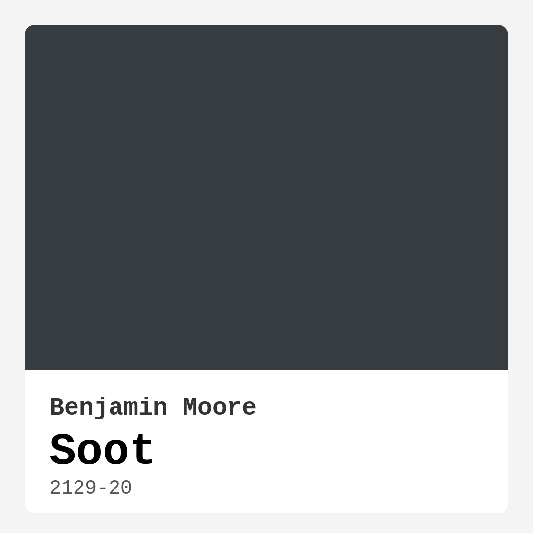
Color Preview & Key Details
| HEX Code | #373C41 |
| RGB | 55, 60, 65 |
| LRV | 6.19% |
| Undertone | Blue |
| Finish Options | Eggshell, Matte, Satin |
If you’re looking for a paint color that brings depth, sophistication, and a touch of drama to your home, Benjamin Moore’s *Soot* (2129-20) might just be your perfect match. This deep, moody hue with its subtle blue undertones is a designer favorite for a reason—it’s versatile, timeless, and effortlessly elevates any space. Whether you’re aiming for a cozy bedroom retreat, a striking accent wall, or a modern kitchen with character, *Soot* delivers. Let’s dive into everything you need to know to decide if this color is right for your next project.
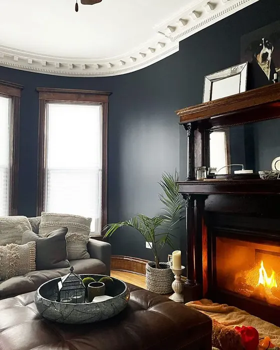
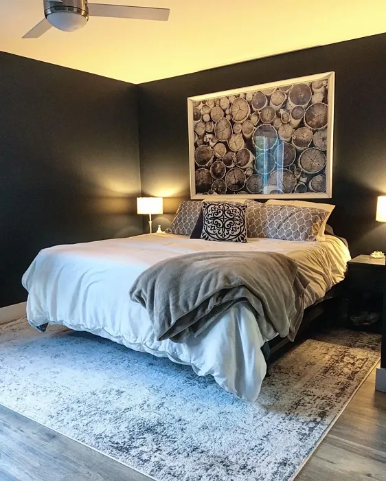
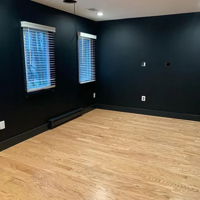
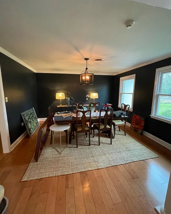
First, let’s talk about the color itself. *Soot* is a rich, dark shade that sits somewhere between charcoal and slate, with a cool blue undertone that keeps it from feeling too heavy. Its LRV (Light Reflectance Value) of 6.19% means it absorbs light rather than reflecting it, creating an intimate, enveloping atmosphere. That makes it ideal for rooms where you want to cultivate warmth and coziness—think living rooms with plush furniture, bedrooms with soft linens, or dining rooms where you want to set a moody, elegant tone. But don’t let the darkness intimidate you. When used thoughtfully, *Soot* can make even smaller spaces feel intentional and stylish, especially when paired with the right lighting and decor.
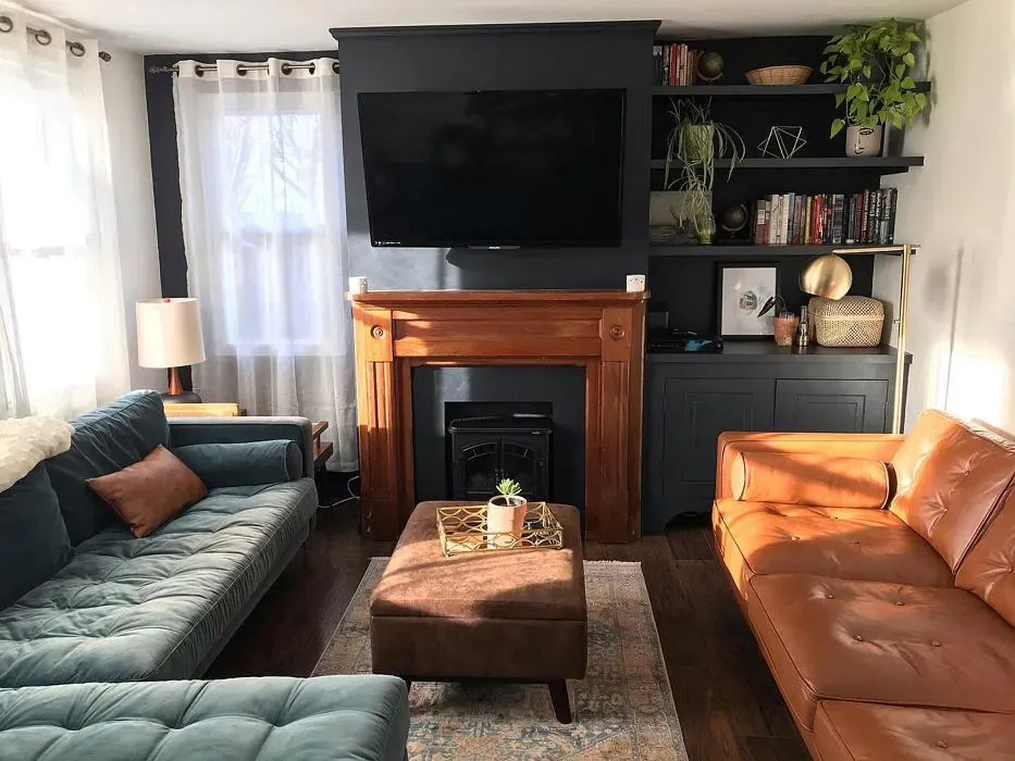
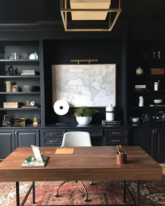
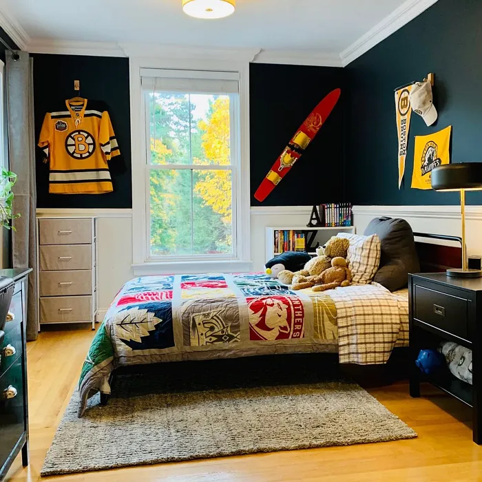
One of the standout qualities of *Soot* is its versatility. It plays well with a range of design styles, from modern and industrial to rustic and minimalist. In a contemporary setting, it adds depth and contrast when paired with clean lines and metallic finishes. For a more rustic vibe, try it alongside natural wood tones and textured fabrics. And if you’re going for a minimalist look, *Soot* provides just enough drama to keep things interesting without overwhelming the space. It’s also a fantastic choice for cabinetry, especially in kitchens or home offices, where it lends a high-end, custom feel.
When it comes to application, *Soot* is beginner-friendly. It offers excellent coverage—often achieving the desired depth in just one or two coats—and it’s touch-up friendly, so minor imperfections won’t stand out. The finish you choose can impact the final look. A matte finish enhances its velvety richness, making it perfect for bedrooms or low-traffic areas. Eggshell adds a subtle sheen, balancing durability with sophistication, while satin works well in spaces like kitchens or hallways where wipeability matters. Just keep in mind that darker colors like *Soot* can show fingerprints or smudges more easily, so a satin or eggshell finish might be the smarter choice for high-traffic zones.
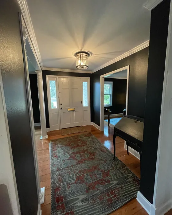
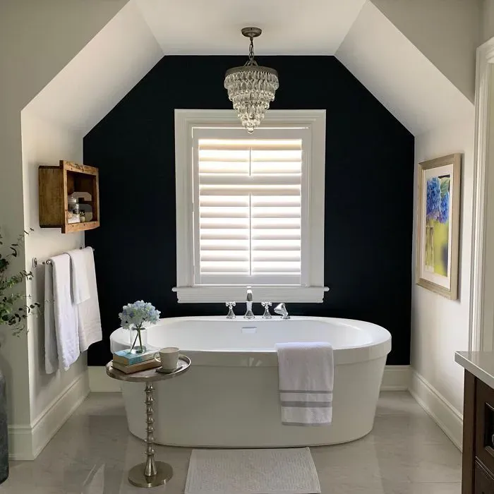
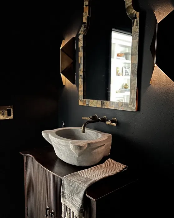
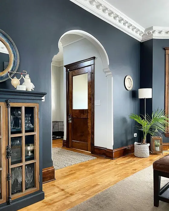
Lighting is key with a color this deep. In rooms with ample natural light, *Soot* will appear softer, almost like a weathered slate, letting its blue undertones shine. In dimmer spaces, it takes on a more mysterious, cocoon-like quality—ideal for creating a cozy nook. If you’re worried about it feeling too dark, balance it with plenty of light sources: layered lamps, sconces, or even a well-placed mirror to bounce light around. And don’t shy away from contrast. Pairing *Soot* with crisp white trim (like Benjamin Moore’s *White Dove*) or warm brass fixtures creates a striking, polished look that keeps the space feeling fresh.
Now, let’s talk pairings. *Soot* is a team player when it comes to other colors. Its blue undertones make it a natural companion for cool shades like soft grays, icy blues, or even muted greens. But it also works beautifully with warm accents—think terracotta, mustard yellow, or rich leather browns—to create a balanced, inviting space. For a monochromatic scheme, layer it with lighter grays or deeper charcoals from the same family. And if you’re feeling bold, try it with a pop of its complementary color, orange, for a dynamic contrast that really makes the room sing.
Is *Soot* right for your home? If you love moody, sophisticated spaces that feel curated and intentional, absolutely. It’s a color that demands a little confidence but rewards you with a look that’s both timeless and on-trend. Test it out with a sample pot first—paint a large swatch and observe it at different times of day to see how the light plays with its undertones. And remember, dark colors like this often look more intimidating on the swatch than they do on the walls. Once it’s up, you’ll likely fall in love with the depth and character it brings to your space.
At the end of the day, *Soot* is more than just a paint color—it’s a design statement. Whether you’re using it to create a focal point, set a mood, or add a layer of sophistication to your home, it’s a choice you won’t regret. So go ahead, embrace the dark side. Your walls will thank you.

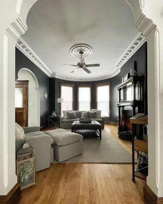
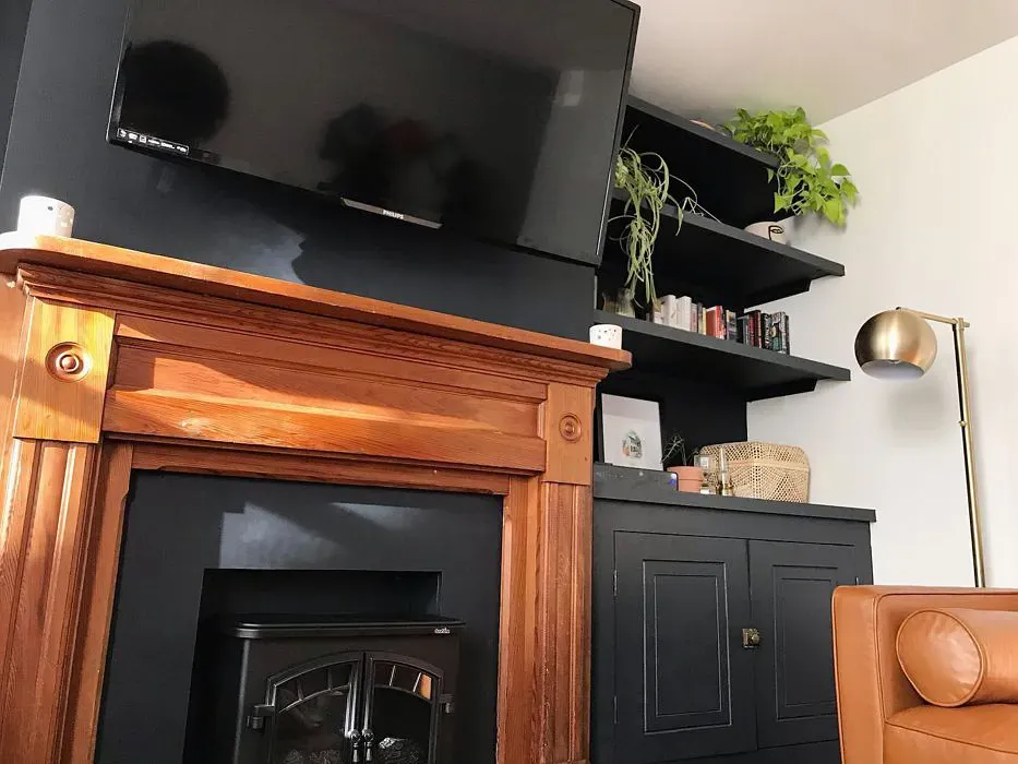
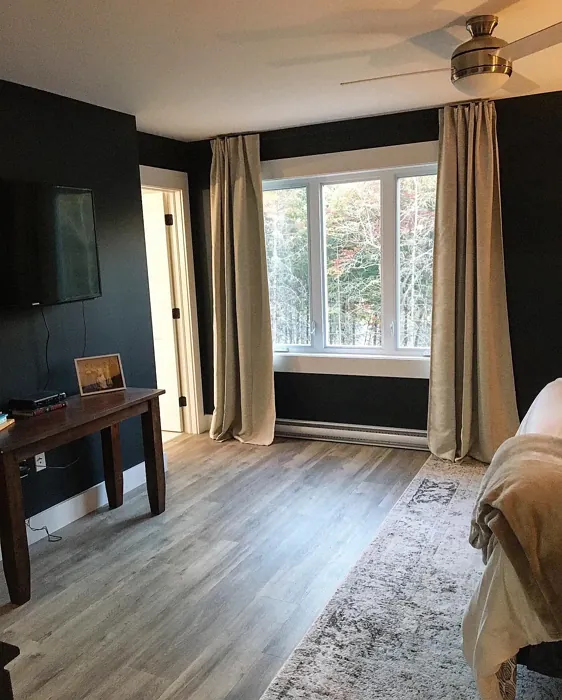
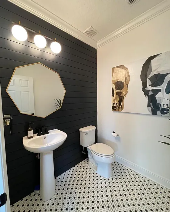
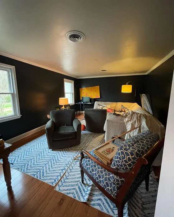
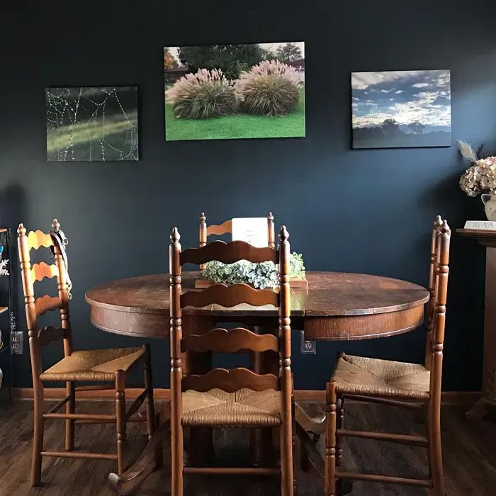
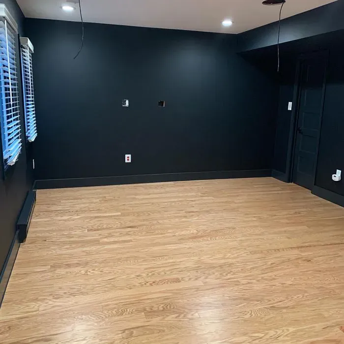
Real Room Photo of Soot 2129-20


Undertones of Soot ?
The undertones of Soot are a key aspect of its character, leaning towards Blue. These subtle underlying hues are what give the color its depth and complexity. For example, a gray with a blue undertone will feel cooler and more modern, while one with a brown undertone will feel warmer and more traditional. It’s essential to test this paint in your home and observe it next to your existing furniture, flooring, and decor to see how these undertones interact and reveal themselves throughout the day.
HEX value: #373C41
RGB code: 55, 60, 65
Is Soot Cool or Warm?
Soot leans towards the cool side of the spectrum, making it an excellent choice for spaces where you want to create a calm and soothing environment. Its cooler undertones work harmoniously with other cool colors, providing a cohesive look.
Understanding Color Properties and Interior Design Tips
Hue refers to a specific position on the color wheel, measured in degrees from 0 to 360. Each degree represents a different pure color:
- 0° represents red
- 120° represents green
- 240° represents blue
Saturation describes the intensity or purity of a color and is expressed as a percentage:
- At 0%, the color appears completely desaturated—essentially a shade of gray
- At 100%, the color is at its most vivid and vibrant
Lightness indicates how light or dark a color is, also expressed as a percentage:
- 0% lightness results in black
- 100% lightness results in white
Using Warm Colors in Interior Design
Warm hues—such as reds, oranges, yellows, warm beiges, and greiges—are excellent choices for creating inviting and energetic spaces. These colors are particularly well-suited for:
- Kitchens, living rooms, and bathrooms, where warmth enhances comfort and sociability
- Large rooms, where warm tones can help reduce the sense of emptiness and make the space feel more intimate
For example:
- Warm beige shades provide a cozy, inviting atmosphere, ideal for living rooms, bedrooms, and hallways.
- Warm greige (a mix of beige and gray) offers the warmth of beige with the modern appeal of gray, making it a versatile backdrop for dining areas, bedrooms, and living spaces.
However, be mindful when using warm light tones in rooms with limited natural light. These shades may appear muted or even take on an unpleasant yellowish tint. To avoid a dull or flat appearance:
- Add depth by incorporating richer tones like deep greens, charcoal, or chocolate brown
- Use textured elements such as curtains, rugs, or cushions to bring dimension to the space
Pro Tip: Achieving Harmony with Warm and Cool Color Balance
To create a well-balanced and visually interesting interior, mix warm and cool tones strategically. This contrast adds depth and harmony to your design.
- If your walls feature warm hues, introduce cool-colored accents such as blue or green furniture, artwork, or accessories to create contrast.
- For a polished look, consider using a complementary color scheme, which pairs colors opposite each other on the color wheel (e.g., red with green, orange with blue).
This thoughtful mix not only enhances visual appeal but also creates a space that feels both dynamic and cohesive.
Light Temperature Affects on Soot
Natural Light
Natural daylight changes in color temperature as the sun moves across the sky. At sunrise and sunset, the light tends to have a warm, golden tone with a color temperature around 2000 Kelvin (K). As the day progresses and the sun rises higher, the light becomes cooler and more neutral. Around midday, especially when the sky is clear, natural light typically reaches its peak brightness and shifts to a cooler tone, ranging from 5500 to 6500 Kelvin. This midday light is close to what we perceive as pure white or daylight-balanced light.
These shifts in natural light can significantly influence how colors appear in a space, which is why designers often consider both the time of day and the orientation of windows when planning interior color schemes.
Artificial Light
When choosing artificial lighting, pay close attention to the color temperature, measured in Kelvin (K). This determines how warm or cool the light will appear. Lower temperatures, around 2700K, give off a warm, yellow glow often used in living rooms or bedrooms. Higher temperatures, above 5000K, create a cool, bluish light similar to daylight, commonly used in kitchens, offices, or task areas.
Use the slider to see how lighting temperature can affect the appearance of a surface or color throughout a space.


4800K
LRV of Soot
The Light Reflectance Value (LRV) of Soot is 6.19%, which places it in the Dark colors category. This means it does not reflect light. Understanding a paint’s LRV is crucial for predicting how it will look in your space. A higher LRV indicates a lighter color that reflects more light, making rooms feel larger and brighter. A lower LRV signifies a darker color that absorbs more light, creating a cozier, more intimate atmosphere. Always consider the natural and artificial lighting in your room when selecting a paint color based on its LRV.
Detailed Review of Soot
Additional Paint Characteristics
Ideal Rooms
Bedroom, Dining Room, Home Office, Kitchen, Living Room
Decor Styles
Contemporary, Industrial, Minimalist, Modern, Rustic
Coverage
Good (1–2 Coats), Touch-Up Friendly
Ease of Application
Beginner Friendly, Brush Smooth, Roller-Ready
Washability
Washable, Wipeable
VOC Level
Low VOC, Ultra Low VOC
Best Use
Accent Wall, Cabinets, Interior Walls, Trim
Room Suitability
Bedroom, Dining Room, Home Office, Kitchen, Living Room
Tone Tag
Balanced, Deep, Moody
Finish Type
Eggshell, Matte
Paint Performance
Easy Touch-Up, High Coverage, Low Odor
Use Cases
Best for Modern Farmhouse, Best for Open Concept, Designer Favorite
Mood
Cozy, Grounding, Sophisticated
Trim Pairing
Complements Brass Fixtures, Matches Pure White, Pairs with White Dove
Soot is a standout choice for those looking to add depth and character to their walls. Its rich, dark tones can transform a room into a sophisticated retreat, making it especially popular in modern and industrial decor styles. When applied, it offers a smooth finish that enhances its luxurious feel. The color works well in both large and small spaces, providing a dramatic backdrop for furniture and artwork. It’s also versatile enough to pair beautifully with a range of trim colors, from crisp whites to warm woods. Just keep in mind that while it offers good coverage, you might want to apply two coats for that perfect depth. Overall, Soot is a bold yet inviting option that can elevate your home’s aesthetic.
Pros & Cons of 2129-20 Soot
Pros
Cons
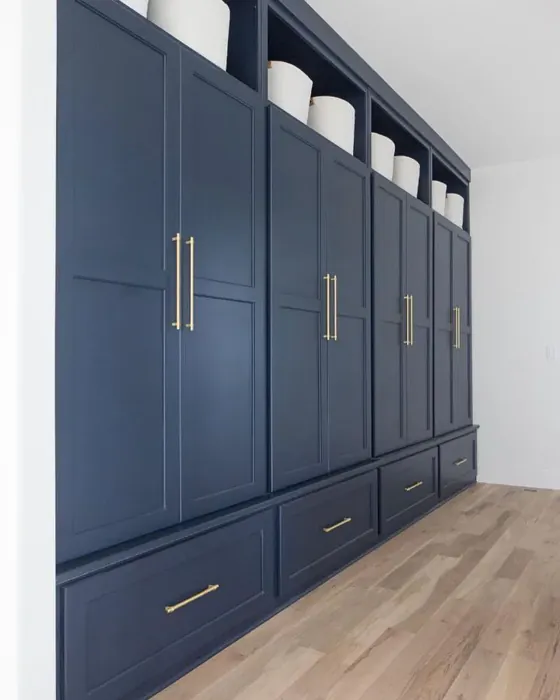
Colors that go with Benjamin Moore Soot
FAQ on 2129-20 Soot
How does Soot compare to other dark colors?
Soot stands out among dark colors due to its unique balance of warmth and coolness. Unlike some other deep shades that can feel heavy, Soot maintains an inviting quality that makes it suitable for various spaces. It’s a versatile option that pairs well with both light and dark accents, creating a sophisticated contrast that many darker shades lack.
What finishes work best with Soot?
For Soot, matte and eggshell finishes are popular choices as they enhance the depth of the color without reflecting too much light. A satin finish can also work well, especially in high-traffic areas, as it provides durability while maintaining a soft sheen. Ultimately, the best finish depends on the specific room and desired aesthetic, but these options will allow Soot to shine in any setting.
Comparisons Soot with other colors
Soot 2129-20 vs Naval SW 6244
| Attribute | Soot 2129-20 | Naval SW 6244 |
|---|---|---|
| Color Name | Soot 2129-20 | Naval SW 6244 |
| Color | ||
| Hue | Blue | Blue |
| Brightness | Dark | Dark |
| RGB | 55, 60, 65 | 47, 61, 76 |
| LRV | 6.19% | 4% |
| Finish Type | Eggshell, Matte | Matte, Satin, Semi-Gloss |
| Finish Options | Eggshell, Matte, Satin | Matte, Satin, Semi-Gloss |
| Ideal Rooms | Bedroom, Dining Room, Home Office, Kitchen, Living Room | Bedroom, Dining Room, Hallway, Home Office, Living Room |
| Decor Styles | Contemporary, Industrial, Minimalist, Modern, Rustic | Coastal, Industrial, Minimalist, Modern, Traditional |
| Coverage | Good (1–2 Coats), Touch-Up Friendly | Good (1–2 Coats), Self-Priming |
| Ease of Application | Beginner Friendly, Brush Smooth, Roller-Ready | Beginner Friendly, Brush Smooth, Roller-Ready |
| Washability | Washable, Wipeable | Highly Washable, Washable |
| Room Suitability | Bedroom, Dining Room, Home Office, Kitchen, Living Room | Bedroom, Dining Room, Entryway, Home Office, Living Room |
| Tone | Balanced, Deep, Moody | Cool, Deep, Moody |
| Paint Performance | Easy Touch-Up, High Coverage, Low Odor | Easy Touch-Up, High Coverage, Low Odor, Scuff Resistant |
Soot 2129-20 vs Sea Serpent SW 7615
| Attribute | Soot 2129-20 | Sea Serpent SW 7615 |
|---|---|---|
| Color Name | Soot 2129-20 | Sea Serpent SW 7615 |
| Color | ||
| Hue | Blue | Blue |
| Brightness | Dark | Dark |
| RGB | 55, 60, 65 | 62, 75, 84 |
| LRV | 6.19% | 12% |
| Finish Type | Eggshell, Matte | Eggshell, Matte, Satin |
| Finish Options | Eggshell, Matte, Satin | Eggshell, Matte, Satin |
| Ideal Rooms | Bedroom, Dining Room, Home Office, Kitchen, Living Room | Bathroom, Bedroom, Home Office, Living Room |
| Decor Styles | Contemporary, Industrial, Minimalist, Modern, Rustic | Coastal, Farmhouse, Industrial, Modern |
| Coverage | Good (1–2 Coats), Touch-Up Friendly | Good (1–2 Coats), Touch-Up Friendly |
| Ease of Application | Beginner Friendly, Brush Smooth, Roller-Ready | Beginner Friendly, Brush Smooth, Roller-Ready |
| Washability | Washable, Wipeable | Highly Washable, Washable |
| Room Suitability | Bedroom, Dining Room, Home Office, Kitchen, Living Room | Bathroom, Bedroom, Home Office, Living Room |
| Tone | Balanced, Deep, Moody | Cool, Deep, Moody |
| Paint Performance | Easy Touch-Up, High Coverage, Low Odor | Easy Touch-Up, High Coverage, Low Odor |
Soot 2129-20 vs Rain Cloud SW 9639
| Attribute | Soot 2129-20 | Rain Cloud SW 9639 |
|---|---|---|
| Color Name | Soot 2129-20 | Rain Cloud SW 9639 |
| Color | ||
| Hue | Blue | Blue |
| Brightness | Dark | Dark |
| RGB | 55, 60, 65 | 83, 97, 104 |
| LRV | 6.19% | 30% |
| Finish Type | Eggshell, Matte | Eggshell, Matte, Satin |
| Finish Options | Eggshell, Matte, Satin | Eggshell, Matte, Satin |
| Ideal Rooms | Bedroom, Dining Room, Home Office, Kitchen, Living Room | Bedroom, Dining Room, Home Office, Living Room |
| Decor Styles | Contemporary, Industrial, Minimalist, Modern, Rustic | Coastal, Contemporary, Minimalist, Scandinavian |
| Coverage | Good (1–2 Coats), Touch-Up Friendly | Good (1–2 Coats), Touch-Up Friendly |
| Ease of Application | Beginner Friendly, Brush Smooth, Roller-Ready | Beginner Friendly, Brush Smooth, Roller-Ready |
| Washability | Washable, Wipeable | Highly Washable, Washable |
| Room Suitability | Bedroom, Dining Room, Home Office, Kitchen, Living Room | Bedroom, Home Office, Living Room |
| Tone | Balanced, Deep, Moody | Balanced, Cool, Muted |
| Paint Performance | Easy Touch-Up, High Coverage, Low Odor | Easy Touch-Up, Fade Resistant, Low Odor |
Soot 2129-20 vs Indigo Batik SW 7602
| Attribute | Soot 2129-20 | Indigo Batik SW 7602 |
|---|---|---|
| Color Name | Soot 2129-20 | Indigo Batik SW 7602 |
| Color | ||
| Hue | Blue | Blue |
| Brightness | Dark | Dark |
| RGB | 55, 60, 65 | 62, 80, 99 |
| LRV | 6.19% | 10% |
| Finish Type | Eggshell, Matte | Matte, Satin |
| Finish Options | Eggshell, Matte, Satin | Eggshell, Flat, Matte, Satin |
| Ideal Rooms | Bedroom, Dining Room, Home Office, Kitchen, Living Room | Bedroom, Dining Room, Home Office, Living Room |
| Decor Styles | Contemporary, Industrial, Minimalist, Modern, Rustic | Bohemian, Coastal, Contemporary, Modern |
| Coverage | Good (1–2 Coats), Touch-Up Friendly | Good (1–2 Coats), Touch-Up Friendly |
| Ease of Application | Beginner Friendly, Brush Smooth, Roller-Ready | Brush Smooth, Fast-Drying, Roller-Ready |
| Washability | Washable, Wipeable | Scrubbable, Washable, Wipeable |
| Room Suitability | Bedroom, Dining Room, Home Office, Kitchen, Living Room | Bedroom, Dining Room, Home Office, Living Room |
| Tone | Balanced, Deep, Moody | Cool, Deep, Moody |
| Paint Performance | Easy Touch-Up, High Coverage, Low Odor | Easy Touch-Up, High Coverage, Low Odor, Quick Drying |
Soot 2129-20 vs Sea Mariner SW 9640
| Attribute | Soot 2129-20 | Sea Mariner SW 9640 |
|---|---|---|
| Color Name | Soot 2129-20 | Sea Mariner SW 9640 |
| Color | ||
| Hue | Blue | Blue |
| Brightness | Dark | Dark |
| RGB | 55, 60, 65 | 67, 74, 84 |
| LRV | 6.19% | 6% |
| Finish Type | Eggshell, Matte | Eggshell, Matte, Satin |
| Finish Options | Eggshell, Matte, Satin | Eggshell, Matte, Satin |
| Ideal Rooms | Bedroom, Dining Room, Home Office, Kitchen, Living Room | Bedroom, Dining Room, Hallway, Home Office, Living Room |
| Decor Styles | Contemporary, Industrial, Minimalist, Modern, Rustic | Coastal, Industrial, Minimalist, Modern |
| Coverage | Good (1–2 Coats), Touch-Up Friendly | Good (1–2 Coats) |
| Ease of Application | Beginner Friendly, Brush Smooth, Roller-Ready | Beginner Friendly, Brush Smooth, Roller-Ready |
| Washability | Washable, Wipeable | Scrubbable, Washable |
| Room Suitability | Bedroom, Dining Room, Home Office, Kitchen, Living Room | Bedroom, Dining Room, Home Office, Living Room |
| Tone | Balanced, Deep, Moody | Cool, Deep, Moody |
| Paint Performance | Easy Touch-Up, High Coverage, Low Odor | Easy Touch-Up, Low Odor, Quick Drying |
Soot 2129-20 vs Still Water SW 6223
| Attribute | Soot 2129-20 | Still Water SW 6223 |
|---|---|---|
| Color Name | Soot 2129-20 | Still Water SW 6223 |
| Color | ||
| Hue | Blue | Blue |
| Brightness | Dark | Dark |
| RGB | 55, 60, 65 | 74, 93, 95 |
| LRV | 6.19% | 48% |
| Finish Type | Eggshell, Matte | Eggshell, Matte, Satin |
| Finish Options | Eggshell, Matte, Satin | Eggshell, Matte, Satin |
| Ideal Rooms | Bedroom, Dining Room, Home Office, Kitchen, Living Room | Bedroom, Dining Room, Home Office, Living Room, Nursery |
| Decor Styles | Contemporary, Industrial, Minimalist, Modern, Rustic | Coastal, Contemporary, Farmhouse, Modern, Rustic |
| Coverage | Good (1–2 Coats), Touch-Up Friendly | Good (1–2 Coats), Touch-Up Friendly |
| Ease of Application | Beginner Friendly, Brush Smooth, Roller-Ready | Beginner Friendly, Brush Smooth, Roller-Ready |
| Washability | Washable, Wipeable | Highly Washable, Washable |
| Room Suitability | Bedroom, Dining Room, Home Office, Kitchen, Living Room | Bedroom, Dining Room, Home Office, Living Room |
| Tone | Balanced, Deep, Moody | Cool, Earthy, Muted |
| Paint Performance | Easy Touch-Up, High Coverage, Low Odor | Easy Touch-Up, Fade Resistant, Low Odor |
Soot 2129-20 vs Waterloo SW 9141
| Attribute | Soot 2129-20 | Waterloo SW 9141 |
|---|---|---|
| Color Name | Soot 2129-20 | Waterloo SW 9141 |
| Color | ||
| Hue | Blue | Blue |
| Brightness | Dark | Dark |
| RGB | 55, 60, 65 | 83, 104, 114 |
| LRV | 6.19% | 12% |
| Finish Type | Eggshell, Matte | Matte, Satin |
| Finish Options | Eggshell, Matte, Satin | Matte, Satin, Semi-Gloss |
| Ideal Rooms | Bedroom, Dining Room, Home Office, Kitchen, Living Room | Bedroom, Dining Room, Hallway, Home Office, Living Room |
| Decor Styles | Contemporary, Industrial, Minimalist, Modern, Rustic | Coastal, Industrial, Modern, Rustic |
| Coverage | Good (1–2 Coats), Touch-Up Friendly | Good (1–2 Coats), Touch-Up Friendly |
| Ease of Application | Beginner Friendly, Brush Smooth, Roller-Ready | Brush Smooth, Fast-Drying, Roller-Ready |
| Washability | Washable, Wipeable | Scrubbable, Washable |
| Room Suitability | Bedroom, Dining Room, Home Office, Kitchen, Living Room | Bedroom, Dining Room, Home Office, Living Room |
| Tone | Balanced, Deep, Moody | Balanced, Cool, Muted |
| Paint Performance | Easy Touch-Up, High Coverage, Low Odor | Easy Touch-Up, Fade Resistant, Low Odor, Quick Drying |
Soot 2129-20 vs Smoky Blue SW 7604
| Attribute | Soot 2129-20 | Smoky Blue SW 7604 |
|---|---|---|
| Color Name | Soot 2129-20 | Smoky Blue SW 7604 |
| Color | ||
| Hue | Blue | Blue |
| Brightness | Dark | Dark |
| RGB | 55, 60, 65 | 89, 110, 121 |
| LRV | 6.19% | 15% |
| Finish Type | Eggshell, Matte | Eggshell, Matte, Satin |
| Finish Options | Eggshell, Matte, Satin | Eggshell, Matte, Satin |
| Ideal Rooms | Bedroom, Dining Room, Home Office, Kitchen, Living Room | Bathroom, Bedroom, Home Office, Kitchen, Living Room |
| Decor Styles | Contemporary, Industrial, Minimalist, Modern, Rustic | Coastal, Modern, Scandinavian, Transitional |
| Coverage | Good (1–2 Coats), Touch-Up Friendly | Good (1–2 Coats), Touch-Up Friendly |
| Ease of Application | Beginner Friendly, Brush Smooth, Roller-Ready | Beginner Friendly, Brush Smooth, Roller-Ready |
| Washability | Washable, Wipeable | Highly Washable, Washable |
| Room Suitability | Bedroom, Dining Room, Home Office, Kitchen, Living Room | Bathroom, Bedroom, Home Office, Living Room |
| Tone | Balanced, Deep, Moody | Cool, Dusty, Muted |
| Paint Performance | Easy Touch-Up, High Coverage, Low Odor | High Coverage, Low Odor, Quick Drying |
Soot 2129-20 vs Needlepoint Navy SW 0032
| Attribute | Soot 2129-20 | Needlepoint Navy SW 0032 |
|---|---|---|
| Color Name | Soot 2129-20 | Needlepoint Navy SW 0032 |
| Color | ||
| Hue | Blue | Blue |
| Brightness | Dark | Dark |
| RGB | 55, 60, 65 | 84, 102, 112 |
| LRV | 6.19% | 4% |
| Finish Type | Eggshell, Matte | Matte, Satin, Semi-Gloss |
| Finish Options | Eggshell, Matte, Satin | Matte, Satin, Semi-Gloss |
| Ideal Rooms | Bedroom, Dining Room, Home Office, Kitchen, Living Room | Bedroom, Dining Room, Entryway, Home Office, Living Room |
| Decor Styles | Contemporary, Industrial, Minimalist, Modern, Rustic | Coastal, Contemporary, Modern Farmhouse, Nautical, Traditional |
| Coverage | Good (1–2 Coats), Touch-Up Friendly | Good (1–2 Coats), Touch-Up Friendly |
| Ease of Application | Beginner Friendly, Brush Smooth, Roller-Ready | Beginner Friendly, Brush Smooth, Fast-Drying, Roller-Ready |
| Washability | Washable, Wipeable | Scrubbable, Washable |
| Room Suitability | Bedroom, Dining Room, Home Office, Kitchen, Living Room | Bedroom, Dining Room, Home Office, Living Room |
| Tone | Balanced, Deep, Moody | Cool, Deep, Muted |
| Paint Performance | Easy Touch-Up, High Coverage, Low Odor | Easy Touch-Up, High Coverage, Low Odor, Quick Drying, Stain Resistant |
Soot 2129-20 vs Riverway SW 6222
| Attribute | Soot 2129-20 | Riverway SW 6222 |
|---|---|---|
| Color Name | Soot 2129-20 | Riverway SW 6222 |
| Color | ||
| Hue | Blue | Blue |
| Brightness | Dark | Dark |
| RGB | 55, 60, 65 | 93, 114, 116 |
| LRV | 6.19% | 24% |
| Finish Type | Eggshell, Matte | Eggshell, Satin |
| Finish Options | Eggshell, Matte, Satin | Eggshell, Matte, Satin |
| Ideal Rooms | Bedroom, Dining Room, Home Office, Kitchen, Living Room | Bathroom, Bedroom, Dining Room, Home Office, Living Room |
| Decor Styles | Contemporary, Industrial, Minimalist, Modern, Rustic | Coastal, Contemporary, Eclectic, Modern, Rustic |
| Coverage | Good (1–2 Coats), Touch-Up Friendly | Good (1–2 Coats), Touch-Up Friendly |
| Ease of Application | Beginner Friendly, Brush Smooth, Roller-Ready | Beginner Friendly, Brush Smooth, Fast-Drying, Low Splatter, Roller-Ready |
| Washability | Washable, Wipeable | Highly Washable, Washable |
| Room Suitability | Bedroom, Dining Room, Home Office, Kitchen, Living Room | Bathroom, Bedroom, Home Office, Living Room |
| Tone | Balanced, Deep, Moody | Balanced, Cool, Muted |
| Paint Performance | Easy Touch-Up, High Coverage, Low Odor | Easy Touch-Up, High Coverage, Low Odor, Quick Drying |
Official Page of Benjamin Moore Soot 2129-20