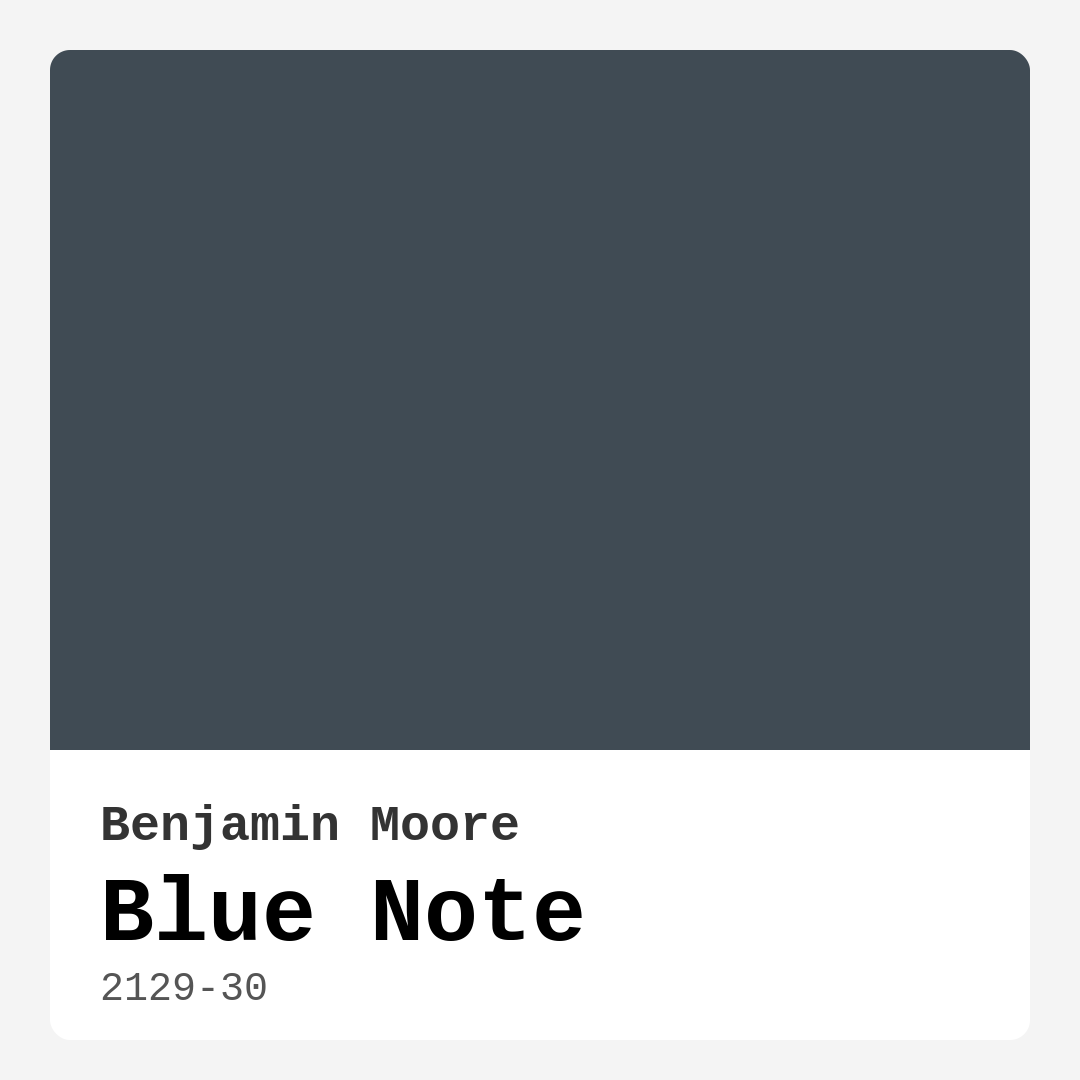
Color Preview & Key Details
| HEX Code | #404B54 |
| RGB | 64, 75, 84 |
| LRV | 9.02% |
| Undertone | Blue |
| Finish Options | Matte, Satin, Semi-Gloss |
If you’re searching for a paint color that effortlessly blends sophistication with warmth, look no further than Benjamin Moore’s *Blue Note* (2129-30). This deep, moody blue-gray is a designer favorite for a reason—it’s versatile, timeless, and packed with personality. Whether you’re refreshing a single wall or transforming an entire room, *Blue Note* brings a sense of calm and elegance that’s hard to match.
One of the first things you’ll notice about *Blue Note* is its rich, velvety finish. With an LRV (Light Reflectance Value) of just 9.02%, it’s undeniably a dark color, absorbing light rather than reflecting it. This makes it perfect for creating cozy, intimate spaces. But don’t let that scare you—dark doesn’t mean dreary. In bright light, the blue undertones shine through, giving it a vibrant yet refined presence. In softer lighting, it takes on a moodier, more subdued tone, making it ideal for bedrooms or home offices where you want a tranquil vibe.
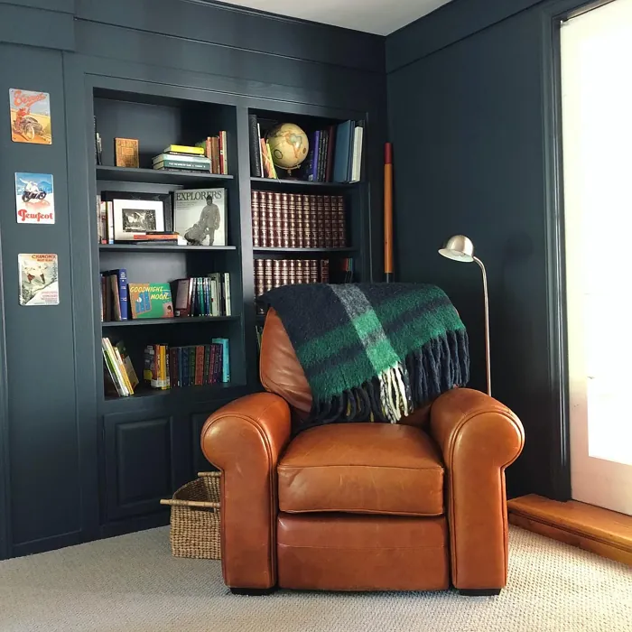
What sets *Blue Note* apart from other blues is its subtle gray infusion. Unlike brighter blues that can feel overwhelming, this shade strikes the perfect balance between bold and understated. It’s cool-toned, but not icy—pair it with warm accents like brass fixtures, rich wood tones, or creamy whites (think *White Dove* for trim), and you’ll create a space that feels balanced and inviting. It’s a chameleon of a color, adapting seamlessly to modern, coastal, industrial, or even rustic decor styles.
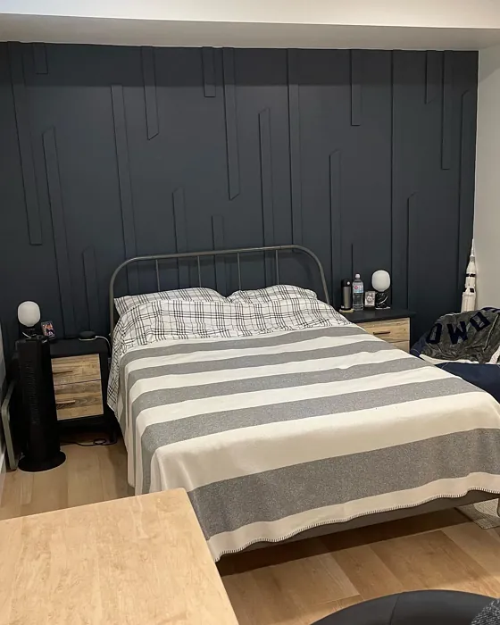
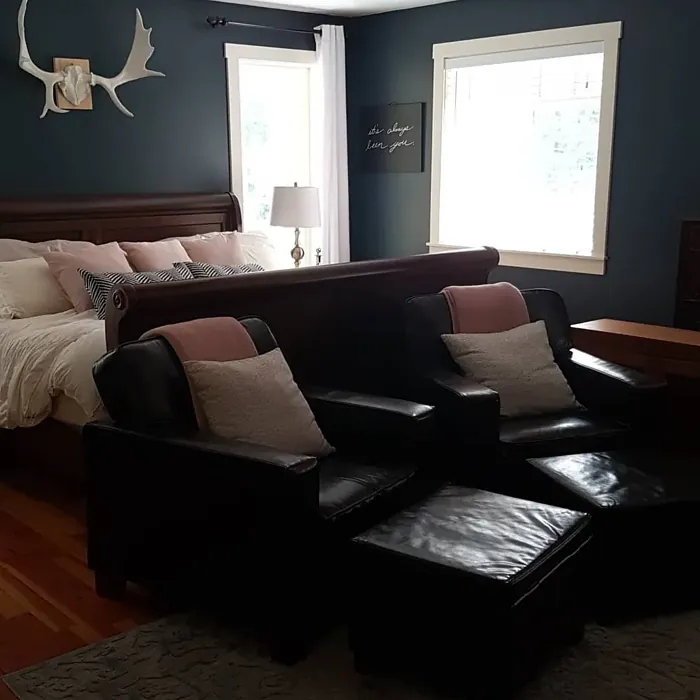
Wondering where to use it? *Blue Note* thrives in living rooms, bedrooms, dining rooms, and home offices. It’s especially striking as an accent wall, adding depth without overpowering a space. If you’re working with a smaller room, don’t shy away—just balance it with lighter furniture or plenty of natural light to keep things airy. And if you’re feeling adventurous, try it on cabinetry or a statement piece of furniture. The deep hue adds instant drama and sophistication.
Application is a breeze, even for beginners. It’s roller-ready, brush-smooth, and fast-drying, with good coverage in one to two coats. Just be mindful of streaks—take your time, and use high-quality tools for the best finish. Once it’s up, maintenance is easy thanks to its washable and scrubbable formula. Plus, with low VOCs, it’s a healthier choice for your home.
Not sure how it’ll look in your space? Test it first. Paint a large swatch and observe it at different times of day. Lighting can dramatically affect how the color reads, and you’ll want to see how those blue undertones play with your existing decor. If you love *Blue Note* but need something slightly lighter or darker, Benjamin Moore offers gorgeous alternatives like *CSP-600* (lighter) or *2062-10* (darker).
Pairing colors is where the fun begins. *Blue Note* looks stunning with crisp whites, soft creams, and warm metallics. For a bold contrast, try it with a pop of red or rust—its complementary hue. Or keep things serene with soft greens and muted grays. However you use it, this color brings depth, character, and a touch of luxury to any room.
So, is *Blue Note* right for your project? If you’re after a color that’s equal parts moody and elegant, with endless styling potential, the answer is a resounding yes. It’s a shade that doesn’t just fill a room—it transforms it. Whether you’re going for modern farmhouse charm or contemporary edge, *Blue Note* delivers. Grab a sample, see how it speaks to you, and get ready to fall in love with your walls all over again.

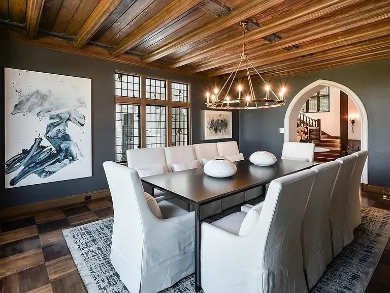
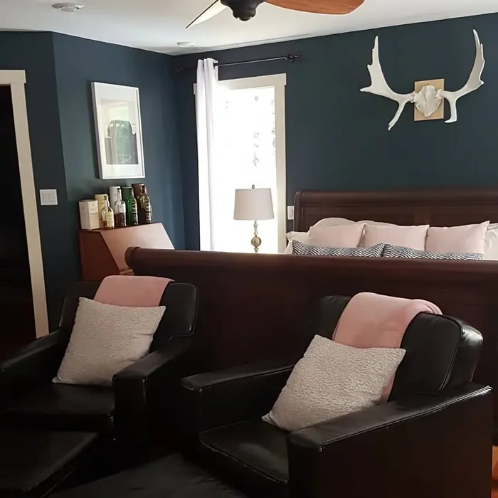
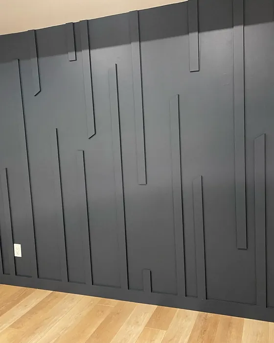
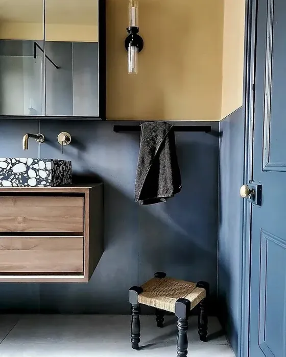
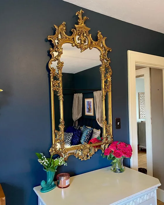
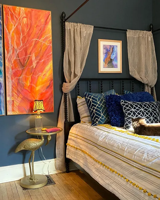
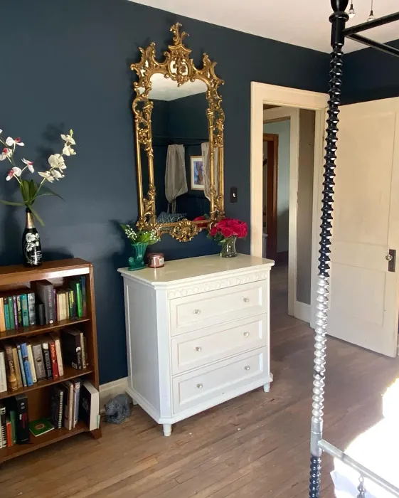
Real Room Photo of Blue Note 2129-30
Undertones of Blue Note ?
The undertones of Blue Note are a key aspect of its character, leaning towards Blue. These subtle underlying hues are what give the color its depth and complexity. For example, a gray with a blue undertone will feel cooler and more modern, while one with a brown undertone will feel warmer and more traditional. It’s essential to test this paint in your home and observe it next to your existing furniture, flooring, and decor to see how these undertones interact and reveal themselves throughout the day.
HEX value: #404B54
RGB code: 64, 75, 84
Is Blue Note Cool or Warm?
This color leans towards the cool side of the spectrum, making it perfect for creating a serene atmosphere. It pairs well with warm accents, allowing for balance in your decor.
Understanding Color Properties and Interior Design Tips
Hue refers to a specific position on the color wheel, measured in degrees from 0 to 360. Each degree represents a different pure color:
- 0° represents red
- 120° represents green
- 240° represents blue
Saturation describes the intensity or purity of a color and is expressed as a percentage:
- At 0%, the color appears completely desaturated—essentially a shade of gray
- At 100%, the color is at its most vivid and vibrant
Lightness indicates how light or dark a color is, also expressed as a percentage:
- 0% lightness results in black
- 100% lightness results in white
Using Warm Colors in Interior Design
Warm hues—such as reds, oranges, yellows, warm beiges, and greiges—are excellent choices for creating inviting and energetic spaces. These colors are particularly well-suited for:
- Kitchens, living rooms, and bathrooms, where warmth enhances comfort and sociability
- Large rooms, where warm tones can help reduce the sense of emptiness and make the space feel more intimate
For example:
- Warm beige shades provide a cozy, inviting atmosphere, ideal for living rooms, bedrooms, and hallways.
- Warm greige (a mix of beige and gray) offers the warmth of beige with the modern appeal of gray, making it a versatile backdrop for dining areas, bedrooms, and living spaces.
However, be mindful when using warm light tones in rooms with limited natural light. These shades may appear muted or even take on an unpleasant yellowish tint. To avoid a dull or flat appearance:
- Add depth by incorporating richer tones like deep greens, charcoal, or chocolate brown
- Use textured elements such as curtains, rugs, or cushions to bring dimension to the space
Pro Tip: Achieving Harmony with Warm and Cool Color Balance
To create a well-balanced and visually interesting interior, mix warm and cool tones strategically. This contrast adds depth and harmony to your design.
- If your walls feature warm hues, introduce cool-colored accents such as blue or green furniture, artwork, or accessories to create contrast.
- For a polished look, consider using a complementary color scheme, which pairs colors opposite each other on the color wheel (e.g., red with green, orange with blue).
This thoughtful mix not only enhances visual appeal but also creates a space that feels both dynamic and cohesive.

Light Temperature Affects on Blue Note
Natural Light
Natural daylight changes in color temperature as the sun moves across the sky. At sunrise and sunset, the light tends to have a warm, golden tone with a color temperature around 2000 Kelvin (K). As the day progresses and the sun rises higher, the light becomes cooler and more neutral. Around midday, especially when the sky is clear, natural light typically reaches its peak brightness and shifts to a cooler tone, ranging from 5500 to 6500 Kelvin. This midday light is close to what we perceive as pure white or daylight-balanced light.
These shifts in natural light can significantly influence how colors appear in a space, which is why designers often consider both the time of day and the orientation of windows when planning interior color schemes.
Artificial Light
When choosing artificial lighting, pay close attention to the color temperature, measured in Kelvin (K). This determines how warm or cool the light will appear. Lower temperatures, around 2700K, give off a warm, yellow glow often used in living rooms or bedrooms. Higher temperatures, above 5000K, create a cool, bluish light similar to daylight, commonly used in kitchens, offices, or task areas.
Use the slider to see how lighting temperature can affect the appearance of a surface or color throughout a space.


4800K
LRV of Blue Note
The Light Reflectance Value (LRV) of Blue Note is 9.02%, which places it in the Dark colors category. This means it does not reflect light. Understanding a paint’s LRV is crucial for predicting how it will look in your space. A higher LRV indicates a lighter color that reflects more light, making rooms feel larger and brighter. A lower LRV signifies a darker color that absorbs more light, creating a cozier, more intimate atmosphere. Always consider the natural and artificial lighting in your room when selecting a paint color based on its LRV.
Detailed Review of Blue Note
Additional Paint Characteristics
Ideal Rooms
Bedroom, Dining Room, Hallway, Home Office, Living Room
Decor Styles
Coastal, Contemporary, Industrial, Modern, Rustic
Coverage
Good (1–2 Coats), Touch-Up Friendly
Ease of Application
Beginner Friendly, Brush Smooth, Fast-Drying, Roller-Ready
Washability
Scrubbable, Washable
VOC Level
Low VOC
Best Use
Accent Wall, Furniture, Interior Walls
Room Suitability
Bedroom, Dining Room, Home Office, Living Room
Tone Tag
Cool, Deep, Moody
Finish Type
Matte, Satin
Paint Performance
Easy Touch-Up, Fade Resistant, Long Lasting, Low Odor
Use Cases
Best for Modern Farmhouse, Best for Rentals, Classic Favorite, Designer Favorite
Mood
Calm, Cozy, Sophisticated
Trim Pairing
Complements Brass Fixtures, Good with Wood Trim, Pairs with White Dove
Blue Note is a remarkable color that truly balances sophistication with comfort. When applied, it has a velvety finish that enhances its deep tones, making spaces feel inviting yet elegant. Perfect for accent walls or entire rooms, it shines in both natural and artificial light. Notably, its versatility allows it to complement various design styles, from modern to rustic. This color is especially striking when paired with lighter trim or warm wood accents, creating a visually appealing contrast. Whether you’re designing a cozy reading nook or a chic dining area, Blue Note will add character and charm to your space. Just make sure to apply it with the right tools for the best finish!
Pros & Cons of 2129-30 Blue Note
Pros
Cons
Colors that go with Benjamin Moore Blue Note
FAQ on 2129-30 Blue Note
Can Blue Note be used in small rooms?
Yes, Blue Note can definitely be used in small rooms, but it’s important to consider the lighting. In small spaces with limited natural light, it may appear darker, which could make the room feel more enclosed. To counteract this, try pairing it with bright accents or lighter furniture to create balance. If you’re looking to maintain an inviting feel, consider using it as an accent wall rather than painting all four walls.
How does Blue Note compare to other blues?
Blue Note stands out from other blues due to its unique blend of gray undertones. Unlike brighter blues that can feel energetic or overwhelming, Blue Note offers a calm, sophisticated vibe that is both modern and timeless. It’s perfect for those who want a statement color without the intensity of a pure blue. Additionally, its versatility allows it to work well in various design styles, making it a favorite among designers.
Comparisons Blue Note with other colors
Blue Note 2129-30 vs Naval SW 6244
| Attribute | Blue Note 2129-30 | Naval SW 6244 |
|---|---|---|
| Color Name | Blue Note 2129-30 | Naval SW 6244 |
| Color | ||
| Hue | Blue | Blue |
| Brightness | Dark | Dark |
| RGB | 64, 75, 84 | 47, 61, 76 |
| LRV | 9.02% | 4% |
| Finish Type | Matte, Satin | Matte, Satin, Semi-Gloss |
| Finish Options | Matte, Satin, Semi-Gloss | Matte, Satin, Semi-Gloss |
| Ideal Rooms | Bedroom, Dining Room, Hallway, Home Office, Living Room | Bedroom, Dining Room, Hallway, Home Office, Living Room |
| Decor Styles | Coastal, Contemporary, Industrial, Modern, Rustic | Coastal, Industrial, Minimalist, Modern, Traditional |
| Coverage | Good (1–2 Coats), Touch-Up Friendly | Good (1–2 Coats), Self-Priming |
| Ease of Application | Beginner Friendly, Brush Smooth, Fast-Drying, Roller-Ready | Beginner Friendly, Brush Smooth, Roller-Ready |
| Washability | Scrubbable, Washable | Highly Washable, Washable |
| Room Suitability | Bedroom, Dining Room, Home Office, Living Room | Bedroom, Dining Room, Entryway, Home Office, Living Room |
| Tone | Cool, Deep, Moody | Cool, Deep, Moody |
| Paint Performance | Easy Touch-Up, Fade Resistant, Long Lasting, Low Odor | Easy Touch-Up, High Coverage, Low Odor, Scuff Resistant |
Blue Note 2129-30 vs Sea Serpent SW 7615
| Attribute | Blue Note 2129-30 | Sea Serpent SW 7615 |
|---|---|---|
| Color Name | Blue Note 2129-30 | Sea Serpent SW 7615 |
| Color | ||
| Hue | Blue | Blue |
| Brightness | Dark | Dark |
| RGB | 64, 75, 84 | 62, 75, 84 |
| LRV | 9.02% | 12% |
| Finish Type | Matte, Satin | Eggshell, Matte, Satin |
| Finish Options | Matte, Satin, Semi-Gloss | Eggshell, Matte, Satin |
| Ideal Rooms | Bedroom, Dining Room, Hallway, Home Office, Living Room | Bathroom, Bedroom, Home Office, Living Room |
| Decor Styles | Coastal, Contemporary, Industrial, Modern, Rustic | Coastal, Farmhouse, Industrial, Modern |
| Coverage | Good (1–2 Coats), Touch-Up Friendly | Good (1–2 Coats), Touch-Up Friendly |
| Ease of Application | Beginner Friendly, Brush Smooth, Fast-Drying, Roller-Ready | Beginner Friendly, Brush Smooth, Roller-Ready |
| Washability | Scrubbable, Washable | Highly Washable, Washable |
| Room Suitability | Bedroom, Dining Room, Home Office, Living Room | Bathroom, Bedroom, Home Office, Living Room |
| Tone | Cool, Deep, Moody | Cool, Deep, Moody |
| Paint Performance | Easy Touch-Up, Fade Resistant, Long Lasting, Low Odor | Easy Touch-Up, High Coverage, Low Odor |
Blue Note 2129-30 vs Rain Cloud SW 9639
| Attribute | Blue Note 2129-30 | Rain Cloud SW 9639 |
|---|---|---|
| Color Name | Blue Note 2129-30 | Rain Cloud SW 9639 |
| Color | ||
| Hue | Blue | Blue |
| Brightness | Dark | Dark |
| RGB | 64, 75, 84 | 83, 97, 104 |
| LRV | 9.02% | 30% |
| Finish Type | Matte, Satin | Eggshell, Matte, Satin |
| Finish Options | Matte, Satin, Semi-Gloss | Eggshell, Matte, Satin |
| Ideal Rooms | Bedroom, Dining Room, Hallway, Home Office, Living Room | Bedroom, Dining Room, Home Office, Living Room |
| Decor Styles | Coastal, Contemporary, Industrial, Modern, Rustic | Coastal, Contemporary, Minimalist, Scandinavian |
| Coverage | Good (1–2 Coats), Touch-Up Friendly | Good (1–2 Coats), Touch-Up Friendly |
| Ease of Application | Beginner Friendly, Brush Smooth, Fast-Drying, Roller-Ready | Beginner Friendly, Brush Smooth, Roller-Ready |
| Washability | Scrubbable, Washable | Highly Washable, Washable |
| Room Suitability | Bedroom, Dining Room, Home Office, Living Room | Bedroom, Home Office, Living Room |
| Tone | Cool, Deep, Moody | Balanced, Cool, Muted |
| Paint Performance | Easy Touch-Up, Fade Resistant, Long Lasting, Low Odor | Easy Touch-Up, Fade Resistant, Low Odor |
Blue Note 2129-30 vs Indigo Batik SW 7602
| Attribute | Blue Note 2129-30 | Indigo Batik SW 7602 |
|---|---|---|
| Color Name | Blue Note 2129-30 | Indigo Batik SW 7602 |
| Color | ||
| Hue | Blue | Blue |
| Brightness | Dark | Dark |
| RGB | 64, 75, 84 | 62, 80, 99 |
| LRV | 9.02% | 10% |
| Finish Type | Matte, Satin | Matte, Satin |
| Finish Options | Matte, Satin, Semi-Gloss | Eggshell, Flat, Matte, Satin |
| Ideal Rooms | Bedroom, Dining Room, Hallway, Home Office, Living Room | Bedroom, Dining Room, Home Office, Living Room |
| Decor Styles | Coastal, Contemporary, Industrial, Modern, Rustic | Bohemian, Coastal, Contemporary, Modern |
| Coverage | Good (1–2 Coats), Touch-Up Friendly | Good (1–2 Coats), Touch-Up Friendly |
| Ease of Application | Beginner Friendly, Brush Smooth, Fast-Drying, Roller-Ready | Brush Smooth, Fast-Drying, Roller-Ready |
| Washability | Scrubbable, Washable | Scrubbable, Washable, Wipeable |
| Room Suitability | Bedroom, Dining Room, Home Office, Living Room | Bedroom, Dining Room, Home Office, Living Room |
| Tone | Cool, Deep, Moody | Cool, Deep, Moody |
| Paint Performance | Easy Touch-Up, Fade Resistant, Long Lasting, Low Odor | Easy Touch-Up, High Coverage, Low Odor, Quick Drying |
Blue Note 2129-30 vs Sea Mariner SW 9640
| Attribute | Blue Note 2129-30 | Sea Mariner SW 9640 |
|---|---|---|
| Color Name | Blue Note 2129-30 | Sea Mariner SW 9640 |
| Color | ||
| Hue | Blue | Blue |
| Brightness | Dark | Dark |
| RGB | 64, 75, 84 | 67, 74, 84 |
| LRV | 9.02% | 6% |
| Finish Type | Matte, Satin | Eggshell, Matte, Satin |
| Finish Options | Matte, Satin, Semi-Gloss | Eggshell, Matte, Satin |
| Ideal Rooms | Bedroom, Dining Room, Hallway, Home Office, Living Room | Bedroom, Dining Room, Hallway, Home Office, Living Room |
| Decor Styles | Coastal, Contemporary, Industrial, Modern, Rustic | Coastal, Industrial, Minimalist, Modern |
| Coverage | Good (1–2 Coats), Touch-Up Friendly | Good (1–2 Coats) |
| Ease of Application | Beginner Friendly, Brush Smooth, Fast-Drying, Roller-Ready | Beginner Friendly, Brush Smooth, Roller-Ready |
| Washability | Scrubbable, Washable | Scrubbable, Washable |
| Room Suitability | Bedroom, Dining Room, Home Office, Living Room | Bedroom, Dining Room, Home Office, Living Room |
| Tone | Cool, Deep, Moody | Cool, Deep, Moody |
| Paint Performance | Easy Touch-Up, Fade Resistant, Long Lasting, Low Odor | Easy Touch-Up, Low Odor, Quick Drying |
Blue Note 2129-30 vs Still Water SW 6223
| Attribute | Blue Note 2129-30 | Still Water SW 6223 |
|---|---|---|
| Color Name | Blue Note 2129-30 | Still Water SW 6223 |
| Color | ||
| Hue | Blue | Blue |
| Brightness | Dark | Dark |
| RGB | 64, 75, 84 | 74, 93, 95 |
| LRV | 9.02% | 48% |
| Finish Type | Matte, Satin | Eggshell, Matte, Satin |
| Finish Options | Matte, Satin, Semi-Gloss | Eggshell, Matte, Satin |
| Ideal Rooms | Bedroom, Dining Room, Hallway, Home Office, Living Room | Bedroom, Dining Room, Home Office, Living Room, Nursery |
| Decor Styles | Coastal, Contemporary, Industrial, Modern, Rustic | Coastal, Contemporary, Farmhouse, Modern, Rustic |
| Coverage | Good (1–2 Coats), Touch-Up Friendly | Good (1–2 Coats), Touch-Up Friendly |
| Ease of Application | Beginner Friendly, Brush Smooth, Fast-Drying, Roller-Ready | Beginner Friendly, Brush Smooth, Roller-Ready |
| Washability | Scrubbable, Washable | Highly Washable, Washable |
| Room Suitability | Bedroom, Dining Room, Home Office, Living Room | Bedroom, Dining Room, Home Office, Living Room |
| Tone | Cool, Deep, Moody | Cool, Earthy, Muted |
| Paint Performance | Easy Touch-Up, Fade Resistant, Long Lasting, Low Odor | Easy Touch-Up, Fade Resistant, Low Odor |
Blue Note 2129-30 vs Waterloo SW 9141
| Attribute | Blue Note 2129-30 | Waterloo SW 9141 |
|---|---|---|
| Color Name | Blue Note 2129-30 | Waterloo SW 9141 |
| Color | ||
| Hue | Blue | Blue |
| Brightness | Dark | Dark |
| RGB | 64, 75, 84 | 83, 104, 114 |
| LRV | 9.02% | 12% |
| Finish Type | Matte, Satin | Matte, Satin |
| Finish Options | Matte, Satin, Semi-Gloss | Matte, Satin, Semi-Gloss |
| Ideal Rooms | Bedroom, Dining Room, Hallway, Home Office, Living Room | Bedroom, Dining Room, Hallway, Home Office, Living Room |
| Decor Styles | Coastal, Contemporary, Industrial, Modern, Rustic | Coastal, Industrial, Modern, Rustic |
| Coverage | Good (1–2 Coats), Touch-Up Friendly | Good (1–2 Coats), Touch-Up Friendly |
| Ease of Application | Beginner Friendly, Brush Smooth, Fast-Drying, Roller-Ready | Brush Smooth, Fast-Drying, Roller-Ready |
| Washability | Scrubbable, Washable | Scrubbable, Washable |
| Room Suitability | Bedroom, Dining Room, Home Office, Living Room | Bedroom, Dining Room, Home Office, Living Room |
| Tone | Cool, Deep, Moody | Balanced, Cool, Muted |
| Paint Performance | Easy Touch-Up, Fade Resistant, Long Lasting, Low Odor | Easy Touch-Up, Fade Resistant, Low Odor, Quick Drying |
Blue Note 2129-30 vs Smoky Blue SW 7604
| Attribute | Blue Note 2129-30 | Smoky Blue SW 7604 |
|---|---|---|
| Color Name | Blue Note 2129-30 | Smoky Blue SW 7604 |
| Color | ||
| Hue | Blue | Blue |
| Brightness | Dark | Dark |
| RGB | 64, 75, 84 | 89, 110, 121 |
| LRV | 9.02% | 15% |
| Finish Type | Matte, Satin | Eggshell, Matte, Satin |
| Finish Options | Matte, Satin, Semi-Gloss | Eggshell, Matte, Satin |
| Ideal Rooms | Bedroom, Dining Room, Hallway, Home Office, Living Room | Bathroom, Bedroom, Home Office, Kitchen, Living Room |
| Decor Styles | Coastal, Contemporary, Industrial, Modern, Rustic | Coastal, Modern, Scandinavian, Transitional |
| Coverage | Good (1–2 Coats), Touch-Up Friendly | Good (1–2 Coats), Touch-Up Friendly |
| Ease of Application | Beginner Friendly, Brush Smooth, Fast-Drying, Roller-Ready | Beginner Friendly, Brush Smooth, Roller-Ready |
| Washability | Scrubbable, Washable | Highly Washable, Washable |
| Room Suitability | Bedroom, Dining Room, Home Office, Living Room | Bathroom, Bedroom, Home Office, Living Room |
| Tone | Cool, Deep, Moody | Cool, Dusty, Muted |
| Paint Performance | Easy Touch-Up, Fade Resistant, Long Lasting, Low Odor | High Coverage, Low Odor, Quick Drying |
Blue Note 2129-30 vs Needlepoint Navy SW 0032
| Attribute | Blue Note 2129-30 | Needlepoint Navy SW 0032 |
|---|---|---|
| Color Name | Blue Note 2129-30 | Needlepoint Navy SW 0032 |
| Color | ||
| Hue | Blue | Blue |
| Brightness | Dark | Dark |
| RGB | 64, 75, 84 | 84, 102, 112 |
| LRV | 9.02% | 4% |
| Finish Type | Matte, Satin | Matte, Satin, Semi-Gloss |
| Finish Options | Matte, Satin, Semi-Gloss | Matte, Satin, Semi-Gloss |
| Ideal Rooms | Bedroom, Dining Room, Hallway, Home Office, Living Room | Bedroom, Dining Room, Entryway, Home Office, Living Room |
| Decor Styles | Coastal, Contemporary, Industrial, Modern, Rustic | Coastal, Contemporary, Modern Farmhouse, Nautical, Traditional |
| Coverage | Good (1–2 Coats), Touch-Up Friendly | Good (1–2 Coats), Touch-Up Friendly |
| Ease of Application | Beginner Friendly, Brush Smooth, Fast-Drying, Roller-Ready | Beginner Friendly, Brush Smooth, Fast-Drying, Roller-Ready |
| Washability | Scrubbable, Washable | Scrubbable, Washable |
| Room Suitability | Bedroom, Dining Room, Home Office, Living Room | Bedroom, Dining Room, Home Office, Living Room |
| Tone | Cool, Deep, Moody | Cool, Deep, Muted |
| Paint Performance | Easy Touch-Up, Fade Resistant, Long Lasting, Low Odor | Easy Touch-Up, High Coverage, Low Odor, Quick Drying, Stain Resistant |
Blue Note 2129-30 vs Riverway SW 6222
| Attribute | Blue Note 2129-30 | Riverway SW 6222 |
|---|---|---|
| Color Name | Blue Note 2129-30 | Riverway SW 6222 |
| Color | ||
| Hue | Blue | Blue |
| Brightness | Dark | Dark |
| RGB | 64, 75, 84 | 93, 114, 116 |
| LRV | 9.02% | 24% |
| Finish Type | Matte, Satin | Eggshell, Satin |
| Finish Options | Matte, Satin, Semi-Gloss | Eggshell, Matte, Satin |
| Ideal Rooms | Bedroom, Dining Room, Hallway, Home Office, Living Room | Bathroom, Bedroom, Dining Room, Home Office, Living Room |
| Decor Styles | Coastal, Contemporary, Industrial, Modern, Rustic | Coastal, Contemporary, Eclectic, Modern, Rustic |
| Coverage | Good (1–2 Coats), Touch-Up Friendly | Good (1–2 Coats), Touch-Up Friendly |
| Ease of Application | Beginner Friendly, Brush Smooth, Fast-Drying, Roller-Ready | Beginner Friendly, Brush Smooth, Fast-Drying, Low Splatter, Roller-Ready |
| Washability | Scrubbable, Washable | Highly Washable, Washable |
| Room Suitability | Bedroom, Dining Room, Home Office, Living Room | Bathroom, Bedroom, Home Office, Living Room |
| Tone | Cool, Deep, Moody | Balanced, Cool, Muted |
| Paint Performance | Easy Touch-Up, Fade Resistant, Long Lasting, Low Odor | Easy Touch-Up, High Coverage, Low Odor, Quick Drying |
Official Page of Benjamin Moore Blue Note 2129-30