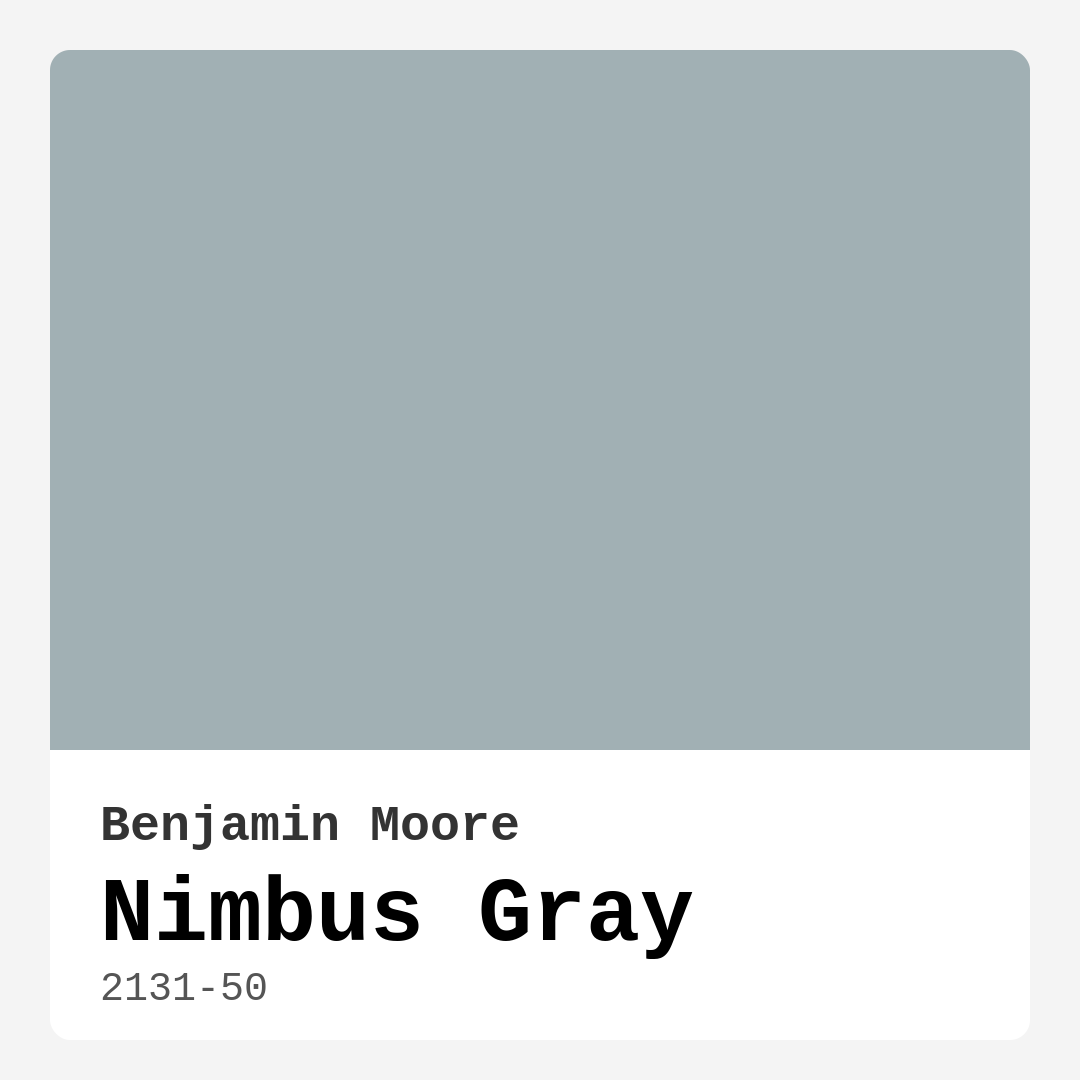
Color Preview & Key Details
| HEX Code | #A1B0B4 |
| RGB | 161, 176, 180 |
| LRV | 41.78% |
| Undertone | Blue |
| Finish Options | Eggshell, Matte, Satin |
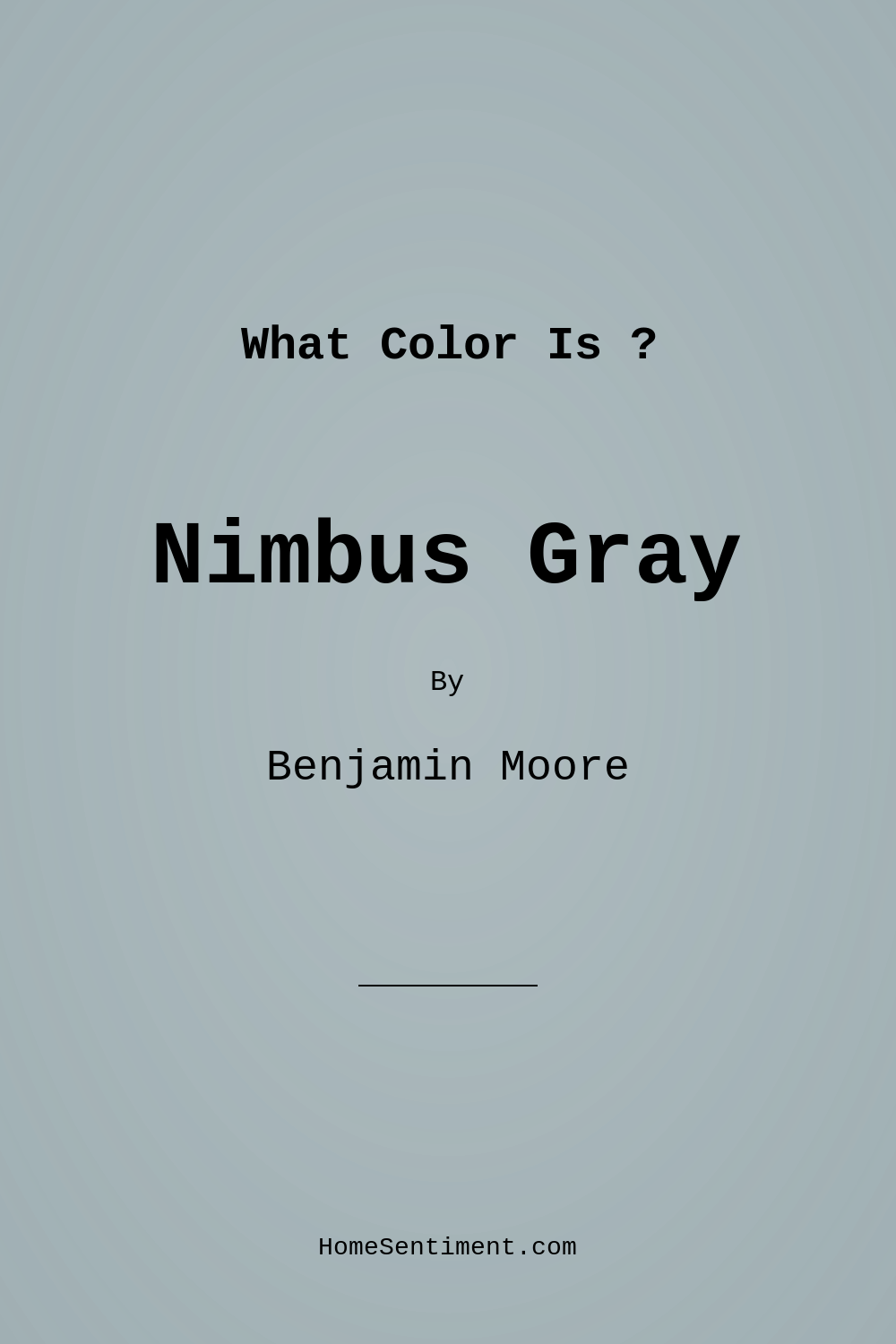
Imagine stepping into a room that instantly feels like a breath of fresh air, where tranquility washes over you, and everything seems to flow effortlessly. That’s the magic of Nimbus Gray, a stunning paint color from Benjamin Moore that has the ability to transform any space into a serene sanctuary. This soft gray isn’t just a color; it’s an experience, a mood, and a stylish backdrop for your life.
Nimbus Gray (2131-50) is a sophisticated shade that balances coolness with warmth, perfectly embodying an inviting, relaxed atmosphere. Its subtle blue undertones give it a unique character, allowing it to adapt beautifully to various decor styles—think modern, Scandinavian, minimalist, and transitional. This versatility makes it an ideal choice for anyone looking to refresh their home with a contemporary touch.
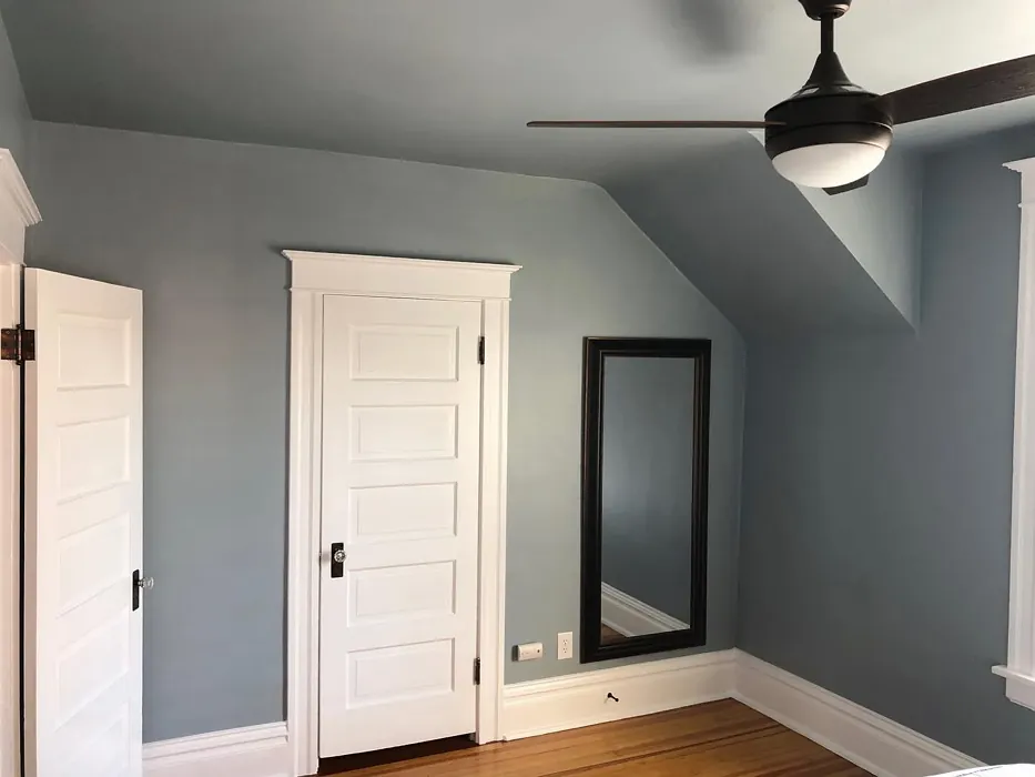
When you’re contemplating paint colors, the first thing to consider is how the light interacts with them. Nimbus Gray shines in well-lit spaces, reflecting about 41.78% of light thanks to its moderate Light Reflectance Value (LRV). This quality means it can brighten up a dim room while also maintaining a cozy feel when the sun goes down. It’s like having the best of both worlds; during the day, it feels airy and expansive, while at night, it creates a warm, inviting backdrop for relaxation.
Now, let’s talk about application. One of the standout features of Nimbus Gray is its ease of use. Whether you’re a beginner or a seasoned DIYer, you’ll find that this paint glides on smoothly. It’s roller-ready and brush-friendly, ensuring that you get a consistent finish without the fear of streaks or patches. Plus, if you happen to need a touch-up down the line, you’ll appreciate how easy it is to fix any spots without compromising the overall look.
Thinking about using Nimbus Gray in a small space? You’re making a wise choice! This shade works wonders in cozy areas, making them feel larger and more open. Just ensure you have good lighting to maximize its reflective properties. Consider pairing it with lighter furniture and accents to enhance that airy vibe even more.
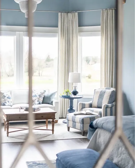
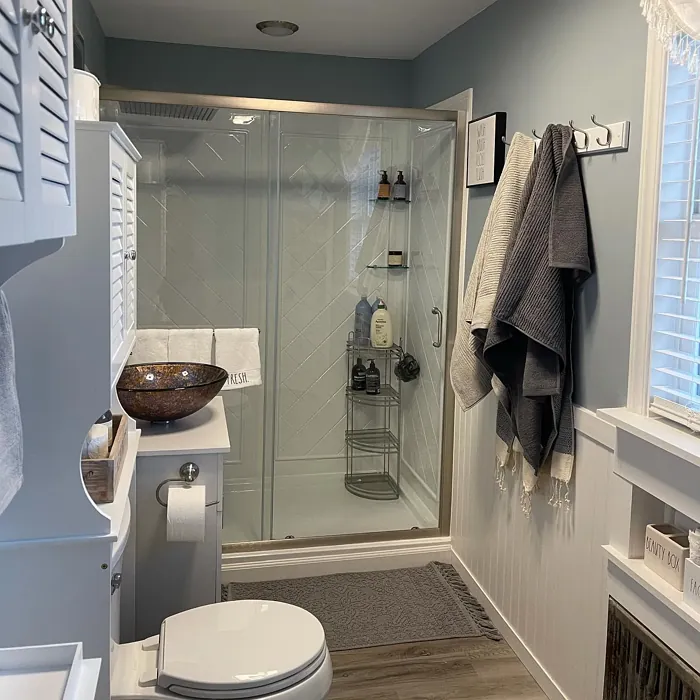
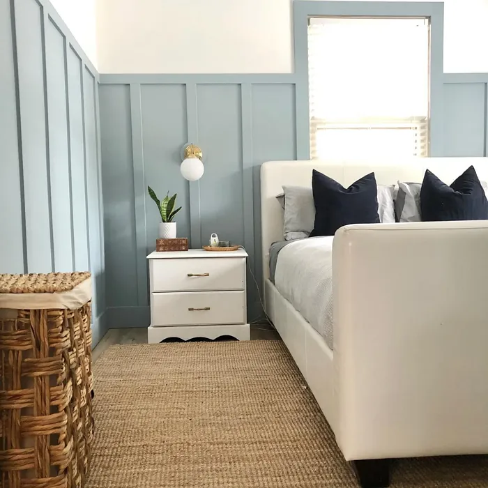
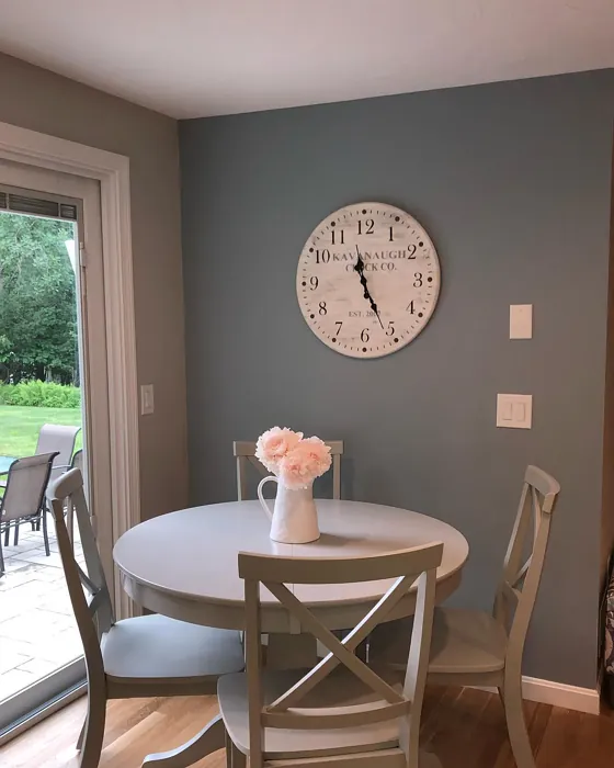
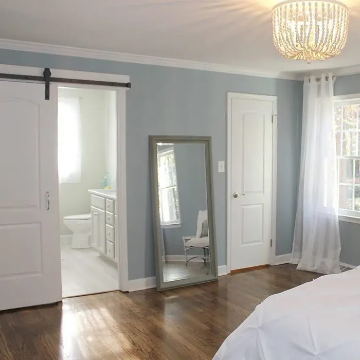
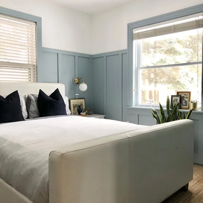
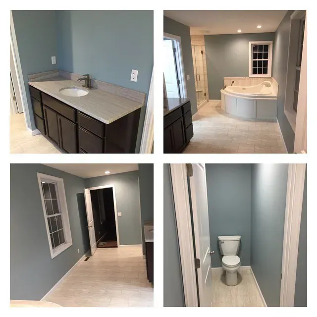
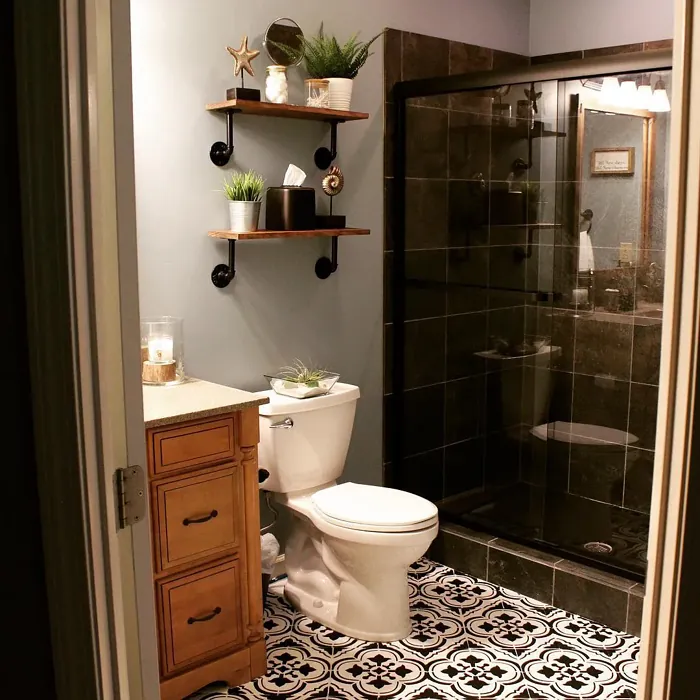
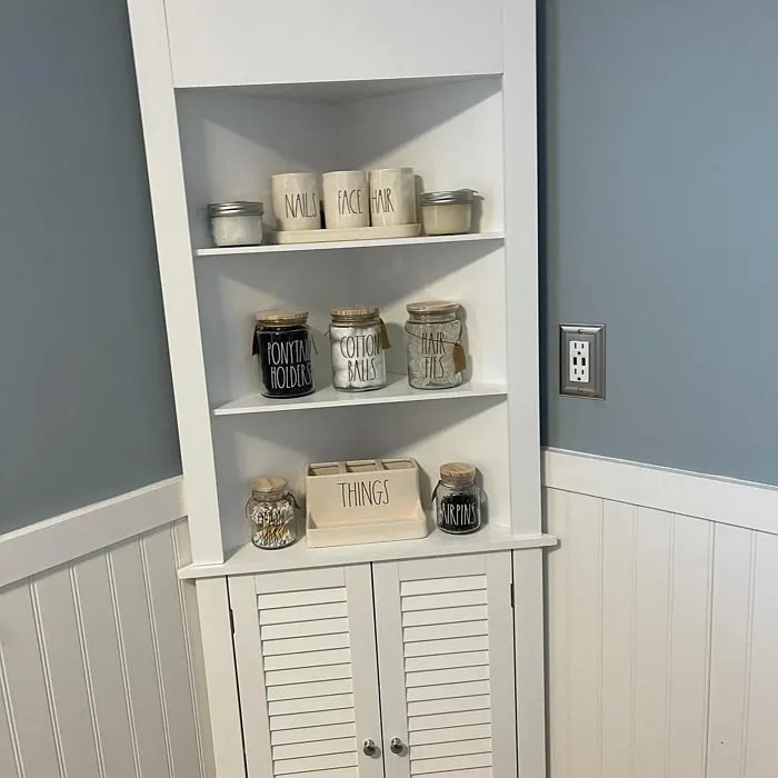
As for where to use Nimbus Gray, the options are virtually limitless. It’s a fantastic choice for living rooms, bedrooms, home offices, and even bathrooms. Imagine a serene bedroom painted in Nimbus Gray, paired with crisp white bedding and soft pastel cushions. Or think about a home office that radiates calm, promoting focus and creativity.
When it comes to pairing colors, Nimbus Gray is like your best friend who gets along with everyone. It harmonizes beautifully with whites, such as Pure White or Simply White, giving you a crisp, clean look. For a bit more drama, consider black fixtures or deep blues to create a striking contrast. If you lean towards softer aesthetics, muted tones and pastel shades will complement Nimbus Gray perfectly, enhancing its calming essence.
With its low VOC levels and eco-certified status, Nimbus Gray is also an environmentally friendly option. You can breathe easy knowing you’re making a healthier choice for your home and the planet. Plus, it’s washable and wipeable, which means it stands up to the demands of daily life while still looking chic.
Of course, like any color, Nimbus Gray has its quirks. In dim lighting, it can lean a bit cooler, which might not be everyone’s cup of tea. If you’re concerned about this, consider incorporating warm lighting options in your decor. You’ll be amazed at how lighting can transform a room, making Nimbus Gray feel even more inviting.
This color’s sophisticated, soft hue creates a calming mood, making it an excellent choice for spaces where you want to unwind and relax. It’s no wonder so many designers and homeowners alike are falling in love with Nimbus Gray. It brings a modern touch while still feeling comfortable and lived-in. Whether you’re updating your entire home or simply looking to refresh a single room, Nimbus Gray is a timeless choice that will stand the test of time.
If you’re ready to take the plunge, remember that paint colors can look different based on the materials around them. Before you commit, grab some samples and paint swatches to see how Nimbus Gray interacts with your existing furnishings and lighting. Trust me, it’s worth the extra step.
Finally, don’t overlook the trim! Nimbus Gray pairs beautifully with white trim, particularly shades like White Dove, which can help to define and elevate the overall palette of your space. If you have wood trim, this gray complements those natural tones wonderfully, adding depth and a touch of sophistication.
In summary, Nimbus Gray (2131-50) is more than just another gray paint. It’s a versatile, sophisticated option that brings calm and tranquility to any room. From its easy application to its beautiful range of pairings, it’s a color that just works. So, if you’re looking to create a serene, inviting atmosphere in your home, Nimbus Gray might just be the perfect choice.
Dive into this color and watch how your space evolves. With Nimbus Gray, you’re not just painting walls; you’re creating a beautiful backdrop for your life. So grab that brush, and let’s bring your vision to life!
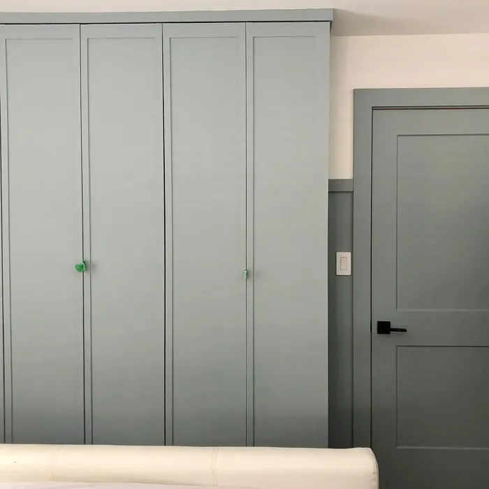
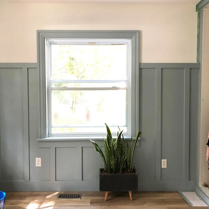
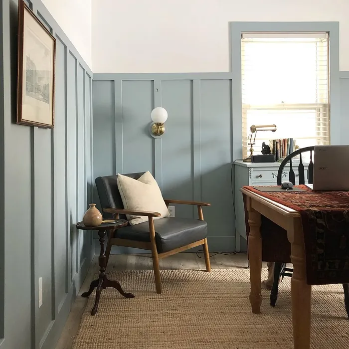
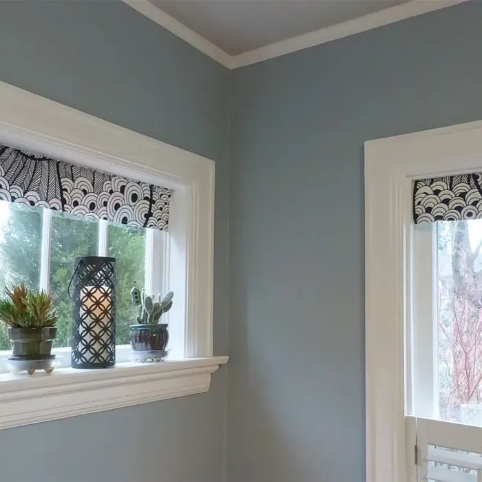
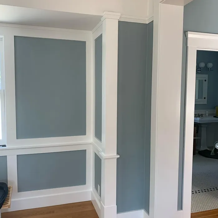
Real Room Photo of Nimbus Gray 2131-50
Undertones of Nimbus Gray ?
Nimbus Gray leans slightly towards a cool undertone, making it ideal for those who prefer a more contemporary aesthetic. The subtle hints of blue can enhance the light in a room, creating an open and airy feel, especially when paired with bright whites or soft pastels.
HEX value: #A1B0B4
RGB code: 161, 176, 180
Is Nimbus Gray Cool or Warm?
This color can be classified as cool, but it possesses enough warmth to feel welcoming. Its balanced nature allows it to adapt to different lighting conditions, appearing more inviting in warmer light while maintaining its cool charm in dimmer settings.
Understanding Color Properties and Interior Design Tips
Hue refers to a specific position on the color wheel, measured in degrees from 0 to 360. Each degree represents a different pure color:
- 0° represents red
- 120° represents green
- 240° represents blue
Saturation describes the intensity or purity of a color and is expressed as a percentage:
- At 0%, the color appears completely desaturated—essentially a shade of gray
- At 100%, the color is at its most vivid and vibrant
Lightness indicates how light or dark a color is, also expressed as a percentage:
- 0% lightness results in black
- 100% lightness results in white
Using Warm Colors in Interior Design
Warm hues—such as reds, oranges, yellows, warm beiges, and greiges—are excellent choices for creating inviting and energetic spaces. These colors are particularly well-suited for:
- Kitchens, living rooms, and bathrooms, where warmth enhances comfort and sociability
- Large rooms, where warm tones can help reduce the sense of emptiness and make the space feel more intimate
For example:
- Warm beige shades provide a cozy, inviting atmosphere, ideal for living rooms, bedrooms, and hallways.
- Warm greige (a mix of beige and gray) offers the warmth of beige with the modern appeal of gray, making it a versatile backdrop for dining areas, bedrooms, and living spaces.
However, be mindful when using warm light tones in rooms with limited natural light. These shades may appear muted or even take on an unpleasant yellowish tint. To avoid a dull or flat appearance:
- Add depth by incorporating richer tones like deep greens, charcoal, or chocolate brown
- Use textured elements such as curtains, rugs, or cushions to bring dimension to the space
Pro Tip: Achieving Harmony with Warm and Cool Color Balance
To create a well-balanced and visually interesting interior, mix warm and cool tones strategically. This contrast adds depth and harmony to your design.
- If your walls feature warm hues, introduce cool-colored accents such as blue or green furniture, artwork, or accessories to create contrast.
- For a polished look, consider using a complementary color scheme, which pairs colors opposite each other on the color wheel (e.g., red with green, orange with blue).
This thoughtful mix not only enhances visual appeal but also creates a space that feels both dynamic and cohesive.
Light Temperature Affects on Nimbus Gray
Natural Light
Natural daylight changes in color temperature as the sun moves across the sky. At sunrise and sunset, the light tends to have a warm, golden tone with a color temperature around 2000 Kelvin (K). As the day progresses and the sun rises higher, the light becomes cooler and more neutral. Around midday, especially when the sky is clear, natural light typically reaches its peak brightness and shifts to a cooler tone, ranging from 5500 to 6500 Kelvin. This midday light is close to what we perceive as pure white or daylight-balanced light.
These shifts in natural light can significantly influence how colors appear in a space, which is why designers often consider both the time of day and the orientation of windows when planning interior color schemes.
Artificial Light
When choosing artificial lighting, pay close attention to the color temperature, measured in Kelvin (K). This determines how warm or cool the light will appear. Lower temperatures, around 2700K, give off a warm, yellow glow often used in living rooms or bedrooms. Higher temperatures, above 5000K, create a cool, bluish light similar to daylight, commonly used in kitchens, offices, or task areas.
Use the slider to see how lighting temperature can affect the appearance of a surface or color throughout a space.


4800K
LRV of Nimbus Gray
The Light Reflectance Value (LRV) of Nimbus Gray is approximately 50, which means it reflects a fair amount of light without being overly bright. This makes it suitable for both well-lit and dimly lit areas, providing a balanced atmosphere throughout your home.
Detailed Review of Nimbus Gray
Additional Paint Characteristics
Ideal Rooms
Bathroom, Bedroom, Home Office, Kitchen, Living Room
Decor Styles
Minimalist, Modern, Scandinavian, Transitional
Coverage
Good (1–2 Coats), Touch-Up Friendly
Ease of Application
Beginner Friendly, Brush Smooth, Roller-Ready
Washability
Washable, Wipeable
VOC Level
Eco-Certified, Low VOC
Best Use
Accent Wall, Furniture, Interior Walls
Room Suitability
Bathroom, Bedroom, Home Office, Living Room
Tone Tag
Balanced, Cool, Neutral
Finish Type
Eggshell, Matte, Satin
Paint Performance
Easy Touch-Up, Fade Resistant, Low Odor, Quick Drying
Use Cases
Best for Open Concept, Best for Rentals, Best for Selling Your Home, Designer Favorite
Mood
Calm, Inviting, Sophisticated
Trim Pairing
Complements Cool Trim, Good with Wood Trim, Pairs with White Dove
Nimbus Gray offers a delicate balance between warmth and coolness, making it a perfect choice for various interior applications. It shines best in spaces where natural light can enhance its soft hue, casting a gentle glow that feels both inviting and serene. This paint’s smooth application ensures that it glides on effortlessly, providing even coverage without the hassle of streaks or patches. Whether you’re painting a large wall or an accent feature, Nimbus Gray performs exceptionally well, allowing for easy touch-ups and a consistent finish. Many homeowners find it an excellent option for bedrooms and living areas, as it promotes a sense of calm and relaxation. Overall, it’s a smart choice for anyone looking to create a stylish yet soothing environment.
Pros & Cons of 2131-50 Nimbus Gray
Pros
Cons
Colors that go with Benjamin Moore Nimbus Gray
FAQ on 2131-50 Nimbus Gray
Can Nimbus Gray be used in small spaces?
Absolutely! Nimbus Gray is a fantastic choice for small spaces. Its soft, light quality helps to make rooms feel larger and more open. Just ensure you use good lighting to maximize its reflective properties, creating an inviting atmosphere even in compact areas.
What colors pair well with Nimbus Gray?
Nimbus Gray pairs beautifully with a range of colors. For a fresh look, consider whites like Pure White or Simply White for trim. If you prefer a more dramatic contrast, black fixtures or deep blues can add a striking element. Soft pastels and muted tones also complement this gray perfectly, enhancing its calming vibe.
Comparisons Nimbus Gray with other colors
Nimbus Gray 2131-50 vs Dutch Tile Blue SW 0031
| Attribute | Nimbus Gray 2131-50 | Dutch Tile Blue SW 0031 |
|---|---|---|
| Color Name | Nimbus Gray 2131-50 | Dutch Tile Blue SW 0031 |
| Color | ||
| Hue | Blue | Blue |
| Brightness | Medium | Medium |
| RGB | 161, 176, 180 | 154, 171, 171 |
| LRV | 41.78% | 24% |
| Finish Type | Eggshell, Matte, Satin | Eggshell, Matte, Satin |
| Finish Options | Eggshell, Matte, Satin | Eggshell, Flat, Matte, Satin |
| Ideal Rooms | Bathroom, Bedroom, Home Office, Kitchen, Living Room | Bathroom, Bedroom, Dining Room, Hallway, Home Office, Kitchen, Living Room |
| Decor Styles | Minimalist, Modern, Scandinavian, Transitional | Coastal, Modern Farmhouse, Scandinavian, Traditional, Transitional |
| Coverage | Good (1–2 Coats), Touch-Up Friendly | Good (1–2 Coats) |
| Ease of Application | Beginner Friendly, Brush Smooth, Roller-Ready | Beginner Friendly, Brush Smooth, Fast-Drying, Roller-Ready |
| Washability | Washable, Wipeable | Highly Washable, Washable |
| Room Suitability | Bathroom, Bedroom, Home Office, Living Room | Bathroom, Bedroom, Dining Room, Kitchen, Living Room |
| Tone | Balanced, Cool, Neutral | Balanced, Cool, Muted |
| Paint Performance | Easy Touch-Up, Fade Resistant, Low Odor, Quick Drying | Easy Touch-Up, High Coverage, Low Odor, Quick Drying |
Nimbus Gray 2131-50 vs Debonair SW 9139
| Attribute | Nimbus Gray 2131-50 | Debonair SW 9139 |
|---|---|---|
| Color Name | Nimbus Gray 2131-50 | Debonair SW 9139 |
| Color | ||
| Hue | Blue | Blue |
| Brightness | Medium | Medium |
| RGB | 161, 176, 180 | 144, 160, 166 |
| LRV | 41.78% | 30% |
| Finish Type | Eggshell, Matte, Satin | Eggshell, Matte, Satin |
| Finish Options | Eggshell, Matte, Satin | Eggshell, Matte, Satin |
| Ideal Rooms | Bathroom, Bedroom, Home Office, Kitchen, Living Room | Bedroom, Dining Room, Home Office, Living Room |
| Decor Styles | Minimalist, Modern, Scandinavian, Transitional | Coastal, Industrial, Modern, Transitional |
| Coverage | Good (1–2 Coats), Touch-Up Friendly | Good (1–2 Coats) |
| Ease of Application | Beginner Friendly, Brush Smooth, Roller-Ready | Beginner Friendly, Brush Smooth, Roller-Ready |
| Washability | Washable, Wipeable | Washable, Wipeable |
| Room Suitability | Bathroom, Bedroom, Home Office, Living Room | Bedroom, Dining Room, Home Office, Living Room |
| Tone | Balanced, Cool, Neutral | Balanced, Cool, Muted |
| Paint Performance | Easy Touch-Up, Fade Resistant, Low Odor, Quick Drying | Easy Touch-Up, Low Odor, Quick Drying |
Nimbus Gray 2131-50 vs Stardew SW 9138
| Attribute | Nimbus Gray 2131-50 | Stardew SW 9138 |
|---|---|---|
| Color Name | Nimbus Gray 2131-50 | Stardew SW 9138 |
| Color | ||
| Hue | Blue | Blue |
| Brightness | Medium | Medium |
| RGB | 161, 176, 180 | 166, 178, 181 |
| LRV | 41.78% | 30% |
| Finish Type | Eggshell, Matte, Satin | Eggshell, Satin |
| Finish Options | Eggshell, Matte, Satin | Eggshell, Matte, Satin |
| Ideal Rooms | Bathroom, Bedroom, Home Office, Kitchen, Living Room | Bathroom, Bedroom, Home Office, Living Room, Nursery |
| Decor Styles | Minimalist, Modern, Scandinavian, Transitional | Coastal, Farmhouse, Modern, Scandinavian |
| Coverage | Good (1–2 Coats), Touch-Up Friendly | Good (1–2 Coats) |
| Ease of Application | Beginner Friendly, Brush Smooth, Roller-Ready | Beginner Friendly, Brush Smooth, Roller-Ready |
| Washability | Washable, Wipeable | Highly Washable, Washable, Wipeable |
| Room Suitability | Bathroom, Bedroom, Home Office, Living Room | Bathroom, Bedroom, Home Office, Living Room |
| Tone | Balanced, Cool, Neutral | Calm, Cool, Muted |
| Paint Performance | Easy Touch-Up, Fade Resistant, Low Odor, Quick Drying | Easy Touch-Up, High Coverage, Low Odor |
Nimbus Gray 2131-50 vs Niebla Azul SW 9137
| Attribute | Nimbus Gray 2131-50 | Niebla Azul SW 9137 |
|---|---|---|
| Color Name | Nimbus Gray 2131-50 | Niebla Azul SW 9137 |
| Color | ||
| Hue | Blue | Blue |
| Brightness | Medium | Medium |
| RGB | 161, 176, 180 | 182, 195, 196 |
| LRV | 41.78% | 48% |
| Finish Type | Eggshell, Matte, Satin | Eggshell, Matte, Satin |
| Finish Options | Eggshell, Matte, Satin | Eggshell, Matte, Satin |
| Ideal Rooms | Bathroom, Bedroom, Home Office, Kitchen, Living Room | Bedroom, Home Office, Living Room, Nursery |
| Decor Styles | Minimalist, Modern, Scandinavian, Transitional | Coastal, Modern, Scandinavian, Transitional |
| Coverage | Good (1–2 Coats), Touch-Up Friendly | Good (1–2 Coats), Touch-Up Friendly |
| Ease of Application | Beginner Friendly, Brush Smooth, Roller-Ready | Beginner Friendly, Brush Smooth, Roller-Ready |
| Washability | Washable, Wipeable | Highly Washable, Washable |
| Room Suitability | Bathroom, Bedroom, Home Office, Living Room | Bedroom, Home Office, Living Room, Nursery |
| Tone | Balanced, Cool, Neutral | Airy, Cool, Muted |
| Paint Performance | Easy Touch-Up, Fade Resistant, Low Odor, Quick Drying | Easy Touch-Up, Fade Resistant, Low Odor, Scuff Resistant |
Nimbus Gray 2131-50 vs Rain SW 6219
| Attribute | Nimbus Gray 2131-50 | Rain SW 6219 |
|---|---|---|
| Color Name | Nimbus Gray 2131-50 | Rain SW 6219 |
| Color | ||
| Hue | Blue | Blue |
| Brightness | Medium | Medium |
| RGB | 161, 176, 180 | 171, 190, 191 |
| LRV | 41.78% | 50% |
| Finish Type | Eggshell, Matte, Satin | Eggshell, Matte, Satin |
| Finish Options | Eggshell, Matte, Satin | Eggshell, Matte, Satin |
| Ideal Rooms | Bathroom, Bedroom, Home Office, Kitchen, Living Room | Bathroom, Bedroom, Home Office, Living Room, Nursery |
| Decor Styles | Minimalist, Modern, Scandinavian, Transitional | Coastal, Minimalist, Modern, Scandinavian, Transitional |
| Coverage | Good (1–2 Coats), Touch-Up Friendly | Good (1–2 Coats), Touch-Up Friendly |
| Ease of Application | Beginner Friendly, Brush Smooth, Roller-Ready | Beginner Friendly, Brush Smooth, Fast-Drying, Roller-Ready |
| Washability | Washable, Wipeable | Scrubbable, Stain Resistant, Washable |
| Room Suitability | Bathroom, Bedroom, Home Office, Living Room | Bathroom, Bedroom, Home Office, Living Room, Nursery |
| Tone | Balanced, Cool, Neutral | Balanced, Cool, Muted |
| Paint Performance | Easy Touch-Up, Fade Resistant, Low Odor, Quick Drying | Easy Touch-Up, Low Odor, Quick Drying, Stain Resistant |
Nimbus Gray 2131-50 vs Morning at Sea SW 9634
| Attribute | Nimbus Gray 2131-50 | Morning at Sea SW 9634 |
|---|---|---|
| Color Name | Nimbus Gray 2131-50 | Morning at Sea SW 9634 |
| Color | ||
| Hue | Blue | Blue |
| Brightness | Medium | Medium |
| RGB | 161, 176, 180 | 130, 151, 155 |
| LRV | 41.78% | 50% |
| Finish Type | Eggshell, Matte, Satin | Eggshell, Matte |
| Finish Options | Eggshell, Matte, Satin | Eggshell, Matte, Satin |
| Ideal Rooms | Bathroom, Bedroom, Home Office, Kitchen, Living Room | Bathroom, Bedroom, Home Office, Living Room |
| Decor Styles | Minimalist, Modern, Scandinavian, Transitional | Coastal, Minimalist, Modern, Scandinavian |
| Coverage | Good (1–2 Coats), Touch-Up Friendly | Good (1–2 Coats), Touch-Up Friendly |
| Ease of Application | Beginner Friendly, Brush Smooth, Roller-Ready | Beginner Friendly, Brush Smooth, Roller-Ready |
| Washability | Washable, Wipeable | Washable, Wipeable |
| Room Suitability | Bathroom, Bedroom, Home Office, Living Room | Bathroom, Bedroom, Home Office, Living Room |
| Tone | Balanced, Cool, Neutral | Airy, Cool, Muted |
| Paint Performance | Easy Touch-Up, Fade Resistant, Low Odor, Quick Drying | Easy Touch-Up, Fade Resistant, Low Odor |
Nimbus Gray 2131-50 vs Sleepy Blue SW 6225
| Attribute | Nimbus Gray 2131-50 | Sleepy Blue SW 6225 |
|---|---|---|
| Color Name | Nimbus Gray 2131-50 | Sleepy Blue SW 6225 |
| Color | ||
| Hue | Blue | Blue |
| Brightness | Medium | Medium |
| RGB | 161, 176, 180 | 188, 203, 206 |
| LRV | 41.78% | 50% |
| Finish Type | Eggshell, Matte, Satin | Eggshell, Matte, Satin |
| Finish Options | Eggshell, Matte, Satin | Eggshell, Matte, Satin |
| Ideal Rooms | Bathroom, Bedroom, Home Office, Kitchen, Living Room | Bedroom, Home Office, Living Room, Nursery |
| Decor Styles | Minimalist, Modern, Scandinavian, Transitional | Coastal, Minimalist, Modern Farmhouse, Scandinavian |
| Coverage | Good (1–2 Coats), Touch-Up Friendly | Good (1–2 Coats) |
| Ease of Application | Beginner Friendly, Brush Smooth, Roller-Ready | Beginner Friendly, Brush Smooth, Fast-Drying, Roller-Ready |
| Washability | Washable, Wipeable | Highly Washable, Washable |
| Room Suitability | Bathroom, Bedroom, Home Office, Living Room | Bedroom, Home Office, Living Room, Nursery |
| Tone | Balanced, Cool, Neutral | Airy, Cool, Muted |
| Paint Performance | Easy Touch-Up, Fade Resistant, Low Odor, Quick Drying | Easy Touch-Up, Low Odor, Quick Drying, Scuff Resistant |
Nimbus Gray 2131-50 vs Lakeside SW 9683
| Attribute | Nimbus Gray 2131-50 | Lakeside SW 9683 |
|---|---|---|
| Color Name | Nimbus Gray 2131-50 | Lakeside SW 9683 |
| Color | ||
| Hue | Blue | Blue |
| Brightness | Medium | Medium |
| RGB | 161, 176, 180 | 173, 184, 192 |
| LRV | 41.78% | 24% |
| Finish Type | Eggshell, Matte, Satin | Eggshell, Matte, Satin |
| Finish Options | Eggshell, Matte, Satin | Eggshell, Matte, Satin |
| Ideal Rooms | Bathroom, Bedroom, Home Office, Kitchen, Living Room | Bathroom, Bedroom, Home Office, Living Room |
| Decor Styles | Minimalist, Modern, Scandinavian, Transitional | Coastal, Minimalist, Modern, Rustic |
| Coverage | Good (1–2 Coats), Touch-Up Friendly | Good (1–2 Coats) |
| Ease of Application | Beginner Friendly, Brush Smooth, Roller-Ready | Beginner Friendly, Brush Smooth, Roller-Ready |
| Washability | Washable, Wipeable | Scrubbable, Washable |
| Room Suitability | Bathroom, Bedroom, Home Office, Living Room | Bathroom, Bedroom, Home Office, Living Room |
| Tone | Balanced, Cool, Neutral | Balanced, Cool, Muted |
| Paint Performance | Easy Touch-Up, Fade Resistant, Low Odor, Quick Drying | Easy Touch-Up, Fade Resistant, High Coverage, Low Odor |
Nimbus Gray 2131-50 vs Upward SW 6239
| Attribute | Nimbus Gray 2131-50 | Upward SW 6239 |
|---|---|---|
| Color Name | Nimbus Gray 2131-50 | Upward SW 6239 |
| Color | ||
| Hue | Blue | Blue |
| Brightness | Medium | Medium |
| RGB | 161, 176, 180 | 191, 201, 208 |
| LRV | 41.78% | 75% |
| Finish Type | Eggshell, Matte, Satin | Eggshell, Satin |
| Finish Options | Eggshell, Matte, Satin | Eggshell, Flat, Satin |
| Ideal Rooms | Bathroom, Bedroom, Home Office, Kitchen, Living Room | Bedroom, Dining Room, Home Office, Living Room, Nursery |
| Decor Styles | Minimalist, Modern, Scandinavian, Transitional | Coastal, Minimalist, Modern, Scandinavian |
| Coverage | Good (1–2 Coats), Touch-Up Friendly | Good (1–2 Coats), Touch-Up Friendly |
| Ease of Application | Beginner Friendly, Brush Smooth, Roller-Ready | Beginner Friendly, Brush Smooth, Fast-Drying, Roller-Ready |
| Washability | Washable, Wipeable | Washable, Wipeable |
| Room Suitability | Bathroom, Bedroom, Home Office, Living Room | Bedroom, Home Office, Living Room, Nursery |
| Tone | Balanced, Cool, Neutral | Cool, Crisp, Muted |
| Paint Performance | Easy Touch-Up, Fade Resistant, Low Odor, Quick Drying | High Coverage, Low Odor, Quick Drying |
Nimbus Gray 2131-50 vs Aleutian SW 6241
| Attribute | Nimbus Gray 2131-50 | Aleutian SW 6241 |
|---|---|---|
| Color Name | Nimbus Gray 2131-50 | Aleutian SW 6241 |
| Color | ||
| Hue | Blue | Blue |
| Brightness | Medium | Medium |
| RGB | 161, 176, 180 | 152, 169, 183 |
| LRV | 41.78% | 24% |
| Finish Type | Eggshell, Matte, Satin | Eggshell, Matte, Satin |
| Finish Options | Eggshell, Matte, Satin | Eggshell, Matte, Satin |
| Ideal Rooms | Bathroom, Bedroom, Home Office, Kitchen, Living Room | Bathroom, Bedroom, Home Office, Kitchen, Living Room, Nursery |
| Decor Styles | Minimalist, Modern, Scandinavian, Transitional | Coastal, Minimalist, Modern, Scandinavian, Transitional |
| Coverage | Good (1–2 Coats), Touch-Up Friendly | Good (1–2 Coats), Touch-Up Friendly |
| Ease of Application | Beginner Friendly, Brush Smooth, Roller-Ready | Beginner Friendly, Brush Smooth, Fast-Drying, Roller-Ready |
| Washability | Washable, Wipeable | Scrubbable, Stain Resistant, Washable |
| Room Suitability | Bathroom, Bedroom, Home Office, Living Room | Bathroom, Bedroom, Home Office, Living Room, Nursery |
| Tone | Balanced, Cool, Neutral | Airy, Balanced, Cool, Muted |
| Paint Performance | Easy Touch-Up, Fade Resistant, Low Odor, Quick Drying | Easy Touch-Up, Fade Resistant, Low Odor, Quick Drying |
Official Page of Benjamin Moore Nimbus Gray 2131-50