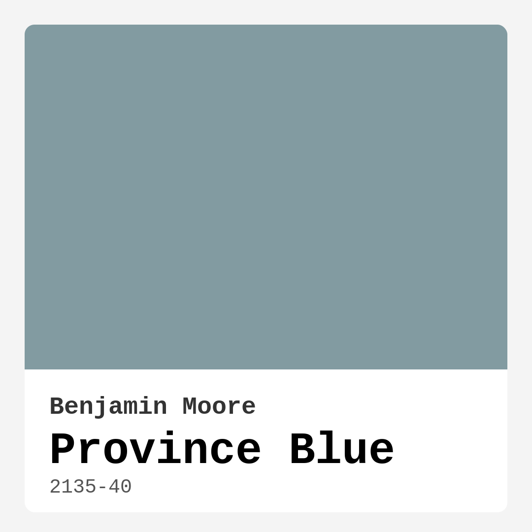
Color Preview & Key Details
| HEX Code | #829BA1 |
| RGB | 130, 155, 161 |
| LRV | 31.57% |
| Undertone | Blue |
| Finish Options | Eggshell, Matte, Satin |
Imagine stepping into a room that feels like a gentle embrace, where the chaos of the outside world fades away, leaving just a sense of peace. That’s the magic of color, and if you’re searching for that perfect hue to transform your space, have you considered Province Blue? This beautiful, soft blue by Benjamin Moore is not just a color; it’s an experience waiting to unfold in your home.
Province Blue (2135-40) is a serene, muted shade that invites tranquility into any room. With its subtle gray undertones, it effortlessly harmonizes with both warm and cool palettes, making it a versatile choice for various decor styles, from coastal to modern farmhouse. This isn’t just paint; it’s a palette of possibilities.
Let’s dive deeper into what makes Province Blue such a beloved choice among homeowners and designers alike. First off, its calming presence is perfect for spaces meant for relaxation. Think bedrooms and nurseries, where a soothing atmosphere is essential. It can also create an inviting ambiance in living rooms and home offices, making it ideal for spaces where you want to unwind or focus.
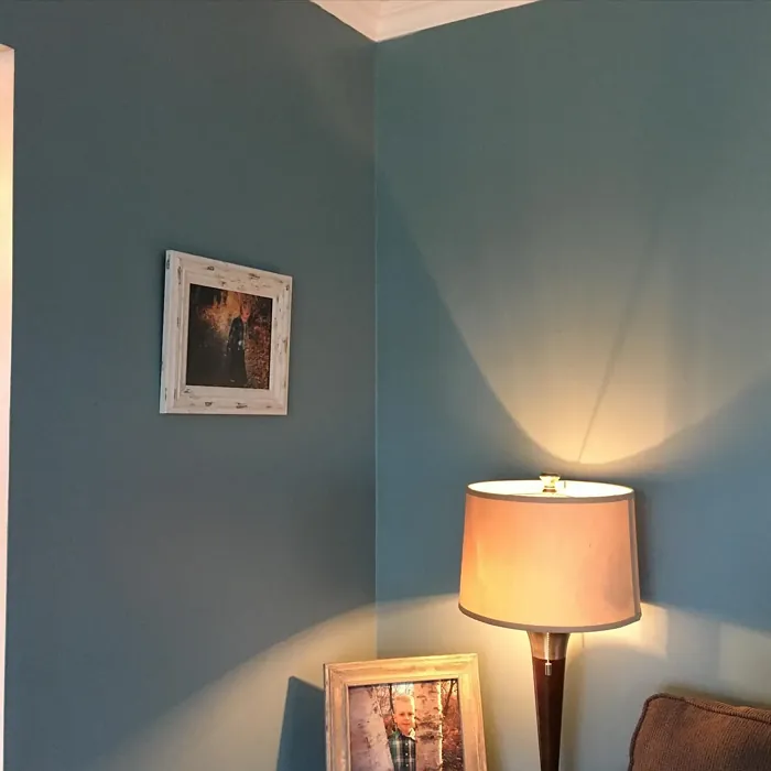
One of the standout features of Province Blue is its ability to reflect light beautifully. With a Light Reflectance Value (LRV) of around 31.57%, it strikes a balance between absorbing some light and reflecting enough to keep the room feeling bright and airy. In natural light, this color appears soft and inviting, creating an expansive feel. However, under artificial lighting, it can take on a deeper hue, adding a layer of depth without overwhelming the space.
Now, if you’re wondering about application, you’ll be pleased to know that Province Blue is beginner-friendly. Whether you’re using a roller or a brush, it applies smoothly and dries quickly, making your painting journey less daunting. Plus, it’s touch-up friendly, which is a big win if you’re a perfectionist like many of us.
When it comes to maintenance, this paint’s washability is a bonus. You can easily wipe away marks and smudges, ensuring your walls stay looking fresh and clean. With low VOC levels, you can feel good about using this paint in any interior space, including those where air quality is a concern, like nurseries or bedrooms.
Thinking about where to use Province Blue? The options are endless. Picture it in your living room, paired with soft white trim, creating a crisp and clean look that feels inviting. Or imagine it in a home office, providing a calming backdrop that helps you focus and be productive. And let’s not forget the nursery—its gentle hue sets the perfect stage for a calm and soothing environment for your little one.
If you’re concerned about the color’s depth in smaller spaces, fear not. Province Blue can work wonders in compact areas. Its soft, muted tone can create an illusion of depth and openness, especially when paired with lighter decor or furniture. Just keep an eye on your lighting; in dimly lit areas, it may appear darker, but with a few strategic choices, you can maintain that airy feel.
Let’s talk about complementary colors. Province Blue plays beautifully with a variety of shades, making it easy to create a cohesive look throughout your home. For trims, classic white shades like White Dove or Pure White pair seamlessly, offering a timeless contrast that brings out the best in Province Blue. If you’re feeling adventurous, consider warming things up with brass fixtures or rich wood accents to add a touch of elegance and warmth.
When choosing decor styles, Province Blue fits in effortlessly with coastal aesthetics, where it echoes the tranquility of a seaside retreat. It can also enhance the rustic charm of a modern farmhouse or the clean lines of Scandinavian design. This versatility makes it a favorite among designers, as it can be used as both a backdrop and a statement color.
As you think about your specific project, consider Province Blue’s adaptability. Whether you’re looking to refresh a single room or transform your entire home, this color can easily adapt to whatever vision you have in mind. Its muted quality makes it suitable for accent walls, furniture, or even cabinetry, adding layers of interest without overwhelming the senses.
If you’re still on the fence about the shade, it’s worth noting the various other shades Benjamin Moore offers that can complement Province Blue. Lighter shades like 2131-50 or HC-145 can create a soft gradient, while darker shades like AF-505 or HC-191 can provide striking contrast that enhances the depth of Province Blue.
In conclusion, Province Blue is more than just paint. It’s a color that evokes calm, creates warmth, and invites serenity into your home. If you want to breathe new life into your space, this hue is a fantastic choice. Its ease of application, versatile nature, and timeless appeal make it an excellent addition to any home decor project.
So, are you ready to embrace the tranquility of Province Blue? Imagine your space transformed, a gentle haven where you can unwind and recharge. Now is the perfect time to explore this beautiful hue and see how it can elevate your home decor. Trust me, once you experience the calming embrace of Province Blue, you’ll wonder how you ever lived without it.
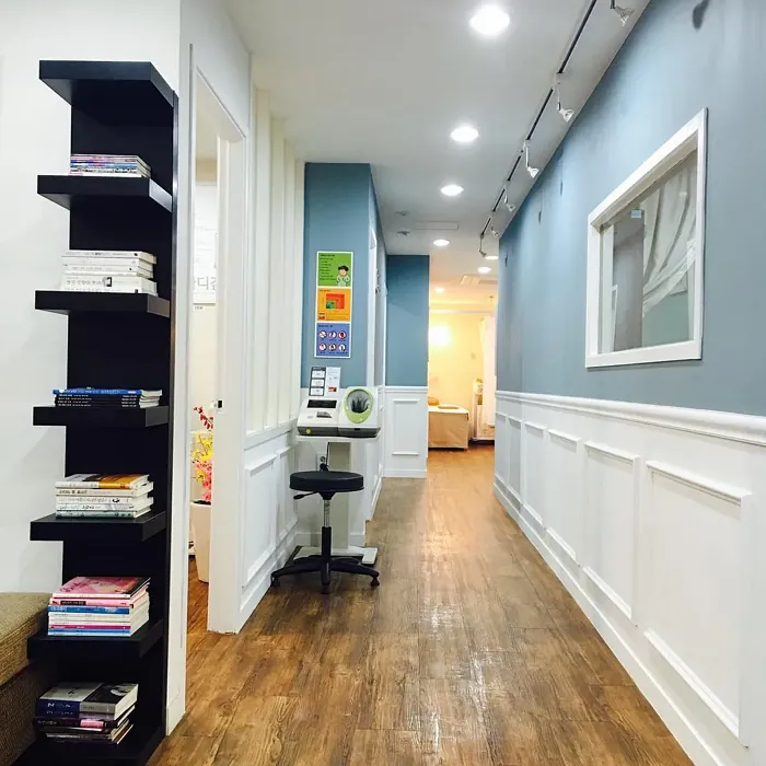
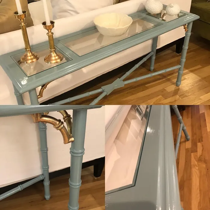
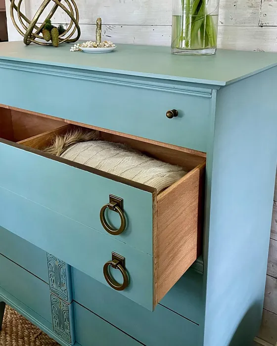
Real Room Photo of Province Blue 2135-40
Undertones of Province Blue ?
Province Blue carries subtle gray undertones, which enhance its versatility and richness. This allows it to harmonize beautifully with both warm and cool palettes, making it an exceptional choice for varied decor styles.
HEX value: #829BA1
RGB code: 130, 155, 161
Is Province Blue Cool or Warm?
Province Blue leans towards the cool side of the color spectrum, providing a refreshing vibe that can brighten up a space. It’s perfect for creating a crisp, clean look while still feeling inviting.
Understanding Color Properties and Interior Design Tips
Hue refers to a specific position on the color wheel, measured in degrees from 0 to 360. Each degree represents a different pure color:
- 0° represents red
- 120° represents green
- 240° represents blue
Saturation describes the intensity or purity of a color and is expressed as a percentage:
- At 0%, the color appears completely desaturated—essentially a shade of gray
- At 100%, the color is at its most vivid and vibrant
Lightness indicates how light or dark a color is, also expressed as a percentage:
- 0% lightness results in black
- 100% lightness results in white
Using Warm Colors in Interior Design
Warm hues—such as reds, oranges, yellows, warm beiges, and greiges—are excellent choices for creating inviting and energetic spaces. These colors are particularly well-suited for:
- Kitchens, living rooms, and bathrooms, where warmth enhances comfort and sociability
- Large rooms, where warm tones can help reduce the sense of emptiness and make the space feel more intimate
For example:
- Warm beige shades provide a cozy, inviting atmosphere, ideal for living rooms, bedrooms, and hallways.
- Warm greige (a mix of beige and gray) offers the warmth of beige with the modern appeal of gray, making it a versatile backdrop for dining areas, bedrooms, and living spaces.
However, be mindful when using warm light tones in rooms with limited natural light. These shades may appear muted or even take on an unpleasant yellowish tint. To avoid a dull or flat appearance:
- Add depth by incorporating richer tones like deep greens, charcoal, or chocolate brown
- Use textured elements such as curtains, rugs, or cushions to bring dimension to the space
Pro Tip: Achieving Harmony with Warm and Cool Color Balance
To create a well-balanced and visually interesting interior, mix warm and cool tones strategically. This contrast adds depth and harmony to your design.
- If your walls feature warm hues, introduce cool-colored accents such as blue or green furniture, artwork, or accessories to create contrast.
- For a polished look, consider using a complementary color scheme, which pairs colors opposite each other on the color wheel (e.g., red with green, orange with blue).
This thoughtful mix not only enhances visual appeal but also creates a space that feels both dynamic and cohesive.
Light Temperature Affects on Province Blue
Natural Light
Natural daylight changes in color temperature as the sun moves across the sky. At sunrise and sunset, the light tends to have a warm, golden tone with a color temperature around 2000 Kelvin (K). As the day progresses and the sun rises higher, the light becomes cooler and more neutral. Around midday, especially when the sky is clear, natural light typically reaches its peak brightness and shifts to a cooler tone, ranging from 5500 to 6500 Kelvin. This midday light is close to what we perceive as pure white or daylight-balanced light.
These shifts in natural light can significantly influence how colors appear in a space, which is why designers often consider both the time of day and the orientation of windows when planning interior color schemes.
Artificial Light
When choosing artificial lighting, pay close attention to the color temperature, measured in Kelvin (K). This determines how warm or cool the light will appear. Lower temperatures, around 2700K, give off a warm, yellow glow often used in living rooms or bedrooms. Higher temperatures, above 5000K, create a cool, bluish light similar to daylight, commonly used in kitchens, offices, or task areas.
Use the slider to see how lighting temperature can affect the appearance of a surface or color throughout a space.


4800K
LRV of Province Blue
With a Light Reflectance Value (LRV) of around 35, Province Blue absorbs some light while still reflecting enough to keep a room feeling open and airy. This makes it suitable for both well-lit and dimly lit areas.
Detailed Review of Province Blue
Additional Paint Characteristics
Ideal Rooms
Bedroom, Dining Room, Home Office, Living Room, Nursery
Decor Styles
Coastal, Modern Farmhouse, Scandinavian, Traditional
Coverage
Good (1–2 Coats), Touch-Up Friendly
Ease of Application
Beginner Friendly, Brush Smooth, Fast-Drying, Roller-Ready
Washability
Highly Washable, Washable
VOC Level
Low VOC
Best Use
Accent Wall, Furniture, Interior Walls
Room Suitability
Bedroom, Home Office, Living Room, Nursery
Tone Tag
Balanced, Cool, Muted
Finish Type
Eggshell, Satin
Paint Performance
Easy Touch-Up, Low Odor, Quick Drying
Use Cases
Best for Open Concept, Best for Rentals, Designer Favorite
Mood
Calm, Inviting, Restful
Trim Pairing
Complements Brass Fixtures, Good with Wood Trim, Pairs with White Dove
When it comes to Province Blue, you’re looking at a color that strikes a beautiful balance between sophistication and serenity. This shade effortlessly complements a variety of decor styles, from the airy feel of a coastal home to the rustic charm of a modern farmhouse. Its muted quality means it can act as both a backdrop and a feature, seamlessly integrating with your furnishings. Whether you’re painting an accent wall or refreshing an entire room, Province Blue offers versatility that makes it a favorite among homeowners and designers alike. Its soft tone is particularly effective in spaces meant for relaxation or focus, like bedrooms and home offices. So, if you’re on the hunt for a color that soothes the soul while still making a stylish statement, Province Blue is definitely worth considering.
Pros & Cons of 2135-40 Province Blue
Pros
Cons
Colors that go with Benjamin Moore Province Blue
FAQ on 2135-40 Province Blue
Can I use Province Blue in small spaces?
Absolutely! Province Blue can actually work wonders in small spaces. Its soft, muted tone can create an illusion of depth and openness. Pair it with lighter decor or furniture to maximize that airy feel. Just be mindful of your lighting, as it may appear deeper in dim areas.
What trim colors pair well with Province Blue?
Province Blue pairs beautifully with a range of trim colors. For a classic look, consider white trims like White Dove or Pure White. If you’re feeling adventurous, you could also match it with warm woods or brass fixtures to add a touch of richness and warmth to your space.
Comparisons Province Blue with other colors
Province Blue 2135-40 vs Dutch Tile Blue SW 0031
| Attribute | Province Blue 2135-40 | Dutch Tile Blue SW 0031 |
|---|---|---|
| Color Name | Province Blue 2135-40 | Dutch Tile Blue SW 0031 |
| Color | ||
| Hue | Blue | Blue |
| Brightness | Medium | Medium |
| RGB | 130, 155, 161 | 154, 171, 171 |
| LRV | 31.57% | 24% |
| Finish Type | Eggshell, Satin | Eggshell, Matte, Satin |
| Finish Options | Eggshell, Matte, Satin | Eggshell, Flat, Matte, Satin |
| Ideal Rooms | Bedroom, Dining Room, Home Office, Living Room, Nursery | Bathroom, Bedroom, Dining Room, Hallway, Home Office, Kitchen, Living Room |
| Decor Styles | Coastal, Modern Farmhouse, Scandinavian, Traditional | Coastal, Modern Farmhouse, Scandinavian, Traditional, Transitional |
| Coverage | Good (1–2 Coats), Touch-Up Friendly | Good (1–2 Coats) |
| Ease of Application | Beginner Friendly, Brush Smooth, Fast-Drying, Roller-Ready | Beginner Friendly, Brush Smooth, Fast-Drying, Roller-Ready |
| Washability | Highly Washable, Washable | Highly Washable, Washable |
| Room Suitability | Bedroom, Home Office, Living Room, Nursery | Bathroom, Bedroom, Dining Room, Kitchen, Living Room |
| Tone | Balanced, Cool, Muted | Balanced, Cool, Muted |
| Paint Performance | Easy Touch-Up, Low Odor, Quick Drying | Easy Touch-Up, High Coverage, Low Odor, Quick Drying |
Province Blue 2135-40 vs Debonair SW 9139
| Attribute | Province Blue 2135-40 | Debonair SW 9139 |
|---|---|---|
| Color Name | Province Blue 2135-40 | Debonair SW 9139 |
| Color | ||
| Hue | Blue | Blue |
| Brightness | Medium | Medium |
| RGB | 130, 155, 161 | 144, 160, 166 |
| LRV | 31.57% | 30% |
| Finish Type | Eggshell, Satin | Eggshell, Matte, Satin |
| Finish Options | Eggshell, Matte, Satin | Eggshell, Matte, Satin |
| Ideal Rooms | Bedroom, Dining Room, Home Office, Living Room, Nursery | Bedroom, Dining Room, Home Office, Living Room |
| Decor Styles | Coastal, Modern Farmhouse, Scandinavian, Traditional | Coastal, Industrial, Modern, Transitional |
| Coverage | Good (1–2 Coats), Touch-Up Friendly | Good (1–2 Coats) |
| Ease of Application | Beginner Friendly, Brush Smooth, Fast-Drying, Roller-Ready | Beginner Friendly, Brush Smooth, Roller-Ready |
| Washability | Highly Washable, Washable | Washable, Wipeable |
| Room Suitability | Bedroom, Home Office, Living Room, Nursery | Bedroom, Dining Room, Home Office, Living Room |
| Tone | Balanced, Cool, Muted | Balanced, Cool, Muted |
| Paint Performance | Easy Touch-Up, Low Odor, Quick Drying | Easy Touch-Up, Low Odor, Quick Drying |
Province Blue 2135-40 vs Stardew SW 9138
| Attribute | Province Blue 2135-40 | Stardew SW 9138 |
|---|---|---|
| Color Name | Province Blue 2135-40 | Stardew SW 9138 |
| Color | ||
| Hue | Blue | Blue |
| Brightness | Medium | Medium |
| RGB | 130, 155, 161 | 166, 178, 181 |
| LRV | 31.57% | 30% |
| Finish Type | Eggshell, Satin | Eggshell, Satin |
| Finish Options | Eggshell, Matte, Satin | Eggshell, Matte, Satin |
| Ideal Rooms | Bedroom, Dining Room, Home Office, Living Room, Nursery | Bathroom, Bedroom, Home Office, Living Room, Nursery |
| Decor Styles | Coastal, Modern Farmhouse, Scandinavian, Traditional | Coastal, Farmhouse, Modern, Scandinavian |
| Coverage | Good (1–2 Coats), Touch-Up Friendly | Good (1–2 Coats) |
| Ease of Application | Beginner Friendly, Brush Smooth, Fast-Drying, Roller-Ready | Beginner Friendly, Brush Smooth, Roller-Ready |
| Washability | Highly Washable, Washable | Highly Washable, Washable, Wipeable |
| Room Suitability | Bedroom, Home Office, Living Room, Nursery | Bathroom, Bedroom, Home Office, Living Room |
| Tone | Balanced, Cool, Muted | Calm, Cool, Muted |
| Paint Performance | Easy Touch-Up, Low Odor, Quick Drying | Easy Touch-Up, High Coverage, Low Odor |
Province Blue 2135-40 vs Niebla Azul SW 9137
| Attribute | Province Blue 2135-40 | Niebla Azul SW 9137 |
|---|---|---|
| Color Name | Province Blue 2135-40 | Niebla Azul SW 9137 |
| Color | ||
| Hue | Blue | Blue |
| Brightness | Medium | Medium |
| RGB | 130, 155, 161 | 182, 195, 196 |
| LRV | 31.57% | 48% |
| Finish Type | Eggshell, Satin | Eggshell, Matte, Satin |
| Finish Options | Eggshell, Matte, Satin | Eggshell, Matte, Satin |
| Ideal Rooms | Bedroom, Dining Room, Home Office, Living Room, Nursery | Bedroom, Home Office, Living Room, Nursery |
| Decor Styles | Coastal, Modern Farmhouse, Scandinavian, Traditional | Coastal, Modern, Scandinavian, Transitional |
| Coverage | Good (1–2 Coats), Touch-Up Friendly | Good (1–2 Coats), Touch-Up Friendly |
| Ease of Application | Beginner Friendly, Brush Smooth, Fast-Drying, Roller-Ready | Beginner Friendly, Brush Smooth, Roller-Ready |
| Washability | Highly Washable, Washable | Highly Washable, Washable |
| Room Suitability | Bedroom, Home Office, Living Room, Nursery | Bedroom, Home Office, Living Room, Nursery |
| Tone | Balanced, Cool, Muted | Airy, Cool, Muted |
| Paint Performance | Easy Touch-Up, Low Odor, Quick Drying | Easy Touch-Up, Fade Resistant, Low Odor, Scuff Resistant |
Province Blue 2135-40 vs Rain SW 6219
| Attribute | Province Blue 2135-40 | Rain SW 6219 |
|---|---|---|
| Color Name | Province Blue 2135-40 | Rain SW 6219 |
| Color | ||
| Hue | Blue | Blue |
| Brightness | Medium | Medium |
| RGB | 130, 155, 161 | 171, 190, 191 |
| LRV | 31.57% | 50% |
| Finish Type | Eggshell, Satin | Eggshell, Matte, Satin |
| Finish Options | Eggshell, Matte, Satin | Eggshell, Matte, Satin |
| Ideal Rooms | Bedroom, Dining Room, Home Office, Living Room, Nursery | Bathroom, Bedroom, Home Office, Living Room, Nursery |
| Decor Styles | Coastal, Modern Farmhouse, Scandinavian, Traditional | Coastal, Minimalist, Modern, Scandinavian, Transitional |
| Coverage | Good (1–2 Coats), Touch-Up Friendly | Good (1–2 Coats), Touch-Up Friendly |
| Ease of Application | Beginner Friendly, Brush Smooth, Fast-Drying, Roller-Ready | Beginner Friendly, Brush Smooth, Fast-Drying, Roller-Ready |
| Washability | Highly Washable, Washable | Scrubbable, Stain Resistant, Washable |
| Room Suitability | Bedroom, Home Office, Living Room, Nursery | Bathroom, Bedroom, Home Office, Living Room, Nursery |
| Tone | Balanced, Cool, Muted | Balanced, Cool, Muted |
| Paint Performance | Easy Touch-Up, Low Odor, Quick Drying | Easy Touch-Up, Low Odor, Quick Drying, Stain Resistant |
Province Blue 2135-40 vs Morning at Sea SW 9634
| Attribute | Province Blue 2135-40 | Morning at Sea SW 9634 |
|---|---|---|
| Color Name | Province Blue 2135-40 | Morning at Sea SW 9634 |
| Color | ||
| Hue | Blue | Blue |
| Brightness | Medium | Medium |
| RGB | 130, 155, 161 | 130, 151, 155 |
| LRV | 31.57% | 50% |
| Finish Type | Eggshell, Satin | Eggshell, Matte |
| Finish Options | Eggshell, Matte, Satin | Eggshell, Matte, Satin |
| Ideal Rooms | Bedroom, Dining Room, Home Office, Living Room, Nursery | Bathroom, Bedroom, Home Office, Living Room |
| Decor Styles | Coastal, Modern Farmhouse, Scandinavian, Traditional | Coastal, Minimalist, Modern, Scandinavian |
| Coverage | Good (1–2 Coats), Touch-Up Friendly | Good (1–2 Coats), Touch-Up Friendly |
| Ease of Application | Beginner Friendly, Brush Smooth, Fast-Drying, Roller-Ready | Beginner Friendly, Brush Smooth, Roller-Ready |
| Washability | Highly Washable, Washable | Washable, Wipeable |
| Room Suitability | Bedroom, Home Office, Living Room, Nursery | Bathroom, Bedroom, Home Office, Living Room |
| Tone | Balanced, Cool, Muted | Airy, Cool, Muted |
| Paint Performance | Easy Touch-Up, Low Odor, Quick Drying | Easy Touch-Up, Fade Resistant, Low Odor |
Province Blue 2135-40 vs Sleepy Blue SW 6225
| Attribute | Province Blue 2135-40 | Sleepy Blue SW 6225 |
|---|---|---|
| Color Name | Province Blue 2135-40 | Sleepy Blue SW 6225 |
| Color | ||
| Hue | Blue | Blue |
| Brightness | Medium | Medium |
| RGB | 130, 155, 161 | 188, 203, 206 |
| LRV | 31.57% | 50% |
| Finish Type | Eggshell, Satin | Eggshell, Matte, Satin |
| Finish Options | Eggshell, Matte, Satin | Eggshell, Matte, Satin |
| Ideal Rooms | Bedroom, Dining Room, Home Office, Living Room, Nursery | Bedroom, Home Office, Living Room, Nursery |
| Decor Styles | Coastal, Modern Farmhouse, Scandinavian, Traditional | Coastal, Minimalist, Modern Farmhouse, Scandinavian |
| Coverage | Good (1–2 Coats), Touch-Up Friendly | Good (1–2 Coats) |
| Ease of Application | Beginner Friendly, Brush Smooth, Fast-Drying, Roller-Ready | Beginner Friendly, Brush Smooth, Fast-Drying, Roller-Ready |
| Washability | Highly Washable, Washable | Highly Washable, Washable |
| Room Suitability | Bedroom, Home Office, Living Room, Nursery | Bedroom, Home Office, Living Room, Nursery |
| Tone | Balanced, Cool, Muted | Airy, Cool, Muted |
| Paint Performance | Easy Touch-Up, Low Odor, Quick Drying | Easy Touch-Up, Low Odor, Quick Drying, Scuff Resistant |
Province Blue 2135-40 vs Lakeside SW 9683
| Attribute | Province Blue 2135-40 | Lakeside SW 9683 |
|---|---|---|
| Color Name | Province Blue 2135-40 | Lakeside SW 9683 |
| Color | ||
| Hue | Blue | Blue |
| Brightness | Medium | Medium |
| RGB | 130, 155, 161 | 173, 184, 192 |
| LRV | 31.57% | 24% |
| Finish Type | Eggshell, Satin | Eggshell, Matte, Satin |
| Finish Options | Eggshell, Matte, Satin | Eggshell, Matte, Satin |
| Ideal Rooms | Bedroom, Dining Room, Home Office, Living Room, Nursery | Bathroom, Bedroom, Home Office, Living Room |
| Decor Styles | Coastal, Modern Farmhouse, Scandinavian, Traditional | Coastal, Minimalist, Modern, Rustic |
| Coverage | Good (1–2 Coats), Touch-Up Friendly | Good (1–2 Coats) |
| Ease of Application | Beginner Friendly, Brush Smooth, Fast-Drying, Roller-Ready | Beginner Friendly, Brush Smooth, Roller-Ready |
| Washability | Highly Washable, Washable | Scrubbable, Washable |
| Room Suitability | Bedroom, Home Office, Living Room, Nursery | Bathroom, Bedroom, Home Office, Living Room |
| Tone | Balanced, Cool, Muted | Balanced, Cool, Muted |
| Paint Performance | Easy Touch-Up, Low Odor, Quick Drying | Easy Touch-Up, Fade Resistant, High Coverage, Low Odor |
Province Blue 2135-40 vs Upward SW 6239
| Attribute | Province Blue 2135-40 | Upward SW 6239 |
|---|---|---|
| Color Name | Province Blue 2135-40 | Upward SW 6239 |
| Color | ||
| Hue | Blue | Blue |
| Brightness | Medium | Medium |
| RGB | 130, 155, 161 | 191, 201, 208 |
| LRV | 31.57% | 75% |
| Finish Type | Eggshell, Satin | Eggshell, Satin |
| Finish Options | Eggshell, Matte, Satin | Eggshell, Flat, Satin |
| Ideal Rooms | Bedroom, Dining Room, Home Office, Living Room, Nursery | Bedroom, Dining Room, Home Office, Living Room, Nursery |
| Decor Styles | Coastal, Modern Farmhouse, Scandinavian, Traditional | Coastal, Minimalist, Modern, Scandinavian |
| Coverage | Good (1–2 Coats), Touch-Up Friendly | Good (1–2 Coats), Touch-Up Friendly |
| Ease of Application | Beginner Friendly, Brush Smooth, Fast-Drying, Roller-Ready | Beginner Friendly, Brush Smooth, Fast-Drying, Roller-Ready |
| Washability | Highly Washable, Washable | Washable, Wipeable |
| Room Suitability | Bedroom, Home Office, Living Room, Nursery | Bedroom, Home Office, Living Room, Nursery |
| Tone | Balanced, Cool, Muted | Cool, Crisp, Muted |
| Paint Performance | Easy Touch-Up, Low Odor, Quick Drying | High Coverage, Low Odor, Quick Drying |
Province Blue 2135-40 vs Aleutian SW 6241
| Attribute | Province Blue 2135-40 | Aleutian SW 6241 |
|---|---|---|
| Color Name | Province Blue 2135-40 | Aleutian SW 6241 |
| Color | ||
| Hue | Blue | Blue |
| Brightness | Medium | Medium |
| RGB | 130, 155, 161 | 152, 169, 183 |
| LRV | 31.57% | 24% |
| Finish Type | Eggshell, Satin | Eggshell, Matte, Satin |
| Finish Options | Eggshell, Matte, Satin | Eggshell, Matte, Satin |
| Ideal Rooms | Bedroom, Dining Room, Home Office, Living Room, Nursery | Bathroom, Bedroom, Home Office, Kitchen, Living Room, Nursery |
| Decor Styles | Coastal, Modern Farmhouse, Scandinavian, Traditional | Coastal, Minimalist, Modern, Scandinavian, Transitional |
| Coverage | Good (1–2 Coats), Touch-Up Friendly | Good (1–2 Coats), Touch-Up Friendly |
| Ease of Application | Beginner Friendly, Brush Smooth, Fast-Drying, Roller-Ready | Beginner Friendly, Brush Smooth, Fast-Drying, Roller-Ready |
| Washability | Highly Washable, Washable | Scrubbable, Stain Resistant, Washable |
| Room Suitability | Bedroom, Home Office, Living Room, Nursery | Bathroom, Bedroom, Home Office, Living Room, Nursery |
| Tone | Balanced, Cool, Muted | Airy, Balanced, Cool, Muted |
| Paint Performance | Easy Touch-Up, Low Odor, Quick Drying | Easy Touch-Up, Fade Resistant, Low Odor, Quick Drying |
Official Page of Benjamin Moore Province Blue 2135-40