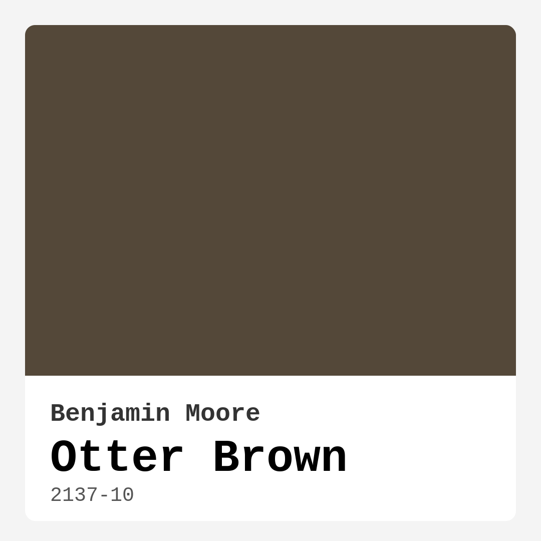
Color Preview & Key Details
| HEX Code | #544839 |
| RGB | 84, 72, 57 |
| LRV | 7.68% |
| Undertone | Red |
| Finish Options | Eggshell, Matte, Satin |
If you’re searching for a paint color that brings warmth, depth, and a touch of nature into your home, Benjamin Moore’s Otter Brown (2137-10) might just be your perfect match. This rich, earthy hue is more than just a dark brown—it’s a sophisticated shade with subtle red undertones that add complexity and warmth to any space. Whether you’re aiming for a cozy living room, a serene bedroom, or a stylish home office, Otter Brown has the versatility to elevate your design. Let’s dive into what makes this color so special and how you can make it work in your home.
First, let’s talk about the tone. Otter Brown is undeniably warm, leaning into its earthy roots with a hint of red that gives it a comforting, almost rustic feel. It’s the kind of color that makes a room feel grounded and inviting, like a well-worn leather chair or the bark of an old tree. But don’t mistake it for flat or boring—its depth allows it to play well with both modern and traditional decor styles. Pair it with crisp white trim for a clean, polished look, or let it mingle with natural wood finishes for a more organic, lived-in vibe.
One of the standout qualities of Otter Brown is its adaptability to different lighting conditions. With an LRV (Light Reflectance Value) of just 7.68%, it’s a dark color that absorbs light rather than reflecting it. In a sunlit room, it’ll show off its warm, reddish-brown tones, creating a welcoming atmosphere. At night or in low-light spaces, it takes on a moodier, more dramatic presence, perfect for creating an intimate setting. If you’re worried about it feeling too heavy in a small room, consider using it on an accent wall or balancing it with lighter furnishings and plenty of layered lighting.
When it comes to pairing Otter Brown with other colors, the possibilities are endless. For a classic, timeless look, try it with soft whites like Benjamin Moore’s White Dove or Simply White. These combinations keep things fresh and prevent the space from feeling too dark. If you’re feeling bold, deep blues or greens can create a striking contrast that highlights Otter Brown’s richness. And don’t forget about metallics—brass fixtures or gold accents add a touch of luxury that plays beautifully with its warm undertones.
As for finishes, Otter Brown works well in matte, eggshell, or satin, depending on the room’s function. Matte is ideal for low-traffic areas where you want a velvety, sophisticated look, while eggshell or satin offers more durability and wipeability for spaces like dining rooms or home offices. And because it’s a low-VOC paint with good coverage (often needing just one or two coats), it’s a practical choice for DIYers and professionals alike.
Now, let’s address the elephant in the room—can Otter Brown work in small spaces? The short answer is yes, but with some strategy. While it’s a deep color that can make a room feel cozy, it might overwhelm if used on all four walls in a tight area. Instead, try it on a single accent wall or pair it with lighter colors to maintain balance. And if you’re painting furniture or cabinetry, Otter Brown can add a touch of elegance without closing in the space.
If you’re still on the fence, here’s the bottom line: Otter Brown is a versatile, warm, and deeply inviting color that can transform a room from bland to beautiful. It’s perfect for anyone who loves earthy tones but wants something with a bit more sophistication than your average beige. Whether you’re going for modern farmhouse, rustic charm, or even a bohemian flair, this shade has the depth and character to make it happen. So grab a sample, test it in your space, and see how Otter Brown can bring a little piece of the natural world into your home.
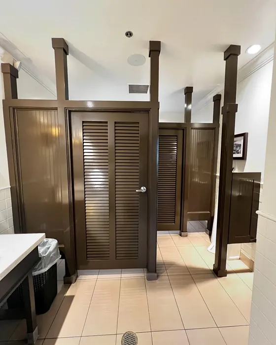
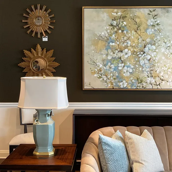
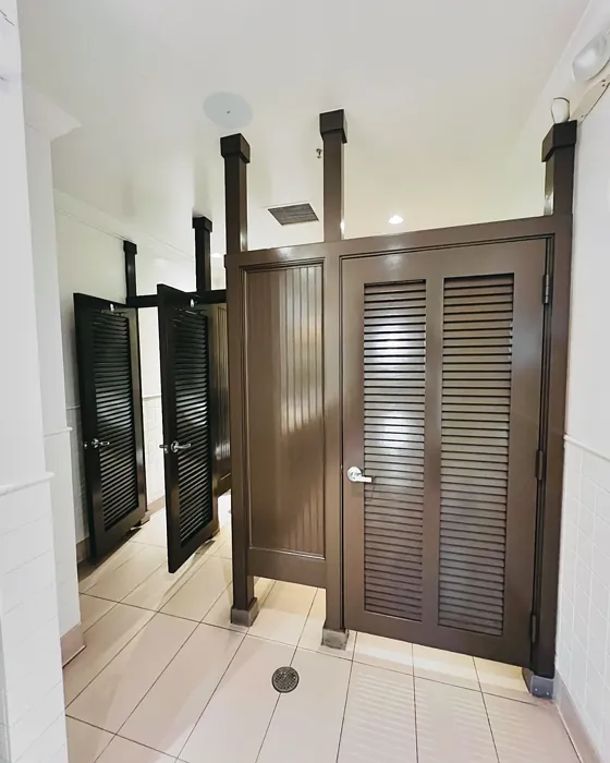
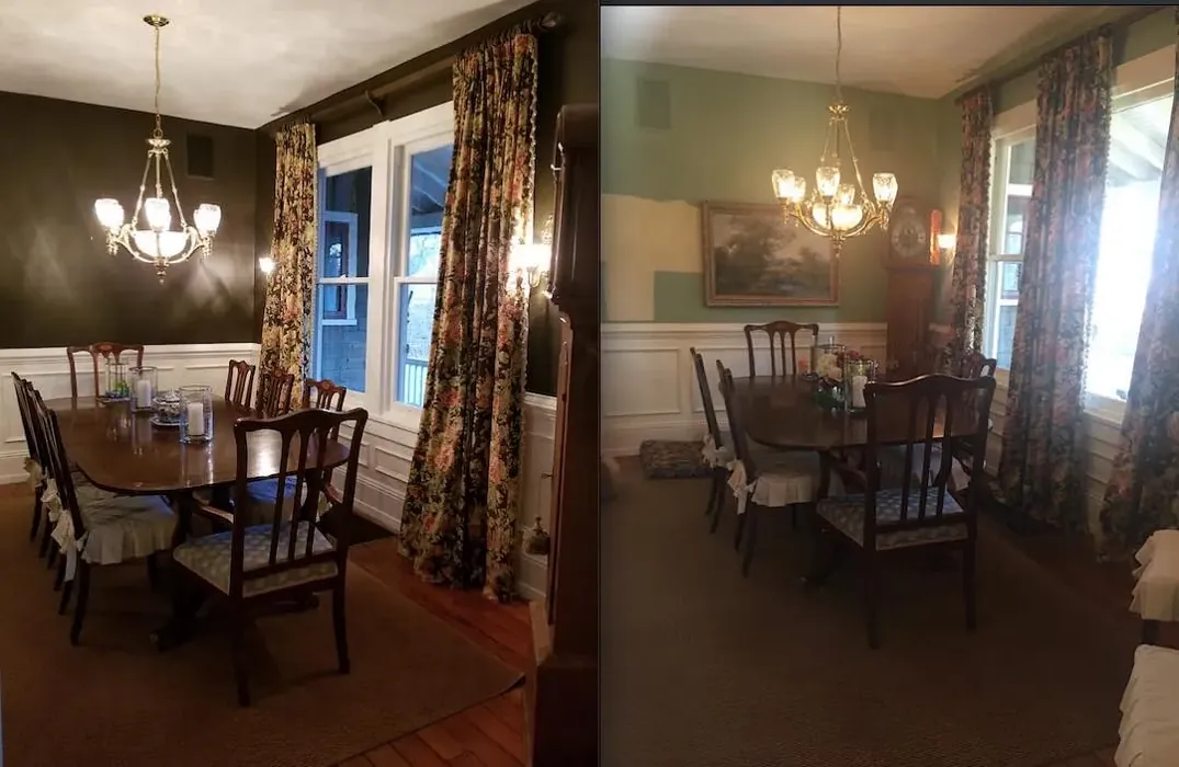
Real Room Photo of Otter Brown 2137-10
Undertones of Otter Brown ?
The undertones of Otter Brown are a key aspect of its character, leaning towards Red. These subtle underlying hues are what give the color its depth and complexity. For example, a gray with a blue undertone will feel cooler and more modern, while one with a brown undertone will feel warmer and more traditional. It’s essential to test this paint in your home and observe it next to your existing furniture, flooring, and decor to see how these undertones interact and reveal themselves throughout the day.
HEX value: #544839
RGB code: 84, 72, 57
Is Otter Brown Cool or Warm?
Otter Brown leans toward the warm side of the spectrum, which contributes to its inviting nature. This warmth makes it a comforting choice for spaces where relaxation is key, like living rooms and bedrooms.
Understanding Color Properties and Interior Design Tips
Hue refers to a specific position on the color wheel, measured in degrees from 0 to 360. Each degree represents a different pure color:
- 0° represents red
- 120° represents green
- 240° represents blue
Saturation describes the intensity or purity of a color and is expressed as a percentage:
- At 0%, the color appears completely desaturated—essentially a shade of gray
- At 100%, the color is at its most vivid and vibrant
Lightness indicates how light or dark a color is, also expressed as a percentage:
- 0% lightness results in black
- 100% lightness results in white
Using Warm Colors in Interior Design
Warm hues—such as reds, oranges, yellows, warm beiges, and greiges—are excellent choices for creating inviting and energetic spaces. These colors are particularly well-suited for:
- Kitchens, living rooms, and bathrooms, where warmth enhances comfort and sociability
- Large rooms, where warm tones can help reduce the sense of emptiness and make the space feel more intimate
For example:
- Warm beige shades provide a cozy, inviting atmosphere, ideal for living rooms, bedrooms, and hallways.
- Warm greige (a mix of beige and gray) offers the warmth of beige with the modern appeal of gray, making it a versatile backdrop for dining areas, bedrooms, and living spaces.
However, be mindful when using warm light tones in rooms with limited natural light. These shades may appear muted or even take on an unpleasant yellowish tint. To avoid a dull or flat appearance:
- Add depth by incorporating richer tones like deep greens, charcoal, or chocolate brown
- Use textured elements such as curtains, rugs, or cushions to bring dimension to the space
Pro Tip: Achieving Harmony with Warm and Cool Color Balance
To create a well-balanced and visually interesting interior, mix warm and cool tones strategically. This contrast adds depth and harmony to your design.
- If your walls feature warm hues, introduce cool-colored accents such as blue or green furniture, artwork, or accessories to create contrast.
- For a polished look, consider using a complementary color scheme, which pairs colors opposite each other on the color wheel (e.g., red with green, orange with blue).
This thoughtful mix not only enhances visual appeal but also creates a space that feels both dynamic and cohesive.
Light Temperature Affects on Otter Brown
Natural Light
Natural daylight changes in color temperature as the sun moves across the sky. At sunrise and sunset, the light tends to have a warm, golden tone with a color temperature around 2000 Kelvin (K). As the day progresses and the sun rises higher, the light becomes cooler and more neutral. Around midday, especially when the sky is clear, natural light typically reaches its peak brightness and shifts to a cooler tone, ranging from 5500 to 6500 Kelvin. This midday light is close to what we perceive as pure white or daylight-balanced light.
These shifts in natural light can significantly influence how colors appear in a space, which is why designers often consider both the time of day and the orientation of windows when planning interior color schemes.
Artificial Light
When choosing artificial lighting, pay close attention to the color temperature, measured in Kelvin (K). This determines how warm or cool the light will appear. Lower temperatures, around 2700K, give off a warm, yellow glow often used in living rooms or bedrooms. Higher temperatures, above 5000K, create a cool, bluish light similar to daylight, commonly used in kitchens, offices, or task areas.
Use the slider to see how lighting temperature can affect the appearance of a surface or color throughout a space.


4800K
LRV of Otter Brown
The Light Reflectance Value (LRV) of Otter Brown is 7.68%, which places it in the Dark colors category. This means it does not reflect light. Understanding a paint’s LRV is crucial for predicting how it will look in your space. A higher LRV indicates a lighter color that reflects more light, making rooms feel larger and brighter. A lower LRV signifies a darker color that absorbs more light, creating a cozier, more intimate atmosphere. Always consider the natural and artificial lighting in your room when selecting a paint color based on its LRV.
Detailed Review of Otter Brown
Additional Paint Characteristics
Ideal Rooms
Bedroom, Dining Room, Home Office, Living Room
Decor Styles
Bohemian, Modern Farmhouse, Rustic, Traditional
Coverage
Good (1–2 Coats), Touch-Up Friendly
Ease of Application
Beginner Friendly, Brush Smooth, Roller-Ready
Washability
Washable, Wipeable
VOC Level
Low VOC
Best Use
Accent Wall, Furniture, Interior Walls
Room Suitability
Bedroom, Dining Room, Home Office, Living Room
Tone Tag
Deep, Earthy, Warm
Finish Type
Eggshell, Matte, Satin
Paint Performance
Easy Touch-Up, High Coverage, Low Odor
Use Cases
Best for Low Light Rooms, Best for Rentals, Classic Favorite
Mood
Cozy, Grounding, Inviting
Trim Pairing
Complements Brass Fixtures, Good with Wood Trim, Pairs with White Dove
Otter Brown stands out for its versatility and depth. This color offers a stunning backdrop that can enhance the beauty of furnishings and decor. When applied, it creates an inviting atmosphere that’s perfect for relaxation or entertaining guests. Its earthy tone pairs beautifully with natural materials like wood and stone, adding to its appeal in both rustic and contemporary homes.
One of the best features of Otter Brown is its ability to adapt to different lighting conditions. In natural light, it reveals a warm, welcoming vibe, while in dimmer settings, it takes on a more moody and dramatic feel. This dynamic quality makes it suitable for various applications, from accent walls to full-room coverage. Whether you’re looking to create a cozy den or a stylish office, Otter Brown is a fantastic choice.
Pros & Cons of 2137-10 Otter Brown
Pros
Cons
Colors that go with Benjamin Moore Otter Brown
FAQ on 2137-10 Otter Brown
What colors pair well with Otter Brown?
Otter Brown works beautifully with a variety of colors. For a balanced look, consider pairing it with soft whites like White Dove or Simply White. If you’re aiming for a more dramatic contrast, deep blues or greens can create a striking effect. Additionally, warm metallics like brass can complement the earthy tones of Otter Brown, enhancing its overall warmth and richness.
Is Otter Brown suitable for small spaces?
While Otter Brown can bring warmth to small spaces, it’s essential to use it wisely. In cramped areas, it may feel overwhelming if used excessively. Instead, consider using it as an accent wall or in combination with lighter colors to maintain an open feel. Proper lighting can also help prevent the space from feeling too enclosed when using this deep hue.
Comparisons Otter Brown with other colors
Otter Brown 2137-10 vs Griffin SW 7026
| Attribute | Otter Brown 2137-10 | Griffin SW 7026 |
|---|---|---|
| Color Name | Otter Brown 2137-10 | Griffin SW 7026 |
| Color | ||
| Hue | Beige | Beige |
| Brightness | Dark | Dark |
| RGB | 84, 72, 57 | 111, 100, 89 |
| LRV | 7.68% | 24% |
| Finish Type | Eggshell, Matte, Satin | Eggshell, Matte |
| Finish Options | Eggshell, Matte, Satin | Eggshell, Matte, Satin |
| Ideal Rooms | Bedroom, Dining Room, Home Office, Living Room | Bathroom, Bedroom, Dining Room, Home Office, Living Room |
| Decor Styles | Bohemian, Modern Farmhouse, Rustic, Traditional | Contemporary, Modern, Rustic, Transitional |
| Coverage | Good (1–2 Coats), Touch-Up Friendly | Good (1–2 Coats), Touch-Up Friendly |
| Ease of Application | Beginner Friendly, Brush Smooth, Roller-Ready | Beginner Friendly, Brush Smooth, Roller-Ready |
| Washability | Washable, Wipeable | Washable, Wipeable |
| Room Suitability | Bedroom, Dining Room, Home Office, Living Room | Bedroom, Dining Room, Home Office, Living Room |
| Tone | Deep, Earthy, Warm | Earthy, Muted, Warm |
| Paint Performance | Easy Touch-Up, High Coverage, Low Odor | Easy Touch-Up, Fade Resistant, Low Odor |
Otter Brown 2137-10 vs Warm Stone SW 7032
| Attribute | Otter Brown 2137-10 | Warm Stone SW 7032 |
|---|---|---|
| Color Name | Otter Brown 2137-10 | Warm Stone SW 7032 |
| Color | ||
| Hue | Beige | Beige |
| Brightness | Dark | Dark |
| RGB | 84, 72, 57 | 136, 123, 108 |
| LRV | 7.68% | 58% |
| Finish Type | Eggshell, Matte, Satin | Eggshell, Matte, Satin |
| Finish Options | Eggshell, Matte, Satin | Eggshell, Matte, Satin |
| Ideal Rooms | Bedroom, Dining Room, Home Office, Living Room | Bedroom, Dining Room, Home Office, Kitchen, Living Room |
| Decor Styles | Bohemian, Modern Farmhouse, Rustic, Traditional | Contemporary, Modern Farmhouse, Rustic, Transitional |
| Coverage | Good (1–2 Coats), Touch-Up Friendly | Good (1–2 Coats), Touch-Up Friendly |
| Ease of Application | Beginner Friendly, Brush Smooth, Roller-Ready | Beginner Friendly, Brush Smooth, Roller-Ready |
| Washability | Washable, Wipeable | Washable, Wipeable |
| Room Suitability | Bedroom, Dining Room, Home Office, Living Room | Bedroom, Dining Room, Home Office, Living Room |
| Tone | Deep, Earthy, Warm | Earthy, Muted, Warm |
| Paint Performance | Easy Touch-Up, High Coverage, Low Odor | Easy Touch-Up, High Coverage, Low Odor, Quick Drying, Scuff Resistant |
Otter Brown 2137-10 vs Black Fox SW 7020
| Attribute | Otter Brown 2137-10 | Black Fox SW 7020 |
|---|---|---|
| Color Name | Otter Brown 2137-10 | Black Fox SW 7020 |
| Color | ||
| Hue | Beige | Beige |
| Brightness | Dark | Dark |
| RGB | 84, 72, 57 | 79, 72, 66 |
| LRV | 7.68% | 5% |
| Finish Type | Eggshell, Matte, Satin | Eggshell, Matte, Satin |
| Finish Options | Eggshell, Matte, Satin | Eggshell, Matte, Satin |
| Ideal Rooms | Bedroom, Dining Room, Home Office, Living Room | Bedroom, Dining Room, Hallway, Home Office, Living Room |
| Decor Styles | Bohemian, Modern Farmhouse, Rustic, Traditional | Bohemian, Industrial, Modern, Rustic, Transitional |
| Coverage | Good (1–2 Coats), Touch-Up Friendly | Good (1–2 Coats), Touch-Up Friendly |
| Ease of Application | Beginner Friendly, Brush Smooth, Roller-Ready | Brush Smooth, Fast-Drying, Roller-Ready |
| Washability | Washable, Wipeable | Washable, Wipeable |
| Room Suitability | Bedroom, Dining Room, Home Office, Living Room | Bedroom, Dining Room, Hallway, Home Office, Living Room |
| Tone | Deep, Earthy, Warm | Deep, Earthy, Warm |
| Paint Performance | Easy Touch-Up, High Coverage, Low Odor | Easy Touch-Up, High Coverage, Low Odor |
Otter Brown 2137-10 vs Anonymous SW 7046
| Attribute | Otter Brown 2137-10 | Anonymous SW 7046 |
|---|---|---|
| Color Name | Otter Brown 2137-10 | Anonymous SW 7046 |
| Color | ||
| Hue | Beige | Beige |
| Brightness | Dark | Dark |
| RGB | 84, 72, 57 | 129, 122, 110 |
| LRV | 7.68% | 22% |
| Finish Type | Eggshell, Matte, Satin | Eggshell, Matte, Satin |
| Finish Options | Eggshell, Matte, Satin | Eggshell, Matte, Satin |
| Ideal Rooms | Bedroom, Dining Room, Home Office, Living Room | Bathroom, Bedroom, Dining Room, Home Office, Living Room |
| Decor Styles | Bohemian, Modern Farmhouse, Rustic, Traditional | Industrial, Modern, Rustic, Transitional |
| Coverage | Good (1–2 Coats), Touch-Up Friendly | Good (1–2 Coats), Touch-Up Friendly |
| Ease of Application | Beginner Friendly, Brush Smooth, Roller-Ready | Beginner Friendly, Brush Smooth, Roller-Ready |
| Washability | Washable, Wipeable | Highly Washable, Washable |
| Room Suitability | Bedroom, Dining Room, Home Office, Living Room | Bedroom, Dining Room, Home Office, Living Room |
| Tone | Deep, Earthy, Warm | Balanced, Earthy, Muted |
| Paint Performance | Easy Touch-Up, High Coverage, Low Odor | Easy Touch-Up, Low Odor, Quick Drying |
Otter Brown 2137-10 vs Porpoise SW 7047
| Attribute | Otter Brown 2137-10 | Porpoise SW 7047 |
|---|---|---|
| Color Name | Otter Brown 2137-10 | Porpoise SW 7047 |
| Color | ||
| Hue | Beige | Beige |
| Brightness | Dark | Dark |
| RGB | 84, 72, 57 | 107, 100, 91 |
| LRV | 7.68% | 30% |
| Finish Type | Eggshell, Matte, Satin | Eggshell, Satin |
| Finish Options | Eggshell, Matte, Satin | Eggshell, Satin, Semi-Gloss |
| Ideal Rooms | Bedroom, Dining Room, Home Office, Living Room | Bedroom, Dining Room, Hallway, Home Office, Living Room |
| Decor Styles | Bohemian, Modern Farmhouse, Rustic, Traditional | Industrial, Modern, Scandinavian, Transitional |
| Coverage | Good (1–2 Coats), Touch-Up Friendly | Good (1–2 Coats) |
| Ease of Application | Beginner Friendly, Brush Smooth, Roller-Ready | Beginner Friendly, Brush Smooth, Fast-Drying, Roller-Ready |
| Washability | Washable, Wipeable | Highly Washable, Washable |
| Room Suitability | Bedroom, Dining Room, Home Office, Living Room | Bedroom, Dining Room, Home Office, Living Room |
| Tone | Deep, Earthy, Warm | Earthy, Muted, Warm |
| Paint Performance | Easy Touch-Up, High Coverage, Low Odor | Easy Touch-Up, Fade Resistant, High Coverage, Low Odor |
Otter Brown 2137-10 vs Virtual Taupe SW 7039
| Attribute | Otter Brown 2137-10 | Virtual Taupe SW 7039 |
|---|---|---|
| Color Name | Otter Brown 2137-10 | Virtual Taupe SW 7039 |
| Color | ||
| Hue | Beige | Beige |
| Brightness | Dark | Dark |
| RGB | 84, 72, 57 | 138, 122, 106 |
| LRV | 7.68% | 24% |
| Finish Type | Eggshell, Matte, Satin | Eggshell, Satin |
| Finish Options | Eggshell, Matte, Satin | Eggshell, Flat, Matte, Satin, Semi-Gloss |
| Ideal Rooms | Bedroom, Dining Room, Home Office, Living Room | Bedroom, Dining Room, Home Office, Living Room |
| Decor Styles | Bohemian, Modern Farmhouse, Rustic, Traditional | Contemporary, Modern Farmhouse, Scandinavian, Transitional |
| Coverage | Good (1–2 Coats), Touch-Up Friendly | Good (1–2 Coats), Touch-Up Friendly |
| Ease of Application | Beginner Friendly, Brush Smooth, Roller-Ready | Brush Smooth, Fast-Drying, Roller-Ready |
| Washability | Washable, Wipeable | Scrubbable, Washable |
| Room Suitability | Bedroom, Dining Room, Home Office, Living Room | Bedroom, Dining Room, Home Office, Living Room |
| Tone | Deep, Earthy, Warm | Earthy, Muted, Warm |
| Paint Performance | Easy Touch-Up, High Coverage, Low Odor | Easy Touch-Up, High Coverage, Low Odor |
Otter Brown 2137-10 vs Polished Mahogany SW 2838
| Attribute | Otter Brown 2137-10 | Polished Mahogany SW 2838 |
|---|---|---|
| Color Name | Otter Brown 2137-10 | Polished Mahogany SW 2838 |
| Color | ||
| Hue | Beige | Beige |
| Brightness | Dark | Dark |
| RGB | 84, 72, 57 | 67, 39, 34 |
| LRV | 7.68% | 6% |
| Finish Type | Eggshell, Matte, Satin | Matte, Satin |
| Finish Options | Eggshell, Matte, Satin | Eggshell, Matte, Satin |
| Ideal Rooms | Bedroom, Dining Room, Home Office, Living Room | Bedroom, Dining Room, Home Office, Living Room |
| Decor Styles | Bohemian, Modern Farmhouse, Rustic, Traditional | Bohemian, Contemporary, Industrial, Rustic, Traditional |
| Coverage | Good (1–2 Coats), Touch-Up Friendly | Good (1–2 Coats) |
| Ease of Application | Beginner Friendly, Brush Smooth, Roller-Ready | Beginner Friendly, Brush Smooth, Fast-Drying, Roller-Ready |
| Washability | Washable, Wipeable | Washable, Wipeable |
| Room Suitability | Bedroom, Dining Room, Home Office, Living Room | Bedroom, Dining Room, Hallway, Home Office, Living Room |
| Tone | Deep, Earthy, Warm | Deep, Earthy, Warm |
| Paint Performance | Easy Touch-Up, High Coverage, Low Odor | High Coverage, Low Odor, Stain Resistant |
Otter Brown 2137-10 vs Sealskin SW 7675
| Attribute | Otter Brown 2137-10 | Sealskin SW 7675 |
|---|---|---|
| Color Name | Otter Brown 2137-10 | Sealskin SW 7675 |
| Color | ||
| Hue | Beige | Beige |
| Brightness | Dark | Dark |
| RGB | 84, 72, 57 | 72, 66, 60 |
| LRV | 7.68% | 4% |
| Finish Type | Eggshell, Matte, Satin | Eggshell, Matte, Satin |
| Finish Options | Eggshell, Matte, Satin | Eggshell, Matte, Satin |
| Ideal Rooms | Bedroom, Dining Room, Home Office, Living Room | Bedroom, Dining Room, Home Office, Living Room |
| Decor Styles | Bohemian, Modern Farmhouse, Rustic, Traditional | Bohemian, Contemporary, Industrial, Modern, Rustic |
| Coverage | Good (1–2 Coats), Touch-Up Friendly | Good (1–2 Coats), Touch-Up Friendly |
| Ease of Application | Beginner Friendly, Brush Smooth, Roller-Ready | Beginner Friendly, Brush Smooth, Roller-Ready |
| Washability | Washable, Wipeable | Washable, Wipeable |
| Room Suitability | Bedroom, Dining Room, Home Office, Living Room | Bedroom, Dining Room, Home Office, Living Room |
| Tone | Deep, Earthy, Warm | Deep, Earthy, Warm |
| Paint Performance | Easy Touch-Up, High Coverage, Low Odor | Easy Touch-Up, Fade Resistant, High Coverage, Low Odor |
Otter Brown 2137-10 vs Muddled Basil SW 7745
| Attribute | Otter Brown 2137-10 | Muddled Basil SW 7745 |
|---|---|---|
| Color Name | Otter Brown 2137-10 | Muddled Basil SW 7745 |
| Color | ||
| Hue | Beige | Beige |
| Brightness | Dark | Dark |
| RGB | 84, 72, 57 | 90, 82, 67 |
| LRV | 7.68% | 12% |
| Finish Type | Eggshell, Matte, Satin | Eggshell, Matte |
| Finish Options | Eggshell, Matte, Satin | Eggshell, Matte, Satin |
| Ideal Rooms | Bedroom, Dining Room, Home Office, Living Room | Bedroom, Dining Room, Home Office, Living Room |
| Decor Styles | Bohemian, Modern Farmhouse, Rustic, Traditional | Bohemian, Contemporary, Industrial, Modern Farmhouse, Rustic |
| Coverage | Good (1–2 Coats), Touch-Up Friendly | Good (1–2 Coats) |
| Ease of Application | Beginner Friendly, Brush Smooth, Roller-Ready | Beginner Friendly, Brush Smooth, Fast-Drying, Roller-Ready |
| Washability | Washable, Wipeable | Washable, Wipeable |
| Room Suitability | Bedroom, Dining Room, Home Office, Living Room | Bedroom, Dining Room, Home Office, Living Room |
| Tone | Deep, Earthy, Warm | Earthy, Muted, Warm |
| Paint Performance | Easy Touch-Up, High Coverage, Low Odor | High Coverage, Low Odor, Quick Drying, Scuff Resistant |
Otter Brown 2137-10 vs Backdrop SW 7025
| Attribute | Otter Brown 2137-10 | Backdrop SW 7025 |
|---|---|---|
| Color Name | Otter Brown 2137-10 | Backdrop SW 7025 |
| Color | ||
| Hue | Beige | Beige |
| Brightness | Dark | Dark |
| RGB | 84, 72, 57 | 134, 122, 111 |
| LRV | 7.68% | 48% |
| Finish Type | Eggshell, Matte, Satin | Eggshell, Matte, Satin |
| Finish Options | Eggshell, Matte, Satin | Eggshell, Matte, Satin |
| Ideal Rooms | Bedroom, Dining Room, Home Office, Living Room | Bedroom, Dining Room, Home Office, Living Room |
| Decor Styles | Bohemian, Modern Farmhouse, Rustic, Traditional | Bohemian, Modern Farmhouse, Scandinavian, Transitional |
| Coverage | Good (1–2 Coats), Touch-Up Friendly | Good (1–2 Coats), Touch-Up Friendly |
| Ease of Application | Beginner Friendly, Brush Smooth, Roller-Ready | Beginner Friendly, Brush Smooth, Fast-Drying, Roller-Ready |
| Washability | Washable, Wipeable | Scrubbable, Washable |
| Room Suitability | Bedroom, Dining Room, Home Office, Living Room | Bedroom, Dining Room, Home Office, Living Room |
| Tone | Deep, Earthy, Warm | Earthy, Muted, Warm |
| Paint Performance | Easy Touch-Up, High Coverage, Low Odor | Easy Touch-Up, High Coverage, Low Odor, Stain Resistant |
Official Page of Benjamin Moore Otter Brown 2137-10