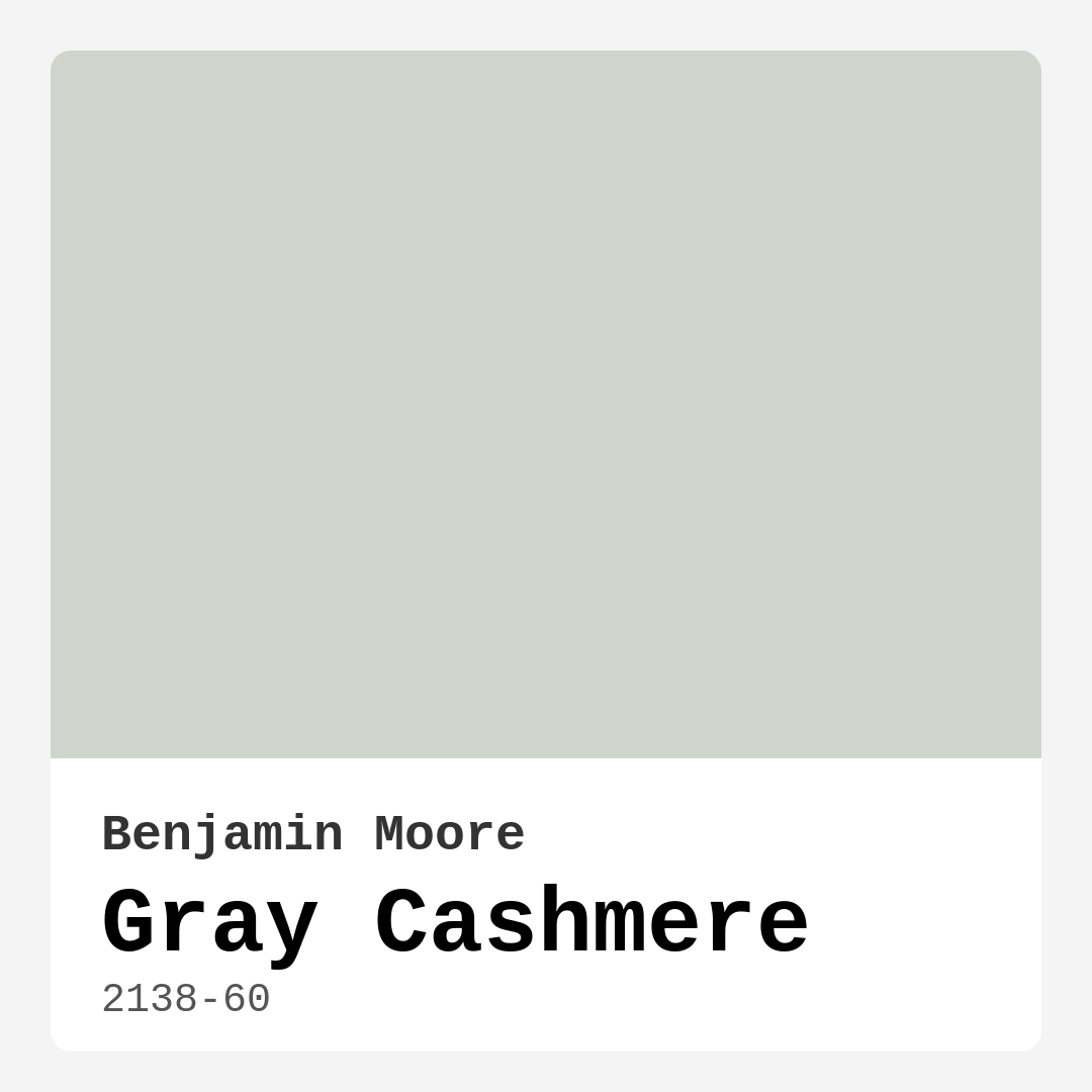
Color Preview & Key Details
| HEX Code | #CFD5CD |
| RGB | 207, 213, 205 |
| LRV | 64.53% |
| Undertone | Green |
| Finish Options | Eggshell, Matte, Satin |
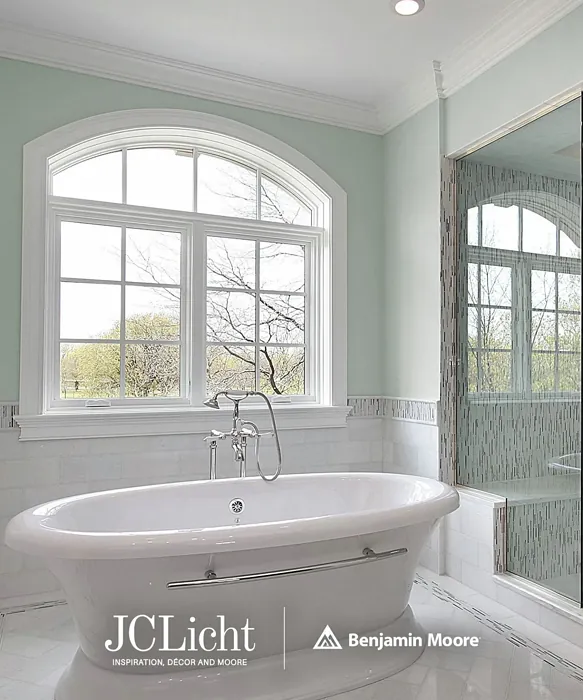
Imagine walking into a room that instantly makes you exhale—soft, serene, and effortlessly elegant. That’s the magic of Benjamin Moore’s Gray Cashmere (2138-60). It’s not just another gray; it’s a chameleon of calm, a shade that adapts to your space like it was made for it. Whether you’re refreshing a tired living room or designing a home office that inspires focus, this color might just be your perfect match. Let’s dive into why Gray Cashmere could be the hero your walls have been waiting for.
Gray Cashmere sits in that sweet spot between warm and cool, thanks to its subtle green undertone. It’s light enough to keep a room feeling airy (with an LRV of 64.53%, it reflects plenty of light) but has just enough depth to avoid feeling sterile. In natural daylight, it leans fresh and open, almost like a soft whisper of color. As evening falls, it deepens slightly, creating a cozy, intimate vibe that’s perfect for unwinding. This duality makes it a dream for spaces where you want both energy and relaxation—think living rooms where you host friends by day and curl up with a book by night.
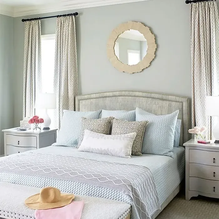
One of the biggest wins with Gray Cashmere is its versatility. It plays well with almost every decor style. Modern minimalism? Check. Farmhouse charm? Absolutely. Scandinavian simplicity or transitional elegance? No problem. Pair it with crisp white trim like Benjamin Moore’s White Dove for a clean, timeless look, or let it mingle with brass fixtures and warm wood tones to bring out its softer side. If you love contrast, try it alongside deeper greens or muted purples—its complementary hues—for a space that feels curated but not contrived.
Application is a breeze, even if you’re a DIY beginner. It’s roller-ready, brush-smooth, and touch-up friendly, with good coverage in one to two coats. Choose an eggshell or satin finish for durability, especially in high-traffic areas like hallways or dining rooms. And since it’s low-VOC and eco-certified, you can breathe easy (literally) while you transform your space. Worried about stains? Don’t be. Its washability means it stands up to life’s little messes, making it a practical pick for busy households.
Now, let’s talk about the elephant in the room: lighting. Like any nuanced color, Gray Cashmere can shift depending on your light sources. North-facing rooms might pull out its cooler green undertones, while south-facing spaces will highlight its warmth. Always test a swatch on your walls and observe it at different times of day. This isn’t a flaw—it’s part of what makes the color dynamic and interesting. But if you’re after a shade that looks exactly the same in every light, this might keep you on your toes.
Small spaces adore Gray Cashmere. Its light-reflective quality tricks the eye into perceiving more square footage, while its muted tone keeps things cozy. Use it in a petite bedroom or a cramped home office, and suddenly, the walls feel like they’re giving you a gentle hug rather than closing in. For open-concept homes, it’s a unifying force, flowing seamlessly from room to room without monotony.
So, is Gray Cashmere right for you? If you crave a color that’s equal parts tranquil and sophisticated, with just enough personality to stand out without overpowering, the answer is probably yes. It’s a designer favorite for a reason—it works. But here’s the real test: picture your furniture, your art, your life against this backdrop. Does it feel like home? If it does, you’ve found your shade. Grab a sample, paint a patch, and let the walls do the talking. Sometimes, the best design decisions start with a single, perfect hue.
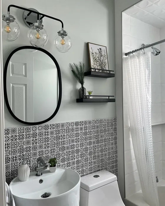
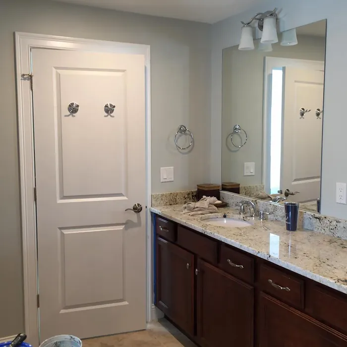
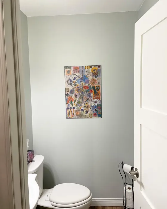
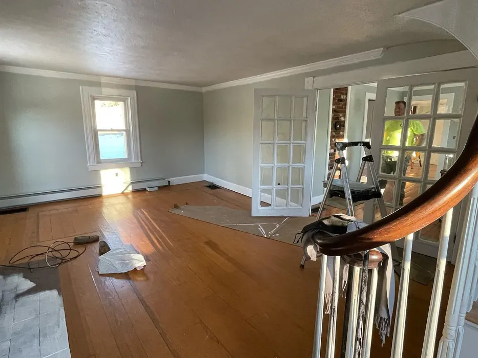
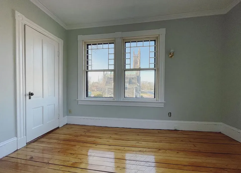
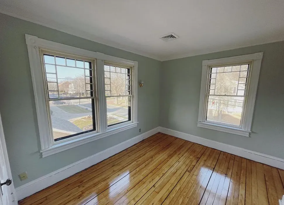
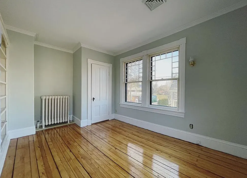
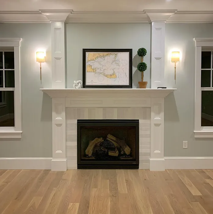
Real Room Photo of Gray Cashmere 2138-60

Undertones of Gray Cashmere ?
The undertones of Gray Cashmere are a key aspect of its character, leaning towards Green. These subtle underlying hues are what give the color its depth and complexity. For example, a gray with a blue undertone will feel cooler and more modern, while one with a brown undertone will feel warmer and more traditional. It’s essential to test this paint in your home and observe it next to your existing furniture, flooring, and decor to see how these undertones interact and reveal themselves throughout the day.
HEX value: #CFD5CD
RGB code: 207, 213, 205
Is Gray Cashmere Cool or Warm?
This color leans towards the cool side of the spectrum but retains a warm softness that prevents it from feeling too stark. It’s perfect for creating a balanced environment, ensuring your space feels inviting yet sophisticated.
Understanding Color Properties and Interior Design Tips
Hue refers to a specific position on the color wheel, measured in degrees from 0 to 360. Each degree represents a different pure color:
- 0° represents red
- 120° represents green
- 240° represents blue
Saturation describes the intensity or purity of a color and is expressed as a percentage:
- At 0%, the color appears completely desaturated—essentially a shade of gray
- At 100%, the color is at its most vivid and vibrant
Lightness indicates how light or dark a color is, also expressed as a percentage:
- 0% lightness results in black
- 100% lightness results in white
Using Warm Colors in Interior Design
Warm hues—such as reds, oranges, yellows, warm beiges, and greiges—are excellent choices for creating inviting and energetic spaces. These colors are particularly well-suited for:
- Kitchens, living rooms, and bathrooms, where warmth enhances comfort and sociability
- Large rooms, where warm tones can help reduce the sense of emptiness and make the space feel more intimate
For example:
- Warm beige shades provide a cozy, inviting atmosphere, ideal for living rooms, bedrooms, and hallways.
- Warm greige (a mix of beige and gray) offers the warmth of beige with the modern appeal of gray, making it a versatile backdrop for dining areas, bedrooms, and living spaces.
However, be mindful when using warm light tones in rooms with limited natural light. These shades may appear muted or even take on an unpleasant yellowish tint. To avoid a dull or flat appearance:
- Add depth by incorporating richer tones like deep greens, charcoal, or chocolate brown
- Use textured elements such as curtains, rugs, or cushions to bring dimension to the space
Pro Tip: Achieving Harmony with Warm and Cool Color Balance
To create a well-balanced and visually interesting interior, mix warm and cool tones strategically. This contrast adds depth and harmony to your design.
- If your walls feature warm hues, introduce cool-colored accents such as blue or green furniture, artwork, or accessories to create contrast.
- For a polished look, consider using a complementary color scheme, which pairs colors opposite each other on the color wheel (e.g., red with green, orange with blue).
This thoughtful mix not only enhances visual appeal but also creates a space that feels both dynamic and cohesive.
Light Temperature Affects on Gray Cashmere
Natural Light
Natural daylight changes in color temperature as the sun moves across the sky. At sunrise and sunset, the light tends to have a warm, golden tone with a color temperature around 2000 Kelvin (K). As the day progresses and the sun rises higher, the light becomes cooler and more neutral. Around midday, especially when the sky is clear, natural light typically reaches its peak brightness and shifts to a cooler tone, ranging from 5500 to 6500 Kelvin. This midday light is close to what we perceive as pure white or daylight-balanced light.
These shifts in natural light can significantly influence how colors appear in a space, which is why designers often consider both the time of day and the orientation of windows when planning interior color schemes.
Artificial Light
When choosing artificial lighting, pay close attention to the color temperature, measured in Kelvin (K). This determines how warm or cool the light will appear. Lower temperatures, around 2700K, give off a warm, yellow glow often used in living rooms or bedrooms. Higher temperatures, above 5000K, create a cool, bluish light similar to daylight, commonly used in kitchens, offices, or task areas.
Use the slider to see how lighting temperature can affect the appearance of a surface or color throughout a space.


4800K
LRV of Gray Cashmere
The Light Reflectance Value (LRV) of Gray Cashmere is 64.53%, which places it in the Light colors category. This means it reflect most of the incident light. Understanding a paint’s LRV is crucial for predicting how it will look in your space. A higher LRV indicates a lighter color that reflects more light, making rooms feel larger and brighter. A lower LRV signifies a darker color that absorbs more light, creating a cozier, more intimate atmosphere. Always consider the natural and artificial lighting in your room when selecting a paint color based on its LRV.
Detailed Review of Gray Cashmere
Additional Paint Characteristics
Ideal Rooms
Bedroom, Dining Room, Hallway, Home Office, Living Room
Decor Styles
Farmhouse, Modern, Scandinavian, Transitional
Coverage
Good (1–2 Coats), Touch-Up Friendly
Ease of Application
Beginner Friendly, Brush Smooth, Roller-Ready
Washability
Highly Washable, Stain Resistant, Washable
VOC Level
Eco-Certified, Low VOC
Best Use
Accent Wall, Interior Walls, Open Concept Spaces
Room Suitability
Bedroom, Dining Room, Home Office, Living Room
Tone Tag
Balanced, Cool, Neutral
Finish Type
Eggshell, Satin
Paint Performance
Easy Touch-Up, Fade Resistant, High Coverage, Low Odor
Use Cases
Best for Open Concept, Best for Small Spaces, Designer Favorite
Mood
Calm, Inviting, Sophisticated
Trim Pairing
Complements Brass Fixtures, Pairs with White Dove, Works with Warm Trim
Gray Cashmere is more than just a color; it’s a statement of style and comfort. This paint offers a unique ability to harmonize with both warm and cool tones, making it a fantastic choice for any space. Whether you’re aiming for a cozy retreat or a chic, modern look, Gray Cashmere adapts beautifully. Its muted tone can make a room feel spacious while still providing a sense of intimacy. Plus, it works well with natural light, enhancing the room’s overall ambiance without overwhelming it. This versatility makes it a favorite among homeowners and designers alike, ensuring it remains relevant in any decor scheme.
Pros & Cons of 2138-60 Gray Cashmere
Pros
Cons
Colors that go with Benjamin Moore Gray Cashmere
FAQ on 2138-60 Gray Cashmere
Can Gray Cashmere be used in small spaces?
Absolutely! Gray Cashmere is a fantastic choice for small spaces. Its light-reflective quality helps to create an illusion of openness, making the area feel larger while still cozy. Pair it with lighter accents and decor, and you’ll have a charming, inviting nook.
How does Gray Cashmere pair with other colors?
Gray Cashmere is incredibly versatile and pairs beautifully with a variety of colors. It looks stunning alongside whites, soft blues, and even warm earth tones. Whether you’re using it as a main color or an accent, it complements both bold and muted palettes effectively.
Comparisons Gray Cashmere with other colors
Gray Cashmere 2138-60 vs Sea Salt SW 6204
| Attribute | Gray Cashmere 2138-60 | Sea Salt SW 6204 |
|---|---|---|
| Color Name | Gray Cashmere 2138-60 | Sea Salt SW 6204 |
| Color | ||
| Hue | Green | Green |
| Brightness | Light | Light |
| RGB | 207, 213, 205 | 205, 210, 202 |
| LRV | 64.53% | 64% |
| Finish Type | Eggshell, Satin | Eggshell, Satin |
| Finish Options | Eggshell, Matte, Satin | Eggshell, Matte, Satin |
| Ideal Rooms | Bedroom, Dining Room, Hallway, Home Office, Living Room | Bathroom, Bedroom, Hallway, Kitchen, Living Room |
| Decor Styles | Farmhouse, Modern, Scandinavian, Transitional | Coastal, Minimalist, Modern Farmhouse, Scandinavian, Traditional |
| Coverage | Good (1–2 Coats), Touch-Up Friendly | Good (1–2 Coats), Touch-Up Friendly |
| Ease of Application | Beginner Friendly, Brush Smooth, Roller-Ready | Beginner Friendly, Brush Smooth, Fast-Drying, Roller-Ready |
| Washability | Highly Washable, Stain Resistant, Washable | Highly Washable, Washable |
| Room Suitability | Bedroom, Dining Room, Home Office, Living Room | Bathroom, Bedroom, Hallway, Kitchen, Living Room |
| Tone | Balanced, Cool, Neutral | Airy, Balanced, Cool, Muted |
| Paint Performance | Easy Touch-Up, Fade Resistant, High Coverage, Low Odor | Easy Touch-Up, High Coverage, Low Odor, Quick Drying |
Gray Cashmere 2138-60 vs Liveable Green SW 6176
| Attribute | Gray Cashmere 2138-60 | Liveable Green SW 6176 |
|---|---|---|
| Color Name | Gray Cashmere 2138-60 | Liveable Green SW 6176 |
| Color | ||
| Hue | Green | Green |
| Brightness | Light | Light |
| RGB | 207, 213, 205 | 206, 206, 189 |
| LRV | 64.53% | 30% |
| Finish Type | Eggshell, Satin | Eggshell, Matte, Satin |
| Finish Options | Eggshell, Matte, Satin | Eggshell, Matte, Satin |
| Ideal Rooms | Bedroom, Dining Room, Hallway, Home Office, Living Room | Bedroom, Home Office, Kitchen, Living Room, Nursery |
| Decor Styles | Farmhouse, Modern, Scandinavian, Transitional | Contemporary, Modern Farmhouse, Rustic, Scandi |
| Coverage | Good (1–2 Coats), Touch-Up Friendly | Good (1–2 Coats), Touch-Up Friendly |
| Ease of Application | Beginner Friendly, Brush Smooth, Roller-Ready | Beginner Friendly, Brush Smooth, Roller-Ready |
| Washability | Highly Washable, Stain Resistant, Washable | Highly Washable, Washable |
| Room Suitability | Bedroom, Dining Room, Home Office, Living Room | Bedroom, Home Office, Living Room, Nursery |
| Tone | Balanced, Cool, Neutral | Balanced, Earthy, Muted |
| Paint Performance | Easy Touch-Up, Fade Resistant, High Coverage, Low Odor | Easy Touch-Up, High Coverage, Low Odor |
Gray Cashmere 2138-60 vs Rainwashed SW 6211
| Attribute | Gray Cashmere 2138-60 | Rainwashed SW 6211 |
|---|---|---|
| Color Name | Gray Cashmere 2138-60 | Rainwashed SW 6211 |
| Color | ||
| Hue | Green | Green |
| Brightness | Light | Light |
| RGB | 207, 213, 205 | 194, 205, 197 |
| LRV | 64.53% | 60% |
| Finish Type | Eggshell, Satin | Eggshell, Matte, Satin |
| Finish Options | Eggshell, Matte, Satin | Eggshell, Matte, Satin |
| Ideal Rooms | Bedroom, Dining Room, Hallway, Home Office, Living Room | Bathroom, Bedroom, Home Office, Living Room, Nursery |
| Decor Styles | Farmhouse, Modern, Scandinavian, Transitional | Coastal, Farmhouse, Minimalist, Modern, Transitional |
| Coverage | Good (1–2 Coats), Touch-Up Friendly | Good (1–2 Coats), Touch-Up Friendly |
| Ease of Application | Beginner Friendly, Brush Smooth, Roller-Ready | Beginner Friendly, Brush Smooth, Fast-Drying, Roller-Ready |
| Washability | Highly Washable, Stain Resistant, Washable | Washable, Wipeable |
| Room Suitability | Bedroom, Dining Room, Home Office, Living Room | Bathroom, Bedroom, Home Office, Living Room, Nursery |
| Tone | Balanced, Cool, Neutral | Balanced, Cool, Muted |
| Paint Performance | Easy Touch-Up, Fade Resistant, High Coverage, Low Odor | Easy Touch-Up, High Coverage, Low Odor |
Gray Cashmere 2138-60 vs Filmy Green SW 6190
| Attribute | Gray Cashmere 2138-60 | Filmy Green SW 6190 |
|---|---|---|
| Color Name | Gray Cashmere 2138-60 | Filmy Green SW 6190 |
| Color | ||
| Hue | Green | Green |
| Brightness | Light | Light |
| RGB | 207, 213, 205 | 209, 211, 199 |
| LRV | 64.53% | 50% |
| Finish Type | Eggshell, Satin | Eggshell, Matte, Satin |
| Finish Options | Eggshell, Matte, Satin | Eggshell, Matte, Satin |
| Ideal Rooms | Bedroom, Dining Room, Hallway, Home Office, Living Room | Bedroom, Home Office, Living Room, Nursery |
| Decor Styles | Farmhouse, Modern, Scandinavian, Transitional | Bohemian, Minimalist, Modern Farmhouse, Scandinavian |
| Coverage | Good (1–2 Coats), Touch-Up Friendly | Good (1–2 Coats) |
| Ease of Application | Beginner Friendly, Brush Smooth, Roller-Ready | Beginner Friendly, Brush Smooth, Roller-Ready |
| Washability | Highly Washable, Stain Resistant, Washable | Washable, Wipeable |
| Room Suitability | Bedroom, Dining Room, Home Office, Living Room | Bedroom, Home Office, Living Room, Nursery |
| Tone | Balanced, Cool, Neutral | Calm, Earthy, Muted |
| Paint Performance | Easy Touch-Up, Fade Resistant, High Coverage, Low Odor | Easy Touch-Up, Low Odor, Quick Drying |
Gray Cashmere 2138-60 vs Slow Green SW 6456
| Attribute | Gray Cashmere 2138-60 | Slow Green SW 6456 |
|---|---|---|
| Color Name | Gray Cashmere 2138-60 | Slow Green SW 6456 |
| Color | ||
| Hue | Green | Green |
| Brightness | Light | Light |
| RGB | 207, 213, 205 | 198, 213, 201 |
| LRV | 64.53% | 48% |
| Finish Type | Eggshell, Satin | Eggshell, Matte, Satin |
| Finish Options | Eggshell, Matte, Satin | Eggshell, Matte, Satin |
| Ideal Rooms | Bedroom, Dining Room, Hallway, Home Office, Living Room | Bedroom, Dining Room, Home Office, Living Room, Nursery |
| Decor Styles | Farmhouse, Modern, Scandinavian, Transitional | Coastal, Farmhouse, Modern, Rustic, Scandinavian |
| Coverage | Good (1–2 Coats), Touch-Up Friendly | Good (1–2 Coats), Touch-Up Friendly |
| Ease of Application | Beginner Friendly, Brush Smooth, Roller-Ready | Beginner Friendly, Brush Smooth, Roller-Ready |
| Washability | Highly Washable, Stain Resistant, Washable | Highly Washable, Washable |
| Room Suitability | Bedroom, Dining Room, Home Office, Living Room | Bedroom, Dining Room, Entryway, Home Office, Living Room, Nursery |
| Tone | Balanced, Cool, Neutral | Balanced, Earthy, Muted |
| Paint Performance | Easy Touch-Up, Fade Resistant, High Coverage, Low Odor | Easy Touch-Up, Fade Resistant, Low Odor |
Gray Cashmere 2138-60 vs Acanthus SW 0029
| Attribute | Gray Cashmere 2138-60 | Acanthus SW 0029 |
|---|---|---|
| Color Name | Gray Cashmere 2138-60 | Acanthus SW 0029 |
| Color | ||
| Hue | Green | Green |
| Brightness | Light | Light |
| RGB | 207, 213, 205 | 205, 205, 180 |
| LRV | 64.53% | 10% |
| Finish Type | Eggshell, Satin | Eggshell, Matte, Satin |
| Finish Options | Eggshell, Matte, Satin | Eggshell, Matte, Satin |
| Ideal Rooms | Bedroom, Dining Room, Hallway, Home Office, Living Room | Bedroom, Dining Room, Home Office, Kitchen, Living Room |
| Decor Styles | Farmhouse, Modern, Scandinavian, Transitional | Eclectic, Farmhouse, Modern, Traditional |
| Coverage | Good (1–2 Coats), Touch-Up Friendly | Good (1–2 Coats) |
| Ease of Application | Beginner Friendly, Brush Smooth, Roller-Ready | Beginner Friendly, Brush Smooth, Fast-Drying, Roller-Ready |
| Washability | Highly Washable, Stain Resistant, Washable | Highly Washable, Stain Resistant, Washable |
| Room Suitability | Bedroom, Dining Room, Home Office, Living Room | Bedroom, Dining Room, Home Office, Living Room |
| Tone | Balanced, Cool, Neutral | Balanced, Earthy, Muted |
| Paint Performance | Easy Touch-Up, Fade Resistant, High Coverage, Low Odor | Easy Touch-Up, Low Odor, Quick Drying, Scuff Resistant |
Gray Cashmere 2138-60 vs Topiary Tint SW 6449
| Attribute | Gray Cashmere 2138-60 | Topiary Tint SW 6449 |
|---|---|---|
| Color Name | Gray Cashmere 2138-60 | Topiary Tint SW 6449 |
| Color | ||
| Hue | Green | Green |
| Brightness | Light | Light |
| RGB | 207, 213, 205 | 200, 216, 196 |
| LRV | 64.53% | 30% |
| Finish Type | Eggshell, Satin | Eggshell, Matte, Satin |
| Finish Options | Eggshell, Matte, Satin | Eggshell, Matte, Satin |
| Ideal Rooms | Bedroom, Dining Room, Hallway, Home Office, Living Room | Bathroom, Bedroom, Dining Room, Home Office, Kitchen, Living Room |
| Decor Styles | Farmhouse, Modern, Scandinavian, Transitional | Bohemian, Coastal, Eclectic, Modern Farmhouse, Transitional |
| Coverage | Good (1–2 Coats), Touch-Up Friendly | Good (1–2 Coats), Touch-Up Friendly |
| Ease of Application | Beginner Friendly, Brush Smooth, Roller-Ready | Beginner Friendly, Brush Smooth, Fast-Drying, Roller-Ready |
| Washability | Highly Washable, Stain Resistant, Washable | Scuff Resistant, Washable |
| Room Suitability | Bedroom, Dining Room, Home Office, Living Room | Bathroom, Bedroom, Dining Room, Kitchen, Living Room |
| Tone | Balanced, Cool, Neutral | Balanced, Calm, Earthy, Muted |
| Paint Performance | Easy Touch-Up, Fade Resistant, High Coverage, Low Odor | Easy Touch-Up, Low Odor, Quick Drying, Stain Resistant |
Gray Cashmere 2138-60 vs Waterscape SW 6470
| Attribute | Gray Cashmere 2138-60 | Waterscape SW 6470 |
|---|---|---|
| Color Name | Gray Cashmere 2138-60 | Waterscape SW 6470 |
| Color | ||
| Hue | Green | Green |
| Brightness | Light | Light |
| RGB | 207, 213, 205 | 191, 210, 201 |
| LRV | 64.53% | 50% |
| Finish Type | Eggshell, Satin | Eggshell, Matte |
| Finish Options | Eggshell, Matte, Satin | Eggshell, Matte, Satin |
| Ideal Rooms | Bedroom, Dining Room, Hallway, Home Office, Living Room | Bathroom, Bedroom, Home Office, Kitchen, Living Room |
| Decor Styles | Farmhouse, Modern, Scandinavian, Transitional | Coastal, Minimalist, Modern, Scandinavian |
| Coverage | Good (1–2 Coats), Touch-Up Friendly | Good (1–2 Coats) |
| Ease of Application | Beginner Friendly, Brush Smooth, Roller-Ready | Beginner Friendly, Brush Smooth, Roller-Ready |
| Washability | Highly Washable, Stain Resistant, Washable | Highly Washable, Washable |
| Room Suitability | Bedroom, Dining Room, Home Office, Living Room | Bathroom, Bedroom, Home Office, Living Room |
| Tone | Balanced, Cool, Neutral | Airy, Cool, Muted |
| Paint Performance | Easy Touch-Up, Fade Resistant, High Coverage, Low Odor | Easy Touch-Up, Low Odor, Quick Drying |
Gray Cashmere 2138-60 vs Bonsai Tint SW 6436
| Attribute | Gray Cashmere 2138-60 | Bonsai Tint SW 6436 |
|---|---|---|
| Color Name | Gray Cashmere 2138-60 | Bonsai Tint SW 6436 |
| Color | ||
| Hue | Green | Green |
| Brightness | Light | Light |
| RGB | 207, 213, 205 | 197, 209, 178 |
| LRV | 64.53% | 64% |
| Finish Type | Eggshell, Satin | Eggshell, Matte |
| Finish Options | Eggshell, Matte, Satin | Eggshell, Matte, Satin |
| Ideal Rooms | Bedroom, Dining Room, Hallway, Home Office, Living Room | Bedroom, Home Office, Living Room, Nursery |
| Decor Styles | Farmhouse, Modern, Scandinavian, Transitional | Bohemian, Minimalist, Modern, Scandinavian |
| Coverage | Good (1–2 Coats), Touch-Up Friendly | Good (1–2 Coats) |
| Ease of Application | Beginner Friendly, Brush Smooth, Roller-Ready | Beginner Friendly, Brush Smooth, Roller-Ready |
| Washability | Highly Washable, Stain Resistant, Washable | Washable, Wipeable |
| Room Suitability | Bedroom, Dining Room, Home Office, Living Room | Bedroom, Home Office, Living Room, Nursery |
| Tone | Balanced, Cool, Neutral | Calm, Earthy, Muted |
| Paint Performance | Easy Touch-Up, Fade Resistant, High Coverage, Low Odor | Easy Touch-Up, Fade Resistant, Low Odor |
Gray Cashmere 2138-60 vs Gratifying Green SW 6435
| Attribute | Gray Cashmere 2138-60 | Gratifying Green SW 6435 |
|---|---|---|
| Color Name | Gray Cashmere 2138-60 | Gratifying Green SW 6435 |
| Color | ||
| Hue | Green | Green |
| Brightness | Light | Light |
| RGB | 207, 213, 205 | 218, 226, 205 |
| LRV | 64.53% | 30% |
| Finish Type | Eggshell, Satin | Eggshell, Matte, Satin |
| Finish Options | Eggshell, Matte, Satin | Eggshell, Matte, Satin |
| Ideal Rooms | Bedroom, Dining Room, Hallway, Home Office, Living Room | Bedroom, Dining Room, Home Office, Living Room, Nursery |
| Decor Styles | Farmhouse, Modern, Scandinavian, Transitional | Bohemian, Coastal, Minimalist, Modern Farmhouse |
| Coverage | Good (1–2 Coats), Touch-Up Friendly | Good (1–2 Coats), Touch-Up Friendly |
| Ease of Application | Beginner Friendly, Brush Smooth, Roller-Ready | Beginner Friendly, Brush Smooth, Roller-Ready |
| Washability | Highly Washable, Stain Resistant, Washable | Washable, Wipeable |
| Room Suitability | Bedroom, Dining Room, Home Office, Living Room | Bedroom, Home Office, Living Room, Nursery |
| Tone | Balanced, Cool, Neutral | Earthy, Muted, Warm |
| Paint Performance | Easy Touch-Up, Fade Resistant, High Coverage, Low Odor | Easy Touch-Up, Low Odor, Quick Drying |
Official Page of Benjamin Moore Gray Cashmere 2138-60