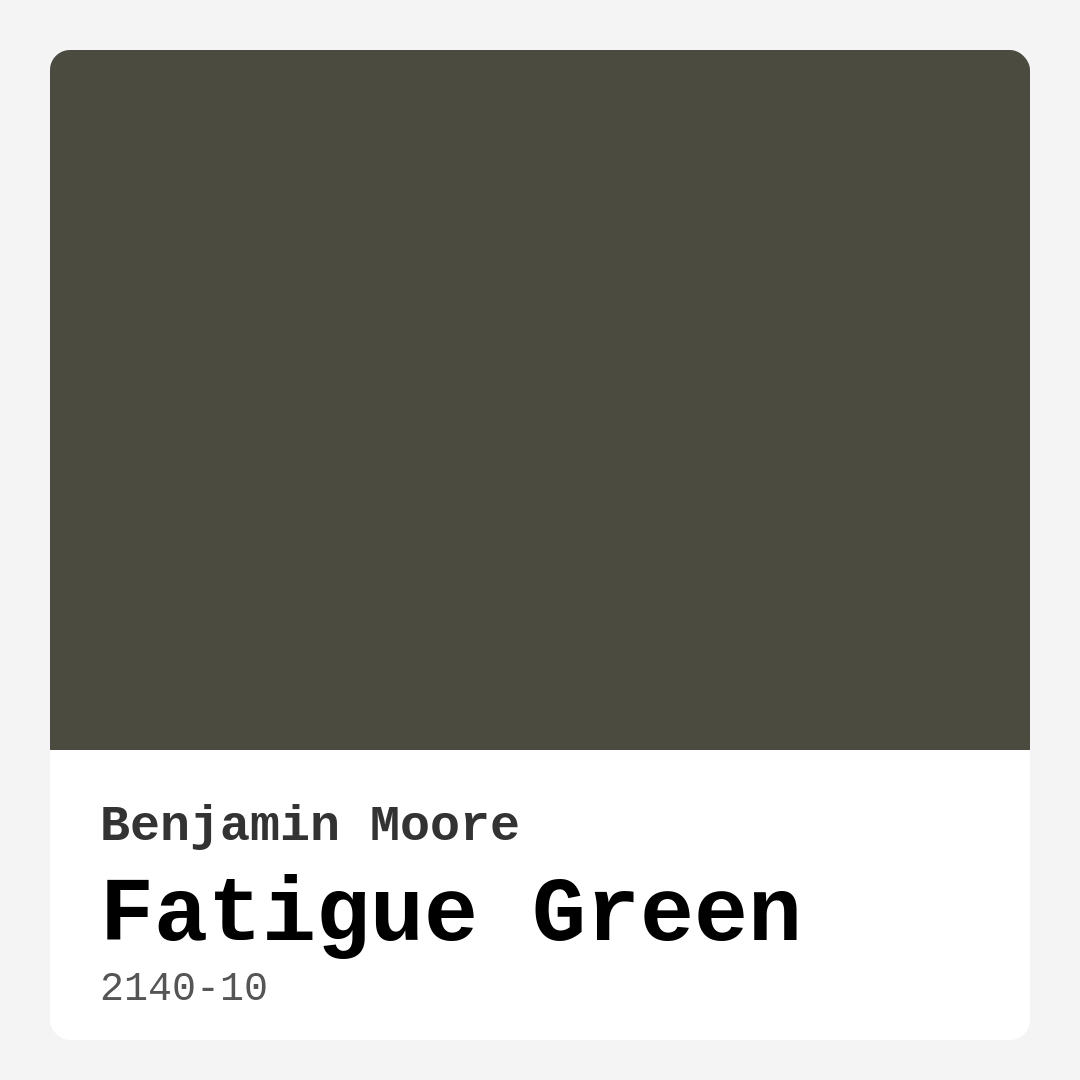
Color Preview & Key Details
| HEX Code | #4B4B3F |
| RGB | 75, 75, 63 |
| LRV | 7.98% |
| Undertone | Yellow |
| Finish Options | Eggshell, Matte, Satin |
If you’re searching for a paint color that effortlessly bridges the gap between earthy warmth and cool sophistication, Benjamin Moore’s Fatigue Green (2140-10) might just be your perfect match. This deep, moody green with its subtle yellow undertones is a chameleon—equally at home in a cozy farmhouse bedroom or a sleek, modern living room. It’s the kind of color that doesn’t just sit on your walls; it interacts with your space, changing subtly with the light and the elements around it. Let’s dive into what makes this shade so special and how you can make it work in your home.
First, let’s talk about the color itself. Fatigue Green is a rich, dark green with an LRV (Light Reflectance Value) of just 7.98%, meaning it absorbs light rather than reflecting it. This gives it an intimate, cocoon-like quality—ideal for creating a sense of calm and grounding in a room. But don’t let the “dark” label scare you. Thanks to its muted olive-gray base and warm yellow undertones, it avoids feeling oppressive. Instead, it wraps a space in quiet elegance, making it a fantastic choice for living rooms, bedrooms, or even a home office where you want to feel both focused and relaxed.
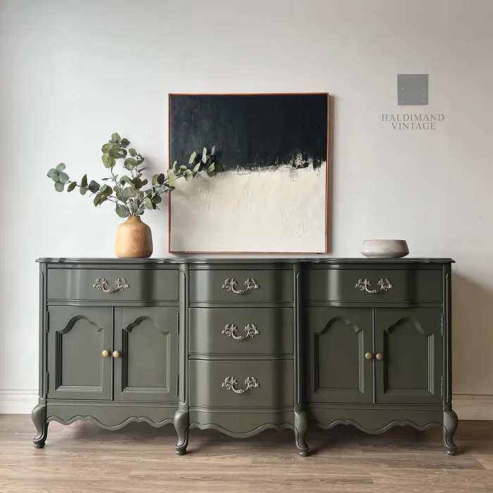
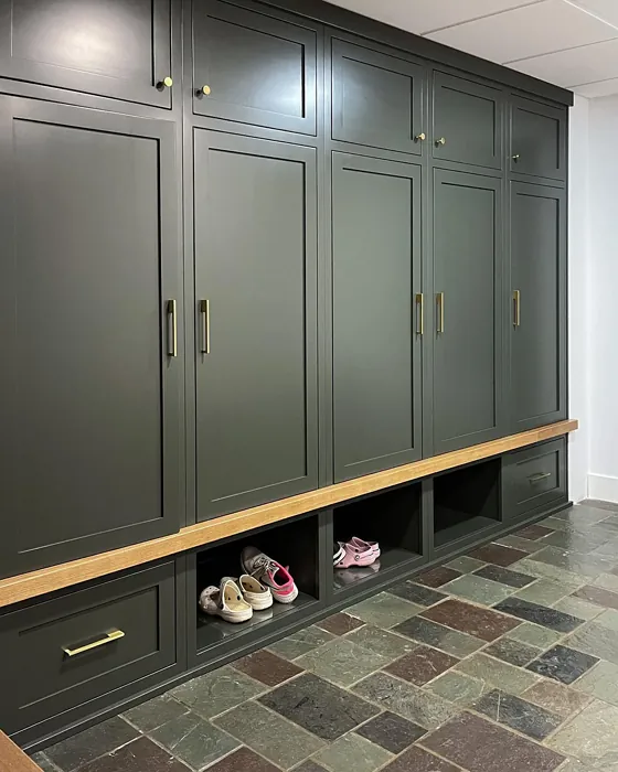
One of the biggest strengths of Fatigue Green is its versatility. It straddles the line between warm and cool, so it plays well with a wide range of materials and finishes. Pair it with warm wood tones for a rustic, organic feel, or combine it with black metal accents for an industrial edge. It also looks stunning against crisp white trim—Benjamin Moore’s White Dove is a classic pairing—or even a soft, warm beige if you’re aiming for a more neutral backdrop. And if you’re feeling bold, try it with deep blues or burnt oranges for a striking contrast that still feels harmonious.
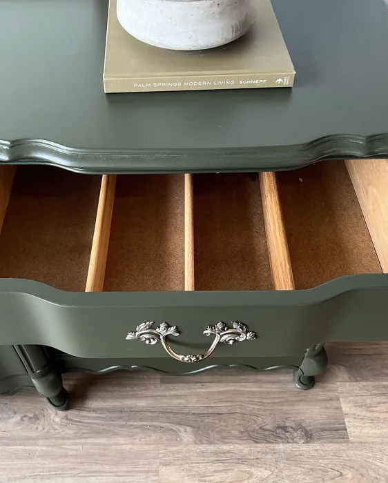
When it comes to application, Fatigue Green is a dream to work with. It’s roller-ready, brush-smooth, and fast-drying, with good coverage that typically only requires one or two coats. The finish options—matte, eggshell, or satin—each bring out different qualities in the color. Matte enhances its earthy, organic vibe, while eggshell adds a subtle sheen that works beautifully in living spaces. If you’re painting a high-traffic area like a dining room, satin offers extra durability and washability without sacrificing the color’s depth.
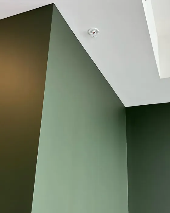
Lighting plays a huge role in how Fatigue Green performs. In a sun-drenched room, the green undertones come alive, giving it an almost botanical freshness. But in lower light, it takes on a moodier, more mysterious quality—think library or study vibes. This adaptability makes it a great choice for rooms with variable light throughout the day. Just keep in mind that in very small or dim spaces, it can feel a bit heavy, so balance it with lighter furniture, textiles, or an accent wall in a softer shade.
Now, let’s address the elephant in the room: the name. “Fatigue Green” might sound a little… uninspiring at first glance. But don’t let that throw you off. This color is anything but tired. It’s inspired by the muted greens found in military uniforms, which means it has a timeless, utilitarian charm. It’s a color that feels both historic and fresh, making it a great fit for modern farmhouse, rustic, or even contemporary interiors.
If you’re still on the fence, here’s a pro tip: always test before you commit. Paint a large swatch on your wall and observe it at different times of day. Notice how it interacts with your furniture, flooring, and even the artwork in the room. You might be surprised at how many different personalities this one color can have. And if you love the idea of Fatigue Green but want something a touch lighter, Benjamin Moore offers several lighter shades in the same family, like Saybrook Sage or the softer tones in the 2140 series.
At the end of the day, Fatigue Green is more than just a paint color—it’s a mood. It’s the feeling of a quiet morning in the woods, the sophistication of a well-worn leather chair, the grounding energy of nature brought indoors. Whether you use it on all four walls or just as an accent, it has the power to transform a space into something layered, intentional, and deeply inviting. So if you’re looking for a color that’s equal parts serene and stylish, this might just be the one.
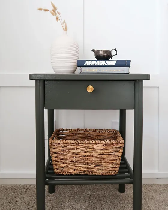
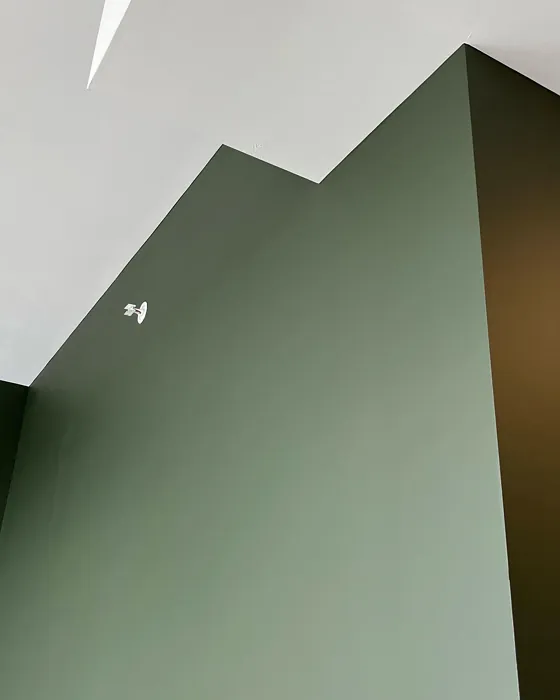
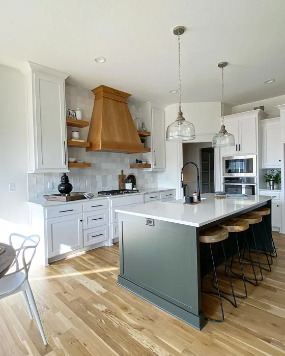
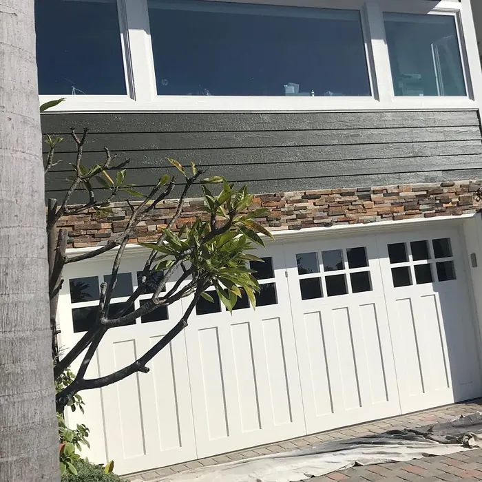
Real Room Photo of Fatigue Green 2140-10
Undertones of Fatigue Green ?
The undertones of Fatigue Green are a key aspect of its character, leaning towards Yellow. These subtle underlying hues are what give the color its depth and complexity. For example, a gray with a blue undertone will feel cooler and more modern, while one with a brown undertone will feel warmer and more traditional. It’s essential to test this paint in your home and observe it next to your existing furniture, flooring, and decor to see how these undertones interact and reveal themselves throughout the day.
HEX value: #4B4B3F
RGB code: 75, 75, 63
Is Fatigue Green Cool or Warm?
Fatigue Green is predominantly a cool color, but its earthy undertones give it warmth, creating a balanced feel in any room. This duality makes it an excellent choice for spaces where you want to feel both relaxed and inspired. It’s versatile enough to be paired with warm woods or cool metals, ensuring it works well in various settings.
Understanding Color Properties and Interior Design Tips
Hue refers to a specific position on the color wheel, measured in degrees from 0 to 360. Each degree represents a different pure color:
- 0° represents red
- 120° represents green
- 240° represents blue
Saturation describes the intensity or purity of a color and is expressed as a percentage:
- At 0%, the color appears completely desaturated—essentially a shade of gray
- At 100%, the color is at its most vivid and vibrant
Lightness indicates how light or dark a color is, also expressed as a percentage:
- 0% lightness results in black
- 100% lightness results in white
Using Warm Colors in Interior Design
Warm hues—such as reds, oranges, yellows, warm beiges, and greiges—are excellent choices for creating inviting and energetic spaces. These colors are particularly well-suited for:
- Kitchens, living rooms, and bathrooms, where warmth enhances comfort and sociability
- Large rooms, where warm tones can help reduce the sense of emptiness and make the space feel more intimate
For example:
- Warm beige shades provide a cozy, inviting atmosphere, ideal for living rooms, bedrooms, and hallways.
- Warm greige (a mix of beige and gray) offers the warmth of beige with the modern appeal of gray, making it a versatile backdrop for dining areas, bedrooms, and living spaces.
However, be mindful when using warm light tones in rooms with limited natural light. These shades may appear muted or even take on an unpleasant yellowish tint. To avoid a dull or flat appearance:
- Add depth by incorporating richer tones like deep greens, charcoal, or chocolate brown
- Use textured elements such as curtains, rugs, or cushions to bring dimension to the space
Pro Tip: Achieving Harmony with Warm and Cool Color Balance
To create a well-balanced and visually interesting interior, mix warm and cool tones strategically. This contrast adds depth and harmony to your design.
- If your walls feature warm hues, introduce cool-colored accents such as blue or green furniture, artwork, or accessories to create contrast.
- For a polished look, consider using a complementary color scheme, which pairs colors opposite each other on the color wheel (e.g., red with green, orange with blue).
This thoughtful mix not only enhances visual appeal but also creates a space that feels both dynamic and cohesive.
Light Temperature Affects on Fatigue Green
Natural Light
Natural daylight changes in color temperature as the sun moves across the sky. At sunrise and sunset, the light tends to have a warm, golden tone with a color temperature around 2000 Kelvin (K). As the day progresses and the sun rises higher, the light becomes cooler and more neutral. Around midday, especially when the sky is clear, natural light typically reaches its peak brightness and shifts to a cooler tone, ranging from 5500 to 6500 Kelvin. This midday light is close to what we perceive as pure white or daylight-balanced light.
These shifts in natural light can significantly influence how colors appear in a space, which is why designers often consider both the time of day and the orientation of windows when planning interior color schemes.
Artificial Light
When choosing artificial lighting, pay close attention to the color temperature, measured in Kelvin (K). This determines how warm or cool the light will appear. Lower temperatures, around 2700K, give off a warm, yellow glow often used in living rooms or bedrooms. Higher temperatures, above 5000K, create a cool, bluish light similar to daylight, commonly used in kitchens, offices, or task areas.
Use the slider to see how lighting temperature can affect the appearance of a surface or color throughout a space.


4800K
LRV of Fatigue Green
The Light Reflectance Value (LRV) of Fatigue Green is 7.98%, which places it in the Dark colors category. This means it does not reflect light. Understanding a paint’s LRV is crucial for predicting how it will look in your space. A higher LRV indicates a lighter color that reflects more light, making rooms feel larger and brighter. A lower LRV signifies a darker color that absorbs more light, creating a cozier, more intimate atmosphere. Always consider the natural and artificial lighting in your room when selecting a paint color based on its LRV.
Detailed Review of Fatigue Green
Additional Paint Characteristics
Ideal Rooms
Bedroom, Dining Room, Home Office, Living Room
Decor Styles
Contemporary, Industrial, Modern Farmhouse, Rustic
Coverage
Good (1–2 Coats), Self-Priming
Ease of Application
Brush Smooth, Fast-Drying, Roller-Ready
Washability
Highly Washable, Washable
VOC Level
Low VOC
Best Use
Accent Wall, Bedroom, Interior Walls, Living Room
Room Suitability
Bedroom, Dining Room, Home Office, Living Room
Tone Tag
Balanced, Earthy, Muted
Finish Type
Eggshell, Matte, Satin
Paint Performance
Easy Touch-Up, High Coverage, Scuff Resistant
Use Cases
Best for Low Light Rooms, Best for Modern Farmhouse, Classic Favorite
Mood
Calm, Grounding, Inviting
Trim Pairing
Complements Cool Trim, Pairs with White Dove, Works with Warm Trim
Fatigue Green is a versatile paint that can transform any room into a tranquil retreat. Its muted quality allows it to blend seamlessly with various decor styles, from rustic to modern farmhouse. The color can make a statement without overwhelming a space, making it perfect for accent walls or entire rooms. Application is smooth, and the paint dries evenly, providing a beautiful finish that enhances the natural light in the room. Whether you’re looking to create a cozy reading nook or a sophisticated dining area, Fatigue Green has the ability to ground your space while adding a touch of elegance.
Pros & Cons of 2140-10 Fatigue Green
Pros
Cons
Colors that go with Benjamin Moore Fatigue Green
FAQ on 2140-10 Fatigue Green
Can Fatigue Green be used in small rooms?
Yes, Fatigue Green can be used in small rooms, but be mindful of the amount of natural light the space receives. In well-lit areas, it can create an inviting atmosphere, while in darker spaces, it may feel a bit heavy. Consider using it as an accent or pairing it with lighter decor to keep the room feeling open.
What type of finish works best with Fatigue Green?
The best finishes for Fatigue Green are matte or eggshell, which enhance its earthy quality and provide a soft, inviting look. If you’re looking for a bit more durability, satin can also work well, especially in high-traffic areas where you might need something more washable.
Comparisons Fatigue Green with other colors
Fatigue Green 2140-10 vs Dried Thyme SW 6186
| Attribute | Fatigue Green 2140-10 | Dried Thyme SW 6186 |
|---|---|---|
| Color Name | Fatigue Green 2140-10 | Dried Thyme SW 6186 |
| Color | ||
| Hue | Green | Green |
| Brightness | Dark | Dark |
| RGB | 75, 75, 63 | 123, 128, 112 |
| LRV | 7.98% | 24% |
| Finish Type | Eggshell, Matte, Satin | Eggshell, Satin |
| Finish Options | Eggshell, Matte, Satin | Eggshell, Matte, Satin |
| Ideal Rooms | Bedroom, Dining Room, Home Office, Living Room | Bathroom, Bedroom, Dining Room, Entryway, Home Office, Kitchen, Living Room |
| Decor Styles | Contemporary, Industrial, Modern Farmhouse, Rustic | Bohemian, Industrial, Minimalist, Modern Farmhouse, Rustic |
| Coverage | Good (1–2 Coats), Self-Priming | Good (1–2 Coats), Touch-Up Friendly |
| Ease of Application | Brush Smooth, Fast-Drying, Roller-Ready | Beginner Friendly, Brush Smooth, Roller-Ready |
| Washability | Highly Washable, Washable | Washable, Wipeable |
| Room Suitability | Bedroom, Dining Room, Home Office, Living Room | Bathroom, Bedroom, Dining Room, Home Office, Kitchen, Living Room |
| Tone | Balanced, Earthy, Muted | Cool, Earthy, Muted |
| Paint Performance | Easy Touch-Up, High Coverage, Scuff Resistant | Easy Touch-Up, Low Odor, Scuff Resistant |
Fatigue Green 2140-10 vs Retreat SW 6207
| Attribute | Fatigue Green 2140-10 | Retreat SW 6207 |
|---|---|---|
| Color Name | Fatigue Green 2140-10 | Retreat SW 6207 |
| Color | ||
| Hue | Green | Green |
| Brightness | Dark | Dark |
| RGB | 75, 75, 63 | 122, 128, 118 |
| LRV | 7.98% | 30% |
| Finish Type | Eggshell, Matte, Satin | Eggshell, Matte, Satin |
| Finish Options | Eggshell, Matte, Satin | Eggshell, Matte, Satin |
| Ideal Rooms | Bedroom, Dining Room, Home Office, Living Room | Bathroom, Bedroom, Home Office, Kitchen, Living Room |
| Decor Styles | Contemporary, Industrial, Modern Farmhouse, Rustic | Minimalist, Modern, Rustic, Transitional |
| Coverage | Good (1–2 Coats), Self-Priming | Good (1–2 Coats), Touch-Up Friendly |
| Ease of Application | Brush Smooth, Fast-Drying, Roller-Ready | Beginner Friendly, Brush Smooth, Roller-Ready |
| Washability | Highly Washable, Washable | Washable, Wipeable |
| Room Suitability | Bedroom, Dining Room, Home Office, Living Room | Bathroom, Bedroom, Home Office, Living Room |
| Tone | Balanced, Earthy, Muted | Cool, Earthy, Muted |
| Paint Performance | Easy Touch-Up, High Coverage, Scuff Resistant | Easy Touch-Up, Low Odor, Scuff Resistant |
Fatigue Green 2140-10 vs Rosemary SW 6187
| Attribute | Fatigue Green 2140-10 | Rosemary SW 6187 |
|---|---|---|
| Color Name | Fatigue Green 2140-10 | Rosemary SW 6187 |
| Color | ||
| Hue | Green | Green |
| Brightness | Dark | Dark |
| RGB | 75, 75, 63 | 100, 105, 92 |
| LRV | 7.98% | 45% |
| Finish Type | Eggshell, Matte, Satin | Eggshell, Matte, Satin |
| Finish Options | Eggshell, Matte, Satin | Eggshell, Matte, Satin |
| Ideal Rooms | Bedroom, Dining Room, Home Office, Living Room | Bedroom, Dining Room, Hallway, Home Office, Living Room |
| Decor Styles | Contemporary, Industrial, Modern Farmhouse, Rustic | Bohemian, Coastal, Modern Farmhouse, Rustic |
| Coverage | Good (1–2 Coats), Self-Priming | Good (1–2 Coats), Touch-Up Friendly |
| Ease of Application | Brush Smooth, Fast-Drying, Roller-Ready | Beginner Friendly, Brush Smooth, Roller-Ready |
| Washability | Highly Washable, Washable | Washable, Wipeable |
| Room Suitability | Bedroom, Dining Room, Home Office, Living Room | Bedroom, Dining Room, Home Office, Living Room |
| Tone | Balanced, Earthy, Muted | Earthy, Muted, Warm |
| Paint Performance | Easy Touch-Up, High Coverage, Scuff Resistant | Fade Resistant, Low Odor, Quick Drying, Stain Resistant |
Fatigue Green 2140-10 vs Basil SW 6194
| Attribute | Fatigue Green 2140-10 | Basil SW 6194 |
|---|---|---|
| Color Name | Fatigue Green 2140-10 | Basil SW 6194 |
| Color | ||
| Hue | Green | Green |
| Brightness | Dark | Dark |
| RGB | 75, 75, 63 | 98, 110, 96 |
| LRV | 7.98% | 12% |
| Finish Type | Eggshell, Matte, Satin | Eggshell, Matte, Satin |
| Finish Options | Eggshell, Matte, Satin | Eggshell, Matte, Satin |
| Ideal Rooms | Bedroom, Dining Room, Home Office, Living Room | Bathroom, Bedroom, Dining Room, Home Office, Kitchen, Living Room |
| Decor Styles | Contemporary, Industrial, Modern Farmhouse, Rustic | Bohemian, Contemporary, Modern Farmhouse, Rustic, Transitional |
| Coverage | Good (1–2 Coats), Self-Priming | Good (1–2 Coats), Touch-Up Friendly |
| Ease of Application | Brush Smooth, Fast-Drying, Roller-Ready | Beginner Friendly, Brush Smooth, Fast-Drying, Roller-Ready |
| Washability | Highly Washable, Washable | Washable, Wipeable |
| Room Suitability | Bedroom, Dining Room, Home Office, Living Room | Bathroom, Bedroom, Dining Room, Kitchen, Living Room |
| Tone | Balanced, Earthy, Muted | Earthy, Muted, Warm |
| Paint Performance | Easy Touch-Up, High Coverage, Scuff Resistant | Easy Touch-Up, Low Odor, Quick Drying |
Fatigue Green 2140-10 vs Artichoke SW 6179
| Attribute | Fatigue Green 2140-10 | Artichoke SW 6179 |
|---|---|---|
| Color Name | Fatigue Green 2140-10 | Artichoke SW 6179 |
| Color | ||
| Hue | Green | Green |
| Brightness | Dark | Dark |
| RGB | 75, 75, 63 | 127, 130, 102 |
| LRV | 7.98% | 24% |
| Finish Type | Eggshell, Matte, Satin | Eggshell, Matte, Satin |
| Finish Options | Eggshell, Matte, Satin | Eggshell, Matte, Satin |
| Ideal Rooms | Bedroom, Dining Room, Home Office, Living Room | Bedroom, Dining Room, Home Office, Living Room |
| Decor Styles | Contemporary, Industrial, Modern Farmhouse, Rustic | Eclectic, Modern Farmhouse, Rustic, Transitional |
| Coverage | Good (1–2 Coats), Self-Priming | Good (1–2 Coats), Touch-Up Friendly |
| Ease of Application | Brush Smooth, Fast-Drying, Roller-Ready | Beginner Friendly, Brush Smooth, Fast-Drying, Roller-Ready |
| Washability | Highly Washable, Washable | Washable, Wipeable |
| Room Suitability | Bedroom, Dining Room, Home Office, Living Room | Bedroom, Dining Room, Home Office, Living Room |
| Tone | Balanced, Earthy, Muted | Earthy, Muted, Warm |
| Paint Performance | Easy Touch-Up, High Coverage, Scuff Resistant | Easy Touch-Up, High Coverage, Low Odor |
Fatigue Green 2140-10 vs Shade-Grown SW 6188
| Attribute | Fatigue Green 2140-10 | Shade-Grown SW 6188 |
|---|---|---|
| Color Name | Fatigue Green 2140-10 | Shade-Grown SW 6188 |
| Color | ||
| Hue | Green | Green |
| Brightness | Dark | Dark |
| RGB | 75, 75, 63 | 78, 81, 71 |
| LRV | 7.98% | 24% |
| Finish Type | Eggshell, Matte, Satin | Eggshell, Satin |
| Finish Options | Eggshell, Matte, Satin | Eggshell, Flat, Satin |
| Ideal Rooms | Bedroom, Dining Room, Home Office, Living Room | Bedroom, Dining Room, Home Office, Living Room |
| Decor Styles | Contemporary, Industrial, Modern Farmhouse, Rustic | Bohemian, Modern, Rustic, Scandinavian |
| Coverage | Good (1–2 Coats), Self-Priming | Good (1–2 Coats), Touch-Up Friendly |
| Ease of Application | Brush Smooth, Fast-Drying, Roller-Ready | Beginner Friendly, Brush Smooth, Fast-Drying, Roller-Ready |
| Washability | Highly Washable, Washable | Highly Washable, Washable |
| Room Suitability | Bedroom, Dining Room, Home Office, Living Room | Bedroom, Dining Room, Home Office, Living Room |
| Tone | Balanced, Earthy, Muted | Deep, Earthy, Muted |
| Paint Performance | Easy Touch-Up, High Coverage, Scuff Resistant | Easy Touch-Up, High Coverage, Low Odor, Scuff Resistant |
Fatigue Green 2140-10 vs Foxhall Green SW 9184
| Attribute | Fatigue Green 2140-10 | Foxhall Green SW 9184 |
|---|---|---|
| Color Name | Fatigue Green 2140-10 | Foxhall Green SW 9184 |
| Color | ||
| Hue | Green | Green |
| Brightness | Dark | Dark |
| RGB | 75, 75, 63 | 69, 75, 64 |
| LRV | 7.98% | 12% |
| Finish Type | Eggshell, Matte, Satin | Eggshell, Matte, Satin |
| Finish Options | Eggshell, Matte, Satin | Eggshell, Matte, Satin |
| Ideal Rooms | Bedroom, Dining Room, Home Office, Living Room | Bedroom, Dining Room, Home Office, Living Room |
| Decor Styles | Contemporary, Industrial, Modern Farmhouse, Rustic | Contemporary, Modern Farmhouse, Rustic, Traditional |
| Coverage | Good (1–2 Coats), Self-Priming | Good (1–2 Coats), Touch-Up Friendly |
| Ease of Application | Brush Smooth, Fast-Drying, Roller-Ready | Beginner Friendly, Brush Smooth, Fast-Drying, Roller-Ready |
| Washability | Highly Washable, Washable | Washable, Wipeable |
| Room Suitability | Bedroom, Dining Room, Home Office, Living Room | Bedroom, Dining Room, Home Office, Living Room |
| Tone | Balanced, Earthy, Muted | Balanced, Deep, Earthy, Muted |
| Paint Performance | Easy Touch-Up, High Coverage, Scuff Resistant | Easy Touch-Up, Fade Resistant, Low Odor, Quick Drying |
Fatigue Green 2140-10 vs Pewter Green SW 6208
| Attribute | Fatigue Green 2140-10 | Pewter Green SW 6208 |
|---|---|---|
| Color Name | Fatigue Green 2140-10 | Pewter Green SW 6208 |
| Color | ||
| Hue | Green | Green |
| Brightness | Dark | Dark |
| RGB | 75, 75, 63 | 94, 98, 89 |
| LRV | 7.98% | 24% |
| Finish Type | Eggshell, Matte, Satin | Eggshell, Matte, Satin |
| Finish Options | Eggshell, Matte, Satin | Eggshell, Matte, Satin |
| Ideal Rooms | Bedroom, Dining Room, Home Office, Living Room | Bedroom, Dining Room, Entryway, Home Office, Living Room |
| Decor Styles | Contemporary, Industrial, Modern Farmhouse, Rustic | Contemporary, Modern Farmhouse, Rustic, Scandinavian, Traditional |
| Coverage | Good (1–2 Coats), Self-Priming | Good (1–2 Coats), Touch-Up Friendly |
| Ease of Application | Brush Smooth, Fast-Drying, Roller-Ready | Beginner Friendly, Brush Smooth, Fast-Drying, Roller-Ready |
| Washability | Highly Washable, Washable | Highly Washable, Washable, Wipeable |
| Room Suitability | Bedroom, Dining Room, Home Office, Living Room | Bathroom, Bedroom, Dining Room, Kitchen, Living Room |
| Tone | Balanced, Earthy, Muted | Balanced, Cool, Earthy, Muted |
| Paint Performance | Easy Touch-Up, High Coverage, Scuff Resistant | Easy Touch-Up, Fade Resistant, Low Odor, Quick Drying |
Fatigue Green 2140-10 vs Rookwood Dark Green SW 2816
| Attribute | Fatigue Green 2140-10 | Rookwood Dark Green SW 2816 |
|---|---|---|
| Color Name | Fatigue Green 2140-10 | Rookwood Dark Green SW 2816 |
| Color | ||
| Hue | Green | Green |
| Brightness | Dark | Dark |
| RGB | 75, 75, 63 | 86, 92, 74 |
| LRV | 7.98% | 6% |
| Finish Type | Eggshell, Matte, Satin | Eggshell, Matte, Satin |
| Finish Options | Eggshell, Matte, Satin | Eggshell, Matte, Satin |
| Ideal Rooms | Bedroom, Dining Room, Home Office, Living Room | Bedroom, Dining Room, Home Office, Kitchen, Living Room |
| Decor Styles | Contemporary, Industrial, Modern Farmhouse, Rustic | Contemporary, Modern Farmhouse, Rustic, Traditional |
| Coverage | Good (1–2 Coats), Self-Priming | Good (1–2 Coats), Touch-Up Friendly |
| Ease of Application | Brush Smooth, Fast-Drying, Roller-Ready | Beginner Friendly, Brush Smooth, Roller-Ready |
| Washability | Highly Washable, Washable | Washable, Wipeable |
| Room Suitability | Bedroom, Dining Room, Home Office, Living Room | Bedroom, Dining Room, Home Office, Living Room |
| Tone | Balanced, Earthy, Muted | Deep, Earthy, Warm |
| Paint Performance | Easy Touch-Up, High Coverage, Scuff Resistant | Easy Touch-Up, High Coverage, Low Odor, Scuff Resistant |
Fatigue Green 2140-10 vs Ripe Olive SW 6209
| Attribute | Fatigue Green 2140-10 | Ripe Olive SW 6209 |
|---|---|---|
| Color Name | Fatigue Green 2140-10 | Ripe Olive SW 6209 |
| Color | ||
| Hue | Green | Green |
| Brightness | Dark | Dark |
| RGB | 75, 75, 63 | 68, 72, 61 |
| LRV | 7.98% | 15% |
| Finish Type | Eggshell, Matte, Satin | Eggshell, Matte |
| Finish Options | Eggshell, Matte, Satin | Eggshell, Matte, Satin |
| Ideal Rooms | Bedroom, Dining Room, Home Office, Living Room | Bedroom, Dining Room, Home Office, Living Room |
| Decor Styles | Contemporary, Industrial, Modern Farmhouse, Rustic | Bohemian, Industrial, Modern Farmhouse, Rustic |
| Coverage | Good (1–2 Coats), Self-Priming | Good (1–2 Coats) |
| Ease of Application | Brush Smooth, Fast-Drying, Roller-Ready | Beginner Friendly, Brush Smooth, Roller-Ready |
| Washability | Highly Washable, Washable | Highly Washable, Washable |
| Room Suitability | Bedroom, Dining Room, Home Office, Living Room | Bedroom, Dining Room, Home Office, Living Room |
| Tone | Balanced, Earthy, Muted | Deep, Earthy, Muted |
| Paint Performance | Easy Touch-Up, High Coverage, Scuff Resistant | Easy Touch-Up, High Coverage, Low Odor |
Official Page of Benjamin Moore Fatigue Green 2140-10