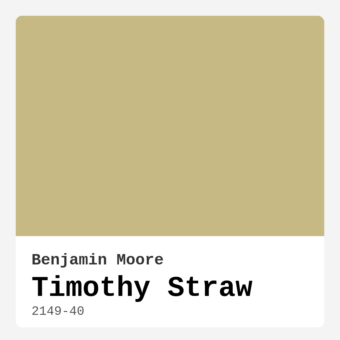
Color Preview & Key Details
| HEX Code | #C6B984 |
| RGB | 198, 185, 132 |
| LRV | 47.16% |
| Undertone | Yellow |
| Finish Options | Eggshell, Matte, Satin |
Imagine stepping into your home after a long day, greeted by a warm, inviting space that instantly makes you feel at ease. That sense of comfort often comes down to the colors you choose for your walls. One hue that’s been turning heads and warming hearts is Benjamin Moore’s Timothy Straw. This charming paint color is more than just a shade; it’s a vibe, a feeling, and a perfect backdrop for everyday life.
Timothy Straw, with its color code 2149-40, is a medium warm beige that radiates a soft glow. It’s the kind of color that wraps around you like a cozy blanket, creating an atmosphere that’s both relaxed and sophisticated. You might be wondering how this color could fit into your home, and that’s exactly what I’m here to help you figure out.
First off, let’s dive into why Timothy Straw is such a versatile choice. The warmth it exudes makes it suitable for various decor styles, from modern farmhouse to bohemian chic. It effortlessly balances between neutral and vibrant, allowing it to serve as a perfect canvas for your decor. Whether you’re dressing it up with rich colors or keeping it simple with soft whites, this color can adapt to whatever style you’re aiming for.
In terms of practicality, Timothy Straw shines brightly. It has a Light Reflectance Value (LRV) of 47.16%, which means it reflects about half of the light that hits it. This characteristic is crucial because it helps create a bright, airy feeling in your space without being overly stark. If you’re considering this color for a living room or kitchen, it will engage with natural light beautifully, appearing lighter during the day and deepening into a more enveloping hue in the evening. This dynamic quality adds depth to your interiors, making spaces feel alive and inviting.
When it comes to application, you’ll find Timothy Straw incredibly user-friendly. It’s designed for even the most novice DIY enthusiasts. The paint goes on smoothly, whether you’re using a brush or a roller, and it dries quickly, allowing you to see the finished product in no time. Plus, it’s highly washable, which is a big bonus for high-traffic areas like the kitchen or dining room. You can clean it up without worrying about damaging the finish.
Now, let’s talk about its undertones. Timothy Straw leans towards a warm yellow, giving it a nuanced depth. These subtle undertones contribute to its character, making it feel cocooning and comforting. If you’re pairing it with existing furniture or decor, consider how these undertones will interact with other colors in your space. For instance, soft whites or cool blues can create a serene palette, while deep greens or navy accents will add a dramatic flair.
While Timothy Straw has many advantages, there are some considerations to keep in mind. In smaller rooms, it may appear darker, which could make them feel a bit cozier—or possibly cramped—if not balanced with ample lighting. A good strategy is to ensure you have plenty of natural light or to use bright trim to keep things feeling open and airy. In rooms where you want to create a sense of spaciousness, pairing it with brighter accents can make a world of difference.
Speaking of pairings, let’s explore the colors that complement Timothy Straw beautifully. You can’t go wrong with a classic like White Dove for trim; it offers a crisp contrast that highlights the warmth of Timothy Straw. If you’re feeling adventurous, consider integrating brass fixtures or warm wood tones to create a cohesive, inviting look. The versatility of this color allows for an abundance of possibilities, so don’t shy away from experimenting!
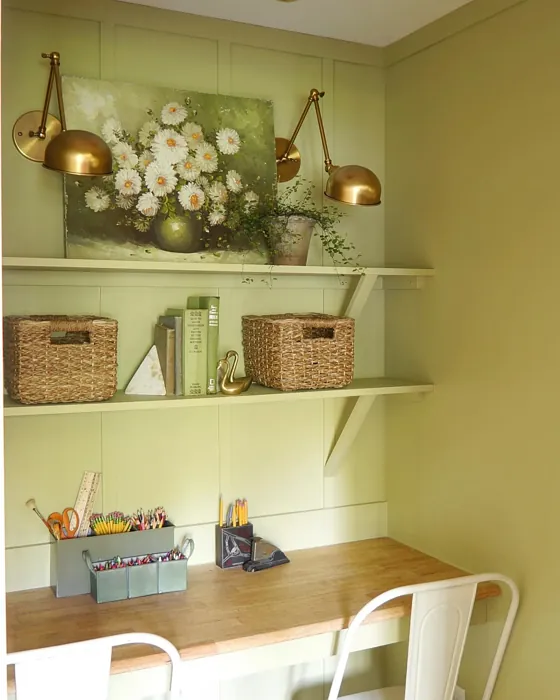
Timothy Straw isn’t just limited to living rooms or kitchens; it works wonderfully in bedrooms, dining rooms, and even home offices. Imagine a cozy bedroom that encourages relaxation or a dining space that feels warm and welcoming during family gatherings. Its inviting nature can create the perfect ambiance for any area where you want to unwind or entertain.
Have you ever thought about how important light is when selecting paint? With Timothy Straw, the way it interacts with light can truly enhance your space. In bright sunlight, it feels soft and airy, while in the evening glow, it transforms into a warm, enveloping hue, perfect for winding down. Understanding how light affects this color is essential, so always test a sample in your home to see how it changes throughout the day.
For those who may be concerned about the environmental impact, Timothy Straw has a low VOC level, making it a healthier choice for your home. You can feel good about painting your walls without compromising indoor air quality, which is especially important if you have kids or pets.
In summary, Timothy Straw by Benjamin Moore is more than just a paint color—it’s a transformative choice for your home. Its warm, earthy tones create a cozy atmosphere that’s perfect for gathering spaces, while its versatility allows it to fit seamlessly into a variety of decor styles. With easy application and excellent washability, it’s a practical choice that doesn’t sacrifice aesthetics.
So, as you consider your next painting project, think about how Timothy Straw can bring warmth and sophistication to your home, creating a space that feels both inviting and stylish. Whether you choose to use it in your living room, bedroom, or kitchen, this color promises to create a comforting ambiance that you and your guests will love. Go ahead and embrace the warmth of Timothy Straw; it might just be the perfect addition to your home’s palette.
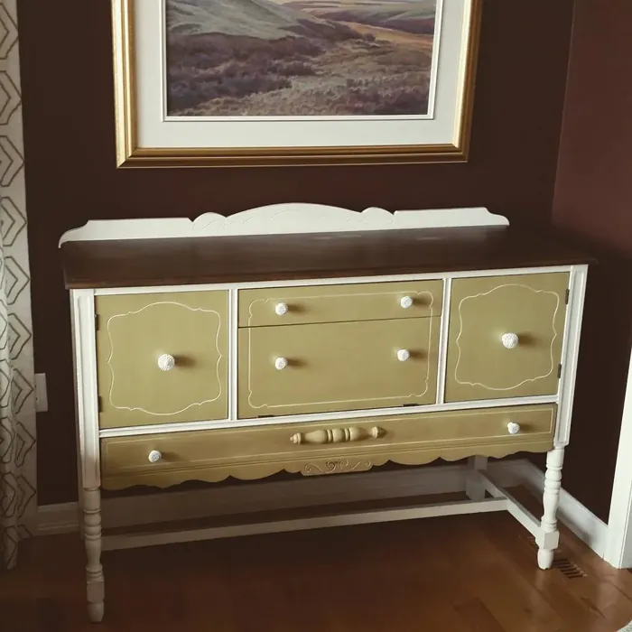
Real Room Photo of Timothy Straw 2149-40
Undertones of Timothy Straw ?
The undertones of Timothy Straw are a key aspect of its character, leaning towards Yellow. These subtle underlying hues are what give the color its depth and complexity. For example, a gray with a blue undertone will feel cooler and more modern, while one with a brown undertone will feel warmer and more traditional. It’s essential to test this paint in your home and observe it next to your existing furniture, flooring, and decor to see how these undertones interact and reveal themselves throughout the day.
HEX value: #C6B984
RGB code: 198, 185, 132
Is Timothy Straw Cool or Warm?
Timothy Straw is considered a warm paint color. This characteristic plays a huge role in the overall feel of a room. Warm colors, like this one, tend to create a cozy, inviting, and energetic atmosphere, making them great for social spaces like living rooms and dining rooms. In contrast, cool colors often evoke a sense of calm and serenity, which is why they are popular in bedrooms and bathrooms. The warmth of Timothy Straw means it will pair beautifully with corresponding decor elements.
Understanding Color Properties and Interior Design Tips
Hue refers to a specific position on the color wheel, measured in degrees from 0 to 360. Each degree represents a different pure color:
- 0° represents red
- 120° represents green
- 240° represents blue
Saturation describes the intensity or purity of a color and is expressed as a percentage:
- At 0%, the color appears completely desaturated—essentially a shade of gray
- At 100%, the color is at its most vivid and vibrant
Lightness indicates how light or dark a color is, also expressed as a percentage:
- 0% lightness results in black
- 100% lightness results in white
Using Warm Colors in Interior Design
Warm hues—such as reds, oranges, yellows, warm beiges, and greiges—are excellent choices for creating inviting and energetic spaces. These colors are particularly well-suited for:
- Kitchens, living rooms, and bathrooms, where warmth enhances comfort and sociability
- Large rooms, where warm tones can help reduce the sense of emptiness and make the space feel more intimate
For example:
- Warm beige shades provide a cozy, inviting atmosphere, ideal for living rooms, bedrooms, and hallways.
- Warm greige (a mix of beige and gray) offers the warmth of beige with the modern appeal of gray, making it a versatile backdrop for dining areas, bedrooms, and living spaces.
However, be mindful when using warm light tones in rooms with limited natural light. These shades may appear muted or even take on an unpleasant yellowish tint. To avoid a dull or flat appearance:
- Add depth by incorporating richer tones like deep greens, charcoal, or chocolate brown
- Use textured elements such as curtains, rugs, or cushions to bring dimension to the space
Pro Tip: Achieving Harmony with Warm and Cool Color Balance
To create a well-balanced and visually interesting interior, mix warm and cool tones strategically. This contrast adds depth and harmony to your design.
- If your walls feature warm hues, introduce cool-colored accents such as blue or green furniture, artwork, or accessories to create contrast.
- For a polished look, consider using a complementary color scheme, which pairs colors opposite each other on the color wheel (e.g., red with green, orange with blue).
This thoughtful mix not only enhances visual appeal but also creates a space that feels both dynamic and cohesive.
Light Temperature Affects on Timothy Straw
Natural Light
Natural daylight changes in color temperature as the sun moves across the sky. At sunrise and sunset, the light tends to have a warm, golden tone with a color temperature around 2000 Kelvin (K). As the day progresses and the sun rises higher, the light becomes cooler and more neutral. Around midday, especially when the sky is clear, natural light typically reaches its peak brightness and shifts to a cooler tone, ranging from 5500 to 6500 Kelvin. This midday light is close to what we perceive as pure white or daylight-balanced light.
These shifts in natural light can significantly influence how colors appear in a space, which is why designers often consider both the time of day and the orientation of windows when planning interior color schemes.
Artificial Light
When choosing artificial lighting, pay close attention to the color temperature, measured in Kelvin (K). This determines how warm or cool the light will appear. Lower temperatures, around 2700K, give off a warm, yellow glow often used in living rooms or bedrooms. Higher temperatures, above 5000K, create a cool, bluish light similar to daylight, commonly used in kitchens, offices, or task areas.
Use the slider to see how lighting temperature can affect the appearance of a surface or color throughout a space.


4800K
LRV of Timothy Straw
The Light Reflectance Value (LRV) of Timothy Straw is 47.16%, which places it in the Light Medium colors category. This means it reflect half of the incident light. Understanding a paint’s LRV is crucial for predicting how it will look in your space. A higher LRV indicates a lighter color that reflects more light, making rooms feel larger and brighter. A lower LRV signifies a darker color that absorbs more light, creating a cozier, more intimate atmosphere. Always consider the natural and artificial lighting in your room when selecting a paint color based on its LRV.
Detailed Review of Timothy Straw
Additional Paint Characteristics
Ideal Rooms
Bedroom, Dining Room, Home Office, Kitchen, Living Room
Decor Styles
Bohemian, Modern Farmhouse, Rustic, Transitional
Coverage
Good (1–2 Coats), Touch-Up Friendly
Ease of Application
Beginner Friendly, Brush Smooth, Fast-Drying, Roller-Ready
Washability
Highly Washable, Washable
VOC Level
Low VOC
Best Use
Accent Wall, Interior Walls, Trim
Room Suitability
Bedroom, Dining Room, Kitchen, Living Room
Tone Tag
Earthy, Muted, Warm
Finish Type
Eggshell, Matte, Satin
Paint Performance
Easy Touch-Up, High Coverage, Low Odor, Quick Drying
Use Cases
Best for Open Concept, Best for Small Spaces, Classic Favorite
Mood
Cozy, Inviting, Warm
Trim Pairing
Complements Brass Fixtures, Pairs with White Dove, Works with Warm Trim
Timothy Straw is an exceptional paint color that seamlessly bridges warmth and sophistication. The soft, muted tones create an inviting atmosphere, perfect for gathering spaces like living rooms and kitchens. Its versatility shines through, as it pairs beautifully with both modern and traditional decor styles. Whether you’re aiming for a rustic farmhouse vibe or a chic bohemian look, this color adapts effortlessly. One of its standout features is how it interacts with light, appearing lighter during the day and deepening into a more enveloping hue in the evening. This makes it a fantastic choice for spaces where you want to create a feeling of comfort and relaxation. Plus, application is a breeze, ensuring that even DIY enthusiasts can achieve a professional finish.
Pros & Cons of 2149-40 Timothy Straw
Pros
Cons
Colors that go with Benjamin Moore Timothy Straw
FAQ on 2149-40 Timothy Straw
Can I use Timothy Straw in small rooms?
Yes, you can! While Timothy Straw is warm and inviting, it might darken a bit in smaller spaces. To combat this, ensure you have adequate lighting to highlight its lovely undertones. Additionally, pairing it with brighter trim can help keep the room feeling open and airy.
What colors pair well with Timothy Straw?
Timothy Straw works beautifully with a variety of colors. For a serene palette, consider pairing it with soft whites like White Dove or cool tones such as soft blues. If you want to create a more dramatic contrast, deep greens or navy accents can add a sophisticated touch. Its versatility makes it easy to create a cohesive look in any room.
Comparisons Timothy Straw with other colors
Timothy Straw 2149-40 vs Hearts of Palm SW 6415
| Attribute | Timothy Straw 2149-40 | Hearts of Palm SW 6415 |
|---|---|---|
| Color Name | Timothy Straw 2149-40 | Hearts of Palm SW 6415 |
| Color | ||
| Hue | Yellow | Yellow |
| Brightness | Medium | Medium |
| RGB | 198, 185, 132 | 207, 194, 145 |
| LRV | 47.16% | 75% |
| Finish Type | Eggshell, Matte, Satin | Eggshell, Matte, Satin |
| Finish Options | Eggshell, Matte, Satin | Eggshell, Matte, Satin |
| Ideal Rooms | Bedroom, Dining Room, Home Office, Kitchen, Living Room | Bathroom, Bedroom, Dining Room, Home Office, Kitchen, Living Room |
| Decor Styles | Bohemian, Modern Farmhouse, Rustic, Transitional | Bohemian, Coastal, Eclectic, Modern Farmhouse, Tropical |
| Coverage | Good (1–2 Coats), Touch-Up Friendly | Good (1–2 Coats), Touch-Up Friendly |
| Ease of Application | Beginner Friendly, Brush Smooth, Fast-Drying, Roller-Ready | Beginner Friendly, Brush Smooth, Roller-Ready |
| Washability | Highly Washable, Washable | Scrubbable, Washable |
| Room Suitability | Bedroom, Dining Room, Kitchen, Living Room | Bathroom, Bedroom, Dining Room, Home Office, Kitchen, Living Room |
| Tone | Earthy, Muted, Warm | Earthy, Muted, Warm |
| Paint Performance | Easy Touch-Up, High Coverage, Low Odor, Quick Drying | Easy Touch-Up, Low Odor, Scuff Resistant |
Timothy Straw 2149-40 vs Blonde SW 6128
| Attribute | Timothy Straw 2149-40 | Blonde SW 6128 |
|---|---|---|
| Color Name | Timothy Straw 2149-40 | Blonde SW 6128 |
| Color | ||
| Hue | Yellow | Yellow |
| Brightness | Medium | Medium |
| RGB | 198, 185, 132 | 220, 189, 146 |
| LRV | 47.16% | 64% |
| Finish Type | Eggshell, Matte, Satin | Eggshell, Satin |
| Finish Options | Eggshell, Matte, Satin | Eggshell, Matte, Satin |
| Ideal Rooms | Bedroom, Dining Room, Home Office, Kitchen, Living Room | Bedroom, Dining Room, Home Office, Kitchen, Living Room |
| Decor Styles | Bohemian, Modern Farmhouse, Rustic, Transitional | Bohemian, Coastal, Modern Farmhouse, Scandinavian, Transitional |
| Coverage | Good (1–2 Coats), Touch-Up Friendly | Good (1–2 Coats), Touch-Up Friendly |
| Ease of Application | Beginner Friendly, Brush Smooth, Fast-Drying, Roller-Ready | Beginner Friendly, Fast-Drying, Roller-Ready |
| Washability | Highly Washable, Washable | Highly Washable, Washable |
| Room Suitability | Bedroom, Dining Room, Kitchen, Living Room | Bedroom, Dining Room, Home Office, Kitchen, Living Room, Nursery |
| Tone | Earthy, Muted, Warm | Earthy, Neutral, Warm |
| Paint Performance | Easy Touch-Up, High Coverage, Low Odor, Quick Drying | Easy Touch-Up, Fade Resistant, Low Odor, Quick Drying |
Timothy Straw 2149-40 vs Ruskin Room Green SW 0042
| Attribute | Timothy Straw 2149-40 | Ruskin Room Green SW 0042 |
|---|---|---|
| Color Name | Timothy Straw 2149-40 | Ruskin Room Green SW 0042 |
| Color | ||
| Hue | Yellow | Yellow |
| Brightness | Medium | Medium |
| RGB | 198, 185, 132 | 172, 161, 125 |
| LRV | 47.16% | 24% |
| Finish Type | Eggshell, Matte, Satin | Eggshell, Matte |
| Finish Options | Eggshell, Matte, Satin | Eggshell, Flat, Matte, Satin |
| Ideal Rooms | Bedroom, Dining Room, Home Office, Kitchen, Living Room | Bedroom, Dining Room, Home Office, Living Room |
| Decor Styles | Bohemian, Modern Farmhouse, Rustic, Transitional | Farmhouse, Modern, Rustic, Traditional |
| Coverage | Good (1–2 Coats), Touch-Up Friendly | Good (1–2 Coats), Touch-Up Friendly |
| Ease of Application | Beginner Friendly, Brush Smooth, Fast-Drying, Roller-Ready | Beginner Friendly, Brush Smooth, Roller-Ready |
| Washability | Highly Washable, Washable | Scrubbable, Washable |
| Room Suitability | Bedroom, Dining Room, Kitchen, Living Room | Bedroom, Dining Room, Home Office, Living Room |
| Tone | Earthy, Muted, Warm | Earthy, Muted, Warm |
| Paint Performance | Easy Touch-Up, High Coverage, Low Odor, Quick Drying | Easy Touch-Up, High Coverage, Low Odor |
Timothy Straw 2149-40 vs Bosc Pear SW 6390
| Attribute | Timothy Straw 2149-40 | Bosc Pear SW 6390 |
|---|---|---|
| Color Name | Timothy Straw 2149-40 | Bosc Pear SW 6390 |
| Color | ||
| Hue | Yellow | Yellow |
| Brightness | Medium | Medium |
| RGB | 198, 185, 132 | 192, 144, 86 |
| LRV | 47.16% | 60% |
| Finish Type | Eggshell, Matte, Satin | Satin, Semi-Gloss |
| Finish Options | Eggshell, Matte, Satin | Flat, Satin, Semi-Gloss |
| Ideal Rooms | Bedroom, Dining Room, Home Office, Kitchen, Living Room | Bedroom, Dining Room, Home Office, Kitchen, Living Room |
| Decor Styles | Bohemian, Modern Farmhouse, Rustic, Transitional | Modern Farmhouse, Rustic, Traditional, Transitional |
| Coverage | Good (1–2 Coats), Touch-Up Friendly | Good (1–2 Coats) |
| Ease of Application | Beginner Friendly, Brush Smooth, Fast-Drying, Roller-Ready | Beginner Friendly, Brush Smooth, Fast-Drying, Roller-Ready |
| Washability | Highly Washable, Washable | Highly Washable, Washable |
| Room Suitability | Bedroom, Dining Room, Kitchen, Living Room | Bedroom, Dining Room, Home Office, Living Room |
| Tone | Earthy, Muted, Warm | Balanced, Earthy, Warm |
| Paint Performance | Easy Touch-Up, High Coverage, Low Odor, Quick Drying | Easy Touch-Up, High Coverage, Low Odor, Quick Drying |
Timothy Straw 2149-40 vs Lemongrass SW 7732
| Attribute | Timothy Straw 2149-40 | Lemongrass SW 7732 |
|---|---|---|
| Color Name | Timothy Straw 2149-40 | Lemongrass SW 7732 |
| Color | ||
| Hue | Yellow | Yellow |
| Brightness | Medium | Medium |
| RGB | 198, 185, 132 | 200, 189, 152 |
| LRV | 47.16% | 48% |
| Finish Type | Eggshell, Matte, Satin | Eggshell, Matte, Satin |
| Finish Options | Eggshell, Matte, Satin | Eggshell, Matte, Satin |
| Ideal Rooms | Bedroom, Dining Room, Home Office, Kitchen, Living Room | Bathroom, Bedroom, Home Office, Kitchen, Living Room, Nursery |
| Decor Styles | Bohemian, Modern Farmhouse, Rustic, Transitional | Bohemian, Modern Farmhouse, Scandinavian, Transitional |
| Coverage | Good (1–2 Coats), Touch-Up Friendly | Good (1–2 Coats) |
| Ease of Application | Beginner Friendly, Brush Smooth, Fast-Drying, Roller-Ready | Beginner Friendly, Brush Smooth, Roller-Ready |
| Washability | Highly Washable, Washable | Highly Washable, Washable |
| Room Suitability | Bedroom, Dining Room, Kitchen, Living Room | Bedroom, Home Office, Kitchen, Living Room |
| Tone | Earthy, Muted, Warm | Earthy, Muted, Warm |
| Paint Performance | Easy Touch-Up, High Coverage, Low Odor, Quick Drying | Easy Touch-Up, Low Odor, Scuff Resistant |
Timothy Straw 2149-40 vs Garden Sage SW 7736
| Attribute | Timothy Straw 2149-40 | Garden Sage SW 7736 |
|---|---|---|
| Color Name | Timothy Straw 2149-40 | Garden Sage SW 7736 |
| Color | ||
| Hue | Yellow | Yellow |
| Brightness | Medium | Medium |
| RGB | 198, 185, 132 | 177, 165, 132 |
| LRV | 47.16% | 24% |
| Finish Type | Eggshell, Matte, Satin | Eggshell, Matte, Satin |
| Finish Options | Eggshell, Matte, Satin | Eggshell, Matte, Satin |
| Ideal Rooms | Bedroom, Dining Room, Home Office, Kitchen, Living Room | Bedroom, Dining Room, Home Office, Kitchen, Living Room, Nursery |
| Decor Styles | Bohemian, Modern Farmhouse, Rustic, Transitional | Bohemian, Cottage, Minimalist, Modern Farmhouse, Traditional |
| Coverage | Good (1–2 Coats), Touch-Up Friendly | Good (1–2 Coats), Touch-Up Friendly |
| Ease of Application | Beginner Friendly, Brush Smooth, Fast-Drying, Roller-Ready | Beginner Friendly, Brush Smooth, Roller-Ready |
| Washability | Highly Washable, Washable | Highly Washable, Washable |
| Room Suitability | Bedroom, Dining Room, Kitchen, Living Room | Bedroom, Dining Room, Home Office, Kitchen, Living Room |
| Tone | Earthy, Muted, Warm | Balanced, Earthy, Muted, Warm |
| Paint Performance | Easy Touch-Up, High Coverage, Low Odor, Quick Drying | Easy Touch-Up, Fade Resistant, Low Odor |
Timothy Straw 2149-40 vs Tassel SW 6369
| Attribute | Timothy Straw 2149-40 | Tassel SW 6369 |
|---|---|---|
| Color Name | Timothy Straw 2149-40 | Tassel SW 6369 |
| Color | ||
| Hue | Yellow | Yellow |
| Brightness | Medium | Medium |
| RGB | 198, 185, 132 | 198, 136, 74 |
| LRV | 47.16% | 45% |
| Finish Type | Eggshell, Matte, Satin | Matte, Satin |
| Finish Options | Eggshell, Matte, Satin | Matte, Satin, Semi-Gloss |
| Ideal Rooms | Bedroom, Dining Room, Home Office, Kitchen, Living Room | Bedroom, Dining Room, Home Office, Living Room |
| Decor Styles | Bohemian, Modern Farmhouse, Rustic, Transitional | Bohemian, Modern Farmhouse, Rustic, Transitional |
| Coverage | Good (1–2 Coats), Touch-Up Friendly | Good (1–2 Coats) |
| Ease of Application | Beginner Friendly, Brush Smooth, Fast-Drying, Roller-Ready | Beginner Friendly, Brush Smooth, Fast-Drying, Roller-Ready |
| Washability | Highly Washable, Washable | Scrubbable, Washable |
| Room Suitability | Bedroom, Dining Room, Kitchen, Living Room | Bedroom, Dining Room, Home Office, Living Room |
| Tone | Earthy, Muted, Warm | Earthy, Inviting, Warm |
| Paint Performance | Easy Touch-Up, High Coverage, Low Odor, Quick Drying | Easy Touch-Up, Low Odor, Quick Drying, Scuff Resistant |
Timothy Straw 2149-40 vs Sunflower SW 6678
| Attribute | Timothy Straw 2149-40 | Sunflower SW 6678 |
|---|---|---|
| Color Name | Timothy Straw 2149-40 | Sunflower SW 6678 |
| Color | ||
| Hue | Yellow | Yellow |
| Brightness | Medium | Medium |
| RGB | 198, 185, 132 | 227, 154, 51 |
| LRV | 47.16% | 75% |
| Finish Type | Eggshell, Matte, Satin | Eggshell, Satin |
| Finish Options | Eggshell, Matte, Satin | Eggshell, Satin, Semi-Gloss |
| Ideal Rooms | Bedroom, Dining Room, Home Office, Kitchen, Living Room | Dining Room, Entryway, Home Office, Kitchen, Living Room |
| Decor Styles | Bohemian, Modern Farmhouse, Rustic, Transitional | Bohemian, Eclectic, Modern Farmhouse, Traditional |
| Coverage | Good (1–2 Coats), Touch-Up Friendly | Good (1–2 Coats), Touch-Up Friendly |
| Ease of Application | Beginner Friendly, Brush Smooth, Fast-Drying, Roller-Ready | Beginner Friendly, Brush Smooth, Fast-Drying, Roller-Ready |
| Washability | Highly Washable, Washable | Highly Washable, Washable |
| Room Suitability | Bedroom, Dining Room, Kitchen, Living Room | Dining Room, Entryway, Kitchen, Living Room |
| Tone | Earthy, Muted, Warm | Bold, Earthy, Warm |
| Paint Performance | Easy Touch-Up, High Coverage, Low Odor, Quick Drying | Fade Resistant, High Coverage, Quick Drying |
Timothy Straw 2149-40 vs Bee's Wax SW 7682
| Attribute | Timothy Straw 2149-40 | Bee's Wax SW 7682 |
|---|---|---|
| Color Name | Timothy Straw 2149-40 | Bee's Wax SW 7682 |
| Color | ||
| Hue | Yellow | Yellow |
| Brightness | Medium | Medium |
| RGB | 198, 185, 132 | 234, 191, 134 |
| LRV | 47.16% | 50% |
| Finish Type | Eggshell, Matte, Satin | Eggshell, Matte, Satin |
| Finish Options | Eggshell, Matte, Satin | Eggshell, Matte, Satin |
| Ideal Rooms | Bedroom, Dining Room, Home Office, Kitchen, Living Room | Bedroom, Dining Room, Entryway, Kitchen, Living Room |
| Decor Styles | Bohemian, Modern Farmhouse, Rustic, Transitional | Bohemian, Coastal, Modern Farmhouse, Traditional, Transitional |
| Coverage | Good (1–2 Coats), Touch-Up Friendly | Good (1–2 Coats), Touch-Up Friendly |
| Ease of Application | Beginner Friendly, Brush Smooth, Fast-Drying, Roller-Ready | Beginner Friendly, Brush Smooth, Roller-Ready |
| Washability | Highly Washable, Washable | Washable, Wipeable |
| Room Suitability | Bedroom, Dining Room, Kitchen, Living Room | Bedroom, Dining Room, Entryway, Kitchen, Living Room |
| Tone | Earthy, Muted, Warm | Creamy, Earthy, Warm |
| Paint Performance | Easy Touch-Up, High Coverage, Low Odor, Quick Drying | Easy Touch-Up, High Coverage, Low Odor |
Timothy Straw 2149-40 vs Downing Straw SW 2813
| Attribute | Timothy Straw 2149-40 | Downing Straw SW 2813 |
|---|---|---|
| Color Name | Timothy Straw 2149-40 | Downing Straw SW 2813 |
| Color | ||
| Hue | Yellow | Yellow |
| Brightness | Medium | Medium |
| RGB | 198, 185, 132 | 202, 171, 125 |
| LRV | 47.16% | 48% |
| Finish Type | Eggshell, Matte, Satin | Eggshell, Matte, Satin |
| Finish Options | Eggshell, Matte, Satin | Eggshell, Matte, Satin |
| Ideal Rooms | Bedroom, Dining Room, Home Office, Kitchen, Living Room | Bedroom, Dining Room, Home Office, Kitchen, Living Room |
| Decor Styles | Bohemian, Modern Farmhouse, Rustic, Transitional | Contemporary, Eclectic, Modern Farmhouse, Rustic, Traditional |
| Coverage | Good (1–2 Coats), Touch-Up Friendly | Good (1–2 Coats), Touch-Up Friendly |
| Ease of Application | Beginner Friendly, Brush Smooth, Fast-Drying, Roller-Ready | Beginner Friendly, Brush Smooth, Roller-Ready |
| Washability | Highly Washable, Washable | Washable, Wipeable |
| Room Suitability | Bedroom, Dining Room, Kitchen, Living Room | Bedroom, Dining Room, Home Office, Kitchen, Living Room |
| Tone | Earthy, Muted, Warm | Earthy, Muted, Warm |
| Paint Performance | Easy Touch-Up, High Coverage, Low Odor, Quick Drying | Easy Touch-Up, High Coverage, Low Odor |
Official Page of Benjamin Moore Timothy Straw 2149-40