
Color Preview & Key Details
| HEX Code | #D5A14B |
| RGB | 213, 161, 75 |
| LRV | 38.76% |
| Undertone | Red |
| Finish Options | Eggshell, Satin, Semi-Gloss |
Imagine stepping into a sunlit room, where the walls seem to bask in the warmth of a perfect spring day. That’s the magic of Buttercup, Benjamin Moore’s stunning hue that embodies everything cheerful and inviting. This vibrant yellow, with its rich undertones, can transform your space into a sanctuary of light and warmth. Whether you’re refreshing your living room, bedroom, or even your kitchen, Buttercup is a color that invites you to breathe easy and feel right at home.
As a home designer with years of experience, I can tell you that choosing the right paint color is crucial in setting the mood of your space. Buttercup isn’t just a color; it’s an experience waiting to be created. With a medium Light Reflectance Value (LRV) of 38.76%, it holds a sweet spot between light and dark, reflecting a lot of light while still providing that cozy, intimate feel we often crave in our homes.
Let’s dive deeper into what makes Buttercup a standout choice.
First off, this shade is warm—really warm. With its red undertones, Buttercup radiates a friendly and welcoming vibe, making it perfect for social spaces where you want to foster connection and comfort. Think about gathering with friends and family in a living room painted in this lovely hue. It’s like wrapping everyone in a warm hug.
Buttercup shines in various decor styles, from modern farmhouse aesthetics to classic traditional and everything in between. Its versatility means you don’t have to overhaul your entire design scheme. It works beautifully alongside a variety of other colors too. Pair it with whites, creams, or even soft blues for a coastal look. Its warm undertones enhance the cozy and inviting feel of spaces, while its sunny disposition can brighten even the gloomiest of days.
Now, you might be wondering about practicalities. Buttercup is incredibly user-friendly for DIYers. It applies smoothly with both brushes and rollers, dries quickly, and is highly washable—meaning those inevitable scuffs and marks can be easily wiped away. Plus, you’ll find that it offers good coverage with just one or two coats, which is a big win in the world of painting.
However, a word of caution: in lower light settings, Buttercup can appear a tad darker than its vibrant self. So, it’s essential to observe how the color behaves throughout the day in your specific space. Natural light brings out its sunny brightness, while artificial light softens it, creating a cozy ambiance, especially in the evenings.
Wondering where this color works best? Picture it in a warm, inviting living room, a cheerful kitchen, or even a cozy home office. It can also make a lovely statement in a dining room or bedroom, providing a sense of warmth that encourages relaxation and conversation. For smaller spaces, Buttercup can make them feel inviting without overwhelming the senses. Use it on all walls for that enveloping effect or as an accent to keep things dynamic and interesting.
One of the key aspects of Buttercup is its adaptability. It plays well with other colors, so don’t hesitate to experiment. For a fresh look, consider pairing it with crisp white trim, which will make it pop beautifully. Warm brass fixtures can enhance its richness, while a soft blue can provide a lovely contrast, balancing the warmth with a cool undertone that feels refreshing and modern.
If you’re on the hunt for complementary shades, think about colors like Benjamin Moore’s Honey Bee or even Sherwin-Williams’ Daffodil for a harmonious palette. For those looking to make a bolder statement, consider darker shades like 2158-30 or even 2154-20 to create depth and interest.
When you choose Buttercup, you’re not just selecting a paint color; you’re selecting an atmosphere. The warm, earthy, and creamy tones of Buttercup evoke feelings of coziness and brightness, perfect for nurturing a happy home. Plus, with its low VOC formula, you can feel good about using it, knowing it has a minimal impact on indoor air quality.
It’s important to remember that the undertones of Buttercup are what give it character. The subtle red undertones add depth, creating a rich, complex feel that can change with the light throughout the day. That’s why it’s crucial to test the paint in your home before committing. Observe it next to your existing furniture and decor to see how it interacts with different colors and materials.
For those who might be curious about using Buttercup outside, while it’s primarily designed for interiors, it can be applied on exterior surfaces if you use the right primer and topcoat. Just make sure you’re considering the weather resistance needed for outdoor applications.
So, where do you go from here? If Buttercup sounds like it could be the right fit for your space, grab a sample and paint a patch on your wall. Observe how it changes throughout the day as the light shifts. You’ll soon see why Buttercup is such a beloved choice among homeowners looking to create a warm, inviting atmosphere.
In the end, remember that the goal of any paint project is to create a space that feels personal and reflects your style. Buttercup offers a beautiful backdrop for your life and memories, turning your home into a haven of warmth and brightness. With this delightful hue, you’re not just adding color—you’re creating a feeling. And isn’t that what home is all about?

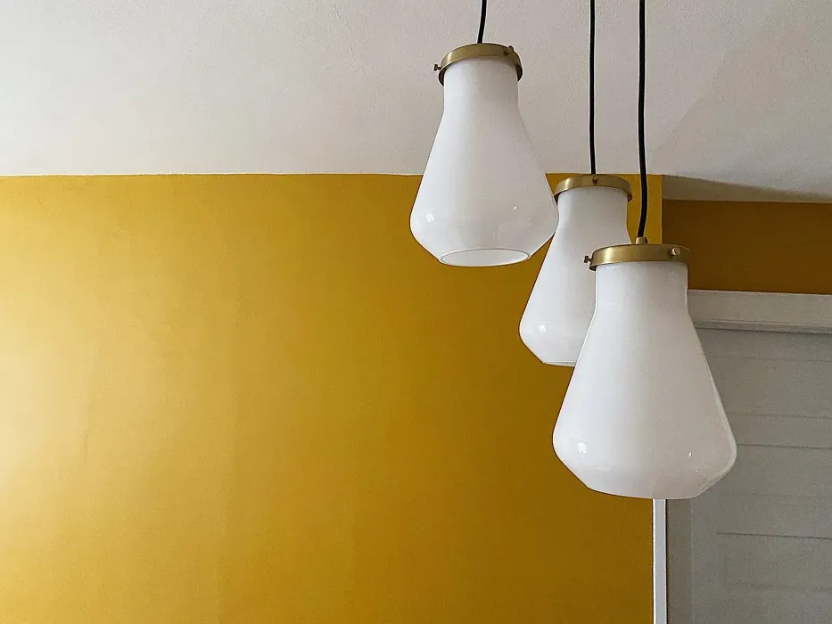
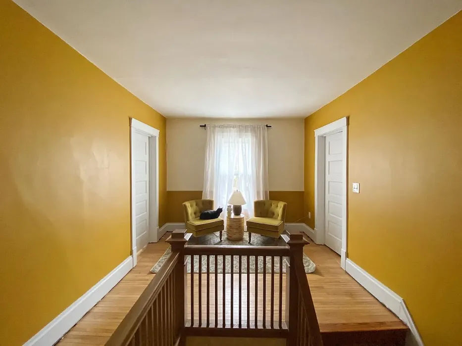
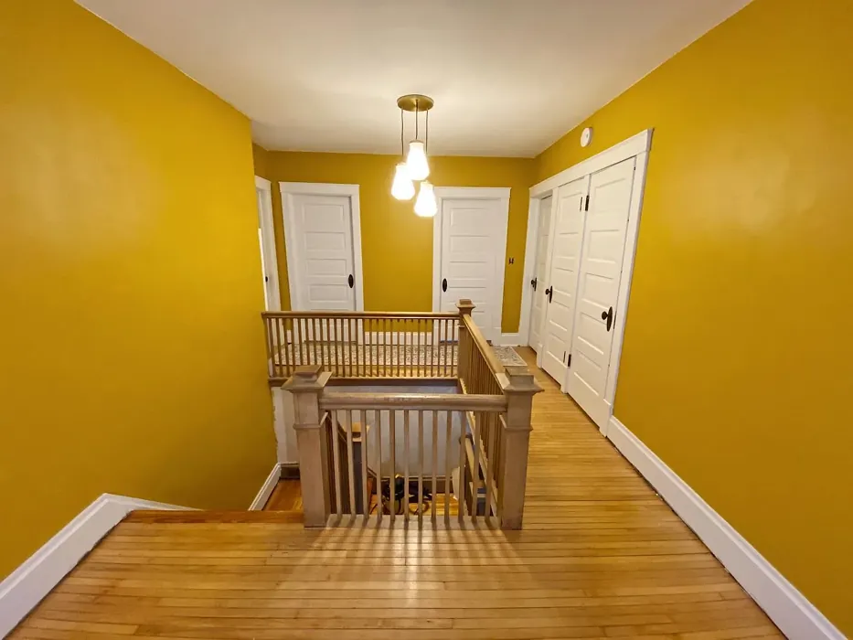
Real Room Photo of Buttercup 2154-30
Undertones of Buttercup ?
The undertones of Buttercup are a key aspect of its character, leaning towards Red. These subtle underlying hues are what give the color its depth and complexity. For example, a gray with a blue undertone will feel cooler and more modern, while one with a brown undertone will feel warmer and more traditional. It’s essential to test this paint in your home and observe it next to your existing furniture, flooring, and decor to see how these undertones interact and reveal themselves throughout the day.
HEX value: #D5A14B
RGB code: 213, 161, 75
Is Buttercup Cool or Warm?
Buttercup is considered a warm paint color. This characteristic plays a huge role in the overall feel of a room. Warm colors, like this one, tend to create a cozy, inviting, and energetic atmosphere, making them great for social spaces like living rooms and dining rooms. In contrast, cool colors often evoke a sense of calm and serenity, which is why they are popular in bedrooms and bathrooms. The warmth of Buttercup means it will pair beautifully with corresponding decor elements.
Understanding Color Properties and Interior Design Tips
Hue refers to a specific position on the color wheel, measured in degrees from 0 to 360. Each degree represents a different pure color:
- 0° represents red
- 120° represents green
- 240° represents blue
Saturation describes the intensity or purity of a color and is expressed as a percentage:
- At 0%, the color appears completely desaturated—essentially a shade of gray
- At 100%, the color is at its most vivid and vibrant
Lightness indicates how light or dark a color is, also expressed as a percentage:
- 0% lightness results in black
- 100% lightness results in white
Using Warm Colors in Interior Design
Warm hues—such as reds, oranges, yellows, warm beiges, and greiges—are excellent choices for creating inviting and energetic spaces. These colors are particularly well-suited for:
- Kitchens, living rooms, and bathrooms, where warmth enhances comfort and sociability
- Large rooms, where warm tones can help reduce the sense of emptiness and make the space feel more intimate
For example:
- Warm beige shades provide a cozy, inviting atmosphere, ideal for living rooms, bedrooms, and hallways.
- Warm greige (a mix of beige and gray) offers the warmth of beige with the modern appeal of gray, making it a versatile backdrop for dining areas, bedrooms, and living spaces.
However, be mindful when using warm light tones in rooms with limited natural light. These shades may appear muted or even take on an unpleasant yellowish tint. To avoid a dull or flat appearance:
- Add depth by incorporating richer tones like deep greens, charcoal, or chocolate brown
- Use textured elements such as curtains, rugs, or cushions to bring dimension to the space
Pro Tip: Achieving Harmony with Warm and Cool Color Balance
To create a well-balanced and visually interesting interior, mix warm and cool tones strategically. This contrast adds depth and harmony to your design.
- If your walls feature warm hues, introduce cool-colored accents such as blue or green furniture, artwork, or accessories to create contrast.
- For a polished look, consider using a complementary color scheme, which pairs colors opposite each other on the color wheel (e.g., red with green, orange with blue).
This thoughtful mix not only enhances visual appeal but also creates a space that feels both dynamic and cohesive.
Light Temperature Affects on Buttercup
Natural Light
Natural daylight changes in color temperature as the sun moves across the sky. At sunrise and sunset, the light tends to have a warm, golden tone with a color temperature around 2000 Kelvin (K). As the day progresses and the sun rises higher, the light becomes cooler and more neutral. Around midday, especially when the sky is clear, natural light typically reaches its peak brightness and shifts to a cooler tone, ranging from 5500 to 6500 Kelvin. This midday light is close to what we perceive as pure white or daylight-balanced light.
These shifts in natural light can significantly influence how colors appear in a space, which is why designers often consider both the time of day and the orientation of windows when planning interior color schemes.
Artificial Light
When choosing artificial lighting, pay close attention to the color temperature, measured in Kelvin (K). This determines how warm or cool the light will appear. Lower temperatures, around 2700K, give off a warm, yellow glow often used in living rooms or bedrooms. Higher temperatures, above 5000K, create a cool, bluish light similar to daylight, commonly used in kitchens, offices, or task areas.
Use the slider to see how lighting temperature can affect the appearance of a surface or color throughout a space.


4800K
LRV of Buttercup
The Light Reflectance Value (LRV) of Buttercup is 38.76%, which places it in the Medium colors category. This means it reflect a lot of light. Understanding a paint’s LRV is crucial for predicting how it will look in your space. A higher LRV indicates a lighter color that reflects more light, making rooms feel larger and brighter. A lower LRV signifies a darker color that absorbs more light, creating a cozier, more intimate atmosphere. Always consider the natural and artificial lighting in your room when selecting a paint color based on its LRV.
Detailed Review of Buttercup
Additional Paint Characteristics
Ideal Rooms
Bedroom, Dining Room, Home Office, Kitchen, Living Room, Nursery
Decor Styles
Bohemian, Coastal, Eclectic, Modern Farmhouse, Traditional
Coverage
Good (1–2 Coats), Touch-Up Friendly
Ease of Application
Beginner Friendly, Brush Smooth, Fast-Drying, Roller-Ready
Washability
Highly Washable, Washable
VOC Level
Low VOC
Best Use
Accent Wall, Furniture, Interior Walls, Trim
Room Suitability
Bedroom, Dining Room, Home Office, Kitchen, Living Room
Tone Tag
Creamy, Earthy, Warm
Finish Type
Eggshell, Satin, Semi-Gloss
Paint Performance
Easy Touch-Up, Low Odor, Quick Drying, Scuff Resistant
Use Cases
Best for Modern Farmhouse, Best for Small Spaces, Classic Favorite
Mood
Brightening, Cozy, Inviting
Trim Pairing
Complements Brass Fixtures, Pairs with White Dove, Works with Warm Trim
Buttercup is more than just a paint color; it’s an experience. When applied, it radiates warmth and positivity, making it an ideal choice for gathering spaces where you want to foster connection and comfort. The balance of its warm undertones means it can adapt to different lighting conditions throughout the day, offering a soft glow in the morning and a cozy ambiance in the evening. Whether you’re painting an accent wall or an entire room, Buttercup’s versatile nature allows it to shine in various decor styles, from modern farmhouse to classic traditional. However, keep in mind that while it’s generally easy to work with, achieving a uniform finish may require a second coat to ensure optimal coverage.
Pros & Cons of 2154-30 Buttercup
Pros
Cons
Colors that go with Benjamin Moore Buttercup
FAQ on 2154-30 Buttercup
Can Buttercup be used in a small room?
Absolutely! Buttercup can make a small room feel warm and inviting. Use it on all walls for a cozy effect, or as an accent color to add depth without overwhelming the space. Pair it with lighter furniture and decor to keep the room feeling open and airy.
Is Buttercup suitable for exterior use?
While Buttercup is primarily designed for interior spaces, it can be used on exterior surfaces if applied with a suitable exterior primer and topcoat. Make sure to check the paint’s specifications for weather resistance and durability to ensure it stands up to outdoor conditions.
Comparisons Buttercup with other colors
Buttercup 2154-30 vs Hearts of Palm SW 6415
| Attribute | Buttercup 2154-30 | Hearts of Palm SW 6415 |
|---|---|---|
| Color Name | Buttercup 2154-30 | Hearts of Palm SW 6415 |
| Color | ||
| Hue | Yellow | Yellow |
| Brightness | Medium | Medium |
| RGB | 213, 161, 75 | 207, 194, 145 |
| LRV | 38.76% | 75% |
| Finish Type | Eggshell, Satin, Semi-Gloss | Eggshell, Matte, Satin |
| Finish Options | Eggshell, Satin, Semi-Gloss | Eggshell, Matte, Satin |
| Ideal Rooms | Bedroom, Dining Room, Home Office, Kitchen, Living Room, Nursery | Bathroom, Bedroom, Dining Room, Home Office, Kitchen, Living Room |
| Decor Styles | Bohemian, Coastal, Eclectic, Modern Farmhouse, Traditional | Bohemian, Coastal, Eclectic, Modern Farmhouse, Tropical |
| Coverage | Good (1–2 Coats), Touch-Up Friendly | Good (1–2 Coats), Touch-Up Friendly |
| Ease of Application | Beginner Friendly, Brush Smooth, Fast-Drying, Roller-Ready | Beginner Friendly, Brush Smooth, Roller-Ready |
| Washability | Highly Washable, Washable | Scrubbable, Washable |
| Room Suitability | Bedroom, Dining Room, Home Office, Kitchen, Living Room | Bathroom, Bedroom, Dining Room, Home Office, Kitchen, Living Room |
| Tone | Creamy, Earthy, Warm | Earthy, Muted, Warm |
| Paint Performance | Easy Touch-Up, Low Odor, Quick Drying, Scuff Resistant | Easy Touch-Up, Low Odor, Scuff Resistant |
Buttercup 2154-30 vs Blonde SW 6128
| Attribute | Buttercup 2154-30 | Blonde SW 6128 |
|---|---|---|
| Color Name | Buttercup 2154-30 | Blonde SW 6128 |
| Color | ||
| Hue | Yellow | Yellow |
| Brightness | Medium | Medium |
| RGB | 213, 161, 75 | 220, 189, 146 |
| LRV | 38.76% | 64% |
| Finish Type | Eggshell, Satin, Semi-Gloss | Eggshell, Satin |
| Finish Options | Eggshell, Satin, Semi-Gloss | Eggshell, Matte, Satin |
| Ideal Rooms | Bedroom, Dining Room, Home Office, Kitchen, Living Room, Nursery | Bedroom, Dining Room, Home Office, Kitchen, Living Room |
| Decor Styles | Bohemian, Coastal, Eclectic, Modern Farmhouse, Traditional | Bohemian, Coastal, Modern Farmhouse, Scandinavian, Transitional |
| Coverage | Good (1–2 Coats), Touch-Up Friendly | Good (1–2 Coats), Touch-Up Friendly |
| Ease of Application | Beginner Friendly, Brush Smooth, Fast-Drying, Roller-Ready | Beginner Friendly, Fast-Drying, Roller-Ready |
| Washability | Highly Washable, Washable | Highly Washable, Washable |
| Room Suitability | Bedroom, Dining Room, Home Office, Kitchen, Living Room | Bedroom, Dining Room, Home Office, Kitchen, Living Room, Nursery |
| Tone | Creamy, Earthy, Warm | Earthy, Neutral, Warm |
| Paint Performance | Easy Touch-Up, Low Odor, Quick Drying, Scuff Resistant | Easy Touch-Up, Fade Resistant, Low Odor, Quick Drying |
Buttercup 2154-30 vs Ruskin Room Green SW 0042
| Attribute | Buttercup 2154-30 | Ruskin Room Green SW 0042 |
|---|---|---|
| Color Name | Buttercup 2154-30 | Ruskin Room Green SW 0042 |
| Color | ||
| Hue | Yellow | Yellow |
| Brightness | Medium | Medium |
| RGB | 213, 161, 75 | 172, 161, 125 |
| LRV | 38.76% | 24% |
| Finish Type | Eggshell, Satin, Semi-Gloss | Eggshell, Matte |
| Finish Options | Eggshell, Satin, Semi-Gloss | Eggshell, Flat, Matte, Satin |
| Ideal Rooms | Bedroom, Dining Room, Home Office, Kitchen, Living Room, Nursery | Bedroom, Dining Room, Home Office, Living Room |
| Decor Styles | Bohemian, Coastal, Eclectic, Modern Farmhouse, Traditional | Farmhouse, Modern, Rustic, Traditional |
| Coverage | Good (1–2 Coats), Touch-Up Friendly | Good (1–2 Coats), Touch-Up Friendly |
| Ease of Application | Beginner Friendly, Brush Smooth, Fast-Drying, Roller-Ready | Beginner Friendly, Brush Smooth, Roller-Ready |
| Washability | Highly Washable, Washable | Scrubbable, Washable |
| Room Suitability | Bedroom, Dining Room, Home Office, Kitchen, Living Room | Bedroom, Dining Room, Home Office, Living Room |
| Tone | Creamy, Earthy, Warm | Earthy, Muted, Warm |
| Paint Performance | Easy Touch-Up, Low Odor, Quick Drying, Scuff Resistant | Easy Touch-Up, High Coverage, Low Odor |
Buttercup 2154-30 vs Bosc Pear SW 6390
| Attribute | Buttercup 2154-30 | Bosc Pear SW 6390 |
|---|---|---|
| Color Name | Buttercup 2154-30 | Bosc Pear SW 6390 |
| Color | ||
| Hue | Yellow | Yellow |
| Brightness | Medium | Medium |
| RGB | 213, 161, 75 | 192, 144, 86 |
| LRV | 38.76% | 60% |
| Finish Type | Eggshell, Satin, Semi-Gloss | Satin, Semi-Gloss |
| Finish Options | Eggshell, Satin, Semi-Gloss | Flat, Satin, Semi-Gloss |
| Ideal Rooms | Bedroom, Dining Room, Home Office, Kitchen, Living Room, Nursery | Bedroom, Dining Room, Home Office, Kitchen, Living Room |
| Decor Styles | Bohemian, Coastal, Eclectic, Modern Farmhouse, Traditional | Modern Farmhouse, Rustic, Traditional, Transitional |
| Coverage | Good (1–2 Coats), Touch-Up Friendly | Good (1–2 Coats) |
| Ease of Application | Beginner Friendly, Brush Smooth, Fast-Drying, Roller-Ready | Beginner Friendly, Brush Smooth, Fast-Drying, Roller-Ready |
| Washability | Highly Washable, Washable | Highly Washable, Washable |
| Room Suitability | Bedroom, Dining Room, Home Office, Kitchen, Living Room | Bedroom, Dining Room, Home Office, Living Room |
| Tone | Creamy, Earthy, Warm | Balanced, Earthy, Warm |
| Paint Performance | Easy Touch-Up, Low Odor, Quick Drying, Scuff Resistant | Easy Touch-Up, High Coverage, Low Odor, Quick Drying |
Buttercup 2154-30 vs Lemongrass SW 7732
| Attribute | Buttercup 2154-30 | Lemongrass SW 7732 |
|---|---|---|
| Color Name | Buttercup 2154-30 | Lemongrass SW 7732 |
| Color | ||
| Hue | Yellow | Yellow |
| Brightness | Medium | Medium |
| RGB | 213, 161, 75 | 200, 189, 152 |
| LRV | 38.76% | 48% |
| Finish Type | Eggshell, Satin, Semi-Gloss | Eggshell, Matte, Satin |
| Finish Options | Eggshell, Satin, Semi-Gloss | Eggshell, Matte, Satin |
| Ideal Rooms | Bedroom, Dining Room, Home Office, Kitchen, Living Room, Nursery | Bathroom, Bedroom, Home Office, Kitchen, Living Room, Nursery |
| Decor Styles | Bohemian, Coastal, Eclectic, Modern Farmhouse, Traditional | Bohemian, Modern Farmhouse, Scandinavian, Transitional |
| Coverage | Good (1–2 Coats), Touch-Up Friendly | Good (1–2 Coats) |
| Ease of Application | Beginner Friendly, Brush Smooth, Fast-Drying, Roller-Ready | Beginner Friendly, Brush Smooth, Roller-Ready |
| Washability | Highly Washable, Washable | Highly Washable, Washable |
| Room Suitability | Bedroom, Dining Room, Home Office, Kitchen, Living Room | Bedroom, Home Office, Kitchen, Living Room |
| Tone | Creamy, Earthy, Warm | Earthy, Muted, Warm |
| Paint Performance | Easy Touch-Up, Low Odor, Quick Drying, Scuff Resistant | Easy Touch-Up, Low Odor, Scuff Resistant |
Buttercup 2154-30 vs Garden Sage SW 7736
| Attribute | Buttercup 2154-30 | Garden Sage SW 7736 |
|---|---|---|
| Color Name | Buttercup 2154-30 | Garden Sage SW 7736 |
| Color | ||
| Hue | Yellow | Yellow |
| Brightness | Medium | Medium |
| RGB | 213, 161, 75 | 177, 165, 132 |
| LRV | 38.76% | 24% |
| Finish Type | Eggshell, Satin, Semi-Gloss | Eggshell, Matte, Satin |
| Finish Options | Eggshell, Satin, Semi-Gloss | Eggshell, Matte, Satin |
| Ideal Rooms | Bedroom, Dining Room, Home Office, Kitchen, Living Room, Nursery | Bedroom, Dining Room, Home Office, Kitchen, Living Room, Nursery |
| Decor Styles | Bohemian, Coastal, Eclectic, Modern Farmhouse, Traditional | Bohemian, Cottage, Minimalist, Modern Farmhouse, Traditional |
| Coverage | Good (1–2 Coats), Touch-Up Friendly | Good (1–2 Coats), Touch-Up Friendly |
| Ease of Application | Beginner Friendly, Brush Smooth, Fast-Drying, Roller-Ready | Beginner Friendly, Brush Smooth, Roller-Ready |
| Washability | Highly Washable, Washable | Highly Washable, Washable |
| Room Suitability | Bedroom, Dining Room, Home Office, Kitchen, Living Room | Bedroom, Dining Room, Home Office, Kitchen, Living Room |
| Tone | Creamy, Earthy, Warm | Balanced, Earthy, Muted, Warm |
| Paint Performance | Easy Touch-Up, Low Odor, Quick Drying, Scuff Resistant | Easy Touch-Up, Fade Resistant, Low Odor |
Buttercup 2154-30 vs Tassel SW 6369
| Attribute | Buttercup 2154-30 | Tassel SW 6369 |
|---|---|---|
| Color Name | Buttercup 2154-30 | Tassel SW 6369 |
| Color | ||
| Hue | Yellow | Yellow |
| Brightness | Medium | Medium |
| RGB | 213, 161, 75 | 198, 136, 74 |
| LRV | 38.76% | 45% |
| Finish Type | Eggshell, Satin, Semi-Gloss | Matte, Satin |
| Finish Options | Eggshell, Satin, Semi-Gloss | Matte, Satin, Semi-Gloss |
| Ideal Rooms | Bedroom, Dining Room, Home Office, Kitchen, Living Room, Nursery | Bedroom, Dining Room, Home Office, Living Room |
| Decor Styles | Bohemian, Coastal, Eclectic, Modern Farmhouse, Traditional | Bohemian, Modern Farmhouse, Rustic, Transitional |
| Coverage | Good (1–2 Coats), Touch-Up Friendly | Good (1–2 Coats) |
| Ease of Application | Beginner Friendly, Brush Smooth, Fast-Drying, Roller-Ready | Beginner Friendly, Brush Smooth, Fast-Drying, Roller-Ready |
| Washability | Highly Washable, Washable | Scrubbable, Washable |
| Room Suitability | Bedroom, Dining Room, Home Office, Kitchen, Living Room | Bedroom, Dining Room, Home Office, Living Room |
| Tone | Creamy, Earthy, Warm | Earthy, Inviting, Warm |
| Paint Performance | Easy Touch-Up, Low Odor, Quick Drying, Scuff Resistant | Easy Touch-Up, Low Odor, Quick Drying, Scuff Resistant |
Buttercup 2154-30 vs Sunflower SW 6678
| Attribute | Buttercup 2154-30 | Sunflower SW 6678 |
|---|---|---|
| Color Name | Buttercup 2154-30 | Sunflower SW 6678 |
| Color | ||
| Hue | Yellow | Yellow |
| Brightness | Medium | Medium |
| RGB | 213, 161, 75 | 227, 154, 51 |
| LRV | 38.76% | 75% |
| Finish Type | Eggshell, Satin, Semi-Gloss | Eggshell, Satin |
| Finish Options | Eggshell, Satin, Semi-Gloss | Eggshell, Satin, Semi-Gloss |
| Ideal Rooms | Bedroom, Dining Room, Home Office, Kitchen, Living Room, Nursery | Dining Room, Entryway, Home Office, Kitchen, Living Room |
| Decor Styles | Bohemian, Coastal, Eclectic, Modern Farmhouse, Traditional | Bohemian, Eclectic, Modern Farmhouse, Traditional |
| Coverage | Good (1–2 Coats), Touch-Up Friendly | Good (1–2 Coats), Touch-Up Friendly |
| Ease of Application | Beginner Friendly, Brush Smooth, Fast-Drying, Roller-Ready | Beginner Friendly, Brush Smooth, Fast-Drying, Roller-Ready |
| Washability | Highly Washable, Washable | Highly Washable, Washable |
| Room Suitability | Bedroom, Dining Room, Home Office, Kitchen, Living Room | Dining Room, Entryway, Kitchen, Living Room |
| Tone | Creamy, Earthy, Warm | Bold, Earthy, Warm |
| Paint Performance | Easy Touch-Up, Low Odor, Quick Drying, Scuff Resistant | Fade Resistant, High Coverage, Quick Drying |
Buttercup 2154-30 vs Bee's Wax SW 7682
| Attribute | Buttercup 2154-30 | Bee's Wax SW 7682 |
|---|---|---|
| Color Name | Buttercup 2154-30 | Bee's Wax SW 7682 |
| Color | ||
| Hue | Yellow | Yellow |
| Brightness | Medium | Medium |
| RGB | 213, 161, 75 | 234, 191, 134 |
| LRV | 38.76% | 50% |
| Finish Type | Eggshell, Satin, Semi-Gloss | Eggshell, Matte, Satin |
| Finish Options | Eggshell, Satin, Semi-Gloss | Eggshell, Matte, Satin |
| Ideal Rooms | Bedroom, Dining Room, Home Office, Kitchen, Living Room, Nursery | Bedroom, Dining Room, Entryway, Kitchen, Living Room |
| Decor Styles | Bohemian, Coastal, Eclectic, Modern Farmhouse, Traditional | Bohemian, Coastal, Modern Farmhouse, Traditional, Transitional |
| Coverage | Good (1–2 Coats), Touch-Up Friendly | Good (1–2 Coats), Touch-Up Friendly |
| Ease of Application | Beginner Friendly, Brush Smooth, Fast-Drying, Roller-Ready | Beginner Friendly, Brush Smooth, Roller-Ready |
| Washability | Highly Washable, Washable | Washable, Wipeable |
| Room Suitability | Bedroom, Dining Room, Home Office, Kitchen, Living Room | Bedroom, Dining Room, Entryway, Kitchen, Living Room |
| Tone | Creamy, Earthy, Warm | Creamy, Earthy, Warm |
| Paint Performance | Easy Touch-Up, Low Odor, Quick Drying, Scuff Resistant | Easy Touch-Up, High Coverage, Low Odor |
Buttercup 2154-30 vs Downing Straw SW 2813
| Attribute | Buttercup 2154-30 | Downing Straw SW 2813 |
|---|---|---|
| Color Name | Buttercup 2154-30 | Downing Straw SW 2813 |
| Color | ||
| Hue | Yellow | Yellow |
| Brightness | Medium | Medium |
| RGB | 213, 161, 75 | 202, 171, 125 |
| LRV | 38.76% | 48% |
| Finish Type | Eggshell, Satin, Semi-Gloss | Eggshell, Matte, Satin |
| Finish Options | Eggshell, Satin, Semi-Gloss | Eggshell, Matte, Satin |
| Ideal Rooms | Bedroom, Dining Room, Home Office, Kitchen, Living Room, Nursery | Bedroom, Dining Room, Home Office, Kitchen, Living Room |
| Decor Styles | Bohemian, Coastal, Eclectic, Modern Farmhouse, Traditional | Contemporary, Eclectic, Modern Farmhouse, Rustic, Traditional |
| Coverage | Good (1–2 Coats), Touch-Up Friendly | Good (1–2 Coats), Touch-Up Friendly |
| Ease of Application | Beginner Friendly, Brush Smooth, Fast-Drying, Roller-Ready | Beginner Friendly, Brush Smooth, Roller-Ready |
| Washability | Highly Washable, Washable | Washable, Wipeable |
| Room Suitability | Bedroom, Dining Room, Home Office, Kitchen, Living Room | Bedroom, Dining Room, Home Office, Kitchen, Living Room |
| Tone | Creamy, Earthy, Warm | Earthy, Muted, Warm |
| Paint Performance | Easy Touch-Up, Low Odor, Quick Drying, Scuff Resistant | Easy Touch-Up, High Coverage, Low Odor |
Official Page of Benjamin Moore Buttercup 2154-30