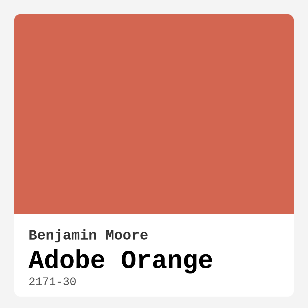
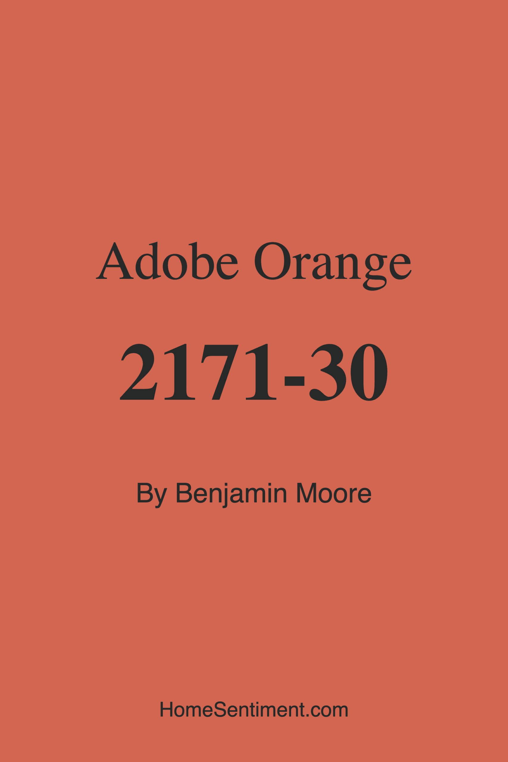
Color Preview & Key Details
| HEX Code | #D36651 |
| RGB | 211, 102, 81 |
| LRV | 24.52% |
| Undertone | Red |
| Finish Options | Eggshell, Matte, Satin |
If you’re searching for a paint color that brings warmth, depth, and a touch of the unexpected to your home, Benjamin Moore’s Adobe Orange (2171-30) might just be your perfect match. This rich, earthy hue dances between red and orange, evoking the sun-drenched tones of desert landscapes and clay pottery. It’s a color that feels both timeless and fresh, making it a standout choice for anyone looking to infuse their space with character. Whether you’re drawn to Southwestern vibes, bohemian flair, or modern farmhouse charm, Adobe Orange has the versatility to adapt to your vision while creating an atmosphere that’s undeniably inviting.
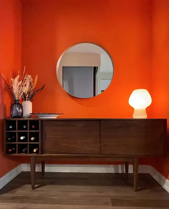
One of the first things you’ll notice about Adobe Orange is its warmth. With its red undertones, this color radiates coziness, making it ideal for spaces where you want to encourage conversation and relaxation. Picture it in a living room with plush textiles and wood accents—it instantly creates a snug, welcoming vibe. Or imagine a dining room where the walls echo the warmth of shared meals and laughter. Even in a kitchen, Adobe Orange can add a playful yet grounded energy, especially when paired with brass fixtures or natural wood cabinetry. It’s a color that doesn’t just sit on the walls; it interacts with the light and the room’s elements to create a dynamic, lived-in feel.
But let’s talk about light, because how a color behaves in different lighting is crucial. Adobe Orange has a Light Reflectance Value (LRV) of 24.52%, which means it reflects a fair amount of light while still holding onto its depth. In a sunlit room, the orange tones come forward, giving the space a vibrant, energetic glow. As the light fades, the color deepens, leaning into its earthy red undertones for a moodier, more intimate effect. This makes it a fantastic choice for rooms with plenty of natural light, but it can also hold its own in spaces with softer illumination—just be mindful of balancing it with lighter neutrals if the room feels too dark.
Now, you might be wondering: *Will this color work in a small space?* The answer is yes, but with some strategy. Adobe Orange is bold, and in a compact room, it can feel enveloping—which isn’t necessarily a bad thing if you’re aiming for a cozy nook. To keep it from overwhelming, consider using it on an accent wall or pairing it with crisp white trim (Benjamin Moore’s Simply White is a classic choice). Another trick is to layer in plenty of textures—think woven rugs, linen curtains, or rattan furniture—to break up the color and add dimension. And if you’re worried about commitment, test it out in a corner first. Paint a large swatch and observe how it shifts throughout the day. You might be surprised by how adaptable it is.
When it comes to application, Adobe Orange is as user-friendly as it gets. With good coverage—often just one to two coats—it’s a dream for DIYers. It’s self-priming, fast-drying, and low-splatter, so even if you’re a beginner, you’ll likely end up with a smooth, professional-looking finish. The paint is also durable, with washable and scrubbable properties, making it practical for high-traffic areas like hallways or kitchens. Plus, it’s low-VOC and eco-certified, so you can breathe easy knowing you’re making a healthier choice for your home.
As for pairing Adobe Orange with other colors, the possibilities are endless. Its complementary hue is green, so think about soft sage or olive tones for a harmonious contrast. For a more neutral backdrop, creamy whites or warm grays let Adobe Orange take center stage without competing. And if you’re feeling adventurous, deep navy or charcoal can create a striking, modern contrast. Don’t forget about metallics—brass, copper, and gold accents play beautifully with this warm hue, adding a touch of sophistication.
If you’re still on the fence, consider this: Adobe Orange is more than just a paint color. It’s a mood. It’s the feeling of a crackling fireplace, a rustic dinner party, or a quiet afternoon with a book. It’s bold enough to make a statement but grounded enough to feel timeless. Whether you use it sparingly or go all-in, this color has a way of making a space feel intentional and alive. So grab a sample, brush it on, and see how it transforms your home. You might just fall in love with the warmth it brings.
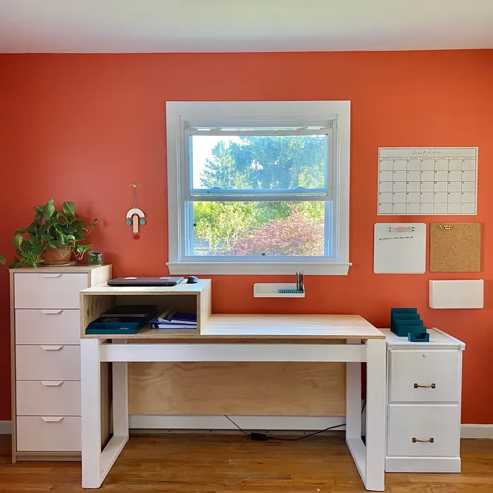
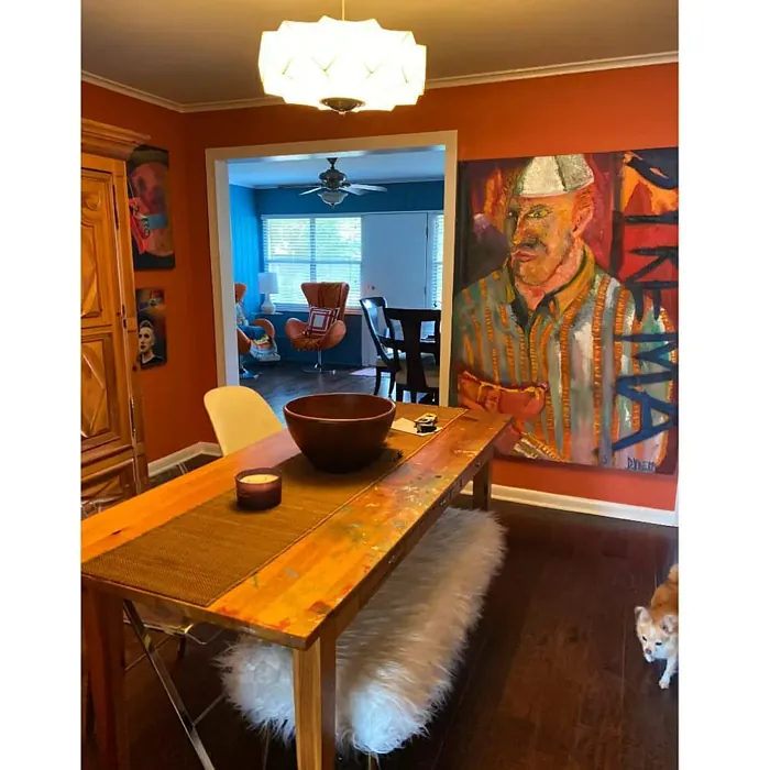
Real Room Photo of Adobe Orange 2171-30
Undertones of Adobe Orange ?
The undertones of Adobe Orange are a key aspect of its character, leaning towards Red. These subtle underlying hues are what give the color its depth and complexity. For example, a gray with a blue undertone will feel cooler and more modern, while one with a brown undertone will feel warmer and more traditional. It’s essential to test this paint in your home and observe it next to your existing furniture, flooring, and decor to see how these undertones interact and reveal themselves throughout the day.
HEX value: #D36651
RGB code: 211, 102, 81
Is Adobe Orange Cool or Warm?
Adobe Orange is distinctly warm, thanks to its rich blend of red and orange hues. This warmth makes it an excellent choice for spaces where you want to encourage a cozy, inviting atmosphere. Warm colors like Adobe Orange are known for their ability to make a room feel more intimate, making them perfect for living rooms and dining areas. This warm tone pairs beautifully with cool neutrals, offering a balanced and harmonious look that can be both relaxing and invigorating.
Understanding Color Properties and Interior Design Tips
Hue refers to a specific position on the color wheel, measured in degrees from 0 to 360. Each degree represents a different pure color:
- 0° represents red
- 120° represents green
- 240° represents blue
Saturation describes the intensity or purity of a color and is expressed as a percentage:
- At 0%, the color appears completely desaturated—essentially a shade of gray
- At 100%, the color is at its most vivid and vibrant
Lightness indicates how light or dark a color is, also expressed as a percentage:
- 0% lightness results in black
- 100% lightness results in white
Using Warm Colors in Interior Design
Warm hues—such as reds, oranges, yellows, warm beiges, and greiges—are excellent choices for creating inviting and energetic spaces. These colors are particularly well-suited for:
- Kitchens, living rooms, and bathrooms, where warmth enhances comfort and sociability
- Large rooms, where warm tones can help reduce the sense of emptiness and make the space feel more intimate
For example:
- Warm beige shades provide a cozy, inviting atmosphere, ideal for living rooms, bedrooms, and hallways.
- Warm greige (a mix of beige and gray) offers the warmth of beige with the modern appeal of gray, making it a versatile backdrop for dining areas, bedrooms, and living spaces.
However, be mindful when using warm light tones in rooms with limited natural light. These shades may appear muted or even take on an unpleasant yellowish tint. To avoid a dull or flat appearance:
- Add depth by incorporating richer tones like deep greens, charcoal, or chocolate brown
- Use textured elements such as curtains, rugs, or cushions to bring dimension to the space
Pro Tip: Achieving Harmony with Warm and Cool Color Balance
To create a well-balanced and visually interesting interior, mix warm and cool tones strategically. This contrast adds depth and harmony to your design.
- If your walls feature warm hues, introduce cool-colored accents such as blue or green furniture, artwork, or accessories to create contrast.
- For a polished look, consider using a complementary color scheme, which pairs colors opposite each other on the color wheel (e.g., red with green, orange with blue).
This thoughtful mix not only enhances visual appeal but also creates a space that feels both dynamic and cohesive.
Light Temperature Affects on Adobe Orange
Natural Light
Natural daylight changes in color temperature as the sun moves across the sky. At sunrise and sunset, the light tends to have a warm, golden tone with a color temperature around 2000 Kelvin (K). As the day progresses and the sun rises higher, the light becomes cooler and more neutral. Around midday, especially when the sky is clear, natural light typically reaches its peak brightness and shifts to a cooler tone, ranging from 5500 to 6500 Kelvin. This midday light is close to what we perceive as pure white or daylight-balanced light.
These shifts in natural light can significantly influence how colors appear in a space, which is why designers often consider both the time of day and the orientation of windows when planning interior color schemes.
Artificial Light
When choosing artificial lighting, pay close attention to the color temperature, measured in Kelvin (K). This determines how warm or cool the light will appear. Lower temperatures, around 2700K, give off a warm, yellow glow often used in living rooms or bedrooms. Higher temperatures, above 5000K, create a cool, bluish light similar to daylight, commonly used in kitchens, offices, or task areas.
Use the slider to see how lighting temperature can affect the appearance of a surface or color throughout a space.


4800K
LRV of Adobe Orange
The Light Reflectance Value (LRV) of Adobe Orange is 24.52%, which places it in the Medium colors category. This means it reflect a lot of light. Understanding a paint’s LRV is crucial for predicting how it will look in your space. A higher LRV indicates a lighter color that reflects more light, making rooms feel larger and brighter. A lower LRV signifies a darker color that absorbs more light, creating a cozier, more intimate atmosphere. Always consider the natural and artificial lighting in your room when selecting a paint color based on its LRV.
Detailed Review of Adobe Orange
Additional Paint Characteristics
Ideal Rooms
Dining Room, Entryway, Hallway, Kitchen, Living Room
Decor Styles
Bohemian, Contemporary, Rustic, Southwestern
Coverage
Good (1–2 Coats), High Hide, Self-Priming
Ease of Application
Beginner Friendly, Brush Smooth, Fast-Drying, Low Splatter, Roller-Ready
Washability
Scrubbable, Stain Resistant, Washable
VOC Level
Eco-Certified, Low VOC
Best Use
Accent Wall, Doors, Interior Walls, Open Concept Spaces
Room Suitability
Dining Room, Kitchen, Living Room
Tone Tag
Bold, Earthy, Warm
Finish Type
Eggshell, Matte, Satin
Paint Performance
Fade Resistant, High Coverage, Long Lasting, Low Odor
Use Cases
Best for Modern Farmhouse, Best for Open Concept, Best for Selling Your Home, Classic Favorite
Mood
Cozy, Inviting, Warm
Trim Pairing
Complements Brass Fixtures, Good with Wood Trim, Pairs with Simply White
Adobe Orange is a vibrant and warm color that brings a sense of coziness and earthiness to your home. It’s the perfect choice for those looking to create an inviting and lively atmosphere. This color works wonderfully in living spaces where you want to encourage conversation and comfort. The earthy tone complements both rustic and modern decor, allowing it to be a versatile addition to your color palette. Adobe Orange’s high pigmentation means you’ll likely get good coverage with just one to two coats, saving you time and effort. It’s a paint that not only looks good but performs well, offering durability and a smooth finish. Whether you’re looking to refresh a single room or your entire home, Adobe Orange is a dependable choice that delivers warmth and style.
Pros & Cons of 2171-30 Adobe Orange
Pros
Cons
Colors that go with Benjamin Moore Adobe Orange
FAQ on 2171-30 Adobe Orange
What decor styles pair well with Adobe Orange?
Adobe Orange is a versatile hue that pairs exceptionally well with several decor styles. If you’re a fan of Southwestern or Bohemian aesthetics, this color is a natural fit, echoing the warm and earthy tones found in those styles. For a more rustic feel, Adobe Orange complements wood accents and natural textures beautifully, adding a touch of warmth that feels grounded and inviting. In contemporary settings, Adobe Orange can serve as a bold accent that provides a pop of color against neutral backdrops, creating a dynamic and modern look. Whether you’re aiming for a laid-back or sophisticated vibe, Adobe Orange can adapt to your decor needs, making it a great choice for any home.
Is Adobe Orange suitable for small spaces?
Adobe Orange can be a bold choice for small spaces, but with thoughtful application, it can work beautifully. Its warm and inviting nature can make a small room feel cozy and welcoming. However, because of its richness, it’s essential to balance Adobe Orange with lighter, neutral colors to prevent the space from feeling too enclosed. Consider using it as an accent wall or in combination with ample natural light to open up the room visually. By using Adobe Orange strategically, you can add depth and character to small spaces without overwhelming them.
Comparisons Adobe Orange with other colors
Adobe Orange 2171-30 vs Cavern Clay SW 7701
| Attribute | Adobe Orange 2171-30 | Cavern Clay SW 7701 |
|---|---|---|
| Color Name | Adobe Orange 2171-30 | Cavern Clay SW 7701 |
| Color | ||
| Hue | Red | Red |
| Brightness | Dark | Dark |
| RGB | 211, 102, 81 | 172, 107, 83 |
| LRV | 24.52% | 30% |
| Finish Type | Eggshell, Matte, Satin | Eggshell, Matte, Satin |
| Finish Options | Eggshell, Matte, Satin | Eggshell, Matte, Satin |
| Ideal Rooms | Dining Room, Entryway, Hallway, Kitchen, Living Room | Bedroom, Dining Room, Home Office, Kitchen, Living Room |
| Decor Styles | Bohemian, Contemporary, Rustic, Southwestern | Bohemian, Contemporary, Modern Farmhouse, Rustic, Transitional |
| Coverage | Good (1–2 Coats), High Hide, Self-Priming | Good (1–2 Coats), Touch-Up Friendly |
| Ease of Application | Beginner Friendly, Brush Smooth, Fast-Drying, Low Splatter, Roller-Ready | Beginner Friendly, Brush Smooth, Roller-Ready |
| Washability | Scrubbable, Stain Resistant, Washable | Washable, Wipeable |
| Room Suitability | Dining Room, Kitchen, Living Room | Bedroom, Dining Room, Home Office, Kitchen, Living Room |
| Tone | Bold, Earthy, Warm | Earthy, Muted, Warm |
| Paint Performance | Fade Resistant, High Coverage, Long Lasting, Low Odor | Easy Touch-Up, Low Odor, Scuff Resistant |
Adobe Orange 2171-30 vs Burgundy SW 6300
| Attribute | Adobe Orange 2171-30 | Burgundy SW 6300 |
|---|---|---|
| Color Name | Adobe Orange 2171-30 | Burgundy SW 6300 |
| Color | ||
| Hue | Red | Red |
| Brightness | Dark | Dark |
| RGB | 211, 102, 81 | 99, 51, 62 |
| LRV | 24.52% | 6% |
| Finish Type | Eggshell, Matte, Satin | Eggshell, Matte, Satin |
| Finish Options | Eggshell, Matte, Satin | Eggshell, Matte, Satin |
| Ideal Rooms | Dining Room, Entryway, Hallway, Kitchen, Living Room | Bedroom, Dining Room, Home Office, Living Room |
| Decor Styles | Bohemian, Contemporary, Rustic, Southwestern | Contemporary, Rustic, Traditional, Vintage |
| Coverage | Good (1–2 Coats), High Hide, Self-Priming | Good (1–2 Coats), Touch-Up Friendly |
| Ease of Application | Beginner Friendly, Brush Smooth, Fast-Drying, Low Splatter, Roller-Ready | Beginner Friendly, Brush Smooth, Fast-Drying, Roller-Ready |
| Washability | Scrubbable, Stain Resistant, Washable | Washable, Wipeable |
| Room Suitability | Dining Room, Kitchen, Living Room | Bedroom, Dining Room, Home Office, Living Room |
| Tone | Bold, Earthy, Warm | Bold, Deep, Warm |
| Paint Performance | Fade Resistant, High Coverage, Long Lasting, Low Odor | High Coverage, Low Odor, Quick Drying |
Adobe Orange 2171-30 vs Rookwood Red SW 2802
| Attribute | Adobe Orange 2171-30 | Rookwood Red SW 2802 |
|---|---|---|
| Color Name | Adobe Orange 2171-30 | Rookwood Red SW 2802 |
| Color | ||
| Hue | Red | Red |
| Brightness | Dark | Dark |
| RGB | 211, 102, 81 | 98, 47, 45 |
| LRV | 24.52% | 6% |
| Finish Type | Eggshell, Matte, Satin | Eggshell, Matte, Satin |
| Finish Options | Eggshell, Matte, Satin | Eggshell, Matte, Satin |
| Ideal Rooms | Dining Room, Entryway, Hallway, Kitchen, Living Room | Bedroom, Dining Room, Home Office, Living Room |
| Decor Styles | Bohemian, Contemporary, Rustic, Southwestern | Arts and Crafts, Modern Farmhouse, Rustic, Traditional |
| Coverage | Good (1–2 Coats), High Hide, Self-Priming | Good (1–2 Coats), Touch-Up Friendly |
| Ease of Application | Beginner Friendly, Brush Smooth, Fast-Drying, Low Splatter, Roller-Ready | Beginner Friendly, Brush Smooth, Fast-Drying, Roller-Ready |
| Washability | Scrubbable, Stain Resistant, Washable | Washable, Wipeable |
| Room Suitability | Dining Room, Kitchen, Living Room | Bedroom, Dining Room, Living Room |
| Tone | Bold, Earthy, Warm | Deep, Earthy, Warm |
| Paint Performance | Fade Resistant, High Coverage, Long Lasting, Low Odor | Easy Touch-Up, High Coverage, Low Odor |
Adobe Orange 2171-30 vs Spiced Cider SW 7702
| Attribute | Adobe Orange 2171-30 | Spiced Cider SW 7702 |
|---|---|---|
| Color Name | Adobe Orange 2171-30 | Spiced Cider SW 7702 |
| Color | ||
| Hue | Red | Red |
| Brightness | Dark | Dark |
| RGB | 211, 102, 81 | 176, 120, 92 |
| LRV | 24.52% | 20% |
| Finish Type | Eggshell, Matte, Satin | Eggshell, Satin |
| Finish Options | Eggshell, Matte, Satin | Eggshell, Satin, Semi-Gloss |
| Ideal Rooms | Dining Room, Entryway, Hallway, Kitchen, Living Room | Bedroom, Dining Room, Kitchen, Living Room |
| Decor Styles | Bohemian, Contemporary, Rustic, Southwestern | Modern Farmhouse, Rustic, Traditional, Transitional |
| Coverage | Good (1–2 Coats), High Hide, Self-Priming | Good (1–2 Coats), Touch-Up Friendly |
| Ease of Application | Beginner Friendly, Brush Smooth, Fast-Drying, Low Splatter, Roller-Ready | Beginner Friendly, Brush Smooth, Roller-Ready |
| Washability | Scrubbable, Stain Resistant, Washable | Scrubbable, Washable |
| Room Suitability | Dining Room, Kitchen, Living Room | Bedroom, Dining Room, Kitchen, Living Room |
| Tone | Bold, Earthy, Warm | Earthy, Inviting, Warm |
| Paint Performance | Fade Resistant, High Coverage, Long Lasting, Low Odor | Easy Touch-Up, High Coverage, Low Odor |
Adobe Orange 2171-30 vs Carnelian SW 7580
| Attribute | Adobe Orange 2171-30 | Carnelian SW 7580 |
|---|---|---|
| Color Name | Adobe Orange 2171-30 | Carnelian SW 7580 |
| Color | ||
| Hue | Red | Red |
| Brightness | Dark | Dark |
| RGB | 211, 102, 81 | 87, 62, 62 |
| LRV | 24.52% | 20% |
| Finish Type | Eggshell, Matte, Satin | Eggshell, Satin |
| Finish Options | Eggshell, Matte, Satin | Eggshell, Matte, Satin |
| Ideal Rooms | Dining Room, Entryway, Hallway, Kitchen, Living Room | Bedroom, Dining Room, Hallway, Home Office, Living Room |
| Decor Styles | Bohemian, Contemporary, Rustic, Southwestern | Bohemian, Modern Farmhouse, Rustic, Traditional |
| Coverage | Good (1–2 Coats), High Hide, Self-Priming | Good (1–2 Coats), Touch-Up Friendly |
| Ease of Application | Beginner Friendly, Brush Smooth, Fast-Drying, Low Splatter, Roller-Ready | Beginner Friendly, Brush Smooth, Fast-Drying, Roller-Ready |
| Washability | Scrubbable, Stain Resistant, Washable | Washable, Wipeable |
| Room Suitability | Dining Room, Kitchen, Living Room | Bedroom, Dining Room, Home Office, Living Room |
| Tone | Bold, Earthy, Warm | Deep, Earthy, Warm |
| Paint Performance | Fade Resistant, High Coverage, Long Lasting, Low Odor | Easy Touch-Up, Low Odor, Quick Drying |
Adobe Orange 2171-30 vs Sommelier SW 7595
| Attribute | Adobe Orange 2171-30 | Sommelier SW 7595 |
|---|---|---|
| Color Name | Adobe Orange 2171-30 | Sommelier SW 7595 |
| Color | ||
| Hue | Red | Red |
| Brightness | Dark | Dark |
| RGB | 211, 102, 81 | 93, 55, 54 |
| LRV | 24.52% | 6% |
| Finish Type | Eggshell, Matte, Satin | Eggshell, Matte, Satin |
| Finish Options | Eggshell, Matte, Satin | Eggshell, Matte, Satin |
| Ideal Rooms | Dining Room, Entryway, Hallway, Kitchen, Living Room | Bedroom, Dining Room, Home Office, Living Room |
| Decor Styles | Bohemian, Contemporary, Rustic, Southwestern | Modern, Rustic, Traditional, Transitional |
| Coverage | Good (1–2 Coats), High Hide, Self-Priming | Good (1–2 Coats), Touch-Up Friendly |
| Ease of Application | Beginner Friendly, Brush Smooth, Fast-Drying, Low Splatter, Roller-Ready | Brush Smooth, Fast-Drying, Low Splatter, Roller-Ready |
| Washability | Scrubbable, Stain Resistant, Washable | Washable, Wipeable |
| Room Suitability | Dining Room, Kitchen, Living Room | Bedroom, Dining Room, Home Office, Living Room |
| Tone | Bold, Earthy, Warm | Deep, Earthy, Warm |
| Paint Performance | Fade Resistant, High Coverage, Long Lasting, Low Odor | Easy Touch-Up, High Coverage, Low Odor, Scuff Resistant |
Adobe Orange 2171-30 vs Sun Dried Tomato SW 7585
| Attribute | Adobe Orange 2171-30 | Sun Dried Tomato SW 7585 |
|---|---|---|
| Color Name | Adobe Orange 2171-30 | Sun Dried Tomato SW 7585 |
| Color | ||
| Hue | Red | Red |
| Brightness | Dark | Dark |
| RGB | 211, 102, 81 | 105, 43, 43 |
| LRV | 24.52% | 20% |
| Finish Type | Eggshell, Matte, Satin | Matte, Satin, Semi-Gloss |
| Finish Options | Eggshell, Matte, Satin | Matte, Satin, Semi-Gloss |
| Ideal Rooms | Dining Room, Entryway, Hallway, Kitchen, Living Room | Dining Room, Home Office, Kitchen, Living Room |
| Decor Styles | Bohemian, Contemporary, Rustic, Southwestern | Industrial, Mediterranean, Modern Farmhouse, Rustic |
| Coverage | Good (1–2 Coats), High Hide, Self-Priming | Good (1–2 Coats), Touch-Up Friendly |
| Ease of Application | Beginner Friendly, Brush Smooth, Fast-Drying, Low Splatter, Roller-Ready | Beginner Friendly, Brush Smooth, Roller-Ready |
| Washability | Scrubbable, Stain Resistant, Washable | Washable, Wipeable |
| Room Suitability | Dining Room, Kitchen, Living Room | Dining Room, Home Office, Kitchen, Living Room |
| Tone | Bold, Earthy, Warm | Bold, Earthy, Warm |
| Paint Performance | Fade Resistant, High Coverage, Long Lasting, Low Odor | Easy Touch-Up, High Coverage, Low Odor |
Adobe Orange 2171-30 vs Rustic Red SW 7593
| Attribute | Adobe Orange 2171-30 | Rustic Red SW 7593 |
|---|---|---|
| Color Name | Adobe Orange 2171-30 | Rustic Red SW 7593 |
| Color | ||
| Hue | Red | Red |
| Brightness | Dark | Dark |
| RGB | 211, 102, 81 | 112, 50, 41 |
| LRV | 24.52% | 12% |
| Finish Type | Eggshell, Matte, Satin | Matte, Satin |
| Finish Options | Eggshell, Matte, Satin | Matte, Satin, Semi-Gloss |
| Ideal Rooms | Dining Room, Entryway, Hallway, Kitchen, Living Room | Bedroom, Dining Room, Hallway, Living Room |
| Decor Styles | Bohemian, Contemporary, Rustic, Southwestern | Country, Farmhouse, Rustic, Traditional |
| Coverage | Good (1–2 Coats), High Hide, Self-Priming | Good (1–2 Coats) |
| Ease of Application | Beginner Friendly, Brush Smooth, Fast-Drying, Low Splatter, Roller-Ready | Beginner Friendly, Brush Smooth, Fast-Drying, Roller-Ready |
| Washability | Scrubbable, Stain Resistant, Washable | Washable, Wipeable |
| Room Suitability | Dining Room, Kitchen, Living Room | Bedroom, Dining Room, Living Room |
| Tone | Bold, Earthy, Warm | Deep, Earthy, Warm |
| Paint Performance | Fade Resistant, High Coverage, Long Lasting, Low Odor | Easy Touch-Up, Low Odor, Quick Drying |
Adobe Orange 2171-30 vs Roycroft Copper Red SW 2839
| Attribute | Adobe Orange 2171-30 | Roycroft Copper Red SW 2839 |
|---|---|---|
| Color Name | Adobe Orange 2171-30 | Roycroft Copper Red SW 2839 |
| Color | ||
| Hue | Red | Red |
| Brightness | Dark | Dark |
| RGB | 211, 102, 81 | 123, 55, 40 |
| LRV | 24.52% | 12% |
| Finish Type | Eggshell, Matte, Satin | Matte, Satin, Semi-Gloss |
| Finish Options | Eggshell, Matte, Satin | Matte, Satin, Semi-Gloss |
| Ideal Rooms | Dining Room, Entryway, Hallway, Kitchen, Living Room | Bedroom, Dining Room, Entryway, Home Office, Living Room |
| Decor Styles | Bohemian, Contemporary, Rustic, Southwestern | Arts and Crafts, Eclectic, Farmhouse, Rustic, Traditional |
| Coverage | Good (1–2 Coats), High Hide, Self-Priming | Good (1–2 Coats), Touch-Up Friendly |
| Ease of Application | Beginner Friendly, Brush Smooth, Fast-Drying, Low Splatter, Roller-Ready | Beginner Friendly, Brush Smooth, Roller-Ready |
| Washability | Scrubbable, Stain Resistant, Washable | Stain Resistant, Washable |
| Room Suitability | Dining Room, Kitchen, Living Room | Bedroom, Dining Room, Entryway, Home Office, Living Room |
| Tone | Bold, Earthy, Warm | Deep, Earthy, Warm |
| Paint Performance | Fade Resistant, High Coverage, Long Lasting, Low Odor | Easy Touch-Up, High Coverage, Low Odor |
Adobe Orange 2171-30 vs Rookwood Dark Red SW 2801
| Attribute | Adobe Orange 2171-30 | Rookwood Dark Red SW 2801 |
|---|---|---|
| Color Name | Adobe Orange 2171-30 | Rookwood Dark Red SW 2801 |
| Color | ||
| Hue | Red | Red |
| Brightness | Dark | Dark |
| RGB | 211, 102, 81 | 75, 41, 41 |
| LRV | 24.52% | 6% |
| Finish Type | Eggshell, Matte, Satin | Matte, Satin, Semi-Gloss |
| Finish Options | Eggshell, Matte, Satin | Matte, Satin, Semi-Gloss |
| Ideal Rooms | Dining Room, Entryway, Hallway, Kitchen, Living Room | Bedroom, Dining Room, Home Office, Living Room |
| Decor Styles | Bohemian, Contemporary, Rustic, Southwestern | Farmhouse, Modern, Rustic, Traditional |
| Coverage | Good (1–2 Coats), High Hide, Self-Priming | Good (1–2 Coats) |
| Ease of Application | Beginner Friendly, Brush Smooth, Fast-Drying, Low Splatter, Roller-Ready | Beginner Friendly, Brush Smooth, Roller-Ready |
| Washability | Scrubbable, Stain Resistant, Washable | Highly Washable, Washable |
| Room Suitability | Dining Room, Kitchen, Living Room | Bedroom, Dining Room, Home Office, Living Room |
| Tone | Bold, Earthy, Warm | Deep, Earthy, Warm |
| Paint Performance | Fade Resistant, High Coverage, Long Lasting, Low Odor | Easy Touch-Up, High Coverage, Low Odor |
Official Page of Benjamin Moore Adobe Orange 2171-30