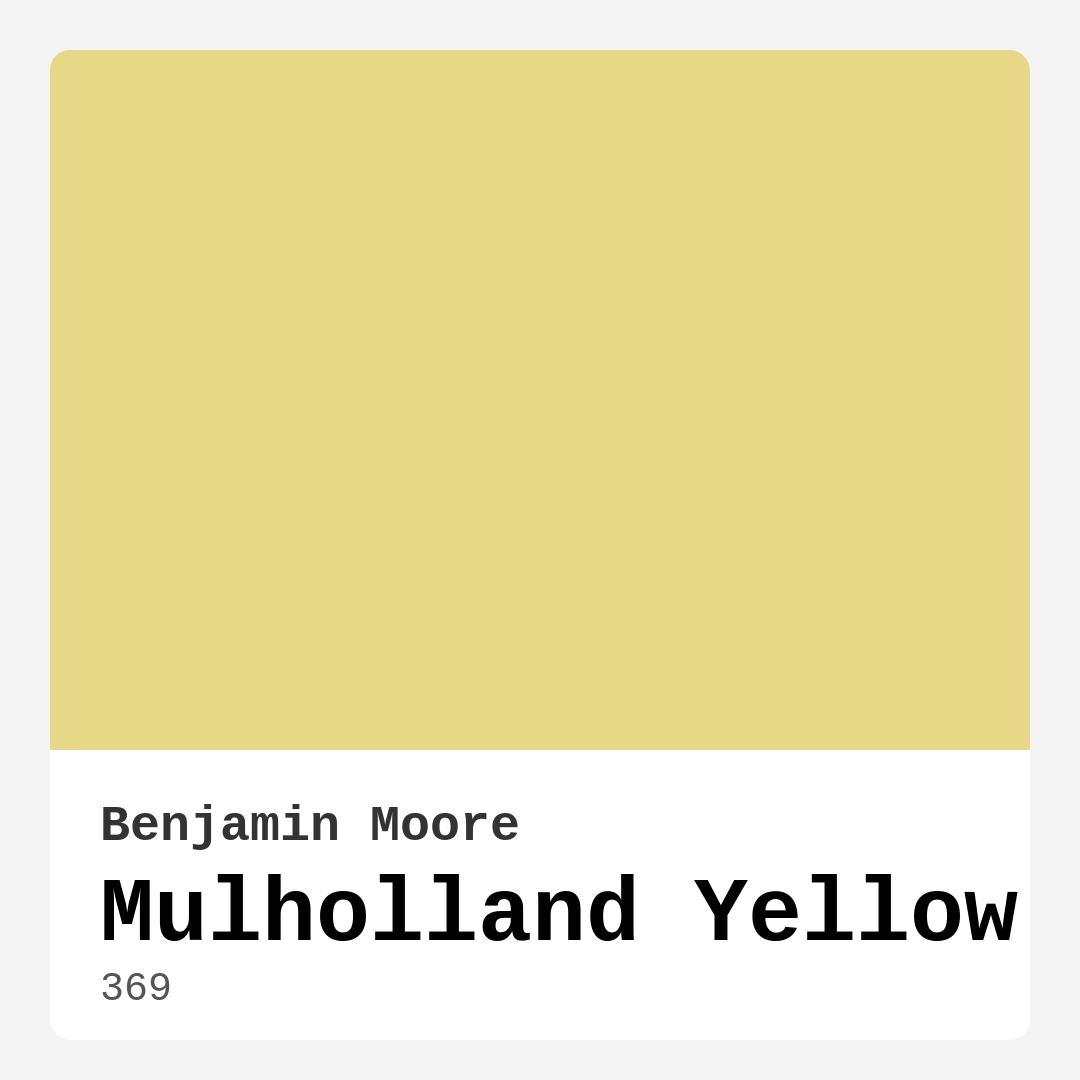
Color Preview & Key Details
| HEX Code | #E7D887 |
| RGB | 231, 216, 135 |
| LRV | 63.95% |
| Undertone | Yellow |
| Finish Options | Eggshell, Satin, Semi-Gloss |
Ever walked into a room and immediately felt lighter, happier, like the walls themselves were radiating sunshine? That’s the magic of a well-chosen yellow paint—and Benjamin Moore’s Mulholland Yellow (color code 369) is one of those shades that just *works*. It’s not too loud, not too timid, but perfectly balanced to bring warmth and cheer to any space. If you’ve been on the fence about adding a sunny hue to your home, let’s talk about why this might be the color you’ve been searching for.
Mulholland Yellow is like a soft golden glow captured in a paint can. With its hex code #E7D887 and an LRV of 63.95%, it sits comfortably in the light-reflective category, meaning it bounces natural light around beautifully. That makes it a fantastic choice for rooms that need a little brightening—think north-facing spaces or cozy corners that could use a lift. But don’t mistake “light” for “washed out.” This color has depth, thanks to its warm yellow undertones that keep it feeling rich and inviting.
One of the best things about Mulholland Yellow is its versatility. It plays well with a range of decor styles, from modern farmhouse to coastal chic. Imagine it in a kitchen with crisp white cabinetry and brass hardware—suddenly, your morning coffee feels like a sunny ritual. Or picture it in a bedroom paired with linen bedding and woven textures for a bohemian escape. It even works in traditional settings, especially when balanced with deeper wood tones or classic molding. The key is in its adaptability; it’s warm without being overwhelming, bright without feeling stark.
Now, let’s talk application. If you’re a DIYer, you’ll appreciate how beginner-friendly this paint is. It rolls on smoothly, dries quickly, and typically only needs one or two coats for full coverage (though darker base walls might require an extra pass). The finish options—eggshell or satin—give you flexibility depending on the room’s needs. Eggshell is great for low-traffic areas like bedrooms, offering a subtle sheen, while satin stands up better to fingerprints in kitchens or hallways. And because it’s low-VOC and eco-certified, you won’t have to worry about harsh fumes lingering in your home.
Lighting can make or break a paint color, and Mulholland Yellow is no exception. In a sun-drenched room, it’ll feel vibrant and energetic, almost like the walls are soaking up the light. But in softer, dimmer spaces, it mellows into a golden whisper, creating a cozy, almost candlelit ambiance. That’s why it’s so effective in open-concept areas—it adapts to the light it’s given, tying different zones together without feeling monotonous. Pro tip: Test a swatch on your wall and observe it at different times of day. You might be surprised how much it shifts (in the best way).
Small spaces? Absolutely. This color’s light-reflecting properties make cramped rooms feel airier, while its warmth keeps them from feeling sterile. Pair it with pure white trim (Benjamin Moore’s White Dove is a classic match) to keep things crisp, or add navy blue accents for a punch of contrast. And if you’re not ready to commit to all four walls, try it on an accent wall behind a bed or sofa. It’s just enough to make a statement without overpowering the room.
Of course, no color is perfect for everyone. If you’re sensitive to bright tones, Mulholland Yellow might feel too bold at first glance. But here’s the thing: It’s not a primary yellow. It’s softened with creamy undertones, so it’s more of a “sunlight through sheer curtains” effect than a “highlighter” vibe. And while it’s touch-up friendly, keep in mind that its brightness means imperfections might show more easily than with a deeper hue.
When it comes to pairings, this color shines with both warm and cool accents. Think earthy terracottas, soft greens, or even muted blues for balance. Metallics like brass or gold elevate its warmth, while matte black fixtures add modern contrast. For furniture, lean into natural materials—wood, rattan, linen—to enhance its organic feel. And if you’re feeling adventurous, layer in patterns like stripes or florals to keep the look dynamic.
So, is Mulholland Yellow right for you? If you’re craving a color that feels like a hug from the sun, the answer is probably yes. It’s cheerful without being childish, sophisticated without being stuffy, and versatile enough to grow with your style. Whether you’re refreshing a tired room or starting from scratch, this shade has a way of making spaces feel *alive*. And really, isn’t that what great design should do?
Still unsure? Grab a sample pot, paint a poster board, and move it around your room for a day. See how it plays with your furniture, your art, your light. Because the best colors aren’t just seen—they’re *felt*. And Mulholland Yellow? It feels like home.
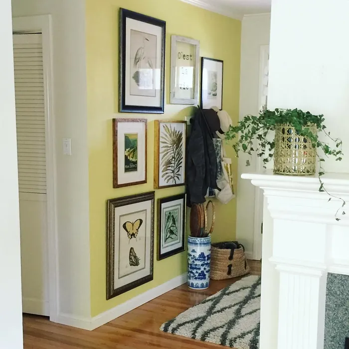
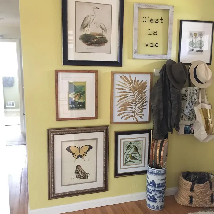
Real Room Photo of Mulholland Yellow 369
Undertones of Mulholland Yellow ?
The undertones of Mulholland Yellow are a key aspect of its character, leaning towards Yellow. These subtle underlying hues are what give the color its depth and complexity. For example, a gray with a blue undertone will feel cooler and more modern, while one with a brown undertone will feel warmer and more traditional. It’s essential to test this paint in your home and observe it next to your existing furniture, flooring, and decor to see how these undertones interact and reveal themselves throughout the day.
HEX value: #E7D887
RGB code: 231, 216, 135
Is Mulholland Yellow Cool or Warm?
Mulholland Yellow is definitely on the warm side of the spectrum. Its golden hue radiates warmth, making it an ideal choice for spaces where you want to create a cozy and inviting atmosphere. It’s perfect for brightening up darker rooms and pairs well with cooler accents for balance.
Understanding Color Properties and Interior Design Tips
Hue refers to a specific position on the color wheel, measured in degrees from 0 to 360. Each degree represents a different pure color:
- 0° represents red
- 120° represents green
- 240° represents blue
Saturation describes the intensity or purity of a color and is expressed as a percentage:
- At 0%, the color appears completely desaturated—essentially a shade of gray
- At 100%, the color is at its most vivid and vibrant
Lightness indicates how light or dark a color is, also expressed as a percentage:
- 0% lightness results in black
- 100% lightness results in white
Using Warm Colors in Interior Design
Warm hues—such as reds, oranges, yellows, warm beiges, and greiges—are excellent choices for creating inviting and energetic spaces. These colors are particularly well-suited for:
- Kitchens, living rooms, and bathrooms, where warmth enhances comfort and sociability
- Large rooms, where warm tones can help reduce the sense of emptiness and make the space feel more intimate
For example:
- Warm beige shades provide a cozy, inviting atmosphere, ideal for living rooms, bedrooms, and hallways.
- Warm greige (a mix of beige and gray) offers the warmth of beige with the modern appeal of gray, making it a versatile backdrop for dining areas, bedrooms, and living spaces.
However, be mindful when using warm light tones in rooms with limited natural light. These shades may appear muted or even take on an unpleasant yellowish tint. To avoid a dull or flat appearance:
- Add depth by incorporating richer tones like deep greens, charcoal, or chocolate brown
- Use textured elements such as curtains, rugs, or cushions to bring dimension to the space
Pro Tip: Achieving Harmony with Warm and Cool Color Balance
To create a well-balanced and visually interesting interior, mix warm and cool tones strategically. This contrast adds depth and harmony to your design.
- If your walls feature warm hues, introduce cool-colored accents such as blue or green furniture, artwork, or accessories to create contrast.
- For a polished look, consider using a complementary color scheme, which pairs colors opposite each other on the color wheel (e.g., red with green, orange with blue).
This thoughtful mix not only enhances visual appeal but also creates a space that feels both dynamic and cohesive.
Light Temperature Affects on Mulholland Yellow
Natural Light
Natural daylight changes in color temperature as the sun moves across the sky. At sunrise and sunset, the light tends to have a warm, golden tone with a color temperature around 2000 Kelvin (K). As the day progresses and the sun rises higher, the light becomes cooler and more neutral. Around midday, especially when the sky is clear, natural light typically reaches its peak brightness and shifts to a cooler tone, ranging from 5500 to 6500 Kelvin. This midday light is close to what we perceive as pure white or daylight-balanced light.
These shifts in natural light can significantly influence how colors appear in a space, which is why designers often consider both the time of day and the orientation of windows when planning interior color schemes.
Artificial Light
When choosing artificial lighting, pay close attention to the color temperature, measured in Kelvin (K). This determines how warm or cool the light will appear. Lower temperatures, around 2700K, give off a warm, yellow glow often used in living rooms or bedrooms. Higher temperatures, above 5000K, create a cool, bluish light similar to daylight, commonly used in kitchens, offices, or task areas.
Use the slider to see how lighting temperature can affect the appearance of a surface or color throughout a space.


4800K
LRV of Mulholland Yellow
The Light Reflectance Value (LRV) of Mulholland Yellow is 63.95%, which places it in the Light colors category. This means it reflect most of the incident light. Understanding a paint’s LRV is crucial for predicting how it will look in your space. A higher LRV indicates a lighter color that reflects more light, making rooms feel larger and brighter. A lower LRV signifies a darker color that absorbs more light, creating a cozier, more intimate atmosphere. Always consider the natural and artificial lighting in your room when selecting a paint color based on its LRV.
Detailed Review of Mulholland Yellow
Additional Paint Characteristics
Ideal Rooms
Bedroom, Dining Room, Home Office, Kitchen, Living Room
Decor Styles
Bohemian, Coastal, Modern Farmhouse, Traditional
Coverage
Good (1–2 Coats), Touch-Up Friendly
Ease of Application
Beginner Friendly, Brush Smooth, Roller-Ready
Washability
Washable, Wipeable
VOC Level
Eco-Certified, Low VOC
Best Use
Accent Wall, Interior Walls, Open Concept Spaces, Small Spaces
Room Suitability
Bedroom, Dining Room, Kitchen, Living Room
Tone Tag
Creamy, Earthy, Warm
Finish Type
Eggshell, Satin
Paint Performance
High Coverage, Low Odor, Quick Drying
Use Cases
Best for Open Concept, Best for Small Spaces, Classic Favorite
Mood
Brightening, Cozy, Inviting
Trim Pairing
Complements Brass Fixtures, Matches Pure White, Pairs with White Dove
Mulholland Yellow is a delightful choice for anyone wanting to bring warmth and vibrancy to their space. Its cheerful tone works wonderfully in both light and airy rooms, as well as cozy corners. When applied, it offers a smooth finish that enhances the natural light, making rooms feel more spacious. This paint is particularly effective in open-concept areas, where it can unify different spaces while keeping a lively ambiance. Whether you’re painting a whole room or just an accent wall, Mulholland Yellow will add a bright pop that can easily complement various decor styles, from rustic to modern. Just be aware that its brightness might require a second coat for full coverage, but the results are worth it!
Pros & Cons of 369 Mulholland Yellow
Pros
Cons
Colors that go with Benjamin Moore Mulholland Yellow
FAQ on 369 Mulholland Yellow
How does Mulholland Yellow look in different lighting?
Mulholland Yellow is quite versatile when it comes to lighting. In natural light, it shines brightly, creating an uplifting atmosphere. However, in dimmer light, it softens to a more muted, golden shade. This adaptability means that it can enhance both sunny and shaded rooms alike, making it a lovely choice for various settings.
Can I use Mulholland Yellow in a small space?
Absolutely! Mulholland Yellow is perfect for small spaces. Its light reflectivity creates an illusion of more space, making rooms appear larger and more open. Plus, its cheerful hue can make a cozy room feel inviting and warm. Just be mindful of the brightness; pairing it with neutral or muted accents can help balance the overall look.
Comparisons Mulholland Yellow with other colors
Mulholland Yellow 369 vs Napery SW 6386
| Attribute | Mulholland Yellow 369 | Napery SW 6386 |
|---|---|---|
| Color Name | Mulholland Yellow 369 | Napery SW 6386 |
| Color | ||
| Hue | Yellow | Yellow |
| Brightness | Light | Light |
| RGB | 231, 216, 135 | 239, 221, 193 |
| LRV | 63.95% | 75% |
| Finish Type | Eggshell, Satin | Eggshell, Matte, Satin |
| Finish Options | Eggshell, Satin, Semi-Gloss | Eggshell, Flat, Matte, Satin |
| Ideal Rooms | Bedroom, Dining Room, Home Office, Kitchen, Living Room | Bedroom, Dining Room, Kitchen, Living Room, Nursery |
| Decor Styles | Bohemian, Coastal, Modern Farmhouse, Traditional | Coastal, Modern Farmhouse, Scandinavian, Traditional, Transitional |
| Coverage | Good (1–2 Coats), Touch-Up Friendly | Good (1–2 Coats) |
| Ease of Application | Beginner Friendly, Brush Smooth, Roller-Ready | Beginner Friendly, Brush Smooth, Fast-Drying, Roller-Ready |
| Washability | Washable, Wipeable | Scrubbable, Washable |
| Room Suitability | Bedroom, Dining Room, Kitchen, Living Room | Bedroom, Dining Room, Home Office, Living Room, Nursery |
| Tone | Creamy, Earthy, Warm | Creamy, Earthy, Neutral, Warm |
| Paint Performance | High Coverage, Low Odor, Quick Drying | Easy Touch-Up, Low Odor, Quick Drying, Scuff Resistant |
Mulholland Yellow 369 vs Friendly Yellow SW 6680
| Attribute | Mulholland Yellow 369 | Friendly Yellow SW 6680 |
|---|---|---|
| Color Name | Mulholland Yellow 369 | Friendly Yellow SW 6680 |
| Color | ||
| Hue | Yellow | Yellow |
| Brightness | Light | Light |
| RGB | 231, 216, 135 | 245, 224, 177 |
| LRV | 63.95% | 75% |
| Finish Type | Eggshell, Satin | Eggshell, Satin, Semi-Gloss |
| Finish Options | Eggshell, Satin, Semi-Gloss | Eggshell, Flat, Satin, Semi-Gloss |
| Ideal Rooms | Bedroom, Dining Room, Home Office, Kitchen, Living Room | Bedroom, Dining Room, Kitchen, Living Room, Nursery |
| Decor Styles | Bohemian, Coastal, Modern Farmhouse, Traditional | Bohemian, Coastal, Contemporary, Modern Farmhouse, Traditional |
| Coverage | Good (1–2 Coats), Touch-Up Friendly | Good (1–2 Coats), Touch-Up Friendly |
| Ease of Application | Beginner Friendly, Brush Smooth, Roller-Ready | Beginner Friendly, Brush Smooth, Fast-Drying, Roller-Ready |
| Washability | Washable, Wipeable | Highly Washable, Washable, Wipeable |
| Room Suitability | Bedroom, Dining Room, Kitchen, Living Room | Bedroom, Dining Room, Kitchen, Living Room, Nursery |
| Tone | Creamy, Earthy, Warm | Bright, Creamy, Warm |
| Paint Performance | High Coverage, Low Odor, Quick Drying | Easy Touch-Up, Low Odor, Quick Drying |
Mulholland Yellow 369 vs Full Moon SW 6679
| Attribute | Mulholland Yellow 369 | Full Moon SW 6679 |
|---|---|---|
| Color Name | Mulholland Yellow 369 | Full Moon SW 6679 |
| Color | ||
| Hue | Yellow | Yellow |
| Brightness | Light | Light |
| RGB | 231, 216, 135 | 244, 227, 188 |
| LRV | 63.95% | 75% |
| Finish Type | Eggshell, Satin | Eggshell, Matte, Satin |
| Finish Options | Eggshell, Satin, Semi-Gloss | Eggshell, Matte, Satin |
| Ideal Rooms | Bedroom, Dining Room, Home Office, Kitchen, Living Room | Bedroom, Dining Room, Home Office, Kitchen, Living Room, Nursery |
| Decor Styles | Bohemian, Coastal, Modern Farmhouse, Traditional | Coastal, Modern Farmhouse, Scandinavian, Transitional |
| Coverage | Good (1–2 Coats), Touch-Up Friendly | Good (1–2 Coats), Touch-Up Friendly |
| Ease of Application | Beginner Friendly, Brush Smooth, Roller-Ready | Beginner Friendly, Brush Smooth, Fast-Drying, Roller-Ready |
| Washability | Washable, Wipeable | Washable, Wipeable |
| Room Suitability | Bedroom, Dining Room, Kitchen, Living Room | Bedroom, Dining Room, Living Room, Nursery |
| Tone | Creamy, Earthy, Warm | Creamy, Inviting, Warm |
| Paint Performance | High Coverage, Low Odor, Quick Drying | High Coverage, Low Odor, Quick Drying |
Mulholland Yellow 369 vs Jersey Cream SW 6379
| Attribute | Mulholland Yellow 369 | Jersey Cream SW 6379 |
|---|---|---|
| Color Name | Mulholland Yellow 369 | Jersey Cream SW 6379 |
| Color | ||
| Hue | Yellow | Yellow |
| Brightness | Light | Light |
| RGB | 231, 216, 135 | 245, 222, 187 |
| LRV | 63.95% | 82% |
| Finish Type | Eggshell, Satin | Eggshell, Satin |
| Finish Options | Eggshell, Satin, Semi-Gloss | Eggshell, Satin, Semi-Gloss |
| Ideal Rooms | Bedroom, Dining Room, Home Office, Kitchen, Living Room | Bedroom, Dining Room, Entryway, Hallway, Home Office, Kitchen, Living Room |
| Decor Styles | Bohemian, Coastal, Modern Farmhouse, Traditional | Coastal, Modern Farmhouse, Rustic, Traditional, Transitional |
| Coverage | Good (1–2 Coats), Touch-Up Friendly | Good (1–2 Coats), Touch-Up Friendly |
| Ease of Application | Beginner Friendly, Brush Smooth, Roller-Ready | Beginner Friendly, Brush Smooth, Fast-Drying, Low Splatter, Roller-Ready |
| Washability | Washable, Wipeable | Stain Resistant, Washable |
| Room Suitability | Bedroom, Dining Room, Kitchen, Living Room | Bedroom, Dining Room, Hallway, Kitchen, Living Room |
| Tone | Creamy, Earthy, Warm | Creamy, Neutral, Warm |
| Paint Performance | High Coverage, Low Odor, Quick Drying | Easy Touch-Up, High Coverage, Low Odor, Quick Drying, Stain Resistant |
Mulholland Yellow 369 vs Classical Yellow SW 2865
| Attribute | Mulholland Yellow 369 | Classical Yellow SW 2865 |
|---|---|---|
| Color Name | Mulholland Yellow 369 | Classical Yellow SW 2865 |
| Color | ||
| Hue | Yellow | Yellow |
| Brightness | Light | Light |
| RGB | 231, 216, 135 | 248, 212, 146 |
| LRV | 63.95% | 75% |
| Finish Type | Eggshell, Satin | Eggshell, Satin |
| Finish Options | Eggshell, Satin, Semi-Gloss | Eggshell, Satin, Semi-Gloss |
| Ideal Rooms | Bedroom, Dining Room, Home Office, Kitchen, Living Room | Bedroom, Dining Room, Home Office, Kitchen, Living Room, Nursery |
| Decor Styles | Bohemian, Coastal, Modern Farmhouse, Traditional | Coastal, Contemporary, Farmhouse, Rustic, Traditional |
| Coverage | Good (1–2 Coats), Touch-Up Friendly | Good (1–2 Coats), Touch-Up Friendly |
| Ease of Application | Beginner Friendly, Brush Smooth, Roller-Ready | Beginner Friendly, Brush Smooth, Fast-Drying, Roller-Ready |
| Washability | Washable, Wipeable | Highly Washable, Washable, Wipeable |
| Room Suitability | Bedroom, Dining Room, Kitchen, Living Room | Bedroom, Dining Room, Home Office, Kitchen, Living Room |
| Tone | Creamy, Earthy, Warm | Cozy, Creamy, Warm |
| Paint Performance | High Coverage, Low Odor, Quick Drying | Easy Touch-Up, High Coverage, Low Odor, Quick Drying |
Mulholland Yellow 369 vs They call it Mellow SW 9015
| Attribute | Mulholland Yellow 369 | They call it Mellow SW 9015 |
|---|---|---|
| Color Name | Mulholland Yellow 369 | They call it Mellow SW 9015 |
| Color | ||
| Hue | Yellow | Yellow |
| Brightness | Light | Light |
| RGB | 231, 216, 135 | 251, 228, 179 |
| LRV | 63.95% | 10% |
| Finish Type | Eggshell, Satin | Eggshell, Satin |
| Finish Options | Eggshell, Satin, Semi-Gloss | Eggshell, Satin, Semi-Gloss |
| Ideal Rooms | Bedroom, Dining Room, Home Office, Kitchen, Living Room | Bedroom, Dining Room, Home Office, Living Room, Nursery |
| Decor Styles | Bohemian, Coastal, Modern Farmhouse, Traditional | Coastal, Farmhouse, Modern, Transitional |
| Coverage | Good (1–2 Coats), Touch-Up Friendly | Good (1–2 Coats), Touch-Up Friendly |
| Ease of Application | Beginner Friendly, Brush Smooth, Roller-Ready | Beginner Friendly, Fast-Drying, Roller-Ready |
| Washability | Washable, Wipeable | Washable, Wipeable |
| Room Suitability | Bedroom, Dining Room, Kitchen, Living Room | Bedroom, Home Office, Living Room, Nursery |
| Tone | Creamy, Earthy, Warm | Creamy, Soft, Warm |
| Paint Performance | High Coverage, Low Odor, Quick Drying | Easy Touch-Up, Low Odor, Quick Drying |
Mulholland Yellow 369 vs Venetian Yellow SW 1666
| Attribute | Mulholland Yellow 369 | Venetian Yellow SW 1666 |
|---|---|---|
| Color Name | Mulholland Yellow 369 | Venetian Yellow SW 1666 |
| Color | ||
| Hue | Yellow | Yellow |
| Brightness | Light | Light |
| RGB | 231, 216, 135 | 246, 227, 161 |
| LRV | 63.95% | 50% |
| Finish Type | Eggshell, Satin | Eggshell, Satin |
| Finish Options | Eggshell, Satin, Semi-Gloss | Eggshell, Flat, Matte, Satin |
| Ideal Rooms | Bedroom, Dining Room, Home Office, Kitchen, Living Room | Bedroom, Dining Room, Hallway, Kitchen, Living Room |
| Decor Styles | Bohemian, Coastal, Modern Farmhouse, Traditional | Bohemian, Farmhouse, Mediterranean, Traditional |
| Coverage | Good (1–2 Coats), Touch-Up Friendly | Good (1–2 Coats), Touch-Up Friendly |
| Ease of Application | Beginner Friendly, Brush Smooth, Roller-Ready | Beginner Friendly, Brush Smooth, Fast-Drying, Roller-Ready |
| Washability | Washable, Wipeable | Highly Washable, Washable |
| Room Suitability | Bedroom, Dining Room, Kitchen, Living Room | Bedroom, Dining Room, Kitchen, Living Room |
| Tone | Creamy, Earthy, Warm | Creamy, Earthy, Warm |
| Paint Performance | High Coverage, Low Odor, Quick Drying | High Coverage, Low Odor, Quick Drying |
Mulholland Yellow 369 vs Sunny Veranda SW 9017
| Attribute | Mulholland Yellow 369 | Sunny Veranda SW 9017 |
|---|---|---|
| Color Name | Mulholland Yellow 369 | Sunny Veranda SW 9017 |
| Color | ||
| Hue | Yellow | Yellow |
| Brightness | Light | Light |
| RGB | 231, 216, 135 | 254, 223, 148 |
| LRV | 63.95% | 9017% |
| Finish Type | Eggshell, Satin | Eggshell, Satin |
| Finish Options | Eggshell, Satin, Semi-Gloss | Eggshell, Satin, Semi-Gloss |
| Ideal Rooms | Bedroom, Dining Room, Home Office, Kitchen, Living Room | Dining Room, Hallway, Kitchen, Living Room, Nursery |
| Decor Styles | Bohemian, Coastal, Modern Farmhouse, Traditional | Bohemian, Coastal, Modern Farmhouse, Scandinavian, Traditional |
| Coverage | Good (1–2 Coats), Touch-Up Friendly | Good (1–2 Coats), Touch-Up Friendly |
| Ease of Application | Beginner Friendly, Brush Smooth, Roller-Ready | Beginner Friendly, Brush Smooth, Fast-Drying, Roller-Ready |
| Washability | Washable, Wipeable | Highly Washable, Washable |
| Room Suitability | Bedroom, Dining Room, Kitchen, Living Room | Dining Room, Hallway, Kitchen, Living Room, Nursery |
| Tone | Creamy, Earthy, Warm | Airy, Creamy, Warm |
| Paint Performance | High Coverage, Low Odor, Quick Drying | Easy Touch-Up, Low Odor, Quick Drying |
Mulholland Yellow 369 vs Humble Gold SW 6380
| Attribute | Mulholland Yellow 369 | Humble Gold SW 6380 |
|---|---|---|
| Color Name | Mulholland Yellow 369 | Humble Gold SW 6380 |
| Color | ||
| Hue | Yellow | Yellow |
| Brightness | Light | Light |
| RGB | 231, 216, 135 | 237, 199, 150 |
| LRV | 63.95% | 38% |
| Finish Type | Eggshell, Satin | Eggshell, Satin |
| Finish Options | Eggshell, Satin, Semi-Gloss | Eggshell, Flat, Satin |
| Ideal Rooms | Bedroom, Dining Room, Home Office, Kitchen, Living Room | Bedroom, Dining Room, Hallway, Home Office, Living Room |
| Decor Styles | Bohemian, Coastal, Modern Farmhouse, Traditional | Bohemian, Modern Farmhouse, Traditional, Transitional |
| Coverage | Good (1–2 Coats), Touch-Up Friendly | Good (1–2 Coats), Touch-Up Friendly |
| Ease of Application | Beginner Friendly, Brush Smooth, Roller-Ready | Beginner Friendly, Brush Smooth, Roller-Ready |
| Washability | Washable, Wipeable | Washable, Wipeable |
| Room Suitability | Bedroom, Dining Room, Kitchen, Living Room | Bedroom, Dining Room, Hallway, Living Room |
| Tone | Creamy, Earthy, Warm | Balanced, Earthy, Warm |
| Paint Performance | High Coverage, Low Odor, Quick Drying | Easy Touch-Up, High Coverage, Low Odor |
Mulholland Yellow 369 vs La Luna Amarilla SW 9016
| Attribute | Mulholland Yellow 369 | La Luna Amarilla SW 9016 |
|---|---|---|
| Color Name | Mulholland Yellow 369 | La Luna Amarilla SW 9016 |
| Color | ||
| Hue | Yellow | Yellow |
| Brightness | Light | Light |
| RGB | 231, 216, 135 | 253, 223, 160 |
| LRV | 63.95% | 83% |
| Finish Type | Eggshell, Satin | Eggshell, Satin |
| Finish Options | Eggshell, Satin, Semi-Gloss | Eggshell, Flat, Satin |
| Ideal Rooms | Bedroom, Dining Room, Home Office, Kitchen, Living Room | Bedroom, Dining Room, Kitchen, Living Room, Nursery |
| Decor Styles | Bohemian, Coastal, Modern Farmhouse, Traditional | Bohemian, Coastal, Contemporary, Modern Farmhouse, Traditional |
| Coverage | Good (1–2 Coats), Touch-Up Friendly | Good (1–2 Coats), Touch-Up Friendly |
| Ease of Application | Beginner Friendly, Brush Smooth, Roller-Ready | Beginner Friendly, Fast-Drying, Low Splatter |
| Washability | Washable, Wipeable | Washable, Wipeable |
| Room Suitability | Bedroom, Dining Room, Kitchen, Living Room | Bedroom, Dining Room, Kitchen, Living Room, Nursery |
| Tone | Creamy, Earthy, Warm | Airy, Creamy, Warm |
| Paint Performance | High Coverage, Low Odor, Quick Drying | Easy Touch-Up, Low Odor, Scuff Resistant |
Official Page of Benjamin Moore Mulholland Yellow 369