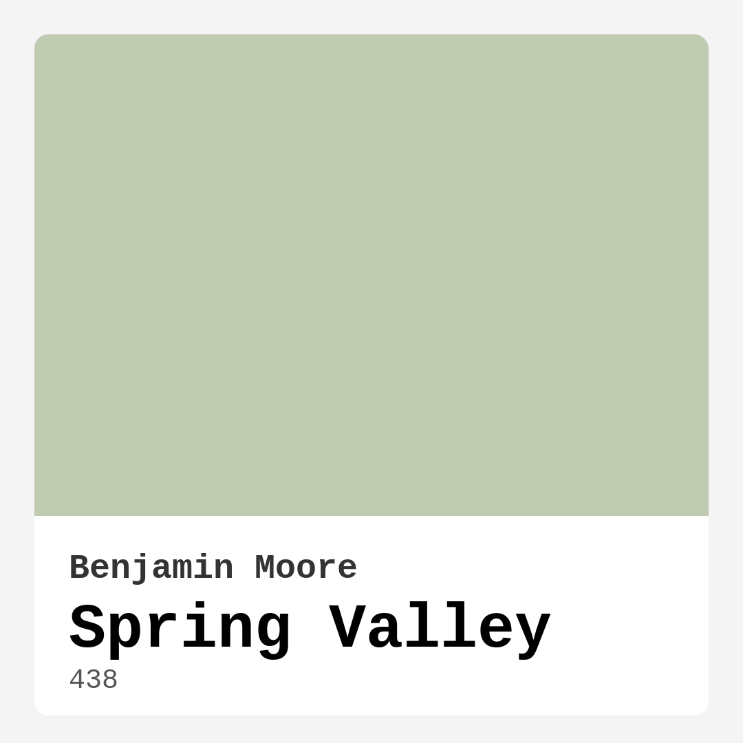
Color Preview & Key Details
| HEX Code | #C0CBB1 |
| RGB | 192, 203, 177 |
| LRV | 55.73% |
| Undertone | Green |
| Finish Options | Eggshell, Matte, Satin |
Imagine walking into a room that feels like a gentle hug from nature. You take a deep breath and instantly feel calmer, as if the stress of the day has melted away. This is the magical effect of a paint color like Spring Valley from Benjamin Moore. With its soft, muted green undertones, this color embodies tranquility and warmth, making it an ideal choice for anyone wanting to create a serene and inviting atmosphere in their home.
Spring Valley, color code 438, is a delightful hue that captures the essence of the great outdoors. You’ll find its subtle, earthy tone complements a variety of styles, from modern farmhouse to coastal chic. This is a versatile choice that can breathe new life into any space, whether it’s a cozy bedroom, a vibrant dining room, or a restful nursery.
One of the standout features of Spring Valley is its impressive Light Reflectance Value (LRV) of 55.73%. What does this mean for you? Simply put, it reflects a significant amount of light, helping to brighten up a room, making it feel more spacious and airy. It’s perfect for smaller spaces or rooms that might not get a lot of natural light. When you apply it to your walls, you’ll notice how it enhances the natural light, creating a welcoming ambiance that draws people in.
You might be wondering about its undertones. Spring Valley leans towards green, but it’s not just any green; it has a warmth that invites comfort and calm. This warmth is what makes it so adaptable. Whether you pair it with crisp whites or rich woods, it harmonizes beautifully, creating a balanced look. The color feels sophisticated yet approachable, and it’s this versatility that makes it a favorite among interior designers.
When considering Spring Valley for your space, think about the mood you want to evoke. This paint is ideal for creating peaceful environments—perfect for bedrooms or reading nooks where relaxation is key. It’s also a wonderful choice for home offices, where a calming atmosphere can boost creativity and productivity. You can even use it in your dining room to promote a warm, inviting space for gatherings with friends and family.
For those who love to entertain, imagine hosting a dinner party in a dining room painted in Spring Valley. The soft green hue sets the perfect backdrop for lively conversations, while its earthy undertones ground the space, making your guests feel at home. You’ll find that this color encourages connection and comfort, creating an atmosphere that’s both stylish and inviting.
Let’s talk about application. Spring Valley is incredibly user-friendly, making it a great choice for DIY enthusiasts or anyone tackling a home project. The paint glides on smoothly, whether you’re using a brush or a roller, and its good coverage means you often only need one or two coats for a beautiful finish. Plus, with its low VOC formulation, you can feel good about using it in your home, knowing that you’re minimizing your environmental impact.
One concern you might have is how the color will look in different lighting. It’s true that Spring Valley can change slightly depending on the light—under natural sunlight, it radiates with a soft glow, while artificial light can bring out its more muted tones. The key is to test it in your space at various times of the day to see how it interacts with your existing décor and furnishings. It’s always best to sample a small area before committing to a whole room.
When you start thinking about what to pair with Spring Valley, your options are endless. It beautifully complements white trims like Benjamin Moore’s White Dove, which can help brighten the overall appearance and add a touch of elegance. If you lean towards a more rustic aesthetic, incorporating wood accents will enhance the earthy vibe of the color. Brass fixtures also stand out against the muted green, adding a hint of sophistication without overwhelming the calmness of the color.
Now, let’s explore some practical considerations. You might be wondering if Spring Valley is suitable for high-traffic areas, such as hallways or children’s playrooms. While it’s a lovely choice for these spaces, keep in mind that its light color may show wear more easily. If you’re looking for durability, consider a finish that offers more washability, like eggshell or satin. This way, you can maintain that lovely, fresh look over time.
If you’re thinking about Spring Valley for a bathroom, it’s certainly an option! Just ensure that the space has good ventilation to handle the humidity. The calming nature of this shade can turn your bathroom into a serene retreat, reminiscent of a spa.
As you contemplate this color, you might also be curious about its counterparts. Spring Valley shares a sophisticated yet muted quality with other greens like Sherwin-Williams’ Sea Salt or Benjamin Moore’s Soft Fern. These colors can serve as excellent alternatives or complementary shades, depending on your design goals.
In the end, choosing a paint color is about creating a space that reflects your personality and lifestyle. Spring Valley offers a calming, inviting atmosphere that feels timeless and elegant. Whether you’re painting a feature wall or refreshing your entire home, this shade can help you achieve a tranquil sanctuary.
So, if you’re ready to transform your space into a serene retreat, give Spring Valley a try. It’s more than just a color; it’s a mood, a feeling, and an invitation to relax and rejuvenate. With its beautiful, warm undertones and versatility across decor styles, it’s a choice that you won’t regret. Remember to sample it in your own space, and watch as it works its magic, turning your home into an oasis of calm.
Real Room Photo of Spring Valley 438

Undertones of Spring Valley ?
The undertones of Spring Valley are a key aspect of its character, leaning towards Green. These subtle underlying hues are what give the color its depth and complexity. For example, a gray with a blue undertone will feel cooler and more modern, while one with a brown undertone will feel warmer and more traditional. It’s essential to test this paint in your home and observe it next to your existing furniture, flooring, and decor to see how these undertones interact and reveal themselves throughout the day.
HEX value: #C0CBB1
RGB code: 192, 203, 177
Is Spring Valley Cool or Warm?
Spring Valley is considered a warm paint color. This characteristic plays a huge role in the overall feel of a room. Warm colors, like this one, tend to create a cozy, inviting, and energetic atmosphere, making them great for social spaces like living rooms and dining rooms. In contrast, cool colors often evoke a sense of calm and serenity, which is why they are popular in bedrooms and bathrooms. The warmth of Spring Valley means it will pair beautifully with corresponding decor elements.
Understanding Color Properties and Interior Design Tips
Hue refers to a specific position on the color wheel, measured in degrees from 0 to 360. Each degree represents a different pure color:
- 0° represents red
- 120° represents green
- 240° represents blue
Saturation describes the intensity or purity of a color and is expressed as a percentage:
- At 0%, the color appears completely desaturated—essentially a shade of gray
- At 100%, the color is at its most vivid and vibrant
Lightness indicates how light or dark a color is, also expressed as a percentage:
- 0% lightness results in black
- 100% lightness results in white
Using Warm Colors in Interior Design
Warm hues—such as reds, oranges, yellows, warm beiges, and greiges—are excellent choices for creating inviting and energetic spaces. These colors are particularly well-suited for:
- Kitchens, living rooms, and bathrooms, where warmth enhances comfort and sociability
- Large rooms, where warm tones can help reduce the sense of emptiness and make the space feel more intimate
For example:
- Warm beige shades provide a cozy, inviting atmosphere, ideal for living rooms, bedrooms, and hallways.
- Warm greige (a mix of beige and gray) offers the warmth of beige with the modern appeal of gray, making it a versatile backdrop for dining areas, bedrooms, and living spaces.
However, be mindful when using warm light tones in rooms with limited natural light. These shades may appear muted or even take on an unpleasant yellowish tint. To avoid a dull or flat appearance:
- Add depth by incorporating richer tones like deep greens, charcoal, or chocolate brown
- Use textured elements such as curtains, rugs, or cushions to bring dimension to the space
Pro Tip: Achieving Harmony with Warm and Cool Color Balance
To create a well-balanced and visually interesting interior, mix warm and cool tones strategically. This contrast adds depth and harmony to your design.
- If your walls feature warm hues, introduce cool-colored accents such as blue or green furniture, artwork, or accessories to create contrast.
- For a polished look, consider using a complementary color scheme, which pairs colors opposite each other on the color wheel (e.g., red with green, orange with blue).
This thoughtful mix not only enhances visual appeal but also creates a space that feels both dynamic and cohesive.
Light Temperature Affects on Spring Valley
Natural Light
Natural daylight changes in color temperature as the sun moves across the sky. At sunrise and sunset, the light tends to have a warm, golden tone with a color temperature around 2000 Kelvin (K). As the day progresses and the sun rises higher, the light becomes cooler and more neutral. Around midday, especially when the sky is clear, natural light typically reaches its peak brightness and shifts to a cooler tone, ranging from 5500 to 6500 Kelvin. This midday light is close to what we perceive as pure white or daylight-balanced light.
These shifts in natural light can significantly influence how colors appear in a space, which is why designers often consider both the time of day and the orientation of windows when planning interior color schemes.
Artificial Light
When choosing artificial lighting, pay close attention to the color temperature, measured in Kelvin (K). This determines how warm or cool the light will appear. Lower temperatures, around 2700K, give off a warm, yellow glow often used in living rooms or bedrooms. Higher temperatures, above 5000K, create a cool, bluish light similar to daylight, commonly used in kitchens, offices, or task areas.
Use the slider to see how lighting temperature can affect the appearance of a surface or color throughout a space.


4800K
LRV of Spring Valley
The Light Reflectance Value (LRV) of Spring Valley is 55.73%, which places it in the Light colors category. This means it reflect most of the incident light. Understanding a paint’s LRV is crucial for predicting how it will look in your space. A higher LRV indicates a lighter color that reflects more light, making rooms feel larger and brighter. A lower LRV signifies a darker color that absorbs more light, creating a cozier, more intimate atmosphere. Always consider the natural and artificial lighting in your room when selecting a paint color based on its LRV.
Detailed Review of Spring Valley
Additional Paint Characteristics
Ideal Rooms
Bedroom, Home Office, Kitchen, Living Room, Nursery
Decor Styles
Bohemian, Coastal, Modern Farmhouse, Scandinavian, Traditional
Coverage
Good (1–2 Coats), Touch-Up Friendly
Ease of Application
Beginner Friendly, Brush Smooth, Roller-Ready
Washability
Highly Washable, Washable
VOC Level
Eco-Certified, Low VOC
Best Use
Accent Wall, Furniture, Interior Walls, Trim
Room Suitability
Bedroom, Dining Room, Home Office, Living Room, Nursery
Tone Tag
Balanced, Earthy, Muted
Finish Type
Eggshell, Matte, Satin
Paint Performance
Easy Touch-Up, Fade Resistant, Low Odor, Quick Drying
Use Cases
Best for Low Light Rooms, Best for Small Spaces, Classic Favorite
Mood
Calm, Inviting, Restful
Trim Pairing
Complements Brass Fixtures, Good with Wood Trim, Pairs with White Dove
Spring Valley is a delightful choice for anyone looking to add a calming touch to their home. This paint glides on smoothly and offers a beautiful finish that enhances the natural light in the room. I found the color to be versatile, easily complementing various decor styles from modern to traditional. It’s particularly effective in spaces where you want to evoke tranquility, like bedrooms or reading nooks. The coverage is commendable; one coat is often enough, but a second coat may enhance depth. Overall, it’s an excellent option for those seeking a soft, nature-inspired hue that’s both stylish and functional.
Pros & Cons of 438 Spring Valley
Pros
Cons
Colors that go with Benjamin Moore Spring Valley
FAQ on 438 Spring Valley
Can Spring Valley be used in a bathroom?
Yes, Spring Valley can be used in a bathroom, but it’s essential to consider the humidity levels. Ensure good ventilation and consider a finish that offers more washability, like eggshell or satin, to withstand moisture.
How does Spring Valley compare to other greens?
Spring Valley stands out with its soft, muted tone that feels more sophisticated and less vibrant than many other greens. It offers a refreshing alternative to brighter greens, making it perfect for those who prefer a more understated look.
Comparisons Spring Valley with other colors
Spring Valley 438 vs Acacia Haze SW 9132
| Attribute | Spring Valley 438 | Acacia Haze SW 9132 |
|---|---|---|
| Color Name | Spring Valley 438 | Acacia Haze SW 9132 |
| Color | ||
| Hue | Green | Green |
| Brightness | Medium | Medium |
| RGB | 192, 203, 177 | 150, 156, 146 |
| LRV | 55.73% | 30% |
| Finish Type | Eggshell, Matte, Satin | Eggshell, Satin |
| Finish Options | Eggshell, Matte, Satin | Eggshell, Matte, Satin |
| Ideal Rooms | Bedroom, Home Office, Kitchen, Living Room, Nursery | Bedroom, Dining Room, Home Office, Living Room, Nursery |
| Decor Styles | Bohemian, Coastal, Modern Farmhouse, Scandinavian, Traditional | Bohemian, Coastal, Modern Farmhouse, Scandinavian |
| Coverage | Good (1–2 Coats), Touch-Up Friendly | Good (1–2 Coats), Touch-Up Friendly |
| Ease of Application | Beginner Friendly, Brush Smooth, Roller-Ready | Beginner Friendly, Brush Smooth, Roller-Ready |
| Washability | Highly Washable, Washable | Washable, Wipeable |
| Room Suitability | Bedroom, Dining Room, Home Office, Living Room, Nursery | Bedroom, Home Office, Living Room, Nursery |
| Tone | Balanced, Earthy, Muted | Balanced, Earthy, Muted |
| Paint Performance | Easy Touch-Up, Fade Resistant, Low Odor, Quick Drying | Easy Touch-Up, High Coverage, Low Odor |
Spring Valley 438 vs Evergreen Fog SW 9130
| Attribute | Spring Valley 438 | Evergreen Fog SW 9130 |
|---|---|---|
| Color Name | Spring Valley 438 | Evergreen Fog SW 9130 |
| Color | ||
| Hue | Green | Green |
| Brightness | Medium | Medium |
| RGB | 192, 203, 177 | 149, 151, 138 |
| LRV | 55.73% | 30% |
| Finish Type | Eggshell, Matte, Satin | Eggshell, Matte, Satin |
| Finish Options | Eggshell, Matte, Satin | Eggshell, Matte, Satin |
| Ideal Rooms | Bedroom, Home Office, Kitchen, Living Room, Nursery | Bedroom, Dining Room, Home Office, Living Room, Nursery |
| Decor Styles | Bohemian, Coastal, Modern Farmhouse, Scandinavian, Traditional | Coastal, Modern Farmhouse, Rustic, Scandinavian, Transitional |
| Coverage | Good (1–2 Coats), Touch-Up Friendly | Good (1–2 Coats), Touch-Up Friendly |
| Ease of Application | Beginner Friendly, Brush Smooth, Roller-Ready | Beginner Friendly, Brush Smooth, Roller-Ready |
| Washability | Highly Washable, Washable | Scrubbable, Washable |
| Room Suitability | Bedroom, Dining Room, Home Office, Living Room, Nursery | Bedroom, Dining Room, Home Office, Living Room, Nursery |
| Tone | Balanced, Earthy, Muted | Balanced, Earthy, Muted |
| Paint Performance | Easy Touch-Up, Fade Resistant, Low Odor, Quick Drying | Easy Touch-Up, Low Odor, Scuff Resistant |
Spring Valley 438 vs Clary Sage SW 6178
| Attribute | Spring Valley 438 | Clary Sage SW 6178 |
|---|---|---|
| Color Name | Spring Valley 438 | Clary Sage SW 6178 |
| Color | ||
| Hue | Green | Green |
| Brightness | Medium | Medium |
| RGB | 192, 203, 177 | 172, 173, 151 |
| LRV | 55.73% | 24% |
| Finish Type | Eggshell, Matte, Satin | Eggshell, Matte |
| Finish Options | Eggshell, Matte, Satin | Eggshell, Matte, Satin |
| Ideal Rooms | Bedroom, Home Office, Kitchen, Living Room, Nursery | Bathroom, Bedroom, Home Office, Kitchen, Living Room |
| Decor Styles | Bohemian, Coastal, Modern Farmhouse, Scandinavian, Traditional | Bohemian, Minimalist, Modern Farmhouse, Scandinavian, Traditional |
| Coverage | Good (1–2 Coats), Touch-Up Friendly | Good (1–2 Coats), Touch-Up Friendly |
| Ease of Application | Beginner Friendly, Brush Smooth, Roller-Ready | Beginner Friendly, Brush Smooth, Roller-Ready |
| Washability | Highly Washable, Washable | Washable, Wipeable |
| Room Suitability | Bedroom, Dining Room, Home Office, Living Room, Nursery | Bathroom, Bedroom, Home Office, Kitchen, Living Room |
| Tone | Balanced, Earthy, Muted | Cool, Earthy, Muted |
| Paint Performance | Easy Touch-Up, Fade Resistant, Low Odor, Quick Drying | Easy Touch-Up, High Coverage, Low Odor |
Spring Valley 438 vs Softened Green SW 6177
| Attribute | Spring Valley 438 | Softened Green SW 6177 |
|---|---|---|
| Color Name | Spring Valley 438 | Softened Green SW 6177 |
| Color | ||
| Hue | Green | Green |
| Brightness | Medium | Medium |
| RGB | 192, 203, 177 | 187, 188, 167 |
| LRV | 55.73% | 48% |
| Finish Type | Eggshell, Matte, Satin | Eggshell, Matte, Satin |
| Finish Options | Eggshell, Matte, Satin | Eggshell, Matte, Satin |
| Ideal Rooms | Bedroom, Home Office, Kitchen, Living Room, Nursery | Bathroom, Bedroom, Dining Room, Home Office, Kitchen, Living Room, Nursery |
| Decor Styles | Bohemian, Coastal, Modern Farmhouse, Scandinavian, Traditional | Coastal, Farmhouse, Minimalist, Modern, Scandinavian |
| Coverage | Good (1–2 Coats), Touch-Up Friendly | Good (1–2 Coats), Touch-Up Friendly |
| Ease of Application | Beginner Friendly, Brush Smooth, Roller-Ready | Beginner Friendly, Brush Smooth, Fast-Drying, Roller-Ready |
| Washability | Highly Washable, Washable | Washable, Wipeable |
| Room Suitability | Bedroom, Dining Room, Home Office, Living Room, Nursery | Bathroom, Bedroom, Dining Room, Home Office, Kitchen, Living Room |
| Tone | Balanced, Earthy, Muted | Calm, Earthy, Muted |
| Paint Performance | Easy Touch-Up, Fade Resistant, Low Odor, Quick Drying | Easy Touch-Up, Fade Resistant, Low Odor, Quick Drying |
Spring Valley 438 vs Eventide SW 9643
| Attribute | Spring Valley 438 | Eventide SW 9643 |
|---|---|---|
| Color Name | Spring Valley 438 | Eventide SW 9643 |
| Color | ||
| Hue | Green | Green |
| Brightness | Medium | Medium |
| RGB | 192, 203, 177 | 163, 175, 172 |
| LRV | 55.73% | 24% |
| Finish Type | Eggshell, Matte, Satin | Eggshell, Matte, Satin |
| Finish Options | Eggshell, Matte, Satin | Eggshell, Matte, Satin |
| Ideal Rooms | Bedroom, Home Office, Kitchen, Living Room, Nursery | Bedroom, Home Office, Kitchen, Living Room, Nursery |
| Decor Styles | Bohemian, Coastal, Modern Farmhouse, Scandinavian, Traditional | Coastal, Contemporary, Minimalist, Modern |
| Coverage | Good (1–2 Coats), Touch-Up Friendly | Good (1–2 Coats), Touch-Up Friendly |
| Ease of Application | Beginner Friendly, Brush Smooth, Roller-Ready | Beginner Friendly, Brush Smooth, Fast-Drying, Roller-Ready |
| Washability | Highly Washable, Washable | Washable, Wipeable |
| Room Suitability | Bedroom, Dining Room, Home Office, Living Room, Nursery | Bedroom, Home Office, Living Room, Nursery |
| Tone | Balanced, Earthy, Muted | Airy, Balanced, Cool, Muted |
| Paint Performance | Easy Touch-Up, Fade Resistant, Low Odor, Quick Drying | Easy Touch-Up, High Coverage, Low Odor, Quick Drying |
Spring Valley 438 vs Escape Gray SW 6185
| Attribute | Spring Valley 438 | Escape Gray SW 6185 |
|---|---|---|
| Color Name | Spring Valley 438 | Escape Gray SW 6185 |
| Color | ||
| Hue | Green | Green |
| Brightness | Medium | Medium |
| RGB | 192, 203, 177 | 171, 172, 159 |
| LRV | 55.73% | 48% |
| Finish Type | Eggshell, Matte, Satin | Eggshell, Matte |
| Finish Options | Eggshell, Matte, Satin | Eggshell, Matte, Satin |
| Ideal Rooms | Bedroom, Home Office, Kitchen, Living Room, Nursery | Bathroom, Bedroom, Entryway, Home Office, Living Room |
| Decor Styles | Bohemian, Coastal, Modern Farmhouse, Scandinavian, Traditional | Minimalist, Modern, Scandinavian, Transitional |
| Coverage | Good (1–2 Coats), Touch-Up Friendly | Good (1–2 Coats) |
| Ease of Application | Beginner Friendly, Brush Smooth, Roller-Ready | Beginner Friendly, Brush Smooth, Roller-Ready |
| Washability | Highly Washable, Washable | Highly Washable, Washable |
| Room Suitability | Bedroom, Dining Room, Home Office, Living Room, Nursery | Bathroom, Bedroom, Home Office, Living Room |
| Tone | Balanced, Earthy, Muted | Cool, Muted, Neutral, Warm |
| Paint Performance | Easy Touch-Up, Fade Resistant, Low Odor, Quick Drying | Easy Touch-Up, Low Odor, Scuff Resistant |
Spring Valley 438 vs Coastal Plain SW 6192
| Attribute | Spring Valley 438 | Coastal Plain SW 6192 |
|---|---|---|
| Color Name | Spring Valley 438 | Coastal Plain SW 6192 |
| Color | ||
| Hue | Green | Green |
| Brightness | Medium | Medium |
| RGB | 192, 203, 177 | 159, 166, 148 |
| LRV | 55.73% | 66% |
| Finish Type | Eggshell, Matte, Satin | Eggshell, Satin |
| Finish Options | Eggshell, Matte, Satin | Eggshell, Satin, Semi-Gloss |
| Ideal Rooms | Bedroom, Home Office, Kitchen, Living Room, Nursery | Bathroom, Bedroom, Home Office, Kitchen, Living Room |
| Decor Styles | Bohemian, Coastal, Modern Farmhouse, Scandinavian, Traditional | Bohemian, Coastal, Contemporary, Modern Farmhouse, Rustic |
| Coverage | Good (1–2 Coats), Touch-Up Friendly | Good (1–2 Coats) |
| Ease of Application | Beginner Friendly, Brush Smooth, Roller-Ready | Beginner Friendly, Brush Smooth, Fast-Drying, Roller-Ready |
| Washability | Highly Washable, Washable | Scrubbable, Washable |
| Room Suitability | Bedroom, Dining Room, Home Office, Living Room, Nursery | Bathroom, Bedroom, Dining Room, Home Office, Kitchen, Living Room |
| Tone | Balanced, Earthy, Muted | Cool, Earthy, Muted |
| Paint Performance | Easy Touch-Up, Fade Resistant, Low Odor, Quick Drying | High Coverage, Low Odor, Quick Drying |
Spring Valley 438 vs Contented SW 6191
| Attribute | Spring Valley 438 | Contented SW 6191 |
|---|---|---|
| Color Name | Spring Valley 438 | Contented SW 6191 |
| Color | ||
| Hue | Green | Green |
| Brightness | Medium | Medium |
| RGB | 192, 203, 177 | 189, 192, 179 |
| LRV | 55.73% | 45% |
| Finish Type | Eggshell, Matte, Satin | Eggshell, Matte, Satin |
| Finish Options | Eggshell, Matte, Satin | Eggshell, Matte, Satin |
| Ideal Rooms | Bedroom, Home Office, Kitchen, Living Room, Nursery | Bedroom, Dining Room, Home Office, Kitchen, Living Room |
| Decor Styles | Bohemian, Coastal, Modern Farmhouse, Scandinavian, Traditional | Contemporary, Minimalist, Modern, Scandinavian, Transitional |
| Coverage | Good (1–2 Coats), Touch-Up Friendly | Good (1–2 Coats), Touch-Up Friendly |
| Ease of Application | Beginner Friendly, Brush Smooth, Roller-Ready | Beginner Friendly, Brush Smooth, Roller-Ready |
| Washability | Highly Washable, Washable | Stain Resistant, Washable |
| Room Suitability | Bedroom, Dining Room, Home Office, Living Room, Nursery | Bedroom, Dining Room, Home Office, Kitchen, Living Room |
| Tone | Balanced, Earthy, Muted | Muted, Neutral, Warm |
| Paint Performance | Easy Touch-Up, Fade Resistant, Low Odor, Quick Drying | Easy Touch-Up, High Coverage, Low Odor |
Spring Valley 438 vs Jade Dragon SW 9129
| Attribute | Spring Valley 438 | Jade Dragon SW 9129 |
|---|---|---|
| Color Name | Spring Valley 438 | Jade Dragon SW 9129 |
| Color | ||
| Hue | Green | Green |
| Brightness | Medium | Medium |
| RGB | 192, 203, 177 | 144, 152, 134 |
| LRV | 55.73% | 12% |
| Finish Type | Eggshell, Matte, Satin | Eggshell, Matte, Satin |
| Finish Options | Eggshell, Matte, Satin | Eggshell, Matte, Satin |
| Ideal Rooms | Bedroom, Home Office, Kitchen, Living Room, Nursery | Bedroom, Dining Room, Home Office, Living Room, Nursery |
| Decor Styles | Bohemian, Coastal, Modern Farmhouse, Scandinavian, Traditional | Bohemian, Minimalist, Modern, Traditional, Transitional |
| Coverage | Good (1–2 Coats), Touch-Up Friendly | Good (1–2 Coats), Touch-Up Friendly |
| Ease of Application | Beginner Friendly, Brush Smooth, Roller-Ready | Beginner Friendly, Brush Smooth, Fast-Drying, Roller-Ready |
| Washability | Highly Washable, Washable | Highly Washable, Stain Resistant, Washable |
| Room Suitability | Bedroom, Dining Room, Home Office, Living Room, Nursery | Bedroom, Dining Room, Home Office, Living Room, Nursery |
| Tone | Balanced, Earthy, Muted | Balanced, Cool, Earthy, Muted |
| Paint Performance | Easy Touch-Up, Fade Resistant, Low Odor, Quick Drying | Easy Touch-Up, Fade Resistant, Low Odor, Stain Resistant |
Spring Valley 438 vs Underseas SW 6214
| Attribute | Spring Valley 438 | Underseas SW 6214 |
|---|---|---|
| Color Name | Spring Valley 438 | Underseas SW 6214 |
| Color | ||
| Hue | Green | Green |
| Brightness | Medium | Medium |
| RGB | 192, 203, 177 | 124, 142, 135 |
| LRV | 55.73% | 24% |
| Finish Type | Eggshell, Matte, Satin | Eggshell, Matte, Satin |
| Finish Options | Eggshell, Matte, Satin | Eggshell, Matte, Satin |
| Ideal Rooms | Bedroom, Home Office, Kitchen, Living Room, Nursery | Bathroom, Bedroom, Dining Room, Hallway, Home Office, Living Room |
| Decor Styles | Bohemian, Coastal, Modern Farmhouse, Scandinavian, Traditional | Coastal, Eclectic, Farmhouse, Modern, Scandinavian |
| Coverage | Good (1–2 Coats), Touch-Up Friendly | Good (1–2 Coats), Touch-Up Friendly |
| Ease of Application | Beginner Friendly, Brush Smooth, Roller-Ready | Beginner Friendly, Brush Smooth, Fast-Drying, Roller-Ready |
| Washability | Highly Washable, Washable | Highly Washable, Washable, Wipeable |
| Room Suitability | Bedroom, Dining Room, Home Office, Living Room, Nursery | Bathroom, Bedroom, Dining Room, Home Office, Living Room |
| Tone | Balanced, Earthy, Muted | Balanced, Cool, Earthy, Muted |
| Paint Performance | Easy Touch-Up, Fade Resistant, Low Odor, Quick Drying | Easy Touch-Up, Fade Resistant, High Coverage, Low Odor |
Official Page of Benjamin Moore Spring Valley 438