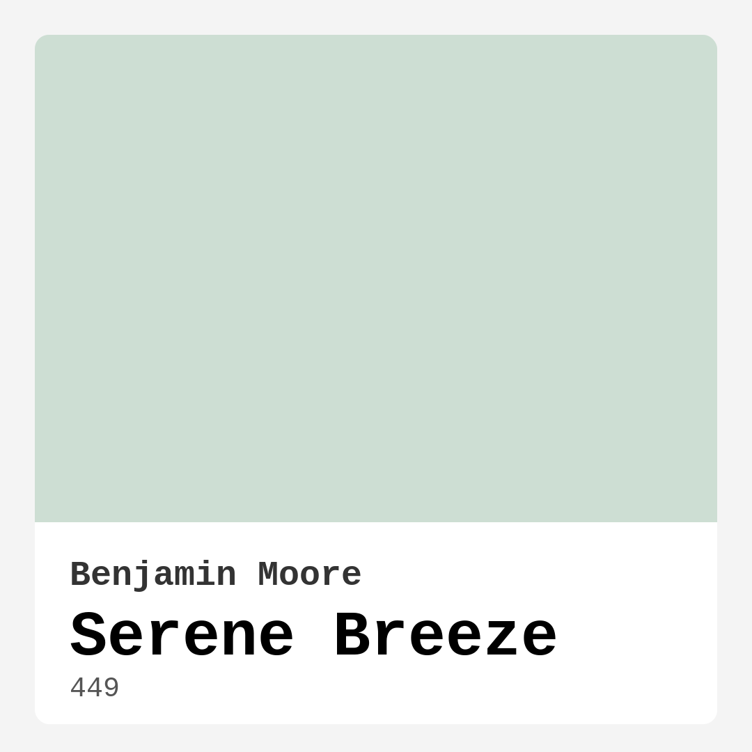
Color Preview & Key Details
| HEX Code | #CDDED3 |
| RGB | 205, 222, 211 |
| LRV | 68.55% |
| Undertone | Green |
| Finish Options | Eggshell, Matte, Satin |
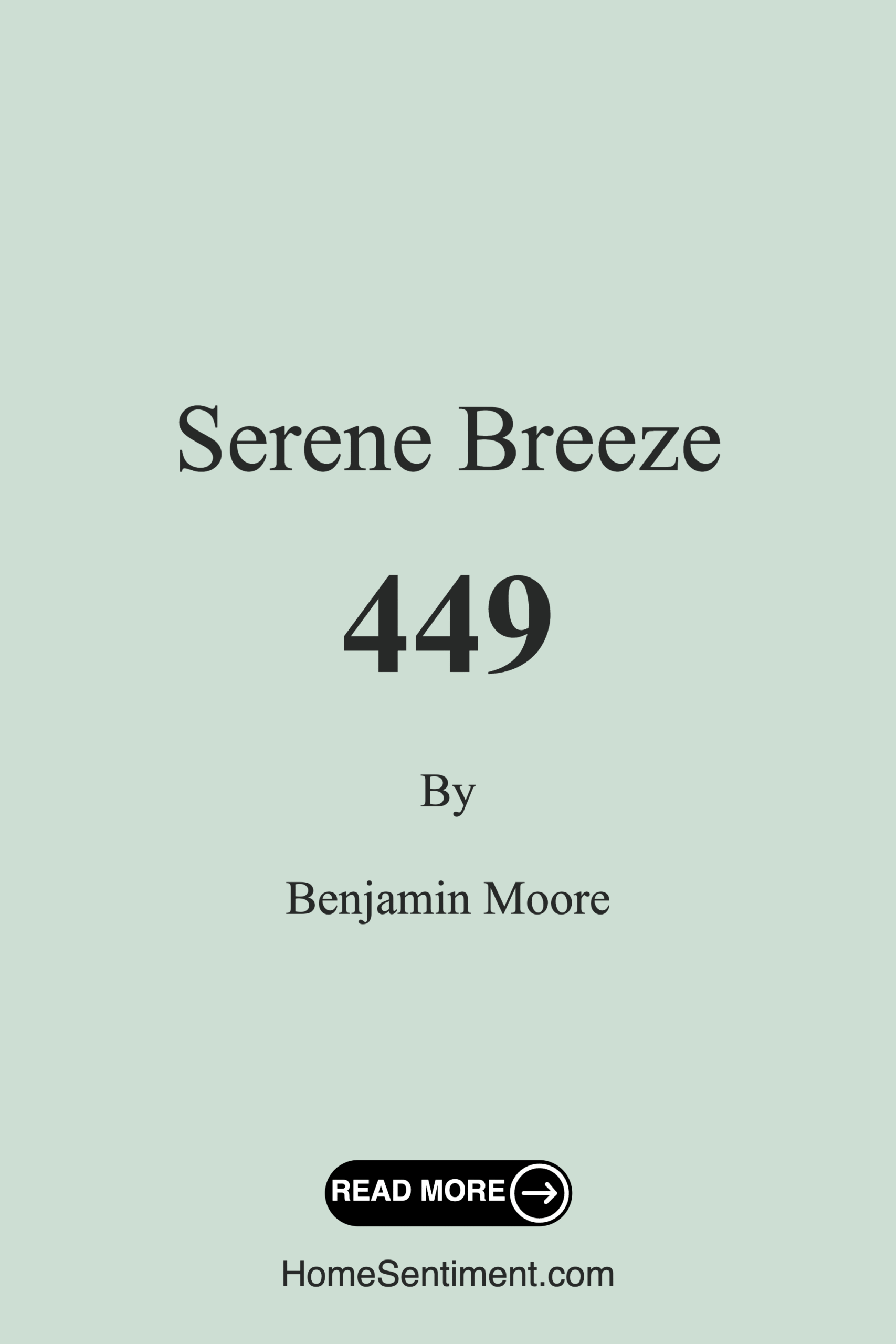
**The Ultimate Guide to Benjamin Moore’s Serene Breeze: A Paint Color That Transforms Your Space**
Picture this: You walk into your living room after a long day, and instead of feeling overwhelmed by clutter or harsh colors, you’re greeted by walls that feel like a gentle exhale. Soft, soothing, and effortlessly elegant—that’s the magic of Benjamin Moore’s Serene Breeze. If you’ve been searching for a paint color that brings calm without sacrificing style, this might be your perfect match.
Serene Breeze (color code 449) is a light, muted green with subtle blue undertones, sitting at a Light Reflectance Value (LRV) of 68.55%. That means it reflects plenty of light, making rooms feel airy and open. It’s the kind of color that doesn’t shout for attention but quietly elevates your space, like a well-placed piece of art or a perfectly fluffed throw pillow. Whether you’re painting a bedroom, home office, or nursery, this shade has a way of making everything feel just a little more peaceful.
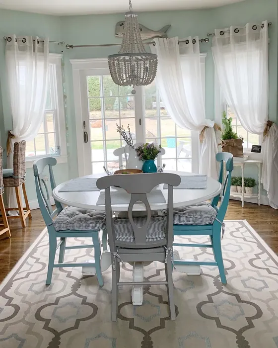
One of the best things about Serene Breeze is its versatility. It plays well with modern, coastal, minimalist, and Scandinavian decor styles, so you don’t have to overhaul your entire aesthetic to make it work. Pair it with crisp white trim like Benjamin Moore’s White Dove for a clean, fresh look, or layer in natural wood tones and linen textiles to enhance its organic vibe. If you’re feeling bold, accent with deeper greens or purples (its complementary hue) to add depth without losing that serene quality.
Now, let’s talk application. If you’re a DIY beginner, you’ll love how forgiving this color is. It offers excellent coverage—often in just one or two coats—and goes on smoothly whether you’re using a roller or brush. The finish options (matte, eggshell, or satin) give you flexibility depending on the room’s needs. Eggshell is a great all-around choice for living areas, while satin works well in spaces like bathrooms where washability matters. And speaking of washability, this paint is stain-resistant, so it’s practical for busy households or homes with kids and pets.
Lighting can make or break a paint color, and Serene Breeze is no exception. In natural light, those cool green-blue undertones shine, giving the room a refreshing, almost breezy quality. Under artificial light, it softens into a more neutral, muted tone. That’s why it’s always a good idea to test a swatch on your wall and observe it at different times of day. North-facing rooms might pull out more of the blue, while south-facing spaces could emphasize the green. But no matter the light, it never feels stark or overwhelming—just quietly beautiful.
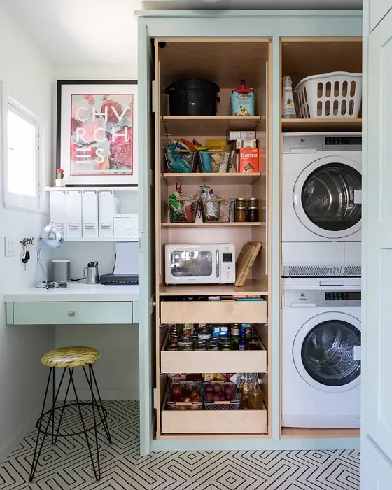
Small rooms? No problem. Serene Breeze is a champion at making tight spaces feel larger. Its light-reflecting properties bounce brightness around, so even a cramped home office or narrow bathroom can feel open and inviting. Just keep your furnishings light and airy to match—think sheer curtains, pale rugs, and minimalist furniture. Avoid heavy, dark pieces that could weigh down the room’s effortless vibe.
Of course, no color is perfect for every scenario. If your space is already very dark or flooded with intense artificial light, Serene Breeze might not have the impact you’re hoping for. It’s also important to be mindful of undertones when selecting complementary colors. A warm beige or taupe with yellow undertones, for example, could clash with Serene Breeze’s coolness. Stick with cooler neutrals or soft pastels to keep the harmony intact.
For those who love this shade but want something a bit deeper, Benjamin Moore offers darker variations like AF-630 or 2072-70. Lighter options, such as Seafoam Green (a close cousin), can work if you’re after a whisper-soft effect. And if you’re pairing it with other colors, lean into purples or soft grays to let Serene Breeze truly sing.
At the end of the day, paint is more than just color—it’s mood, atmosphere, and personality. Serene Breeze delivers all three with understated elegance. It’s the kind of shade that makes you pause when you walk into a room, not because it’s loud, but because it feels *right*. Whether you’re refreshing a rental, creating a nursery, or just craving a change, this color has the power to transform your space into a sanctuary. So grab a sample, brush a little on your wall, and see how it makes you feel. You might just find yourself breathing a little easier.
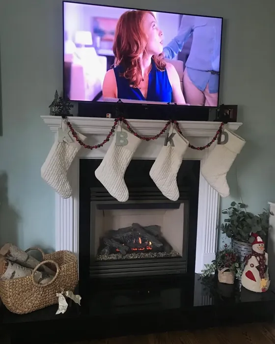
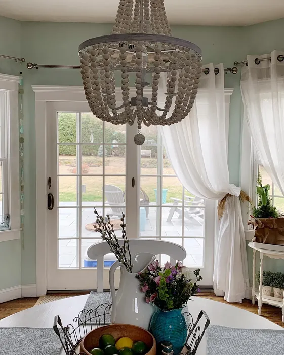
Real Room Photo of Serene Breeze 449
Undertones of Serene Breeze ?
The undertones of Serene Breeze are a key aspect of its character, leaning towards Green. These subtle underlying hues are what give the color its depth and complexity. For example, a gray with a blue undertone will feel cooler and more modern, while one with a brown undertone will feel warmer and more traditional. It’s essential to test this paint in your home and observe it next to your existing furniture, flooring, and decor to see how these undertones interact and reveal themselves throughout the day.
HEX value: #CDDED3
RGB code: 205, 222, 211
Is Serene Breeze Cool or Warm?
Serene Breeze is predominantly cool, with its soft hints of green and blue. This makes it an ideal choice for creating a refreshing and tranquil environment, particularly in warmer climates or during the summer months.
Understanding Color Properties and Interior Design Tips
Hue refers to a specific position on the color wheel, measured in degrees from 0 to 360. Each degree represents a different pure color:
- 0° represents red
- 120° represents green
- 240° represents blue
Saturation describes the intensity or purity of a color and is expressed as a percentage:
- At 0%, the color appears completely desaturated—essentially a shade of gray
- At 100%, the color is at its most vivid and vibrant
Lightness indicates how light or dark a color is, also expressed as a percentage:
- 0% lightness results in black
- 100% lightness results in white
Using Warm Colors in Interior Design
Warm hues—such as reds, oranges, yellows, warm beiges, and greiges—are excellent choices for creating inviting and energetic spaces. These colors are particularly well-suited for:
- Kitchens, living rooms, and bathrooms, where warmth enhances comfort and sociability
- Large rooms, where warm tones can help reduce the sense of emptiness and make the space feel more intimate
For example:
- Warm beige shades provide a cozy, inviting atmosphere, ideal for living rooms, bedrooms, and hallways.
- Warm greige (a mix of beige and gray) offers the warmth of beige with the modern appeal of gray, making it a versatile backdrop for dining areas, bedrooms, and living spaces.
However, be mindful when using warm light tones in rooms with limited natural light. These shades may appear muted or even take on an unpleasant yellowish tint. To avoid a dull or flat appearance:
- Add depth by incorporating richer tones like deep greens, charcoal, or chocolate brown
- Use textured elements such as curtains, rugs, or cushions to bring dimension to the space
Pro Tip: Achieving Harmony with Warm and Cool Color Balance
To create a well-balanced and visually interesting interior, mix warm and cool tones strategically. This contrast adds depth and harmony to your design.
- If your walls feature warm hues, introduce cool-colored accents such as blue or green furniture, artwork, or accessories to create contrast.
- For a polished look, consider using a complementary color scheme, which pairs colors opposite each other on the color wheel (e.g., red with green, orange with blue).
This thoughtful mix not only enhances visual appeal but also creates a space that feels both dynamic and cohesive.
Light Temperature Affects on Serene Breeze
Natural Light
Natural daylight changes in color temperature as the sun moves across the sky. At sunrise and sunset, the light tends to have a warm, golden tone with a color temperature around 2000 Kelvin (K). As the day progresses and the sun rises higher, the light becomes cooler and more neutral. Around midday, especially when the sky is clear, natural light typically reaches its peak brightness and shifts to a cooler tone, ranging from 5500 to 6500 Kelvin. This midday light is close to what we perceive as pure white or daylight-balanced light.
These shifts in natural light can significantly influence how colors appear in a space, which is why designers often consider both the time of day and the orientation of windows when planning interior color schemes.
Artificial Light
When choosing artificial lighting, pay close attention to the color temperature, measured in Kelvin (K). This determines how warm or cool the light will appear. Lower temperatures, around 2700K, give off a warm, yellow glow often used in living rooms or bedrooms. Higher temperatures, above 5000K, create a cool, bluish light similar to daylight, commonly used in kitchens, offices, or task areas.
Use the slider to see how lighting temperature can affect the appearance of a surface or color throughout a space.


4800K
LRV of Serene Breeze
The Light Reflectance Value (LRV) of Serene Breeze is 68.55%, which places it in the Light colors category. This means it reflect most of the incident light. Understanding a paint’s LRV is crucial for predicting how it will look in your space. A higher LRV indicates a lighter color that reflects more light, making rooms feel larger and brighter. A lower LRV signifies a darker color that absorbs more light, creating a cozier, more intimate atmosphere. Always consider the natural and artificial lighting in your room when selecting a paint color based on its LRV.
Detailed Review of Serene Breeze
Additional Paint Characteristics
Ideal Rooms
Bathroom, Bedroom, Home Office, Living Room, Nursery
Decor Styles
Coastal, Minimalist, Modern, Scandinavian
Coverage
Good (1–2 Coats)
Ease of Application
Beginner Friendly, Brush Smooth, Roller-Ready
Washability
Highly Washable, Stain Resistant, Washable
VOC Level
Low VOC
Best Use
Accent Wall, Furniture, Interior Walls
Room Suitability
Bedroom, Home Office, Living Room, Nursery
Tone Tag
Airy, Cool, Muted
Finish Type
Eggshell, Matte, Satin
Paint Performance
High Coverage, Low Odor, Quick Drying
Use Cases
Best for Low Light Rooms, Best for Rentals, Best for Small Spaces, Classic Favorite
Mood
Calm, Inviting, Restful
Trim Pairing
Complements Cool Trim, Matches Pure White, Pairs with White Dove
Serene Breeze is a delightful shade that truly lives up to its name. It’s perfect for creating a serene atmosphere in any room. When applied, the color brings a soft, airy quality that enhances natural light, making spaces feel more open and inviting. It works particularly well in bedrooms and living areas where relaxation is key. The color is easy to work with, providing good coverage in just one or two coats, depending on your base color. Plus, it complements various decor styles, from coastal to minimalist, making it a versatile choice for many homeowners. Whether you’re looking to refresh a room or create a new focal point, Serene Breeze is an excellent option that will breathe life into your space.
Pros & Cons of 449 Serene Breeze
Pros
Cons
Colors that go with Benjamin Moore Serene Breeze
FAQ on 449 Serene Breeze
How does Serene Breeze perform in different lighting?
Serene Breeze adapts well to various lighting situations. In natural light, it appears more vibrant, showcasing its cool undertones. In artificial light, it may take on a softer, more muted appearance. It’s important to test the color in your specific space to see how it interacts with the light throughout the day, as this can influence its overall look and feel.
Can I use Serene Breeze in a small room?
Absolutely! Serene Breeze is an excellent choice for small rooms. Its light-reflecting properties can help make a space feel larger and airier. Pair it with light furnishings and decor to enhance the open feel, while still maintaining a cozy atmosphere. Just be mindful of your color selections for accents to ensure they complement rather than clash with this soothing shade.
Comparisons Serene Breeze with other colors
Serene Breeze 449 vs Sea Salt SW 6204
| Attribute | Serene Breeze 449 | Sea Salt SW 6204 |
|---|---|---|
| Color Name | Serene Breeze 449 | Sea Salt SW 6204 |
| Color | ||
| Hue | Green | Green |
| Brightness | Light | Light |
| RGB | 205, 222, 211 | 205, 210, 202 |
| LRV | 68.55% | 64% |
| Finish Type | Eggshell, Matte, Satin | Eggshell, Satin |
| Finish Options | Eggshell, Matte, Satin | Eggshell, Matte, Satin |
| Ideal Rooms | Bathroom, Bedroom, Home Office, Living Room, Nursery | Bathroom, Bedroom, Hallway, Kitchen, Living Room |
| Decor Styles | Coastal, Minimalist, Modern, Scandinavian | Coastal, Minimalist, Modern Farmhouse, Scandinavian, Traditional |
| Coverage | Good (1–2 Coats) | Good (1–2 Coats), Touch-Up Friendly |
| Ease of Application | Beginner Friendly, Brush Smooth, Roller-Ready | Beginner Friendly, Brush Smooth, Fast-Drying, Roller-Ready |
| Washability | Highly Washable, Stain Resistant, Washable | Highly Washable, Washable |
| Room Suitability | Bedroom, Home Office, Living Room, Nursery | Bathroom, Bedroom, Hallway, Kitchen, Living Room |
| Tone | Airy, Cool, Muted | Airy, Balanced, Cool, Muted |
| Paint Performance | High Coverage, Low Odor, Quick Drying | Easy Touch-Up, High Coverage, Low Odor, Quick Drying |
Serene Breeze 449 vs Liveable Green SW 6176
| Attribute | Serene Breeze 449 | Liveable Green SW 6176 |
|---|---|---|
| Color Name | Serene Breeze 449 | Liveable Green SW 6176 |
| Color | ||
| Hue | Green | Green |
| Brightness | Light | Light |
| RGB | 205, 222, 211 | 206, 206, 189 |
| LRV | 68.55% | 30% |
| Finish Type | Eggshell, Matte, Satin | Eggshell, Matte, Satin |
| Finish Options | Eggshell, Matte, Satin | Eggshell, Matte, Satin |
| Ideal Rooms | Bathroom, Bedroom, Home Office, Living Room, Nursery | Bedroom, Home Office, Kitchen, Living Room, Nursery |
| Decor Styles | Coastal, Minimalist, Modern, Scandinavian | Contemporary, Modern Farmhouse, Rustic, Scandi |
| Coverage | Good (1–2 Coats) | Good (1–2 Coats), Touch-Up Friendly |
| Ease of Application | Beginner Friendly, Brush Smooth, Roller-Ready | Beginner Friendly, Brush Smooth, Roller-Ready |
| Washability | Highly Washable, Stain Resistant, Washable | Highly Washable, Washable |
| Room Suitability | Bedroom, Home Office, Living Room, Nursery | Bedroom, Home Office, Living Room, Nursery |
| Tone | Airy, Cool, Muted | Balanced, Earthy, Muted |
| Paint Performance | High Coverage, Low Odor, Quick Drying | Easy Touch-Up, High Coverage, Low Odor |
Serene Breeze 449 vs Rainwashed SW 6211
| Attribute | Serene Breeze 449 | Rainwashed SW 6211 |
|---|---|---|
| Color Name | Serene Breeze 449 | Rainwashed SW 6211 |
| Color | ||
| Hue | Green | Green |
| Brightness | Light | Light |
| RGB | 205, 222, 211 | 194, 205, 197 |
| LRV | 68.55% | 60% |
| Finish Type | Eggshell, Matte, Satin | Eggshell, Matte, Satin |
| Finish Options | Eggshell, Matte, Satin | Eggshell, Matte, Satin |
| Ideal Rooms | Bathroom, Bedroom, Home Office, Living Room, Nursery | Bathroom, Bedroom, Home Office, Living Room, Nursery |
| Decor Styles | Coastal, Minimalist, Modern, Scandinavian | Coastal, Farmhouse, Minimalist, Modern, Transitional |
| Coverage | Good (1–2 Coats) | Good (1–2 Coats), Touch-Up Friendly |
| Ease of Application | Beginner Friendly, Brush Smooth, Roller-Ready | Beginner Friendly, Brush Smooth, Fast-Drying, Roller-Ready |
| Washability | Highly Washable, Stain Resistant, Washable | Washable, Wipeable |
| Room Suitability | Bedroom, Home Office, Living Room, Nursery | Bathroom, Bedroom, Home Office, Living Room, Nursery |
| Tone | Airy, Cool, Muted | Balanced, Cool, Muted |
| Paint Performance | High Coverage, Low Odor, Quick Drying | Easy Touch-Up, High Coverage, Low Odor |
Serene Breeze 449 vs Filmy Green SW 6190
| Attribute | Serene Breeze 449 | Filmy Green SW 6190 |
|---|---|---|
| Color Name | Serene Breeze 449 | Filmy Green SW 6190 |
| Color | ||
| Hue | Green | Green |
| Brightness | Light | Light |
| RGB | 205, 222, 211 | 209, 211, 199 |
| LRV | 68.55% | 50% |
| Finish Type | Eggshell, Matte, Satin | Eggshell, Matte, Satin |
| Finish Options | Eggshell, Matte, Satin | Eggshell, Matte, Satin |
| Ideal Rooms | Bathroom, Bedroom, Home Office, Living Room, Nursery | Bedroom, Home Office, Living Room, Nursery |
| Decor Styles | Coastal, Minimalist, Modern, Scandinavian | Bohemian, Minimalist, Modern Farmhouse, Scandinavian |
| Coverage | Good (1–2 Coats) | Good (1–2 Coats) |
| Ease of Application | Beginner Friendly, Brush Smooth, Roller-Ready | Beginner Friendly, Brush Smooth, Roller-Ready |
| Washability | Highly Washable, Stain Resistant, Washable | Washable, Wipeable |
| Room Suitability | Bedroom, Home Office, Living Room, Nursery | Bedroom, Home Office, Living Room, Nursery |
| Tone | Airy, Cool, Muted | Calm, Earthy, Muted |
| Paint Performance | High Coverage, Low Odor, Quick Drying | Easy Touch-Up, Low Odor, Quick Drying |
Serene Breeze 449 vs Slow Green SW 6456
| Attribute | Serene Breeze 449 | Slow Green SW 6456 |
|---|---|---|
| Color Name | Serene Breeze 449 | Slow Green SW 6456 |
| Color | ||
| Hue | Green | Green |
| Brightness | Light | Light |
| RGB | 205, 222, 211 | 198, 213, 201 |
| LRV | 68.55% | 48% |
| Finish Type | Eggshell, Matte, Satin | Eggshell, Matte, Satin |
| Finish Options | Eggshell, Matte, Satin | Eggshell, Matte, Satin |
| Ideal Rooms | Bathroom, Bedroom, Home Office, Living Room, Nursery | Bedroom, Dining Room, Home Office, Living Room, Nursery |
| Decor Styles | Coastal, Minimalist, Modern, Scandinavian | Coastal, Farmhouse, Modern, Rustic, Scandinavian |
| Coverage | Good (1–2 Coats) | Good (1–2 Coats), Touch-Up Friendly |
| Ease of Application | Beginner Friendly, Brush Smooth, Roller-Ready | Beginner Friendly, Brush Smooth, Roller-Ready |
| Washability | Highly Washable, Stain Resistant, Washable | Highly Washable, Washable |
| Room Suitability | Bedroom, Home Office, Living Room, Nursery | Bedroom, Dining Room, Entryway, Home Office, Living Room, Nursery |
| Tone | Airy, Cool, Muted | Balanced, Earthy, Muted |
| Paint Performance | High Coverage, Low Odor, Quick Drying | Easy Touch-Up, Fade Resistant, Low Odor |
Serene Breeze 449 vs Acanthus SW 0029
| Attribute | Serene Breeze 449 | Acanthus SW 0029 |
|---|---|---|
| Color Name | Serene Breeze 449 | Acanthus SW 0029 |
| Color | ||
| Hue | Green | Green |
| Brightness | Light | Light |
| RGB | 205, 222, 211 | 205, 205, 180 |
| LRV | 68.55% | 10% |
| Finish Type | Eggshell, Matte, Satin | Eggshell, Matte, Satin |
| Finish Options | Eggshell, Matte, Satin | Eggshell, Matte, Satin |
| Ideal Rooms | Bathroom, Bedroom, Home Office, Living Room, Nursery | Bedroom, Dining Room, Home Office, Kitchen, Living Room |
| Decor Styles | Coastal, Minimalist, Modern, Scandinavian | Eclectic, Farmhouse, Modern, Traditional |
| Coverage | Good (1–2 Coats) | Good (1–2 Coats) |
| Ease of Application | Beginner Friendly, Brush Smooth, Roller-Ready | Beginner Friendly, Brush Smooth, Fast-Drying, Roller-Ready |
| Washability | Highly Washable, Stain Resistant, Washable | Highly Washable, Stain Resistant, Washable |
| Room Suitability | Bedroom, Home Office, Living Room, Nursery | Bedroom, Dining Room, Home Office, Living Room |
| Tone | Airy, Cool, Muted | Balanced, Earthy, Muted |
| Paint Performance | High Coverage, Low Odor, Quick Drying | Easy Touch-Up, Low Odor, Quick Drying, Scuff Resistant |
Serene Breeze 449 vs Topiary Tint SW 6449
| Attribute | Serene Breeze 449 | Topiary Tint SW 6449 |
|---|---|---|
| Color Name | Serene Breeze 449 | Topiary Tint SW 6449 |
| Color | ||
| Hue | Green | Green |
| Brightness | Light | Light |
| RGB | 205, 222, 211 | 200, 216, 196 |
| LRV | 68.55% | 30% |
| Finish Type | Eggshell, Matte, Satin | Eggshell, Matte, Satin |
| Finish Options | Eggshell, Matte, Satin | Eggshell, Matte, Satin |
| Ideal Rooms | Bathroom, Bedroom, Home Office, Living Room, Nursery | Bathroom, Bedroom, Dining Room, Home Office, Kitchen, Living Room |
| Decor Styles | Coastal, Minimalist, Modern, Scandinavian | Bohemian, Coastal, Eclectic, Modern Farmhouse, Transitional |
| Coverage | Good (1–2 Coats) | Good (1–2 Coats), Touch-Up Friendly |
| Ease of Application | Beginner Friendly, Brush Smooth, Roller-Ready | Beginner Friendly, Brush Smooth, Fast-Drying, Roller-Ready |
| Washability | Highly Washable, Stain Resistant, Washable | Scuff Resistant, Washable |
| Room Suitability | Bedroom, Home Office, Living Room, Nursery | Bathroom, Bedroom, Dining Room, Kitchen, Living Room |
| Tone | Airy, Cool, Muted | Balanced, Calm, Earthy, Muted |
| Paint Performance | High Coverage, Low Odor, Quick Drying | Easy Touch-Up, Low Odor, Quick Drying, Stain Resistant |
Serene Breeze 449 vs Waterscape SW 6470
| Attribute | Serene Breeze 449 | Waterscape SW 6470 |
|---|---|---|
| Color Name | Serene Breeze 449 | Waterscape SW 6470 |
| Color | ||
| Hue | Green | Green |
| Brightness | Light | Light |
| RGB | 205, 222, 211 | 191, 210, 201 |
| LRV | 68.55% | 50% |
| Finish Type | Eggshell, Matte, Satin | Eggshell, Matte |
| Finish Options | Eggshell, Matte, Satin | Eggshell, Matte, Satin |
| Ideal Rooms | Bathroom, Bedroom, Home Office, Living Room, Nursery | Bathroom, Bedroom, Home Office, Kitchen, Living Room |
| Decor Styles | Coastal, Minimalist, Modern, Scandinavian | Coastal, Minimalist, Modern, Scandinavian |
| Coverage | Good (1–2 Coats) | Good (1–2 Coats) |
| Ease of Application | Beginner Friendly, Brush Smooth, Roller-Ready | Beginner Friendly, Brush Smooth, Roller-Ready |
| Washability | Highly Washable, Stain Resistant, Washable | Highly Washable, Washable |
| Room Suitability | Bedroom, Home Office, Living Room, Nursery | Bathroom, Bedroom, Home Office, Living Room |
| Tone | Airy, Cool, Muted | Airy, Cool, Muted |
| Paint Performance | High Coverage, Low Odor, Quick Drying | Easy Touch-Up, Low Odor, Quick Drying |
Serene Breeze 449 vs Bonsai Tint SW 6436
| Attribute | Serene Breeze 449 | Bonsai Tint SW 6436 |
|---|---|---|
| Color Name | Serene Breeze 449 | Bonsai Tint SW 6436 |
| Color | ||
| Hue | Green | Green |
| Brightness | Light | Light |
| RGB | 205, 222, 211 | 197, 209, 178 |
| LRV | 68.55% | 64% |
| Finish Type | Eggshell, Matte, Satin | Eggshell, Matte |
| Finish Options | Eggshell, Matte, Satin | Eggshell, Matte, Satin |
| Ideal Rooms | Bathroom, Bedroom, Home Office, Living Room, Nursery | Bedroom, Home Office, Living Room, Nursery |
| Decor Styles | Coastal, Minimalist, Modern, Scandinavian | Bohemian, Minimalist, Modern, Scandinavian |
| Coverage | Good (1–2 Coats) | Good (1–2 Coats) |
| Ease of Application | Beginner Friendly, Brush Smooth, Roller-Ready | Beginner Friendly, Brush Smooth, Roller-Ready |
| Washability | Highly Washable, Stain Resistant, Washable | Washable, Wipeable |
| Room Suitability | Bedroom, Home Office, Living Room, Nursery | Bedroom, Home Office, Living Room, Nursery |
| Tone | Airy, Cool, Muted | Calm, Earthy, Muted |
| Paint Performance | High Coverage, Low Odor, Quick Drying | Easy Touch-Up, Fade Resistant, Low Odor |
Serene Breeze 449 vs Gratifying Green SW 6435
| Attribute | Serene Breeze 449 | Gratifying Green SW 6435 |
|---|---|---|
| Color Name | Serene Breeze 449 | Gratifying Green SW 6435 |
| Color | ||
| Hue | Green | Green |
| Brightness | Light | Light |
| RGB | 205, 222, 211 | 218, 226, 205 |
| LRV | 68.55% | 30% |
| Finish Type | Eggshell, Matte, Satin | Eggshell, Matte, Satin |
| Finish Options | Eggshell, Matte, Satin | Eggshell, Matte, Satin |
| Ideal Rooms | Bathroom, Bedroom, Home Office, Living Room, Nursery | Bedroom, Dining Room, Home Office, Living Room, Nursery |
| Decor Styles | Coastal, Minimalist, Modern, Scandinavian | Bohemian, Coastal, Minimalist, Modern Farmhouse |
| Coverage | Good (1–2 Coats) | Good (1–2 Coats), Touch-Up Friendly |
| Ease of Application | Beginner Friendly, Brush Smooth, Roller-Ready | Beginner Friendly, Brush Smooth, Roller-Ready |
| Washability | Highly Washable, Stain Resistant, Washable | Washable, Wipeable |
| Room Suitability | Bedroom, Home Office, Living Room, Nursery | Bedroom, Home Office, Living Room, Nursery |
| Tone | Airy, Cool, Muted | Earthy, Muted, Warm |
| Paint Performance | High Coverage, Low Odor, Quick Drying | Easy Touch-Up, Low Odor, Quick Drying |
Official Page of Benjamin Moore Serene Breeze 449