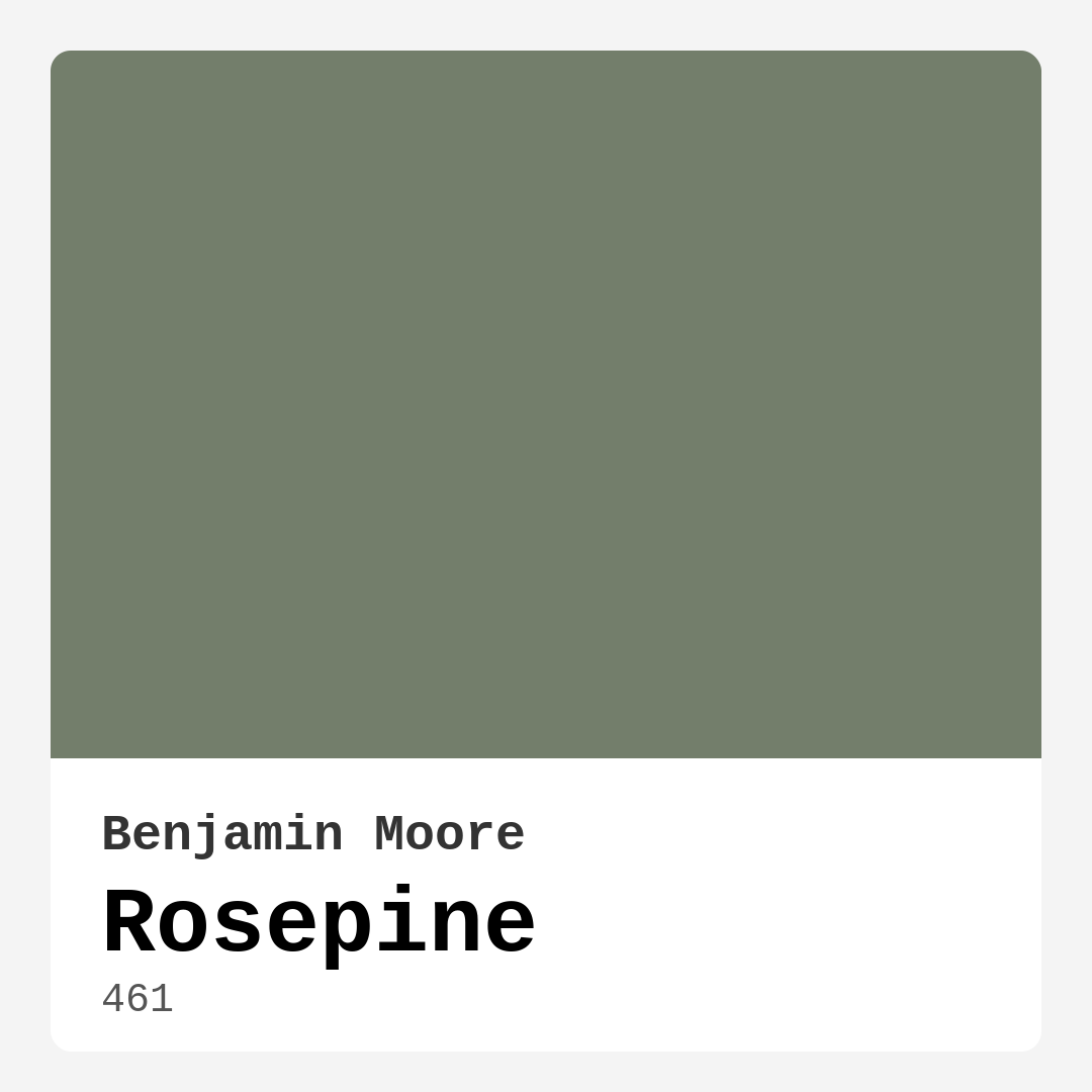
Color Preview & Key Details
| HEX Code | #737E6B |
| RGB | 115, 126, 107 |
| LRV | 20.82% |
| Undertone | Green |
| Finish Options | Eggshell, Matte, Satin |
If you’re searching for a paint color that effortlessly blends sophistication with serenity, Benjamin Moore’s Rosepine might just be your perfect match. This muted green with subtle gray undertones and a whisper of warmth is a designer favorite for good reason—it’s versatile, calming, and works beautifully in almost any space. Whether you’re refreshing a living room, designing a cozy bedroom, or creating a peaceful home office, Rosepine offers a timeless elegance that adapts to your style without demanding too much attention.
One of the standout qualities of Rosepine is its ability to create a tranquil atmosphere. Unlike bolder greens that can dominate a room, this shade has a soft, understated presence that feels both grounding and inviting. It’s the kind of color that makes you exhale when you walk into the room, which is why it’s such a great choice for bedrooms and nurseries. The warmth in its undertones keeps it from feeling cold or sterile, so even in a modern farmhouse or Scandinavian-inspired space, it adds just the right amount of coziness.
When it comes to application, Rosepine is beginner-friendly. With good coverage in just one or two coats, you won’t find yourself endlessly layering paint to get the perfect finish. It’s roller-ready and brush-smooth, so whether you’re a DIY enthusiast or hiring a pro, the process is straightforward. Plus, it’s touch-up friendly and washable, making it a practical choice for high-traffic areas or homes with kids and pets. The low VOC formula is another bonus, ensuring minimal odor and a healthier indoor environment.
Lighting plays a big role in how Rosepine performs in your space. With an LRV of 20.82%, it reflects a fair amount of light, but it’s still considered a medium shade. In bright, sunlit rooms, it takes on a fresh, airy quality, while in lower light, it deepens into a more intimate, moody tone. If you’re using it in a small room, consider balancing it with lighter furniture or textiles to keep the space from feeling too enclosed. An accent wall in Rosepine can also add depth without overwhelming the room—pair it with crisp white trim like Benjamin Moore’s White Dove for a classic, clean look.
Decorating around Rosepine is where the fun begins. Its earthy, muted tone pairs beautifully with natural materials like wood and linen, making it a natural fit for modern farmhouse or bohemian styles. For a contemporary vibe, try combining it with sleek black accents or brass fixtures, which add a touch of sophistication. If you love contrast, its complementary hues—think soft purples and warm neutrals—can create a dynamic yet harmonious palette. And don’t shy away from texture; a chunky knit throw or a woven rug will enhance its organic feel.
Rosepine’s versatility extends beyond walls. Consider using it on furniture, cabinetry, or even ceilings for a unexpected twist. A dresser or bookshelf in this shade can anchor a room without feeling heavy, while a ceiling painted in Rosepine can make a bedroom feel like a cozy, enveloping retreat. The matte, eggshell, or satin finish options give you flexibility depending on the look and durability you need—eggshell is great for walls, while satin works well for trim or furniture that needs a bit more sheen.
Of course, no color is without its considerations. Rosepine’s depth means it can darken in smaller spaces or rooms with limited natural light, so if you’re working with a tight area, test it first. Sampling is key—paint a large swatch and observe it at different times of day to see how the undertones shift. You might notice hints of gray or warmth coming through depending on the light, which is part of what makes this color so interesting.
If you’re wondering how Rosepine stacks up against other greens, it’s more subdued than a sage or moss green, with a grayed-down quality that keeps it feeling modern. It’s not as cool as a true gray-green, nor as warm as an olive, striking a balance that works with both warm and cool palettes. That’s what makes it such a reliable choice—it doesn’t clash, and it doesn’t demand attention, but it always elevates a space.
At the end of the day, Rosepine is a color that feels intentional without being fussy. It’s the kind of shade that grows with your style, adapting to different decor changes over the years. Whether you’re aiming for a serene retreat or a stylish, lived-in look, this muted green delivers. So if you’re on the fence, grab a sample and see how it transforms your space—you might just fall in love with the quiet charm of Rosepine.
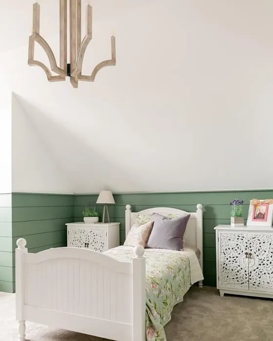
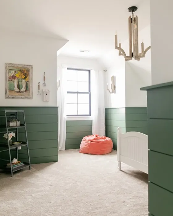
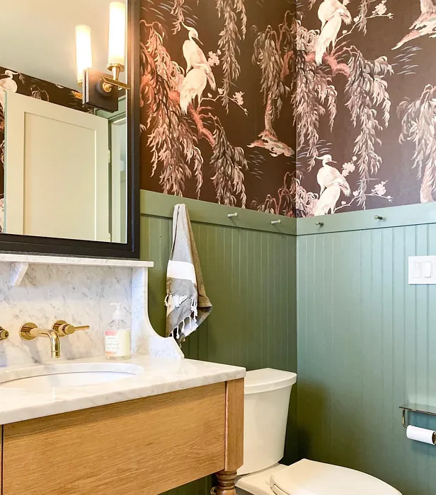
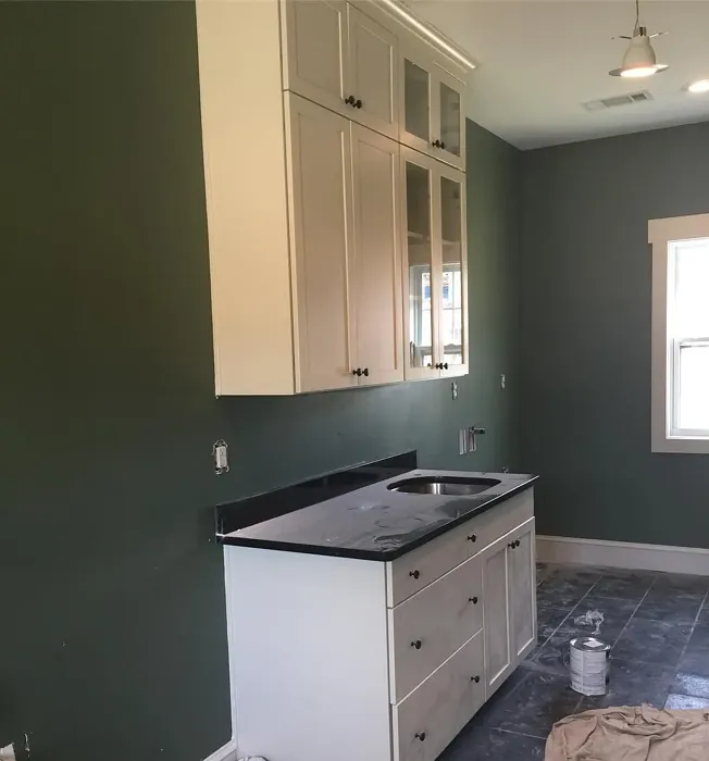
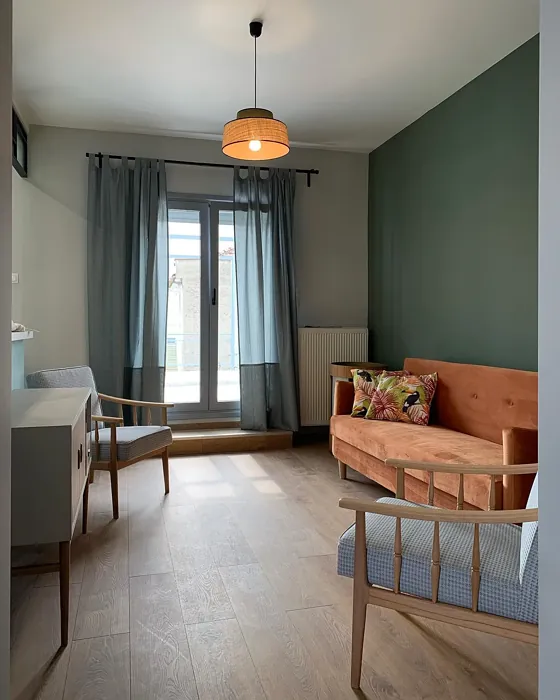
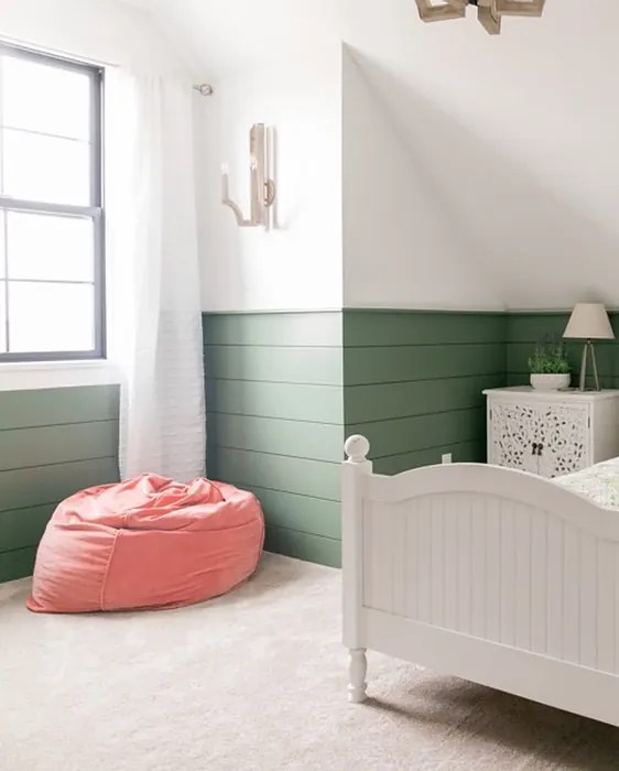
Real Room Photo of Rosepine 461


Undertones of Rosepine ?
The undertones of Rosepine are a key aspect of its character, leaning towards Green. These subtle underlying hues are what give the color its depth and complexity. For example, a gray with a blue undertone will feel cooler and more modern, while one with a brown undertone will feel warmer and more traditional. It’s essential to test this paint in your home and observe it next to your existing furniture, flooring, and decor to see how these undertones interact and reveal themselves throughout the day.
HEX value: #737E6B
RGB code: 115, 126, 107
Is Rosepine Cool or Warm?
This color can be classified as warm due to its soft undertones, but it strikes a balance that keeps it from feeling too heated. It’s versatile enough to harmonize with both warm and cool color palettes.
Understanding Color Properties and Interior Design Tips
Hue refers to a specific position on the color wheel, measured in degrees from 0 to 360. Each degree represents a different pure color:
- 0° represents red
- 120° represents green
- 240° represents blue
Saturation describes the intensity or purity of a color and is expressed as a percentage:
- At 0%, the color appears completely desaturated—essentially a shade of gray
- At 100%, the color is at its most vivid and vibrant
Lightness indicates how light or dark a color is, also expressed as a percentage:
- 0% lightness results in black
- 100% lightness results in white
Using Warm Colors in Interior Design
Warm hues—such as reds, oranges, yellows, warm beiges, and greiges—are excellent choices for creating inviting and energetic spaces. These colors are particularly well-suited for:
- Kitchens, living rooms, and bathrooms, where warmth enhances comfort and sociability
- Large rooms, where warm tones can help reduce the sense of emptiness and make the space feel more intimate
For example:
- Warm beige shades provide a cozy, inviting atmosphere, ideal for living rooms, bedrooms, and hallways.
- Warm greige (a mix of beige and gray) offers the warmth of beige with the modern appeal of gray, making it a versatile backdrop for dining areas, bedrooms, and living spaces.
However, be mindful when using warm light tones in rooms with limited natural light. These shades may appear muted or even take on an unpleasant yellowish tint. To avoid a dull or flat appearance:
- Add depth by incorporating richer tones like deep greens, charcoal, or chocolate brown
- Use textured elements such as curtains, rugs, or cushions to bring dimension to the space
Pro Tip: Achieving Harmony with Warm and Cool Color Balance
To create a well-balanced and visually interesting interior, mix warm and cool tones strategically. This contrast adds depth and harmony to your design.
- If your walls feature warm hues, introduce cool-colored accents such as blue or green furniture, artwork, or accessories to create contrast.
- For a polished look, consider using a complementary color scheme, which pairs colors opposite each other on the color wheel (e.g., red with green, orange with blue).
This thoughtful mix not only enhances visual appeal but also creates a space that feels both dynamic and cohesive.
Light Temperature Affects on Rosepine
Natural Light
Natural daylight changes in color temperature as the sun moves across the sky. At sunrise and sunset, the light tends to have a warm, golden tone with a color temperature around 2000 Kelvin (K). As the day progresses and the sun rises higher, the light becomes cooler and more neutral. Around midday, especially when the sky is clear, natural light typically reaches its peak brightness and shifts to a cooler tone, ranging from 5500 to 6500 Kelvin. This midday light is close to what we perceive as pure white or daylight-balanced light.
These shifts in natural light can significantly influence how colors appear in a space, which is why designers often consider both the time of day and the orientation of windows when planning interior color schemes.
Artificial Light
When choosing artificial lighting, pay close attention to the color temperature, measured in Kelvin (K). This determines how warm or cool the light will appear. Lower temperatures, around 2700K, give off a warm, yellow glow often used in living rooms or bedrooms. Higher temperatures, above 5000K, create a cool, bluish light similar to daylight, commonly used in kitchens, offices, or task areas.
Use the slider to see how lighting temperature can affect the appearance of a surface or color throughout a space.


4800K
LRV of Rosepine
The Light Reflectance Value (LRV) of Rosepine is 20.82%, which places it in the Medium colors category. This means it reflect a lot of light. Understanding a paint’s LRV is crucial for predicting how it will look in your space. A higher LRV indicates a lighter color that reflects more light, making rooms feel larger and brighter. A lower LRV signifies a darker color that absorbs more light, creating a cozier, more intimate atmosphere. Always consider the natural and artificial lighting in your room when selecting a paint color based on its LRV.
Detailed Review of Rosepine
Additional Paint Characteristics
Ideal Rooms
Bedroom, Dining Room, Home Office, Living Room, Nursery
Decor Styles
Bohemian, Contemporary, Modern Farmhouse, Scandinavian
Coverage
Good (1–2 Coats), Touch-Up Friendly
Ease of Application
Beginner Friendly, Brush Smooth, Roller-Ready
Washability
Washable, Wipeable
VOC Level
Low VOC
Best Use
Accent Wall, Furniture, Interior Walls
Room Suitability
Bedroom, Home Office, Living Room, Nursery
Tone Tag
Earthy, Muted, Warm
Finish Type
Eggshell, Matte, Satin
Paint Performance
Easy Touch-Up, Low Odor, Scuff Resistant
Use Cases
Best for Modern Farmhouse, Best for Rentals, Designer Favorite
Mood
Calm, Grounding, Inviting
Trim Pairing
Complements Brass Fixtures, Good with Wood Trim, Pairs with White Dove
Rosepine stands out as an exceptional choice for those looking to create a serene and inviting atmosphere in their home. Its unique blend of muted green and gray provides a distinctive backdrop that complements a variety of decor styles, from rustic to sleek modern. When applied, it maintains a soft, sophisticated finish that can adapt to changing light throughout the day. The subtle warmth in the color helps to create a cozy vibe, making it ideal for spaces where relaxation is key. Overall, Rosepine offers a perfect balance between stylish and soothing, making it a worthy option for your next painting project.
Pros & Cons of 461 Rosepine
Pros
Cons
Colors that go with Benjamin Moore Rosepine
FAQ on 461 Rosepine
How does Rosepine compare to other greens?
Rosepine is a unique blend of muted green and gray, setting it apart from brighter or more saturated greens. Its soft undertones provide versatility, allowing it to work well with both warm and cool palettes. Unlike bolder greens, Rosepine offers a subtler presence, making it ideal for creating serene environments without overwhelming the senses. It’s perfect for those who appreciate a more understated elegance in their color choices.
Is Rosepine suitable for small rooms?
Yes, Rosepine can be suitable for small rooms, but it’s important to consider natural light. While its warm undertones can make a space feel cozy, it may also darken smaller areas if they lack sufficient light. To maximize its effect, pair it with lighter furnishings or accents to keep the space feeling open and inviting. Using it on an accent wall can also provide depth without closing in the room.
Comparisons Rosepine with other colors
Rosepine 461 vs Dried Thyme SW 6186
| Attribute | Rosepine 461 | Dried Thyme SW 6186 |
|---|---|---|
| Color Name | Rosepine 461 | Dried Thyme SW 6186 |
| Color | ||
| Hue | Green | Green |
| Brightness | Dark | Dark |
| RGB | 115, 126, 107 | 123, 128, 112 |
| LRV | 20.82% | 24% |
| Finish Type | Eggshell, Matte, Satin | Eggshell, Satin |
| Finish Options | Eggshell, Matte, Satin | Eggshell, Matte, Satin |
| Ideal Rooms | Bedroom, Dining Room, Home Office, Living Room, Nursery | Bathroom, Bedroom, Dining Room, Entryway, Home Office, Kitchen, Living Room |
| Decor Styles | Bohemian, Contemporary, Modern Farmhouse, Scandinavian | Bohemian, Industrial, Minimalist, Modern Farmhouse, Rustic |
| Coverage | Good (1–2 Coats), Touch-Up Friendly | Good (1–2 Coats), Touch-Up Friendly |
| Ease of Application | Beginner Friendly, Brush Smooth, Roller-Ready | Beginner Friendly, Brush Smooth, Roller-Ready |
| Washability | Washable, Wipeable | Washable, Wipeable |
| Room Suitability | Bedroom, Home Office, Living Room, Nursery | Bathroom, Bedroom, Dining Room, Home Office, Kitchen, Living Room |
| Tone | Earthy, Muted, Warm | Cool, Earthy, Muted |
| Paint Performance | Easy Touch-Up, Low Odor, Scuff Resistant | Easy Touch-Up, Low Odor, Scuff Resistant |
Rosepine 461 vs Retreat SW 6207
| Attribute | Rosepine 461 | Retreat SW 6207 |
|---|---|---|
| Color Name | Rosepine 461 | Retreat SW 6207 |
| Color | ||
| Hue | Green | Green |
| Brightness | Dark | Dark |
| RGB | 115, 126, 107 | 122, 128, 118 |
| LRV | 20.82% | 30% |
| Finish Type | Eggshell, Matte, Satin | Eggshell, Matte, Satin |
| Finish Options | Eggshell, Matte, Satin | Eggshell, Matte, Satin |
| Ideal Rooms | Bedroom, Dining Room, Home Office, Living Room, Nursery | Bathroom, Bedroom, Home Office, Kitchen, Living Room |
| Decor Styles | Bohemian, Contemporary, Modern Farmhouse, Scandinavian | Minimalist, Modern, Rustic, Transitional |
| Coverage | Good (1–2 Coats), Touch-Up Friendly | Good (1–2 Coats), Touch-Up Friendly |
| Ease of Application | Beginner Friendly, Brush Smooth, Roller-Ready | Beginner Friendly, Brush Smooth, Roller-Ready |
| Washability | Washable, Wipeable | Washable, Wipeable |
| Room Suitability | Bedroom, Home Office, Living Room, Nursery | Bathroom, Bedroom, Home Office, Living Room |
| Tone | Earthy, Muted, Warm | Cool, Earthy, Muted |
| Paint Performance | Easy Touch-Up, Low Odor, Scuff Resistant | Easy Touch-Up, Low Odor, Scuff Resistant |
Rosepine 461 vs Rosemary SW 6187
| Attribute | Rosepine 461 | Rosemary SW 6187 |
|---|---|---|
| Color Name | Rosepine 461 | Rosemary SW 6187 |
| Color | ||
| Hue | Green | Green |
| Brightness | Dark | Dark |
| RGB | 115, 126, 107 | 100, 105, 92 |
| LRV | 20.82% | 45% |
| Finish Type | Eggshell, Matte, Satin | Eggshell, Matte, Satin |
| Finish Options | Eggshell, Matte, Satin | Eggshell, Matte, Satin |
| Ideal Rooms | Bedroom, Dining Room, Home Office, Living Room, Nursery | Bedroom, Dining Room, Hallway, Home Office, Living Room |
| Decor Styles | Bohemian, Contemporary, Modern Farmhouse, Scandinavian | Bohemian, Coastal, Modern Farmhouse, Rustic |
| Coverage | Good (1–2 Coats), Touch-Up Friendly | Good (1–2 Coats), Touch-Up Friendly |
| Ease of Application | Beginner Friendly, Brush Smooth, Roller-Ready | Beginner Friendly, Brush Smooth, Roller-Ready |
| Washability | Washable, Wipeable | Washable, Wipeable |
| Room Suitability | Bedroom, Home Office, Living Room, Nursery | Bedroom, Dining Room, Home Office, Living Room |
| Tone | Earthy, Muted, Warm | Earthy, Muted, Warm |
| Paint Performance | Easy Touch-Up, Low Odor, Scuff Resistant | Fade Resistant, Low Odor, Quick Drying, Stain Resistant |
Rosepine 461 vs Basil SW 6194
| Attribute | Rosepine 461 | Basil SW 6194 |
|---|---|---|
| Color Name | Rosepine 461 | Basil SW 6194 |
| Color | ||
| Hue | Green | Green |
| Brightness | Dark | Dark |
| RGB | 115, 126, 107 | 98, 110, 96 |
| LRV | 20.82% | 12% |
| Finish Type | Eggshell, Matte, Satin | Eggshell, Matte, Satin |
| Finish Options | Eggshell, Matte, Satin | Eggshell, Matte, Satin |
| Ideal Rooms | Bedroom, Dining Room, Home Office, Living Room, Nursery | Bathroom, Bedroom, Dining Room, Home Office, Kitchen, Living Room |
| Decor Styles | Bohemian, Contemporary, Modern Farmhouse, Scandinavian | Bohemian, Contemporary, Modern Farmhouse, Rustic, Transitional |
| Coverage | Good (1–2 Coats), Touch-Up Friendly | Good (1–2 Coats), Touch-Up Friendly |
| Ease of Application | Beginner Friendly, Brush Smooth, Roller-Ready | Beginner Friendly, Brush Smooth, Fast-Drying, Roller-Ready |
| Washability | Washable, Wipeable | Washable, Wipeable |
| Room Suitability | Bedroom, Home Office, Living Room, Nursery | Bathroom, Bedroom, Dining Room, Kitchen, Living Room |
| Tone | Earthy, Muted, Warm | Earthy, Muted, Warm |
| Paint Performance | Easy Touch-Up, Low Odor, Scuff Resistant | Easy Touch-Up, Low Odor, Quick Drying |
Rosepine 461 vs Artichoke SW 6179
| Attribute | Rosepine 461 | Artichoke SW 6179 |
|---|---|---|
| Color Name | Rosepine 461 | Artichoke SW 6179 |
| Color | ||
| Hue | Green | Green |
| Brightness | Dark | Dark |
| RGB | 115, 126, 107 | 127, 130, 102 |
| LRV | 20.82% | 24% |
| Finish Type | Eggshell, Matte, Satin | Eggshell, Matte, Satin |
| Finish Options | Eggshell, Matte, Satin | Eggshell, Matte, Satin |
| Ideal Rooms | Bedroom, Dining Room, Home Office, Living Room, Nursery | Bedroom, Dining Room, Home Office, Living Room |
| Decor Styles | Bohemian, Contemporary, Modern Farmhouse, Scandinavian | Eclectic, Modern Farmhouse, Rustic, Transitional |
| Coverage | Good (1–2 Coats), Touch-Up Friendly | Good (1–2 Coats), Touch-Up Friendly |
| Ease of Application | Beginner Friendly, Brush Smooth, Roller-Ready | Beginner Friendly, Brush Smooth, Fast-Drying, Roller-Ready |
| Washability | Washable, Wipeable | Washable, Wipeable |
| Room Suitability | Bedroom, Home Office, Living Room, Nursery | Bedroom, Dining Room, Home Office, Living Room |
| Tone | Earthy, Muted, Warm | Earthy, Muted, Warm |
| Paint Performance | Easy Touch-Up, Low Odor, Scuff Resistant | Easy Touch-Up, High Coverage, Low Odor |
Rosepine 461 vs Shade-Grown SW 6188
| Attribute | Rosepine 461 | Shade-Grown SW 6188 |
|---|---|---|
| Color Name | Rosepine 461 | Shade-Grown SW 6188 |
| Color | ||
| Hue | Green | Green |
| Brightness | Dark | Dark |
| RGB | 115, 126, 107 | 78, 81, 71 |
| LRV | 20.82% | 24% |
| Finish Type | Eggshell, Matte, Satin | Eggshell, Satin |
| Finish Options | Eggshell, Matte, Satin | Eggshell, Flat, Satin |
| Ideal Rooms | Bedroom, Dining Room, Home Office, Living Room, Nursery | Bedroom, Dining Room, Home Office, Living Room |
| Decor Styles | Bohemian, Contemporary, Modern Farmhouse, Scandinavian | Bohemian, Modern, Rustic, Scandinavian |
| Coverage | Good (1–2 Coats), Touch-Up Friendly | Good (1–2 Coats), Touch-Up Friendly |
| Ease of Application | Beginner Friendly, Brush Smooth, Roller-Ready | Beginner Friendly, Brush Smooth, Fast-Drying, Roller-Ready |
| Washability | Washable, Wipeable | Highly Washable, Washable |
| Room Suitability | Bedroom, Home Office, Living Room, Nursery | Bedroom, Dining Room, Home Office, Living Room |
| Tone | Earthy, Muted, Warm | Deep, Earthy, Muted |
| Paint Performance | Easy Touch-Up, Low Odor, Scuff Resistant | Easy Touch-Up, High Coverage, Low Odor, Scuff Resistant |
Rosepine 461 vs Foxhall Green SW 9184
| Attribute | Rosepine 461 | Foxhall Green SW 9184 |
|---|---|---|
| Color Name | Rosepine 461 | Foxhall Green SW 9184 |
| Color | ||
| Hue | Green | Green |
| Brightness | Dark | Dark |
| RGB | 115, 126, 107 | 69, 75, 64 |
| LRV | 20.82% | 12% |
| Finish Type | Eggshell, Matte, Satin | Eggshell, Matte, Satin |
| Finish Options | Eggshell, Matte, Satin | Eggshell, Matte, Satin |
| Ideal Rooms | Bedroom, Dining Room, Home Office, Living Room, Nursery | Bedroom, Dining Room, Home Office, Living Room |
| Decor Styles | Bohemian, Contemporary, Modern Farmhouse, Scandinavian | Contemporary, Modern Farmhouse, Rustic, Traditional |
| Coverage | Good (1–2 Coats), Touch-Up Friendly | Good (1–2 Coats), Touch-Up Friendly |
| Ease of Application | Beginner Friendly, Brush Smooth, Roller-Ready | Beginner Friendly, Brush Smooth, Fast-Drying, Roller-Ready |
| Washability | Washable, Wipeable | Washable, Wipeable |
| Room Suitability | Bedroom, Home Office, Living Room, Nursery | Bedroom, Dining Room, Home Office, Living Room |
| Tone | Earthy, Muted, Warm | Balanced, Deep, Earthy, Muted |
| Paint Performance | Easy Touch-Up, Low Odor, Scuff Resistant | Easy Touch-Up, Fade Resistant, Low Odor, Quick Drying |
Rosepine 461 vs Pewter Green SW 6208
| Attribute | Rosepine 461 | Pewter Green SW 6208 |
|---|---|---|
| Color Name | Rosepine 461 | Pewter Green SW 6208 |
| Color | ||
| Hue | Green | Green |
| Brightness | Dark | Dark |
| RGB | 115, 126, 107 | 94, 98, 89 |
| LRV | 20.82% | 24% |
| Finish Type | Eggshell, Matte, Satin | Eggshell, Matte, Satin |
| Finish Options | Eggshell, Matte, Satin | Eggshell, Matte, Satin |
| Ideal Rooms | Bedroom, Dining Room, Home Office, Living Room, Nursery | Bedroom, Dining Room, Entryway, Home Office, Living Room |
| Decor Styles | Bohemian, Contemporary, Modern Farmhouse, Scandinavian | Contemporary, Modern Farmhouse, Rustic, Scandinavian, Traditional |
| Coverage | Good (1–2 Coats), Touch-Up Friendly | Good (1–2 Coats), Touch-Up Friendly |
| Ease of Application | Beginner Friendly, Brush Smooth, Roller-Ready | Beginner Friendly, Brush Smooth, Fast-Drying, Roller-Ready |
| Washability | Washable, Wipeable | Highly Washable, Washable, Wipeable |
| Room Suitability | Bedroom, Home Office, Living Room, Nursery | Bathroom, Bedroom, Dining Room, Kitchen, Living Room |
| Tone | Earthy, Muted, Warm | Balanced, Cool, Earthy, Muted |
| Paint Performance | Easy Touch-Up, Low Odor, Scuff Resistant | Easy Touch-Up, Fade Resistant, Low Odor, Quick Drying |
Rosepine 461 vs Rookwood Dark Green SW 2816
| Attribute | Rosepine 461 | Rookwood Dark Green SW 2816 |
|---|---|---|
| Color Name | Rosepine 461 | Rookwood Dark Green SW 2816 |
| Color | ||
| Hue | Green | Green |
| Brightness | Dark | Dark |
| RGB | 115, 126, 107 | 86, 92, 74 |
| LRV | 20.82% | 6% |
| Finish Type | Eggshell, Matte, Satin | Eggshell, Matte, Satin |
| Finish Options | Eggshell, Matte, Satin | Eggshell, Matte, Satin |
| Ideal Rooms | Bedroom, Dining Room, Home Office, Living Room, Nursery | Bedroom, Dining Room, Home Office, Kitchen, Living Room |
| Decor Styles | Bohemian, Contemporary, Modern Farmhouse, Scandinavian | Contemporary, Modern Farmhouse, Rustic, Traditional |
| Coverage | Good (1–2 Coats), Touch-Up Friendly | Good (1–2 Coats), Touch-Up Friendly |
| Ease of Application | Beginner Friendly, Brush Smooth, Roller-Ready | Beginner Friendly, Brush Smooth, Roller-Ready |
| Washability | Washable, Wipeable | Washable, Wipeable |
| Room Suitability | Bedroom, Home Office, Living Room, Nursery | Bedroom, Dining Room, Home Office, Living Room |
| Tone | Earthy, Muted, Warm | Deep, Earthy, Warm |
| Paint Performance | Easy Touch-Up, Low Odor, Scuff Resistant | Easy Touch-Up, High Coverage, Low Odor, Scuff Resistant |
Rosepine 461 vs Ripe Olive SW 6209
| Attribute | Rosepine 461 | Ripe Olive SW 6209 |
|---|---|---|
| Color Name | Rosepine 461 | Ripe Olive SW 6209 |
| Color | ||
| Hue | Green | Green |
| Brightness | Dark | Dark |
| RGB | 115, 126, 107 | 68, 72, 61 |
| LRV | 20.82% | 15% |
| Finish Type | Eggshell, Matte, Satin | Eggshell, Matte |
| Finish Options | Eggshell, Matte, Satin | Eggshell, Matte, Satin |
| Ideal Rooms | Bedroom, Dining Room, Home Office, Living Room, Nursery | Bedroom, Dining Room, Home Office, Living Room |
| Decor Styles | Bohemian, Contemporary, Modern Farmhouse, Scandinavian | Bohemian, Industrial, Modern Farmhouse, Rustic |
| Coverage | Good (1–2 Coats), Touch-Up Friendly | Good (1–2 Coats) |
| Ease of Application | Beginner Friendly, Brush Smooth, Roller-Ready | Beginner Friendly, Brush Smooth, Roller-Ready |
| Washability | Washable, Wipeable | Highly Washable, Washable |
| Room Suitability | Bedroom, Home Office, Living Room, Nursery | Bedroom, Dining Room, Home Office, Living Room |
| Tone | Earthy, Muted, Warm | Deep, Earthy, Muted |
| Paint Performance | Easy Touch-Up, Low Odor, Scuff Resistant | Easy Touch-Up, High Coverage, Low Odor |
Official Page of Benjamin Moore Rosepine 461