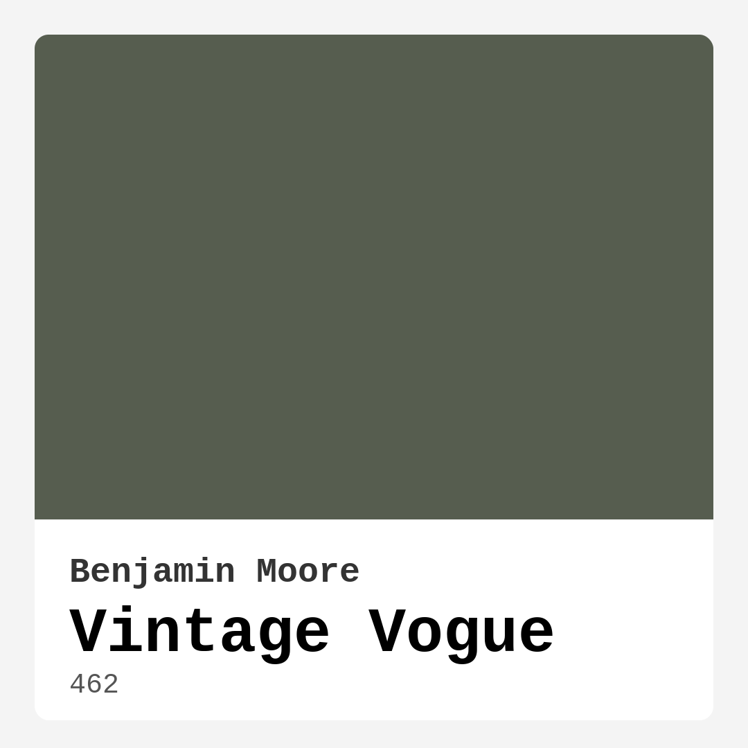
Color Preview & Key Details
| HEX Code | #565D4F |
| RGB | 86, 93, 79 |
| LRV | 11.85% |
| Undertone | Green |
| Finish Options | Eggshell, Matte, Satin |
If you’re searching for a paint color that effortlessly blends sophistication with a touch of nostalgia, Benjamin Moore’s Vintage Vogue (462) might just be your perfect match. This muted green-gray is a chameleon of sorts—subtle enough to serve as a neutral backdrop yet rich enough to infuse your space with character. Whether you’re revamping a living room, bedroom, or home office, this shade has a way of making any room feel both serene and stylish. Let’s dive into what makes Vintage Vogue so special and how you can make it work in your home.
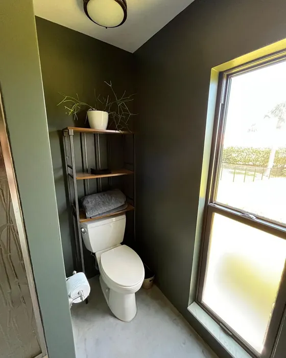
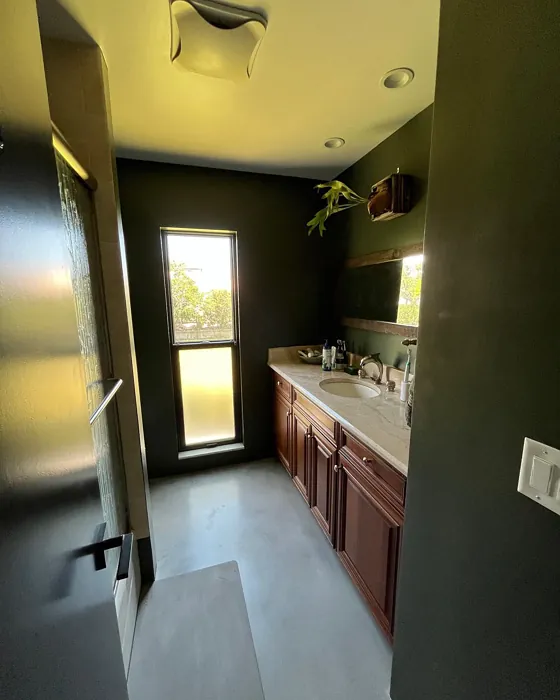
First, let’s talk about the color itself. Vintage Vogue sits in that sweet spot between green and gray, with just enough warmth to keep it from feeling sterile. Its LRV (Light Reflectance Value) of 11.85% means it’s on the darker side, absorbing more light than it reflects. This gives it a cozy, intimate vibe—ideal for spaces where you want to unwind. But don’t let that scare you off if your room lacks natural light. With the right lighting choices (think warm bulbs or strategically placed lamps), this color can still feel inviting rather than oppressive.
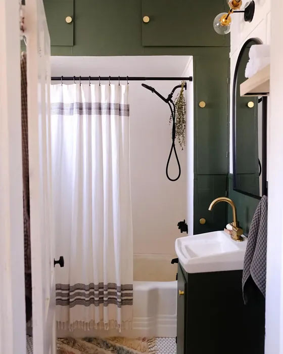
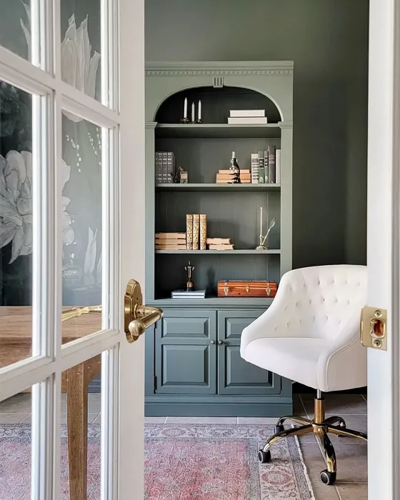
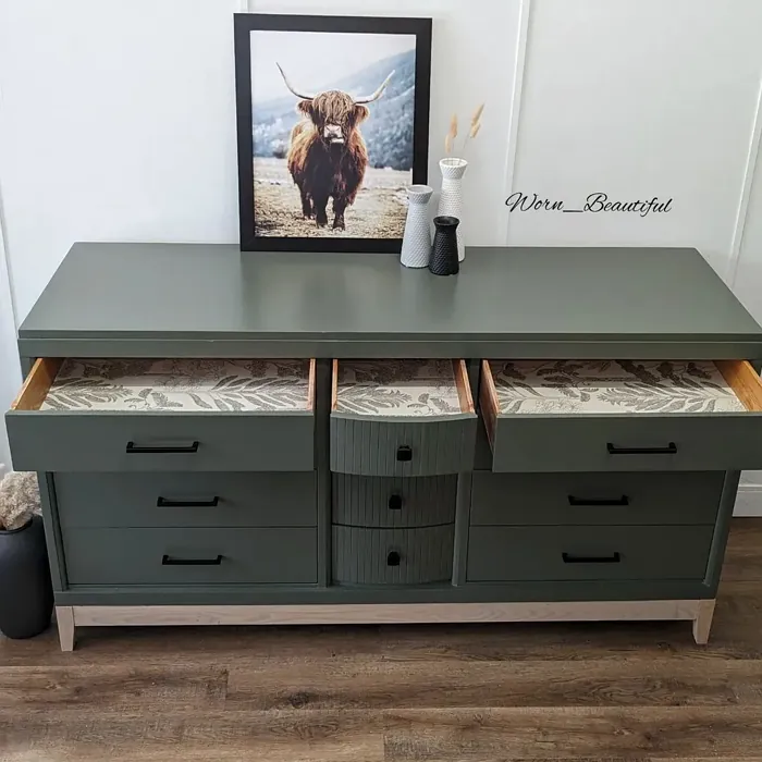
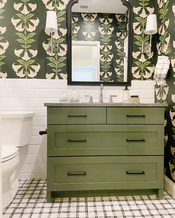
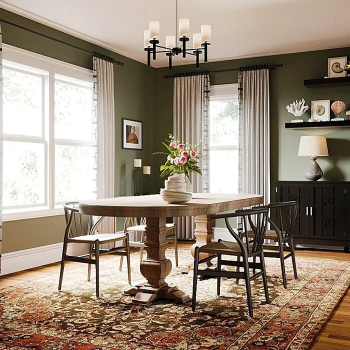
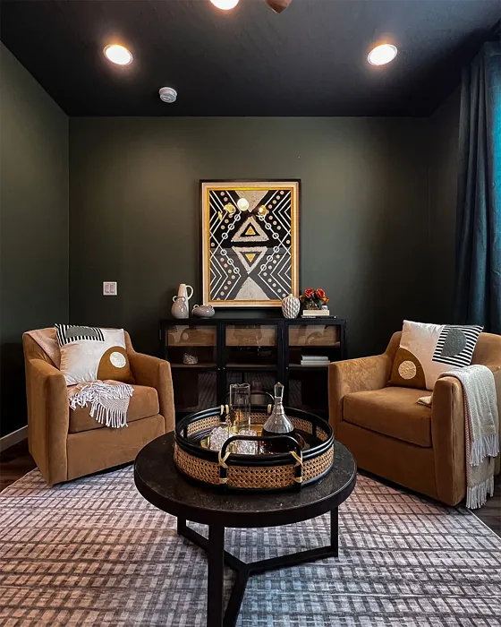
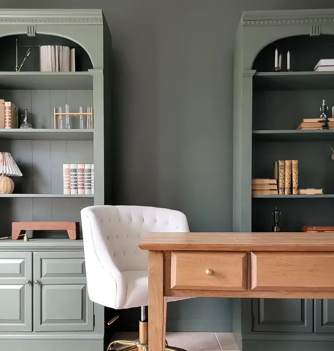
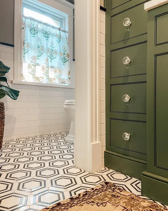
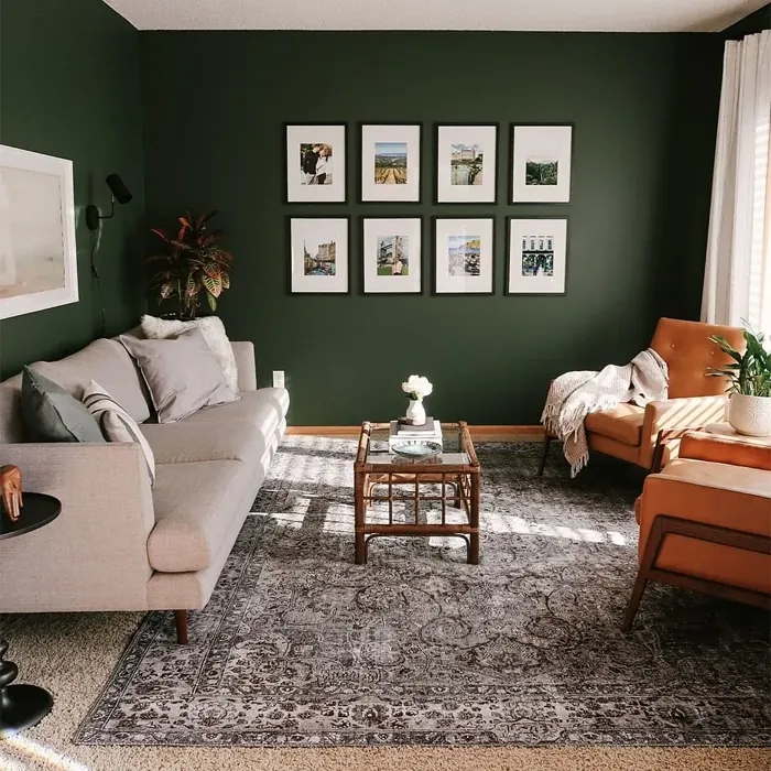
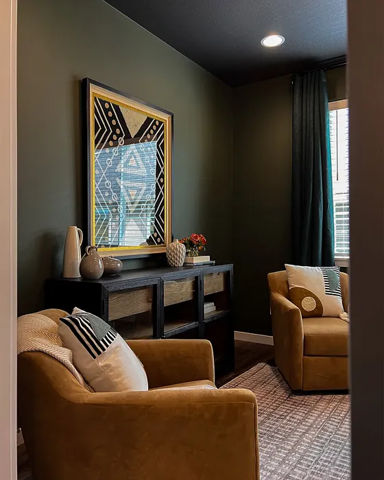
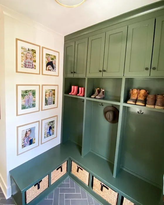
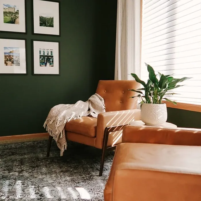
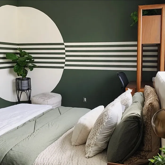
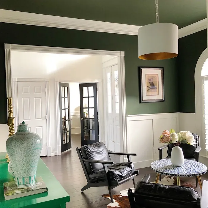
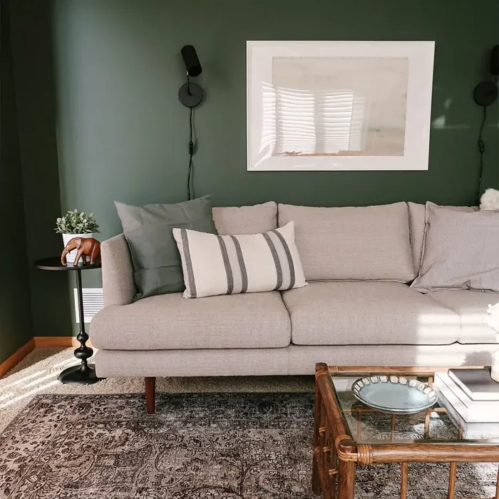
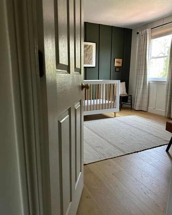
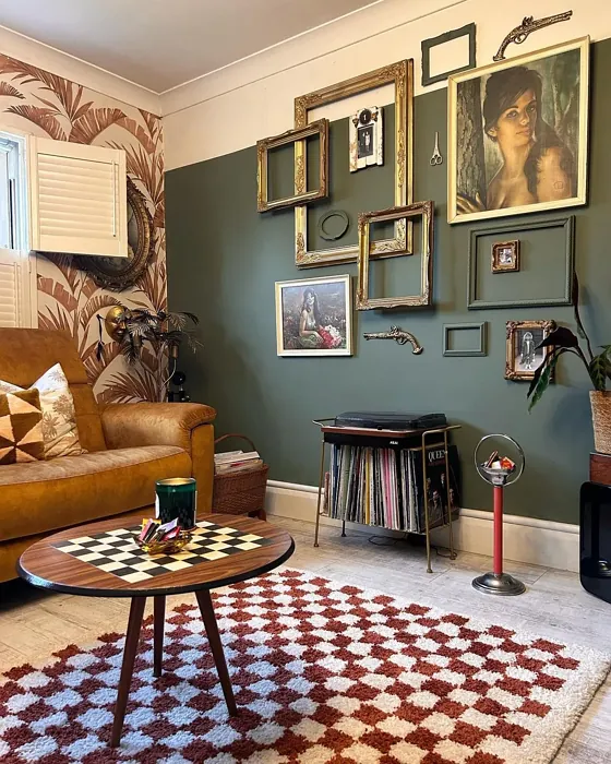
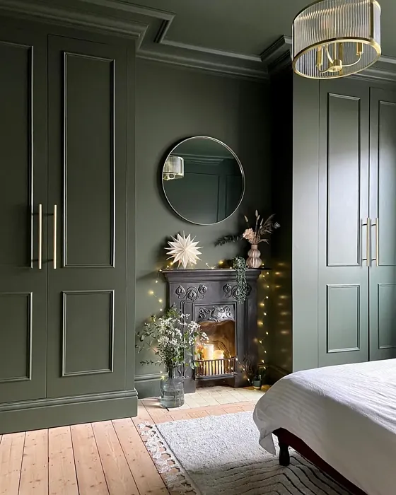
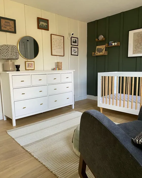
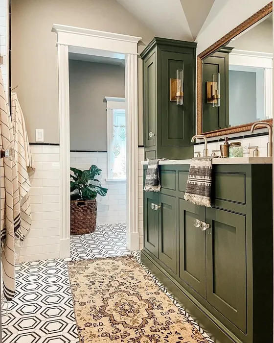
One of the standout qualities of Vintage Vogue is its versatility. It plays well with a range of decor styles, from modern farmhouse to bohemian, industrial, or even Scandinavian. Pair it with crisp white trim like Benjamin Moore’s White Dove for a clean, polished look, or let it mingle with natural wood finishes for an earthy, organic feel. Brass fixtures? Absolutely. They add a touch of warmth and elegance that complements the color’s muted sophistication. And if you’re feeling bold, try it on an accent wall—it’s deep enough to make a statement without overwhelming the space.
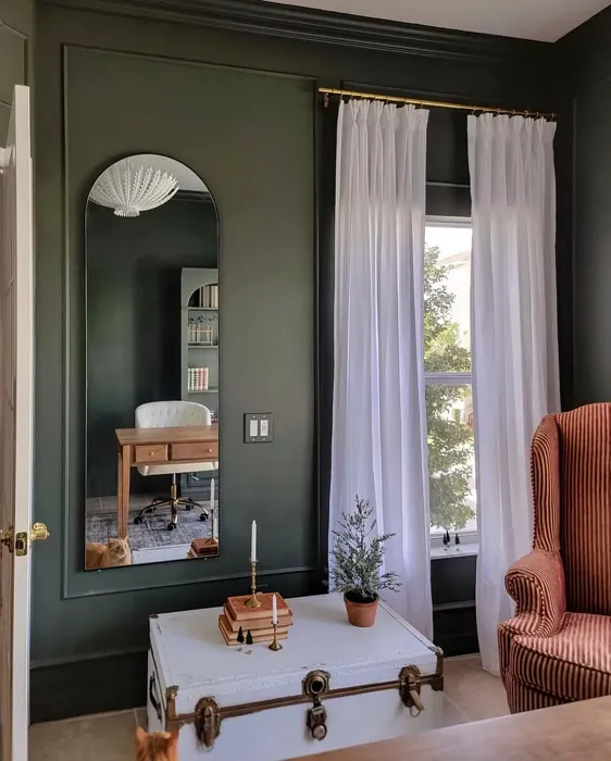
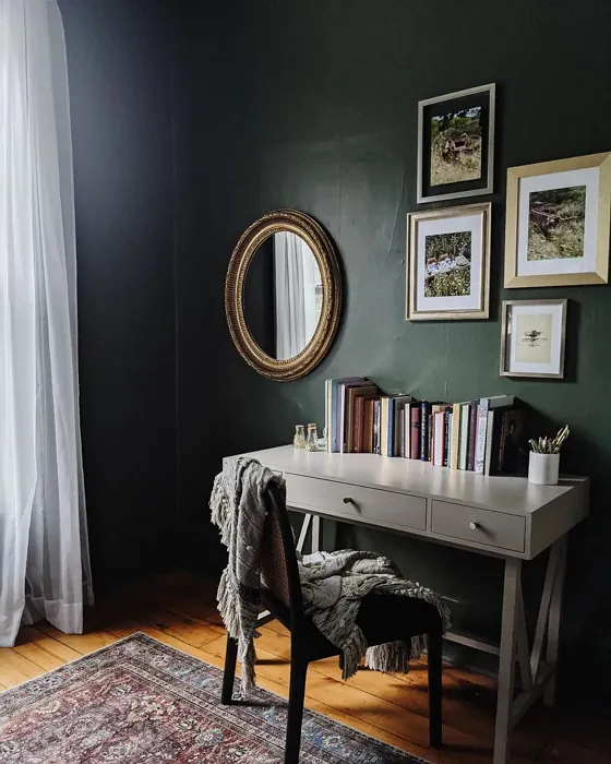
Application is a breeze, which is always a win. Vintage Vogue offers good coverage, often needing just one or two coats, and it’s beginner-friendly whether you’re rolling or brushing it on. The finish options—matte, eggshell, or satin—give you flexibility depending on the room’s function. Eggshell is a great all-around choice for living areas, offering a slight sheen that’s easy to clean, while matte works beautifully in low-traffic spaces like bedrooms where you want a softer look.
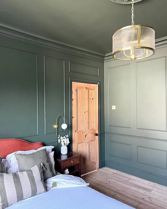
Now, let’s address the elephant in the room: undertones. Vintage Vogue leans slightly cool with its green undertones, but it’s balanced enough to avoid feeling icy. This makes it a fantastic choice for rooms with ample natural light, where it can take on an almost ethereal quality. In darker spaces, it might read more muted and moody, which can be incredibly cozy—think of it like wrapping your walls in a cashmere throw. Just be sure to test it in your space before committing. Paint a large swatch and observe it at different times of day to see how it shifts with the light.
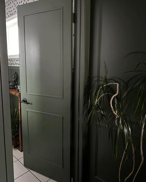
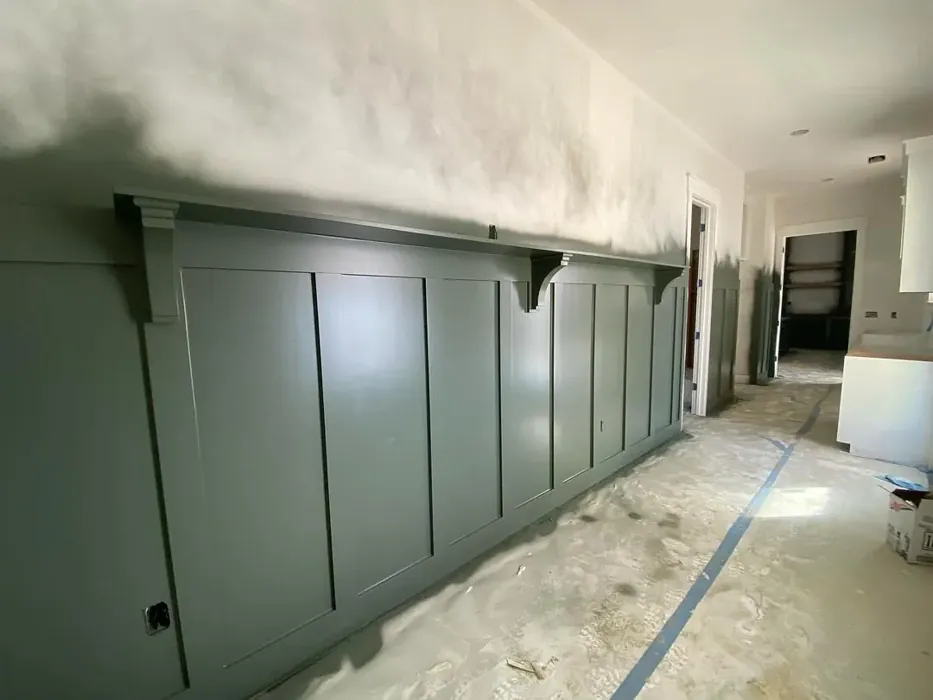
If you’re worried about small spaces, don’t be. Vintage Vogue can work wonders in tighter areas, especially if you balance it with lighter furnishings and plenty of lighting. The key is to keep the room feeling open and airy—avoid overcrowding with dark furniture, and let the color do its thing. Hallways, often overlooked, can also benefit from this shade. It adds depth and interest to what’s usually just a pass-through space.
As for pairings, the complementary shades are where the magic happens. Soft purples (think lavender or lilac) can bring out the color’s subtle complexity, while creamy whites keep it fresh. If you’re after a monochromatic scheme, explore its lighter siblings like Benjamin Moore’s CW-500 or darker cousins like CSP-810 for a layered, dimensional effect. And if you love the vibe but want something a tad different, Sherwin-Williams’ Sea Salt or Behr’s Silver Sage are close cousins worth considering.
Washability is another plus. Vintage Vogue is highly washable, making it a practical choice for busy households. Whether it’s a dining room prone to splatters or a hallway that sees a lot of traffic, this paint can handle it. Plus, its low VOC content means you won’t be dealing with harsh fumes during or after application—a win for your health and the environment.
So, who is Vintage Vogue for? If you’re drawn to colors that feel timeless yet current, if you crave a space that’s calming but not boring, and if you want a hue that adapts to your lifestyle rather than dictating it, this might be your dream color. It’s elegant without being stuffy, versatile without being bland, and rich without being overpowering. Whether you’re painting a single wall or an entire room, Vintage Vogue has a way of making spaces feel intentional and lived-in—like they’ve been curated, not just decorated.
At the end of the day, the best paint color is one that makes you happy every time you walk into the room. Vintage Vogue has that rare ability to feel both familiar and fresh, like a well-loved book you keep coming back to. So grab a sample, brush it on, and see how it speaks to you. You might just find it’s the missing piece your home has been waiting for.
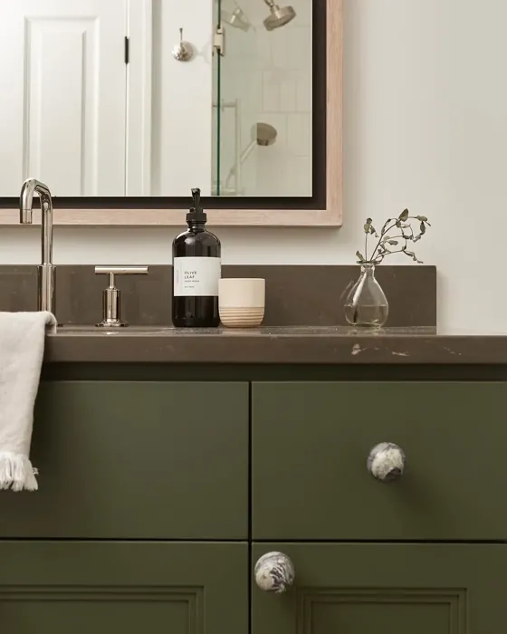
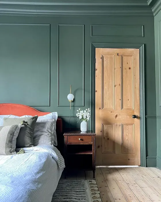
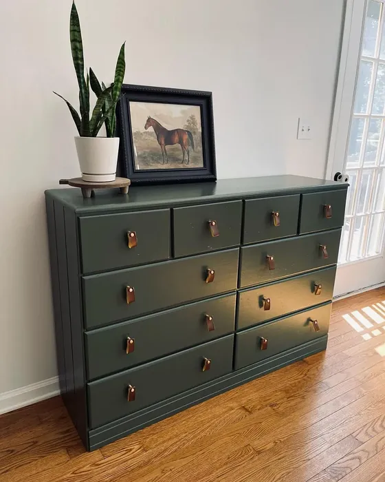
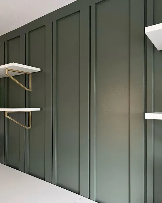
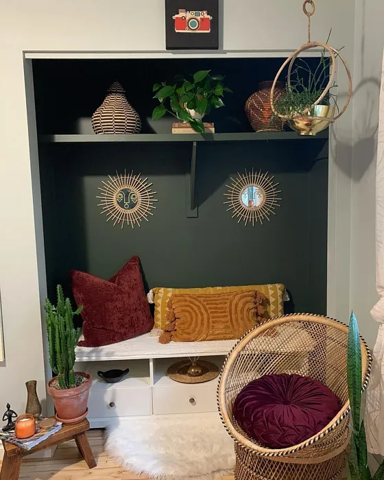
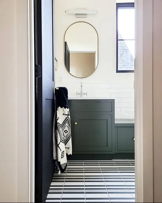
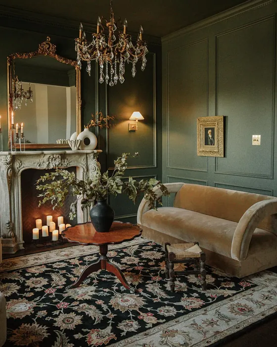
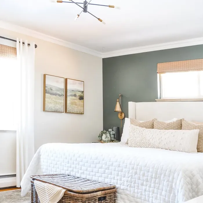
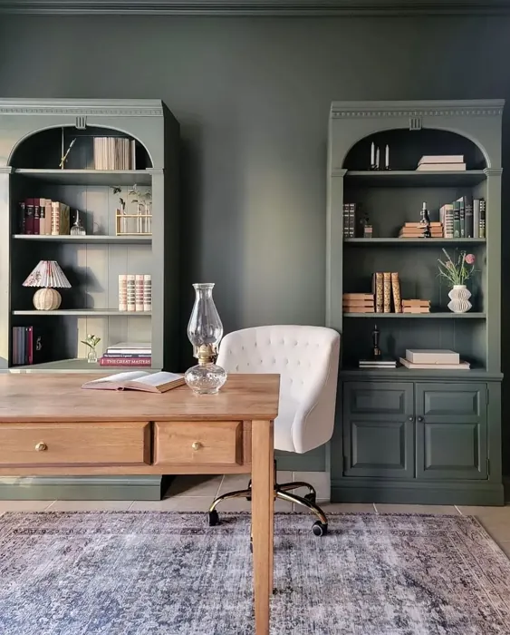
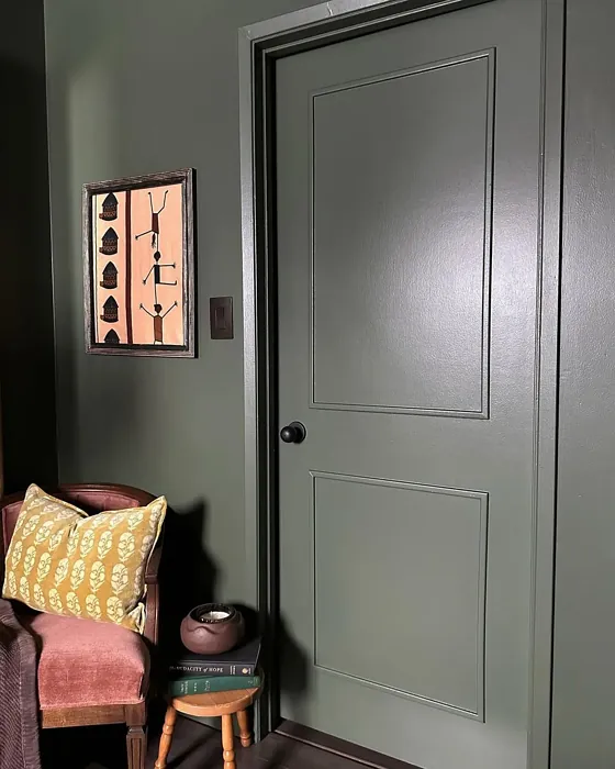
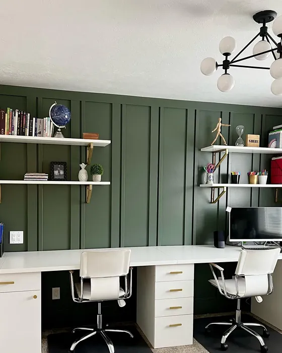
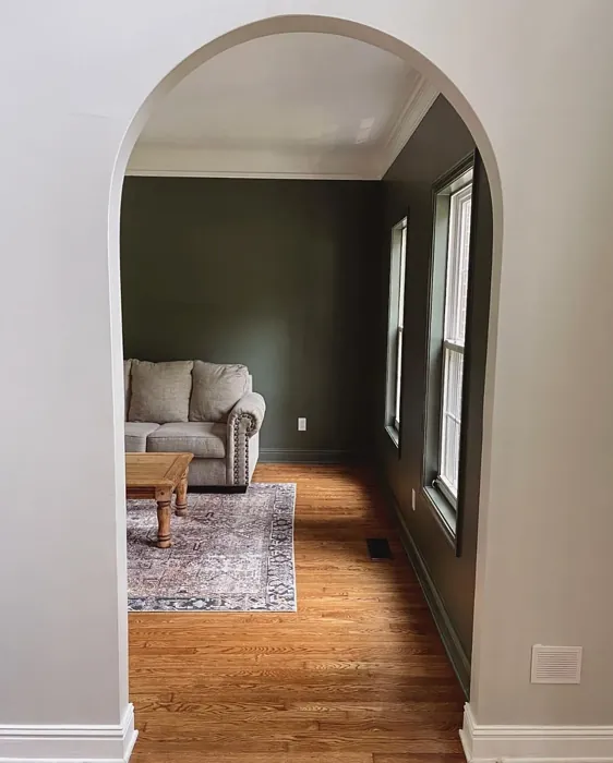
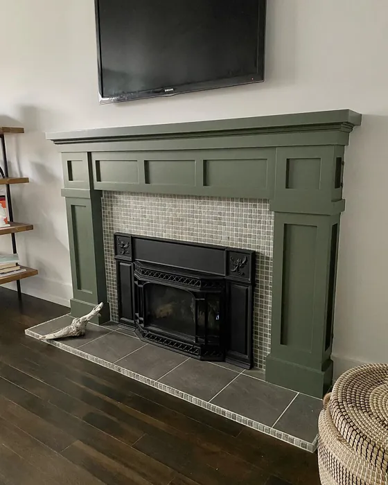
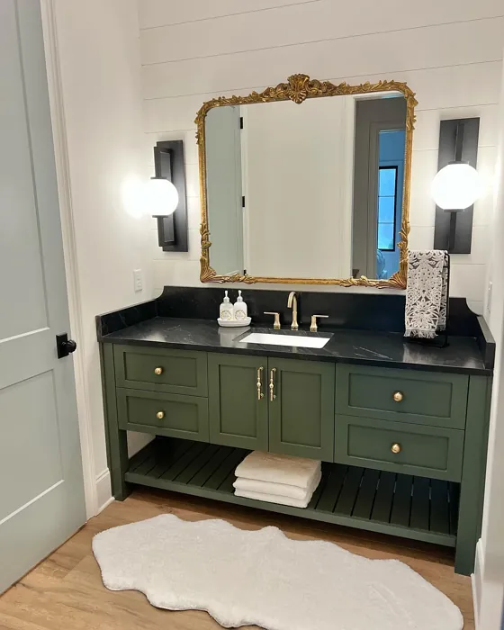
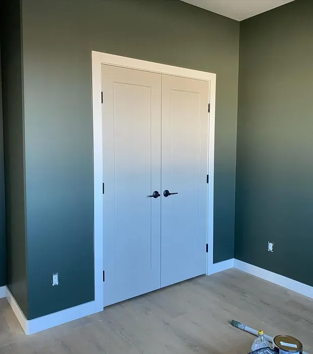
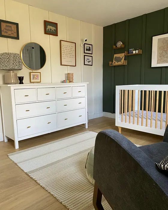
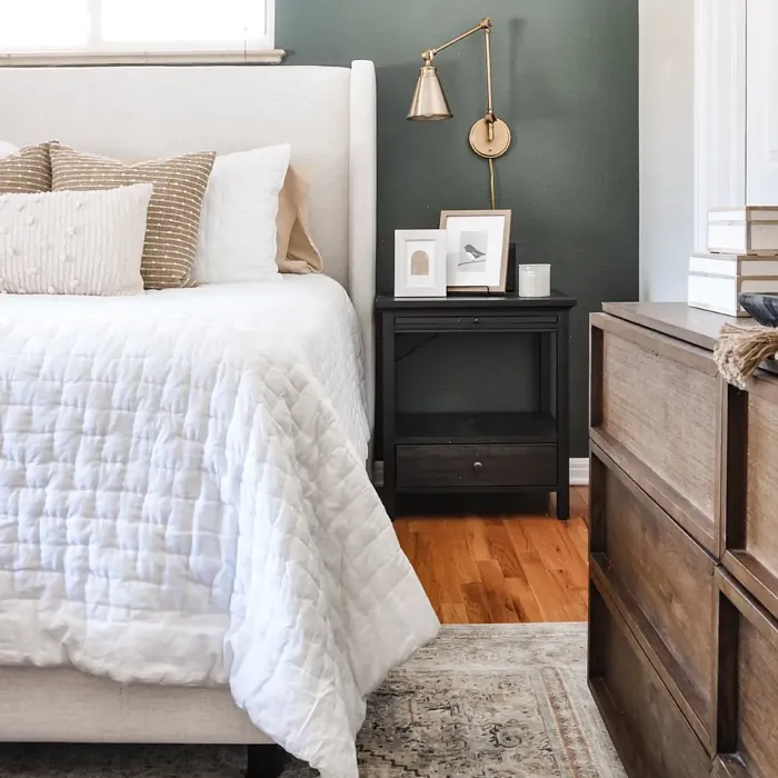
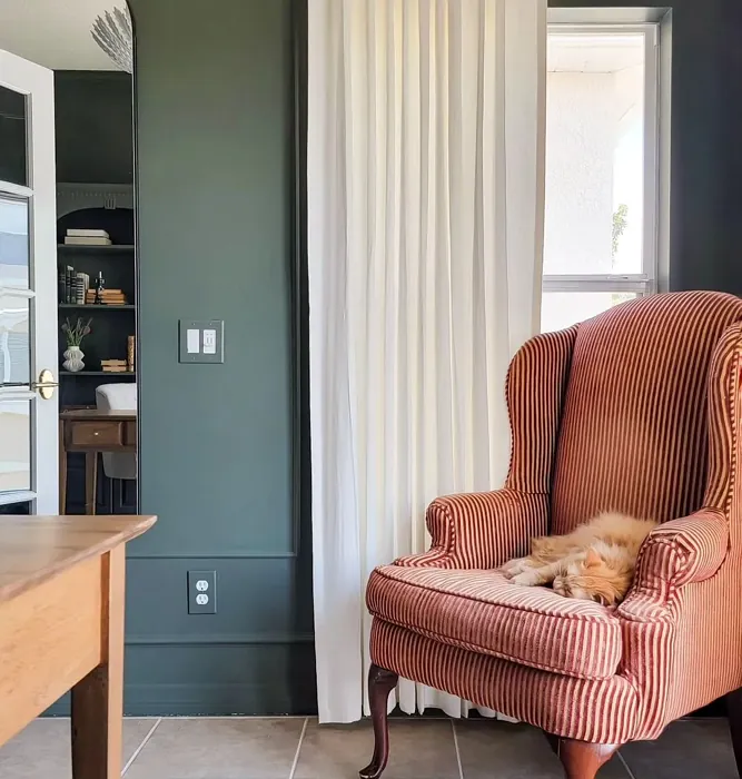
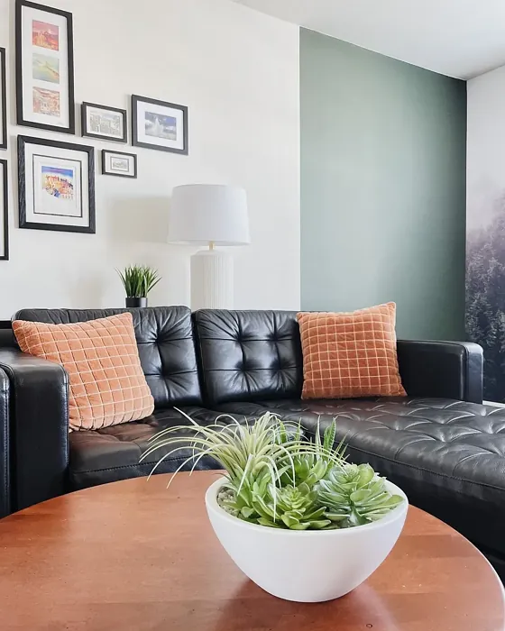
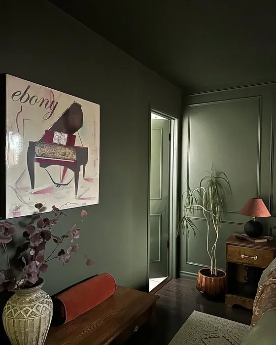
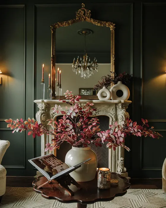
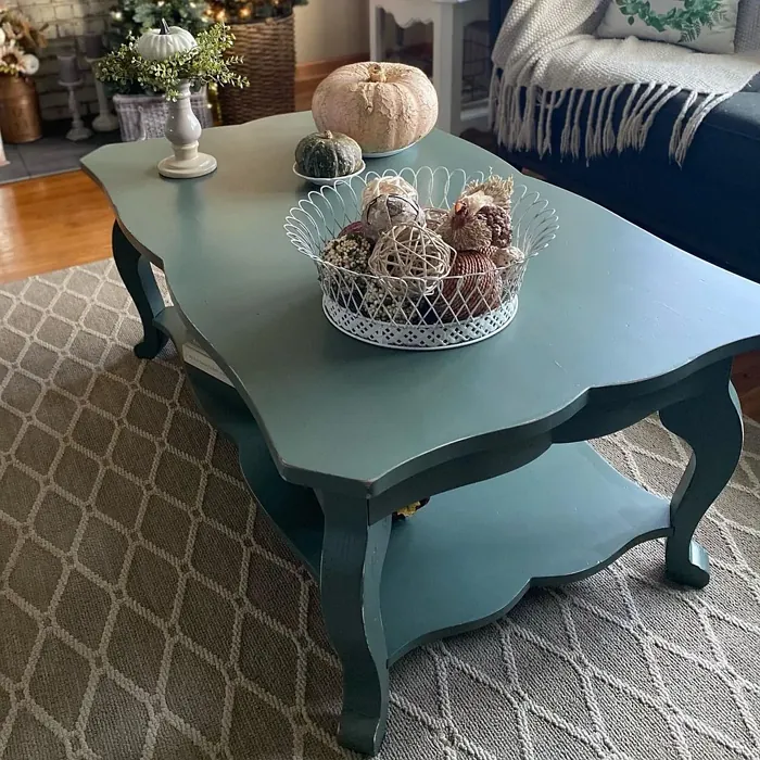
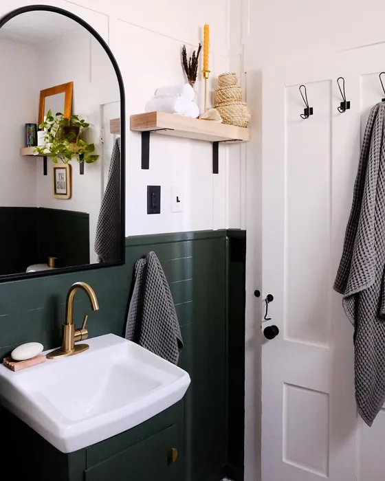
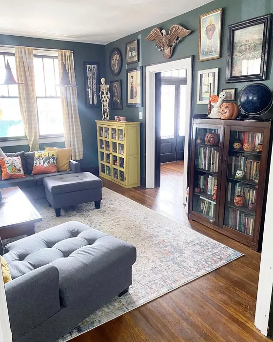
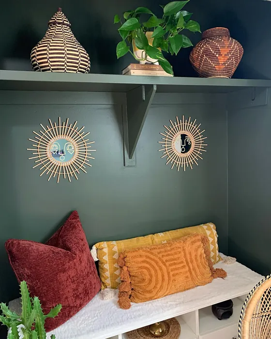
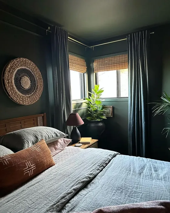
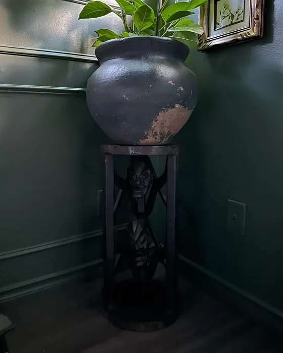
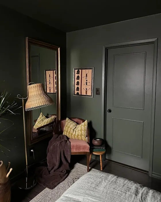
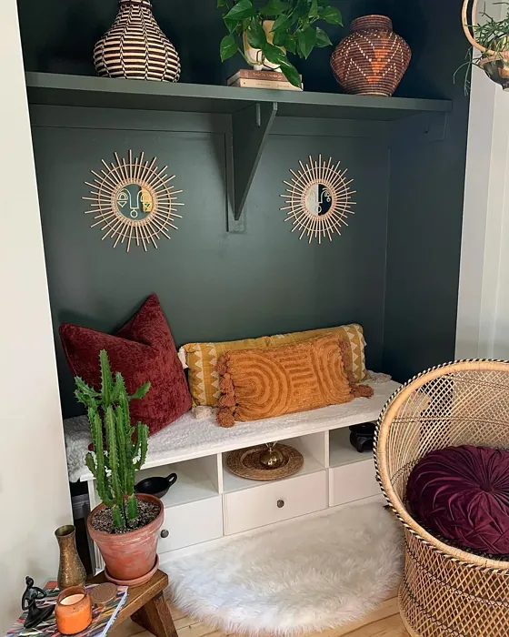
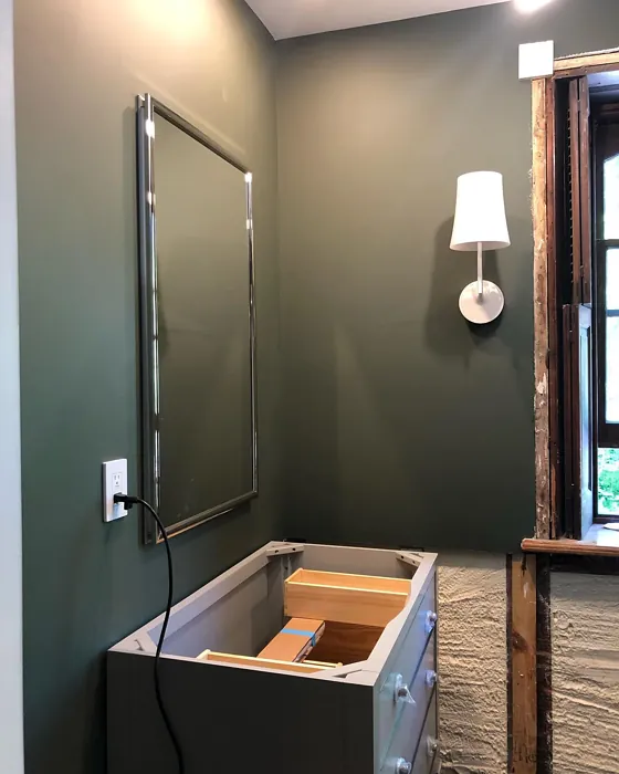
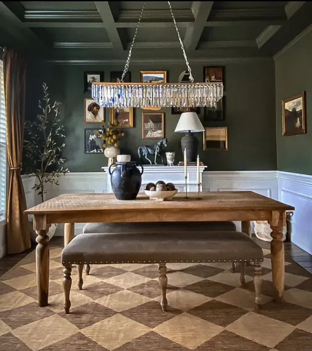
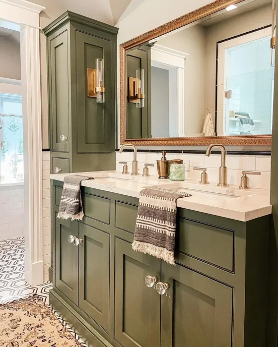
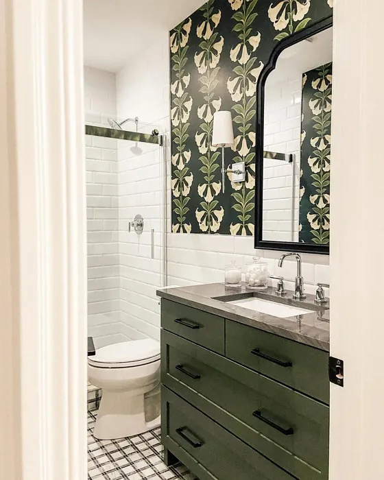
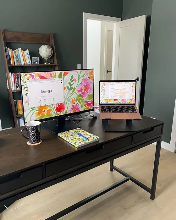
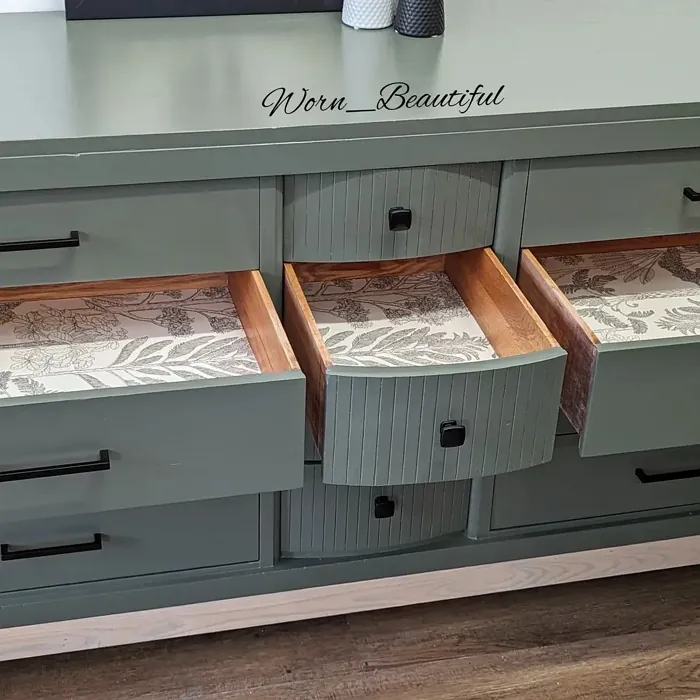
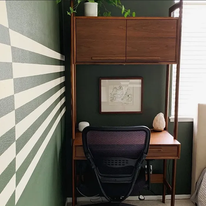
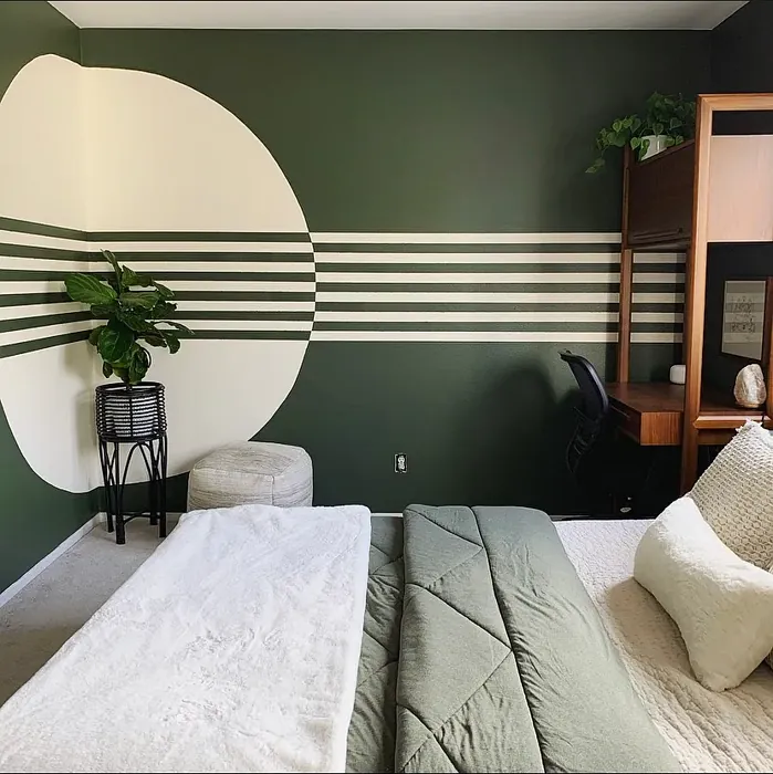
Real Room Photo of Vintage Vogue 462


Undertones of Vintage Vogue ?
The undertones of Vintage Vogue are a key aspect of its character, leaning towards Green. These subtle underlying hues are what give the color its depth and complexity. For example, a gray with a blue undertone will feel cooler and more modern, while one with a brown undertone will feel warmer and more traditional. It’s essential to test this paint in your home and observe it next to your existing furniture, flooring, and decor to see how these undertones interact and reveal themselves throughout the day.
HEX value: #565D4F
RGB code: 86, 93, 79
Is Vintage Vogue Cool or Warm?
This color leans slightly cool due to its blue undertone, making it an excellent choice for enhancing natural light and creating an airy feel.
Understanding Color Properties and Interior Design Tips
Hue refers to a specific position on the color wheel, measured in degrees from 0 to 360. Each degree represents a different pure color:
- 0° represents red
- 120° represents green
- 240° represents blue
Saturation describes the intensity or purity of a color and is expressed as a percentage:
- At 0%, the color appears completely desaturated—essentially a shade of gray
- At 100%, the color is at its most vivid and vibrant
Lightness indicates how light or dark a color is, also expressed as a percentage:
- 0% lightness results in black
- 100% lightness results in white
Using Warm Colors in Interior Design
Warm hues—such as reds, oranges, yellows, warm beiges, and greiges—are excellent choices for creating inviting and energetic spaces. These colors are particularly well-suited for:
- Kitchens, living rooms, and bathrooms, where warmth enhances comfort and sociability
- Large rooms, where warm tones can help reduce the sense of emptiness and make the space feel more intimate
For example:
- Warm beige shades provide a cozy, inviting atmosphere, ideal for living rooms, bedrooms, and hallways.
- Warm greige (a mix of beige and gray) offers the warmth of beige with the modern appeal of gray, making it a versatile backdrop for dining areas, bedrooms, and living spaces.
However, be mindful when using warm light tones in rooms with limited natural light. These shades may appear muted or even take on an unpleasant yellowish tint. To avoid a dull or flat appearance:
- Add depth by incorporating richer tones like deep greens, charcoal, or chocolate brown
- Use textured elements such as curtains, rugs, or cushions to bring dimension to the space
Pro Tip: Achieving Harmony with Warm and Cool Color Balance
To create a well-balanced and visually interesting interior, mix warm and cool tones strategically. This contrast adds depth and harmony to your design.
- If your walls feature warm hues, introduce cool-colored accents such as blue or green furniture, artwork, or accessories to create contrast.
- For a polished look, consider using a complementary color scheme, which pairs colors opposite each other on the color wheel (e.g., red with green, orange with blue).
This thoughtful mix not only enhances visual appeal but also creates a space that feels both dynamic and cohesive.
Light Temperature Affects on Vintage Vogue
Natural Light
Natural daylight changes in color temperature as the sun moves across the sky. At sunrise and sunset, the light tends to have a warm, golden tone with a color temperature around 2000 Kelvin (K). As the day progresses and the sun rises higher, the light becomes cooler and more neutral. Around midday, especially when the sky is clear, natural light typically reaches its peak brightness and shifts to a cooler tone, ranging from 5500 to 6500 Kelvin. This midday light is close to what we perceive as pure white or daylight-balanced light.
These shifts in natural light can significantly influence how colors appear in a space, which is why designers often consider both the time of day and the orientation of windows when planning interior color schemes.
Artificial Light
When choosing artificial lighting, pay close attention to the color temperature, measured in Kelvin (K). This determines how warm or cool the light will appear. Lower temperatures, around 2700K, give off a warm, yellow glow often used in living rooms or bedrooms. Higher temperatures, above 5000K, create a cool, bluish light similar to daylight, commonly used in kitchens, offices, or task areas.
Use the slider to see how lighting temperature can affect the appearance of a surface or color throughout a space.


4800K
LRV of Vintage Vogue
The Light Reflectance Value (LRV) of Vintage Vogue is 11.85%, which places it in the Medium Dark category. This means it reflects very little light. Understanding a paint’s LRV is crucial for predicting how it will look in your space. A higher LRV indicates a lighter color that reflects more light, making rooms feel larger and brighter. A lower LRV signifies a darker color that absorbs more light, creating a cozier, more intimate atmosphere. Always consider the natural and artificial lighting in your room when selecting a paint color based on its LRV.
Detailed Review of Vintage Vogue
Additional Paint Characteristics
Ideal Rooms
Bedroom, Dining Room, Hallway, Home Office, Living Room
Decor Styles
Bohemian, Industrial, Modern Farmhouse, Scandinavian, Vintage
Coverage
Good (1–2 Coats)
Ease of Application
Beginner Friendly, Brush Smooth, Roller-Ready
Washability
Highly Washable, Washable
VOC Level
Low VOC
Best Use
Accent Wall, Interior Walls
Room Suitability
Bedroom, Dining Room, Home Office, Living Room
Tone Tag
Balanced, Earthy, Muted
Finish Type
Eggshell, Matte
Paint Performance
Easy Touch-Up, High Coverage, Low Odor
Use Cases
Best for Low Light Rooms, Best for Modern Farmhouse, Designer Favorite
Mood
Calm, Cozy, Inviting
Trim Pairing
Complements Brass Fixtures, Good with Wood Trim, Pairs with White Dove
Vintage Vogue is truly a versatile color that can transform any room into a stylish sanctuary. Its muted green-gray tone complements a variety of decor styles, from modern farmhouse to vintage chic. The soft, understated hue works well as a neutral backdrop, allowing your furniture and decor to shine without overwhelming the space. When applied, it has a lovely depth that brings warmth and character to walls. Whether you’re looking to create a cozy reading nook or an elegant dining area, this paint will deliver a sophisticated touch that feels both timeless and fresh. Just be sure to test it in different lighting conditions to see how it changes throughout the day.
Pros & Cons of 462 Vintage Vogue
Pros
Cons
Colors that go with Benjamin Moore Vintage Vogue
FAQ on 462 Vintage Vogue
Can Vintage Vogue be used in small spaces?
Absolutely! Vintage Vogue can work beautifully in small spaces, especially if you utilize good lighting. While it is a mid-tone color, its subtle undertones can keep the space feeling open and inviting. Just be mindful of the lighting to ensure it doesn’t overwhelm the room.
How does Vintage Vogue pair with trim colors?
Vintage Vogue pairs exceptionally well with a variety of trim colors. It looks fantastic with white trims like White Dove or Simply White, providing a crisp contrast. If you’re leaning towards a warmer aesthetic, wood trims can add an earthy touch that enhances its vintage vibe.
Comparisons Vintage Vogue with other colors
Vintage Vogue 462 vs Dried Thyme SW 6186
| Attribute | Vintage Vogue 462 | Dried Thyme SW 6186 |
|---|---|---|
| Color Name | Vintage Vogue 462 | Dried Thyme SW 6186 |
| Color | ||
| Hue | Green | Green |
| Brightness | Dark | Dark |
| RGB | 86, 93, 79 | 123, 128, 112 |
| LRV | 11.85% | 24% |
| Finish Type | Eggshell, Matte | Eggshell, Satin |
| Finish Options | Eggshell, Matte, Satin | Eggshell, Matte, Satin |
| Ideal Rooms | Bedroom, Dining Room, Hallway, Home Office, Living Room | Bathroom, Bedroom, Dining Room, Entryway, Home Office, Kitchen, Living Room |
| Decor Styles | Bohemian, Industrial, Modern Farmhouse, Scandinavian, Vintage | Bohemian, Industrial, Minimalist, Modern Farmhouse, Rustic |
| Coverage | Good (1–2 Coats) | Good (1–2 Coats), Touch-Up Friendly |
| Ease of Application | Beginner Friendly, Brush Smooth, Roller-Ready | Beginner Friendly, Brush Smooth, Roller-Ready |
| Washability | Highly Washable, Washable | Washable, Wipeable |
| Room Suitability | Bedroom, Dining Room, Home Office, Living Room | Bathroom, Bedroom, Dining Room, Home Office, Kitchen, Living Room |
| Tone | Balanced, Earthy, Muted | Cool, Earthy, Muted |
| Paint Performance | Easy Touch-Up, High Coverage, Low Odor | Easy Touch-Up, Low Odor, Scuff Resistant |
Vintage Vogue 462 vs Retreat SW 6207
| Attribute | Vintage Vogue 462 | Retreat SW 6207 |
|---|---|---|
| Color Name | Vintage Vogue 462 | Retreat SW 6207 |
| Color | ||
| Hue | Green | Green |
| Brightness | Dark | Dark |
| RGB | 86, 93, 79 | 122, 128, 118 |
| LRV | 11.85% | 30% |
| Finish Type | Eggshell, Matte | Eggshell, Matte, Satin |
| Finish Options | Eggshell, Matte, Satin | Eggshell, Matte, Satin |
| Ideal Rooms | Bedroom, Dining Room, Hallway, Home Office, Living Room | Bathroom, Bedroom, Home Office, Kitchen, Living Room |
| Decor Styles | Bohemian, Industrial, Modern Farmhouse, Scandinavian, Vintage | Minimalist, Modern, Rustic, Transitional |
| Coverage | Good (1–2 Coats) | Good (1–2 Coats), Touch-Up Friendly |
| Ease of Application | Beginner Friendly, Brush Smooth, Roller-Ready | Beginner Friendly, Brush Smooth, Roller-Ready |
| Washability | Highly Washable, Washable | Washable, Wipeable |
| Room Suitability | Bedroom, Dining Room, Home Office, Living Room | Bathroom, Bedroom, Home Office, Living Room |
| Tone | Balanced, Earthy, Muted | Cool, Earthy, Muted |
| Paint Performance | Easy Touch-Up, High Coverage, Low Odor | Easy Touch-Up, Low Odor, Scuff Resistant |
Vintage Vogue 462 vs Rosemary SW 6187
| Attribute | Vintage Vogue 462 | Rosemary SW 6187 |
|---|---|---|
| Color Name | Vintage Vogue 462 | Rosemary SW 6187 |
| Color | ||
| Hue | Green | Green |
| Brightness | Dark | Dark |
| RGB | 86, 93, 79 | 100, 105, 92 |
| LRV | 11.85% | 45% |
| Finish Type | Eggshell, Matte | Eggshell, Matte, Satin |
| Finish Options | Eggshell, Matte, Satin | Eggshell, Matte, Satin |
| Ideal Rooms | Bedroom, Dining Room, Hallway, Home Office, Living Room | Bedroom, Dining Room, Hallway, Home Office, Living Room |
| Decor Styles | Bohemian, Industrial, Modern Farmhouse, Scandinavian, Vintage | Bohemian, Coastal, Modern Farmhouse, Rustic |
| Coverage | Good (1–2 Coats) | Good (1–2 Coats), Touch-Up Friendly |
| Ease of Application | Beginner Friendly, Brush Smooth, Roller-Ready | Beginner Friendly, Brush Smooth, Roller-Ready |
| Washability | Highly Washable, Washable | Washable, Wipeable |
| Room Suitability | Bedroom, Dining Room, Home Office, Living Room | Bedroom, Dining Room, Home Office, Living Room |
| Tone | Balanced, Earthy, Muted | Earthy, Muted, Warm |
| Paint Performance | Easy Touch-Up, High Coverage, Low Odor | Fade Resistant, Low Odor, Quick Drying, Stain Resistant |
Vintage Vogue 462 vs Basil SW 6194
| Attribute | Vintage Vogue 462 | Basil SW 6194 |
|---|---|---|
| Color Name | Vintage Vogue 462 | Basil SW 6194 |
| Color | ||
| Hue | Green | Green |
| Brightness | Dark | Dark |
| RGB | 86, 93, 79 | 98, 110, 96 |
| LRV | 11.85% | 12% |
| Finish Type | Eggshell, Matte | Eggshell, Matte, Satin |
| Finish Options | Eggshell, Matte, Satin | Eggshell, Matte, Satin |
| Ideal Rooms | Bedroom, Dining Room, Hallway, Home Office, Living Room | Bathroom, Bedroom, Dining Room, Home Office, Kitchen, Living Room |
| Decor Styles | Bohemian, Industrial, Modern Farmhouse, Scandinavian, Vintage | Bohemian, Contemporary, Modern Farmhouse, Rustic, Transitional |
| Coverage | Good (1–2 Coats) | Good (1–2 Coats), Touch-Up Friendly |
| Ease of Application | Beginner Friendly, Brush Smooth, Roller-Ready | Beginner Friendly, Brush Smooth, Fast-Drying, Roller-Ready |
| Washability | Highly Washable, Washable | Washable, Wipeable |
| Room Suitability | Bedroom, Dining Room, Home Office, Living Room | Bathroom, Bedroom, Dining Room, Kitchen, Living Room |
| Tone | Balanced, Earthy, Muted | Earthy, Muted, Warm |
| Paint Performance | Easy Touch-Up, High Coverage, Low Odor | Easy Touch-Up, Low Odor, Quick Drying |
Vintage Vogue 462 vs Artichoke SW 6179
| Attribute | Vintage Vogue 462 | Artichoke SW 6179 |
|---|---|---|
| Color Name | Vintage Vogue 462 | Artichoke SW 6179 |
| Color | ||
| Hue | Green | Green |
| Brightness | Dark | Dark |
| RGB | 86, 93, 79 | 127, 130, 102 |
| LRV | 11.85% | 24% |
| Finish Type | Eggshell, Matte | Eggshell, Matte, Satin |
| Finish Options | Eggshell, Matte, Satin | Eggshell, Matte, Satin |
| Ideal Rooms | Bedroom, Dining Room, Hallway, Home Office, Living Room | Bedroom, Dining Room, Home Office, Living Room |
| Decor Styles | Bohemian, Industrial, Modern Farmhouse, Scandinavian, Vintage | Eclectic, Modern Farmhouse, Rustic, Transitional |
| Coverage | Good (1–2 Coats) | Good (1–2 Coats), Touch-Up Friendly |
| Ease of Application | Beginner Friendly, Brush Smooth, Roller-Ready | Beginner Friendly, Brush Smooth, Fast-Drying, Roller-Ready |
| Washability | Highly Washable, Washable | Washable, Wipeable |
| Room Suitability | Bedroom, Dining Room, Home Office, Living Room | Bedroom, Dining Room, Home Office, Living Room |
| Tone | Balanced, Earthy, Muted | Earthy, Muted, Warm |
| Paint Performance | Easy Touch-Up, High Coverage, Low Odor | Easy Touch-Up, High Coverage, Low Odor |
Vintage Vogue 462 vs Shade-Grown SW 6188
| Attribute | Vintage Vogue 462 | Shade-Grown SW 6188 |
|---|---|---|
| Color Name | Vintage Vogue 462 | Shade-Grown SW 6188 |
| Color | ||
| Hue | Green | Green |
| Brightness | Dark | Dark |
| RGB | 86, 93, 79 | 78, 81, 71 |
| LRV | 11.85% | 24% |
| Finish Type | Eggshell, Matte | Eggshell, Satin |
| Finish Options | Eggshell, Matte, Satin | Eggshell, Flat, Satin |
| Ideal Rooms | Bedroom, Dining Room, Hallway, Home Office, Living Room | Bedroom, Dining Room, Home Office, Living Room |
| Decor Styles | Bohemian, Industrial, Modern Farmhouse, Scandinavian, Vintage | Bohemian, Modern, Rustic, Scandinavian |
| Coverage | Good (1–2 Coats) | Good (1–2 Coats), Touch-Up Friendly |
| Ease of Application | Beginner Friendly, Brush Smooth, Roller-Ready | Beginner Friendly, Brush Smooth, Fast-Drying, Roller-Ready |
| Washability | Highly Washable, Washable | Highly Washable, Washable |
| Room Suitability | Bedroom, Dining Room, Home Office, Living Room | Bedroom, Dining Room, Home Office, Living Room |
| Tone | Balanced, Earthy, Muted | Deep, Earthy, Muted |
| Paint Performance | Easy Touch-Up, High Coverage, Low Odor | Easy Touch-Up, High Coverage, Low Odor, Scuff Resistant |
Vintage Vogue 462 vs Foxhall Green SW 9184
| Attribute | Vintage Vogue 462 | Foxhall Green SW 9184 |
|---|---|---|
| Color Name | Vintage Vogue 462 | Foxhall Green SW 9184 |
| Color | ||
| Hue | Green | Green |
| Brightness | Dark | Dark |
| RGB | 86, 93, 79 | 69, 75, 64 |
| LRV | 11.85% | 12% |
| Finish Type | Eggshell, Matte | Eggshell, Matte, Satin |
| Finish Options | Eggshell, Matte, Satin | Eggshell, Matte, Satin |
| Ideal Rooms | Bedroom, Dining Room, Hallway, Home Office, Living Room | Bedroom, Dining Room, Home Office, Living Room |
| Decor Styles | Bohemian, Industrial, Modern Farmhouse, Scandinavian, Vintage | Contemporary, Modern Farmhouse, Rustic, Traditional |
| Coverage | Good (1–2 Coats) | Good (1–2 Coats), Touch-Up Friendly |
| Ease of Application | Beginner Friendly, Brush Smooth, Roller-Ready | Beginner Friendly, Brush Smooth, Fast-Drying, Roller-Ready |
| Washability | Highly Washable, Washable | Washable, Wipeable |
| Room Suitability | Bedroom, Dining Room, Home Office, Living Room | Bedroom, Dining Room, Home Office, Living Room |
| Tone | Balanced, Earthy, Muted | Balanced, Deep, Earthy, Muted |
| Paint Performance | Easy Touch-Up, High Coverage, Low Odor | Easy Touch-Up, Fade Resistant, Low Odor, Quick Drying |
Vintage Vogue 462 vs Pewter Green SW 6208
| Attribute | Vintage Vogue 462 | Pewter Green SW 6208 |
|---|---|---|
| Color Name | Vintage Vogue 462 | Pewter Green SW 6208 |
| Color | ||
| Hue | Green | Green |
| Brightness | Dark | Dark |
| RGB | 86, 93, 79 | 94, 98, 89 |
| LRV | 11.85% | 24% |
| Finish Type | Eggshell, Matte | Eggshell, Matte, Satin |
| Finish Options | Eggshell, Matte, Satin | Eggshell, Matte, Satin |
| Ideal Rooms | Bedroom, Dining Room, Hallway, Home Office, Living Room | Bedroom, Dining Room, Entryway, Home Office, Living Room |
| Decor Styles | Bohemian, Industrial, Modern Farmhouse, Scandinavian, Vintage | Contemporary, Modern Farmhouse, Rustic, Scandinavian, Traditional |
| Coverage | Good (1–2 Coats) | Good (1–2 Coats), Touch-Up Friendly |
| Ease of Application | Beginner Friendly, Brush Smooth, Roller-Ready | Beginner Friendly, Brush Smooth, Fast-Drying, Roller-Ready |
| Washability | Highly Washable, Washable | Highly Washable, Washable, Wipeable |
| Room Suitability | Bedroom, Dining Room, Home Office, Living Room | Bathroom, Bedroom, Dining Room, Kitchen, Living Room |
| Tone | Balanced, Earthy, Muted | Balanced, Cool, Earthy, Muted |
| Paint Performance | Easy Touch-Up, High Coverage, Low Odor | Easy Touch-Up, Fade Resistant, Low Odor, Quick Drying |
Vintage Vogue 462 vs Rookwood Dark Green SW 2816
| Attribute | Vintage Vogue 462 | Rookwood Dark Green SW 2816 |
|---|---|---|
| Color Name | Vintage Vogue 462 | Rookwood Dark Green SW 2816 |
| Color | ||
| Hue | Green | Green |
| Brightness | Dark | Dark |
| RGB | 86, 93, 79 | 86, 92, 74 |
| LRV | 11.85% | 6% |
| Finish Type | Eggshell, Matte | Eggshell, Matte, Satin |
| Finish Options | Eggshell, Matte, Satin | Eggshell, Matte, Satin |
| Ideal Rooms | Bedroom, Dining Room, Hallway, Home Office, Living Room | Bedroom, Dining Room, Home Office, Kitchen, Living Room |
| Decor Styles | Bohemian, Industrial, Modern Farmhouse, Scandinavian, Vintage | Contemporary, Modern Farmhouse, Rustic, Traditional |
| Coverage | Good (1–2 Coats) | Good (1–2 Coats), Touch-Up Friendly |
| Ease of Application | Beginner Friendly, Brush Smooth, Roller-Ready | Beginner Friendly, Brush Smooth, Roller-Ready |
| Washability | Highly Washable, Washable | Washable, Wipeable |
| Room Suitability | Bedroom, Dining Room, Home Office, Living Room | Bedroom, Dining Room, Home Office, Living Room |
| Tone | Balanced, Earthy, Muted | Deep, Earthy, Warm |
| Paint Performance | Easy Touch-Up, High Coverage, Low Odor | Easy Touch-Up, High Coverage, Low Odor, Scuff Resistant |
Vintage Vogue 462 vs Ripe Olive SW 6209
| Attribute | Vintage Vogue 462 | Ripe Olive SW 6209 |
|---|---|---|
| Color Name | Vintage Vogue 462 | Ripe Olive SW 6209 |
| Color | ||
| Hue | Green | Green |
| Brightness | Dark | Dark |
| RGB | 86, 93, 79 | 68, 72, 61 |
| LRV | 11.85% | 15% |
| Finish Type | Eggshell, Matte | Eggshell, Matte |
| Finish Options | Eggshell, Matte, Satin | Eggshell, Matte, Satin |
| Ideal Rooms | Bedroom, Dining Room, Hallway, Home Office, Living Room | Bedroom, Dining Room, Home Office, Living Room |
| Decor Styles | Bohemian, Industrial, Modern Farmhouse, Scandinavian, Vintage | Bohemian, Industrial, Modern Farmhouse, Rustic |
| Coverage | Good (1–2 Coats) | Good (1–2 Coats) |
| Ease of Application | Beginner Friendly, Brush Smooth, Roller-Ready | Beginner Friendly, Brush Smooth, Roller-Ready |
| Washability | Highly Washable, Washable | Highly Washable, Washable |
| Room Suitability | Bedroom, Dining Room, Home Office, Living Room | Bedroom, Dining Room, Home Office, Living Room |
| Tone | Balanced, Earthy, Muted | Deep, Earthy, Muted |
| Paint Performance | Easy Touch-Up, High Coverage, Low Odor | Easy Touch-Up, High Coverage, Low Odor |
Official Page of Benjamin Moore Vintage Vogue 462