Color Preview & Key Details
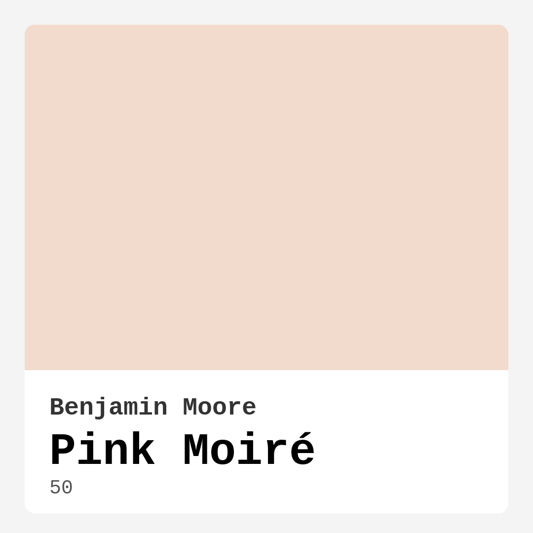
| HEX Code | #F2DACC |
| RGB | 242, 218, 204 |
| LRV | 71.90% |
| Undertone | Red |
| Finish Options | Eggshell, Matte, Satin |
Imagine walking into a room that instantly makes you feel at ease—soft, warm, and just a little bit romantic. The walls wrap around you like a gentle hug, and the light filtering through the windows gives everything a dreamy glow. That’s the magic of Benjamin Moore’s Pink Moiré. It’s not just a paint color; it’s a mood. Whether you’re revamping a bedroom, refreshing a living room, or creating a nursery that feels like a sanctuary, this delicate blush hue might be exactly what you’ve been searching for.
Pink Moiré is a masterclass in subtlety. With its LRV of 71.90%, it sits comfortably in the light color category, reflecting plenty of light to keep spaces feeling airy and open. But don’t let its lightness fool you—this shade has depth. Its red undertones give it a warmth that prevents it from feeling cold or sterile, making it ideal for rooms where comfort is key. Think of it as the color equivalent of your favorite cashmere throw: soft, inviting, and effortlessly elegant.
One of the best things about Pink Moiré is its versatility. It plays well with a range of decor styles, from modern farmhouse to classic traditional. Pair it with crisp white trim like Benjamin Moore’s White Dove for a clean, timeless look, or let it mingle with brass fixtures and warm wood tones for a touch of vintage charm. In a bohemian space, it acts as a soothing backdrop for layered textiles and eclectic accents. And in a minimalist setting, it adds just enough warmth to keep things from feeling too stark.
Lighting can make or break a paint color, and Pink Moiré handles it beautifully. In natural light, it feels almost ethereal—a whisper of pink that brightens without overwhelming. As the sun sets and artificial light takes over, it deepens slightly, leaning into its warm undertones for a cozier vibe. This adaptability makes it a great choice for open-concept spaces where lighting conditions change throughout the day. Just be sure to test it on your walls first. Paint a large swatch and observe it at different times to see how it behaves in your specific environment.
When it comes to application, Pink Moiré is beginner-friendly. It’s roller-ready and brush-smooth, with good coverage that typically only requires two coats for a rich, even finish. If you’re painting over a darker color, though, you might need an extra coat to ensure full opacity. The finish you choose matters, too. A matte finish will give you that velvety, sophisticated look, while eggshell or satin will add a subtle sheen and make the walls easier to clean—especially handy in spaces like dining rooms or home offices where wipeability is a plus.
Now, let’s talk rooms. Pink Moiré shines in bedrooms, where its calming energy helps create a restful retreat. It’s also a gorgeous choice for nurseries, offering a gentle, gender-neutral alternative to bolder pinks. In living rooms, it sets the stage for cozy gatherings, and in dining rooms, it fosters an intimate, welcoming atmosphere. Even home offices benefit from its soothing presence, making it easier to focus without feeling sterile. Just avoid using it in high-traffic areas like hallways or mudrooms unless you opt for a more durable finish, as lighter colors can show wear more easily over time.
Maintenance is a breeze with Pink Moiré. Its wipeable and washable properties mean you can easily clean up smudges or spills without worrying about damaging the finish. And because it’s low-VOC, you won’t have to deal with harsh fumes during or after painting—a win for your health and the environment. Touch-ups are straightforward, too, thanks to its forgiving nature. Just keep a small amount of leftover paint for minor fixes, and you’re good to go.
If you’re worried about committing to an all-over pink, consider starting with an accent wall. Pink Moiré works beautifully as a focal point, especially when paired with complementary shades like soft greens or warm neutrals. Or use it in smaller spaces—a powder room, a reading nook—where its warmth can make a big impact without feeling overwhelming. And if you’re selling your home, don’t underestimate its appeal. This shade has a universal likability that can make spaces feel fresh and inviting to potential buyers.
So, is Pink Moiré right for your project? If you’re after a color that’s warm but not overpowering, elegant but not fussy, and versatile enough to adapt to your evolving style, then yes. It’s the kind of hue that grows with you, offering a timeless backdrop for whatever decor direction you take. Test it out, live with it for a few days, and see how it makes you feel. Because the best paint colors aren’t just about how they look—they’re about how they make you feel when you walk into the room. And Pink Moiré? It feels like home.

Real Room Photo of Pink Moiré 50


Undertones of Pink Moiré ?
The undertones of Pink Moiré are a key aspect of its character, leaning towards Red. These subtle underlying hues are what give the color its depth and complexity. For example, a gray with a blue undertone will feel cooler and more modern, while one with a brown undertone will feel warmer and more traditional. It’s essential to test this paint in your home and observe it next to your existing furniture, flooring, and decor to see how these undertones interact and reveal themselves throughout the day.
HEX value: #F2DACC
RGB code: 242, 218, 204
Is Pink Moiré Cool or Warm?
This paint color is predominantly warm, creating a welcoming ambiance. The warm undertones help in softening harsher elements in a room, making it feel more inviting and enjoyable.
Understanding Color Properties and Interior Design Tips
Hue refers to a specific position on the color wheel, measured in degrees from 0 to 360. Each degree represents a different pure color:
- 0° represents red
- 120° represents green
- 240° represents blue
Saturation describes the intensity or purity of a color and is expressed as a percentage:
- At 0%, the color appears completely desaturated—essentially a shade of gray
- At 100%, the color is at its most vivid and vibrant
Lightness indicates how light or dark a color is, also expressed as a percentage:
- 0% lightness results in black
- 100% lightness results in white
Using Warm Colors in Interior Design
Warm hues—such as reds, oranges, yellows, warm beiges, and greiges—are excellent choices for creating inviting and energetic spaces. These colors are particularly well-suited for:
- Kitchens, living rooms, and bathrooms, where warmth enhances comfort and sociability
- Large rooms, where warm tones can help reduce the sense of emptiness and make the space feel more intimate
For example:
- Warm beige shades provide a cozy, inviting atmosphere, ideal for living rooms, bedrooms, and hallways.
- Warm greige (a mix of beige and gray) offers the warmth of beige with the modern appeal of gray, making it a versatile backdrop for dining areas, bedrooms, and living spaces.
However, be mindful when using warm light tones in rooms with limited natural light. These shades may appear muted or even take on an unpleasant yellowish tint. To avoid a dull or flat appearance:
- Add depth by incorporating richer tones like deep greens, charcoal, or chocolate brown
- Use textured elements such as curtains, rugs, or cushions to bring dimension to the space
Pro Tip: Achieving Harmony with Warm and Cool Color Balance
To create a well-balanced and visually interesting interior, mix warm and cool tones strategically. This contrast adds depth and harmony to your design.
- If your walls feature warm hues, introduce cool-colored accents such as blue or green furniture, artwork, or accessories to create contrast.
- For a polished look, consider using a complementary color scheme, which pairs colors opposite each other on the color wheel (e.g., red with green, orange with blue).
This thoughtful mix not only enhances visual appeal but also creates a space that feels both dynamic and cohesive.

Light Temperature Affects on Pink Moiré
Natural Light
Natural daylight changes in color temperature as the sun moves across the sky. At sunrise and sunset, the light tends to have a warm, golden tone with a color temperature around 2000 Kelvin (K). As the day progresses and the sun rises higher, the light becomes cooler and more neutral. Around midday, especially when the sky is clear, natural light typically reaches its peak brightness and shifts to a cooler tone, ranging from 5500 to 6500 Kelvin. This midday light is close to what we perceive as pure white or daylight-balanced light.
These shifts in natural light can significantly influence how colors appear in a space, which is why designers often consider both the time of day and the orientation of windows when planning interior color schemes.
Artificial Light
When choosing artificial lighting, pay close attention to the color temperature, measured in Kelvin (K). This determines how warm or cool the light will appear. Lower temperatures, around 2700K, give off a warm, yellow glow often used in living rooms or bedrooms. Higher temperatures, above 5000K, create a cool, bluish light similar to daylight, commonly used in kitchens, offices, or task areas.
Use the slider to see how lighting temperature can affect the appearance of a surface or color throughout a space.


4800K
LRV of Pink Moiré
The Light Reflectance Value (LRV) of Pink Moiré is 71.90%, which places it in the Light colors category. This means it reflect most of the incident light. Understanding a paint’s LRV is crucial for predicting how it will look in your space. A higher LRV indicates a lighter color that reflects more light, making rooms feel larger and brighter. A lower LRV signifies a darker color that absorbs more light, creating a cozier, more intimate atmosphere. Always consider the natural and artificial lighting in your room when selecting a paint color based on its LRV.
Detailed Review of Pink Moiré
Additional Paint Characteristics
Ideal Rooms
Bedroom, Dining Room, Home Office, Living Room, Nursery
Decor Styles
from modern farmhouse to classic and even bohemian decor. It harmonizes well with both vintage and contemporary furnishings, making it versatile for any design aesthetic., Pink Moiré complements a variety of styles
Coverage
Good (1–2 Coats), Touch-Up Friendly
Ease of Application
Beginner Friendly, Brush Smooth, Roller-Ready
Washability
Washable, Wipeable
VOC Level
Low VOC
Best Use
Accent Wall, Interior Walls, Large Spaces, Small Spaces
Room Suitability
and living rooms, intimate setting for gatherings., nurseries, promoting a cozy, This lovely hue shines in bedrooms, where a calming environment is desired. It can also be a lovely addition to dining spaces
Tone Tag
Airy, Pastel, Warm
Finish Type
Eggshell, Matte, Satin
Paint Performance
Easy Touch-Up, Low Odor, Scuff Resistant
Use Cases
Best for Rentals, Best for Selling Your Home, Best for Small Spaces
Mood
Calm, Cozy, Inviting
Trim Pairing
Complements Brass Fixtures, Pairs with White Dove, Works with Warm Trim
Pink Moiré is a delightful choice for those looking to infuse a bit of warmth into their spaces. The color’s soft, muted quality means it won’t overpower a room but rather create a gentle backdrop that allows other decor elements to shine. It has a unique ability to adapt to various lighting conditions, appearing lighter in natural light and deeper in dimmer settings. This versatility makes it ideal for open concept areas where different lighting can affect how colors are perceived. Whether you’re accenting a wall or painting an entire room, Pink Moiré offers a refreshing and inviting vibe that’s hard to resist. Plus, it pairs beautifully with both cool and warm tones, making it a flexible choice for a range of decor styles.
Pros & Cons of 50 Pink Moiré
Pros
Cons
Colors that go with Benjamin Moore Pink Moiré
FAQ on 50 Pink Moiré
How many coats of Pink Moiré should I apply?
For optimal results, it’s recommended to apply at least two coats of Pink Moiré. The first coat provides a nice base, while the second ensures a rich and even finish. Depending on the surface you’re painting and the color underneath, you might find that a third coat gives you the best coverage and depth. Always test a small area first to see how it interacts with your existing decor.
Can I use Pink Moiré in a bathroom?
Yes, you can use Pink Moiré in a bathroom, but it’s essential to consider the humidity levels. Ensure proper ventilation to help the paint dry and maintain its finish. For added durability, consider using a satin or eggshell finish, which will provide better moisture resistance than a matte finish. This will help the color last longer and make it easier to maintain.
Comparisons Pink Moiré with other colors
Pink Moiré 50 vs Malted Milk SW 6057
| Attribute | Pink Moiré 50 | Malted Milk SW 6057 |
|---|---|---|
| Color Name | Pink Moiré 50 | Malted Milk SW 6057 |
| Color | ||
| Hue | Pink | Pink |
| Brightness | Light | Light |
| RGB | 242, 218, 204 | 222, 202, 189 |
| LRV | 71.90% | 74% |
| Finish Type | Eggshell, Matte, Satin | Eggshell, Satin |
| Finish Options | Eggshell, Matte, Satin | Eggshell, Matte, Satin |
| Ideal Rooms | Bedroom, Dining Room, Home Office, Living Room, Nursery | Bedroom, Dining Room, Kitchen, Living Room, Nursery |
| Decor Styles | from modern farmhouse to classic and even bohemian decor. It harmonizes well with both vintage and contemporary furnishings, making it versatile for any design aesthetic., Pink Moiré complements a variety of styles | Coastal, Farmhouse, Modern, Scandinavian, Transitional |
| Coverage | Good (1–2 Coats), Touch-Up Friendly | Good (1–2 Coats), Touch-Up Friendly |
| Ease of Application | Beginner Friendly, Brush Smooth, Roller-Ready | Beginner Friendly, Brush Smooth, Fast-Drying, Roller-Ready |
| Washability | Washable, Wipeable | Washable, Wipeable |
| Room Suitability | and living rooms, intimate setting for gatherings., nurseries, promoting a cozy, This lovely hue shines in bedrooms, where a calming environment is desired. It can also be a lovely addition to dining spaces | Bedroom, Dining Room, Kitchen, Living Room, Nursery |
| Tone | Airy, Pastel, Warm | Creamy, Neutral, Warm |
| Paint Performance | Easy Touch-Up, Low Odor, Scuff Resistant | High Coverage, Low Odor, Quick Drying |
Pink Moiré 50 vs Intimate White SW 6322
| Attribute | Pink Moiré 50 | Intimate White SW 6322 |
|---|---|---|
| Color Name | Pink Moiré 50 | Intimate White SW 6322 |
| Color | ||
| Hue | Pink | Pink |
| Brightness | Light | Light |
| RGB | 242, 218, 204 | 240, 225, 216 |
| LRV | 71.90% | 75% |
| Finish Type | Eggshell, Matte, Satin | Eggshell, Matte, Satin |
| Finish Options | Eggshell, Matte, Satin | Eggshell, Matte, Satin |
| Ideal Rooms | Bedroom, Dining Room, Home Office, Living Room, Nursery | Bedroom, Hallway, Home Office, Living Room, Nursery |
| Decor Styles | from modern farmhouse to classic and even bohemian decor. It harmonizes well with both vintage and contemporary furnishings, making it versatile for any design aesthetic., Pink Moiré complements a variety of styles | Farmhouse, Minimalist, Modern, Traditional |
| Coverage | Good (1–2 Coats), Touch-Up Friendly | Good (1–2 Coats) |
| Ease of Application | Beginner Friendly, Brush Smooth, Roller-Ready | Beginner Friendly, Brush Smooth, Roller-Ready |
| Washability | Washable, Wipeable | Highly Washable, Washable |
| Room Suitability | and living rooms, intimate setting for gatherings., nurseries, promoting a cozy, This lovely hue shines in bedrooms, where a calming environment is desired. It can also be a lovely addition to dining spaces | Bedroom, Hallway, Living Room, Nursery |
| Tone | Airy, Pastel, Warm | Creamy, Muted, Warm |
| Paint Performance | Easy Touch-Up, Low Odor, Scuff Resistant | Easy Touch-Up, Fade Resistant, Low Odor |
Pink Moiré 50 vs Abalone Shell SW 6050
| Attribute | Pink Moiré 50 | Abalone Shell SW 6050 |
|---|---|---|
| Color Name | Pink Moiré 50 | Abalone Shell SW 6050 |
| Color | ||
| Hue | Pink | Pink |
| Brightness | Light | Light |
| RGB | 242, 218, 204 | 219, 199, 189 |
| LRV | 71.90% | 30% |
| Finish Type | Eggshell, Matte, Satin | Eggshell, Matte, Satin |
| Finish Options | Eggshell, Matte, Satin | Eggshell, Matte, Satin |
| Ideal Rooms | Bedroom, Dining Room, Home Office, Living Room, Nursery | Bedroom, Dining Room, Home Office, Living Room |
| Decor Styles | from modern farmhouse to classic and even bohemian decor. It harmonizes well with both vintage and contemporary furnishings, making it versatile for any design aesthetic., Pink Moiré complements a variety of styles | Coastal, Farmhouse, Minimalist, Modern, Traditional |
| Coverage | Good (1–2 Coats), Touch-Up Friendly | Good (1–2 Coats), Touch-Up Friendly |
| Ease of Application | Beginner Friendly, Brush Smooth, Roller-Ready | Beginner Friendly, Brush Smooth, Fast-Drying, Roller-Ready |
| Washability | Washable, Wipeable | Washable, Wipeable |
| Room Suitability | and living rooms, intimate setting for gatherings., nurseries, promoting a cozy, This lovely hue shines in bedrooms, where a calming environment is desired. It can also be a lovely addition to dining spaces | Bedroom, Dining Room, Home Office, Living Room |
| Tone | Airy, Pastel, Warm | Balanced, Muted, Warm |
| Paint Performance | Easy Touch-Up, Low Odor, Scuff Resistant | Easy Touch-Up, Fade Resistant, Low Odor, Quick Drying |
Pink Moiré 50 vs White Truffle SW 6029
| Attribute | Pink Moiré 50 | White Truffle SW 6029 |
|---|---|---|
| Color Name | Pink Moiré 50 | White Truffle SW 6029 |
| Color | ||
| Hue | Pink | Pink |
| Brightness | Light | Light |
| RGB | 242, 218, 204 | 215, 200, 194 |
| LRV | 71.90% | 48% |
| Finish Type | Eggshell, Matte, Satin | Eggshell, Satin |
| Finish Options | Eggshell, Matte, Satin | Eggshell, Flat, Matte, Satin |
| Ideal Rooms | Bedroom, Dining Room, Home Office, Living Room, Nursery | Bedroom, Dining Room, Hallway, Kitchen, Living Room |
| Decor Styles | from modern farmhouse to classic and even bohemian decor. It harmonizes well with both vintage and contemporary furnishings, making it versatile for any design aesthetic., Pink Moiré complements a variety of styles | Eclectic, Farmhouse, Modern, Traditional |
| Coverage | Good (1–2 Coats), Touch-Up Friendly | Good (1–2 Coats), Touch-Up Friendly |
| Ease of Application | Beginner Friendly, Brush Smooth, Roller-Ready | Beginner Friendly, Brush Smooth, Roller-Ready |
| Washability | Washable, Wipeable | Washable, Wipeable |
| Room Suitability | and living rooms, intimate setting for gatherings., nurseries, promoting a cozy, This lovely hue shines in bedrooms, where a calming environment is desired. It can also be a lovely addition to dining spaces | Bedroom, Dining Room, Hallway, Living Room |
| Tone | Airy, Pastel, Warm | Earthy, Neutral, Warm |
| Paint Performance | Easy Touch-Up, Low Odor, Scuff Resistant | Easy Touch-Up, Low Odor, Scuff Resistant |
Pink Moiré 50 vs Faint Coral SW 6329
| Attribute | Pink Moiré 50 | Faint Coral SW 6329 |
|---|---|---|
| Color Name | Pink Moiré 50 | Faint Coral SW 6329 |
| Color | ||
| Hue | Pink | Pink |
| Brightness | Light | Light |
| RGB | 242, 218, 204 | 238, 222, 213 |
| LRV | 71.90% | 66% |
| Finish Type | Eggshell, Matte, Satin | Eggshell, Matte, Satin |
| Finish Options | Eggshell, Matte, Satin | Eggshell, Matte, Satin |
| Ideal Rooms | Bedroom, Dining Room, Home Office, Living Room, Nursery | Bedroom, Dining Room, Hallway, Living Room, Nursery |
| Decor Styles | from modern farmhouse to classic and even bohemian decor. It harmonizes well with both vintage and contemporary furnishings, making it versatile for any design aesthetic., Pink Moiré complements a variety of styles | Bohemian, Coastal, Modern Farmhouse, Scandinavian, Vintage |
| Coverage | Good (1–2 Coats), Touch-Up Friendly | Good (1–2 Coats), Touch-Up Friendly |
| Ease of Application | Beginner Friendly, Brush Smooth, Roller-Ready | Beginner Friendly, Brush Smooth, Fast-Drying, Roller-Ready |
| Washability | Washable, Wipeable | Washable, Wipeable |
| Room Suitability | and living rooms, intimate setting for gatherings., nurseries, promoting a cozy, This lovely hue shines in bedrooms, where a calming environment is desired. It can also be a lovely addition to dining spaces | Bedroom, Dining Room, Hallway, Living Room, Nursery |
| Tone | Airy, Pastel, Warm | Airy, Muted, Pastel, Warm |
| Paint Performance | Easy Touch-Up, Low Odor, Scuff Resistant | Easy Touch-Up, Low Odor, Quick Drying |
Pink Moiré 50 vs Romance SW 6323
| Attribute | Pink Moiré 50 | Romance SW 6323 |
|---|---|---|
| Color Name | Pink Moiré 50 | Romance SW 6323 |
| Color | ||
| Hue | Pink | Pink |
| Brightness | Light | Light |
| RGB | 242, 218, 204 | 235, 207, 195 |
| LRV | 71.90% | 69% |
| Finish Type | Eggshell, Matte, Satin | Eggshell, Matte |
| Finish Options | Eggshell, Matte, Satin | Eggshell, Flat, Matte, Satin |
| Ideal Rooms | Bedroom, Dining Room, Home Office, Living Room, Nursery | Bedroom, Dining Room, Living Room, Nursery |
| Decor Styles | from modern farmhouse to classic and even bohemian decor. It harmonizes well with both vintage and contemporary furnishings, making it versatile for any design aesthetic., Pink Moiré complements a variety of styles | Bohemian, Modern, Shabby Chic, Vintage |
| Coverage | Good (1–2 Coats), Touch-Up Friendly | Good (1–2 Coats), Touch-Up Friendly |
| Ease of Application | Beginner Friendly, Brush Smooth, Roller-Ready | Beginner Friendly, Brush Smooth, Fast-Drying, Roller-Ready |
| Washability | Washable, Wipeable | Washable, Wipeable |
| Room Suitability | and living rooms, intimate setting for gatherings., nurseries, promoting a cozy, This lovely hue shines in bedrooms, where a calming environment is desired. It can also be a lovely addition to dining spaces | Bedroom, Dining Room, Living Room, Nursery |
| Tone | Airy, Pastel, Warm | Pastel, Soft, Warm |
| Paint Performance | Easy Touch-Up, Low Odor, Scuff Resistant | Easy Touch-Up, Low Odor, Quick Drying |
Pink Moiré 50 vs Innocence SW 6302
| Attribute | Pink Moiré 50 | Innocence SW 6302 |
|---|---|---|
| Color Name | Pink Moiré 50 | Innocence SW 6302 |
| Color | ||
| Hue | Pink | Pink |
| Brightness | Light | Light |
| RGB | 242, 218, 204 | 235, 209, 207 |
| LRV | 71.90% | 75% |
| Finish Type | Eggshell, Matte, Satin | Eggshell, Matte |
| Finish Options | Eggshell, Matte, Satin | Eggshell, Matte, Satin |
| Ideal Rooms | Bedroom, Dining Room, Home Office, Living Room, Nursery | Bedroom, Dining Room, Living Room, Nursery |
| Decor Styles | from modern farmhouse to classic and even bohemian decor. It harmonizes well with both vintage and contemporary furnishings, making it versatile for any design aesthetic., Pink Moiré complements a variety of styles | Bohemian, Modern Farmhouse, Scandinavian, Shabby Chic |
| Coverage | Good (1–2 Coats), Touch-Up Friendly | Good (1–2 Coats), Touch-Up Friendly |
| Ease of Application | Beginner Friendly, Brush Smooth, Roller-Ready | Beginner Friendly, Brush Smooth, Roller-Ready |
| Washability | Washable, Wipeable | Washable, Wipeable |
| Room Suitability | and living rooms, intimate setting for gatherings., nurseries, promoting a cozy, This lovely hue shines in bedrooms, where a calming environment is desired. It can also be a lovely addition to dining spaces | Bedroom, Dining Room, Living Room, Nursery |
| Tone | Airy, Pastel, Warm | Pastel, Soft, Warm |
| Paint Performance | Easy Touch-Up, Low Odor, Scuff Resistant | Easy Touch-Up, Fade Resistant, Low Odor |
Pink Moiré 50 vs Angelic SW 6602
| Attribute | Pink Moiré 50 | Angelic SW 6602 |
|---|---|---|
| Color Name | Pink Moiré 50 | Angelic SW 6602 |
| Color | ||
| Hue | Pink | Pink |
| Brightness | Light | Light |
| RGB | 242, 218, 204 | 242, 220, 215 |
| LRV | 71.90% | 75% |
| Finish Type | Eggshell, Matte, Satin | Eggshell, Satin |
| Finish Options | Eggshell, Matte, Satin | Eggshell, Flat, Matte, Satin |
| Ideal Rooms | Bedroom, Dining Room, Home Office, Living Room, Nursery | Bedroom, Dining Room, Home Office, Living Room, Nursery |
| Decor Styles | from modern farmhouse to classic and even bohemian decor. It harmonizes well with both vintage and contemporary furnishings, making it versatile for any design aesthetic., Pink Moiré complements a variety of styles | Bohemian, Farmhouse, Modern, Transitional |
| Coverage | Good (1–2 Coats), Touch-Up Friendly | Good (1–2 Coats), Touch-Up Friendly |
| Ease of Application | Beginner Friendly, Brush Smooth, Roller-Ready | Beginner Friendly, Brush Smooth, Roller-Ready |
| Washability | Washable, Wipeable | Washable, Wipeable |
| Room Suitability | and living rooms, intimate setting for gatherings., nurseries, promoting a cozy, This lovely hue shines in bedrooms, where a calming environment is desired. It can also be a lovely addition to dining spaces | Bedroom, Home Office, Living Room, Nursery |
| Tone | Airy, Pastel, Warm | Airy, Pastel, Warm |
| Paint Performance | Easy Touch-Up, Low Odor, Scuff Resistant | Easy Touch-Up, Fade Resistant, Low Odor |
Pink Moiré 50 vs Rosy Outlook SW 6316
| Attribute | Pink Moiré 50 | Rosy Outlook SW 6316 |
|---|---|---|
| Color Name | Pink Moiré 50 | Rosy Outlook SW 6316 |
| Color | ||
| Hue | Pink | Pink |
| Brightness | Light | Light |
| RGB | 242, 218, 204 | 235, 206, 203 |
| LRV | 71.90% | 45% |
| Finish Type | Eggshell, Matte, Satin | Eggshell, Matte, Satin |
| Finish Options | Eggshell, Matte, Satin | Eggshell, Matte, Satin |
| Ideal Rooms | Bedroom, Dining Room, Home Office, Living Room, Nursery | Bedroom, Home Office, Living Room, Nursery |
| Decor Styles | from modern farmhouse to classic and even bohemian decor. It harmonizes well with both vintage and contemporary furnishings, making it versatile for any design aesthetic., Pink Moiré complements a variety of styles | Bohemian, Cottage, Modern, Traditional |
| Coverage | Good (1–2 Coats), Touch-Up Friendly | Good (1–2 Coats), Touch-Up Friendly |
| Ease of Application | Beginner Friendly, Brush Smooth, Roller-Ready | Beginner Friendly, Brush Smooth, Roller-Ready |
| Washability | Washable, Wipeable | Scuff Resistant, Washable, Wipeable |
| Room Suitability | and living rooms, intimate setting for gatherings., nurseries, promoting a cozy, This lovely hue shines in bedrooms, where a calming environment is desired. It can also be a lovely addition to dining spaces | Bedroom, Home Office, Living Room, Nursery |
| Tone | Airy, Pastel, Warm | Muted, Pastel, Warm |
| Paint Performance | Easy Touch-Up, Low Odor, Scuff Resistant | High Coverage, Low Odor, Quick Drying |
Pink Moiré 50 vs Demure SW 6295
| Attribute | Pink Moiré 50 | Demure SW 6295 |
|---|---|---|
| Color Name | Pink Moiré 50 | Demure SW 6295 |
| Color | ||
| Hue | Pink | Pink |
| Brightness | Light | Light |
| RGB | 242, 218, 204 | 232, 212, 213 |
| LRV | 71.90% | 50% |
| Finish Type | Eggshell, Matte, Satin | Eggshell, Matte |
| Finish Options | Eggshell, Matte, Satin | Eggshell, Matte, Satin |
| Ideal Rooms | Bedroom, Dining Room, Home Office, Living Room, Nursery | Bedroom, Home Office, Living Room, Nursery |
| Decor Styles | from modern farmhouse to classic and even bohemian decor. It harmonizes well with both vintage and contemporary furnishings, making it versatile for any design aesthetic., Pink Moiré complements a variety of styles | Minimalist, Modern, Shabby Chic, Transitional |
| Coverage | Good (1–2 Coats), Touch-Up Friendly | Good (1–2 Coats), Touch-Up Friendly |
| Ease of Application | Beginner Friendly, Brush Smooth, Roller-Ready | Beginner Friendly, Brush Smooth, Roller-Ready |
| Washability | Washable, Wipeable | Washable, Wipeable |
| Room Suitability | and living rooms, intimate setting for gatherings., nurseries, promoting a cozy, This lovely hue shines in bedrooms, where a calming environment is desired. It can also be a lovely addition to dining spaces | Bedroom, Home Office, Living Room, Nursery |
| Tone | Airy, Pastel, Warm | Muted, Pastel, Warm |
| Paint Performance | Easy Touch-Up, Low Odor, Scuff Resistant | Easy Touch-Up, Low Odor, Quick Drying |
Official Page of Benjamin Moore Pink Moiré 50