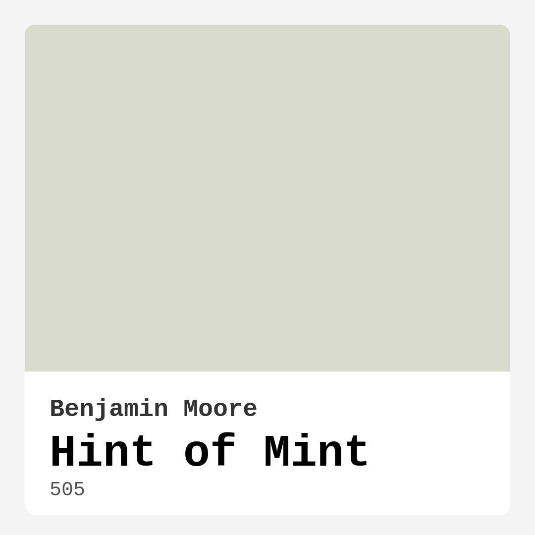
Color Preview & Key Details
| HEX Code | #D9DCCC |
| RGB | 217, 220, 204 |
| LRV | 68.72% |
| Undertone | Yellow |
| Finish Options | Eggshell, Matte, Satin |
Have you ever walked into a room and immediately felt a sense of calm wash over you? That’s the magic of the right paint color—it doesn’t just cover walls; it sets the tone for your entire space. Today, let’s talk about one of those effortlessly soothing shades: Benjamin Moore’s Hint of Mint (505). This soft, pastel green is like a breath of fresh air, and if you’re considering it for your home, you’re in for a treat.
Hint of Mint is the kind of color that plays well with others. It’s not too bold, not too bland—just a perfectly balanced whisper of green with a subtle yellow undertone that adds warmth without overpowering. With an LRV of 68.72%, it reflects plenty of light, making it ideal for rooms that could use a little brightness. Whether you’re working with a sun-drenched living room or a cozy bedroom that needs a lift, this shade delivers.
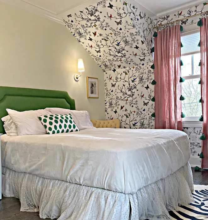
One of the best things about Hint of Mint is its versatility. It fits seamlessly into modern farmhouse kitchens, coastal-inspired bathrooms, and minimalist home offices. Pair it with crisp white trim like Benjamin Moore’s White Dove for a clean, timeless look, or let it mingle with natural wood tones for a touch of organic warmth. If you’re feeling adventurous, layer in deeper greens or soft blues for a harmonious, nature-inspired palette.
Application is a breeze, even if you’re new to painting. The formula is beginner-friendly, dries quickly, and offers excellent coverage in just one or two coats. Opt for an eggshell or satin finish in high-traffic areas for added durability—this paint is washable, so it holds up well to everyday life. Just keep in mind that lighting can shift its appearance slightly. North-facing rooms might bring out its cooler side, while south-facing light will highlight those warm yellow undertones.
Small spaces? No problem. Hint of Mint’s airy quality makes cramped rooms feel more open. Use it on all four walls for a cohesive look, or try it as an accent wall behind a bed or sofa to add depth without closing things in. In kitchens, it pairs beautifully with marble countertops and brass hardware, while in bathrooms, it creates a spa-like retreat when paired with fluffy white towels and woven baskets.
Now, let’s talk mood. This color is calm personified. It’s the kind of shade that makes mornings feel a little gentler and evenings a bit more relaxed. If you’re aiming for a serene, inviting atmosphere—whether in a bedroom, home office, or even a dining room—Hint of Mint nails it. And because it’s low-VOC and eco-certified, you can feel good about using it in any room, including nurseries or pet-friendly spaces.
Of course, no color is perfect for every situation. If you’re working with existing warm orange or red tones in your decor, test Hint of Mint first to see how they interact. And while it’s a champ at hiding minor imperfections, darker walls might need an extra coat for full opacity. But these are small trade-offs for a color that brings so much effortless style to the table.
So, is Hint of Mint right for you? If you love soft, sophisticated hues that create a sense of tranquility, the answer is probably yes. Grab a sample, paint a swatch, and watch how it transforms in your light throughout the day. You might just find it’s the missing piece your space has been waiting for. After all, the best colors don’t just look good—they make you feel something. And Hint of Mint? It feels like home.
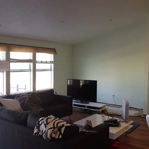
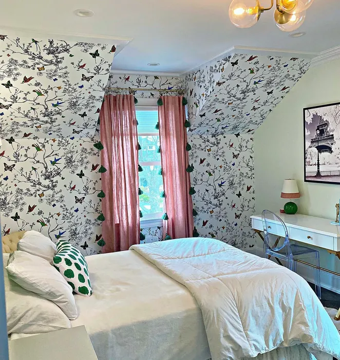
Real Room Photo of Hint of Mint 505
Undertones of Hint of Mint ?
The undertones of Hint of Mint are a key aspect of its character, leaning towards Yellow. These subtle underlying hues are what give the color its depth and complexity. For example, a gray with a blue undertone will feel cooler and more modern, while one with a brown undertone will feel warmer and more traditional. It’s essential to test this paint in your home and observe it next to your existing furniture, flooring, and decor to see how these undertones interact and reveal themselves throughout the day.
HEX value: #D9DCCC
RGB code: 217, 220, 204
Is Hint of Mint Cool or Warm?
This color leans towards the cool side of the spectrum, providing a refreshing feel without being too stark. It’s perfect for creating serene spaces or complementing warmer tones in your decor.
Understanding Color Properties and Interior Design Tips
Hue refers to a specific position on the color wheel, measured in degrees from 0 to 360. Each degree represents a different pure color:
- 0° represents red
- 120° represents green
- 240° represents blue
Saturation describes the intensity or purity of a color and is expressed as a percentage:
- At 0%, the color appears completely desaturated—essentially a shade of gray
- At 100%, the color is at its most vivid and vibrant
Lightness indicates how light or dark a color is, also expressed as a percentage:
- 0% lightness results in black
- 100% lightness results in white
Using Warm Colors in Interior Design
Warm hues—such as reds, oranges, yellows, warm beiges, and greiges—are excellent choices for creating inviting and energetic spaces. These colors are particularly well-suited for:
- Kitchens, living rooms, and bathrooms, where warmth enhances comfort and sociability
- Large rooms, where warm tones can help reduce the sense of emptiness and make the space feel more intimate
For example:
- Warm beige shades provide a cozy, inviting atmosphere, ideal for living rooms, bedrooms, and hallways.
- Warm greige (a mix of beige and gray) offers the warmth of beige with the modern appeal of gray, making it a versatile backdrop for dining areas, bedrooms, and living spaces.
However, be mindful when using warm light tones in rooms with limited natural light. These shades may appear muted or even take on an unpleasant yellowish tint. To avoid a dull or flat appearance:
- Add depth by incorporating richer tones like deep greens, charcoal, or chocolate brown
- Use textured elements such as curtains, rugs, or cushions to bring dimension to the space
Pro Tip: Achieving Harmony with Warm and Cool Color Balance
To create a well-balanced and visually interesting interior, mix warm and cool tones strategically. This contrast adds depth and harmony to your design.
- If your walls feature warm hues, introduce cool-colored accents such as blue or green furniture, artwork, or accessories to create contrast.
- For a polished look, consider using a complementary color scheme, which pairs colors opposite each other on the color wheel (e.g., red with green, orange with blue).
This thoughtful mix not only enhances visual appeal but also creates a space that feels both dynamic and cohesive.
Light Temperature Affects on Hint of Mint
Natural Light
Natural daylight changes in color temperature as the sun moves across the sky. At sunrise and sunset, the light tends to have a warm, golden tone with a color temperature around 2000 Kelvin (K). As the day progresses and the sun rises higher, the light becomes cooler and more neutral. Around midday, especially when the sky is clear, natural light typically reaches its peak brightness and shifts to a cooler tone, ranging from 5500 to 6500 Kelvin. This midday light is close to what we perceive as pure white or daylight-balanced light.
These shifts in natural light can significantly influence how colors appear in a space, which is why designers often consider both the time of day and the orientation of windows when planning interior color schemes.
Artificial Light
When choosing artificial lighting, pay close attention to the color temperature, measured in Kelvin (K). This determines how warm or cool the light will appear. Lower temperatures, around 2700K, give off a warm, yellow glow often used in living rooms or bedrooms. Higher temperatures, above 5000K, create a cool, bluish light similar to daylight, commonly used in kitchens, offices, or task areas.
Use the slider to see how lighting temperature can affect the appearance of a surface or color throughout a space.


4800K
LRV of Hint of Mint
The Light Reflectance Value (LRV) of Hint of Mint is 68.72%, which places it in the Light colors category. This means it reflect most of the incident light. Understanding a paint’s LRV is crucial for predicting how it will look in your space. A higher LRV indicates a lighter color that reflects more light, making rooms feel larger and brighter. A lower LRV signifies a darker color that absorbs more light, creating a cozier, more intimate atmosphere. Always consider the natural and artificial lighting in your room when selecting a paint color based on its LRV.
Detailed Review of Hint of Mint
Additional Paint Characteristics
Ideal Rooms
Bathroom, Bedroom, Dining Room, Home Office, Kitchen, Living Room
Decor Styles
Coastal, Farmhouse, Minimalist, Modern, Scandinavian
Coverage
Good (1–2 Coats), Touch-Up Friendly
Ease of Application
Beginner Friendly, Brush Smooth, Fast-Drying, Roller-Ready
Washability
Highly Washable, Washable
VOC Level
Eco-Certified, Low VOC
Best Use
Accent Wall, Furniture, Interior Walls
Room Suitability
Bathroom, Bedroom, Dining Room, Home Office, Kitchen, Living Room
Tone Tag
Airy, Cool, Pastel
Finish Type
Eggshell, Matte, Satin
Paint Performance
Easy Touch-Up, Low Odor, Quick Drying
Use Cases
Best for Modern Farmhouse, Best for Small Spaces, Designer Favorite
Mood
Airy, Calm, Inviting
Trim Pairing
Good with Wood Trim, Pairs with White Dove
When it comes to Hint of Mint, you’re getting more than just a color; you’re inviting a sense of peace into your home. This paint glides on effortlessly, offering a smooth finish whether you choose to roll or brush it on. It’s particularly stunning in natural light, where it can appear almost ethereal, creating a soft and inviting atmosphere. The color works wonders for accent walls and can also serve as a backdrop for brighter decor elements. However, it’s essential to apply a second coat for optimal coverage, especially on lighter surfaces. Overall, Hint of Mint is a delightful choice for anyone looking to refresh their space with a hint of color without overwhelming the senses.
Pros & Cons of 505 Hint of Mint
Pros
Cons
Colors that go with Benjamin Moore Hint of Mint
FAQ on 505 Hint of Mint
Is Hint of Mint suitable for small spaces?
Absolutely! Hint of Mint is a great choice for small spaces. Its light and airy nature can make rooms feel larger and more open. Pair it with good lighting and strategic decor to maximize its effect. Just be sure to test the color in your specific lighting, as it can shift slightly throughout the day.
How does Hint of Mint perform in high-traffic areas?
Hint of Mint is quite resilient, making it suitable for moderate traffic areas. However, for spaces like hallways or kids’ rooms, you may want to consider a finish that offers extra durability, such as satin or eggshell. With its washable properties, you can easily maintain its fresh look with regular cleaning.
Comparisons Hint of Mint with other colors
Hint of Mint 505 vs Sea Salt SW 6204
| Attribute | Hint of Mint 505 | Sea Salt SW 6204 |
|---|---|---|
| Color Name | Hint of Mint 505 | Sea Salt SW 6204 |
| Color | ||
| Hue | Green | Green |
| Brightness | Light | Light |
| RGB | 217, 220, 204 | 205, 210, 202 |
| LRV | 68.72% | 64% |
| Finish Type | Eggshell, Matte, Satin | Eggshell, Satin |
| Finish Options | Eggshell, Matte, Satin | Eggshell, Matte, Satin |
| Ideal Rooms | Bathroom, Bedroom, Dining Room, Home Office, Kitchen, Living Room | Bathroom, Bedroom, Hallway, Kitchen, Living Room |
| Decor Styles | Coastal, Farmhouse, Minimalist, Modern, Scandinavian | Coastal, Minimalist, Modern Farmhouse, Scandinavian, Traditional |
| Coverage | Good (1–2 Coats), Touch-Up Friendly | Good (1–2 Coats), Touch-Up Friendly |
| Ease of Application | Beginner Friendly, Brush Smooth, Fast-Drying, Roller-Ready | Beginner Friendly, Brush Smooth, Fast-Drying, Roller-Ready |
| Washability | Highly Washable, Washable | Highly Washable, Washable |
| Room Suitability | Bathroom, Bedroom, Dining Room, Home Office, Kitchen, Living Room | Bathroom, Bedroom, Hallway, Kitchen, Living Room |
| Tone | Airy, Cool, Pastel | Airy, Balanced, Cool, Muted |
| Paint Performance | Easy Touch-Up, Low Odor, Quick Drying | Easy Touch-Up, High Coverage, Low Odor, Quick Drying |
Hint of Mint 505 vs Liveable Green SW 6176
| Attribute | Hint of Mint 505 | Liveable Green SW 6176 |
|---|---|---|
| Color Name | Hint of Mint 505 | Liveable Green SW 6176 |
| Color | ||
| Hue | Green | Green |
| Brightness | Light | Light |
| RGB | 217, 220, 204 | 206, 206, 189 |
| LRV | 68.72% | 30% |
| Finish Type | Eggshell, Matte, Satin | Eggshell, Matte, Satin |
| Finish Options | Eggshell, Matte, Satin | Eggshell, Matte, Satin |
| Ideal Rooms | Bathroom, Bedroom, Dining Room, Home Office, Kitchen, Living Room | Bedroom, Home Office, Kitchen, Living Room, Nursery |
| Decor Styles | Coastal, Farmhouse, Minimalist, Modern, Scandinavian | Contemporary, Modern Farmhouse, Rustic, Scandi |
| Coverage | Good (1–2 Coats), Touch-Up Friendly | Good (1–2 Coats), Touch-Up Friendly |
| Ease of Application | Beginner Friendly, Brush Smooth, Fast-Drying, Roller-Ready | Beginner Friendly, Brush Smooth, Roller-Ready |
| Washability | Highly Washable, Washable | Highly Washable, Washable |
| Room Suitability | Bathroom, Bedroom, Dining Room, Home Office, Kitchen, Living Room | Bedroom, Home Office, Living Room, Nursery |
| Tone | Airy, Cool, Pastel | Balanced, Earthy, Muted |
| Paint Performance | Easy Touch-Up, Low Odor, Quick Drying | Easy Touch-Up, High Coverage, Low Odor |
Hint of Mint 505 vs Rainwashed SW 6211
| Attribute | Hint of Mint 505 | Rainwashed SW 6211 |
|---|---|---|
| Color Name | Hint of Mint 505 | Rainwashed SW 6211 |
| Color | ||
| Hue | Green | Green |
| Brightness | Light | Light |
| RGB | 217, 220, 204 | 194, 205, 197 |
| LRV | 68.72% | 60% |
| Finish Type | Eggshell, Matte, Satin | Eggshell, Matte, Satin |
| Finish Options | Eggshell, Matte, Satin | Eggshell, Matte, Satin |
| Ideal Rooms | Bathroom, Bedroom, Dining Room, Home Office, Kitchen, Living Room | Bathroom, Bedroom, Home Office, Living Room, Nursery |
| Decor Styles | Coastal, Farmhouse, Minimalist, Modern, Scandinavian | Coastal, Farmhouse, Minimalist, Modern, Transitional |
| Coverage | Good (1–2 Coats), Touch-Up Friendly | Good (1–2 Coats), Touch-Up Friendly |
| Ease of Application | Beginner Friendly, Brush Smooth, Fast-Drying, Roller-Ready | Beginner Friendly, Brush Smooth, Fast-Drying, Roller-Ready |
| Washability | Highly Washable, Washable | Washable, Wipeable |
| Room Suitability | Bathroom, Bedroom, Dining Room, Home Office, Kitchen, Living Room | Bathroom, Bedroom, Home Office, Living Room, Nursery |
| Tone | Airy, Cool, Pastel | Balanced, Cool, Muted |
| Paint Performance | Easy Touch-Up, Low Odor, Quick Drying | Easy Touch-Up, High Coverage, Low Odor |
Hint of Mint 505 vs Filmy Green SW 6190
| Attribute | Hint of Mint 505 | Filmy Green SW 6190 |
|---|---|---|
| Color Name | Hint of Mint 505 | Filmy Green SW 6190 |
| Color | ||
| Hue | Green | Green |
| Brightness | Light | Light |
| RGB | 217, 220, 204 | 209, 211, 199 |
| LRV | 68.72% | 50% |
| Finish Type | Eggshell, Matte, Satin | Eggshell, Matte, Satin |
| Finish Options | Eggshell, Matte, Satin | Eggshell, Matte, Satin |
| Ideal Rooms | Bathroom, Bedroom, Dining Room, Home Office, Kitchen, Living Room | Bedroom, Home Office, Living Room, Nursery |
| Decor Styles | Coastal, Farmhouse, Minimalist, Modern, Scandinavian | Bohemian, Minimalist, Modern Farmhouse, Scandinavian |
| Coverage | Good (1–2 Coats), Touch-Up Friendly | Good (1–2 Coats) |
| Ease of Application | Beginner Friendly, Brush Smooth, Fast-Drying, Roller-Ready | Beginner Friendly, Brush Smooth, Roller-Ready |
| Washability | Highly Washable, Washable | Washable, Wipeable |
| Room Suitability | Bathroom, Bedroom, Dining Room, Home Office, Kitchen, Living Room | Bedroom, Home Office, Living Room, Nursery |
| Tone | Airy, Cool, Pastel | Calm, Earthy, Muted |
| Paint Performance | Easy Touch-Up, Low Odor, Quick Drying | Easy Touch-Up, Low Odor, Quick Drying |
Hint of Mint 505 vs Slow Green SW 6456
| Attribute | Hint of Mint 505 | Slow Green SW 6456 |
|---|---|---|
| Color Name | Hint of Mint 505 | Slow Green SW 6456 |
| Color | ||
| Hue | Green | Green |
| Brightness | Light | Light |
| RGB | 217, 220, 204 | 198, 213, 201 |
| LRV | 68.72% | 48% |
| Finish Type | Eggshell, Matte, Satin | Eggshell, Matte, Satin |
| Finish Options | Eggshell, Matte, Satin | Eggshell, Matte, Satin |
| Ideal Rooms | Bathroom, Bedroom, Dining Room, Home Office, Kitchen, Living Room | Bedroom, Dining Room, Home Office, Living Room, Nursery |
| Decor Styles | Coastal, Farmhouse, Minimalist, Modern, Scandinavian | Coastal, Farmhouse, Modern, Rustic, Scandinavian |
| Coverage | Good (1–2 Coats), Touch-Up Friendly | Good (1–2 Coats), Touch-Up Friendly |
| Ease of Application | Beginner Friendly, Brush Smooth, Fast-Drying, Roller-Ready | Beginner Friendly, Brush Smooth, Roller-Ready |
| Washability | Highly Washable, Washable | Highly Washable, Washable |
| Room Suitability | Bathroom, Bedroom, Dining Room, Home Office, Kitchen, Living Room | Bedroom, Dining Room, Entryway, Home Office, Living Room, Nursery |
| Tone | Airy, Cool, Pastel | Balanced, Earthy, Muted |
| Paint Performance | Easy Touch-Up, Low Odor, Quick Drying | Easy Touch-Up, Fade Resistant, Low Odor |
Hint of Mint 505 vs Acanthus SW 0029
| Attribute | Hint of Mint 505 | Acanthus SW 0029 |
|---|---|---|
| Color Name | Hint of Mint 505 | Acanthus SW 0029 |
| Color | ||
| Hue | Green | Green |
| Brightness | Light | Light |
| RGB | 217, 220, 204 | 205, 205, 180 |
| LRV | 68.72% | 10% |
| Finish Type | Eggshell, Matte, Satin | Eggshell, Matte, Satin |
| Finish Options | Eggshell, Matte, Satin | Eggshell, Matte, Satin |
| Ideal Rooms | Bathroom, Bedroom, Dining Room, Home Office, Kitchen, Living Room | Bedroom, Dining Room, Home Office, Kitchen, Living Room |
| Decor Styles | Coastal, Farmhouse, Minimalist, Modern, Scandinavian | Eclectic, Farmhouse, Modern, Traditional |
| Coverage | Good (1–2 Coats), Touch-Up Friendly | Good (1–2 Coats) |
| Ease of Application | Beginner Friendly, Brush Smooth, Fast-Drying, Roller-Ready | Beginner Friendly, Brush Smooth, Fast-Drying, Roller-Ready |
| Washability | Highly Washable, Washable | Highly Washable, Stain Resistant, Washable |
| Room Suitability | Bathroom, Bedroom, Dining Room, Home Office, Kitchen, Living Room | Bedroom, Dining Room, Home Office, Living Room |
| Tone | Airy, Cool, Pastel | Balanced, Earthy, Muted |
| Paint Performance | Easy Touch-Up, Low Odor, Quick Drying | Easy Touch-Up, Low Odor, Quick Drying, Scuff Resistant |
Hint of Mint 505 vs Topiary Tint SW 6449
| Attribute | Hint of Mint 505 | Topiary Tint SW 6449 |
|---|---|---|
| Color Name | Hint of Mint 505 | Topiary Tint SW 6449 |
| Color | ||
| Hue | Green | Green |
| Brightness | Light | Light |
| RGB | 217, 220, 204 | 200, 216, 196 |
| LRV | 68.72% | 30% |
| Finish Type | Eggshell, Matte, Satin | Eggshell, Matte, Satin |
| Finish Options | Eggshell, Matte, Satin | Eggshell, Matte, Satin |
| Ideal Rooms | Bathroom, Bedroom, Dining Room, Home Office, Kitchen, Living Room | Bathroom, Bedroom, Dining Room, Home Office, Kitchen, Living Room |
| Decor Styles | Coastal, Farmhouse, Minimalist, Modern, Scandinavian | Bohemian, Coastal, Eclectic, Modern Farmhouse, Transitional |
| Coverage | Good (1–2 Coats), Touch-Up Friendly | Good (1–2 Coats), Touch-Up Friendly |
| Ease of Application | Beginner Friendly, Brush Smooth, Fast-Drying, Roller-Ready | Beginner Friendly, Brush Smooth, Fast-Drying, Roller-Ready |
| Washability | Highly Washable, Washable | Scuff Resistant, Washable |
| Room Suitability | Bathroom, Bedroom, Dining Room, Home Office, Kitchen, Living Room | Bathroom, Bedroom, Dining Room, Kitchen, Living Room |
| Tone | Airy, Cool, Pastel | Balanced, Calm, Earthy, Muted |
| Paint Performance | Easy Touch-Up, Low Odor, Quick Drying | Easy Touch-Up, Low Odor, Quick Drying, Stain Resistant |
Hint of Mint 505 vs Waterscape SW 6470
| Attribute | Hint of Mint 505 | Waterscape SW 6470 |
|---|---|---|
| Color Name | Hint of Mint 505 | Waterscape SW 6470 |
| Color | ||
| Hue | Green | Green |
| Brightness | Light | Light |
| RGB | 217, 220, 204 | 191, 210, 201 |
| LRV | 68.72% | 50% |
| Finish Type | Eggshell, Matte, Satin | Eggshell, Matte |
| Finish Options | Eggshell, Matte, Satin | Eggshell, Matte, Satin |
| Ideal Rooms | Bathroom, Bedroom, Dining Room, Home Office, Kitchen, Living Room | Bathroom, Bedroom, Home Office, Kitchen, Living Room |
| Decor Styles | Coastal, Farmhouse, Minimalist, Modern, Scandinavian | Coastal, Minimalist, Modern, Scandinavian |
| Coverage | Good (1–2 Coats), Touch-Up Friendly | Good (1–2 Coats) |
| Ease of Application | Beginner Friendly, Brush Smooth, Fast-Drying, Roller-Ready | Beginner Friendly, Brush Smooth, Roller-Ready |
| Washability | Highly Washable, Washable | Highly Washable, Washable |
| Room Suitability | Bathroom, Bedroom, Dining Room, Home Office, Kitchen, Living Room | Bathroom, Bedroom, Home Office, Living Room |
| Tone | Airy, Cool, Pastel | Airy, Cool, Muted |
| Paint Performance | Easy Touch-Up, Low Odor, Quick Drying | Easy Touch-Up, Low Odor, Quick Drying |
Hint of Mint 505 vs Bonsai Tint SW 6436
| Attribute | Hint of Mint 505 | Bonsai Tint SW 6436 |
|---|---|---|
| Color Name | Hint of Mint 505 | Bonsai Tint SW 6436 |
| Color | ||
| Hue | Green | Green |
| Brightness | Light | Light |
| RGB | 217, 220, 204 | 197, 209, 178 |
| LRV | 68.72% | 64% |
| Finish Type | Eggshell, Matte, Satin | Eggshell, Matte |
| Finish Options | Eggshell, Matte, Satin | Eggshell, Matte, Satin |
| Ideal Rooms | Bathroom, Bedroom, Dining Room, Home Office, Kitchen, Living Room | Bedroom, Home Office, Living Room, Nursery |
| Decor Styles | Coastal, Farmhouse, Minimalist, Modern, Scandinavian | Bohemian, Minimalist, Modern, Scandinavian |
| Coverage | Good (1–2 Coats), Touch-Up Friendly | Good (1–2 Coats) |
| Ease of Application | Beginner Friendly, Brush Smooth, Fast-Drying, Roller-Ready | Beginner Friendly, Brush Smooth, Roller-Ready |
| Washability | Highly Washable, Washable | Washable, Wipeable |
| Room Suitability | Bathroom, Bedroom, Dining Room, Home Office, Kitchen, Living Room | Bedroom, Home Office, Living Room, Nursery |
| Tone | Airy, Cool, Pastel | Calm, Earthy, Muted |
| Paint Performance | Easy Touch-Up, Low Odor, Quick Drying | Easy Touch-Up, Fade Resistant, Low Odor |
Hint of Mint 505 vs Gratifying Green SW 6435
| Attribute | Hint of Mint 505 | Gratifying Green SW 6435 |
|---|---|---|
| Color Name | Hint of Mint 505 | Gratifying Green SW 6435 |
| Color | ||
| Hue | Green | Green |
| Brightness | Light | Light |
| RGB | 217, 220, 204 | 218, 226, 205 |
| LRV | 68.72% | 30% |
| Finish Type | Eggshell, Matte, Satin | Eggshell, Matte, Satin |
| Finish Options | Eggshell, Matte, Satin | Eggshell, Matte, Satin |
| Ideal Rooms | Bathroom, Bedroom, Dining Room, Home Office, Kitchen, Living Room | Bedroom, Dining Room, Home Office, Living Room, Nursery |
| Decor Styles | Coastal, Farmhouse, Minimalist, Modern, Scandinavian | Bohemian, Coastal, Minimalist, Modern Farmhouse |
| Coverage | Good (1–2 Coats), Touch-Up Friendly | Good (1–2 Coats), Touch-Up Friendly |
| Ease of Application | Beginner Friendly, Brush Smooth, Fast-Drying, Roller-Ready | Beginner Friendly, Brush Smooth, Roller-Ready |
| Washability | Highly Washable, Washable | Washable, Wipeable |
| Room Suitability | Bathroom, Bedroom, Dining Room, Home Office, Kitchen, Living Room | Bedroom, Home Office, Living Room, Nursery |
| Tone | Airy, Cool, Pastel | Earthy, Muted, Warm |
| Paint Performance | Easy Touch-Up, Low Odor, Quick Drying | Easy Touch-Up, Low Odor, Quick Drying |
Official Page of Benjamin Moore Hint of Mint 505