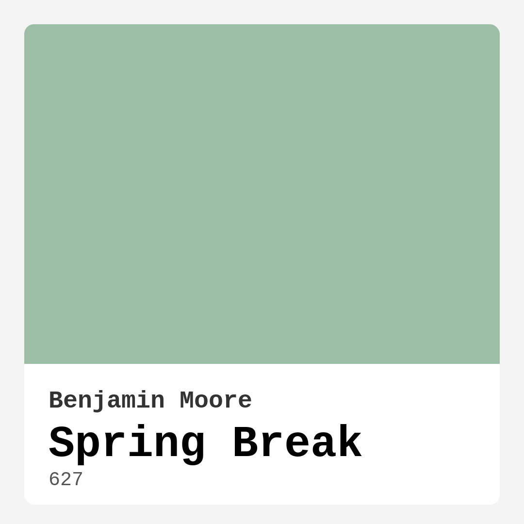
Color Preview & Key Details
| HEX Code | #9CBEA6 |
| RGB | 156, 190, 166 |
| LRV | 46.10% |
| Undertone | Green |
| Finish Options | Eggshell, Satin, Semi-Gloss |
Imagine stepping into a room that feels like a gentle embrace from nature, where every corner whispers tranquility and renewal. This is the magic of Benjamin Moore’s Spring Break, a refreshing and soothing green hue that captures the essence of budding leaves and gentle breezes. This color isn’t just a shade; it’s an invitation to transform your space into a serene haven.
Spring Break, with its color code 627, is a medium brightness green that resonates with the spirit of spring. Its hex code (#9CBEA6) evokes images of lush gardens and fresh beginnings, making it an ideal choice for anyone looking to infuse their home with a sense of calm and vitality. The cool undertones of this paint bring a sophisticated yet lively vibe, perfect for a variety of decor styles, from modern to coastal, bohemian, Scandinavian, and farmhouse aesthetics.
One of the striking features of Spring Break is its versatility. It can effortlessly transition from a serene bedroom to a vibrant living room or a cozy nursery. Its refreshing nature makes it suitable for spaces designed for relaxation, creativity, and comfort. Imagine this hue gracing the walls of your home office, inspiring productivity while maintaining a calm ambiance, or wrapping your child’s nursery in a gentle cocoon of tranquility. It’s a color that welcomes you in, making every room feel like a personal retreat.
When it comes to light, Spring Break has an impressive Light Reflectance Value (LRV) of 46.10%. This means it reflects about half of the incident light, striking a balance that makes spaces feel airy yet intimate. In natural daylight, the color shines with clarity, brightening up your room with a lively touch, while in dimmer light, it holds onto its calming essence, showcasing a muted sophistication that’s still inviting. Understanding this aspect is crucial when selecting a paint color, as the interplay of natural and artificial lighting can dramatically alter how a hue feels in your space.
Now, let’s talk about the practicalities of using Spring Break in your home. This paint is extremely beginner-friendly, rolling on smoothly and easily with a brush, making it perfect for DIY projects. It’s also touch-up friendly, so keeping your walls looking fresh won’t require a Herculean effort. And if you’re a parent or a pet owner, you’ll appreciate its washability. With a highly washable finish, you can wipe away scuffs and marks without worrying about damaging the color or finish.
However, like any product, Spring Break does come with a few considerations. While it offers good coverage, you might find that it requires two coats for a completely uniform look, especially on darker surfaces. Lighter shades can sometimes show imperfections, so proper surface preparation is key. But for those who appreciate a soft, refreshing hue that can bring life into a room, the benefits far outweigh any minor drawbacks.
In terms of decor, Spring Break pairs harmoniously with various complementary shades. Consider using it alongside whites, such as Benjamin Moore’s White Dove, to create a fresh and airy feel. This pairing works beautifully, particularly when accented by brass fixtures or wooden trim. The combination can enhance the sophisticated vibe of your space while keeping things grounded and natural.
When deciding where to use Spring Break, think about the mood you want to set. It’s ideal for spaces that demand calm and relaxation, making it perfect for bedrooms and nurseries. For living rooms and home offices, it inspires creativity and connection, inviting everyone who enters to feel at ease. Picture a cozy reading nook bathed in this gentle hue, or a vibrant family gathering space that encourages conversation and laughter.
If you’re wondering about the surfaces Spring Break can be applied to, you’ll be pleased to know it’s highly versatile. It works well on drywall, wood, and even metal, making it suitable for interior walls, trim, and furniture. Just ensure your surfaces are clean and prepped for the best adhesion and finish. Whether you’re revamping your living room or giving your nursery a fresh look, this color is ready to work with you.
In terms of maintenance, Spring Break holds up well in high-traffic areas. While it might show dirt or scuffs more readily than darker shades, its washable nature means you can easily clean it without compromising the finish. For busy households, keeping a touch-up paint handy is a smart strategy to keep your walls looking pristine.
The overall mood that Spring Break creates is calm, inviting, and restful. It’s a hue that encourages you to slow down and enjoy the little moments in life. The soft green undertones bring a touch of nature indoors, making every corner feel more grounded and connected to the world outside. Whether you’re hosting friends, working on a project, or simply unwinding after a long day, this color sets the perfect backdrop for any activity.
For those who appreciate the finer details, the undertones of Spring Break add depth to its character. Leaning towards green, this hue interacts beautifully with various decor elements. It’s essential to test this paint in your home, observing how it looks next to your existing furniture, flooring, and decor throughout the day. Color can shift based on lighting, so seeing it in different conditions will help you appreciate its true essence.
If you’re feeling adventurous, consider using Spring Break as an accent color in your design scheme. It works wonderfully in spaces looking to blend sophistication with a touch of playfulness. You can use it to create an accent wall that draws the eye or incorporate it into furniture for a subtle yet impactful touch.
In conclusion, Benjamin Moore’s Spring Break is more than just a paint color; it’s an opportunity to create a space that feels fresh, inviting, and personal. Its versatility, ease of application, and calming nature make it a delightful addition to any home. Whether you’re embarking on a major renovation or simply looking to refresh a room, this color will not disappoint. So take that leap, grab a sample, and let Spring Break transform your home into a serene sanctuary. You deserve a space that feels good, and this hue is ready to help you create just that.
Real Room Photo of Spring Break 627


Undertones of Spring Break ?
The undertones of Spring Break are a key aspect of its character, leaning towards Green. These subtle underlying hues are what give the color its depth and complexity. For example, a gray with a blue undertone will feel cooler and more modern, while one with a brown undertone will feel warmer and more traditional. It’s essential to test this paint in your home and observe it next to your existing furniture, flooring, and decor to see how these undertones interact and reveal themselves throughout the day.
HEX value: #9CBEA6
RGB code: 156, 190, 166
Is Spring Break Cool or Warm?
Spring Break is considered a cool paint color. This characteristic plays a huge role in the overall feel of a room. Cool colors, like this one, tend to create a cozy, inviting, and energetic atmosphere, making them great for social spaces like living rooms and dining rooms. In contrast, warm colors often evoke a sense of calm and serenity, which is why they are popular in bedrooms and bathrooms. The coolth of Spring Break means it will pair beautifully with corresponding decor elements.
Understanding Color Properties and Interior Design Tips
Hue refers to a specific position on the color wheel, measured in degrees from 0 to 360. Each degree represents a different pure color:
- 0° represents red
- 120° represents green
- 240° represents blue
Saturation describes the intensity or purity of a color and is expressed as a percentage:
- At 0%, the color appears completely desaturated—essentially a shade of gray
- At 100%, the color is at its most vivid and vibrant
Lightness indicates how light or dark a color is, also expressed as a percentage:
- 0% lightness results in black
- 100% lightness results in white
Using Warm Colors in Interior Design
Warm hues—such as reds, oranges, yellows, warm beiges, and greiges—are excellent choices for creating inviting and energetic spaces. These colors are particularly well-suited for:
- Kitchens, living rooms, and bathrooms, where warmth enhances comfort and sociability
- Large rooms, where warm tones can help reduce the sense of emptiness and make the space feel more intimate
For example:
- Warm beige shades provide a cozy, inviting atmosphere, ideal for living rooms, bedrooms, and hallways.
- Warm greige (a mix of beige and gray) offers the warmth of beige with the modern appeal of gray, making it a versatile backdrop for dining areas, bedrooms, and living spaces.
However, be mindful when using warm light tones in rooms with limited natural light. These shades may appear muted or even take on an unpleasant yellowish tint. To avoid a dull or flat appearance:
- Add depth by incorporating richer tones like deep greens, charcoal, or chocolate brown
- Use textured elements such as curtains, rugs, or cushions to bring dimension to the space
Pro Tip: Achieving Harmony with Warm and Cool Color Balance
To create a well-balanced and visually interesting interior, mix warm and cool tones strategically. This contrast adds depth and harmony to your design.
- If your walls feature warm hues, introduce cool-colored accents such as blue or green furniture, artwork, or accessories to create contrast.
- For a polished look, consider using a complementary color scheme, which pairs colors opposite each other on the color wheel (e.g., red with green, orange with blue).
This thoughtful mix not only enhances visual appeal but also creates a space that feels both dynamic and cohesive.
Light Temperature Affects on Spring Break
Natural Light
Natural daylight changes in color temperature as the sun moves across the sky. At sunrise and sunset, the light tends to have a warm, golden tone with a color temperature around 2000 Kelvin (K). As the day progresses and the sun rises higher, the light becomes cooler and more neutral. Around midday, especially when the sky is clear, natural light typically reaches its peak brightness and shifts to a cooler tone, ranging from 5500 to 6500 Kelvin. This midday light is close to what we perceive as pure white or daylight-balanced light.
These shifts in natural light can significantly influence how colors appear in a space, which is why designers often consider both the time of day and the orientation of windows when planning interior color schemes.
Artificial Light
When choosing artificial lighting, pay close attention to the color temperature, measured in Kelvin (K). This determines how warm or cool the light will appear. Lower temperatures, around 2700K, give off a warm, yellow glow often used in living rooms or bedrooms. Higher temperatures, above 5000K, create a cool, bluish light similar to daylight, commonly used in kitchens, offices, or task areas.
Use the slider to see how lighting temperature can affect the appearance of a surface or color throughout a space.


4800K
LRV of Spring Break
The Light Reflectance Value (LRV) of Spring Break is 46.10%, which places it in the Light Medium colors category. This means it reflect half of the incident light. Understanding a paint’s LRV is crucial for predicting how it will look in your space. A higher LRV indicates a lighter color that reflects more light, making rooms feel larger and brighter. A lower LRV signifies a darker color that absorbs more light, creating a cozier, more intimate atmosphere. Always consider the natural and artificial lighting in your room when selecting a paint color based on its LRV.
Detailed Review of Spring Break
Additional Paint Characteristics
Ideal Rooms
Bedroom, Home Office, Kids Room, Living Room, Nursery
Decor Styles
Bohemian, Coastal, Farmhouse, Modern, Scandinavian
Coverage
Good (1–2 Coats), Touch-Up Friendly
Ease of Application
Beginner Friendly, Brush Smooth, Roller-Ready
Washability
Highly Washable, Washable
VOC Level
Eco-Certified, Low VOC
Best Use
Accent Wall, Furniture, Interior Walls
Room Suitability
Bedroom, Home Office, Kids Room, Living Room, Nursery
Tone Tag
Cool, Muted, Pastel
Finish Type
Eggshell, Satin
Paint Performance
Easy Touch-Up, Low Odor, Quick Drying, Scuff Resistant
Use Cases
Best for Rentals, Best for Small Spaces, Designer Favorite
Mood
Calm, Inviting, Restful
Trim Pairing
Complements Brass Fixtures, Good with Wood Trim, Pairs with White Dove
Spring Break is a delightful choice for anyone wanting to infuse their space with a calm yet invigorating vibe. The color’s soft green undertones bring a touch of tranquility, making it suitable for spaces where relaxation is key. It pairs beautifully with natural materials and can enhance both modern and traditional decor styles. One of the standout features of this paint is its versatility; it works wonders in bedrooms, creating a restful atmosphere, as well as in home offices, helping to inspire creativity. Overall, it’s a color that invites warmth and connection, perfect for gathering spaces or personal retreats.
Pros & Cons of 627 Spring Break
Pros
Cons
Colors that go with Benjamin Moore Spring Break
FAQ on 627 Spring Break
What surfaces can I use Spring Break on?
Spring Break is incredibly versatile and can be applied to various surfaces, including drywall, wood, and metal. It’s perfect for interior walls, trim, and even furniture. Just ensure that the surface is clean and well-prepped for the best adhesion and finish. Whether you’re painting a nursery or refreshing your living room, this color works beautifully across different applications.
How does Spring Break perform in high-traffic areas?
While Spring Break is suitable for high-traffic areas, it’s essential to consider that lighter colors may show dirt or scuffs more readily than darker shades. However, its washability means that you can easily wipe off marks without damaging the finish. For areas like hallways or children’s rooms, you might want to keep a touch-up paint handy for maintenance and to keep the space looking fresh.
Comparisons Spring Break with other colors
Spring Break 627 vs Acacia Haze SW 9132
| Attribute | Spring Break 627 | Acacia Haze SW 9132 |
|---|---|---|
| Color Name | Spring Break 627 | Acacia Haze SW 9132 |
| Color | ||
| Hue | Green | Green |
| Brightness | Medium | Medium |
| RGB | 156, 190, 166 | 150, 156, 146 |
| LRV | 46.10% | 30% |
| Finish Type | Eggshell, Satin | Eggshell, Satin |
| Finish Options | Eggshell, Satin, Semi-Gloss | Eggshell, Matte, Satin |
| Ideal Rooms | Bedroom, Home Office, Kids Room, Living Room, Nursery | Bedroom, Dining Room, Home Office, Living Room, Nursery |
| Decor Styles | Bohemian, Coastal, Farmhouse, Modern, Scandinavian | Bohemian, Coastal, Modern Farmhouse, Scandinavian |
| Coverage | Good (1–2 Coats), Touch-Up Friendly | Good (1–2 Coats), Touch-Up Friendly |
| Ease of Application | Beginner Friendly, Brush Smooth, Roller-Ready | Beginner Friendly, Brush Smooth, Roller-Ready |
| Washability | Highly Washable, Washable | Washable, Wipeable |
| Room Suitability | Bedroom, Home Office, Kids Room, Living Room, Nursery | Bedroom, Home Office, Living Room, Nursery |
| Tone | Cool, Muted, Pastel | Balanced, Earthy, Muted |
| Paint Performance | Easy Touch-Up, Low Odor, Quick Drying, Scuff Resistant | Easy Touch-Up, High Coverage, Low Odor |
Spring Break 627 vs Evergreen Fog SW 9130
| Attribute | Spring Break 627 | Evergreen Fog SW 9130 |
|---|---|---|
| Color Name | Spring Break 627 | Evergreen Fog SW 9130 |
| Color | ||
| Hue | Green | Green |
| Brightness | Medium | Medium |
| RGB | 156, 190, 166 | 149, 151, 138 |
| LRV | 46.10% | 30% |
| Finish Type | Eggshell, Satin | Eggshell, Matte, Satin |
| Finish Options | Eggshell, Satin, Semi-Gloss | Eggshell, Matte, Satin |
| Ideal Rooms | Bedroom, Home Office, Kids Room, Living Room, Nursery | Bedroom, Dining Room, Home Office, Living Room, Nursery |
| Decor Styles | Bohemian, Coastal, Farmhouse, Modern, Scandinavian | Coastal, Modern Farmhouse, Rustic, Scandinavian, Transitional |
| Coverage | Good (1–2 Coats), Touch-Up Friendly | Good (1–2 Coats), Touch-Up Friendly |
| Ease of Application | Beginner Friendly, Brush Smooth, Roller-Ready | Beginner Friendly, Brush Smooth, Roller-Ready |
| Washability | Highly Washable, Washable | Scrubbable, Washable |
| Room Suitability | Bedroom, Home Office, Kids Room, Living Room, Nursery | Bedroom, Dining Room, Home Office, Living Room, Nursery |
| Tone | Cool, Muted, Pastel | Balanced, Earthy, Muted |
| Paint Performance | Easy Touch-Up, Low Odor, Quick Drying, Scuff Resistant | Easy Touch-Up, Low Odor, Scuff Resistant |
Spring Break 627 vs Clary Sage SW 6178
| Attribute | Spring Break 627 | Clary Sage SW 6178 |
|---|---|---|
| Color Name | Spring Break 627 | Clary Sage SW 6178 |
| Color | ||
| Hue | Green | Green |
| Brightness | Medium | Medium |
| RGB | 156, 190, 166 | 172, 173, 151 |
| LRV | 46.10% | 24% |
| Finish Type | Eggshell, Satin | Eggshell, Matte |
| Finish Options | Eggshell, Satin, Semi-Gloss | Eggshell, Matte, Satin |
| Ideal Rooms | Bedroom, Home Office, Kids Room, Living Room, Nursery | Bathroom, Bedroom, Home Office, Kitchen, Living Room |
| Decor Styles | Bohemian, Coastal, Farmhouse, Modern, Scandinavian | Bohemian, Minimalist, Modern Farmhouse, Scandinavian, Traditional |
| Coverage | Good (1–2 Coats), Touch-Up Friendly | Good (1–2 Coats), Touch-Up Friendly |
| Ease of Application | Beginner Friendly, Brush Smooth, Roller-Ready | Beginner Friendly, Brush Smooth, Roller-Ready |
| Washability | Highly Washable, Washable | Washable, Wipeable |
| Room Suitability | Bedroom, Home Office, Kids Room, Living Room, Nursery | Bathroom, Bedroom, Home Office, Kitchen, Living Room |
| Tone | Cool, Muted, Pastel | Cool, Earthy, Muted |
| Paint Performance | Easy Touch-Up, Low Odor, Quick Drying, Scuff Resistant | Easy Touch-Up, High Coverage, Low Odor |
Spring Break 627 vs Softened Green SW 6177
| Attribute | Spring Break 627 | Softened Green SW 6177 |
|---|---|---|
| Color Name | Spring Break 627 | Softened Green SW 6177 |
| Color | ||
| Hue | Green | Green |
| Brightness | Medium | Medium |
| RGB | 156, 190, 166 | 187, 188, 167 |
| LRV | 46.10% | 48% |
| Finish Type | Eggshell, Satin | Eggshell, Matte, Satin |
| Finish Options | Eggshell, Satin, Semi-Gloss | Eggshell, Matte, Satin |
| Ideal Rooms | Bedroom, Home Office, Kids Room, Living Room, Nursery | Bathroom, Bedroom, Dining Room, Home Office, Kitchen, Living Room, Nursery |
| Decor Styles | Bohemian, Coastal, Farmhouse, Modern, Scandinavian | Coastal, Farmhouse, Minimalist, Modern, Scandinavian |
| Coverage | Good (1–2 Coats), Touch-Up Friendly | Good (1–2 Coats), Touch-Up Friendly |
| Ease of Application | Beginner Friendly, Brush Smooth, Roller-Ready | Beginner Friendly, Brush Smooth, Fast-Drying, Roller-Ready |
| Washability | Highly Washable, Washable | Washable, Wipeable |
| Room Suitability | Bedroom, Home Office, Kids Room, Living Room, Nursery | Bathroom, Bedroom, Dining Room, Home Office, Kitchen, Living Room |
| Tone | Cool, Muted, Pastel | Calm, Earthy, Muted |
| Paint Performance | Easy Touch-Up, Low Odor, Quick Drying, Scuff Resistant | Easy Touch-Up, Fade Resistant, Low Odor, Quick Drying |
Spring Break 627 vs Eventide SW 9643
| Attribute | Spring Break 627 | Eventide SW 9643 |
|---|---|---|
| Color Name | Spring Break 627 | Eventide SW 9643 |
| Color | ||
| Hue | Green | Green |
| Brightness | Medium | Medium |
| RGB | 156, 190, 166 | 163, 175, 172 |
| LRV | 46.10% | 24% |
| Finish Type | Eggshell, Satin | Eggshell, Matte, Satin |
| Finish Options | Eggshell, Satin, Semi-Gloss | Eggshell, Matte, Satin |
| Ideal Rooms | Bedroom, Home Office, Kids Room, Living Room, Nursery | Bedroom, Home Office, Kitchen, Living Room, Nursery |
| Decor Styles | Bohemian, Coastal, Farmhouse, Modern, Scandinavian | Coastal, Contemporary, Minimalist, Modern |
| Coverage | Good (1–2 Coats), Touch-Up Friendly | Good (1–2 Coats), Touch-Up Friendly |
| Ease of Application | Beginner Friendly, Brush Smooth, Roller-Ready | Beginner Friendly, Brush Smooth, Fast-Drying, Roller-Ready |
| Washability | Highly Washable, Washable | Washable, Wipeable |
| Room Suitability | Bedroom, Home Office, Kids Room, Living Room, Nursery | Bedroom, Home Office, Living Room, Nursery |
| Tone | Cool, Muted, Pastel | Airy, Balanced, Cool, Muted |
| Paint Performance | Easy Touch-Up, Low Odor, Quick Drying, Scuff Resistant | Easy Touch-Up, High Coverage, Low Odor, Quick Drying |
Spring Break 627 vs Escape Gray SW 6185
| Attribute | Spring Break 627 | Escape Gray SW 6185 |
|---|---|---|
| Color Name | Spring Break 627 | Escape Gray SW 6185 |
| Color | ||
| Hue | Green | Green |
| Brightness | Medium | Medium |
| RGB | 156, 190, 166 | 171, 172, 159 |
| LRV | 46.10% | 48% |
| Finish Type | Eggshell, Satin | Eggshell, Matte |
| Finish Options | Eggshell, Satin, Semi-Gloss | Eggshell, Matte, Satin |
| Ideal Rooms | Bedroom, Home Office, Kids Room, Living Room, Nursery | Bathroom, Bedroom, Entryway, Home Office, Living Room |
| Decor Styles | Bohemian, Coastal, Farmhouse, Modern, Scandinavian | Minimalist, Modern, Scandinavian, Transitional |
| Coverage | Good (1–2 Coats), Touch-Up Friendly | Good (1–2 Coats) |
| Ease of Application | Beginner Friendly, Brush Smooth, Roller-Ready | Beginner Friendly, Brush Smooth, Roller-Ready |
| Washability | Highly Washable, Washable | Highly Washable, Washable |
| Room Suitability | Bedroom, Home Office, Kids Room, Living Room, Nursery | Bathroom, Bedroom, Home Office, Living Room |
| Tone | Cool, Muted, Pastel | Cool, Muted, Neutral, Warm |
| Paint Performance | Easy Touch-Up, Low Odor, Quick Drying, Scuff Resistant | Easy Touch-Up, Low Odor, Scuff Resistant |
Spring Break 627 vs Coastal Plain SW 6192
| Attribute | Spring Break 627 | Coastal Plain SW 6192 |
|---|---|---|
| Color Name | Spring Break 627 | Coastal Plain SW 6192 |
| Color | ||
| Hue | Green | Green |
| Brightness | Medium | Medium |
| RGB | 156, 190, 166 | 159, 166, 148 |
| LRV | 46.10% | 66% |
| Finish Type | Eggshell, Satin | Eggshell, Satin |
| Finish Options | Eggshell, Satin, Semi-Gloss | Eggshell, Satin, Semi-Gloss |
| Ideal Rooms | Bedroom, Home Office, Kids Room, Living Room, Nursery | Bathroom, Bedroom, Home Office, Kitchen, Living Room |
| Decor Styles | Bohemian, Coastal, Farmhouse, Modern, Scandinavian | Bohemian, Coastal, Contemporary, Modern Farmhouse, Rustic |
| Coverage | Good (1–2 Coats), Touch-Up Friendly | Good (1–2 Coats) |
| Ease of Application | Beginner Friendly, Brush Smooth, Roller-Ready | Beginner Friendly, Brush Smooth, Fast-Drying, Roller-Ready |
| Washability | Highly Washable, Washable | Scrubbable, Washable |
| Room Suitability | Bedroom, Home Office, Kids Room, Living Room, Nursery | Bathroom, Bedroom, Dining Room, Home Office, Kitchen, Living Room |
| Tone | Cool, Muted, Pastel | Cool, Earthy, Muted |
| Paint Performance | Easy Touch-Up, Low Odor, Quick Drying, Scuff Resistant | High Coverage, Low Odor, Quick Drying |
Spring Break 627 vs Contented SW 6191
| Attribute | Spring Break 627 | Contented SW 6191 |
|---|---|---|
| Color Name | Spring Break 627 | Contented SW 6191 |
| Color | ||
| Hue | Green | Green |
| Brightness | Medium | Medium |
| RGB | 156, 190, 166 | 189, 192, 179 |
| LRV | 46.10% | 45% |
| Finish Type | Eggshell, Satin | Eggshell, Matte, Satin |
| Finish Options | Eggshell, Satin, Semi-Gloss | Eggshell, Matte, Satin |
| Ideal Rooms | Bedroom, Home Office, Kids Room, Living Room, Nursery | Bedroom, Dining Room, Home Office, Kitchen, Living Room |
| Decor Styles | Bohemian, Coastal, Farmhouse, Modern, Scandinavian | Contemporary, Minimalist, Modern, Scandinavian, Transitional |
| Coverage | Good (1–2 Coats), Touch-Up Friendly | Good (1–2 Coats), Touch-Up Friendly |
| Ease of Application | Beginner Friendly, Brush Smooth, Roller-Ready | Beginner Friendly, Brush Smooth, Roller-Ready |
| Washability | Highly Washable, Washable | Stain Resistant, Washable |
| Room Suitability | Bedroom, Home Office, Kids Room, Living Room, Nursery | Bedroom, Dining Room, Home Office, Kitchen, Living Room |
| Tone | Cool, Muted, Pastel | Muted, Neutral, Warm |
| Paint Performance | Easy Touch-Up, Low Odor, Quick Drying, Scuff Resistant | Easy Touch-Up, High Coverage, Low Odor |
Spring Break 627 vs Jade Dragon SW 9129
| Attribute | Spring Break 627 | Jade Dragon SW 9129 |
|---|---|---|
| Color Name | Spring Break 627 | Jade Dragon SW 9129 |
| Color | ||
| Hue | Green | Green |
| Brightness | Medium | Medium |
| RGB | 156, 190, 166 | 144, 152, 134 |
| LRV | 46.10% | 12% |
| Finish Type | Eggshell, Satin | Eggshell, Matte, Satin |
| Finish Options | Eggshell, Satin, Semi-Gloss | Eggshell, Matte, Satin |
| Ideal Rooms | Bedroom, Home Office, Kids Room, Living Room, Nursery | Bedroom, Dining Room, Home Office, Living Room, Nursery |
| Decor Styles | Bohemian, Coastal, Farmhouse, Modern, Scandinavian | Bohemian, Minimalist, Modern, Traditional, Transitional |
| Coverage | Good (1–2 Coats), Touch-Up Friendly | Good (1–2 Coats), Touch-Up Friendly |
| Ease of Application | Beginner Friendly, Brush Smooth, Roller-Ready | Beginner Friendly, Brush Smooth, Fast-Drying, Roller-Ready |
| Washability | Highly Washable, Washable | Highly Washable, Stain Resistant, Washable |
| Room Suitability | Bedroom, Home Office, Kids Room, Living Room, Nursery | Bedroom, Dining Room, Home Office, Living Room, Nursery |
| Tone | Cool, Muted, Pastel | Balanced, Cool, Earthy, Muted |
| Paint Performance | Easy Touch-Up, Low Odor, Quick Drying, Scuff Resistant | Easy Touch-Up, Fade Resistant, Low Odor, Stain Resistant |
Spring Break 627 vs Underseas SW 6214
| Attribute | Spring Break 627 | Underseas SW 6214 |
|---|---|---|
| Color Name | Spring Break 627 | Underseas SW 6214 |
| Color | ||
| Hue | Green | Green |
| Brightness | Medium | Medium |
| RGB | 156, 190, 166 | 124, 142, 135 |
| LRV | 46.10% | 24% |
| Finish Type | Eggshell, Satin | Eggshell, Matte, Satin |
| Finish Options | Eggshell, Satin, Semi-Gloss | Eggshell, Matte, Satin |
| Ideal Rooms | Bedroom, Home Office, Kids Room, Living Room, Nursery | Bathroom, Bedroom, Dining Room, Hallway, Home Office, Living Room |
| Decor Styles | Bohemian, Coastal, Farmhouse, Modern, Scandinavian | Coastal, Eclectic, Farmhouse, Modern, Scandinavian |
| Coverage | Good (1–2 Coats), Touch-Up Friendly | Good (1–2 Coats), Touch-Up Friendly |
| Ease of Application | Beginner Friendly, Brush Smooth, Roller-Ready | Beginner Friendly, Brush Smooth, Fast-Drying, Roller-Ready |
| Washability | Highly Washable, Washable | Highly Washable, Washable, Wipeable |
| Room Suitability | Bedroom, Home Office, Kids Room, Living Room, Nursery | Bathroom, Bedroom, Dining Room, Home Office, Living Room |
| Tone | Cool, Muted, Pastel | Balanced, Cool, Earthy, Muted |
| Paint Performance | Easy Touch-Up, Low Odor, Quick Drying, Scuff Resistant | Easy Touch-Up, Fade Resistant, High Coverage, Low Odor |
Official Page of Benjamin Moore Spring Break 627