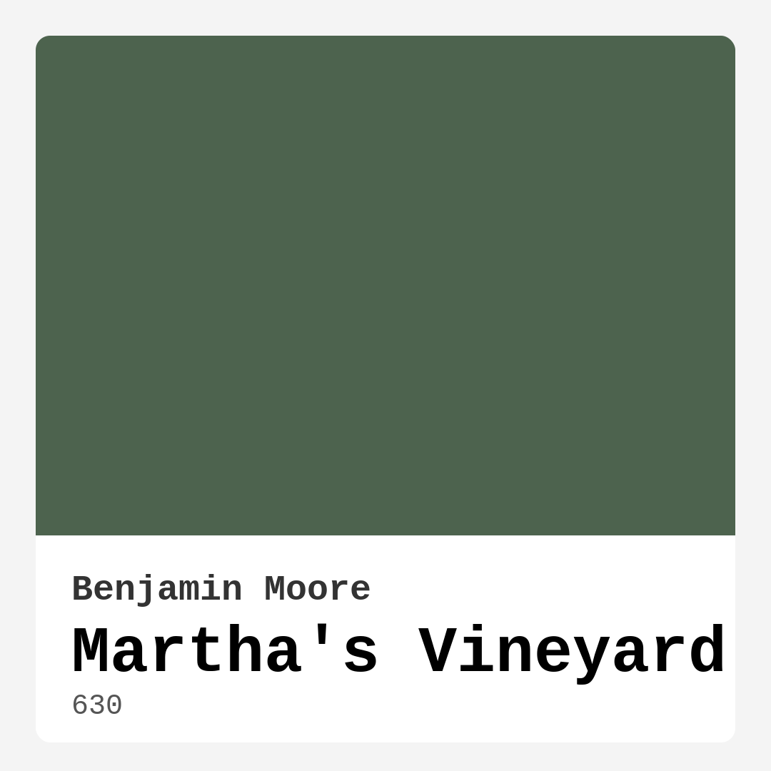
Color Preview & Key Details
| HEX Code | #4D634E |
| RGB | 77, 99, 78 |
| LRV | 11.51% |
| Undertone | Green |
| Finish Options | Eggshell, Matte, Satin |
If you’re searching for a paint color that effortlessly blends tranquility with timeless style, let me introduce you to Benjamin Moore’s *Martha’s Vineyard* (color code 630). This muted green hue is like a breath of fresh air—calming, sophisticated, and incredibly versatile. Whether you’re dreaming of a coastal-inspired living room, a rustic kitchen, or a serene bedroom retreat, this shade has the power to transform your space into something truly special.
One of the first things you’ll notice about *Martha’s Vineyard* is its depth. With an LRV (Light Reflectance Value) of 11.51%, it sits firmly in the medium-dark range, meaning it absorbs more light than it reflects. This gives it a rich, grounded quality that feels both cozy and inviting. In rooms flooded with natural light, the color comes alive, revealing subtle hints of its green undertones. But in lower-light spaces, it takes on a deeper, almost moodier presence—perfect for creating an intimate atmosphere.
What makes this shade so unique is its ability to adapt. It’s not overly bold, nor is it too soft. Instead, it strikes a perfect balance, making it a fantastic choice for almost any room in your home. Picture it in a living room with crisp white trim (Benjamin Moore’s *White Dove* is a flawless pairing) and warm wood accents. The contrast between the deep green and lighter elements keeps the space feeling open while adding just the right amount of drama.
In a bedroom, *Martha’s Vineyard* works like a charm. Its calming, earthy tone promotes relaxation, making it ideal for creating a sanctuary. Pair it with linen bedding, woven textures, and a few well-placed plants, and you’ve got a space that feels like a quiet escape. And if you’re worried about it feeling too dark, don’t be. Even in smaller rooms, this color can shine—just balance it with lighter furnishings and plenty of layered lighting to keep things airy.
Kitchens and dining rooms are another great fit. Imagine your cabinets painted in this lush green, especially in a matte or satin finish. It’s unexpected yet classic, especially when paired with brass hardware and marble countertops. In a dining room, it sets the stage for elegant dinners, especially when complemented by a rustic wood table and soft, neutral tableware.
Now, let’s talk application. One of the best things about *Martha’s Vineyard* is how beginner-friendly it is. The coverage is excellent—you’ll likely only need one or two coats—and it’s touch-up friendly, so minor scuffs or marks won’t be a headache. It’s also low in VOCs, which means fewer fumes and a healthier indoor environment. For high-traffic areas, opt for a satin or eggshell finish, as they offer better washability and durability.
Of course, no color is without its considerations. If your room lacks natural light, *Martha’s Vineyard* can feel a bit more subdued, so be sure to test it in your space before committing. And while it’s versatile, it does lean slightly cool, so if you’re aiming for a warmer vibe, you might want to balance it with creamy whites or warm wood tones.
When it comes to decor pairings, this shade plays well with others. Its complementary hue is purple, so soft lavender accents can add a lovely contrast. For a more natural look, pair it with warm neutrals like beige, taupe, or even a soft gray. And if you’re feeling bold, a deep navy or charcoal can create a striking, modern contrast.
In the end, *Martha’s Vineyard* is more than just a paint color—it’s a mood. It’s the feeling of walking through a lush garden or sitting by the ocean under a canopy of trees. It’s grounding yet fresh, traditional yet modern. Whether you’re refreshing a single wall or overhauling an entire room, this shade has the power to make your space feel intentional, inviting, and utterly unique. So go ahead—dive in. Your perfect green awaits.
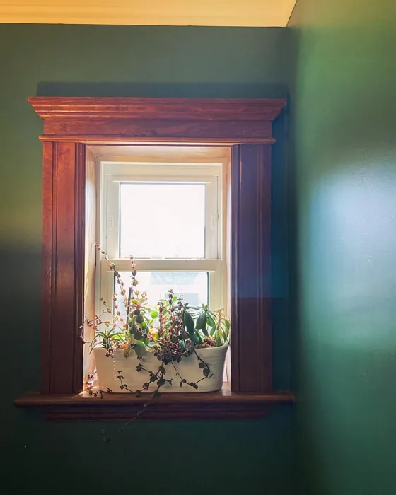
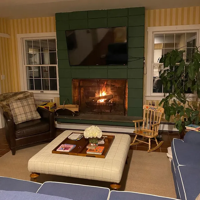
Real Room Photo of Martha’s Vineyard 630
Undertones of Martha’s Vineyard ?
The undertones of Martha’s Vineyard are a key aspect of its character, leaning towards Green. These subtle underlying hues are what give the color its depth and complexity. For example, a gray with a blue undertone will feel cooler and more modern, while one with a brown undertone will feel warmer and more traditional. It’s essential to test this paint in your home and observe it next to your existing furniture, flooring, and decor to see how these undertones interact and reveal themselves throughout the day.
HEX value: #4D634E
RGB code: 77, 99, 78
Is Martha’s Vineyard Cool or Warm?
Martha’s Vineyard leans towards the cooler side of the color spectrum, giving it a refreshing and calming quality. This makes it an excellent choice for creating serene environments, especially in spaces where relaxation is key.
Understanding Color Properties and Interior Design Tips
Hue refers to a specific position on the color wheel, measured in degrees from 0 to 360. Each degree represents a different pure color:
- 0° represents red
- 120° represents green
- 240° represents blue
Saturation describes the intensity or purity of a color and is expressed as a percentage:
- At 0%, the color appears completely desaturated—essentially a shade of gray
- At 100%, the color is at its most vivid and vibrant
Lightness indicates how light or dark a color is, also expressed as a percentage:
- 0% lightness results in black
- 100% lightness results in white
Using Warm Colors in Interior Design
Warm hues—such as reds, oranges, yellows, warm beiges, and greiges—are excellent choices for creating inviting and energetic spaces. These colors are particularly well-suited for:
- Kitchens, living rooms, and bathrooms, where warmth enhances comfort and sociability
- Large rooms, where warm tones can help reduce the sense of emptiness and make the space feel more intimate
For example:
- Warm beige shades provide a cozy, inviting atmosphere, ideal for living rooms, bedrooms, and hallways.
- Warm greige (a mix of beige and gray) offers the warmth of beige with the modern appeal of gray, making it a versatile backdrop for dining areas, bedrooms, and living spaces.
However, be mindful when using warm light tones in rooms with limited natural light. These shades may appear muted or even take on an unpleasant yellowish tint. To avoid a dull or flat appearance:
- Add depth by incorporating richer tones like deep greens, charcoal, or chocolate brown
- Use textured elements such as curtains, rugs, or cushions to bring dimension to the space
Pro Tip: Achieving Harmony with Warm and Cool Color Balance
To create a well-balanced and visually interesting interior, mix warm and cool tones strategically. This contrast adds depth and harmony to your design.
- If your walls feature warm hues, introduce cool-colored accents such as blue or green furniture, artwork, or accessories to create contrast.
- For a polished look, consider using a complementary color scheme, which pairs colors opposite each other on the color wheel (e.g., red with green, orange with blue).
This thoughtful mix not only enhances visual appeal but also creates a space that feels both dynamic and cohesive.
Light Temperature Affects on Martha’s Vineyard
Natural Light
Natural daylight changes in color temperature as the sun moves across the sky. At sunrise and sunset, the light tends to have a warm, golden tone with a color temperature around 2000 Kelvin (K). As the day progresses and the sun rises higher, the light becomes cooler and more neutral. Around midday, especially when the sky is clear, natural light typically reaches its peak brightness and shifts to a cooler tone, ranging from 5500 to 6500 Kelvin. This midday light is close to what we perceive as pure white or daylight-balanced light.
These shifts in natural light can significantly influence how colors appear in a space, which is why designers often consider both the time of day and the orientation of windows when planning interior color schemes.
Artificial Light
When choosing artificial lighting, pay close attention to the color temperature, measured in Kelvin (K). This determines how warm or cool the light will appear. Lower temperatures, around 2700K, give off a warm, yellow glow often used in living rooms or bedrooms. Higher temperatures, above 5000K, create a cool, bluish light similar to daylight, commonly used in kitchens, offices, or task areas.
Use the slider to see how lighting temperature can affect the appearance of a surface or color throughout a space.


4800K
LRV of Martha’s Vineyard
The Light Reflectance Value (LRV) of Martha’s Vineyard is 11.51%, which places it in the Medium Dark category. This means it reflects very little light. Understanding a paint’s LRV is crucial for predicting how it will look in your space. A higher LRV indicates a lighter color that reflects more light, making rooms feel larger and brighter. A lower LRV signifies a darker color that absorbs more light, creating a cozier, more intimate atmosphere. Always consider the natural and artificial lighting in your room when selecting a paint color based on its LRV.
Detailed Review of Martha’s Vineyard
Additional Paint Characteristics
Ideal Rooms
Bedroom, Dining Room, Home Office, Kitchen, Living Room
Decor Styles
Coastal, Modern Farmhouse, Rustic, Traditional
Coverage
Good (1–2 Coats), Touch-Up Friendly
Ease of Application
Beginner Friendly, Brush Smooth, Roller-Ready
Washability
Spot Clean Only, Washable
VOC Level
Low VOC, Ultra Low VOC
Best Use
Accent Wall, Furniture, Interior Walls
Room Suitability
Bedroom, Dining Room, Kitchen, Living Room
Tone Tag
Calm, Earthy, Muted
Finish Type
Eggshell, Matte, Satin
Paint Performance
Easy Touch-Up, High Coverage, Low Odor
Use Cases
Best for Low Light Rooms, Best for Modern Farmhouse, Best for Rentals
Mood
Calm, Grounding, Inviting
Trim Pairing
Complements Wood Trim, Matches Pure White, Pairs with White Dove
Martha’s Vineyard stands out for its versatility and calming presence. Whether you’re looking to refresh a room or create a cozy nook, this paint color fits seamlessly into various styles. The muted green tone offers a perfect backdrop for both contemporary furnishings and classic decor. As a bonus, it pairs beautifully with natural materials like wood and stone, enhancing the organic feel of any space. Homeowners often rave about how it transforms rooms into inviting havens, making it ideal for bedrooms or living areas. Additionally, the paint’s application is smooth and user-friendly, providing a pleasant painting experience.
Pros & Cons of 630 Martha’s Vineyard
Pros
Cons
Colors that go with Benjamin Moore Martha’s Vineyard
FAQ on 630 Martha’s Vineyard
Can Martha’s Vineyard be used in a small room?
Absolutely! While Martha’s Vineyard does have a calming, muted quality, it can work beautifully in small rooms. Just keep in mind that it might darken slightly in less natural light. To maximize the effect, pair it with lighter trim and decor to keep the space feeling open and airy.
How does this paint perform in high-traffic areas?
Martha’s Vineyard is quite durable and can hold up well in high-traffic areas when properly applied. For best results, consider a satin or eggshell finish, which offers more washability and resistance to scuffs. Just be sure to follow the manufacturer’s instructions for prep and application to ensure longevity.
Comparisons Martha’s Vineyard with other colors
Martha's Vineyard 630 vs Dried Thyme SW 6186
| Attribute | Martha's Vineyard 630 | Dried Thyme SW 6186 |
|---|---|---|
| Color Name | Martha's Vineyard 630 | Dried Thyme SW 6186 |
| Color | ||
| Hue | Green | Green |
| Brightness | Dark | Dark |
| RGB | 77, 99, 78 | 123, 128, 112 |
| LRV | 11.51% | 24% |
| Finish Type | Eggshell, Matte, Satin | Eggshell, Satin |
| Finish Options | Eggshell, Matte, Satin | Eggshell, Matte, Satin |
| Ideal Rooms | Bedroom, Dining Room, Home Office, Kitchen, Living Room | Bathroom, Bedroom, Dining Room, Entryway, Home Office, Kitchen, Living Room |
| Decor Styles | Coastal, Modern Farmhouse, Rustic, Traditional | Bohemian, Industrial, Minimalist, Modern Farmhouse, Rustic |
| Coverage | Good (1–2 Coats), Touch-Up Friendly | Good (1–2 Coats), Touch-Up Friendly |
| Ease of Application | Beginner Friendly, Brush Smooth, Roller-Ready | Beginner Friendly, Brush Smooth, Roller-Ready |
| Washability | Spot Clean Only, Washable | Washable, Wipeable |
| Room Suitability | Bedroom, Dining Room, Kitchen, Living Room | Bathroom, Bedroom, Dining Room, Home Office, Kitchen, Living Room |
| Tone | Calm, Earthy, Muted | Cool, Earthy, Muted |
| Paint Performance | Easy Touch-Up, High Coverage, Low Odor | Easy Touch-Up, Low Odor, Scuff Resistant |
Martha's Vineyard 630 vs Retreat SW 6207
| Attribute | Martha's Vineyard 630 | Retreat SW 6207 |
|---|---|---|
| Color Name | Martha's Vineyard 630 | Retreat SW 6207 |
| Color | ||
| Hue | Green | Green |
| Brightness | Dark | Dark |
| RGB | 77, 99, 78 | 122, 128, 118 |
| LRV | 11.51% | 30% |
| Finish Type | Eggshell, Matte, Satin | Eggshell, Matte, Satin |
| Finish Options | Eggshell, Matte, Satin | Eggshell, Matte, Satin |
| Ideal Rooms | Bedroom, Dining Room, Home Office, Kitchen, Living Room | Bathroom, Bedroom, Home Office, Kitchen, Living Room |
| Decor Styles | Coastal, Modern Farmhouse, Rustic, Traditional | Minimalist, Modern, Rustic, Transitional |
| Coverage | Good (1–2 Coats), Touch-Up Friendly | Good (1–2 Coats), Touch-Up Friendly |
| Ease of Application | Beginner Friendly, Brush Smooth, Roller-Ready | Beginner Friendly, Brush Smooth, Roller-Ready |
| Washability | Spot Clean Only, Washable | Washable, Wipeable |
| Room Suitability | Bedroom, Dining Room, Kitchen, Living Room | Bathroom, Bedroom, Home Office, Living Room |
| Tone | Calm, Earthy, Muted | Cool, Earthy, Muted |
| Paint Performance | Easy Touch-Up, High Coverage, Low Odor | Easy Touch-Up, Low Odor, Scuff Resistant |
Martha's Vineyard 630 vs Rosemary SW 6187
| Attribute | Martha's Vineyard 630 | Rosemary SW 6187 |
|---|---|---|
| Color Name | Martha's Vineyard 630 | Rosemary SW 6187 |
| Color | ||
| Hue | Green | Green |
| Brightness | Dark | Dark |
| RGB | 77, 99, 78 | 100, 105, 92 |
| LRV | 11.51% | 45% |
| Finish Type | Eggshell, Matte, Satin | Eggshell, Matte, Satin |
| Finish Options | Eggshell, Matte, Satin | Eggshell, Matte, Satin |
| Ideal Rooms | Bedroom, Dining Room, Home Office, Kitchen, Living Room | Bedroom, Dining Room, Hallway, Home Office, Living Room |
| Decor Styles | Coastal, Modern Farmhouse, Rustic, Traditional | Bohemian, Coastal, Modern Farmhouse, Rustic |
| Coverage | Good (1–2 Coats), Touch-Up Friendly | Good (1–2 Coats), Touch-Up Friendly |
| Ease of Application | Beginner Friendly, Brush Smooth, Roller-Ready | Beginner Friendly, Brush Smooth, Roller-Ready |
| Washability | Spot Clean Only, Washable | Washable, Wipeable |
| Room Suitability | Bedroom, Dining Room, Kitchen, Living Room | Bedroom, Dining Room, Home Office, Living Room |
| Tone | Calm, Earthy, Muted | Earthy, Muted, Warm |
| Paint Performance | Easy Touch-Up, High Coverage, Low Odor | Fade Resistant, Low Odor, Quick Drying, Stain Resistant |
Martha's Vineyard 630 vs Basil SW 6194
| Attribute | Martha's Vineyard 630 | Basil SW 6194 |
|---|---|---|
| Color Name | Martha's Vineyard 630 | Basil SW 6194 |
| Color | ||
| Hue | Green | Green |
| Brightness | Dark | Dark |
| RGB | 77, 99, 78 | 98, 110, 96 |
| LRV | 11.51% | 12% |
| Finish Type | Eggshell, Matte, Satin | Eggshell, Matte, Satin |
| Finish Options | Eggshell, Matte, Satin | Eggshell, Matte, Satin |
| Ideal Rooms | Bedroom, Dining Room, Home Office, Kitchen, Living Room | Bathroom, Bedroom, Dining Room, Home Office, Kitchen, Living Room |
| Decor Styles | Coastal, Modern Farmhouse, Rustic, Traditional | Bohemian, Contemporary, Modern Farmhouse, Rustic, Transitional |
| Coverage | Good (1–2 Coats), Touch-Up Friendly | Good (1–2 Coats), Touch-Up Friendly |
| Ease of Application | Beginner Friendly, Brush Smooth, Roller-Ready | Beginner Friendly, Brush Smooth, Fast-Drying, Roller-Ready |
| Washability | Spot Clean Only, Washable | Washable, Wipeable |
| Room Suitability | Bedroom, Dining Room, Kitchen, Living Room | Bathroom, Bedroom, Dining Room, Kitchen, Living Room |
| Tone | Calm, Earthy, Muted | Earthy, Muted, Warm |
| Paint Performance | Easy Touch-Up, High Coverage, Low Odor | Easy Touch-Up, Low Odor, Quick Drying |
Martha's Vineyard 630 vs Artichoke SW 6179
| Attribute | Martha's Vineyard 630 | Artichoke SW 6179 |
|---|---|---|
| Color Name | Martha's Vineyard 630 | Artichoke SW 6179 |
| Color | ||
| Hue | Green | Green |
| Brightness | Dark | Dark |
| RGB | 77, 99, 78 | 127, 130, 102 |
| LRV | 11.51% | 24% |
| Finish Type | Eggshell, Matte, Satin | Eggshell, Matte, Satin |
| Finish Options | Eggshell, Matte, Satin | Eggshell, Matte, Satin |
| Ideal Rooms | Bedroom, Dining Room, Home Office, Kitchen, Living Room | Bedroom, Dining Room, Home Office, Living Room |
| Decor Styles | Coastal, Modern Farmhouse, Rustic, Traditional | Eclectic, Modern Farmhouse, Rustic, Transitional |
| Coverage | Good (1–2 Coats), Touch-Up Friendly | Good (1–2 Coats), Touch-Up Friendly |
| Ease of Application | Beginner Friendly, Brush Smooth, Roller-Ready | Beginner Friendly, Brush Smooth, Fast-Drying, Roller-Ready |
| Washability | Spot Clean Only, Washable | Washable, Wipeable |
| Room Suitability | Bedroom, Dining Room, Kitchen, Living Room | Bedroom, Dining Room, Home Office, Living Room |
| Tone | Calm, Earthy, Muted | Earthy, Muted, Warm |
| Paint Performance | Easy Touch-Up, High Coverage, Low Odor | Easy Touch-Up, High Coverage, Low Odor |
Martha's Vineyard 630 vs Shade-Grown SW 6188
| Attribute | Martha's Vineyard 630 | Shade-Grown SW 6188 |
|---|---|---|
| Color Name | Martha's Vineyard 630 | Shade-Grown SW 6188 |
| Color | ||
| Hue | Green | Green |
| Brightness | Dark | Dark |
| RGB | 77, 99, 78 | 78, 81, 71 |
| LRV | 11.51% | 24% |
| Finish Type | Eggshell, Matte, Satin | Eggshell, Satin |
| Finish Options | Eggshell, Matte, Satin | Eggshell, Flat, Satin |
| Ideal Rooms | Bedroom, Dining Room, Home Office, Kitchen, Living Room | Bedroom, Dining Room, Home Office, Living Room |
| Decor Styles | Coastal, Modern Farmhouse, Rustic, Traditional | Bohemian, Modern, Rustic, Scandinavian |
| Coverage | Good (1–2 Coats), Touch-Up Friendly | Good (1–2 Coats), Touch-Up Friendly |
| Ease of Application | Beginner Friendly, Brush Smooth, Roller-Ready | Beginner Friendly, Brush Smooth, Fast-Drying, Roller-Ready |
| Washability | Spot Clean Only, Washable | Highly Washable, Washable |
| Room Suitability | Bedroom, Dining Room, Kitchen, Living Room | Bedroom, Dining Room, Home Office, Living Room |
| Tone | Calm, Earthy, Muted | Deep, Earthy, Muted |
| Paint Performance | Easy Touch-Up, High Coverage, Low Odor | Easy Touch-Up, High Coverage, Low Odor, Scuff Resistant |
Martha's Vineyard 630 vs Foxhall Green SW 9184
| Attribute | Martha's Vineyard 630 | Foxhall Green SW 9184 |
|---|---|---|
| Color Name | Martha's Vineyard 630 | Foxhall Green SW 9184 |
| Color | ||
| Hue | Green | Green |
| Brightness | Dark | Dark |
| RGB | 77, 99, 78 | 69, 75, 64 |
| LRV | 11.51% | 12% |
| Finish Type | Eggshell, Matte, Satin | Eggshell, Matte, Satin |
| Finish Options | Eggshell, Matte, Satin | Eggshell, Matte, Satin |
| Ideal Rooms | Bedroom, Dining Room, Home Office, Kitchen, Living Room | Bedroom, Dining Room, Home Office, Living Room |
| Decor Styles | Coastal, Modern Farmhouse, Rustic, Traditional | Contemporary, Modern Farmhouse, Rustic, Traditional |
| Coverage | Good (1–2 Coats), Touch-Up Friendly | Good (1–2 Coats), Touch-Up Friendly |
| Ease of Application | Beginner Friendly, Brush Smooth, Roller-Ready | Beginner Friendly, Brush Smooth, Fast-Drying, Roller-Ready |
| Washability | Spot Clean Only, Washable | Washable, Wipeable |
| Room Suitability | Bedroom, Dining Room, Kitchen, Living Room | Bedroom, Dining Room, Home Office, Living Room |
| Tone | Calm, Earthy, Muted | Balanced, Deep, Earthy, Muted |
| Paint Performance | Easy Touch-Up, High Coverage, Low Odor | Easy Touch-Up, Fade Resistant, Low Odor, Quick Drying |
Martha's Vineyard 630 vs Pewter Green SW 6208
| Attribute | Martha's Vineyard 630 | Pewter Green SW 6208 |
|---|---|---|
| Color Name | Martha's Vineyard 630 | Pewter Green SW 6208 |
| Color | ||
| Hue | Green | Green |
| Brightness | Dark | Dark |
| RGB | 77, 99, 78 | 94, 98, 89 |
| LRV | 11.51% | 24% |
| Finish Type | Eggshell, Matte, Satin | Eggshell, Matte, Satin |
| Finish Options | Eggshell, Matte, Satin | Eggshell, Matte, Satin |
| Ideal Rooms | Bedroom, Dining Room, Home Office, Kitchen, Living Room | Bedroom, Dining Room, Entryway, Home Office, Living Room |
| Decor Styles | Coastal, Modern Farmhouse, Rustic, Traditional | Contemporary, Modern Farmhouse, Rustic, Scandinavian, Traditional |
| Coverage | Good (1–2 Coats), Touch-Up Friendly | Good (1–2 Coats), Touch-Up Friendly |
| Ease of Application | Beginner Friendly, Brush Smooth, Roller-Ready | Beginner Friendly, Brush Smooth, Fast-Drying, Roller-Ready |
| Washability | Spot Clean Only, Washable | Highly Washable, Washable, Wipeable |
| Room Suitability | Bedroom, Dining Room, Kitchen, Living Room | Bathroom, Bedroom, Dining Room, Kitchen, Living Room |
| Tone | Calm, Earthy, Muted | Balanced, Cool, Earthy, Muted |
| Paint Performance | Easy Touch-Up, High Coverage, Low Odor | Easy Touch-Up, Fade Resistant, Low Odor, Quick Drying |
Martha's Vineyard 630 vs Rookwood Dark Green SW 2816
| Attribute | Martha's Vineyard 630 | Rookwood Dark Green SW 2816 |
|---|---|---|
| Color Name | Martha's Vineyard 630 | Rookwood Dark Green SW 2816 |
| Color | ||
| Hue | Green | Green |
| Brightness | Dark | Dark |
| RGB | 77, 99, 78 | 86, 92, 74 |
| LRV | 11.51% | 6% |
| Finish Type | Eggshell, Matte, Satin | Eggshell, Matte, Satin |
| Finish Options | Eggshell, Matte, Satin | Eggshell, Matte, Satin |
| Ideal Rooms | Bedroom, Dining Room, Home Office, Kitchen, Living Room | Bedroom, Dining Room, Home Office, Kitchen, Living Room |
| Decor Styles | Coastal, Modern Farmhouse, Rustic, Traditional | Contemporary, Modern Farmhouse, Rustic, Traditional |
| Coverage | Good (1–2 Coats), Touch-Up Friendly | Good (1–2 Coats), Touch-Up Friendly |
| Ease of Application | Beginner Friendly, Brush Smooth, Roller-Ready | Beginner Friendly, Brush Smooth, Roller-Ready |
| Washability | Spot Clean Only, Washable | Washable, Wipeable |
| Room Suitability | Bedroom, Dining Room, Kitchen, Living Room | Bedroom, Dining Room, Home Office, Living Room |
| Tone | Calm, Earthy, Muted | Deep, Earthy, Warm |
| Paint Performance | Easy Touch-Up, High Coverage, Low Odor | Easy Touch-Up, High Coverage, Low Odor, Scuff Resistant |
Martha's Vineyard 630 vs Ripe Olive SW 6209
| Attribute | Martha's Vineyard 630 | Ripe Olive SW 6209 |
|---|---|---|
| Color Name | Martha's Vineyard 630 | Ripe Olive SW 6209 |
| Color | ||
| Hue | Green | Green |
| Brightness | Dark | Dark |
| RGB | 77, 99, 78 | 68, 72, 61 |
| LRV | 11.51% | 15% |
| Finish Type | Eggshell, Matte, Satin | Eggshell, Matte |
| Finish Options | Eggshell, Matte, Satin | Eggshell, Matte, Satin |
| Ideal Rooms | Bedroom, Dining Room, Home Office, Kitchen, Living Room | Bedroom, Dining Room, Home Office, Living Room |
| Decor Styles | Coastal, Modern Farmhouse, Rustic, Traditional | Bohemian, Industrial, Modern Farmhouse, Rustic |
| Coverage | Good (1–2 Coats), Touch-Up Friendly | Good (1–2 Coats) |
| Ease of Application | Beginner Friendly, Brush Smooth, Roller-Ready | Beginner Friendly, Brush Smooth, Roller-Ready |
| Washability | Spot Clean Only, Washable | Highly Washable, Washable |
| Room Suitability | Bedroom, Dining Room, Kitchen, Living Room | Bedroom, Dining Room, Home Office, Living Room |
| Tone | Calm, Earthy, Muted | Deep, Earthy, Muted |
| Paint Performance | Easy Touch-Up, High Coverage, Low Odor | Easy Touch-Up, High Coverage, Low Odor |
Official Page of Benjamin Moore Martha’s Vineyard 630