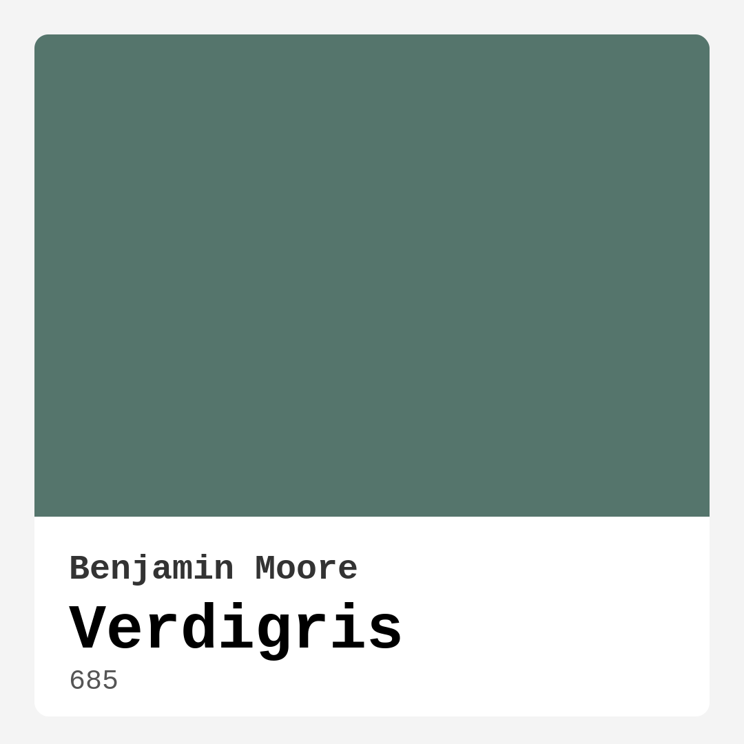
Color Preview & Key Details
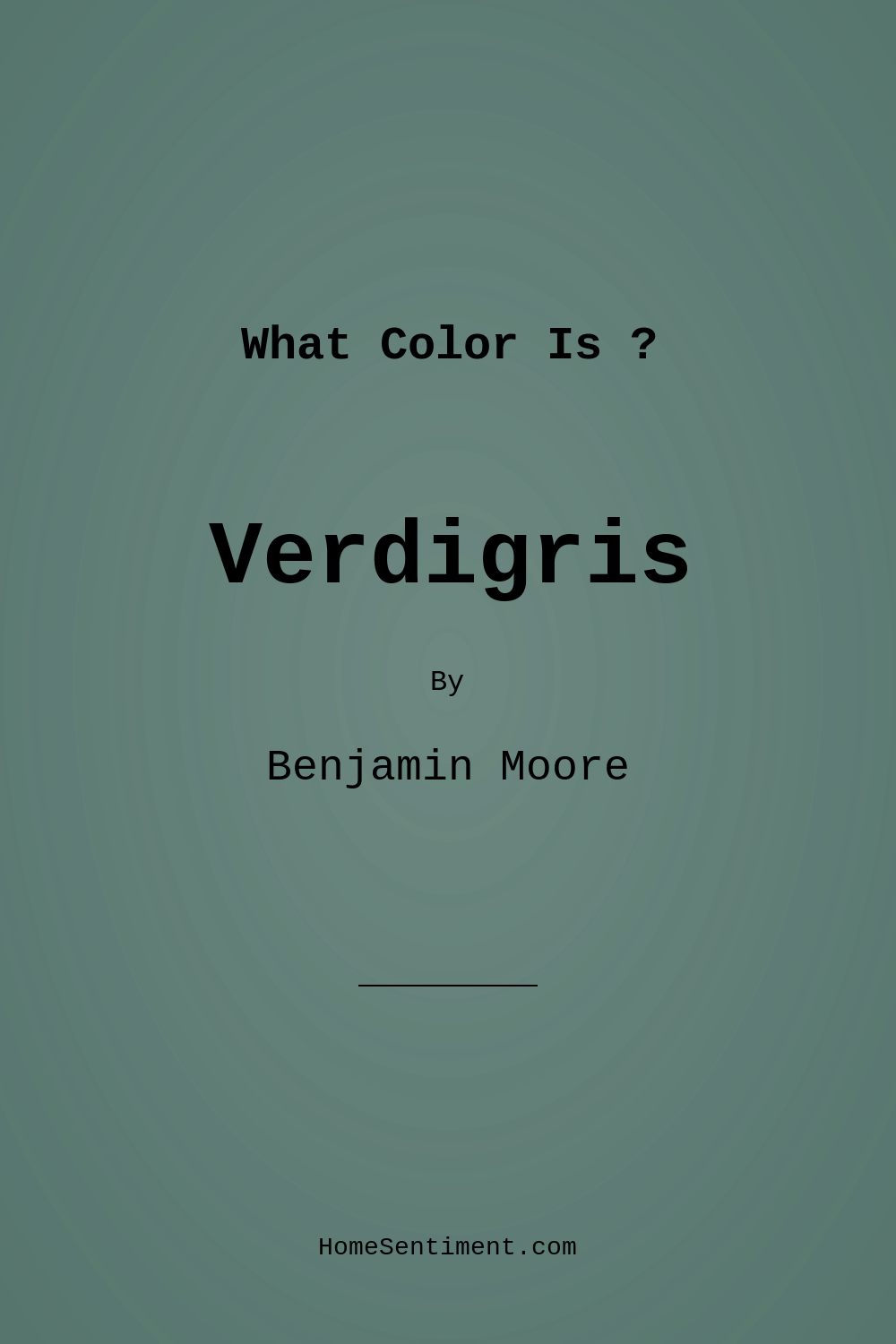
| HEX Code | #55756C |
| RGB | 85, 117, 108 |
| LRV | 17.28% |
| Undertone | Green |
| Finish Options | Matte, Satin, Semi-Gloss |
If you’re searching for a paint color that effortlessly blends sophistication with tranquility, Benjamin Moore’s Verdigris (685) might just be your perfect match. This deep teal-green hue, with its earthy undertones and muted elegance, has a way of transforming any space into a serene retreat. Whether you’re revamping a living room, bedroom, or home office, Verdigris brings a refreshing yet grounded vibe that works across a variety of decor styles—from modern and industrial to rustic and coastal. Let’s dive into what makes this color so special and how you can make it work in your home.
One of the first things you’ll notice about Verdigris is its rich, complex tone. It’s reminiscent of the patina on aged copper, giving it a timeless quality that feels both classic and contemporary. The green undertones are subtle but present, adding depth without overpowering the space. This makes it an excellent choice if you’re looking for a color that’s bold but not overwhelming. Because it reflects very little light (with an LRV of 17.28%), it creates a cozy, intimate atmosphere—perfect for rooms where you want to foster relaxation and focus.
Lighting plays a huge role in how Verdigris appears throughout the day. In natural light, the color comes alive, revealing its true teal-green richness. As the sun shifts, it takes on a more subdued, calming presence in shadowed areas. This dynamic quality means your room will never feel static; instead, it’ll have a living, breathing quality that changes with the time of day. If your space lacks ample natural light, consider pairing Verdigris with lighter accents or strategic lighting to keep it from feeling too dark.
When it comes to application, Verdigris is beginner-friendly. It offers good coverage—usually requiring just one or two coats—and is touch-up friendly, so small mistakes won’t be a headache to fix. The finish you choose can dramatically affect the final look. A matte finish will give you a soft, understated elegance, while satin or semi-gloss will add a bit of sheen, making the color feel more vibrant and polished. If you’re using it on furniture or an accent wall, a semi-gloss finish can highlight details and create a luxe effect.
Versatility is where Verdigris truly shines. It pairs beautifully with a range of materials and colors. For trim, crisp whites like Benjamin Moore’s White Dove keep the look clean and modern. If you want warmth, brass fixtures or wood trim add a touch of organic contrast. For complementary colors, lean into earthy neutrals or even muted reds (its opposite on the color wheel) to create a balanced, harmonious palette. Think terracotta accents, warm leather furniture, or even blush-toned textiles to soften the depth of Verdigris.
Wondering where to use it? This color excels in living rooms and bedrooms, where its calming presence fosters relaxation. In a home office, it promotes focus without feeling sterile. Even kitchens can benefit from Verdigris—especially when paired with natural wood cabinets or marble countertops for a high-end look. If you’re working with an open-concept space, it can help define zones while maintaining a cohesive flow.
Practicality matters, and Verdigris delivers there too. It’s washable, fade-resistant, and low-VOC, making it a great choice for busy households or eco-conscious homeowners. Plus, its quick-drying formula means less downtime during your project. Whether you’re a DIY enthusiast or hiring a pro, this color is forgiving and rewarding to work with.
So, is Verdigris right for you? If you love colors with depth, character, and a touch of timeless elegance, the answer is likely yes. It’s a shade that adapts to your style rather than dictating it, offering endless possibilities for personalization. Test a sample in your space, observe it at different times of day, and imagine how it’ll interact with your furniture and lighting. When done right, Verdigris doesn’t just color your walls—it elevates your entire home.
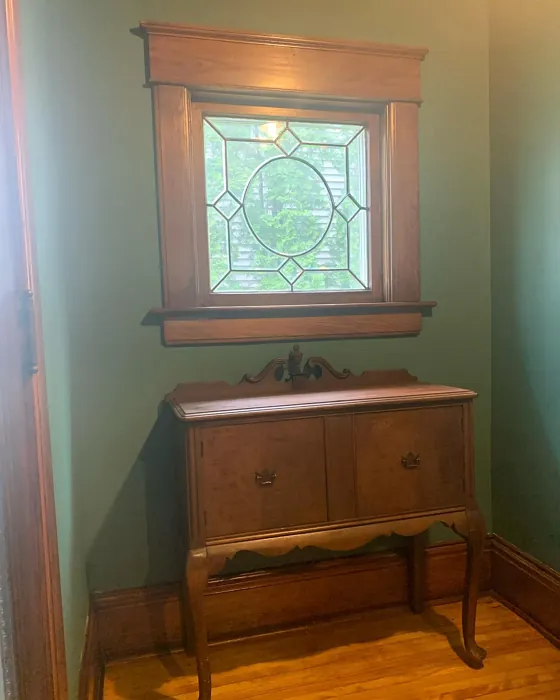
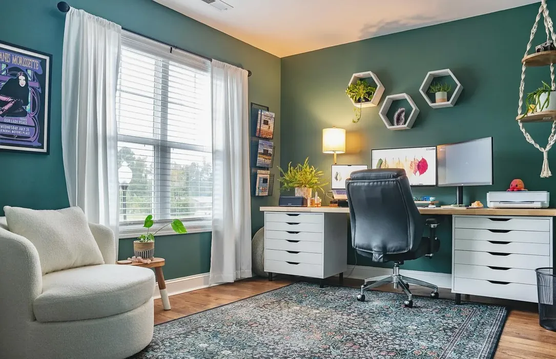
Real Room Photo of Verdigris 685
Undertones of Verdigris ?
The undertones of Verdigris are a key aspect of its character, leaning towards Green. These subtle underlying hues are what give the color its depth and complexity. For example, a gray with a blue undertone will feel cooler and more modern, while one with a brown undertone will feel warmer and more traditional. It’s essential to test this paint in your home and observe it next to your existing furniture, flooring, and decor to see how these undertones interact and reveal themselves throughout the day.
HEX value: #55756C
RGB code: 85, 117, 108
Is Verdigris Cool or Warm?
This color leans towards the cooler side of the spectrum, providing a refreshing yet grounded feel that can brighten up any room without overwhelming it.
Understanding Color Properties and Interior Design Tips
Hue refers to a specific position on the color wheel, measured in degrees from 0 to 360. Each degree represents a different pure color:
- 0° represents red
- 120° represents green
- 240° represents blue
Saturation describes the intensity or purity of a color and is expressed as a percentage:
- At 0%, the color appears completely desaturated—essentially a shade of gray
- At 100%, the color is at its most vivid and vibrant
Lightness indicates how light or dark a color is, also expressed as a percentage:
- 0% lightness results in black
- 100% lightness results in white
Using Warm Colors in Interior Design
Warm hues—such as reds, oranges, yellows, warm beiges, and greiges—are excellent choices for creating inviting and energetic spaces. These colors are particularly well-suited for:
- Kitchens, living rooms, and bathrooms, where warmth enhances comfort and sociability
- Large rooms, where warm tones can help reduce the sense of emptiness and make the space feel more intimate
For example:
- Warm beige shades provide a cozy, inviting atmosphere, ideal for living rooms, bedrooms, and hallways.
- Warm greige (a mix of beige and gray) offers the warmth of beige with the modern appeal of gray, making it a versatile backdrop for dining areas, bedrooms, and living spaces.
However, be mindful when using warm light tones in rooms with limited natural light. These shades may appear muted or even take on an unpleasant yellowish tint. To avoid a dull or flat appearance:
- Add depth by incorporating richer tones like deep greens, charcoal, or chocolate brown
- Use textured elements such as curtains, rugs, or cushions to bring dimension to the space
Pro Tip: Achieving Harmony with Warm and Cool Color Balance
To create a well-balanced and visually interesting interior, mix warm and cool tones strategically. This contrast adds depth and harmony to your design.
- If your walls feature warm hues, introduce cool-colored accents such as blue or green furniture, artwork, or accessories to create contrast.
- For a polished look, consider using a complementary color scheme, which pairs colors opposite each other on the color wheel (e.g., red with green, orange with blue).
This thoughtful mix not only enhances visual appeal but also creates a space that feels both dynamic and cohesive.
Light Temperature Affects on Verdigris
Natural Light
Natural daylight changes in color temperature as the sun moves across the sky. At sunrise and sunset, the light tends to have a warm, golden tone with a color temperature around 2000 Kelvin (K). As the day progresses and the sun rises higher, the light becomes cooler and more neutral. Around midday, especially when the sky is clear, natural light typically reaches its peak brightness and shifts to a cooler tone, ranging from 5500 to 6500 Kelvin. This midday light is close to what we perceive as pure white or daylight-balanced light.
These shifts in natural light can significantly influence how colors appear in a space, which is why designers often consider both the time of day and the orientation of windows when planning interior color schemes.
Artificial Light
When choosing artificial lighting, pay close attention to the color temperature, measured in Kelvin (K). This determines how warm or cool the light will appear. Lower temperatures, around 2700K, give off a warm, yellow glow often used in living rooms or bedrooms. Higher temperatures, above 5000K, create a cool, bluish light similar to daylight, commonly used in kitchens, offices, or task areas.
Use the slider to see how lighting temperature can affect the appearance of a surface or color throughout a space.


4800K
LRV of Verdigris
The Light Reflectance Value (LRV) of Verdigris is 17.28%, which places it in the Medium Dark category. This means it reflects very little light. Understanding a paint’s LRV is crucial for predicting how it will look in your space. A higher LRV indicates a lighter color that reflects more light, making rooms feel larger and brighter. A lower LRV signifies a darker color that absorbs more light, creating a cozier, more intimate atmosphere. Always consider the natural and artificial lighting in your room when selecting a paint color based on its LRV.
Detailed Review of Verdigris
Additional Paint Characteristics
Ideal Rooms
Bedroom, Home Office, Kitchen, Living Room
Decor Styles
Coastal, Industrial, Modern, Rustic, Traditional
Coverage
Good (1–2 Coats), Touch-Up Friendly
Ease of Application
Beginner Friendly, Brush Smooth, Roller-Ready
Washability
Highly Washable, Washable
VOC Level
Eco-Certified, Low VOC
Best Use
Accent Wall, Furniture, Interior Walls
Room Suitability
Bedroom, Dining Room, Home Office, Living Room
Tone Tag
Cool, Earthy, Muted
Finish Type
Matte, Satin, Semi-Gloss
Paint Performance
Easy Touch-Up, Fade Resistant, Low Odor, Quick Drying
Use Cases
Best for Modern Farmhouse, Best for Open Concept, Designer Favorite
Mood
Calm, Grounding, Inviting
Trim Pairing
Complements Brass Fixtures, Good with Wood Trim, Pairs with White Dove
When it comes to Verdigris, one can’t help but admire its versatility. This color works wonders in a variety of rooms, from the calming embrace of a bedroom to the lively atmosphere of a dining area. Its muted elegance allows it to pair beautifully with a range of decor styles, making it a favorite among designers. The finish options are equally impressive; whether you choose a matte for a softer look or a semi-gloss for a bit of sheen, Verdigris maintains its charm. In terms of application, it’s relatively easy to work with, providing good coverage and a smooth finish. If you’re looking for a color that embodies both tranquility and style, Verdigris is certainly worth considering.
Pros & Cons of 685 Verdigris
Pros
Cons
Colors that go with Benjamin Moore Verdigris
FAQ on 685 Verdigris
Can Verdigris be used in smaller spaces?
Absolutely! While Verdigris offers a deep tone, it can still work well in smaller rooms. To avoid feeling cramped, pair it with lighter accents and ensure adequate lighting. This will help maintain a balanced feel and prevent the space from appearing too dark.
What finishes work best with Verdigris?
Verdigris shines in a variety of finishes. A matte finish provides a soft, understated look, while a satin or semi-gloss finish can add a touch of elegance and reflectivity. Consider your room’s overall design and the effect you want to achieve when selecting a finish.
Comparisons Verdigris with other colors
Verdigris 685 vs Dried Thyme SW 6186
| Attribute | Verdigris 685 | Dried Thyme SW 6186 |
|---|---|---|
| Color Name | Verdigris 685 | Dried Thyme SW 6186 |
| Color | ||
| Hue | Green | Green |
| Brightness | Dark | Dark |
| RGB | 85, 117, 108 | 123, 128, 112 |
| LRV | 17.28% | 24% |
| Finish Type | Matte, Satin, Semi-Gloss | Eggshell, Satin |
| Finish Options | Matte, Satin, Semi-Gloss | Eggshell, Matte, Satin |
| Ideal Rooms | Bedroom, Home Office, Kitchen, Living Room | Bathroom, Bedroom, Dining Room, Entryway, Home Office, Kitchen, Living Room |
| Decor Styles | Coastal, Industrial, Modern, Rustic, Traditional | Bohemian, Industrial, Minimalist, Modern Farmhouse, Rustic |
| Coverage | Good (1–2 Coats), Touch-Up Friendly | Good (1–2 Coats), Touch-Up Friendly |
| Ease of Application | Beginner Friendly, Brush Smooth, Roller-Ready | Beginner Friendly, Brush Smooth, Roller-Ready |
| Washability | Highly Washable, Washable | Washable, Wipeable |
| Room Suitability | Bedroom, Dining Room, Home Office, Living Room | Bathroom, Bedroom, Dining Room, Home Office, Kitchen, Living Room |
| Tone | Cool, Earthy, Muted | Cool, Earthy, Muted |
| Paint Performance | Easy Touch-Up, Fade Resistant, Low Odor, Quick Drying | Easy Touch-Up, Low Odor, Scuff Resistant |
Verdigris 685 vs Retreat SW 6207
| Attribute | Verdigris 685 | Retreat SW 6207 |
|---|---|---|
| Color Name | Verdigris 685 | Retreat SW 6207 |
| Color | ||
| Hue | Green | Green |
| Brightness | Dark | Dark |
| RGB | 85, 117, 108 | 122, 128, 118 |
| LRV | 17.28% | 30% |
| Finish Type | Matte, Satin, Semi-Gloss | Eggshell, Matte, Satin |
| Finish Options | Matte, Satin, Semi-Gloss | Eggshell, Matte, Satin |
| Ideal Rooms | Bedroom, Home Office, Kitchen, Living Room | Bathroom, Bedroom, Home Office, Kitchen, Living Room |
| Decor Styles | Coastal, Industrial, Modern, Rustic, Traditional | Minimalist, Modern, Rustic, Transitional |
| Coverage | Good (1–2 Coats), Touch-Up Friendly | Good (1–2 Coats), Touch-Up Friendly |
| Ease of Application | Beginner Friendly, Brush Smooth, Roller-Ready | Beginner Friendly, Brush Smooth, Roller-Ready |
| Washability | Highly Washable, Washable | Washable, Wipeable |
| Room Suitability | Bedroom, Dining Room, Home Office, Living Room | Bathroom, Bedroom, Home Office, Living Room |
| Tone | Cool, Earthy, Muted | Cool, Earthy, Muted |
| Paint Performance | Easy Touch-Up, Fade Resistant, Low Odor, Quick Drying | Easy Touch-Up, Low Odor, Scuff Resistant |
Verdigris 685 vs Rosemary SW 6187
| Attribute | Verdigris 685 | Rosemary SW 6187 |
|---|---|---|
| Color Name | Verdigris 685 | Rosemary SW 6187 |
| Color | ||
| Hue | Green | Green |
| Brightness | Dark | Dark |
| RGB | 85, 117, 108 | 100, 105, 92 |
| LRV | 17.28% | 45% |
| Finish Type | Matte, Satin, Semi-Gloss | Eggshell, Matte, Satin |
| Finish Options | Matte, Satin, Semi-Gloss | Eggshell, Matte, Satin |
| Ideal Rooms | Bedroom, Home Office, Kitchen, Living Room | Bedroom, Dining Room, Hallway, Home Office, Living Room |
| Decor Styles | Coastal, Industrial, Modern, Rustic, Traditional | Bohemian, Coastal, Modern Farmhouse, Rustic |
| Coverage | Good (1–2 Coats), Touch-Up Friendly | Good (1–2 Coats), Touch-Up Friendly |
| Ease of Application | Beginner Friendly, Brush Smooth, Roller-Ready | Beginner Friendly, Brush Smooth, Roller-Ready |
| Washability | Highly Washable, Washable | Washable, Wipeable |
| Room Suitability | Bedroom, Dining Room, Home Office, Living Room | Bedroom, Dining Room, Home Office, Living Room |
| Tone | Cool, Earthy, Muted | Earthy, Muted, Warm |
| Paint Performance | Easy Touch-Up, Fade Resistant, Low Odor, Quick Drying | Fade Resistant, Low Odor, Quick Drying, Stain Resistant |
Verdigris 685 vs Basil SW 6194
| Attribute | Verdigris 685 | Basil SW 6194 |
|---|---|---|
| Color Name | Verdigris 685 | Basil SW 6194 |
| Color | ||
| Hue | Green | Green |
| Brightness | Dark | Dark |
| RGB | 85, 117, 108 | 98, 110, 96 |
| LRV | 17.28% | 12% |
| Finish Type | Matte, Satin, Semi-Gloss | Eggshell, Matte, Satin |
| Finish Options | Matte, Satin, Semi-Gloss | Eggshell, Matte, Satin |
| Ideal Rooms | Bedroom, Home Office, Kitchen, Living Room | Bathroom, Bedroom, Dining Room, Home Office, Kitchen, Living Room |
| Decor Styles | Coastal, Industrial, Modern, Rustic, Traditional | Bohemian, Contemporary, Modern Farmhouse, Rustic, Transitional |
| Coverage | Good (1–2 Coats), Touch-Up Friendly | Good (1–2 Coats), Touch-Up Friendly |
| Ease of Application | Beginner Friendly, Brush Smooth, Roller-Ready | Beginner Friendly, Brush Smooth, Fast-Drying, Roller-Ready |
| Washability | Highly Washable, Washable | Washable, Wipeable |
| Room Suitability | Bedroom, Dining Room, Home Office, Living Room | Bathroom, Bedroom, Dining Room, Kitchen, Living Room |
| Tone | Cool, Earthy, Muted | Earthy, Muted, Warm |
| Paint Performance | Easy Touch-Up, Fade Resistant, Low Odor, Quick Drying | Easy Touch-Up, Low Odor, Quick Drying |
Verdigris 685 vs Artichoke SW 6179
| Attribute | Verdigris 685 | Artichoke SW 6179 |
|---|---|---|
| Color Name | Verdigris 685 | Artichoke SW 6179 |
| Color | ||
| Hue | Green | Green |
| Brightness | Dark | Dark |
| RGB | 85, 117, 108 | 127, 130, 102 |
| LRV | 17.28% | 24% |
| Finish Type | Matte, Satin, Semi-Gloss | Eggshell, Matte, Satin |
| Finish Options | Matte, Satin, Semi-Gloss | Eggshell, Matte, Satin |
| Ideal Rooms | Bedroom, Home Office, Kitchen, Living Room | Bedroom, Dining Room, Home Office, Living Room |
| Decor Styles | Coastal, Industrial, Modern, Rustic, Traditional | Eclectic, Modern Farmhouse, Rustic, Transitional |
| Coverage | Good (1–2 Coats), Touch-Up Friendly | Good (1–2 Coats), Touch-Up Friendly |
| Ease of Application | Beginner Friendly, Brush Smooth, Roller-Ready | Beginner Friendly, Brush Smooth, Fast-Drying, Roller-Ready |
| Washability | Highly Washable, Washable | Washable, Wipeable |
| Room Suitability | Bedroom, Dining Room, Home Office, Living Room | Bedroom, Dining Room, Home Office, Living Room |
| Tone | Cool, Earthy, Muted | Earthy, Muted, Warm |
| Paint Performance | Easy Touch-Up, Fade Resistant, Low Odor, Quick Drying | Easy Touch-Up, High Coverage, Low Odor |
Verdigris 685 vs Shade-Grown SW 6188
| Attribute | Verdigris 685 | Shade-Grown SW 6188 |
|---|---|---|
| Color Name | Verdigris 685 | Shade-Grown SW 6188 |
| Color | ||
| Hue | Green | Green |
| Brightness | Dark | Dark |
| RGB | 85, 117, 108 | 78, 81, 71 |
| LRV | 17.28% | 24% |
| Finish Type | Matte, Satin, Semi-Gloss | Eggshell, Satin |
| Finish Options | Matte, Satin, Semi-Gloss | Eggshell, Flat, Satin |
| Ideal Rooms | Bedroom, Home Office, Kitchen, Living Room | Bedroom, Dining Room, Home Office, Living Room |
| Decor Styles | Coastal, Industrial, Modern, Rustic, Traditional | Bohemian, Modern, Rustic, Scandinavian |
| Coverage | Good (1–2 Coats), Touch-Up Friendly | Good (1–2 Coats), Touch-Up Friendly |
| Ease of Application | Beginner Friendly, Brush Smooth, Roller-Ready | Beginner Friendly, Brush Smooth, Fast-Drying, Roller-Ready |
| Washability | Highly Washable, Washable | Highly Washable, Washable |
| Room Suitability | Bedroom, Dining Room, Home Office, Living Room | Bedroom, Dining Room, Home Office, Living Room |
| Tone | Cool, Earthy, Muted | Deep, Earthy, Muted |
| Paint Performance | Easy Touch-Up, Fade Resistant, Low Odor, Quick Drying | Easy Touch-Up, High Coverage, Low Odor, Scuff Resistant |
Verdigris 685 vs Foxhall Green SW 9184
| Attribute | Verdigris 685 | Foxhall Green SW 9184 |
|---|---|---|
| Color Name | Verdigris 685 | Foxhall Green SW 9184 |
| Color | ||
| Hue | Green | Green |
| Brightness | Dark | Dark |
| RGB | 85, 117, 108 | 69, 75, 64 |
| LRV | 17.28% | 12% |
| Finish Type | Matte, Satin, Semi-Gloss | Eggshell, Matte, Satin |
| Finish Options | Matte, Satin, Semi-Gloss | Eggshell, Matte, Satin |
| Ideal Rooms | Bedroom, Home Office, Kitchen, Living Room | Bedroom, Dining Room, Home Office, Living Room |
| Decor Styles | Coastal, Industrial, Modern, Rustic, Traditional | Contemporary, Modern Farmhouse, Rustic, Traditional |
| Coverage | Good (1–2 Coats), Touch-Up Friendly | Good (1–2 Coats), Touch-Up Friendly |
| Ease of Application | Beginner Friendly, Brush Smooth, Roller-Ready | Beginner Friendly, Brush Smooth, Fast-Drying, Roller-Ready |
| Washability | Highly Washable, Washable | Washable, Wipeable |
| Room Suitability | Bedroom, Dining Room, Home Office, Living Room | Bedroom, Dining Room, Home Office, Living Room |
| Tone | Cool, Earthy, Muted | Balanced, Deep, Earthy, Muted |
| Paint Performance | Easy Touch-Up, Fade Resistant, Low Odor, Quick Drying | Easy Touch-Up, Fade Resistant, Low Odor, Quick Drying |
Verdigris 685 vs Pewter Green SW 6208
| Attribute | Verdigris 685 | Pewter Green SW 6208 |
|---|---|---|
| Color Name | Verdigris 685 | Pewter Green SW 6208 |
| Color | ||
| Hue | Green | Green |
| Brightness | Dark | Dark |
| RGB | 85, 117, 108 | 94, 98, 89 |
| LRV | 17.28% | 24% |
| Finish Type | Matte, Satin, Semi-Gloss | Eggshell, Matte, Satin |
| Finish Options | Matte, Satin, Semi-Gloss | Eggshell, Matte, Satin |
| Ideal Rooms | Bedroom, Home Office, Kitchen, Living Room | Bedroom, Dining Room, Entryway, Home Office, Living Room |
| Decor Styles | Coastal, Industrial, Modern, Rustic, Traditional | Contemporary, Modern Farmhouse, Rustic, Scandinavian, Traditional |
| Coverage | Good (1–2 Coats), Touch-Up Friendly | Good (1–2 Coats), Touch-Up Friendly |
| Ease of Application | Beginner Friendly, Brush Smooth, Roller-Ready | Beginner Friendly, Brush Smooth, Fast-Drying, Roller-Ready |
| Washability | Highly Washable, Washable | Highly Washable, Washable, Wipeable |
| Room Suitability | Bedroom, Dining Room, Home Office, Living Room | Bathroom, Bedroom, Dining Room, Kitchen, Living Room |
| Tone | Cool, Earthy, Muted | Balanced, Cool, Earthy, Muted |
| Paint Performance | Easy Touch-Up, Fade Resistant, Low Odor, Quick Drying | Easy Touch-Up, Fade Resistant, Low Odor, Quick Drying |
Verdigris 685 vs Rookwood Dark Green SW 2816
| Attribute | Verdigris 685 | Rookwood Dark Green SW 2816 |
|---|---|---|
| Color Name | Verdigris 685 | Rookwood Dark Green SW 2816 |
| Color | ||
| Hue | Green | Green |
| Brightness | Dark | Dark |
| RGB | 85, 117, 108 | 86, 92, 74 |
| LRV | 17.28% | 6% |
| Finish Type | Matte, Satin, Semi-Gloss | Eggshell, Matte, Satin |
| Finish Options | Matte, Satin, Semi-Gloss | Eggshell, Matte, Satin |
| Ideal Rooms | Bedroom, Home Office, Kitchen, Living Room | Bedroom, Dining Room, Home Office, Kitchen, Living Room |
| Decor Styles | Coastal, Industrial, Modern, Rustic, Traditional | Contemporary, Modern Farmhouse, Rustic, Traditional |
| Coverage | Good (1–2 Coats), Touch-Up Friendly | Good (1–2 Coats), Touch-Up Friendly |
| Ease of Application | Beginner Friendly, Brush Smooth, Roller-Ready | Beginner Friendly, Brush Smooth, Roller-Ready |
| Washability | Highly Washable, Washable | Washable, Wipeable |
| Room Suitability | Bedroom, Dining Room, Home Office, Living Room | Bedroom, Dining Room, Home Office, Living Room |
| Tone | Cool, Earthy, Muted | Deep, Earthy, Warm |
| Paint Performance | Easy Touch-Up, Fade Resistant, Low Odor, Quick Drying | Easy Touch-Up, High Coverage, Low Odor, Scuff Resistant |
Verdigris 685 vs Ripe Olive SW 6209
| Attribute | Verdigris 685 | Ripe Olive SW 6209 |
|---|---|---|
| Color Name | Verdigris 685 | Ripe Olive SW 6209 |
| Color | ||
| Hue | Green | Green |
| Brightness | Dark | Dark |
| RGB | 85, 117, 108 | 68, 72, 61 |
| LRV | 17.28% | 15% |
| Finish Type | Matte, Satin, Semi-Gloss | Eggshell, Matte |
| Finish Options | Matte, Satin, Semi-Gloss | Eggshell, Matte, Satin |
| Ideal Rooms | Bedroom, Home Office, Kitchen, Living Room | Bedroom, Dining Room, Home Office, Living Room |
| Decor Styles | Coastal, Industrial, Modern, Rustic, Traditional | Bohemian, Industrial, Modern Farmhouse, Rustic |
| Coverage | Good (1–2 Coats), Touch-Up Friendly | Good (1–2 Coats) |
| Ease of Application | Beginner Friendly, Brush Smooth, Roller-Ready | Beginner Friendly, Brush Smooth, Roller-Ready |
| Washability | Highly Washable, Washable | Highly Washable, Washable |
| Room Suitability | Bedroom, Dining Room, Home Office, Living Room | Bedroom, Dining Room, Home Office, Living Room |
| Tone | Cool, Earthy, Muted | Deep, Earthy, Muted |
| Paint Performance | Easy Touch-Up, Fade Resistant, Low Odor, Quick Drying | Easy Touch-Up, High Coverage, Low Odor |
Official Page of Benjamin Moore Verdigris 685