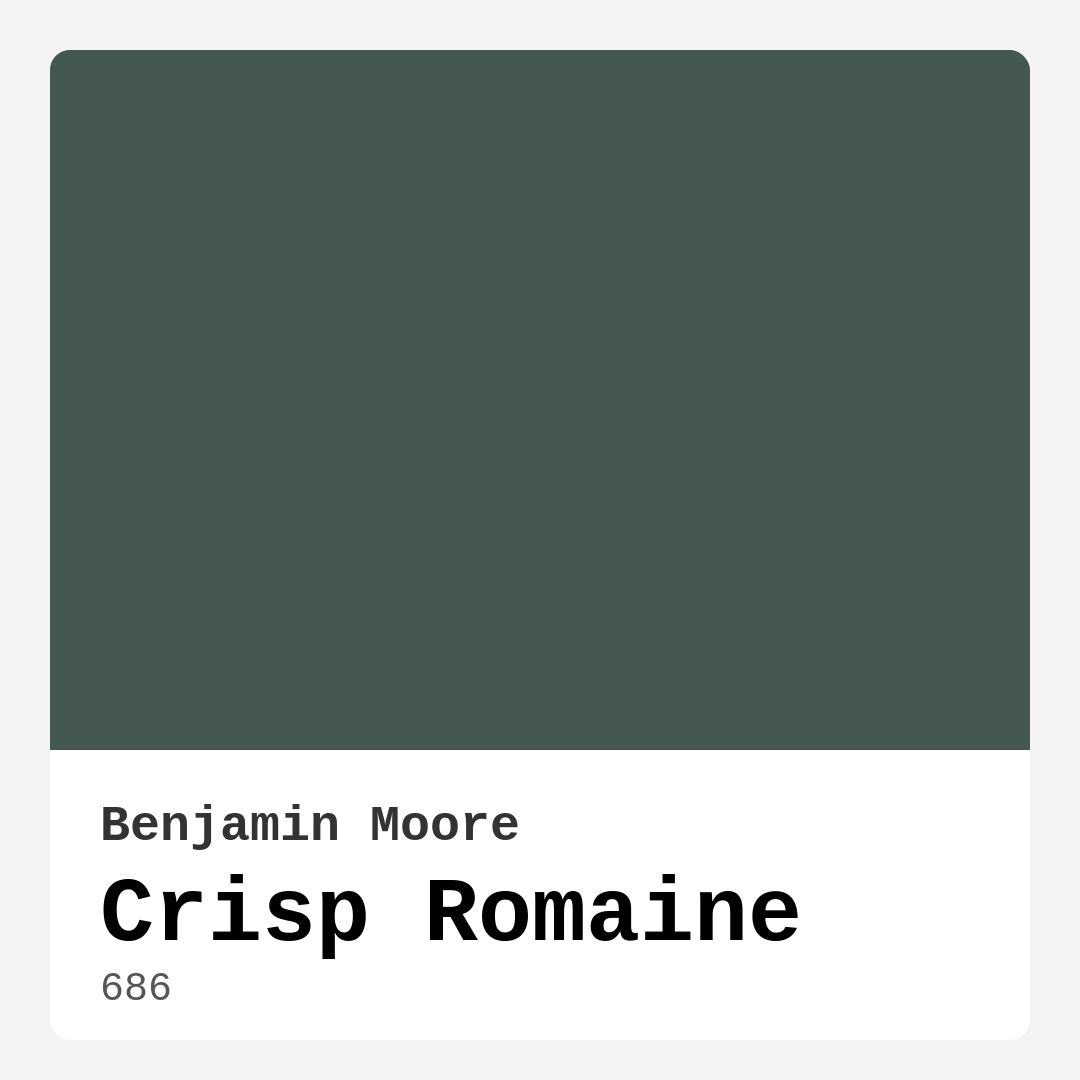
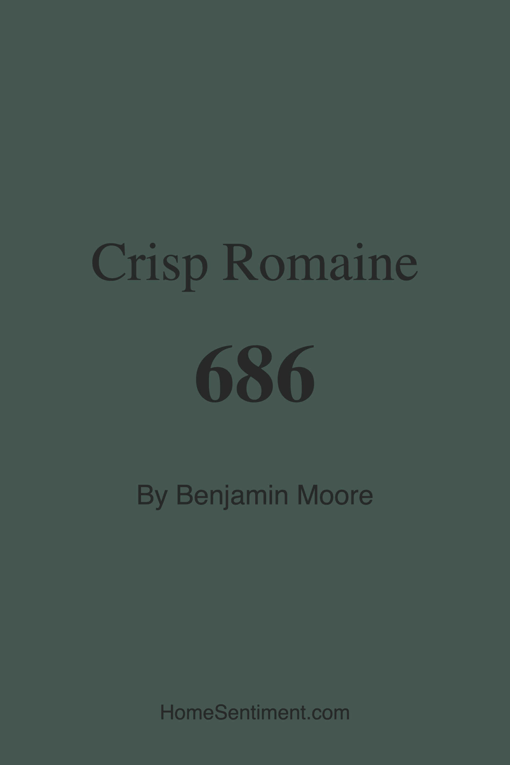
Color Preview & Key Details
| HEX Code | #445851 |
| RGB | 68, 88, 81 |
| LRV | 9.22% |
| Undertone | Green |
| Finish Options | Eggshell, Satin, Semi-Gloss |
If you’re looking for a paint color that effortlessly blends sophistication with a touch of nature’s tranquility, Benjamin Moore’s Crisp Romaine might just be your perfect match. This deep, muted green—coded as 686—has a way of transforming spaces into serene retreats while still feeling fresh and modern. With its rich undertones and versatile appeal, it’s no wonder this shade has become a favorite among designers and homeowners alike. Let’s dive into everything you need to know to decide if Crisp Romaine is right for your next project.
First, let’s talk about the color itself. Crisp Romaine sits firmly in the green family, but it’s far from your typical bright or grassy hue. Instead, it leans into a darker, more subdued palette with subtle gray undertones that give it depth and complexity. The hex code #445851 breaks down to a balanced mix of blue and green, creating a tone that feels earthy and refined. With a Light Reflectance Value (LRV) of just 9.22%, this color absorbs light rather than reflecting it, making it ideal for creating cozy, intimate spaces. That said, don’t let the low LRV scare you—it’s all about how you use it.
One of the standout qualities of Crisp Romaine is its versatility. Whether your style leans modern farmhouse, contemporary, rustic, or eclectic, this shade adapts beautifully. Imagine it in a living room with crisp white trim and warm wood accents—it instantly feels inviting. Or picture it in a home office paired with brass fixtures and leather furniture, where it adds a touch of understated elegance. It even works wonders in kitchens and dining rooms, especially when balanced with lighter cabinetry or open shelving. The key is to let it shine as a statement while keeping the surrounding elements light and airy to prevent the space from feeling too heavy.
Now, let’s address the elephant in the room: can you use Crisp Romaine in small spaces? Absolutely. While darker colors can sometimes make small rooms feel cramped, this shade has a way of creating depth without overwhelming. Try it on an accent wall or pair it with plenty of natural light and lighter furnishings to keep the room feeling open. If you’re hesitant, test a small area first and observe how the color changes throughout the day. You might be surprised at how it brings warmth and character to even the coziest corners.
When it comes to application, Crisp Romaine is beginner-friendly. It offers excellent coverage, often needing just one or two coats, and it’s touch-up friendly—a lifesaver for busy households. The finish options (eggshell, satin, or semi-gloss) give you flexibility depending on the room’s needs. High-traffic areas like hallways or kitchens? Go for satin or semi-gloss for added durability and easy cleaning. Bedrooms or home offices? Eggshell will give you a soft, velvety finish that enhances the color’s richness.
Speaking of durability, this paint holds up well over time. It’s low VOC and eco-certified, so you won’t have to worry about harsh fumes during or after application. Plus, its washability makes it practical for spaces that see a lot of action. Spills, scuffs, or fingerprints? A quick wipe-down is all it takes to keep it looking fresh.
Now, let’s talk pairings. Crisp Romaine plays well with a range of complementary colors. For a classic look, pair it with Benjamin Moore’s White Dove or Pure White for trim—the contrast is timeless. If you want to lean into its earthy side, try warm neutrals like AF-625 or CSP-480. For a bolder approach, accents in red-hued tones (think terracotta or deep burgundy) can create a striking balance, thanks to its complementary hue value of 339. And don’t forget metallics—brass, gold, or even matte black fixtures can elevate the entire space.
Lighting is another factor to consider. In natural light, Crisp Romaine reveals its true depth, almost like the lush greenery of a forest. In dimmer settings, it takes on a more muted, cozy vibe, perfect for creating a relaxing bedroom or a moody dining room. If your space lacks natural light, don’t shy away—just balance it with plenty of ambient lighting to keep it from feeling too dark.
So, who is Crisp Romaine best for? If you’re drawn to colors that feel grounded and calming, this is a winner. It’s ideal for anyone wanting to bring a touch of nature indoors without sacrificing sophistication. It’s also a great choice if you love the idea of a dark wall but aren’t ready to commit to something as bold as black or navy. And if you’re working with a modern farmhouse or rustic aesthetic, this shade will feel right at home.
Of course, no color is without its considerations. Crisp Romaine’s depth means it requires thoughtful pairing—mismatched furniture or clashing undertones can throw off the entire vibe. And while it’s versatile, it might not be the best fit for rooms where you want a bright, airy feel. But if you’re after warmth, coziness, and a connection to the outdoors, it’s hard to beat.
At the end of the day, paint is personal. The best way to know if Crisp Romaine is right for you is to test it in your space. Grab a sample, paint a swatch, and live with it for a few days. Notice how it changes with the light, how it interacts with your furniture, and most importantly, how it makes you feel. Because the perfect color isn’t just about trends—it’s about creating a home that feels uniquely yours. And Crisp Romaine? It just might be the missing piece you’ve been looking for.
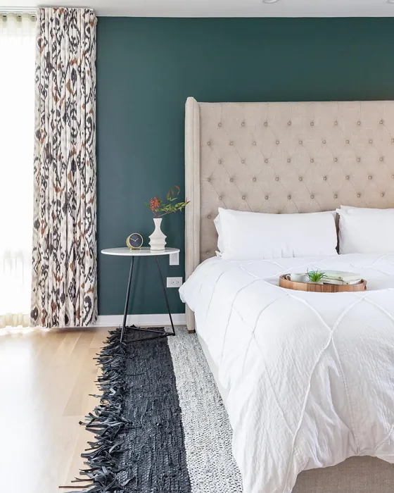
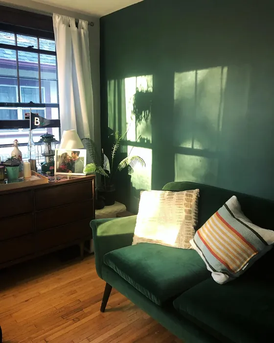
Real Room Photo of Crisp Romaine 686
Undertones of Crisp Romaine ?
The undertones of Crisp Romaine are a key aspect of its character, leaning towards Green. These subtle underlying hues are what give the color its depth and complexity. For example, a gray with a blue undertone will feel cooler and more modern, while one with a brown undertone will feel warmer and more traditional. It’s essential to test this paint in your home and observe it next to your existing furniture, flooring, and decor to see how these undertones interact and reveal themselves throughout the day.
HEX value: #445851
RGB code: 68, 88, 81
Is Crisp Romaine Cool or Warm?
This color leans slightly cool due to its gray undertones, which help to balance the warmth of natural light. This makes it an excellent choice for spaces that receive a lot of sunlight, as it won’t appear too vibrant or overwhelming.
Understanding Color Properties and Interior Design Tips
Hue refers to a specific position on the color wheel, measured in degrees from 0 to 360. Each degree represents a different pure color:
- 0° represents red
- 120° represents green
- 240° represents blue
Saturation describes the intensity or purity of a color and is expressed as a percentage:
- At 0%, the color appears completely desaturated—essentially a shade of gray
- At 100%, the color is at its most vivid and vibrant
Lightness indicates how light or dark a color is, also expressed as a percentage:
- 0% lightness results in black
- 100% lightness results in white
Using Warm Colors in Interior Design
Warm hues—such as reds, oranges, yellows, warm beiges, and greiges—are excellent choices for creating inviting and energetic spaces. These colors are particularly well-suited for:
- Kitchens, living rooms, and bathrooms, where warmth enhances comfort and sociability
- Large rooms, where warm tones can help reduce the sense of emptiness and make the space feel more intimate
For example:
- Warm beige shades provide a cozy, inviting atmosphere, ideal for living rooms, bedrooms, and hallways.
- Warm greige (a mix of beige and gray) offers the warmth of beige with the modern appeal of gray, making it a versatile backdrop for dining areas, bedrooms, and living spaces.
However, be mindful when using warm light tones in rooms with limited natural light. These shades may appear muted or even take on an unpleasant yellowish tint. To avoid a dull or flat appearance:
- Add depth by incorporating richer tones like deep greens, charcoal, or chocolate brown
- Use textured elements such as curtains, rugs, or cushions to bring dimension to the space
Pro Tip: Achieving Harmony with Warm and Cool Color Balance
To create a well-balanced and visually interesting interior, mix warm and cool tones strategically. This contrast adds depth and harmony to your design.
- If your walls feature warm hues, introduce cool-colored accents such as blue or green furniture, artwork, or accessories to create contrast.
- For a polished look, consider using a complementary color scheme, which pairs colors opposite each other on the color wheel (e.g., red with green, orange with blue).
This thoughtful mix not only enhances visual appeal but also creates a space that feels both dynamic and cohesive.
Light Temperature Affects on Crisp Romaine
Natural Light
Natural daylight changes in color temperature as the sun moves across the sky. At sunrise and sunset, the light tends to have a warm, golden tone with a color temperature around 2000 Kelvin (K). As the day progresses and the sun rises higher, the light becomes cooler and more neutral. Around midday, especially when the sky is clear, natural light typically reaches its peak brightness and shifts to a cooler tone, ranging from 5500 to 6500 Kelvin. This midday light is close to what we perceive as pure white or daylight-balanced light.
These shifts in natural light can significantly influence how colors appear in a space, which is why designers often consider both the time of day and the orientation of windows when planning interior color schemes.
Artificial Light
When choosing artificial lighting, pay close attention to the color temperature, measured in Kelvin (K). This determines how warm or cool the light will appear. Lower temperatures, around 2700K, give off a warm, yellow glow often used in living rooms or bedrooms. Higher temperatures, above 5000K, create a cool, bluish light similar to daylight, commonly used in kitchens, offices, or task areas.
Use the slider to see how lighting temperature can affect the appearance of a surface or color throughout a space.


4800K
LRV of Crisp Romaine
The Light Reflectance Value (LRV) of Crisp Romaine is 9.22%, which places it in the Dark colors category. This means it does not reflect light. Understanding a paint’s LRV is crucial for predicting how it will look in your space. A higher LRV indicates a lighter color that reflects more light, making rooms feel larger and brighter. A lower LRV signifies a darker color that absorbs more light, creating a cozier, more intimate atmosphere. Always consider the natural and artificial lighting in your room when selecting a paint color based on its LRV.
Detailed Review of Crisp Romaine
Additional Paint Characteristics
Ideal Rooms
Bedroom, Home Office, Kitchen, Living Room
Decor Styles
Contemporary, Eclectic, Modern Farmhouse, Rustic
Coverage
Good (1–2 Coats), Touch-Up Friendly
Ease of Application
Beginner Friendly, Brush Smooth, Roller-Ready
Washability
Washable, Wipeable
VOC Level
Eco-Certified, Low VOC
Best Use
Accent Wall, Furniture, Interior Walls
Room Suitability
Bedroom, Dining Room, Home Office, Kitchen, Living Room
Tone Tag
Deep, Earthy, Muted
Finish Type
Eggshell, Satin
Paint Performance
Easy Touch-Up, High Coverage, Low Odor
Use Cases
Best for Low Light Rooms, Best for Modern Farmhouse, Designer Favorite
Mood
Calm, Cozy, Inviting
Trim Pairing
Complements Brass Fixtures, Matches Pure White, Pairs with White Dove
Crisp Romaine stands out with its unique blend of deep green and subtle gray undertones. This color is not just a paint; it’s a statement that invites the outdoors in. When applied, it creates a cozy atmosphere, perfect for relaxation while still being stylish enough for entertaining. The versatility of Crisp Romaine makes it an excellent choice for various decor styles—from contemporary settings to rustic homes. It pairs beautifully with light woods and white trim, enhancing its earthy feel. Users report that it maintains its integrity over time, resisting fading and wear, which is essential for high-traffic areas. Overall, Crisp Romaine is a color that balances sophistication and warmth, making it a top contender for your next project.
Pros & Cons of 686 Crisp Romaine
Pros
Cons
Colors that go with Benjamin Moore Crisp Romaine
FAQ on 686 Crisp Romaine
Can Crisp Romaine be used in small rooms?
Absolutely! While Crisp Romaine is a deeper shade, it can work beautifully in small rooms if balanced with lighter decor elements. Use it on an accent wall or in combination with white trim to keep the space feeling open and inviting. Lighting also plays a crucial role, so make sure to consider how natural light interacts with the color throughout the day.
How does Crisp Romaine perform in high-traffic areas?
Crisp Romaine holds up well in high-traffic areas due to its durable finish options. When applied with a satin or semi-gloss finish, it offers added durability and washability, making it easy to clean and maintain. This makes it a solid choice for kitchens, hallways, or living spaces where scuffs and stains are likely.
Comparisons Crisp Romaine with other colors
Crisp Romaine 686 vs Dried Thyme SW 6186
| Attribute | Crisp Romaine 686 | Dried Thyme SW 6186 |
|---|---|---|
| Color Name | Crisp Romaine 686 | Dried Thyme SW 6186 |
| Color | ||
| Hue | Green | Green |
| Brightness | Dark | Dark |
| RGB | 68, 88, 81 | 123, 128, 112 |
| LRV | 9.22% | 24% |
| Finish Type | Eggshell, Satin | Eggshell, Satin |
| Finish Options | Eggshell, Satin, Semi-Gloss | Eggshell, Matte, Satin |
| Ideal Rooms | Bedroom, Home Office, Kitchen, Living Room | Bathroom, Bedroom, Dining Room, Entryway, Home Office, Kitchen, Living Room |
| Decor Styles | Contemporary, Eclectic, Modern Farmhouse, Rustic | Bohemian, Industrial, Minimalist, Modern Farmhouse, Rustic |
| Coverage | Good (1–2 Coats), Touch-Up Friendly | Good (1–2 Coats), Touch-Up Friendly |
| Ease of Application | Beginner Friendly, Brush Smooth, Roller-Ready | Beginner Friendly, Brush Smooth, Roller-Ready |
| Washability | Washable, Wipeable | Washable, Wipeable |
| Room Suitability | Bedroom, Dining Room, Home Office, Kitchen, Living Room | Bathroom, Bedroom, Dining Room, Home Office, Kitchen, Living Room |
| Tone | Deep, Earthy, Muted | Cool, Earthy, Muted |
| Paint Performance | Easy Touch-Up, High Coverage, Low Odor | Easy Touch-Up, Low Odor, Scuff Resistant |
Crisp Romaine 686 vs Retreat SW 6207
| Attribute | Crisp Romaine 686 | Retreat SW 6207 |
|---|---|---|
| Color Name | Crisp Romaine 686 | Retreat SW 6207 |
| Color | ||
| Hue | Green | Green |
| Brightness | Dark | Dark |
| RGB | 68, 88, 81 | 122, 128, 118 |
| LRV | 9.22% | 30% |
| Finish Type | Eggshell, Satin | Eggshell, Matte, Satin |
| Finish Options | Eggshell, Satin, Semi-Gloss | Eggshell, Matte, Satin |
| Ideal Rooms | Bedroom, Home Office, Kitchen, Living Room | Bathroom, Bedroom, Home Office, Kitchen, Living Room |
| Decor Styles | Contemporary, Eclectic, Modern Farmhouse, Rustic | Minimalist, Modern, Rustic, Transitional |
| Coverage | Good (1–2 Coats), Touch-Up Friendly | Good (1–2 Coats), Touch-Up Friendly |
| Ease of Application | Beginner Friendly, Brush Smooth, Roller-Ready | Beginner Friendly, Brush Smooth, Roller-Ready |
| Washability | Washable, Wipeable | Washable, Wipeable |
| Room Suitability | Bedroom, Dining Room, Home Office, Kitchen, Living Room | Bathroom, Bedroom, Home Office, Living Room |
| Tone | Deep, Earthy, Muted | Cool, Earthy, Muted |
| Paint Performance | Easy Touch-Up, High Coverage, Low Odor | Easy Touch-Up, Low Odor, Scuff Resistant |
Crisp Romaine 686 vs Rosemary SW 6187
| Attribute | Crisp Romaine 686 | Rosemary SW 6187 |
|---|---|---|
| Color Name | Crisp Romaine 686 | Rosemary SW 6187 |
| Color | ||
| Hue | Green | Green |
| Brightness | Dark | Dark |
| RGB | 68, 88, 81 | 100, 105, 92 |
| LRV | 9.22% | 45% |
| Finish Type | Eggshell, Satin | Eggshell, Matte, Satin |
| Finish Options | Eggshell, Satin, Semi-Gloss | Eggshell, Matte, Satin |
| Ideal Rooms | Bedroom, Home Office, Kitchen, Living Room | Bedroom, Dining Room, Hallway, Home Office, Living Room |
| Decor Styles | Contemporary, Eclectic, Modern Farmhouse, Rustic | Bohemian, Coastal, Modern Farmhouse, Rustic |
| Coverage | Good (1–2 Coats), Touch-Up Friendly | Good (1–2 Coats), Touch-Up Friendly |
| Ease of Application | Beginner Friendly, Brush Smooth, Roller-Ready | Beginner Friendly, Brush Smooth, Roller-Ready |
| Washability | Washable, Wipeable | Washable, Wipeable |
| Room Suitability | Bedroom, Dining Room, Home Office, Kitchen, Living Room | Bedroom, Dining Room, Home Office, Living Room |
| Tone | Deep, Earthy, Muted | Earthy, Muted, Warm |
| Paint Performance | Easy Touch-Up, High Coverage, Low Odor | Fade Resistant, Low Odor, Quick Drying, Stain Resistant |
Crisp Romaine 686 vs Basil SW 6194
| Attribute | Crisp Romaine 686 | Basil SW 6194 |
|---|---|---|
| Color Name | Crisp Romaine 686 | Basil SW 6194 |
| Color | ||
| Hue | Green | Green |
| Brightness | Dark | Dark |
| RGB | 68, 88, 81 | 98, 110, 96 |
| LRV | 9.22% | 12% |
| Finish Type | Eggshell, Satin | Eggshell, Matte, Satin |
| Finish Options | Eggshell, Satin, Semi-Gloss | Eggshell, Matte, Satin |
| Ideal Rooms | Bedroom, Home Office, Kitchen, Living Room | Bathroom, Bedroom, Dining Room, Home Office, Kitchen, Living Room |
| Decor Styles | Contemporary, Eclectic, Modern Farmhouse, Rustic | Bohemian, Contemporary, Modern Farmhouse, Rustic, Transitional |
| Coverage | Good (1–2 Coats), Touch-Up Friendly | Good (1–2 Coats), Touch-Up Friendly |
| Ease of Application | Beginner Friendly, Brush Smooth, Roller-Ready | Beginner Friendly, Brush Smooth, Fast-Drying, Roller-Ready |
| Washability | Washable, Wipeable | Washable, Wipeable |
| Room Suitability | Bedroom, Dining Room, Home Office, Kitchen, Living Room | Bathroom, Bedroom, Dining Room, Kitchen, Living Room |
| Tone | Deep, Earthy, Muted | Earthy, Muted, Warm |
| Paint Performance | Easy Touch-Up, High Coverage, Low Odor | Easy Touch-Up, Low Odor, Quick Drying |
Crisp Romaine 686 vs Artichoke SW 6179
| Attribute | Crisp Romaine 686 | Artichoke SW 6179 |
|---|---|---|
| Color Name | Crisp Romaine 686 | Artichoke SW 6179 |
| Color | ||
| Hue | Green | Green |
| Brightness | Dark | Dark |
| RGB | 68, 88, 81 | 127, 130, 102 |
| LRV | 9.22% | 24% |
| Finish Type | Eggshell, Satin | Eggshell, Matte, Satin |
| Finish Options | Eggshell, Satin, Semi-Gloss | Eggshell, Matte, Satin |
| Ideal Rooms | Bedroom, Home Office, Kitchen, Living Room | Bedroom, Dining Room, Home Office, Living Room |
| Decor Styles | Contemporary, Eclectic, Modern Farmhouse, Rustic | Eclectic, Modern Farmhouse, Rustic, Transitional |
| Coverage | Good (1–2 Coats), Touch-Up Friendly | Good (1–2 Coats), Touch-Up Friendly |
| Ease of Application | Beginner Friendly, Brush Smooth, Roller-Ready | Beginner Friendly, Brush Smooth, Fast-Drying, Roller-Ready |
| Washability | Washable, Wipeable | Washable, Wipeable |
| Room Suitability | Bedroom, Dining Room, Home Office, Kitchen, Living Room | Bedroom, Dining Room, Home Office, Living Room |
| Tone | Deep, Earthy, Muted | Earthy, Muted, Warm |
| Paint Performance | Easy Touch-Up, High Coverage, Low Odor | Easy Touch-Up, High Coverage, Low Odor |
Crisp Romaine 686 vs Shade-Grown SW 6188
| Attribute | Crisp Romaine 686 | Shade-Grown SW 6188 |
|---|---|---|
| Color Name | Crisp Romaine 686 | Shade-Grown SW 6188 |
| Color | ||
| Hue | Green | Green |
| Brightness | Dark | Dark |
| RGB | 68, 88, 81 | 78, 81, 71 |
| LRV | 9.22% | 24% |
| Finish Type | Eggshell, Satin | Eggshell, Satin |
| Finish Options | Eggshell, Satin, Semi-Gloss | Eggshell, Flat, Satin |
| Ideal Rooms | Bedroom, Home Office, Kitchen, Living Room | Bedroom, Dining Room, Home Office, Living Room |
| Decor Styles | Contemporary, Eclectic, Modern Farmhouse, Rustic | Bohemian, Modern, Rustic, Scandinavian |
| Coverage | Good (1–2 Coats), Touch-Up Friendly | Good (1–2 Coats), Touch-Up Friendly |
| Ease of Application | Beginner Friendly, Brush Smooth, Roller-Ready | Beginner Friendly, Brush Smooth, Fast-Drying, Roller-Ready |
| Washability | Washable, Wipeable | Highly Washable, Washable |
| Room Suitability | Bedroom, Dining Room, Home Office, Kitchen, Living Room | Bedroom, Dining Room, Home Office, Living Room |
| Tone | Deep, Earthy, Muted | Deep, Earthy, Muted |
| Paint Performance | Easy Touch-Up, High Coverage, Low Odor | Easy Touch-Up, High Coverage, Low Odor, Scuff Resistant |
Crisp Romaine 686 vs Foxhall Green SW 9184
| Attribute | Crisp Romaine 686 | Foxhall Green SW 9184 |
|---|---|---|
| Color Name | Crisp Romaine 686 | Foxhall Green SW 9184 |
| Color | ||
| Hue | Green | Green |
| Brightness | Dark | Dark |
| RGB | 68, 88, 81 | 69, 75, 64 |
| LRV | 9.22% | 12% |
| Finish Type | Eggshell, Satin | Eggshell, Matte, Satin |
| Finish Options | Eggshell, Satin, Semi-Gloss | Eggshell, Matte, Satin |
| Ideal Rooms | Bedroom, Home Office, Kitchen, Living Room | Bedroom, Dining Room, Home Office, Living Room |
| Decor Styles | Contemporary, Eclectic, Modern Farmhouse, Rustic | Contemporary, Modern Farmhouse, Rustic, Traditional |
| Coverage | Good (1–2 Coats), Touch-Up Friendly | Good (1–2 Coats), Touch-Up Friendly |
| Ease of Application | Beginner Friendly, Brush Smooth, Roller-Ready | Beginner Friendly, Brush Smooth, Fast-Drying, Roller-Ready |
| Washability | Washable, Wipeable | Washable, Wipeable |
| Room Suitability | Bedroom, Dining Room, Home Office, Kitchen, Living Room | Bedroom, Dining Room, Home Office, Living Room |
| Tone | Deep, Earthy, Muted | Balanced, Deep, Earthy, Muted |
| Paint Performance | Easy Touch-Up, High Coverage, Low Odor | Easy Touch-Up, Fade Resistant, Low Odor, Quick Drying |
Crisp Romaine 686 vs Pewter Green SW 6208
| Attribute | Crisp Romaine 686 | Pewter Green SW 6208 |
|---|---|---|
| Color Name | Crisp Romaine 686 | Pewter Green SW 6208 |
| Color | ||
| Hue | Green | Green |
| Brightness | Dark | Dark |
| RGB | 68, 88, 81 | 94, 98, 89 |
| LRV | 9.22% | 24% |
| Finish Type | Eggshell, Satin | Eggshell, Matte, Satin |
| Finish Options | Eggshell, Satin, Semi-Gloss | Eggshell, Matte, Satin |
| Ideal Rooms | Bedroom, Home Office, Kitchen, Living Room | Bedroom, Dining Room, Entryway, Home Office, Living Room |
| Decor Styles | Contemporary, Eclectic, Modern Farmhouse, Rustic | Contemporary, Modern Farmhouse, Rustic, Scandinavian, Traditional |
| Coverage | Good (1–2 Coats), Touch-Up Friendly | Good (1–2 Coats), Touch-Up Friendly |
| Ease of Application | Beginner Friendly, Brush Smooth, Roller-Ready | Beginner Friendly, Brush Smooth, Fast-Drying, Roller-Ready |
| Washability | Washable, Wipeable | Highly Washable, Washable, Wipeable |
| Room Suitability | Bedroom, Dining Room, Home Office, Kitchen, Living Room | Bathroom, Bedroom, Dining Room, Kitchen, Living Room |
| Tone | Deep, Earthy, Muted | Balanced, Cool, Earthy, Muted |
| Paint Performance | Easy Touch-Up, High Coverage, Low Odor | Easy Touch-Up, Fade Resistant, Low Odor, Quick Drying |
Crisp Romaine 686 vs Rookwood Dark Green SW 2816
| Attribute | Crisp Romaine 686 | Rookwood Dark Green SW 2816 |
|---|---|---|
| Color Name | Crisp Romaine 686 | Rookwood Dark Green SW 2816 |
| Color | ||
| Hue | Green | Green |
| Brightness | Dark | Dark |
| RGB | 68, 88, 81 | 86, 92, 74 |
| LRV | 9.22% | 6% |
| Finish Type | Eggshell, Satin | Eggshell, Matte, Satin |
| Finish Options | Eggshell, Satin, Semi-Gloss | Eggshell, Matte, Satin |
| Ideal Rooms | Bedroom, Home Office, Kitchen, Living Room | Bedroom, Dining Room, Home Office, Kitchen, Living Room |
| Decor Styles | Contemporary, Eclectic, Modern Farmhouse, Rustic | Contemporary, Modern Farmhouse, Rustic, Traditional |
| Coverage | Good (1–2 Coats), Touch-Up Friendly | Good (1–2 Coats), Touch-Up Friendly |
| Ease of Application | Beginner Friendly, Brush Smooth, Roller-Ready | Beginner Friendly, Brush Smooth, Roller-Ready |
| Washability | Washable, Wipeable | Washable, Wipeable |
| Room Suitability | Bedroom, Dining Room, Home Office, Kitchen, Living Room | Bedroom, Dining Room, Home Office, Living Room |
| Tone | Deep, Earthy, Muted | Deep, Earthy, Warm |
| Paint Performance | Easy Touch-Up, High Coverage, Low Odor | Easy Touch-Up, High Coverage, Low Odor, Scuff Resistant |
Crisp Romaine 686 vs Ripe Olive SW 6209
| Attribute | Crisp Romaine 686 | Ripe Olive SW 6209 |
|---|---|---|
| Color Name | Crisp Romaine 686 | Ripe Olive SW 6209 |
| Color | ||
| Hue | Green | Green |
| Brightness | Dark | Dark |
| RGB | 68, 88, 81 | 68, 72, 61 |
| LRV | 9.22% | 15% |
| Finish Type | Eggshell, Satin | Eggshell, Matte |
| Finish Options | Eggshell, Satin, Semi-Gloss | Eggshell, Matte, Satin |
| Ideal Rooms | Bedroom, Home Office, Kitchen, Living Room | Bedroom, Dining Room, Home Office, Living Room |
| Decor Styles | Contemporary, Eclectic, Modern Farmhouse, Rustic | Bohemian, Industrial, Modern Farmhouse, Rustic |
| Coverage | Good (1–2 Coats), Touch-Up Friendly | Good (1–2 Coats) |
| Ease of Application | Beginner Friendly, Brush Smooth, Roller-Ready | Beginner Friendly, Brush Smooth, Roller-Ready |
| Washability | Washable, Wipeable | Highly Washable, Washable |
| Room Suitability | Bedroom, Dining Room, Home Office, Kitchen, Living Room | Bedroom, Dining Room, Home Office, Living Room |
| Tone | Deep, Earthy, Muted | Deep, Earthy, Muted |
| Paint Performance | Easy Touch-Up, High Coverage, Low Odor | Easy Touch-Up, High Coverage, Low Odor |
Official Page of Benjamin Moore Crisp Romaine 686