
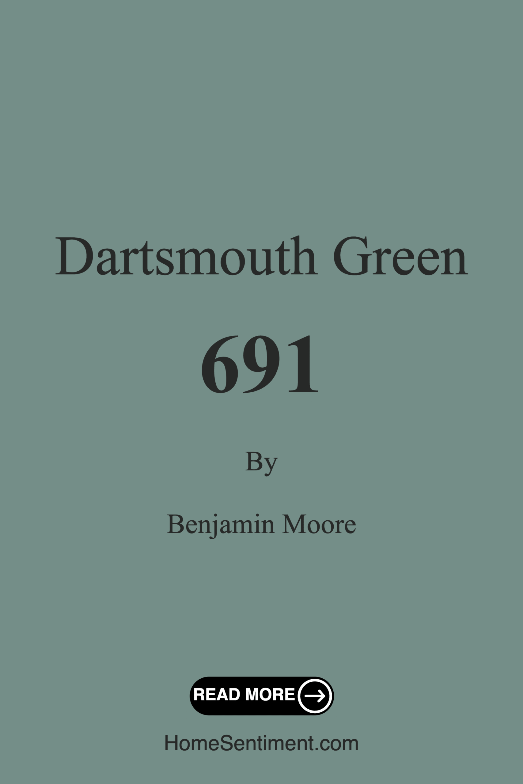
Color Preview & Key Details
| HEX Code | #748E88 |
| RGB | 116, 142, 136 |
| LRV | 25.95% |
| Undertone | Green |
| Finish Options | Flat, Satin, Semi-Gloss |
Imagine standing in a beautifully decorated room, where the walls envelop you in a soothing embrace. The color around you is Dartsmouth Green by Benjamin Moore, a serene, muted teal that instantly calms the mind and encourages relaxation. You might be wondering if this rich, earthy hue is the right choice for your home. Let’s explore all that Dartsmouth Green has to offer and see how it could transform your space into a tranquil retreat.
Dartsmouth Green is more than just a color; it provides a feeling of peace reminiscent of nature. With its medium brightness and cool undertones, it evokes a sense of calmness that can be particularly inviting in spaces designed for unwinding, like bedrooms and living rooms. This versatile shade strikes a balance between modernity and tradition, making it an ideal fit for a wide range of decor styles, from coastal chic to modern minimalism.
One of the best things about Dartsmouth Green is its adaptability to light conditions. Its light reflectance value (LRV) of 25.95% means it reflects a good amount of light without coming off as overly bright. In bright spaces, it maintains a soft, soothing presence, while in dimmer areas, it can deepen into a more pronounced teal, adding depth and character to your surroundings. This quality makes it an excellent choice for any room, whether you’re looking to create a cozy reading nook bathed in soft light or a serene bedroom that feels cocooned and private.
As you consider where to apply Dartsmouth Green in your home, think about its ideal rooms: the living room, bedroom, home office, and even a nursery. Its calming essence is perfect for creating a nurturing environment for little ones, while also encouraging productivity in a workspace. Picture a home office adorned in this muted teal, encouraging creativity and focus while avoiding the harshness of brighter colors. The beauty of Dartsmouth Green is that it invites tranquility without sacrificing style.
What’s more, this color pairs beautifully with various decor styles. If you have a modern home, its muted tones can enhance sleek lines and minimalist decor, while in a traditional setting, it can add a refreshing twist to classic furnishings. Its versatility extends to different materials as well. Imagine it alongside natural woods and stones, enhancing their earthy appeal and creating a harmonious balance in your interior.
When it comes to application, Dartsmouth Green is beginner-friendly and easy to work with. Its smooth application means that whether you prefer using a roller or a brush, the process will be straightforward. You can achieve good coverage with just one or two coats, and thanks to its touch-up friendly nature, any minor imperfections can be quickly resolved. Plus, its low VOC content means you can paint with a clear conscience, ensuring that your home remains a safe haven.
Now, let’s talk about how to make Dartsmouth Green truly shine in your space. One great way to do this is by considering trim colors that will complement its rich tones. White Dove or Simply White are exceptional choices for trim, as they enhance the richness of Dartsmouth Green while providing a fresh contrast. This pairing creates a clean and polished look that feels effortlessly chic. If you have wooden trim, the warm tones will harmonize beautifully with Dartsmouth Green, adding an inviting warmth to your decor.
If you’re worried about using Dartsmouth Green in smaller spaces, put those concerns to rest. This color can actually work wonders in compact rooms, making them feel more open and inviting. Just remember to pair it with lighter furniture and decor to maintain an airy vibe. The coolness of Dartsmouth Green can create a sense of spaciousness that’s particularly beneficial in smaller areas, allowing you to play with depth and dimension without making the room feel cramped.
As with any paint choice, it’s essential to consider how the color interacts with your existing decor. The undertones of Dartsmouth Green lean towards green, which can create a grounding atmosphere in your home. These subtle undertones add depth, so it’s worth testing the color in your space and observing how it shifts throughout the day in different lighting conditions. You’ll find that Dartsmouth Green adapts and reveals its nuanced character, making it a dynamic choice for your walls.
If you’re still unsure about committing to this color, consider its equivalent options. For instance, Benjamin Moore’s Ocean Breeze or Sherwin-Williams’ Sea Salt offer similar vibes while providing an alternative for those looking for something slightly different. However, Dartsmouth Green stands out with its unique blend of tranquility and sophistication, setting it apart in the spectrum of muted greens.
In terms of durability, Dartsmouth Green is a long-lasting option that is both wipeable and washable, meaning it can endure the wear and tear of everyday life without losing its charm. Whether it’s a little smudge from a wandering hand or dust accumulating over time, a simple wipe-down can keep your walls looking fresh.
When you think about the mood you want to create in your home, Dartsmouth Green can evoke feelings of coziness and calmness. It’s a color that invites you to slow down, breathe deeply, and appreciate the beauty around you. Whether you’re curling up with a book in your newly painted living room or enjoying a peaceful night’s sleep in a Dartsmouth Green bedroom, you’ll find that this color nurtures a sense of well-being.
In conclusion, Dartsmouth Green is a rich, versatile paint color that offers an array of benefits and possibilities for your home. Its calming undertones make it a perfect choice for a relaxing retreat, while its adaptability allows it to seamlessly fit into various decor styles. With easy application and maintenance, this color not only elevates the aesthetic of your spaces but also contributes to a grounded, serene atmosphere. So, if you’re ready to transform your space into a tranquil haven, Dartsmouth Green may just be the perfect hue for you.
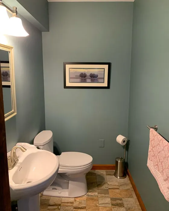
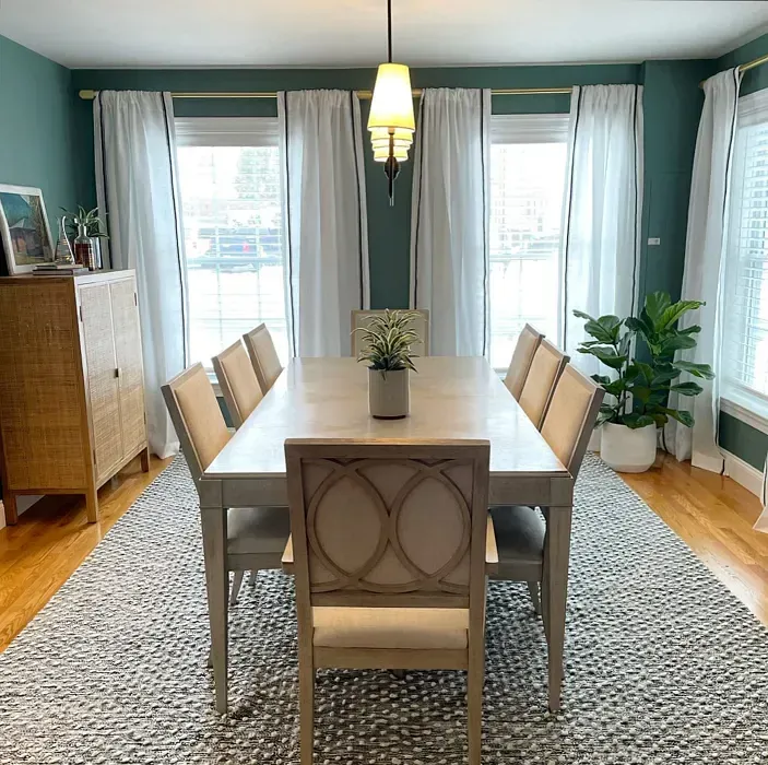
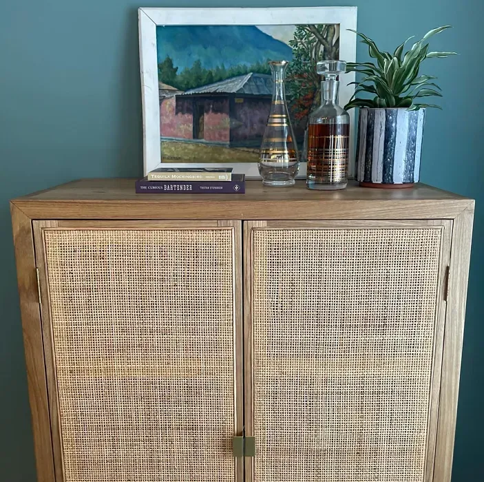
Real Room Photo of Dartsmouth Green 691
Undertones of Dartsmouth Green ?
The undertones of Dartsmouth Green are a key aspect of its character, leaning towards Green. These subtle underlying hues are what give the color its depth and complexity. For example, a gray with a blue undertone will feel cooler and more modern, while one with a brown undertone will feel warmer and more traditional. It’s essential to test this paint in your home and observe it next to your existing furniture, flooring, and decor to see how these undertones interact and reveal themselves throughout the day.
HEX value: #748E88
RGB code: 116, 142, 136
Is Dartsmouth Green Cool or Warm?
Dartsmouth Green is considered a cool paint color. This characteristic plays a huge role in the overall feel of a room. Cool colors, like this one, tend to create a cozy, inviting, and energetic atmosphere, making them great for social spaces like living rooms and dining rooms. In contrast, warm colors often evoke a sense of calm and serenity, which is why they are popular in bedrooms and bathrooms. The coolth of Dartsmouth Green means it will pair beautifully with corresponding decor elements.
Understanding Color Properties and Interior Design Tips
Hue refers to a specific position on the color wheel, measured in degrees from 0 to 360. Each degree represents a different pure color:
- 0° represents red
- 120° represents green
- 240° represents blue
Saturation describes the intensity or purity of a color and is expressed as a percentage:
- At 0%, the color appears completely desaturated—essentially a shade of gray
- At 100%, the color is at its most vivid and vibrant
Lightness indicates how light or dark a color is, also expressed as a percentage:
- 0% lightness results in black
- 100% lightness results in white
Using Warm Colors in Interior Design
Warm hues—such as reds, oranges, yellows, warm beiges, and greiges—are excellent choices for creating inviting and energetic spaces. These colors are particularly well-suited for:
- Kitchens, living rooms, and bathrooms, where warmth enhances comfort and sociability
- Large rooms, where warm tones can help reduce the sense of emptiness and make the space feel more intimate
For example:
- Warm beige shades provide a cozy, inviting atmosphere, ideal for living rooms, bedrooms, and hallways.
- Warm greige (a mix of beige and gray) offers the warmth of beige with the modern appeal of gray, making it a versatile backdrop for dining areas, bedrooms, and living spaces.
However, be mindful when using warm light tones in rooms with limited natural light. These shades may appear muted or even take on an unpleasant yellowish tint. To avoid a dull or flat appearance:
- Add depth by incorporating richer tones like deep greens, charcoal, or chocolate brown
- Use textured elements such as curtains, rugs, or cushions to bring dimension to the space
Pro Tip: Achieving Harmony with Warm and Cool Color Balance
To create a well-balanced and visually interesting interior, mix warm and cool tones strategically. This contrast adds depth and harmony to your design.
- If your walls feature warm hues, introduce cool-colored accents such as blue or green furniture, artwork, or accessories to create contrast.
- For a polished look, consider using a complementary color scheme, which pairs colors opposite each other on the color wheel (e.g., red with green, orange with blue).
This thoughtful mix not only enhances visual appeal but also creates a space that feels both dynamic and cohesive.
Light Temperature Affects on Dartsmouth Green
Natural Light
Natural daylight changes in color temperature as the sun moves across the sky. At sunrise and sunset, the light tends to have a warm, golden tone with a color temperature around 2000 Kelvin (K). As the day progresses and the sun rises higher, the light becomes cooler and more neutral. Around midday, especially when the sky is clear, natural light typically reaches its peak brightness and shifts to a cooler tone, ranging from 5500 to 6500 Kelvin. This midday light is close to what we perceive as pure white or daylight-balanced light.
These shifts in natural light can significantly influence how colors appear in a space, which is why designers often consider both the time of day and the orientation of windows when planning interior color schemes.
Artificial Light
When choosing artificial lighting, pay close attention to the color temperature, measured in Kelvin (K). This determines how warm or cool the light will appear. Lower temperatures, around 2700K, give off a warm, yellow glow often used in living rooms or bedrooms. Higher temperatures, above 5000K, create a cool, bluish light similar to daylight, commonly used in kitchens, offices, or task areas.
Use the slider to see how lighting temperature can affect the appearance of a surface or color throughout a space.


4800K
LRV of Dartsmouth Green
The Light Reflectance Value (LRV) of Dartsmouth Green is 25.95%, which places it in the Medium colors category. This means it reflect a lot of light. Understanding a paint’s LRV is crucial for predicting how it will look in your space. A higher LRV indicates a lighter color that reflects more light, making rooms feel larger and brighter. A lower LRV signifies a darker color that absorbs more light, creating a cozier, more intimate atmosphere. Always consider the natural and artificial lighting in your room when selecting a paint color based on its LRV.
Detailed Review of Dartsmouth Green
Additional Paint Characteristics
Ideal Rooms
Bedroom, Dining Room, Home Office, Living Room, Nursery
Decor Styles
Bohemian, Coastal, Modern, Traditional
Coverage
Good (1–2 Coats), Touch-Up Friendly
Ease of Application
Beginner Friendly, Brush Smooth, Roller-Ready
Washability
Washable, Wipeable
VOC Level
Eco-Certified, Low VOC
Best Use
Accent Wall, Interior Walls, Trim
Room Suitability
Bedroom, Home Office, Living Room, Nursery
Tone Tag
Cool, Earthy, Muted
Finish Type
Satin, Semi-Gloss
Paint Performance
Easy Touch-Up, Long Lasting, Low Odor
Use Cases
Best for Modern Farmhouse, Best for Small Spaces, Designer Favorite
Mood
Calm, Cozy, Grounding
Trim Pairing
Complements Cool Trim, Pairs with White Dove
Dartsmouth Green offers a unique blend of tranquility and sophistication, making it a standout choice for any home. This color works beautifully in both light and dark spaces, reflecting different moods depending on the time of day. It pairs wonderfully with natural materials like wood and stone, enhancing its earthy appeal. Whether you’re looking to create a cozy reading nook or a serene bedroom, this color adapts seamlessly to your vision. Its versatility extends to various design styles, from coastal chic to modern minimalism, ensuring that Dartsmouth Green will remain a timeless choice for years to come.
Pros & Cons of 691 Dartsmouth Green
Pros
Cons
Colors that go with Benjamin Moore Dartsmouth Green
FAQ on 691 Dartsmouth Green
Can Dartsmouth Green be used in small spaces?
Absolutely! Dartsmouth Green can work wonders in small spaces. Its calming tones can make a room feel more open and inviting. Just pair it with lighter furniture and decor to keep the space feeling airy and bright.
What trim colors pair best with Dartsmouth Green?
Dartsmouth Green pairs beautifully with white trim, especially shades like White Dove or Simply White. This contrast enhances the green’s richness while maintaining a fresh, clean look. It also complements wooden trim, adding a natural warmth to the overall aesthetic.
Comparisons Dartsmouth Green with other colors
Dartsmouth Green 691 vs Acacia Haze SW 9132
| Attribute | Dartsmouth Green 691 | Acacia Haze SW 9132 |
|---|---|---|
| Color Name | Dartsmouth Green 691 | Acacia Haze SW 9132 |
| Color | ||
| Hue | Green | Green |
| Brightness | Medium | Medium |
| RGB | 116, 142, 136 | 150, 156, 146 |
| LRV | 25.95% | 30% |
| Finish Type | Satin, Semi-Gloss | Eggshell, Satin |
| Finish Options | Flat, Satin, Semi-Gloss | Eggshell, Matte, Satin |
| Ideal Rooms | Bedroom, Dining Room, Home Office, Living Room, Nursery | Bedroom, Dining Room, Home Office, Living Room, Nursery |
| Decor Styles | Bohemian, Coastal, Modern, Traditional | Bohemian, Coastal, Modern Farmhouse, Scandinavian |
| Coverage | Good (1–2 Coats), Touch-Up Friendly | Good (1–2 Coats), Touch-Up Friendly |
| Ease of Application | Beginner Friendly, Brush Smooth, Roller-Ready | Beginner Friendly, Brush Smooth, Roller-Ready |
| Washability | Washable, Wipeable | Washable, Wipeable |
| Room Suitability | Bedroom, Home Office, Living Room, Nursery | Bedroom, Home Office, Living Room, Nursery |
| Tone | Cool, Earthy, Muted | Balanced, Earthy, Muted |
| Paint Performance | Easy Touch-Up, Long Lasting, Low Odor | Easy Touch-Up, High Coverage, Low Odor |
Dartsmouth Green 691 vs Evergreen Fog SW 9130
| Attribute | Dartsmouth Green 691 | Evergreen Fog SW 9130 |
|---|---|---|
| Color Name | Dartsmouth Green 691 | Evergreen Fog SW 9130 |
| Color | ||
| Hue | Green | Green |
| Brightness | Medium | Medium |
| RGB | 116, 142, 136 | 149, 151, 138 |
| LRV | 25.95% | 30% |
| Finish Type | Satin, Semi-Gloss | Eggshell, Matte, Satin |
| Finish Options | Flat, Satin, Semi-Gloss | Eggshell, Matte, Satin |
| Ideal Rooms | Bedroom, Dining Room, Home Office, Living Room, Nursery | Bedroom, Dining Room, Home Office, Living Room, Nursery |
| Decor Styles | Bohemian, Coastal, Modern, Traditional | Coastal, Modern Farmhouse, Rustic, Scandinavian, Transitional |
| Coverage | Good (1–2 Coats), Touch-Up Friendly | Good (1–2 Coats), Touch-Up Friendly |
| Ease of Application | Beginner Friendly, Brush Smooth, Roller-Ready | Beginner Friendly, Brush Smooth, Roller-Ready |
| Washability | Washable, Wipeable | Scrubbable, Washable |
| Room Suitability | Bedroom, Home Office, Living Room, Nursery | Bedroom, Dining Room, Home Office, Living Room, Nursery |
| Tone | Cool, Earthy, Muted | Balanced, Earthy, Muted |
| Paint Performance | Easy Touch-Up, Long Lasting, Low Odor | Easy Touch-Up, Low Odor, Scuff Resistant |
Dartsmouth Green 691 vs Clary Sage SW 6178
| Attribute | Dartsmouth Green 691 | Clary Sage SW 6178 |
|---|---|---|
| Color Name | Dartsmouth Green 691 | Clary Sage SW 6178 |
| Color | ||
| Hue | Green | Green |
| Brightness | Medium | Medium |
| RGB | 116, 142, 136 | 172, 173, 151 |
| LRV | 25.95% | 24% |
| Finish Type | Satin, Semi-Gloss | Eggshell, Matte |
| Finish Options | Flat, Satin, Semi-Gloss | Eggshell, Matte, Satin |
| Ideal Rooms | Bedroom, Dining Room, Home Office, Living Room, Nursery | Bathroom, Bedroom, Home Office, Kitchen, Living Room |
| Decor Styles | Bohemian, Coastal, Modern, Traditional | Bohemian, Minimalist, Modern Farmhouse, Scandinavian, Traditional |
| Coverage | Good (1–2 Coats), Touch-Up Friendly | Good (1–2 Coats), Touch-Up Friendly |
| Ease of Application | Beginner Friendly, Brush Smooth, Roller-Ready | Beginner Friendly, Brush Smooth, Roller-Ready |
| Washability | Washable, Wipeable | Washable, Wipeable |
| Room Suitability | Bedroom, Home Office, Living Room, Nursery | Bathroom, Bedroom, Home Office, Kitchen, Living Room |
| Tone | Cool, Earthy, Muted | Cool, Earthy, Muted |
| Paint Performance | Easy Touch-Up, Long Lasting, Low Odor | Easy Touch-Up, High Coverage, Low Odor |
Dartsmouth Green 691 vs Softened Green SW 6177
| Attribute | Dartsmouth Green 691 | Softened Green SW 6177 |
|---|---|---|
| Color Name | Dartsmouth Green 691 | Softened Green SW 6177 |
| Color | ||
| Hue | Green | Green |
| Brightness | Medium | Medium |
| RGB | 116, 142, 136 | 187, 188, 167 |
| LRV | 25.95% | 48% |
| Finish Type | Satin, Semi-Gloss | Eggshell, Matte, Satin |
| Finish Options | Flat, Satin, Semi-Gloss | Eggshell, Matte, Satin |
| Ideal Rooms | Bedroom, Dining Room, Home Office, Living Room, Nursery | Bathroom, Bedroom, Dining Room, Home Office, Kitchen, Living Room, Nursery |
| Decor Styles | Bohemian, Coastal, Modern, Traditional | Coastal, Farmhouse, Minimalist, Modern, Scandinavian |
| Coverage | Good (1–2 Coats), Touch-Up Friendly | Good (1–2 Coats), Touch-Up Friendly |
| Ease of Application | Beginner Friendly, Brush Smooth, Roller-Ready | Beginner Friendly, Brush Smooth, Fast-Drying, Roller-Ready |
| Washability | Washable, Wipeable | Washable, Wipeable |
| Room Suitability | Bedroom, Home Office, Living Room, Nursery | Bathroom, Bedroom, Dining Room, Home Office, Kitchen, Living Room |
| Tone | Cool, Earthy, Muted | Calm, Earthy, Muted |
| Paint Performance | Easy Touch-Up, Long Lasting, Low Odor | Easy Touch-Up, Fade Resistant, Low Odor, Quick Drying |
Dartsmouth Green 691 vs Eventide SW 9643
| Attribute | Dartsmouth Green 691 | Eventide SW 9643 |
|---|---|---|
| Color Name | Dartsmouth Green 691 | Eventide SW 9643 |
| Color | ||
| Hue | Green | Green |
| Brightness | Medium | Medium |
| RGB | 116, 142, 136 | 163, 175, 172 |
| LRV | 25.95% | 24% |
| Finish Type | Satin, Semi-Gloss | Eggshell, Matte, Satin |
| Finish Options | Flat, Satin, Semi-Gloss | Eggshell, Matte, Satin |
| Ideal Rooms | Bedroom, Dining Room, Home Office, Living Room, Nursery | Bedroom, Home Office, Kitchen, Living Room, Nursery |
| Decor Styles | Bohemian, Coastal, Modern, Traditional | Coastal, Contemporary, Minimalist, Modern |
| Coverage | Good (1–2 Coats), Touch-Up Friendly | Good (1–2 Coats), Touch-Up Friendly |
| Ease of Application | Beginner Friendly, Brush Smooth, Roller-Ready | Beginner Friendly, Brush Smooth, Fast-Drying, Roller-Ready |
| Washability | Washable, Wipeable | Washable, Wipeable |
| Room Suitability | Bedroom, Home Office, Living Room, Nursery | Bedroom, Home Office, Living Room, Nursery |
| Tone | Cool, Earthy, Muted | Airy, Balanced, Cool, Muted |
| Paint Performance | Easy Touch-Up, Long Lasting, Low Odor | Easy Touch-Up, High Coverage, Low Odor, Quick Drying |
Dartsmouth Green 691 vs Escape Gray SW 6185
| Attribute | Dartsmouth Green 691 | Escape Gray SW 6185 |
|---|---|---|
| Color Name | Dartsmouth Green 691 | Escape Gray SW 6185 |
| Color | ||
| Hue | Green | Green |
| Brightness | Medium | Medium |
| RGB | 116, 142, 136 | 171, 172, 159 |
| LRV | 25.95% | 48% |
| Finish Type | Satin, Semi-Gloss | Eggshell, Matte |
| Finish Options | Flat, Satin, Semi-Gloss | Eggshell, Matte, Satin |
| Ideal Rooms | Bedroom, Dining Room, Home Office, Living Room, Nursery | Bathroom, Bedroom, Entryway, Home Office, Living Room |
| Decor Styles | Bohemian, Coastal, Modern, Traditional | Minimalist, Modern, Scandinavian, Transitional |
| Coverage | Good (1–2 Coats), Touch-Up Friendly | Good (1–2 Coats) |
| Ease of Application | Beginner Friendly, Brush Smooth, Roller-Ready | Beginner Friendly, Brush Smooth, Roller-Ready |
| Washability | Washable, Wipeable | Highly Washable, Washable |
| Room Suitability | Bedroom, Home Office, Living Room, Nursery | Bathroom, Bedroom, Home Office, Living Room |
| Tone | Cool, Earthy, Muted | Cool, Muted, Neutral, Warm |
| Paint Performance | Easy Touch-Up, Long Lasting, Low Odor | Easy Touch-Up, Low Odor, Scuff Resistant |
Dartsmouth Green 691 vs Coastal Plain SW 6192
| Attribute | Dartsmouth Green 691 | Coastal Plain SW 6192 |
|---|---|---|
| Color Name | Dartsmouth Green 691 | Coastal Plain SW 6192 |
| Color | ||
| Hue | Green | Green |
| Brightness | Medium | Medium |
| RGB | 116, 142, 136 | 159, 166, 148 |
| LRV | 25.95% | 66% |
| Finish Type | Satin, Semi-Gloss | Eggshell, Satin |
| Finish Options | Flat, Satin, Semi-Gloss | Eggshell, Satin, Semi-Gloss |
| Ideal Rooms | Bedroom, Dining Room, Home Office, Living Room, Nursery | Bathroom, Bedroom, Home Office, Kitchen, Living Room |
| Decor Styles | Bohemian, Coastal, Modern, Traditional | Bohemian, Coastal, Contemporary, Modern Farmhouse, Rustic |
| Coverage | Good (1–2 Coats), Touch-Up Friendly | Good (1–2 Coats) |
| Ease of Application | Beginner Friendly, Brush Smooth, Roller-Ready | Beginner Friendly, Brush Smooth, Fast-Drying, Roller-Ready |
| Washability | Washable, Wipeable | Scrubbable, Washable |
| Room Suitability | Bedroom, Home Office, Living Room, Nursery | Bathroom, Bedroom, Dining Room, Home Office, Kitchen, Living Room |
| Tone | Cool, Earthy, Muted | Cool, Earthy, Muted |
| Paint Performance | Easy Touch-Up, Long Lasting, Low Odor | High Coverage, Low Odor, Quick Drying |
Dartsmouth Green 691 vs Contented SW 6191
| Attribute | Dartsmouth Green 691 | Contented SW 6191 |
|---|---|---|
| Color Name | Dartsmouth Green 691 | Contented SW 6191 |
| Color | ||
| Hue | Green | Green |
| Brightness | Medium | Medium |
| RGB | 116, 142, 136 | 189, 192, 179 |
| LRV | 25.95% | 45% |
| Finish Type | Satin, Semi-Gloss | Eggshell, Matte, Satin |
| Finish Options | Flat, Satin, Semi-Gloss | Eggshell, Matte, Satin |
| Ideal Rooms | Bedroom, Dining Room, Home Office, Living Room, Nursery | Bedroom, Dining Room, Home Office, Kitchen, Living Room |
| Decor Styles | Bohemian, Coastal, Modern, Traditional | Contemporary, Minimalist, Modern, Scandinavian, Transitional |
| Coverage | Good (1–2 Coats), Touch-Up Friendly | Good (1–2 Coats), Touch-Up Friendly |
| Ease of Application | Beginner Friendly, Brush Smooth, Roller-Ready | Beginner Friendly, Brush Smooth, Roller-Ready |
| Washability | Washable, Wipeable | Stain Resistant, Washable |
| Room Suitability | Bedroom, Home Office, Living Room, Nursery | Bedroom, Dining Room, Home Office, Kitchen, Living Room |
| Tone | Cool, Earthy, Muted | Muted, Neutral, Warm |
| Paint Performance | Easy Touch-Up, Long Lasting, Low Odor | Easy Touch-Up, High Coverage, Low Odor |
Dartsmouth Green 691 vs Jade Dragon SW 9129
| Attribute | Dartsmouth Green 691 | Jade Dragon SW 9129 |
|---|---|---|
| Color Name | Dartsmouth Green 691 | Jade Dragon SW 9129 |
| Color | ||
| Hue | Green | Green |
| Brightness | Medium | Medium |
| RGB | 116, 142, 136 | 144, 152, 134 |
| LRV | 25.95% | 12% |
| Finish Type | Satin, Semi-Gloss | Eggshell, Matte, Satin |
| Finish Options | Flat, Satin, Semi-Gloss | Eggshell, Matte, Satin |
| Ideal Rooms | Bedroom, Dining Room, Home Office, Living Room, Nursery | Bedroom, Dining Room, Home Office, Living Room, Nursery |
| Decor Styles | Bohemian, Coastal, Modern, Traditional | Bohemian, Minimalist, Modern, Traditional, Transitional |
| Coverage | Good (1–2 Coats), Touch-Up Friendly | Good (1–2 Coats), Touch-Up Friendly |
| Ease of Application | Beginner Friendly, Brush Smooth, Roller-Ready | Beginner Friendly, Brush Smooth, Fast-Drying, Roller-Ready |
| Washability | Washable, Wipeable | Highly Washable, Stain Resistant, Washable |
| Room Suitability | Bedroom, Home Office, Living Room, Nursery | Bedroom, Dining Room, Home Office, Living Room, Nursery |
| Tone | Cool, Earthy, Muted | Balanced, Cool, Earthy, Muted |
| Paint Performance | Easy Touch-Up, Long Lasting, Low Odor | Easy Touch-Up, Fade Resistant, Low Odor, Stain Resistant |
Dartsmouth Green 691 vs Underseas SW 6214
| Attribute | Dartsmouth Green 691 | Underseas SW 6214 |
|---|---|---|
| Color Name | Dartsmouth Green 691 | Underseas SW 6214 |
| Color | ||
| Hue | Green | Green |
| Brightness | Medium | Medium |
| RGB | 116, 142, 136 | 124, 142, 135 |
| LRV | 25.95% | 24% |
| Finish Type | Satin, Semi-Gloss | Eggshell, Matte, Satin |
| Finish Options | Flat, Satin, Semi-Gloss | Eggshell, Matte, Satin |
| Ideal Rooms | Bedroom, Dining Room, Home Office, Living Room, Nursery | Bathroom, Bedroom, Dining Room, Hallway, Home Office, Living Room |
| Decor Styles | Bohemian, Coastal, Modern, Traditional | Coastal, Eclectic, Farmhouse, Modern, Scandinavian |
| Coverage | Good (1–2 Coats), Touch-Up Friendly | Good (1–2 Coats), Touch-Up Friendly |
| Ease of Application | Beginner Friendly, Brush Smooth, Roller-Ready | Beginner Friendly, Brush Smooth, Fast-Drying, Roller-Ready |
| Washability | Washable, Wipeable | Highly Washable, Washable, Wipeable |
| Room Suitability | Bedroom, Home Office, Living Room, Nursery | Bathroom, Bedroom, Dining Room, Home Office, Living Room |
| Tone | Cool, Earthy, Muted | Balanced, Cool, Earthy, Muted |
| Paint Performance | Easy Touch-Up, Long Lasting, Low Odor | Easy Touch-Up, Fade Resistant, High Coverage, Low Odor |
Official Page of Benjamin Moore Dartsmouth Green 691