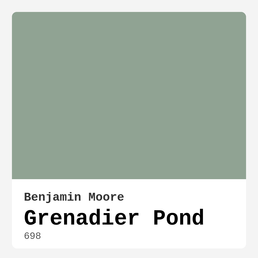
Color Preview & Key Details
| HEX Code | #90A393 |
| RGB | 144, 163, 147 |
| LRV | 34.48% |
| Undertone | Green |
| Finish Options | Eggshell, Flat, Satin |
Imagine walking into a room that instantly envelops you in calmness, a soothing space where your stress melts away. That’s the magic of the right paint color, and if you’re considering a refresh for your home, let me introduce you to Grenadier Pond by Benjamin Moore. This beautiful green-gray hue is not just a paint color; it’s an experience, a feeling that can transform your interiors into a serene sanctuary.
Grenadier Pond, with its color code 698, falls under the green hue category and carries a medium brightness level. It embodies a perfect blend of tranquility and sophistication, making it an adaptable choice for various decor styles. This color paints a backdrop that beautifully complements both contemporary and traditional elements, which means it’s versatile enough to fit seamlessly into your home, no matter your style preference.
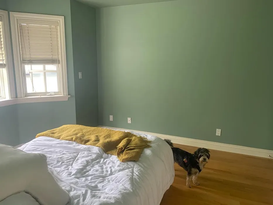
When you first observe Grenadier Pond, you’ll notice its soft, muted tone that evokes an immediate sense of calmness. It’s like a breath of fresh air in your living space, connecting you to nature with every glance. Its underlying green undertone adds depth, creating a nuanced character that can adapt to the lighting conditions of your home. In bright, natural light, this shade exudes warmth and life, while in lower light, it can take on a more subdued appearance, adding to its charm and versatility.
Speaking of lighting, the Light Reflectance Value (LRV) of Grenadier Pond is 34.48%, placing it firmly in the medium color category. This means it reflects a good amount of light, which can help make your rooms feel more spacious and inviting. It’s essential to keep in mind that the LRV can significantly affect how the color appears throughout different times of the day. In rooms with ample natural light, Grenadier Pond shines brilliantly, enhancing the overall ambiance. Conversely, in darker spaces, it may appear muted, but this can create a cozy and intimate atmosphere that many homeowners cherish.
One of the most significant advantages of Grenadier Pond is its versatility. Whether you’re looking to create a serene atmosphere in your bedroom, a calming workspace in your home office, or a welcoming vibe in your living room, this color delivers. It’s a beautiful choice for dining rooms, too, where it can set the stage for warm gatherings and lively conversations. The adaptability of Grenadier Pond means you can use it throughout your home, ensuring a harmonious flow from one room to the next.
If you’re a DIY enthusiast, you’ll appreciate how beginner-friendly Grenadier Pond is. Its application is smooth and effortless, whether you’re using a roller or a brush. With good coverage typically achieved in just one to two coats, you won’t spend an entire weekend painting your walls. Plus, it’s touch-up friendly, so maintaining that perfect finish is a breeze. For those concerned about the environment, this low VOC, eco-certified paint is a bonus. You can refresh your space without worrying about harmful emissions.
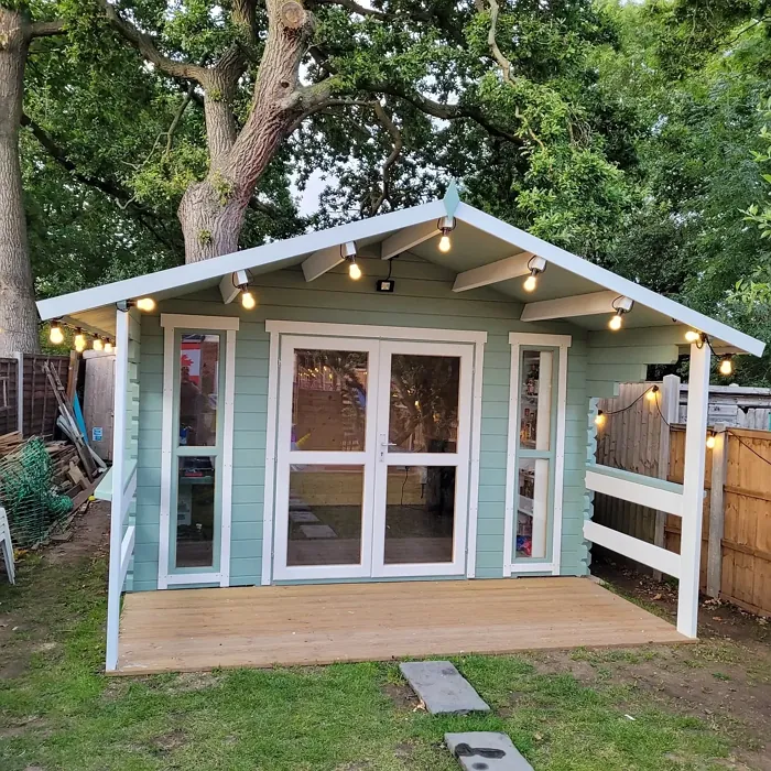
Now, let’s dive into the decor styles that harmonize beautifully with Grenadier Pond. Its muted elegance makes it an excellent choice for rustic and coastal decor, where natural elements reign supreme. Imagine pairing it with wood accents, rattan furniture, and soft textiles to create a cozy retreat. It fits seamlessly in Scandinavian designs, offering a clean and airy feel that’s both inviting and stylish. Even if your style leans more towards modern or traditional, Grenadier Pond can anchor your space, providing a fresh yet timeless backdrop.
What about the finishing touches? Grenadier Pond comes in several finishes, including Flat, Eggshell, and Satin. Flat finishes are perfect for ceilings or low-traffic areas, while Eggshell provides that ideal balance of sheen and durability for everyday walls. Satin is fantastic for high-traffic areas, as it offers added washability, ensuring your color remains vibrant and fresh over time. When it comes to trim, pairing Grenadier Pond with White Dove creates an elegant contrast, while cool trims can enhance its soothing vibe. If you prefer a rustic touch, warm wood tones can beautifully complement this color, adding warmth and character to your space.
Of course, every color has its pros and cons. While Grenadier Pond is a beautifully calming hue that works across various styles, it can feel muted in darker spaces. To counter this, ensure your room has enough natural light, or consider incorporating brighter decor elements to lift the overall vibe. In certain lighting conditions, multiple coats may be necessary to achieve the desired depth, so keep that in mind. Lastly, while this color is adaptable, it may not suit ultra-modern looks without careful pairing.
Grenadier Pond can also be an excellent choice for small rooms. The cool undertones create a soft, welcoming atmosphere that visually expands the space. When paired with lighter trim and accessories, it can enhance the feeling of openness, making it perfect for cozy corners or tiny bathrooms.
As you contemplate using Grenadier Pond in your project, remember that testing the paint in your home is essential. Observe how it interacts with your existing furniture, flooring, and decor. The undertones, which lean towards green, can play differently based on your space, lighting, and neighboring colors. So grab a sample and let it sit on your walls for a day or two to truly see its character emerge.
In summary, Grenadier Pond is more than just a color—it’s a gateway to creating a serene, inviting space in your home. Its versatility allows it to adapt beautifully to a range of styles, while its calming nature creates a soothing environment that you’ll love coming home to. With its ease of application, excellent coverage, and eco-friendly properties, it’s a smart choice for both seasoned designers and DIYers alike. So, whether you’re refreshing a single room or reimagining your entire home, Grenadier Pond might just be the perfect shade to help you achieve your vision.
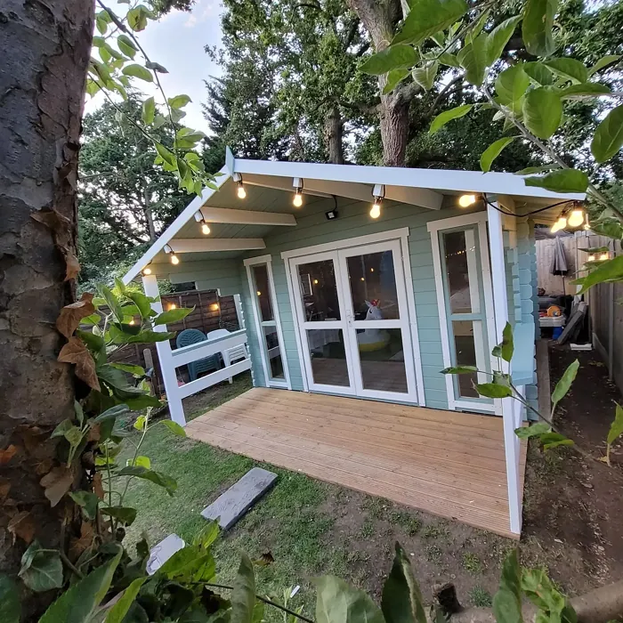
Real Room Photo of Grenadier Pond 698
Undertones of Grenadier Pond ?
The undertones of Grenadier Pond are a key aspect of its character, leaning towards Green. These subtle underlying hues are what give the color its depth and complexity. For example, a gray with a blue undertone will feel cooler and more modern, while one with a brown undertone will feel warmer and more traditional. It’s essential to test this paint in your home and observe it next to your existing furniture, flooring, and decor to see how these undertones interact and reveal themselves throughout the day.
HEX value: #90A393
RGB code: 144, 163, 147
Is Grenadier Pond Cool or Warm?
Grenadier Pond is considered a cool paint color. This characteristic plays a huge role in the overall feel of a room. Cool colors, like this one, tend to create a cozy, inviting, and energetic atmosphere, making them great for social spaces like living rooms and dining rooms. In contrast, warm colors often evoke a sense of calm and serenity, which is why they are popular in bedrooms and bathrooms. The coolth of Grenadier Pond means it will pair beautifully with corresponding decor elements.
Understanding Color Properties and Interior Design Tips
Hue refers to a specific position on the color wheel, measured in degrees from 0 to 360. Each degree represents a different pure color:
- 0° represents red
- 120° represents green
- 240° represents blue
Saturation describes the intensity or purity of a color and is expressed as a percentage:
- At 0%, the color appears completely desaturated—essentially a shade of gray
- At 100%, the color is at its most vivid and vibrant
Lightness indicates how light or dark a color is, also expressed as a percentage:
- 0% lightness results in black
- 100% lightness results in white
Using Warm Colors in Interior Design
Warm hues—such as reds, oranges, yellows, warm beiges, and greiges—are excellent choices for creating inviting and energetic spaces. These colors are particularly well-suited for:
- Kitchens, living rooms, and bathrooms, where warmth enhances comfort and sociability
- Large rooms, where warm tones can help reduce the sense of emptiness and make the space feel more intimate
For example:
- Warm beige shades provide a cozy, inviting atmosphere, ideal for living rooms, bedrooms, and hallways.
- Warm greige (a mix of beige and gray) offers the warmth of beige with the modern appeal of gray, making it a versatile backdrop for dining areas, bedrooms, and living spaces.
However, be mindful when using warm light tones in rooms with limited natural light. These shades may appear muted or even take on an unpleasant yellowish tint. To avoid a dull or flat appearance:
- Add depth by incorporating richer tones like deep greens, charcoal, or chocolate brown
- Use textured elements such as curtains, rugs, or cushions to bring dimension to the space
Pro Tip: Achieving Harmony with Warm and Cool Color Balance
To create a well-balanced and visually interesting interior, mix warm and cool tones strategically. This contrast adds depth and harmony to your design.
- If your walls feature warm hues, introduce cool-colored accents such as blue or green furniture, artwork, or accessories to create contrast.
- For a polished look, consider using a complementary color scheme, which pairs colors opposite each other on the color wheel (e.g., red with green, orange with blue).
This thoughtful mix not only enhances visual appeal but also creates a space that feels both dynamic and cohesive.

Light Temperature Affects on Grenadier Pond
Natural Light
Natural daylight changes in color temperature as the sun moves across the sky. At sunrise and sunset, the light tends to have a warm, golden tone with a color temperature around 2000 Kelvin (K). As the day progresses and the sun rises higher, the light becomes cooler and more neutral. Around midday, especially when the sky is clear, natural light typically reaches its peak brightness and shifts to a cooler tone, ranging from 5500 to 6500 Kelvin. This midday light is close to what we perceive as pure white or daylight-balanced light.
These shifts in natural light can significantly influence how colors appear in a space, which is why designers often consider both the time of day and the orientation of windows when planning interior color schemes.
Artificial Light
When choosing artificial lighting, pay close attention to the color temperature, measured in Kelvin (K). This determines how warm or cool the light will appear. Lower temperatures, around 2700K, give off a warm, yellow glow often used in living rooms or bedrooms. Higher temperatures, above 5000K, create a cool, bluish light similar to daylight, commonly used in kitchens, offices, or task areas.
Use the slider to see how lighting temperature can affect the appearance of a surface or color throughout a space.


4800K
LRV of Grenadier Pond
The Light Reflectance Value (LRV) of Grenadier Pond is 34.48%, which places it in the Medium colors category. This means it reflect a lot of light. Understanding a paint’s LRV is crucial for predicting how it will look in your space. A higher LRV indicates a lighter color that reflects more light, making rooms feel larger and brighter. A lower LRV signifies a darker color that absorbs more light, creating a cozier, more intimate atmosphere. Always consider the natural and artificial lighting in your room when selecting a paint color based on its LRV.
Detailed Review of Grenadier Pond
Additional Paint Characteristics
Ideal Rooms
Bedroom, Dining Room, Home Office, Living Room
Decor Styles
Coastal, Modern, Rustic, Scandinavian, Traditional
Coverage
Good (1–2 Coats), Touch-Up Friendly
Ease of Application
Beginner Friendly, Brush Smooth, Roller-Ready
Washability
Scrubbable, Washable
VOC Level
Eco-Certified, Low VOC
Best Use
Accent Wall, Bedroom, Interior Walls, Living Room
Room Suitability
Bedroom, Dining Room, Hallway, Home Office, Living Room
Tone Tag
Cool, Earthy, Muted
Finish Type
Eggshell, Satin
Paint Performance
Easy Touch-Up, High Coverage, Low Odor
Use Cases
Best for Rentals, Classic Favorite, Designer Favorite
Mood
Calm, Grounding, Inviting
Trim Pairing
Complements Cool Trim, Good with Wood Trim, Pairs with White Dove
Grenadier Pond is a versatile color that effortlessly blends with various styles, from modern to rustic. Its calming green-gray tone makes it ideal for creating a harmonious environment in your home. Application is a breeze, with a smooth finish that doesn’t streak and offers excellent coverage. When paired with natural light, the color comes alive, enhancing the overall ambiance of the room. It’s also a wonderful choice for open concept spaces, as it can help define areas while maintaining a cohesive look throughout. Whether you’re looking to refresh a single room or your entire home, Grenadier Pond provides a stylish, serene backdrop that feels both inviting and sophisticated.
Pros & Cons of 698 Grenadier Pond
Pros
Cons
Colors that go with Benjamin Moore Grenadier Pond
FAQ on 698 Grenadier Pond
Can Grenadier Pond be used in small rooms?
Absolutely! Grenadier Pond works well in small rooms, offering a soft, welcoming vibe that makes spaces feel larger. Its cool undertones can help to visually expand the space, especially when paired with lighter trim and accessories. Just ensure the room gets enough natural light to prevent it from feeling too dark.
What finishes are available for Grenadier Pond?
Grenadier Pond is available in several finishes, including Flat, Eggshell, and Satin. Flat is perfect for ceilings or low-traffic areas, while Eggshell provides a nice balance of sheen and durability, making it ideal for walls. Satin can be used in high-traffic areas, as it offers added washability and durability, ensuring your color stays fresh over time.
Comparisons Grenadier Pond with other colors
Grenadier Pond 698 vs Acacia Haze SW 9132
| Attribute | Grenadier Pond 698 | Acacia Haze SW 9132 |
|---|---|---|
| Color Name | Grenadier Pond 698 | Acacia Haze SW 9132 |
| Color | ||
| Hue | Green | Green |
| Brightness | Medium | Medium |
| RGB | 144, 163, 147 | 150, 156, 146 |
| LRV | 34.48% | 30% |
| Finish Type | Eggshell, Satin | Eggshell, Satin |
| Finish Options | Eggshell, Flat, Satin | Eggshell, Matte, Satin |
| Ideal Rooms | Bedroom, Dining Room, Home Office, Living Room | Bedroom, Dining Room, Home Office, Living Room, Nursery |
| Decor Styles | Coastal, Modern, Rustic, Scandinavian, Traditional | Bohemian, Coastal, Modern Farmhouse, Scandinavian |
| Coverage | Good (1–2 Coats), Touch-Up Friendly | Good (1–2 Coats), Touch-Up Friendly |
| Ease of Application | Beginner Friendly, Brush Smooth, Roller-Ready | Beginner Friendly, Brush Smooth, Roller-Ready |
| Washability | Scrubbable, Washable | Washable, Wipeable |
| Room Suitability | Bedroom, Dining Room, Hallway, Home Office, Living Room | Bedroom, Home Office, Living Room, Nursery |
| Tone | Cool, Earthy, Muted | Balanced, Earthy, Muted |
| Paint Performance | Easy Touch-Up, High Coverage, Low Odor | Easy Touch-Up, High Coverage, Low Odor |
Grenadier Pond 698 vs Evergreen Fog SW 9130
| Attribute | Grenadier Pond 698 | Evergreen Fog SW 9130 |
|---|---|---|
| Color Name | Grenadier Pond 698 | Evergreen Fog SW 9130 |
| Color | ||
| Hue | Green | Green |
| Brightness | Medium | Medium |
| RGB | 144, 163, 147 | 149, 151, 138 |
| LRV | 34.48% | 30% |
| Finish Type | Eggshell, Satin | Eggshell, Matte, Satin |
| Finish Options | Eggshell, Flat, Satin | Eggshell, Matte, Satin |
| Ideal Rooms | Bedroom, Dining Room, Home Office, Living Room | Bedroom, Dining Room, Home Office, Living Room, Nursery |
| Decor Styles | Coastal, Modern, Rustic, Scandinavian, Traditional | Coastal, Modern Farmhouse, Rustic, Scandinavian, Transitional |
| Coverage | Good (1–2 Coats), Touch-Up Friendly | Good (1–2 Coats), Touch-Up Friendly |
| Ease of Application | Beginner Friendly, Brush Smooth, Roller-Ready | Beginner Friendly, Brush Smooth, Roller-Ready |
| Washability | Scrubbable, Washable | Scrubbable, Washable |
| Room Suitability | Bedroom, Dining Room, Hallway, Home Office, Living Room | Bedroom, Dining Room, Home Office, Living Room, Nursery |
| Tone | Cool, Earthy, Muted | Balanced, Earthy, Muted |
| Paint Performance | Easy Touch-Up, High Coverage, Low Odor | Easy Touch-Up, Low Odor, Scuff Resistant |
Grenadier Pond 698 vs Clary Sage SW 6178
| Attribute | Grenadier Pond 698 | Clary Sage SW 6178 |
|---|---|---|
| Color Name | Grenadier Pond 698 | Clary Sage SW 6178 |
| Color | ||
| Hue | Green | Green |
| Brightness | Medium | Medium |
| RGB | 144, 163, 147 | 172, 173, 151 |
| LRV | 34.48% | 24% |
| Finish Type | Eggshell, Satin | Eggshell, Matte |
| Finish Options | Eggshell, Flat, Satin | Eggshell, Matte, Satin |
| Ideal Rooms | Bedroom, Dining Room, Home Office, Living Room | Bathroom, Bedroom, Home Office, Kitchen, Living Room |
| Decor Styles | Coastal, Modern, Rustic, Scandinavian, Traditional | Bohemian, Minimalist, Modern Farmhouse, Scandinavian, Traditional |
| Coverage | Good (1–2 Coats), Touch-Up Friendly | Good (1–2 Coats), Touch-Up Friendly |
| Ease of Application | Beginner Friendly, Brush Smooth, Roller-Ready | Beginner Friendly, Brush Smooth, Roller-Ready |
| Washability | Scrubbable, Washable | Washable, Wipeable |
| Room Suitability | Bedroom, Dining Room, Hallway, Home Office, Living Room | Bathroom, Bedroom, Home Office, Kitchen, Living Room |
| Tone | Cool, Earthy, Muted | Cool, Earthy, Muted |
| Paint Performance | Easy Touch-Up, High Coverage, Low Odor | Easy Touch-Up, High Coverage, Low Odor |
Grenadier Pond 698 vs Softened Green SW 6177
| Attribute | Grenadier Pond 698 | Softened Green SW 6177 |
|---|---|---|
| Color Name | Grenadier Pond 698 | Softened Green SW 6177 |
| Color | ||
| Hue | Green | Green |
| Brightness | Medium | Medium |
| RGB | 144, 163, 147 | 187, 188, 167 |
| LRV | 34.48% | 48% |
| Finish Type | Eggshell, Satin | Eggshell, Matte, Satin |
| Finish Options | Eggshell, Flat, Satin | Eggshell, Matte, Satin |
| Ideal Rooms | Bedroom, Dining Room, Home Office, Living Room | Bathroom, Bedroom, Dining Room, Home Office, Kitchen, Living Room, Nursery |
| Decor Styles | Coastal, Modern, Rustic, Scandinavian, Traditional | Coastal, Farmhouse, Minimalist, Modern, Scandinavian |
| Coverage | Good (1–2 Coats), Touch-Up Friendly | Good (1–2 Coats), Touch-Up Friendly |
| Ease of Application | Beginner Friendly, Brush Smooth, Roller-Ready | Beginner Friendly, Brush Smooth, Fast-Drying, Roller-Ready |
| Washability | Scrubbable, Washable | Washable, Wipeable |
| Room Suitability | Bedroom, Dining Room, Hallway, Home Office, Living Room | Bathroom, Bedroom, Dining Room, Home Office, Kitchen, Living Room |
| Tone | Cool, Earthy, Muted | Calm, Earthy, Muted |
| Paint Performance | Easy Touch-Up, High Coverage, Low Odor | Easy Touch-Up, Fade Resistant, Low Odor, Quick Drying |
Grenadier Pond 698 vs Eventide SW 9643
| Attribute | Grenadier Pond 698 | Eventide SW 9643 |
|---|---|---|
| Color Name | Grenadier Pond 698 | Eventide SW 9643 |
| Color | ||
| Hue | Green | Green |
| Brightness | Medium | Medium |
| RGB | 144, 163, 147 | 163, 175, 172 |
| LRV | 34.48% | 24% |
| Finish Type | Eggshell, Satin | Eggshell, Matte, Satin |
| Finish Options | Eggshell, Flat, Satin | Eggshell, Matte, Satin |
| Ideal Rooms | Bedroom, Dining Room, Home Office, Living Room | Bedroom, Home Office, Kitchen, Living Room, Nursery |
| Decor Styles | Coastal, Modern, Rustic, Scandinavian, Traditional | Coastal, Contemporary, Minimalist, Modern |
| Coverage | Good (1–2 Coats), Touch-Up Friendly | Good (1–2 Coats), Touch-Up Friendly |
| Ease of Application | Beginner Friendly, Brush Smooth, Roller-Ready | Beginner Friendly, Brush Smooth, Fast-Drying, Roller-Ready |
| Washability | Scrubbable, Washable | Washable, Wipeable |
| Room Suitability | Bedroom, Dining Room, Hallway, Home Office, Living Room | Bedroom, Home Office, Living Room, Nursery |
| Tone | Cool, Earthy, Muted | Airy, Balanced, Cool, Muted |
| Paint Performance | Easy Touch-Up, High Coverage, Low Odor | Easy Touch-Up, High Coverage, Low Odor, Quick Drying |
Grenadier Pond 698 vs Escape Gray SW 6185
| Attribute | Grenadier Pond 698 | Escape Gray SW 6185 |
|---|---|---|
| Color Name | Grenadier Pond 698 | Escape Gray SW 6185 |
| Color | ||
| Hue | Green | Green |
| Brightness | Medium | Medium |
| RGB | 144, 163, 147 | 171, 172, 159 |
| LRV | 34.48% | 48% |
| Finish Type | Eggshell, Satin | Eggshell, Matte |
| Finish Options | Eggshell, Flat, Satin | Eggshell, Matte, Satin |
| Ideal Rooms | Bedroom, Dining Room, Home Office, Living Room | Bathroom, Bedroom, Entryway, Home Office, Living Room |
| Decor Styles | Coastal, Modern, Rustic, Scandinavian, Traditional | Minimalist, Modern, Scandinavian, Transitional |
| Coverage | Good (1–2 Coats), Touch-Up Friendly | Good (1–2 Coats) |
| Ease of Application | Beginner Friendly, Brush Smooth, Roller-Ready | Beginner Friendly, Brush Smooth, Roller-Ready |
| Washability | Scrubbable, Washable | Highly Washable, Washable |
| Room Suitability | Bedroom, Dining Room, Hallway, Home Office, Living Room | Bathroom, Bedroom, Home Office, Living Room |
| Tone | Cool, Earthy, Muted | Cool, Muted, Neutral, Warm |
| Paint Performance | Easy Touch-Up, High Coverage, Low Odor | Easy Touch-Up, Low Odor, Scuff Resistant |
Grenadier Pond 698 vs Coastal Plain SW 6192
| Attribute | Grenadier Pond 698 | Coastal Plain SW 6192 |
|---|---|---|
| Color Name | Grenadier Pond 698 | Coastal Plain SW 6192 |
| Color | ||
| Hue | Green | Green |
| Brightness | Medium | Medium |
| RGB | 144, 163, 147 | 159, 166, 148 |
| LRV | 34.48% | 66% |
| Finish Type | Eggshell, Satin | Eggshell, Satin |
| Finish Options | Eggshell, Flat, Satin | Eggshell, Satin, Semi-Gloss |
| Ideal Rooms | Bedroom, Dining Room, Home Office, Living Room | Bathroom, Bedroom, Home Office, Kitchen, Living Room |
| Decor Styles | Coastal, Modern, Rustic, Scandinavian, Traditional | Bohemian, Coastal, Contemporary, Modern Farmhouse, Rustic |
| Coverage | Good (1–2 Coats), Touch-Up Friendly | Good (1–2 Coats) |
| Ease of Application | Beginner Friendly, Brush Smooth, Roller-Ready | Beginner Friendly, Brush Smooth, Fast-Drying, Roller-Ready |
| Washability | Scrubbable, Washable | Scrubbable, Washable |
| Room Suitability | Bedroom, Dining Room, Hallway, Home Office, Living Room | Bathroom, Bedroom, Dining Room, Home Office, Kitchen, Living Room |
| Tone | Cool, Earthy, Muted | Cool, Earthy, Muted |
| Paint Performance | Easy Touch-Up, High Coverage, Low Odor | High Coverage, Low Odor, Quick Drying |
Grenadier Pond 698 vs Contented SW 6191
| Attribute | Grenadier Pond 698 | Contented SW 6191 |
|---|---|---|
| Color Name | Grenadier Pond 698 | Contented SW 6191 |
| Color | ||
| Hue | Green | Green |
| Brightness | Medium | Medium |
| RGB | 144, 163, 147 | 189, 192, 179 |
| LRV | 34.48% | 45% |
| Finish Type | Eggshell, Satin | Eggshell, Matte, Satin |
| Finish Options | Eggshell, Flat, Satin | Eggshell, Matte, Satin |
| Ideal Rooms | Bedroom, Dining Room, Home Office, Living Room | Bedroom, Dining Room, Home Office, Kitchen, Living Room |
| Decor Styles | Coastal, Modern, Rustic, Scandinavian, Traditional | Contemporary, Minimalist, Modern, Scandinavian, Transitional |
| Coverage | Good (1–2 Coats), Touch-Up Friendly | Good (1–2 Coats), Touch-Up Friendly |
| Ease of Application | Beginner Friendly, Brush Smooth, Roller-Ready | Beginner Friendly, Brush Smooth, Roller-Ready |
| Washability | Scrubbable, Washable | Stain Resistant, Washable |
| Room Suitability | Bedroom, Dining Room, Hallway, Home Office, Living Room | Bedroom, Dining Room, Home Office, Kitchen, Living Room |
| Tone | Cool, Earthy, Muted | Muted, Neutral, Warm |
| Paint Performance | Easy Touch-Up, High Coverage, Low Odor | Easy Touch-Up, High Coverage, Low Odor |
Grenadier Pond 698 vs Jade Dragon SW 9129
| Attribute | Grenadier Pond 698 | Jade Dragon SW 9129 |
|---|---|---|
| Color Name | Grenadier Pond 698 | Jade Dragon SW 9129 |
| Color | ||
| Hue | Green | Green |
| Brightness | Medium | Medium |
| RGB | 144, 163, 147 | 144, 152, 134 |
| LRV | 34.48% | 12% |
| Finish Type | Eggshell, Satin | Eggshell, Matte, Satin |
| Finish Options | Eggshell, Flat, Satin | Eggshell, Matte, Satin |
| Ideal Rooms | Bedroom, Dining Room, Home Office, Living Room | Bedroom, Dining Room, Home Office, Living Room, Nursery |
| Decor Styles | Coastal, Modern, Rustic, Scandinavian, Traditional | Bohemian, Minimalist, Modern, Traditional, Transitional |
| Coverage | Good (1–2 Coats), Touch-Up Friendly | Good (1–2 Coats), Touch-Up Friendly |
| Ease of Application | Beginner Friendly, Brush Smooth, Roller-Ready | Beginner Friendly, Brush Smooth, Fast-Drying, Roller-Ready |
| Washability | Scrubbable, Washable | Highly Washable, Stain Resistant, Washable |
| Room Suitability | Bedroom, Dining Room, Hallway, Home Office, Living Room | Bedroom, Dining Room, Home Office, Living Room, Nursery |
| Tone | Cool, Earthy, Muted | Balanced, Cool, Earthy, Muted |
| Paint Performance | Easy Touch-Up, High Coverage, Low Odor | Easy Touch-Up, Fade Resistant, Low Odor, Stain Resistant |
Grenadier Pond 698 vs Underseas SW 6214
| Attribute | Grenadier Pond 698 | Underseas SW 6214 |
|---|---|---|
| Color Name | Grenadier Pond 698 | Underseas SW 6214 |
| Color | ||
| Hue | Green | Green |
| Brightness | Medium | Medium |
| RGB | 144, 163, 147 | 124, 142, 135 |
| LRV | 34.48% | 24% |
| Finish Type | Eggshell, Satin | Eggshell, Matte, Satin |
| Finish Options | Eggshell, Flat, Satin | Eggshell, Matte, Satin |
| Ideal Rooms | Bedroom, Dining Room, Home Office, Living Room | Bathroom, Bedroom, Dining Room, Hallway, Home Office, Living Room |
| Decor Styles | Coastal, Modern, Rustic, Scandinavian, Traditional | Coastal, Eclectic, Farmhouse, Modern, Scandinavian |
| Coverage | Good (1–2 Coats), Touch-Up Friendly | Good (1–2 Coats), Touch-Up Friendly |
| Ease of Application | Beginner Friendly, Brush Smooth, Roller-Ready | Beginner Friendly, Brush Smooth, Fast-Drying, Roller-Ready |
| Washability | Scrubbable, Washable | Highly Washable, Washable, Wipeable |
| Room Suitability | Bedroom, Dining Room, Hallway, Home Office, Living Room | Bathroom, Bedroom, Dining Room, Home Office, Living Room |
| Tone | Cool, Earthy, Muted | Balanced, Cool, Earthy, Muted |
| Paint Performance | Easy Touch-Up, High Coverage, Low Odor | Easy Touch-Up, Fade Resistant, High Coverage, Low Odor |
Official Page of Benjamin Moore Grenadier Pond 698