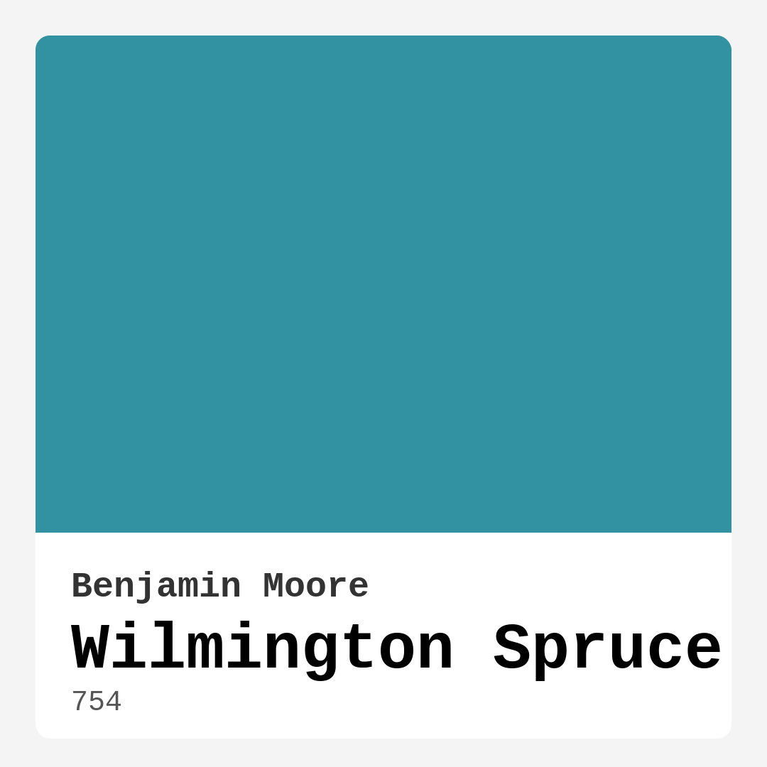
Color Preview & Key Details
| HEX Code | #3292A1 |
| RGB | 50, 146, 161 |
| LRV | 25.70% |
| Undertone | Blue |
| Finish Options | Eggshell, Matte, Satin |
Imagine stepping into a room that feels both refreshing and calming, a space that invites you to relax yet energizes your senses. That’s the magic of Wilmington Spruce, a stunning teal paint color by Benjamin Moore that beautifully balances vibrancy and tranquility. With its rich, deep tones, it’s the kind of color that can transform your home into a serene retreat, evoking the essence of nature right within your walls.
Wilmington Spruce, with a color code of 754, has a hue that leans towards blue and features a medium brightness tag. If you’re looking to create an atmosphere that’s both striking and unique, this is a color you definitely want to explore. The hex code #3292A1 and RGB value of 50, 146, 161 encapsulate its captivating essence perfectly. The Light Reflectance Value (LRV) of 25.70% means it reflects a fair amount of light, ensuring it won’t make your space feel overly dark, provided the lighting is just right.
One of the best things about Wilmington Spruce is its versatility. Whether you’re leaning towards a modern, coastal, bohemian, farmhouse, or eclectic decor style, this color can adapt beautifully to your vision. Imagine it in a cozy living room, a tranquil bedroom, or even a dynamic home office. It brings a sense of calm and grounding, making it an excellent choice for spaces where you want to unwind or gather with friends and family.
Let’s talk about application. Wilmington Spruce is incredibly beginner-friendly, making it a great choice for DIY projects. Its smooth application process means it goes on evenly, drying without streaks. You’ll find it easy to achieve that coveted professional look. Plus, it’s washable and scrubbable, making it practical for high-traffic areas. Just think about how often your walls could use a quick wipe-down — with this paint, you won’t have to worry about ruining the finish.
When selecting a paint color, understanding its undertones is crucial. Wilmington Spruce has a blue undertone, which adds depth and complexity. This characteristic can change how the color interacts with your existing decor. For example, in a room with warm wood tones or golden accents, the blue undertone can create a stunning contrast that feels both modern and inviting. It’s essential to test this color in your space and observe how it looks throughout the day and in different lighting conditions. In natural light, the color shines with vibrancy, while in dimmer settings, it becomes a sophisticated, moody hue.
Now, you might be wondering how this color works in smaller spaces. Absolutely, Wilmington Spruce can shine in a tiny room, especially if used thoughtfully. Consider an accent wall to add depth without overwhelming the space. Pairing it with lighter decor elements can maintain an airy feel. In well-lit areas, it can even make small rooms feel more vibrant and inviting.
When it comes to color pairings, Wilmington Spruce is a dream. It looks fantastic with crisp whites for a fresh contrast. Imagine pure white trim against the teal walls — it creates a sharp, clean line that enhances both colors. Warm neutrals can also complement Wilmington Spruce beautifully, creating a cozy environment. For a more layered approach, consider soft pinks or earthy browns. Don’t hesitate to experiment; finding the right combinations is part of the fun!
However, it’s worth noting a couple of potential downsides. Wilmington Spruce may require multiple coats for full coverage, so be prepared for that if you’re painting a large area. In poorly lit spaces, it might darken more than you’d like, so definitely consider the lighting before committing. If your room is very bright and sunny, you might want to think about how the color will react to that intense light throughout the day.
The finishes available for Wilmington Spruce—matte, eggshell, and satin—offer additional flexibility based on your design needs. Matte finishes can lend a more sophisticated, understated look, while eggshell and satin finishes can add a bit of sheen and durability, making them ideal for areas that see a lot of activity. Think about where you plan to use this color and choose a finish that aligns with your lifestyle and aesthetic preferences.
Wilmington Spruce is not just about looks; it’s also eco-friendly with low VOC levels, meaning it’s a safe choice for your home environment. You can feel good about using it, knowing that it’s better for your indoor air quality. It has a low odor too, so there’s no need to worry about overwhelming scents while you’re painting.
As you consider this beautiful color for your home, envision it in various spaces. In the living room, it can create a warm and inviting atmosphere for gatherings. In a bedroom, it can become a serene sanctuary that promotes relaxation. A kitchen painted in Wilmington Spruce could feel fresh and vibrant, while a home office in this shade could inspire creativity and focus.
In conclusion, Wilmington Spruce by Benjamin Moore is a color that offers so much potential for creating personalized, beautiful interiors. Its unique teal hue is the perfect blend of tranquility and vibrancy, suitable for various decor styles and room functions. Whether you’re updating a single accent wall or embarking on a full-room transformation, Wilmington Spruce can help you achieve that stunning, cohesive look you’ve been dreaming about.
So, what are you waiting for? Grab a sample and see how this color can elevate your space. You might just find that Wilmington Spruce is the perfect addition to your home, making it a more inviting and beautiful place. Remember, the key to great design is finding colors that resonate with you, and Wilmington Spruce could be just the hue you need to bring that vision to life.
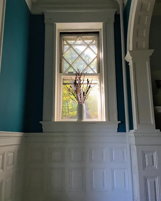
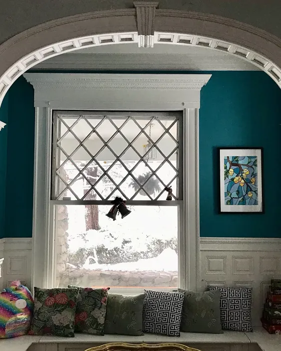
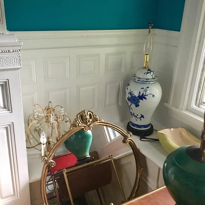
Real Room Photo of Wilmington Spruce 754
Undertones of Wilmington Spruce ?
The undertones of Wilmington Spruce are a key aspect of its character, leaning towards Blue. These subtle underlying hues are what give the color its depth and complexity. For example, a gray with a blue undertone will feel cooler and more modern, while one with a brown undertone will feel warmer and more traditional. It’s essential to test this paint in your home and observe it next to your existing furniture, flooring, and decor to see how these undertones interact and reveal themselves throughout the day.
HEX value: #3292A1
RGB code: 50, 146, 161
Is Wilmington Spruce Cool or Warm?
Wilmington Spruce is considered a cool paint color. This characteristic plays a huge role in the overall feel of a room. Cool colors, like this one, tend to create a cozy, inviting, and energetic atmosphere, making them great for social spaces like living rooms and dining rooms. In contrast, warm colors often evoke a sense of calm and serenity, which is why they are popular in bedrooms and bathrooms. The coolth of Wilmington Spruce means it will pair beautifully with corresponding decor elements.
Understanding Color Properties and Interior Design Tips
Hue refers to a specific position on the color wheel, measured in degrees from 0 to 360. Each degree represents a different pure color:
- 0° represents red
- 120° represents green
- 240° represents blue
Saturation describes the intensity or purity of a color and is expressed as a percentage:
- At 0%, the color appears completely desaturated—essentially a shade of gray
- At 100%, the color is at its most vivid and vibrant
Lightness indicates how light or dark a color is, also expressed as a percentage:
- 0% lightness results in black
- 100% lightness results in white
Using Warm Colors in Interior Design
Warm hues—such as reds, oranges, yellows, warm beiges, and greiges—are excellent choices for creating inviting and energetic spaces. These colors are particularly well-suited for:
- Kitchens, living rooms, and bathrooms, where warmth enhances comfort and sociability
- Large rooms, where warm tones can help reduce the sense of emptiness and make the space feel more intimate
For example:
- Warm beige shades provide a cozy, inviting atmosphere, ideal for living rooms, bedrooms, and hallways.
- Warm greige (a mix of beige and gray) offers the warmth of beige with the modern appeal of gray, making it a versatile backdrop for dining areas, bedrooms, and living spaces.
However, be mindful when using warm light tones in rooms with limited natural light. These shades may appear muted or even take on an unpleasant yellowish tint. To avoid a dull or flat appearance:
- Add depth by incorporating richer tones like deep greens, charcoal, or chocolate brown
- Use textured elements such as curtains, rugs, or cushions to bring dimension to the space
Pro Tip: Achieving Harmony with Warm and Cool Color Balance
To create a well-balanced and visually interesting interior, mix warm and cool tones strategically. This contrast adds depth and harmony to your design.
- If your walls feature warm hues, introduce cool-colored accents such as blue or green furniture, artwork, or accessories to create contrast.
- For a polished look, consider using a complementary color scheme, which pairs colors opposite each other on the color wheel (e.g., red with green, orange with blue).
This thoughtful mix not only enhances visual appeal but also creates a space that feels both dynamic and cohesive.
Light Temperature Affects on Wilmington Spruce
Natural Light
Natural daylight changes in color temperature as the sun moves across the sky. At sunrise and sunset, the light tends to have a warm, golden tone with a color temperature around 2000 Kelvin (K). As the day progresses and the sun rises higher, the light becomes cooler and more neutral. Around midday, especially when the sky is clear, natural light typically reaches its peak brightness and shifts to a cooler tone, ranging from 5500 to 6500 Kelvin. This midday light is close to what we perceive as pure white or daylight-balanced light.
These shifts in natural light can significantly influence how colors appear in a space, which is why designers often consider both the time of day and the orientation of windows when planning interior color schemes.
Artificial Light
When choosing artificial lighting, pay close attention to the color temperature, measured in Kelvin (K). This determines how warm or cool the light will appear. Lower temperatures, around 2700K, give off a warm, yellow glow often used in living rooms or bedrooms. Higher temperatures, above 5000K, create a cool, bluish light similar to daylight, commonly used in kitchens, offices, or task areas.
Use the slider to see how lighting temperature can affect the appearance of a surface or color throughout a space.


4800K
LRV of Wilmington Spruce
The Light Reflectance Value (LRV) of Wilmington Spruce is 25.70%, which places it in the Medium colors category. This means it reflect a lot of light. Understanding a paint’s LRV is crucial for predicting how it will look in your space. A higher LRV indicates a lighter color that reflects more light, making rooms feel larger and brighter. A lower LRV signifies a darker color that absorbs more light, creating a cozier, more intimate atmosphere. Always consider the natural and artificial lighting in your room when selecting a paint color based on its LRV.
Detailed Review of Wilmington Spruce
Additional Paint Characteristics
Ideal Rooms
Bedroom, Dining Room, Home Office, Kitchen, Living Room
Decor Styles
Bohemian, Coastal, Eclectic, Farmhouse, Modern
Coverage
Good (1–2 Coats), Touch-Up Friendly
Ease of Application
Beginner Friendly, Brush Smooth, Roller-Ready
Washability
Scrubbable, Washable
VOC Level
Eco-Certified, Low VOC
Best Use
Accent Wall, Furniture, Interior Walls, Open Concept Spaces
Room Suitability
Bedroom, Dining Room, Home Office, Kitchen, Living Room
Tone Tag
Cool, Deep, Earthy
Finish Type
Eggshell, Matte, Satin
Paint Performance
Easy Touch-Up, High Coverage, Low Odor, Stain Resistant
Use Cases
Best for Modern Farmhouse, Best for Open Concept, Best for Selling Your Home, Designer Favorite
Mood
Calm, Grounding, Inviting
Trim Pairing
Complements Cool Trim, Matches Pure White, Pairs with White Dove
Wilmington Spruce is a standout choice for those looking to add a touch of elegance to their interiors. Its deep teal hue offers a refreshing yet calming vibe, making it versatile for various spaces. Whether you’re aiming for a coastal feel or a modern aesthetic, this color adapts beautifully. In natural light, it appears more vibrant, while in dimmer settings, it transforms into a sophisticated, moody shade. The application process is smooth, and it dries evenly without streaks, enhancing its appeal. Overall, Wilmington Spruce is ideal for both accent walls and full-room applications, providing a cozy yet chic atmosphere.
Pros & Cons of 754 Wilmington Spruce
Pros
Cons
Colors that go with Benjamin Moore Wilmington Spruce
FAQ on 754 Wilmington Spruce
Can Wilmington Spruce be used in small rooms?
Absolutely! While Wilmington Spruce is a bold color, it can work wonderfully in small rooms if used thoughtfully. Consider using it on an accent wall or pairing it with lighter decor elements to maintain an airy feel. In well-lit spaces, it can even make small rooms feel more vibrant and inviting.
How does Wilmington Spruce pair with other colors?
Wilmington Spruce pairs beautifully with a variety of colors. Complement it with crisp whites for a fresh contrast, or use warm neutrals to create a cozy environment. It also looks stunning alongside soft pinks or earthy browns for a more layered, sophisticated palette. Don’t hesitate to experiment with different combinations to find what resonates with your style!
Comparisons Wilmington Spruce with other colors
Wilmington Spruce 754 vs Dutch Tile Blue SW 0031
| Attribute | Wilmington Spruce 754 | Dutch Tile Blue SW 0031 |
|---|---|---|
| Color Name | Wilmington Spruce 754 | Dutch Tile Blue SW 0031 |
| Color | ||
| Hue | Blue | Blue |
| Brightness | Medium | Medium |
| RGB | 50, 146, 161 | 154, 171, 171 |
| LRV | 25.70% | 24% |
| Finish Type | Eggshell, Matte, Satin | Eggshell, Matte, Satin |
| Finish Options | Eggshell, Matte, Satin | Eggshell, Flat, Matte, Satin |
| Ideal Rooms | Bedroom, Dining Room, Home Office, Kitchen, Living Room | Bathroom, Bedroom, Dining Room, Hallway, Home Office, Kitchen, Living Room |
| Decor Styles | Bohemian, Coastal, Eclectic, Farmhouse, Modern | Coastal, Modern Farmhouse, Scandinavian, Traditional, Transitional |
| Coverage | Good (1–2 Coats), Touch-Up Friendly | Good (1–2 Coats) |
| Ease of Application | Beginner Friendly, Brush Smooth, Roller-Ready | Beginner Friendly, Brush Smooth, Fast-Drying, Roller-Ready |
| Washability | Scrubbable, Washable | Highly Washable, Washable |
| Room Suitability | Bedroom, Dining Room, Home Office, Kitchen, Living Room | Bathroom, Bedroom, Dining Room, Kitchen, Living Room |
| Tone | Cool, Deep, Earthy | Balanced, Cool, Muted |
| Paint Performance | Easy Touch-Up, High Coverage, Low Odor, Stain Resistant | Easy Touch-Up, High Coverage, Low Odor, Quick Drying |
Wilmington Spruce 754 vs Debonair SW 9139
| Attribute | Wilmington Spruce 754 | Debonair SW 9139 |
|---|---|---|
| Color Name | Wilmington Spruce 754 | Debonair SW 9139 |
| Color | ||
| Hue | Blue | Blue |
| Brightness | Medium | Medium |
| RGB | 50, 146, 161 | 144, 160, 166 |
| LRV | 25.70% | 30% |
| Finish Type | Eggshell, Matte, Satin | Eggshell, Matte, Satin |
| Finish Options | Eggshell, Matte, Satin | Eggshell, Matte, Satin |
| Ideal Rooms | Bedroom, Dining Room, Home Office, Kitchen, Living Room | Bedroom, Dining Room, Home Office, Living Room |
| Decor Styles | Bohemian, Coastal, Eclectic, Farmhouse, Modern | Coastal, Industrial, Modern, Transitional |
| Coverage | Good (1–2 Coats), Touch-Up Friendly | Good (1–2 Coats) |
| Ease of Application | Beginner Friendly, Brush Smooth, Roller-Ready | Beginner Friendly, Brush Smooth, Roller-Ready |
| Washability | Scrubbable, Washable | Washable, Wipeable |
| Room Suitability | Bedroom, Dining Room, Home Office, Kitchen, Living Room | Bedroom, Dining Room, Home Office, Living Room |
| Tone | Cool, Deep, Earthy | Balanced, Cool, Muted |
| Paint Performance | Easy Touch-Up, High Coverage, Low Odor, Stain Resistant | Easy Touch-Up, Low Odor, Quick Drying |
Wilmington Spruce 754 vs Stardew SW 9138
| Attribute | Wilmington Spruce 754 | Stardew SW 9138 |
|---|---|---|
| Color Name | Wilmington Spruce 754 | Stardew SW 9138 |
| Color | ||
| Hue | Blue | Blue |
| Brightness | Medium | Medium |
| RGB | 50, 146, 161 | 166, 178, 181 |
| LRV | 25.70% | 30% |
| Finish Type | Eggshell, Matte, Satin | Eggshell, Satin |
| Finish Options | Eggshell, Matte, Satin | Eggshell, Matte, Satin |
| Ideal Rooms | Bedroom, Dining Room, Home Office, Kitchen, Living Room | Bathroom, Bedroom, Home Office, Living Room, Nursery |
| Decor Styles | Bohemian, Coastal, Eclectic, Farmhouse, Modern | Coastal, Farmhouse, Modern, Scandinavian |
| Coverage | Good (1–2 Coats), Touch-Up Friendly | Good (1–2 Coats) |
| Ease of Application | Beginner Friendly, Brush Smooth, Roller-Ready | Beginner Friendly, Brush Smooth, Roller-Ready |
| Washability | Scrubbable, Washable | Highly Washable, Washable, Wipeable |
| Room Suitability | Bedroom, Dining Room, Home Office, Kitchen, Living Room | Bathroom, Bedroom, Home Office, Living Room |
| Tone | Cool, Deep, Earthy | Calm, Cool, Muted |
| Paint Performance | Easy Touch-Up, High Coverage, Low Odor, Stain Resistant | Easy Touch-Up, High Coverage, Low Odor |
Wilmington Spruce 754 vs Niebla Azul SW 9137
| Attribute | Wilmington Spruce 754 | Niebla Azul SW 9137 |
|---|---|---|
| Color Name | Wilmington Spruce 754 | Niebla Azul SW 9137 |
| Color | ||
| Hue | Blue | Blue |
| Brightness | Medium | Medium |
| RGB | 50, 146, 161 | 182, 195, 196 |
| LRV | 25.70% | 48% |
| Finish Type | Eggshell, Matte, Satin | Eggshell, Matte, Satin |
| Finish Options | Eggshell, Matte, Satin | Eggshell, Matte, Satin |
| Ideal Rooms | Bedroom, Dining Room, Home Office, Kitchen, Living Room | Bedroom, Home Office, Living Room, Nursery |
| Decor Styles | Bohemian, Coastal, Eclectic, Farmhouse, Modern | Coastal, Modern, Scandinavian, Transitional |
| Coverage | Good (1–2 Coats), Touch-Up Friendly | Good (1–2 Coats), Touch-Up Friendly |
| Ease of Application | Beginner Friendly, Brush Smooth, Roller-Ready | Beginner Friendly, Brush Smooth, Roller-Ready |
| Washability | Scrubbable, Washable | Highly Washable, Washable |
| Room Suitability | Bedroom, Dining Room, Home Office, Kitchen, Living Room | Bedroom, Home Office, Living Room, Nursery |
| Tone | Cool, Deep, Earthy | Airy, Cool, Muted |
| Paint Performance | Easy Touch-Up, High Coverage, Low Odor, Stain Resistant | Easy Touch-Up, Fade Resistant, Low Odor, Scuff Resistant |
Wilmington Spruce 754 vs Rain SW 6219
| Attribute | Wilmington Spruce 754 | Rain SW 6219 |
|---|---|---|
| Color Name | Wilmington Spruce 754 | Rain SW 6219 |
| Color | ||
| Hue | Blue | Blue |
| Brightness | Medium | Medium |
| RGB | 50, 146, 161 | 171, 190, 191 |
| LRV | 25.70% | 50% |
| Finish Type | Eggshell, Matte, Satin | Eggshell, Matte, Satin |
| Finish Options | Eggshell, Matte, Satin | Eggshell, Matte, Satin |
| Ideal Rooms | Bedroom, Dining Room, Home Office, Kitchen, Living Room | Bathroom, Bedroom, Home Office, Living Room, Nursery |
| Decor Styles | Bohemian, Coastal, Eclectic, Farmhouse, Modern | Coastal, Minimalist, Modern, Scandinavian, Transitional |
| Coverage | Good (1–2 Coats), Touch-Up Friendly | Good (1–2 Coats), Touch-Up Friendly |
| Ease of Application | Beginner Friendly, Brush Smooth, Roller-Ready | Beginner Friendly, Brush Smooth, Fast-Drying, Roller-Ready |
| Washability | Scrubbable, Washable | Scrubbable, Stain Resistant, Washable |
| Room Suitability | Bedroom, Dining Room, Home Office, Kitchen, Living Room | Bathroom, Bedroom, Home Office, Living Room, Nursery |
| Tone | Cool, Deep, Earthy | Balanced, Cool, Muted |
| Paint Performance | Easy Touch-Up, High Coverage, Low Odor, Stain Resistant | Easy Touch-Up, Low Odor, Quick Drying, Stain Resistant |
Wilmington Spruce 754 vs Morning at Sea SW 9634
| Attribute | Wilmington Spruce 754 | Morning at Sea SW 9634 |
|---|---|---|
| Color Name | Wilmington Spruce 754 | Morning at Sea SW 9634 |
| Color | ||
| Hue | Blue | Blue |
| Brightness | Medium | Medium |
| RGB | 50, 146, 161 | 130, 151, 155 |
| LRV | 25.70% | 50% |
| Finish Type | Eggshell, Matte, Satin | Eggshell, Matte |
| Finish Options | Eggshell, Matte, Satin | Eggshell, Matte, Satin |
| Ideal Rooms | Bedroom, Dining Room, Home Office, Kitchen, Living Room | Bathroom, Bedroom, Home Office, Living Room |
| Decor Styles | Bohemian, Coastal, Eclectic, Farmhouse, Modern | Coastal, Minimalist, Modern, Scandinavian |
| Coverage | Good (1–2 Coats), Touch-Up Friendly | Good (1–2 Coats), Touch-Up Friendly |
| Ease of Application | Beginner Friendly, Brush Smooth, Roller-Ready | Beginner Friendly, Brush Smooth, Roller-Ready |
| Washability | Scrubbable, Washable | Washable, Wipeable |
| Room Suitability | Bedroom, Dining Room, Home Office, Kitchen, Living Room | Bathroom, Bedroom, Home Office, Living Room |
| Tone | Cool, Deep, Earthy | Airy, Cool, Muted |
| Paint Performance | Easy Touch-Up, High Coverage, Low Odor, Stain Resistant | Easy Touch-Up, Fade Resistant, Low Odor |
Wilmington Spruce 754 vs Sleepy Blue SW 6225
| Attribute | Wilmington Spruce 754 | Sleepy Blue SW 6225 |
|---|---|---|
| Color Name | Wilmington Spruce 754 | Sleepy Blue SW 6225 |
| Color | ||
| Hue | Blue | Blue |
| Brightness | Medium | Medium |
| RGB | 50, 146, 161 | 188, 203, 206 |
| LRV | 25.70% | 50% |
| Finish Type | Eggshell, Matte, Satin | Eggshell, Matte, Satin |
| Finish Options | Eggshell, Matte, Satin | Eggshell, Matte, Satin |
| Ideal Rooms | Bedroom, Dining Room, Home Office, Kitchen, Living Room | Bedroom, Home Office, Living Room, Nursery |
| Decor Styles | Bohemian, Coastal, Eclectic, Farmhouse, Modern | Coastal, Minimalist, Modern Farmhouse, Scandinavian |
| Coverage | Good (1–2 Coats), Touch-Up Friendly | Good (1–2 Coats) |
| Ease of Application | Beginner Friendly, Brush Smooth, Roller-Ready | Beginner Friendly, Brush Smooth, Fast-Drying, Roller-Ready |
| Washability | Scrubbable, Washable | Highly Washable, Washable |
| Room Suitability | Bedroom, Dining Room, Home Office, Kitchen, Living Room | Bedroom, Home Office, Living Room, Nursery |
| Tone | Cool, Deep, Earthy | Airy, Cool, Muted |
| Paint Performance | Easy Touch-Up, High Coverage, Low Odor, Stain Resistant | Easy Touch-Up, Low Odor, Quick Drying, Scuff Resistant |
Wilmington Spruce 754 vs Lakeside SW 9683
| Attribute | Wilmington Spruce 754 | Lakeside SW 9683 |
|---|---|---|
| Color Name | Wilmington Spruce 754 | Lakeside SW 9683 |
| Color | ||
| Hue | Blue | Blue |
| Brightness | Medium | Medium |
| RGB | 50, 146, 161 | 173, 184, 192 |
| LRV | 25.70% | 24% |
| Finish Type | Eggshell, Matte, Satin | Eggshell, Matte, Satin |
| Finish Options | Eggshell, Matte, Satin | Eggshell, Matte, Satin |
| Ideal Rooms | Bedroom, Dining Room, Home Office, Kitchen, Living Room | Bathroom, Bedroom, Home Office, Living Room |
| Decor Styles | Bohemian, Coastal, Eclectic, Farmhouse, Modern | Coastal, Minimalist, Modern, Rustic |
| Coverage | Good (1–2 Coats), Touch-Up Friendly | Good (1–2 Coats) |
| Ease of Application | Beginner Friendly, Brush Smooth, Roller-Ready | Beginner Friendly, Brush Smooth, Roller-Ready |
| Washability | Scrubbable, Washable | Scrubbable, Washable |
| Room Suitability | Bedroom, Dining Room, Home Office, Kitchen, Living Room | Bathroom, Bedroom, Home Office, Living Room |
| Tone | Cool, Deep, Earthy | Balanced, Cool, Muted |
| Paint Performance | Easy Touch-Up, High Coverage, Low Odor, Stain Resistant | Easy Touch-Up, Fade Resistant, High Coverage, Low Odor |
Wilmington Spruce 754 vs Upward SW 6239
| Attribute | Wilmington Spruce 754 | Upward SW 6239 |
|---|---|---|
| Color Name | Wilmington Spruce 754 | Upward SW 6239 |
| Color | ||
| Hue | Blue | Blue |
| Brightness | Medium | Medium |
| RGB | 50, 146, 161 | 191, 201, 208 |
| LRV | 25.70% | 75% |
| Finish Type | Eggshell, Matte, Satin | Eggshell, Satin |
| Finish Options | Eggshell, Matte, Satin | Eggshell, Flat, Satin |
| Ideal Rooms | Bedroom, Dining Room, Home Office, Kitchen, Living Room | Bedroom, Dining Room, Home Office, Living Room, Nursery |
| Decor Styles | Bohemian, Coastal, Eclectic, Farmhouse, Modern | Coastal, Minimalist, Modern, Scandinavian |
| Coverage | Good (1–2 Coats), Touch-Up Friendly | Good (1–2 Coats), Touch-Up Friendly |
| Ease of Application | Beginner Friendly, Brush Smooth, Roller-Ready | Beginner Friendly, Brush Smooth, Fast-Drying, Roller-Ready |
| Washability | Scrubbable, Washable | Washable, Wipeable |
| Room Suitability | Bedroom, Dining Room, Home Office, Kitchen, Living Room | Bedroom, Home Office, Living Room, Nursery |
| Tone | Cool, Deep, Earthy | Cool, Crisp, Muted |
| Paint Performance | Easy Touch-Up, High Coverage, Low Odor, Stain Resistant | High Coverage, Low Odor, Quick Drying |
Wilmington Spruce 754 vs Aleutian SW 6241
| Attribute | Wilmington Spruce 754 | Aleutian SW 6241 |
|---|---|---|
| Color Name | Wilmington Spruce 754 | Aleutian SW 6241 |
| Color | ||
| Hue | Blue | Blue |
| Brightness | Medium | Medium |
| RGB | 50, 146, 161 | 152, 169, 183 |
| LRV | 25.70% | 24% |
| Finish Type | Eggshell, Matte, Satin | Eggshell, Matte, Satin |
| Finish Options | Eggshell, Matte, Satin | Eggshell, Matte, Satin |
| Ideal Rooms | Bedroom, Dining Room, Home Office, Kitchen, Living Room | Bathroom, Bedroom, Home Office, Kitchen, Living Room, Nursery |
| Decor Styles | Bohemian, Coastal, Eclectic, Farmhouse, Modern | Coastal, Minimalist, Modern, Scandinavian, Transitional |
| Coverage | Good (1–2 Coats), Touch-Up Friendly | Good (1–2 Coats), Touch-Up Friendly |
| Ease of Application | Beginner Friendly, Brush Smooth, Roller-Ready | Beginner Friendly, Brush Smooth, Fast-Drying, Roller-Ready |
| Washability | Scrubbable, Washable | Scrubbable, Stain Resistant, Washable |
| Room Suitability | Bedroom, Dining Room, Home Office, Kitchen, Living Room | Bathroom, Bedroom, Home Office, Living Room, Nursery |
| Tone | Cool, Deep, Earthy | Airy, Balanced, Cool, Muted |
| Paint Performance | Easy Touch-Up, High Coverage, Low Odor, Stain Resistant | Easy Touch-Up, Fade Resistant, Low Odor, Quick Drying |
Official Page of Benjamin Moore Wilmington Spruce 754