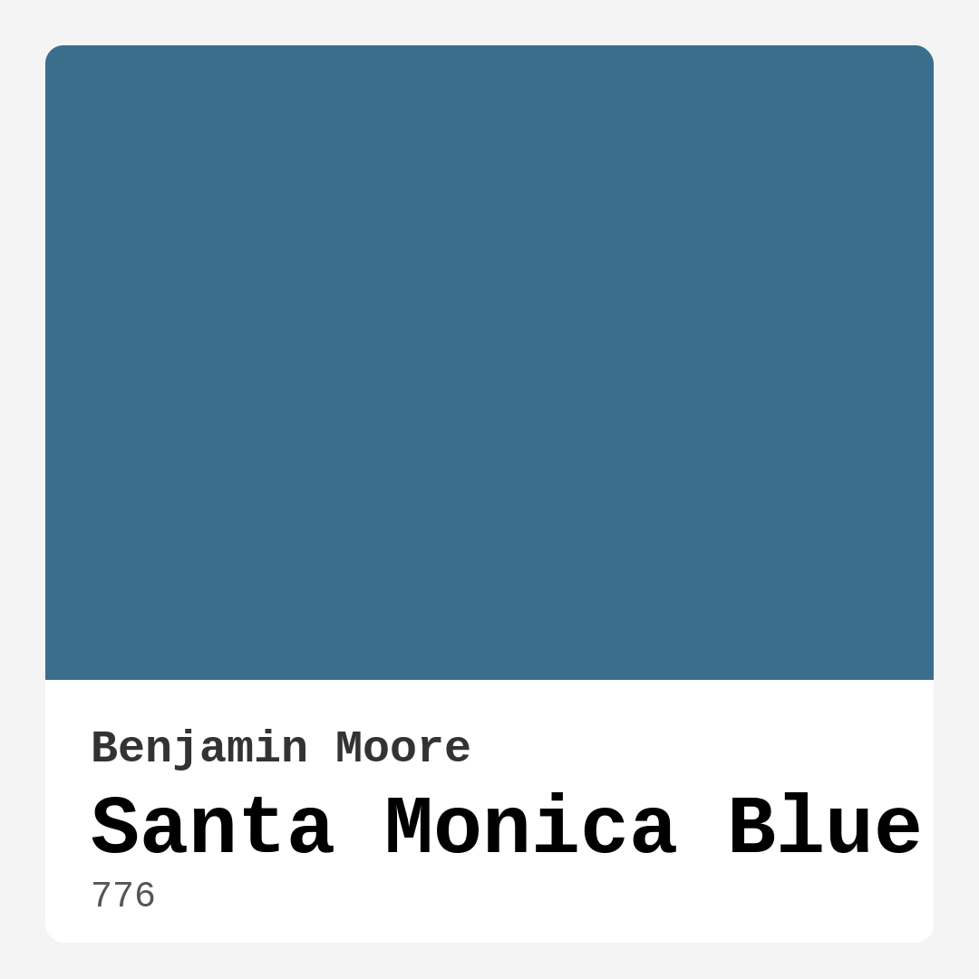
Color Preview & Key Details
| HEX Code | #3A6E8C |
| RGB | 58, 110, 140 |
| LRV | 16.08% |
| Undertone | Blue |
| Finish Options | Matte, Satin, Semi-Gloss |
If you’re searching for a paint color that effortlessly brings the serenity of the coast into your home, look no further than Benjamin Moore’s Santa Monica Blue (776). This rich, medium-dark blue with a hint of green undertone is like a breath of fresh ocean air—calming, refreshing, and endlessly versatile. Whether you’re dreaming of a coastal-inspired bedroom, a minimalist home office, or a tranquil bathroom retreat, this shade has the power to transform your space into a haven of relaxation.
Santa Monica Blue isn’t just another blue paint—it’s a carefully balanced hue that avoids feeling too cold or stark. Its subtle green undertone softens the overall effect, making it feel more organic and inviting than a pure, icy blue. The color’s depth comes alive in different lighting, shifting from a vibrant, almost teal-like tone in natural daylight to a deeper, more subdued shade in the evening. This chameleon-like quality means it adapts beautifully to any room, whether it’s flooded with sunlight or relies on softer artificial lighting.
One of the standout features of Santa Monica Blue is its ease of application. If you’re a DIY enthusiast or a first-time painter, you’ll appreciate how smoothly it rolls on, with excellent coverage in just one or two coats. The paint is touch-up friendly, so minor imperfections or scuffs can be easily fixed without leaving noticeable patches. It’s also fast-drying, which means less downtime between coats and a quicker transformation for your space. And because it’s low in VOCs, you won’t have to worry about harsh fumes lingering in your home—making it a great choice for families or anyone prioritizing eco-friendly options.
When it comes to finishes, Santa Monica Blue shines in both satin and semi-gloss. A satin finish gives walls a soft, velvety look that’s perfect for living rooms and bedrooms, where you want a bit of sheen without too much reflection. Semi-gloss, on the other hand, works wonders in bathrooms or kitchens, where durability and washability are key. No matter which finish you choose, the color’s richness remains intact, adding depth and sophistication to your walls.
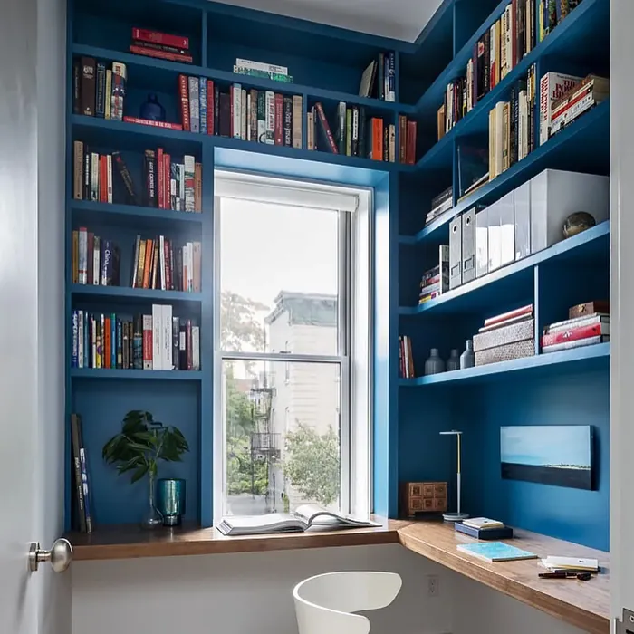
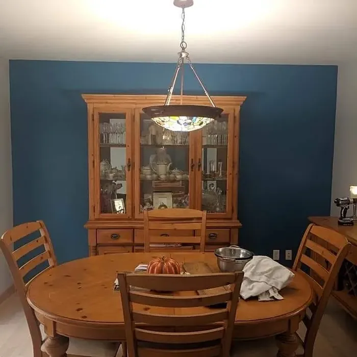
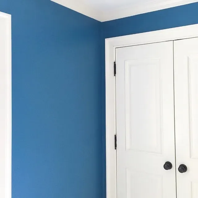
So where does Santa Monica Blue work best? Almost anywhere, really. In a bedroom, it creates a restful retreat that feels like a permanent vacation. Pair it with crisp white trim—Benjamin Moore’s White Dove is a classic choice—and brass or gold fixtures for a touch of warmth. In a living room, it serves as a stunning backdrop for both modern and traditional furniture, especially when balanced with neutral upholstery and natural wood tones. For a home office, it fosters focus and calm, making it easier to concentrate without feeling sterile. Even in small spaces like bathrooms or entryways, Santa Monica Blue works magic, making rooms feel larger and more open thanks to its cool, airy undertones.
If you’re worried about committing to a darker shade, don’t be. While Santa Monica Blue has a lower LRV (Light Reflectance Value) of 16.08%, meaning it absorbs more light than it reflects, it doesn’t make a room feel cave-like. Instead, it creates a cozy, intimate atmosphere that’s perfect for relaxation. To keep the space feeling bright, balance it with plenty of white or light-colored decor, and consider using it on an accent wall if you’re not ready to go all-in.
Decorating around Santa Monica Blue is a breeze thanks to its versatility. For a coastal vibe, layer in natural textures like rattan, jute, and driftwood, and add pops of coral or seafoam green. If modern minimalism is more your style, keep the palette clean with black-and-white accents and sleek metallic finishes. And if you love a bit of contrast, try pairing it with warm, earthy tones like terracotta or mustard yellow—the complementary red undertones in these colors will make the blue pop even more.
Of course, no color is perfect for every situation. Santa Monica Blue’s cool undertones might clash with very warm palettes, so if your space is filled with reds, oranges, or heavy woods, test a sample first to see how it plays with your existing decor. Lighting can also affect how the color reads—north-facing rooms may emphasize its cooler side, while south-facing light can bring out its greenish notes. Always swatch it on your walls and observe it at different times of day before making a final decision.
For those who love Santa Monica Blue but want something a bit lighter or darker, Benjamin Moore offers a range of similar shades. Lighter options like Ocean Breeze or CW-620 keep the coastal feel but brighten things up, while deeper blues like CSP-655 add drama and intensity. And if you’re looking for complementary colors, soft whites, warm grays, and muted greens (like Benjamin Moore’s CSP-415) all play nicely with this versatile blue.
At the end of the day, Santa Monica Blue is more than just a paint color—it’s an experience. It brings the tranquility of the ocean into your home, creating spaces that feel both stylish and soothing. Whether you’re refreshing a single room or reimagining your entire house, this shade offers the perfect blend of sophistication and ease. So grab a brush, roll up your sleeves, and get ready to fall in love with your walls all over again.
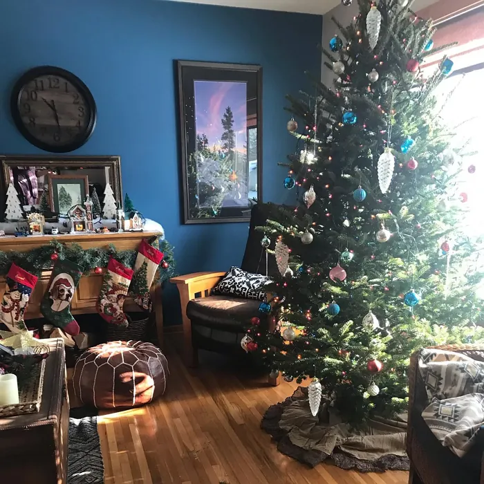
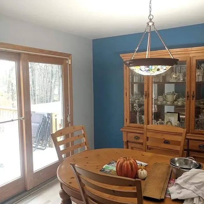
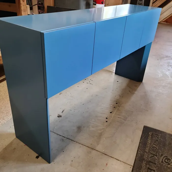
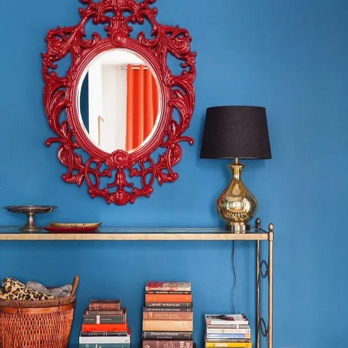
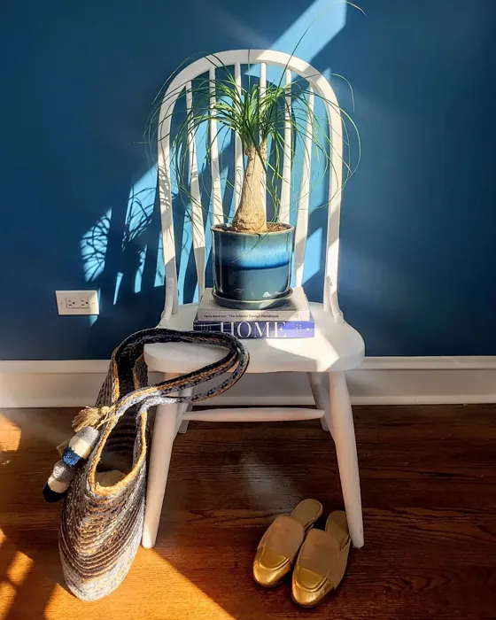
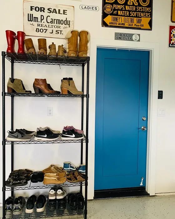
Real Room Photo of Santa Monica Blue 776
Undertones of Santa Monica Blue ?
The undertones of Santa Monica Blue are a key aspect of its character, leaning towards Blue. These subtle underlying hues are what give the color its depth and complexity. For example, a gray with a blue undertone will feel cooler and more modern, while one with a brown undertone will feel warmer and more traditional. It’s essential to test this paint in your home and observe it next to your existing furniture, flooring, and decor to see how these undertones interact and reveal themselves throughout the day.
HEX value: #3A6E8C
RGB code: 58, 110, 140
Is Santa Monica Blue Cool or Warm?
Santa Monica Blue is primarily a cool color. Its blue-green undertones offer a soothing effect, making it ideal for spaces where relaxation and calmness are desired. Pair it with warmer accents for a balanced look.
Understanding Color Properties and Interior Design Tips
Hue refers to a specific position on the color wheel, measured in degrees from 0 to 360. Each degree represents a different pure color:
- 0° represents red
- 120° represents green
- 240° represents blue
Saturation describes the intensity or purity of a color and is expressed as a percentage:
- At 0%, the color appears completely desaturated—essentially a shade of gray
- At 100%, the color is at its most vivid and vibrant
Lightness indicates how light or dark a color is, also expressed as a percentage:
- 0% lightness results in black
- 100% lightness results in white
Using Warm Colors in Interior Design
Warm hues—such as reds, oranges, yellows, warm beiges, and greiges—are excellent choices for creating inviting and energetic spaces. These colors are particularly well-suited for:
- Kitchens, living rooms, and bathrooms, where warmth enhances comfort and sociability
- Large rooms, where warm tones can help reduce the sense of emptiness and make the space feel more intimate
For example:
- Warm beige shades provide a cozy, inviting atmosphere, ideal for living rooms, bedrooms, and hallways.
- Warm greige (a mix of beige and gray) offers the warmth of beige with the modern appeal of gray, making it a versatile backdrop for dining areas, bedrooms, and living spaces.
However, be mindful when using warm light tones in rooms with limited natural light. These shades may appear muted or even take on an unpleasant yellowish tint. To avoid a dull or flat appearance:
- Add depth by incorporating richer tones like deep greens, charcoal, or chocolate brown
- Use textured elements such as curtains, rugs, or cushions to bring dimension to the space
Pro Tip: Achieving Harmony with Warm and Cool Color Balance
To create a well-balanced and visually interesting interior, mix warm and cool tones strategically. This contrast adds depth and harmony to your design.
- If your walls feature warm hues, introduce cool-colored accents such as blue or green furniture, artwork, or accessories to create contrast.
- For a polished look, consider using a complementary color scheme, which pairs colors opposite each other on the color wheel (e.g., red with green, orange with blue).
This thoughtful mix not only enhances visual appeal but also creates a space that feels both dynamic and cohesive.
Light Temperature Affects on Santa Monica Blue
Natural Light
Natural daylight changes in color temperature as the sun moves across the sky. At sunrise and sunset, the light tends to have a warm, golden tone with a color temperature around 2000 Kelvin (K). As the day progresses and the sun rises higher, the light becomes cooler and more neutral. Around midday, especially when the sky is clear, natural light typically reaches its peak brightness and shifts to a cooler tone, ranging from 5500 to 6500 Kelvin. This midday light is close to what we perceive as pure white or daylight-balanced light.
These shifts in natural light can significantly influence how colors appear in a space, which is why designers often consider both the time of day and the orientation of windows when planning interior color schemes.
Artificial Light
When choosing artificial lighting, pay close attention to the color temperature, measured in Kelvin (K). This determines how warm or cool the light will appear. Lower temperatures, around 2700K, give off a warm, yellow glow often used in living rooms or bedrooms. Higher temperatures, above 5000K, create a cool, bluish light similar to daylight, commonly used in kitchens, offices, or task areas.
Use the slider to see how lighting temperature can affect the appearance of a surface or color throughout a space.


4800K
LRV of Santa Monica Blue
The Light Reflectance Value (LRV) of Santa Monica Blue is 16.08%, which places it in the Medium Dark category. This means it reflects very little light. Understanding a paint’s LRV is crucial for predicting how it will look in your space. A higher LRV indicates a lighter color that reflects more light, making rooms feel larger and brighter. A lower LRV signifies a darker color that absorbs more light, creating a cozier, more intimate atmosphere. Always consider the natural and artificial lighting in your room when selecting a paint color based on its LRV.
Detailed Review of Santa Monica Blue
Additional Paint Characteristics
Ideal Rooms
Bathroom, Bedroom, Entryway, Home Office, Living Room
Decor Styles
Coastal, Minimalist, Modern, Nautical, Transitional
Coverage
Good (1–2 Coats), Touch-Up Friendly
Ease of Application
Beginner Friendly, Brush Smooth, Fast-Drying, Roller-Ready
Washability
Highly Washable, Washable
VOC Level
Eco-Certified, Low VOC
Best Use
Accent Wall, Furniture, Interior Walls
Room Suitability
Bathroom, Bedroom, Home Office, Living Room
Tone Tag
Airy, Balanced, Cool
Finish Type
Satin, Semi-Gloss
Paint Performance
Easy Touch-Up, High Coverage, Low Odor, Quick Drying
Use Cases
Best for Low Light Rooms, Best for Open Concept, Best for Rentals, Designer Favorite
Mood
Calm, Inviting, Restful
Trim Pairing
Complements Brass Fixtures, Pairs with White Dove
Santa Monica Blue is more than just a paint color; it’s a mood lifter. The blend of blue and green gives it an inviting and refreshing vibe, perfect for spaces meant for relaxation. Its versatility shines through, making it suitable for various rooms, from bedrooms to home offices. When applied, the paint goes on smoothly and evenly, providing good coverage with just one or two coats. The satin finish reflects light beautifully, enhancing the color’s depth while maintaining a soft look. Whether you’re aiming for a coastal retreat or a sophisticated modern space, Santa Monica Blue sets a tranquil tone that can harmonize with a variety of decor styles.
Pros & Cons of 776 Santa Monica Blue
Pros
Cons
Colors that go with Benjamin Moore Santa Monica Blue
FAQ on 776 Santa Monica Blue
Can I use Santa Monica Blue in a small room?
Absolutely! Santa Monica Blue works well in small spaces, providing a sense of openness and tranquility. To enhance this effect, consider pairing it with lighter trim and decor elements. Its cool tone can make a room feel airy and spacious, perfect for cozy nooks or compact bedrooms.
Is Santa Monica Blue suitable for exteriors?
Yes, Santa Monica Blue can be used on exterior walls, particularly for coastal or beach-style homes. Its soothing color complements natural surroundings and can withstand varying weather conditions. Just make sure to use a high-quality exterior paint to ensure durability against the elements.
Comparisons Santa Monica Blue with other colors
Santa Monica Blue 776 vs Naval SW 6244
| Attribute | Santa Monica Blue 776 | Naval SW 6244 |
|---|---|---|
| Color Name | Santa Monica Blue 776 | Naval SW 6244 |
| Color | ||
| Hue | Blue | Blue |
| Brightness | Dark | Dark |
| RGB | 58, 110, 140 | 47, 61, 76 |
| LRV | 16.08% | 4% |
| Finish Type | Satin, Semi-Gloss | Matte, Satin, Semi-Gloss |
| Finish Options | Matte, Satin, Semi-Gloss | Matte, Satin, Semi-Gloss |
| Ideal Rooms | Bathroom, Bedroom, Entryway, Home Office, Living Room | Bedroom, Dining Room, Hallway, Home Office, Living Room |
| Decor Styles | Coastal, Minimalist, Modern, Nautical, Transitional | Coastal, Industrial, Minimalist, Modern, Traditional |
| Coverage | Good (1–2 Coats), Touch-Up Friendly | Good (1–2 Coats), Self-Priming |
| Ease of Application | Beginner Friendly, Brush Smooth, Fast-Drying, Roller-Ready | Beginner Friendly, Brush Smooth, Roller-Ready |
| Washability | Highly Washable, Washable | Highly Washable, Washable |
| Room Suitability | Bathroom, Bedroom, Home Office, Living Room | Bedroom, Dining Room, Entryway, Home Office, Living Room |
| Tone | Airy, Balanced, Cool | Cool, Deep, Moody |
| Paint Performance | Easy Touch-Up, High Coverage, Low Odor, Quick Drying | Easy Touch-Up, High Coverage, Low Odor, Scuff Resistant |
Santa Monica Blue 776 vs Sea Serpent SW 7615
| Attribute | Santa Monica Blue 776 | Sea Serpent SW 7615 |
|---|---|---|
| Color Name | Santa Monica Blue 776 | Sea Serpent SW 7615 |
| Color | ||
| Hue | Blue | Blue |
| Brightness | Dark | Dark |
| RGB | 58, 110, 140 | 62, 75, 84 |
| LRV | 16.08% | 12% |
| Finish Type | Satin, Semi-Gloss | Eggshell, Matte, Satin |
| Finish Options | Matte, Satin, Semi-Gloss | Eggshell, Matte, Satin |
| Ideal Rooms | Bathroom, Bedroom, Entryway, Home Office, Living Room | Bathroom, Bedroom, Home Office, Living Room |
| Decor Styles | Coastal, Minimalist, Modern, Nautical, Transitional | Coastal, Farmhouse, Industrial, Modern |
| Coverage | Good (1–2 Coats), Touch-Up Friendly | Good (1–2 Coats), Touch-Up Friendly |
| Ease of Application | Beginner Friendly, Brush Smooth, Fast-Drying, Roller-Ready | Beginner Friendly, Brush Smooth, Roller-Ready |
| Washability | Highly Washable, Washable | Highly Washable, Washable |
| Room Suitability | Bathroom, Bedroom, Home Office, Living Room | Bathroom, Bedroom, Home Office, Living Room |
| Tone | Airy, Balanced, Cool | Cool, Deep, Moody |
| Paint Performance | Easy Touch-Up, High Coverage, Low Odor, Quick Drying | Easy Touch-Up, High Coverage, Low Odor |
Santa Monica Blue 776 vs Rain Cloud SW 9639
| Attribute | Santa Monica Blue 776 | Rain Cloud SW 9639 |
|---|---|---|
| Color Name | Santa Monica Blue 776 | Rain Cloud SW 9639 |
| Color | ||
| Hue | Blue | Blue |
| Brightness | Dark | Dark |
| RGB | 58, 110, 140 | 83, 97, 104 |
| LRV | 16.08% | 30% |
| Finish Type | Satin, Semi-Gloss | Eggshell, Matte, Satin |
| Finish Options | Matte, Satin, Semi-Gloss | Eggshell, Matte, Satin |
| Ideal Rooms | Bathroom, Bedroom, Entryway, Home Office, Living Room | Bedroom, Dining Room, Home Office, Living Room |
| Decor Styles | Coastal, Minimalist, Modern, Nautical, Transitional | Coastal, Contemporary, Minimalist, Scandinavian |
| Coverage | Good (1–2 Coats), Touch-Up Friendly | Good (1–2 Coats), Touch-Up Friendly |
| Ease of Application | Beginner Friendly, Brush Smooth, Fast-Drying, Roller-Ready | Beginner Friendly, Brush Smooth, Roller-Ready |
| Washability | Highly Washable, Washable | Highly Washable, Washable |
| Room Suitability | Bathroom, Bedroom, Home Office, Living Room | Bedroom, Home Office, Living Room |
| Tone | Airy, Balanced, Cool | Balanced, Cool, Muted |
| Paint Performance | Easy Touch-Up, High Coverage, Low Odor, Quick Drying | Easy Touch-Up, Fade Resistant, Low Odor |
Santa Monica Blue 776 vs Indigo Batik SW 7602
| Attribute | Santa Monica Blue 776 | Indigo Batik SW 7602 |
|---|---|---|
| Color Name | Santa Monica Blue 776 | Indigo Batik SW 7602 |
| Color | ||
| Hue | Blue | Blue |
| Brightness | Dark | Dark |
| RGB | 58, 110, 140 | 62, 80, 99 |
| LRV | 16.08% | 10% |
| Finish Type | Satin, Semi-Gloss | Matte, Satin |
| Finish Options | Matte, Satin, Semi-Gloss | Eggshell, Flat, Matte, Satin |
| Ideal Rooms | Bathroom, Bedroom, Entryway, Home Office, Living Room | Bedroom, Dining Room, Home Office, Living Room |
| Decor Styles | Coastal, Minimalist, Modern, Nautical, Transitional | Bohemian, Coastal, Contemporary, Modern |
| Coverage | Good (1–2 Coats), Touch-Up Friendly | Good (1–2 Coats), Touch-Up Friendly |
| Ease of Application | Beginner Friendly, Brush Smooth, Fast-Drying, Roller-Ready | Brush Smooth, Fast-Drying, Roller-Ready |
| Washability | Highly Washable, Washable | Scrubbable, Washable, Wipeable |
| Room Suitability | Bathroom, Bedroom, Home Office, Living Room | Bedroom, Dining Room, Home Office, Living Room |
| Tone | Airy, Balanced, Cool | Cool, Deep, Moody |
| Paint Performance | Easy Touch-Up, High Coverage, Low Odor, Quick Drying | Easy Touch-Up, High Coverage, Low Odor, Quick Drying |
Santa Monica Blue 776 vs Sea Mariner SW 9640
| Attribute | Santa Monica Blue 776 | Sea Mariner SW 9640 |
|---|---|---|
| Color Name | Santa Monica Blue 776 | Sea Mariner SW 9640 |
| Color | ||
| Hue | Blue | Blue |
| Brightness | Dark | Dark |
| RGB | 58, 110, 140 | 67, 74, 84 |
| LRV | 16.08% | 6% |
| Finish Type | Satin, Semi-Gloss | Eggshell, Matte, Satin |
| Finish Options | Matte, Satin, Semi-Gloss | Eggshell, Matte, Satin |
| Ideal Rooms | Bathroom, Bedroom, Entryway, Home Office, Living Room | Bedroom, Dining Room, Hallway, Home Office, Living Room |
| Decor Styles | Coastal, Minimalist, Modern, Nautical, Transitional | Coastal, Industrial, Minimalist, Modern |
| Coverage | Good (1–2 Coats), Touch-Up Friendly | Good (1–2 Coats) |
| Ease of Application | Beginner Friendly, Brush Smooth, Fast-Drying, Roller-Ready | Beginner Friendly, Brush Smooth, Roller-Ready |
| Washability | Highly Washable, Washable | Scrubbable, Washable |
| Room Suitability | Bathroom, Bedroom, Home Office, Living Room | Bedroom, Dining Room, Home Office, Living Room |
| Tone | Airy, Balanced, Cool | Cool, Deep, Moody |
| Paint Performance | Easy Touch-Up, High Coverage, Low Odor, Quick Drying | Easy Touch-Up, Low Odor, Quick Drying |
Santa Monica Blue 776 vs Still Water SW 6223
| Attribute | Santa Monica Blue 776 | Still Water SW 6223 |
|---|---|---|
| Color Name | Santa Monica Blue 776 | Still Water SW 6223 |
| Color | ||
| Hue | Blue | Blue |
| Brightness | Dark | Dark |
| RGB | 58, 110, 140 | 74, 93, 95 |
| LRV | 16.08% | 48% |
| Finish Type | Satin, Semi-Gloss | Eggshell, Matte, Satin |
| Finish Options | Matte, Satin, Semi-Gloss | Eggshell, Matte, Satin |
| Ideal Rooms | Bathroom, Bedroom, Entryway, Home Office, Living Room | Bedroom, Dining Room, Home Office, Living Room, Nursery |
| Decor Styles | Coastal, Minimalist, Modern, Nautical, Transitional | Coastal, Contemporary, Farmhouse, Modern, Rustic |
| Coverage | Good (1–2 Coats), Touch-Up Friendly | Good (1–2 Coats), Touch-Up Friendly |
| Ease of Application | Beginner Friendly, Brush Smooth, Fast-Drying, Roller-Ready | Beginner Friendly, Brush Smooth, Roller-Ready |
| Washability | Highly Washable, Washable | Highly Washable, Washable |
| Room Suitability | Bathroom, Bedroom, Home Office, Living Room | Bedroom, Dining Room, Home Office, Living Room |
| Tone | Airy, Balanced, Cool | Cool, Earthy, Muted |
| Paint Performance | Easy Touch-Up, High Coverage, Low Odor, Quick Drying | Easy Touch-Up, Fade Resistant, Low Odor |
Santa Monica Blue 776 vs Waterloo SW 9141
| Attribute | Santa Monica Blue 776 | Waterloo SW 9141 |
|---|---|---|
| Color Name | Santa Monica Blue 776 | Waterloo SW 9141 |
| Color | ||
| Hue | Blue | Blue |
| Brightness | Dark | Dark |
| RGB | 58, 110, 140 | 83, 104, 114 |
| LRV | 16.08% | 12% |
| Finish Type | Satin, Semi-Gloss | Matte, Satin |
| Finish Options | Matte, Satin, Semi-Gloss | Matte, Satin, Semi-Gloss |
| Ideal Rooms | Bathroom, Bedroom, Entryway, Home Office, Living Room | Bedroom, Dining Room, Hallway, Home Office, Living Room |
| Decor Styles | Coastal, Minimalist, Modern, Nautical, Transitional | Coastal, Industrial, Modern, Rustic |
| Coverage | Good (1–2 Coats), Touch-Up Friendly | Good (1–2 Coats), Touch-Up Friendly |
| Ease of Application | Beginner Friendly, Brush Smooth, Fast-Drying, Roller-Ready | Brush Smooth, Fast-Drying, Roller-Ready |
| Washability | Highly Washable, Washable | Scrubbable, Washable |
| Room Suitability | Bathroom, Bedroom, Home Office, Living Room | Bedroom, Dining Room, Home Office, Living Room |
| Tone | Airy, Balanced, Cool | Balanced, Cool, Muted |
| Paint Performance | Easy Touch-Up, High Coverage, Low Odor, Quick Drying | Easy Touch-Up, Fade Resistant, Low Odor, Quick Drying |
Santa Monica Blue 776 vs Smoky Blue SW 7604
| Attribute | Santa Monica Blue 776 | Smoky Blue SW 7604 |
|---|---|---|
| Color Name | Santa Monica Blue 776 | Smoky Blue SW 7604 |
| Color | ||
| Hue | Blue | Blue |
| Brightness | Dark | Dark |
| RGB | 58, 110, 140 | 89, 110, 121 |
| LRV | 16.08% | 15% |
| Finish Type | Satin, Semi-Gloss | Eggshell, Matte, Satin |
| Finish Options | Matte, Satin, Semi-Gloss | Eggshell, Matte, Satin |
| Ideal Rooms | Bathroom, Bedroom, Entryway, Home Office, Living Room | Bathroom, Bedroom, Home Office, Kitchen, Living Room |
| Decor Styles | Coastal, Minimalist, Modern, Nautical, Transitional | Coastal, Modern, Scandinavian, Transitional |
| Coverage | Good (1–2 Coats), Touch-Up Friendly | Good (1–2 Coats), Touch-Up Friendly |
| Ease of Application | Beginner Friendly, Brush Smooth, Fast-Drying, Roller-Ready | Beginner Friendly, Brush Smooth, Roller-Ready |
| Washability | Highly Washable, Washable | Highly Washable, Washable |
| Room Suitability | Bathroom, Bedroom, Home Office, Living Room | Bathroom, Bedroom, Home Office, Living Room |
| Tone | Airy, Balanced, Cool | Cool, Dusty, Muted |
| Paint Performance | Easy Touch-Up, High Coverage, Low Odor, Quick Drying | High Coverage, Low Odor, Quick Drying |
Santa Monica Blue 776 vs Needlepoint Navy SW 0032
| Attribute | Santa Monica Blue 776 | Needlepoint Navy SW 0032 |
|---|---|---|
| Color Name | Santa Monica Blue 776 | Needlepoint Navy SW 0032 |
| Color | ||
| Hue | Blue | Blue |
| Brightness | Dark | Dark |
| RGB | 58, 110, 140 | 84, 102, 112 |
| LRV | 16.08% | 4% |
| Finish Type | Satin, Semi-Gloss | Matte, Satin, Semi-Gloss |
| Finish Options | Matte, Satin, Semi-Gloss | Matte, Satin, Semi-Gloss |
| Ideal Rooms | Bathroom, Bedroom, Entryway, Home Office, Living Room | Bedroom, Dining Room, Entryway, Home Office, Living Room |
| Decor Styles | Coastal, Minimalist, Modern, Nautical, Transitional | Coastal, Contemporary, Modern Farmhouse, Nautical, Traditional |
| Coverage | Good (1–2 Coats), Touch-Up Friendly | Good (1–2 Coats), Touch-Up Friendly |
| Ease of Application | Beginner Friendly, Brush Smooth, Fast-Drying, Roller-Ready | Beginner Friendly, Brush Smooth, Fast-Drying, Roller-Ready |
| Washability | Highly Washable, Washable | Scrubbable, Washable |
| Room Suitability | Bathroom, Bedroom, Home Office, Living Room | Bedroom, Dining Room, Home Office, Living Room |
| Tone | Airy, Balanced, Cool | Cool, Deep, Muted |
| Paint Performance | Easy Touch-Up, High Coverage, Low Odor, Quick Drying | Easy Touch-Up, High Coverage, Low Odor, Quick Drying, Stain Resistant |
Santa Monica Blue 776 vs Riverway SW 6222
| Attribute | Santa Monica Blue 776 | Riverway SW 6222 |
|---|---|---|
| Color Name | Santa Monica Blue 776 | Riverway SW 6222 |
| Color | ||
| Hue | Blue | Blue |
| Brightness | Dark | Dark |
| RGB | 58, 110, 140 | 93, 114, 116 |
| LRV | 16.08% | 24% |
| Finish Type | Satin, Semi-Gloss | Eggshell, Satin |
| Finish Options | Matte, Satin, Semi-Gloss | Eggshell, Matte, Satin |
| Ideal Rooms | Bathroom, Bedroom, Entryway, Home Office, Living Room | Bathroom, Bedroom, Dining Room, Home Office, Living Room |
| Decor Styles | Coastal, Minimalist, Modern, Nautical, Transitional | Coastal, Contemporary, Eclectic, Modern, Rustic |
| Coverage | Good (1–2 Coats), Touch-Up Friendly | Good (1–2 Coats), Touch-Up Friendly |
| Ease of Application | Beginner Friendly, Brush Smooth, Fast-Drying, Roller-Ready | Beginner Friendly, Brush Smooth, Fast-Drying, Low Splatter, Roller-Ready |
| Washability | Highly Washable, Washable | Highly Washable, Washable |
| Room Suitability | Bathroom, Bedroom, Home Office, Living Room | Bathroom, Bedroom, Home Office, Living Room |
| Tone | Airy, Balanced, Cool | Balanced, Cool, Muted |
| Paint Performance | Easy Touch-Up, High Coverage, Low Odor, Quick Drying | Easy Touch-Up, High Coverage, Low Odor, Quick Drying |
Official Page of Benjamin Moore Santa Monica Blue 776