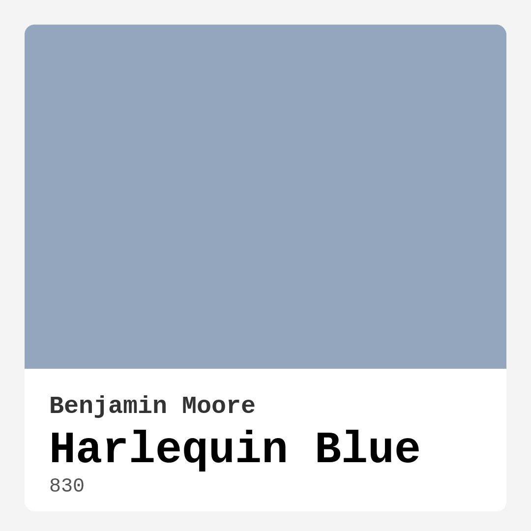
Color Preview & Key Details
| HEX Code | #93A6BE |
| RGB | 147, 166, 190 |
| LRV | 38.31% |
| Undertone | Blue |
| Finish Options | Eggshell, Matte, Satin |
Imagine stepping into a room that feels both refreshing and tranquil, a space where every element harmonizes to create a sense of calm. That’s the magic of Harlequin Blue by Benjamin Moore. This stunning shade, with its rich blue undertones and subtle gray hints, invites you to linger and enjoy your surroundings.
When considering paint colors, it’s essential to think about how a hue will shape the mood of a space. Harlequin Blue strikes a perfect balance between being cool and inviting, making it a versatile choice for various settings. Whether you’re looking to create a cozy living room, a serene bedroom, or a productive home office, this color can transform your environment.
What’s truly appealing about Harlequin Blue is its ability to reflect light beautifully. With a Light Reflectance Value (LRV) of 38.31%, it does a fantastic job of brightening up a room while maintaining a warm, inviting atmosphere. The way it interacts with natural light adds depth and character to your walls. In bright conditions, you’ll notice its cheerful essence; while in dimmer settings, it softens into a more subdued tone that’s equally comforting.
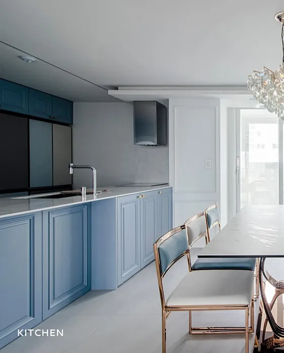
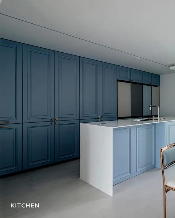
One of the best things about this color is its versatility. Harlequin Blue complements a variety of decor styles, from modern and coastal to Scandinavian and transitional. You can seamlessly integrate it into your home, whether you’re aiming for a relaxed beach vibe or a more contemporary aesthetic. The subtle gray undertones allow it to adapt and blend with both warm and cool palettes, making it a flexible choice for any room.
Let’s talk about application. If you’re a DIY enthusiast or even a beginner, you’ll find that Harlequin Blue is incredibly user-friendly. Its smooth application makes it easy to achieve an even coat, whether you’re using a brush or a roller. Plus, it’s touch-up friendly, so you won’t have to worry too much about those pesky marks that often come with home painting projects. The finish options—matte, eggshell, and satin—give you the flexibility to choose the look that suits your style. For a classic finish, I recommend matte or eggshell on the walls, as they enhance the color without too much shine. If you want to create some contrast, consider a satin finish for your trim or furniture to enrich the overall feel of the space.
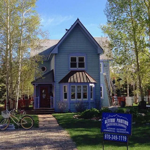
One question I frequently encounter is whether Harlequin Blue works in small rooms. The answer is a resounding yes! This color can make a small room feel more expansive and airy. By reflecting light, it creates the illusion of space, which is particularly effective in compact areas. Just keep an eye on the lighting; in lower light conditions, it may appear cooler than you’d expect. To maintain a cozy vibe in these spaces, pair it with warm trims or decor elements.
The color also performs well in terms of washability and durability. It’s highly washable, scuff-resistant, and long-lasting, making it an ideal choice for families or high-traffic areas. After all, a beautiful wall is no good if it can’t withstand the everyday hustle and bustle of life.
If you’re considering how to pair this stunning hue with other colors, think about complementary shades that can enhance its beauty. White Dove is an excellent choice for trim, providing a crisp contrast that highlights the richness of Harlequin Blue. You could also introduce brass fixtures or wooden elements to add warmth and texture to your space. If you want to go bolder, shades like CSP-70 or HC-175 will create a striking visual dynamic that draws the eye and adds personality.
Harlequin Blue fits beautifully in a variety of rooms. You might envision it in the living room, where it encourages conversation and relaxation. Perhaps you’re thinking about the bedroom, where it can create a soothing retreat at the end of a long day. It’s also a fantastic choice for a nursery, promoting a calming atmosphere for little ones, or in a home office, where it fosters focus and productivity.
Before making your final decision, I recommend testing the color in your space. Purchase a sample, paint a small area, and observe how it interacts with your lighting throughout the day. You’ll be surprised at how a color can shift and change, and this step is crucial in ensuring you love the outcome.
In summary, Harlequin Blue is not just a paint color; it’s an experience. It brings serenity and elegance to any room, making it a designer favorite for those looking to create a harmonious home. Its ease of application, adaptability across styles, and calming nature make it a worthy choice for both seasoned decorators and those just beginning their design journey.
So, if you’re ready to infuse your space with a color that feels both refreshing and inviting, consider the magic of Harlequin Blue. Your walls will thank you, and so will everyone who experiences the tranquil beauty of your newly painted space.
Remember, the right color can transform your environment and elevate your mood. Embrace the artistry of Harlequin Blue, and watch as your home flourishes with its serene charm.
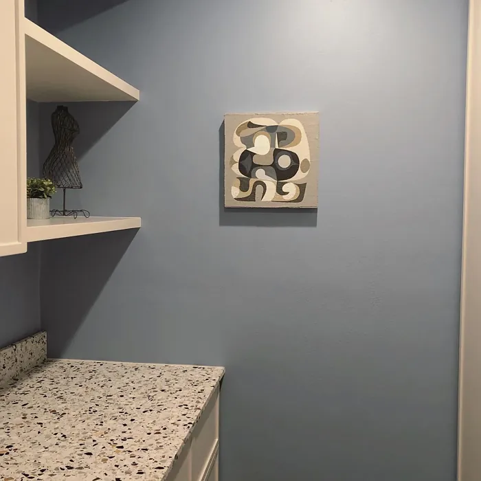
Real Room Photo of Harlequin Blue 830

Undertones of Harlequin Blue ?
Harlequin Blue leans cool, with its underlying gray tones softening the blue. This unique blend allows it to complement both warm and cool palettes, making it a flexible choice for various decor styles.
HEX value: #93A6BE
RGB code: 147, 166, 190
Is Harlequin Blue Cool or Warm?
This color is predominantly cool, with its tranquil blue hues and subtle gray undertones. It can create a refreshing atmosphere in any room while still feeling inviting.
Understanding Color Properties and Interior Design Tips
Hue refers to a specific position on the color wheel, measured in degrees from 0 to 360. Each degree represents a different pure color:
- 0° represents red
- 120° represents green
- 240° represents blue
Saturation describes the intensity or purity of a color and is expressed as a percentage:
- At 0%, the color appears completely desaturated—essentially a shade of gray
- At 100%, the color is at its most vivid and vibrant
Lightness indicates how light or dark a color is, also expressed as a percentage:
- 0% lightness results in black
- 100% lightness results in white
Using Warm Colors in Interior Design
Warm hues—such as reds, oranges, yellows, warm beiges, and greiges—are excellent choices for creating inviting and energetic spaces. These colors are particularly well-suited for:
- Kitchens, living rooms, and bathrooms, where warmth enhances comfort and sociability
- Large rooms, where warm tones can help reduce the sense of emptiness and make the space feel more intimate
For example:
- Warm beige shades provide a cozy, inviting atmosphere, ideal for living rooms, bedrooms, and hallways.
- Warm greige (a mix of beige and gray) offers the warmth of beige with the modern appeal of gray, making it a versatile backdrop for dining areas, bedrooms, and living spaces.
However, be mindful when using warm light tones in rooms with limited natural light. These shades may appear muted or even take on an unpleasant yellowish tint. To avoid a dull or flat appearance:
- Add depth by incorporating richer tones like deep greens, charcoal, or chocolate brown
- Use textured elements such as curtains, rugs, or cushions to bring dimension to the space
Pro Tip: Achieving Harmony with Warm and Cool Color Balance
To create a well-balanced and visually interesting interior, mix warm and cool tones strategically. This contrast adds depth and harmony to your design.
- If your walls feature warm hues, introduce cool-colored accents such as blue or green furniture, artwork, or accessories to create contrast.
- For a polished look, consider using a complementary color scheme, which pairs colors opposite each other on the color wheel (e.g., red with green, orange with blue).
This thoughtful mix not only enhances visual appeal but also creates a space that feels both dynamic and cohesive.
Light Temperature Affects on Harlequin Blue
Natural Light
Natural daylight changes in color temperature as the sun moves across the sky. At sunrise and sunset, the light tends to have a warm, golden tone with a color temperature around 2000 Kelvin (K). As the day progresses and the sun rises higher, the light becomes cooler and more neutral. Around midday, especially when the sky is clear, natural light typically reaches its peak brightness and shifts to a cooler tone, ranging from 5500 to 6500 Kelvin. This midday light is close to what we perceive as pure white or daylight-balanced light.
These shifts in natural light can significantly influence how colors appear in a space, which is why designers often consider both the time of day and the orientation of windows when planning interior color schemes.
Artificial Light
When choosing artificial lighting, pay close attention to the color temperature, measured in Kelvin (K). This determines how warm or cool the light will appear. Lower temperatures, around 2700K, give off a warm, yellow glow often used in living rooms or bedrooms. Higher temperatures, above 5000K, create a cool, bluish light similar to daylight, commonly used in kitchens, offices, or task areas.
Use the slider to see how lighting temperature can affect the appearance of a surface or color throughout a space.


4800K
LRV of Harlequin Blue
With a Light Reflectance Value (LRV) of 45, Harlequin Blue strikes a nice balance. It reflects a decent amount of light, making it suitable for both bright and subdued environments.
Detailed Review of Harlequin Blue
Additional Paint Characteristics
Ideal Rooms
Bedroom, Dining Room, Home Office, Living Room, Nursery
Decor Styles
Coastal, Modern, Scandinavian, Transitional
Coverage
Good (1–2 Coats), Touch-Up Friendly
Ease of Application
Beginner Friendly, Brush Smooth, Roller-Ready
Washability
Highly Washable, Washable
VOC Level
Eco-Certified, Low VOC
Best Use
Accent Wall, Interior Walls, Large Spaces, Small Spaces
Room Suitability
Bedroom, Home Office, Living Room, Nursery
Tone Tag
Balanced, Cool, Muted
Finish Type
Eggshell, Matte, Satin
Paint Performance
Fade Resistant, Long Lasting, Low Odor, Quick Drying, Scuff Resistant
Use Cases
Best for Low Light Rooms, Best for Open Concept, Designer Favorite
Mood
Calm, Inviting, Restful
Trim Pairing
Complements Brass Fixtures, Good with Wood Trim, Pairs with White Dove
Harlequin Blue is a versatile color that brings both elegance and serenity to your home. Whether you’re painting a large accent wall or just touching up smaller areas, this shade performs beautifully. Its muted tone allows it to work harmoniously with various decor styles, from coastal to contemporary. The application process is smooth and easy, making it suitable for DIY enthusiasts and professionals alike. Plus, its ability to adapt to different lighting conditions means it can brighten up a dim room or add warmth to a well-lit space. You’ll appreciate how it can transform your environment without overwhelming it.
Pros & Cons of 830 Harlequin Blue
Pros
Cons
Colors that go with Benjamin Moore Harlequin Blue
FAQ on 830 Harlequin Blue
Can I use Harlequin Blue in a small room?
Absolutely! Harlequin Blue can actually help make a small room feel more expansive and airy. When applied to walls, it reflects light beautifully, creating an illusion of space. Just be mindful of the lighting; in dimly lit areas, the color may appear cooler than expected. Pair it with warm trim or decor to maintain a cozy feel.
What finishes work best with Harlequin Blue?
For a classic and sophisticated look, consider using a matte or eggshell finish on the walls. These finishes enhance the color’s natural beauty without creating too much shine. If you want to add a bit of contrast, a satin finish on trim or furniture can complement Harlequin Blue beautifully, creating a cohesive and inviting atmosphere.
Comparisons Harlequin Blue with other colors
Harlequin Blue 830 vs Dutch Tile Blue SW 0031
| Attribute | Harlequin Blue 830 | Dutch Tile Blue SW 0031 |
|---|---|---|
| Color Name | Harlequin Blue 830 | Dutch Tile Blue SW 0031 |
| Color | ||
| Hue | Blue | Blue |
| Brightness | Medium | Medium |
| RGB | 147, 166, 190 | 154, 171, 171 |
| LRV | 38.31% | 24% |
| Finish Type | Eggshell, Matte, Satin | Eggshell, Matte, Satin |
| Finish Options | Eggshell, Matte, Satin | Eggshell, Flat, Matte, Satin |
| Ideal Rooms | Bedroom, Dining Room, Home Office, Living Room, Nursery | Bathroom, Bedroom, Dining Room, Hallway, Home Office, Kitchen, Living Room |
| Decor Styles | Coastal, Modern, Scandinavian, Transitional | Coastal, Modern Farmhouse, Scandinavian, Traditional, Transitional |
| Coverage | Good (1–2 Coats), Touch-Up Friendly | Good (1–2 Coats) |
| Ease of Application | Beginner Friendly, Brush Smooth, Roller-Ready | Beginner Friendly, Brush Smooth, Fast-Drying, Roller-Ready |
| Washability | Highly Washable, Washable | Highly Washable, Washable |
| Room Suitability | Bedroom, Home Office, Living Room, Nursery | Bathroom, Bedroom, Dining Room, Kitchen, Living Room |
| Tone | Balanced, Cool, Muted | Balanced, Cool, Muted |
| Paint Performance | Fade Resistant, Long Lasting, Low Odor, Quick Drying, Scuff Resistant | Easy Touch-Up, High Coverage, Low Odor, Quick Drying |
Harlequin Blue 830 vs Debonair SW 9139
| Attribute | Harlequin Blue 830 | Debonair SW 9139 |
|---|---|---|
| Color Name | Harlequin Blue 830 | Debonair SW 9139 |
| Color | ||
| Hue | Blue | Blue |
| Brightness | Medium | Medium |
| RGB | 147, 166, 190 | 144, 160, 166 |
| LRV | 38.31% | 30% |
| Finish Type | Eggshell, Matte, Satin | Eggshell, Matte, Satin |
| Finish Options | Eggshell, Matte, Satin | Eggshell, Matte, Satin |
| Ideal Rooms | Bedroom, Dining Room, Home Office, Living Room, Nursery | Bedroom, Dining Room, Home Office, Living Room |
| Decor Styles | Coastal, Modern, Scandinavian, Transitional | Coastal, Industrial, Modern, Transitional |
| Coverage | Good (1–2 Coats), Touch-Up Friendly | Good (1–2 Coats) |
| Ease of Application | Beginner Friendly, Brush Smooth, Roller-Ready | Beginner Friendly, Brush Smooth, Roller-Ready |
| Washability | Highly Washable, Washable | Washable, Wipeable |
| Room Suitability | Bedroom, Home Office, Living Room, Nursery | Bedroom, Dining Room, Home Office, Living Room |
| Tone | Balanced, Cool, Muted | Balanced, Cool, Muted |
| Paint Performance | Fade Resistant, Long Lasting, Low Odor, Quick Drying, Scuff Resistant | Easy Touch-Up, Low Odor, Quick Drying |
Harlequin Blue 830 vs Stardew SW 9138
| Attribute | Harlequin Blue 830 | Stardew SW 9138 |
|---|---|---|
| Color Name | Harlequin Blue 830 | Stardew SW 9138 |
| Color | ||
| Hue | Blue | Blue |
| Brightness | Medium | Medium |
| RGB | 147, 166, 190 | 166, 178, 181 |
| LRV | 38.31% | 30% |
| Finish Type | Eggshell, Matte, Satin | Eggshell, Satin |
| Finish Options | Eggshell, Matte, Satin | Eggshell, Matte, Satin |
| Ideal Rooms | Bedroom, Dining Room, Home Office, Living Room, Nursery | Bathroom, Bedroom, Home Office, Living Room, Nursery |
| Decor Styles | Coastal, Modern, Scandinavian, Transitional | Coastal, Farmhouse, Modern, Scandinavian |
| Coverage | Good (1–2 Coats), Touch-Up Friendly | Good (1–2 Coats) |
| Ease of Application | Beginner Friendly, Brush Smooth, Roller-Ready | Beginner Friendly, Brush Smooth, Roller-Ready |
| Washability | Highly Washable, Washable | Highly Washable, Washable, Wipeable |
| Room Suitability | Bedroom, Home Office, Living Room, Nursery | Bathroom, Bedroom, Home Office, Living Room |
| Tone | Balanced, Cool, Muted | Calm, Cool, Muted |
| Paint Performance | Fade Resistant, Long Lasting, Low Odor, Quick Drying, Scuff Resistant | Easy Touch-Up, High Coverage, Low Odor |
Harlequin Blue 830 vs Niebla Azul SW 9137
| Attribute | Harlequin Blue 830 | Niebla Azul SW 9137 |
|---|---|---|
| Color Name | Harlequin Blue 830 | Niebla Azul SW 9137 |
| Color | ||
| Hue | Blue | Blue |
| Brightness | Medium | Medium |
| RGB | 147, 166, 190 | 182, 195, 196 |
| LRV | 38.31% | 48% |
| Finish Type | Eggshell, Matte, Satin | Eggshell, Matte, Satin |
| Finish Options | Eggshell, Matte, Satin | Eggshell, Matte, Satin |
| Ideal Rooms | Bedroom, Dining Room, Home Office, Living Room, Nursery | Bedroom, Home Office, Living Room, Nursery |
| Decor Styles | Coastal, Modern, Scandinavian, Transitional | Coastal, Modern, Scandinavian, Transitional |
| Coverage | Good (1–2 Coats), Touch-Up Friendly | Good (1–2 Coats), Touch-Up Friendly |
| Ease of Application | Beginner Friendly, Brush Smooth, Roller-Ready | Beginner Friendly, Brush Smooth, Roller-Ready |
| Washability | Highly Washable, Washable | Highly Washable, Washable |
| Room Suitability | Bedroom, Home Office, Living Room, Nursery | Bedroom, Home Office, Living Room, Nursery |
| Tone | Balanced, Cool, Muted | Airy, Cool, Muted |
| Paint Performance | Fade Resistant, Long Lasting, Low Odor, Quick Drying, Scuff Resistant | Easy Touch-Up, Fade Resistant, Low Odor, Scuff Resistant |
Harlequin Blue 830 vs Rain SW 6219
| Attribute | Harlequin Blue 830 | Rain SW 6219 |
|---|---|---|
| Color Name | Harlequin Blue 830 | Rain SW 6219 |
| Color | ||
| Hue | Blue | Blue |
| Brightness | Medium | Medium |
| RGB | 147, 166, 190 | 171, 190, 191 |
| LRV | 38.31% | 50% |
| Finish Type | Eggshell, Matte, Satin | Eggshell, Matte, Satin |
| Finish Options | Eggshell, Matte, Satin | Eggshell, Matte, Satin |
| Ideal Rooms | Bedroom, Dining Room, Home Office, Living Room, Nursery | Bathroom, Bedroom, Home Office, Living Room, Nursery |
| Decor Styles | Coastal, Modern, Scandinavian, Transitional | Coastal, Minimalist, Modern, Scandinavian, Transitional |
| Coverage | Good (1–2 Coats), Touch-Up Friendly | Good (1–2 Coats), Touch-Up Friendly |
| Ease of Application | Beginner Friendly, Brush Smooth, Roller-Ready | Beginner Friendly, Brush Smooth, Fast-Drying, Roller-Ready |
| Washability | Highly Washable, Washable | Scrubbable, Stain Resistant, Washable |
| Room Suitability | Bedroom, Home Office, Living Room, Nursery | Bathroom, Bedroom, Home Office, Living Room, Nursery |
| Tone | Balanced, Cool, Muted | Balanced, Cool, Muted |
| Paint Performance | Fade Resistant, Long Lasting, Low Odor, Quick Drying, Scuff Resistant | Easy Touch-Up, Low Odor, Quick Drying, Stain Resistant |
Harlequin Blue 830 vs Morning at Sea SW 9634
| Attribute | Harlequin Blue 830 | Morning at Sea SW 9634 |
|---|---|---|
| Color Name | Harlequin Blue 830 | Morning at Sea SW 9634 |
| Color | ||
| Hue | Blue | Blue |
| Brightness | Medium | Medium |
| RGB | 147, 166, 190 | 130, 151, 155 |
| LRV | 38.31% | 50% |
| Finish Type | Eggshell, Matte, Satin | Eggshell, Matte |
| Finish Options | Eggshell, Matte, Satin | Eggshell, Matte, Satin |
| Ideal Rooms | Bedroom, Dining Room, Home Office, Living Room, Nursery | Bathroom, Bedroom, Home Office, Living Room |
| Decor Styles | Coastal, Modern, Scandinavian, Transitional | Coastal, Minimalist, Modern, Scandinavian |
| Coverage | Good (1–2 Coats), Touch-Up Friendly | Good (1–2 Coats), Touch-Up Friendly |
| Ease of Application | Beginner Friendly, Brush Smooth, Roller-Ready | Beginner Friendly, Brush Smooth, Roller-Ready |
| Washability | Highly Washable, Washable | Washable, Wipeable |
| Room Suitability | Bedroom, Home Office, Living Room, Nursery | Bathroom, Bedroom, Home Office, Living Room |
| Tone | Balanced, Cool, Muted | Airy, Cool, Muted |
| Paint Performance | Fade Resistant, Long Lasting, Low Odor, Quick Drying, Scuff Resistant | Easy Touch-Up, Fade Resistant, Low Odor |
Harlequin Blue 830 vs Sleepy Blue SW 6225
| Attribute | Harlequin Blue 830 | Sleepy Blue SW 6225 |
|---|---|---|
| Color Name | Harlequin Blue 830 | Sleepy Blue SW 6225 |
| Color | ||
| Hue | Blue | Blue |
| Brightness | Medium | Medium |
| RGB | 147, 166, 190 | 188, 203, 206 |
| LRV | 38.31% | 50% |
| Finish Type | Eggshell, Matte, Satin | Eggshell, Matte, Satin |
| Finish Options | Eggshell, Matte, Satin | Eggshell, Matte, Satin |
| Ideal Rooms | Bedroom, Dining Room, Home Office, Living Room, Nursery | Bedroom, Home Office, Living Room, Nursery |
| Decor Styles | Coastal, Modern, Scandinavian, Transitional | Coastal, Minimalist, Modern Farmhouse, Scandinavian |
| Coverage | Good (1–2 Coats), Touch-Up Friendly | Good (1–2 Coats) |
| Ease of Application | Beginner Friendly, Brush Smooth, Roller-Ready | Beginner Friendly, Brush Smooth, Fast-Drying, Roller-Ready |
| Washability | Highly Washable, Washable | Highly Washable, Washable |
| Room Suitability | Bedroom, Home Office, Living Room, Nursery | Bedroom, Home Office, Living Room, Nursery |
| Tone | Balanced, Cool, Muted | Airy, Cool, Muted |
| Paint Performance | Fade Resistant, Long Lasting, Low Odor, Quick Drying, Scuff Resistant | Easy Touch-Up, Low Odor, Quick Drying, Scuff Resistant |
Harlequin Blue 830 vs Lakeside SW 9683
| Attribute | Harlequin Blue 830 | Lakeside SW 9683 |
|---|---|---|
| Color Name | Harlequin Blue 830 | Lakeside SW 9683 |
| Color | ||
| Hue | Blue | Blue |
| Brightness | Medium | Medium |
| RGB | 147, 166, 190 | 173, 184, 192 |
| LRV | 38.31% | 24% |
| Finish Type | Eggshell, Matte, Satin | Eggshell, Matte, Satin |
| Finish Options | Eggshell, Matte, Satin | Eggshell, Matte, Satin |
| Ideal Rooms | Bedroom, Dining Room, Home Office, Living Room, Nursery | Bathroom, Bedroom, Home Office, Living Room |
| Decor Styles | Coastal, Modern, Scandinavian, Transitional | Coastal, Minimalist, Modern, Rustic |
| Coverage | Good (1–2 Coats), Touch-Up Friendly | Good (1–2 Coats) |
| Ease of Application | Beginner Friendly, Brush Smooth, Roller-Ready | Beginner Friendly, Brush Smooth, Roller-Ready |
| Washability | Highly Washable, Washable | Scrubbable, Washable |
| Room Suitability | Bedroom, Home Office, Living Room, Nursery | Bathroom, Bedroom, Home Office, Living Room |
| Tone | Balanced, Cool, Muted | Balanced, Cool, Muted |
| Paint Performance | Fade Resistant, Long Lasting, Low Odor, Quick Drying, Scuff Resistant | Easy Touch-Up, Fade Resistant, High Coverage, Low Odor |
Harlequin Blue 830 vs Upward SW 6239
| Attribute | Harlequin Blue 830 | Upward SW 6239 |
|---|---|---|
| Color Name | Harlequin Blue 830 | Upward SW 6239 |
| Color | ||
| Hue | Blue | Blue |
| Brightness | Medium | Medium |
| RGB | 147, 166, 190 | 191, 201, 208 |
| LRV | 38.31% | 75% |
| Finish Type | Eggshell, Matte, Satin | Eggshell, Satin |
| Finish Options | Eggshell, Matte, Satin | Eggshell, Flat, Satin |
| Ideal Rooms | Bedroom, Dining Room, Home Office, Living Room, Nursery | Bedroom, Dining Room, Home Office, Living Room, Nursery |
| Decor Styles | Coastal, Modern, Scandinavian, Transitional | Coastal, Minimalist, Modern, Scandinavian |
| Coverage | Good (1–2 Coats), Touch-Up Friendly | Good (1–2 Coats), Touch-Up Friendly |
| Ease of Application | Beginner Friendly, Brush Smooth, Roller-Ready | Beginner Friendly, Brush Smooth, Fast-Drying, Roller-Ready |
| Washability | Highly Washable, Washable | Washable, Wipeable |
| Room Suitability | Bedroom, Home Office, Living Room, Nursery | Bedroom, Home Office, Living Room, Nursery |
| Tone | Balanced, Cool, Muted | Cool, Crisp, Muted |
| Paint Performance | Fade Resistant, Long Lasting, Low Odor, Quick Drying, Scuff Resistant | High Coverage, Low Odor, Quick Drying |
Harlequin Blue 830 vs Aleutian SW 6241
| Attribute | Harlequin Blue 830 | Aleutian SW 6241 |
|---|---|---|
| Color Name | Harlequin Blue 830 | Aleutian SW 6241 |
| Color | ||
| Hue | Blue | Blue |
| Brightness | Medium | Medium |
| RGB | 147, 166, 190 | 152, 169, 183 |
| LRV | 38.31% | 24% |
| Finish Type | Eggshell, Matte, Satin | Eggshell, Matte, Satin |
| Finish Options | Eggshell, Matte, Satin | Eggshell, Matte, Satin |
| Ideal Rooms | Bedroom, Dining Room, Home Office, Living Room, Nursery | Bathroom, Bedroom, Home Office, Kitchen, Living Room, Nursery |
| Decor Styles | Coastal, Modern, Scandinavian, Transitional | Coastal, Minimalist, Modern, Scandinavian, Transitional |
| Coverage | Good (1–2 Coats), Touch-Up Friendly | Good (1–2 Coats), Touch-Up Friendly |
| Ease of Application | Beginner Friendly, Brush Smooth, Roller-Ready | Beginner Friendly, Brush Smooth, Fast-Drying, Roller-Ready |
| Washability | Highly Washable, Washable | Scrubbable, Stain Resistant, Washable |
| Room Suitability | Bedroom, Home Office, Living Room, Nursery | Bathroom, Bedroom, Home Office, Living Room, Nursery |
| Tone | Balanced, Cool, Muted | Airy, Balanced, Cool, Muted |
| Paint Performance | Fade Resistant, Long Lasting, Low Odor, Quick Drying, Scuff Resistant | Easy Touch-Up, Fade Resistant, Low Odor, Quick Drying |
Official Page of Benjamin Moore Harlequin Blue 830