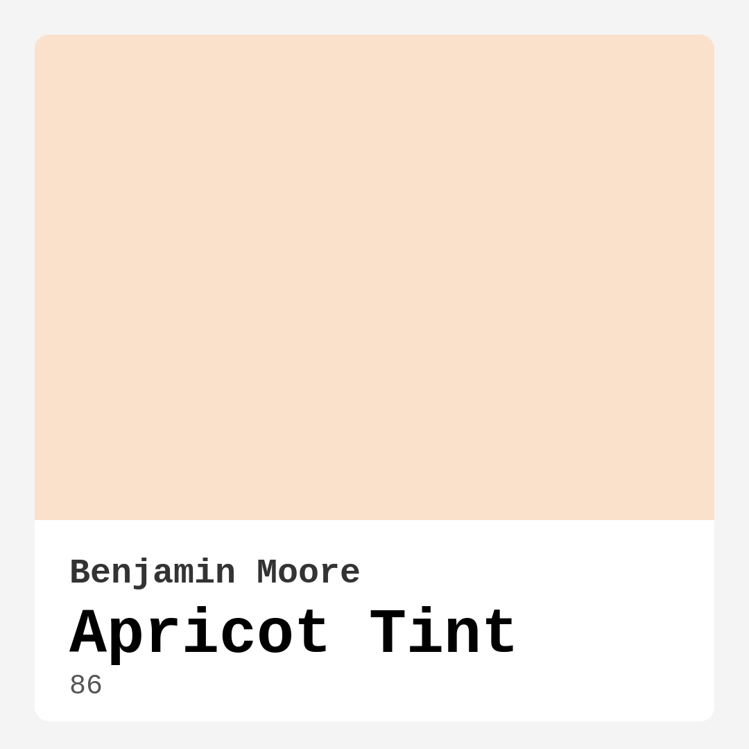
Color Preview & Key Details
| HEX Code | #F9E1CB |
| RGB | 249, 225, 203 |
| LRV | 75.17% |
| Undertone | Red |
| Finish Options | Eggshell, Matte, Satin |
Imagine walking into a room that instantly wraps you in warmth—like the soft glow of a sunset or the first sip of a perfectly brewed cup of tea. That’s the magic of Benjamin Moore’s Apricot Tint. This delicate, peachy hue isn’t just another paint color; it’s a mood enhancer, a space transformer, and a design secret weapon all rolled into one. Whether you’re refreshing a nursery, revamping a living room, or adding character to a kitchen, Apricot Tint has the versatility and charm to make your vision come alive.
Let’s talk about what makes this color so special. With an LRV (Light Reflectance Value) of 75.17%, Apricot Tint sits comfortably in the off-white category, meaning it reflects a ton of light. This makes it a fantastic choice for smaller rooms or spaces that lack natural light—it’ll brighten things up without feeling stark or clinical. But don’t mistake its lightness for blandness. The subtle red undertones give it depth, creating a cozy, inviting atmosphere that’s hard to resist. It’s like a whisper of warmth on your walls, subtle enough to play well with other colors but distinct enough to stand on its own.
One of the biggest wins with Apricot Tint is its versatility. It straddles the line between modern and traditional effortlessly, making it a dream for almost any decor style. Love the relaxed vibe of coastal design? Pair it with crisp whites and natural textures like rattan or linen. Drawn to modern farmhouse? Combine it with warm wood tones and black accents for a look that’s fresh yet timeless. Even in a bohemian space, this color holds its own, especially when layered with rich patterns and earthy greens (its complementary hue). And if you’re worried about commitment, here’s the good news: it’s beginner-friendly. With good coverage—often just one or two coats—and easy touch-up capabilities, it’s a low-stress way to dip your toes into color.
Now, let’s address the elephant in the room: undertones. Apricot Tint leans warm, thanks to its red base, which means it’ll play nicely with other warm colors but might clash with cooler tones if you’re not careful. Always test it in your space before committing. Paint a large swatch and observe it at different times of day. You’ll notice how it shifts—sometimes soft and creamy under morning light, other times glowing like a ripe apricot in the afternoon sun. This dynamism is part of its charm, but it’s also why sampling is non-negotiable.
Speaking of testing, don’t forget to think about finishes. Matte is perfect if you want a velvety, non-reflective look that hides imperfections (great for older homes). Eggshell offers a hint of sheen and is a breeze to clean, making it ideal for busy areas like kitchens or hallways. Satin kicks the shine up a notch, adding durability and a subtle glow that works wonders in bathrooms or kids’ rooms. Each finish changes the personality of the color slightly, so choose based on both practicality and the mood you’re after.
As for pairings, Apricot Tint is a team player. Trim in White Dove or Pure White keeps things crisp and classic, while brass fixtures add a touch of vintage elegance. If you’re feeling bold, try an accent wall in a deeper shade like Benjamin Moore’s 2062-50 (a muted green) for contrast that’s striking but not overwhelming. And if you’re using it in a nursery or bedroom, layer in soft textiles—think linen curtains, a chunky knit throw—to amplify the cozy factor.
Of course, no color is perfect for every scenario. Apricot Tint’s lightness might feel underwhelming in a vast, open-concept space unless you balance it with darker furniture or bold artwork. And if your style leans ultra-modern—all sleek lines and monochrome—this warm, earthy tone might feel out of place. But for most homes, it’s a winner. It’s low-VOC, quick-drying, and highly washable, so it’s as practical as it is pretty.
So, is Apricot Tint right for you? If you’re craving a color that’s warm but not overwhelming, soft but not saccharine, and versatile enough to grow with your style, the answer is probably yes. It’s the kind of hue that makes a house feel like a home—a backdrop for lazy Sunday mornings, lively dinner parties, and everything in between. Grab a sample, paint a patch, and see how it makes you feel. Sometimes, the right color doesn’t just change a room—it changes how you live in it.
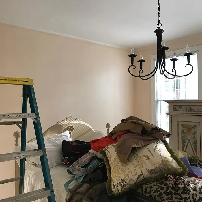
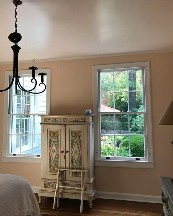
Real Room Photo of Apricot Tint 86
Undertones of Apricot Tint ?
The undertones of Apricot Tint are a key aspect of its character, leaning towards Red. These subtle underlying hues are what give the color its depth and complexity. For example, a gray with a blue undertone will feel cooler and more modern, while one with a brown undertone will feel warmer and more traditional. It’s essential to test this paint in your home and observe it next to your existing furniture, flooring, and decor to see how these undertones interact and reveal themselves throughout the day.
HEX value: #F9E1CB
RGB code: 249, 225, 203
Is Apricot Tint Cool or Warm?
Apricot Tint is decidedly warm, offering a comforting glow that can transform a space. Its warmth makes it particularly suited for cozy settings, fostering a sense of relaxation and comfort.
Understanding Color Properties and Interior Design Tips
Hue refers to a specific position on the color wheel, measured in degrees from 0 to 360. Each degree represents a different pure color:
- 0° represents red
- 120° represents green
- 240° represents blue
Saturation describes the intensity or purity of a color and is expressed as a percentage:
- At 0%, the color appears completely desaturated—essentially a shade of gray
- At 100%, the color is at its most vivid and vibrant
Lightness indicates how light or dark a color is, also expressed as a percentage:
- 0% lightness results in black
- 100% lightness results in white
Using Warm Colors in Interior Design
Warm hues—such as reds, oranges, yellows, warm beiges, and greiges—are excellent choices for creating inviting and energetic spaces. These colors are particularly well-suited for:
- Kitchens, living rooms, and bathrooms, where warmth enhances comfort and sociability
- Large rooms, where warm tones can help reduce the sense of emptiness and make the space feel more intimate
For example:
- Warm beige shades provide a cozy, inviting atmosphere, ideal for living rooms, bedrooms, and hallways.
- Warm greige (a mix of beige and gray) offers the warmth of beige with the modern appeal of gray, making it a versatile backdrop for dining areas, bedrooms, and living spaces.
However, be mindful when using warm light tones in rooms with limited natural light. These shades may appear muted or even take on an unpleasant yellowish tint. To avoid a dull or flat appearance:
- Add depth by incorporating richer tones like deep greens, charcoal, or chocolate brown
- Use textured elements such as curtains, rugs, or cushions to bring dimension to the space
Pro Tip: Achieving Harmony with Warm and Cool Color Balance
To create a well-balanced and visually interesting interior, mix warm and cool tones strategically. This contrast adds depth and harmony to your design.
- If your walls feature warm hues, introduce cool-colored accents such as blue or green furniture, artwork, or accessories to create contrast.
- For a polished look, consider using a complementary color scheme, which pairs colors opposite each other on the color wheel (e.g., red with green, orange with blue).
This thoughtful mix not only enhances visual appeal but also creates a space that feels both dynamic and cohesive.
Light Temperature Affects on Apricot Tint
Natural Light
Natural daylight changes in color temperature as the sun moves across the sky. At sunrise and sunset, the light tends to have a warm, golden tone with a color temperature around 2000 Kelvin (K). As the day progresses and the sun rises higher, the light becomes cooler and more neutral. Around midday, especially when the sky is clear, natural light typically reaches its peak brightness and shifts to a cooler tone, ranging from 5500 to 6500 Kelvin. This midday light is close to what we perceive as pure white or daylight-balanced light.
These shifts in natural light can significantly influence how colors appear in a space, which is why designers often consider both the time of day and the orientation of windows when planning interior color schemes.
Artificial Light
When choosing artificial lighting, pay close attention to the color temperature, measured in Kelvin (K). This determines how warm or cool the light will appear. Lower temperatures, around 2700K, give off a warm, yellow glow often used in living rooms or bedrooms. Higher temperatures, above 5000K, create a cool, bluish light similar to daylight, commonly used in kitchens, offices, or task areas.
Use the slider to see how lighting temperature can affect the appearance of a surface or color throughout a space.


4800K
LRV of Apricot Tint
The Light Reflectance Value (LRV) of Apricot Tint is 75.17%, which places it in the Off‑White colors category. This means it reflect a lot of light. Understanding a paint’s LRV is crucial for predicting how it will look in your space. A higher LRV indicates a lighter color that reflects more light, making rooms feel larger and brighter. A lower LRV signifies a darker color that absorbs more light, creating a cozier, more intimate atmosphere. Always consider the natural and artificial lighting in your room when selecting a paint color based on its LRV.
Detailed Review of Apricot Tint
Additional Paint Characteristics
Ideal Rooms
Bedroom, Dining Room, Kitchen, Living Room, Nursery
Decor Styles
Bohemian, Coastal, Modern Farmhouse, Traditional, Transitional
Coverage
Good (1–2 Coats), Touch-Up Friendly
Ease of Application
Beginner Friendly, Brush Smooth, Roller-Ready
Washability
Highly Washable, Washable
VOC Level
Low VOC
Best Use
Accent Wall, Bedroom, Interior Walls, Living Room, Nursery
Room Suitability
Bedroom, Dining Room, Kitchen, Living Room, Nursery
Tone Tag
Creamy, Earthy, Warm
Finish Type
Eggshell, Matte, Satin
Paint Performance
Easy Touch-Up, High Coverage, Low Odor, Quick Drying
Use Cases
Best for Modern Farmhouse, Best for Small Spaces, Classic Favorite
Mood
Cozy, Inviting, Warm
Trim Pairing
Complements Brass Fixtures, Matches Pure White, Pairs with White Dove
When it comes to Apricot Tint, you’re looking at a color that’s both refreshing and sophisticated. Its warm undertones create a welcoming environment, making it ideal for spaces where you want to relax and unwind. The subtle peachy hue allows for easy pairing with various furniture and decor styles, ensuring that your space feels cohesive and inviting. Plus, it has a great coverage that allows for a smooth finish with just one or two coats, saving you both time and effort during application. Whether you’re revamping a nursery or refreshing a living room, Apricot Tint is a color that can elevate your space effortlessly.
Pros & Cons of 86 Apricot Tint
Pros
Cons
Colors that go with Benjamin Moore Apricot Tint
FAQ on 86 Apricot Tint
What types of finishes are available for Apricot Tint?
Apricot Tint comes in several finishes including matte, eggshell, and satin. Each finish offers a unique look and feel for your space. Matte provides a soft, non-reflective surface that hides imperfections well, while eggshell has a slight sheen that’s easy to clean. Satin offers a glossier finish that adds a subtle shine and is perfect for areas that require durability, such as kitchens and bathrooms. Choosing the right finish depends on the room’s use and the aesthetic you’re aiming for.
Is Apricot Tint suitable for small rooms?
Absolutely! Apricot Tint is an excellent choice for small rooms. Its light, warm tone can make a space feel more open and airy, which is ideal for compact areas. When paired with good lighting, this color helps to reflect light, creating an illusion of a larger space. However, if you’re concerned about it being too light, consider using it as an accent color or in combination with slightly darker shades to add depth without overwhelming the space.
Comparisons Apricot Tint with other colors
Apricot Tint 86 vs Malted Milk SW 6057
| Attribute | Apricot Tint 86 | Malted Milk SW 6057 |
|---|---|---|
| Color Name | Apricot Tint 86 | Malted Milk SW 6057 |
| Color | ||
| Hue | Pink | Pink |
| Brightness | Light | Light |
| RGB | 249, 225, 203 | 222, 202, 189 |
| LRV | 75.17% | 74% |
| Finish Type | Eggshell, Matte, Satin | Eggshell, Satin |
| Finish Options | Eggshell, Matte, Satin | Eggshell, Matte, Satin |
| Ideal Rooms | Bedroom, Dining Room, Kitchen, Living Room, Nursery | Bedroom, Dining Room, Kitchen, Living Room, Nursery |
| Decor Styles | Bohemian, Coastal, Modern Farmhouse, Traditional, Transitional | Coastal, Farmhouse, Modern, Scandinavian, Transitional |
| Coverage | Good (1–2 Coats), Touch-Up Friendly | Good (1–2 Coats), Touch-Up Friendly |
| Ease of Application | Beginner Friendly, Brush Smooth, Roller-Ready | Beginner Friendly, Brush Smooth, Fast-Drying, Roller-Ready |
| Washability | Highly Washable, Washable | Washable, Wipeable |
| Room Suitability | Bedroom, Dining Room, Kitchen, Living Room, Nursery | Bedroom, Dining Room, Kitchen, Living Room, Nursery |
| Tone | Creamy, Earthy, Warm | Creamy, Neutral, Warm |
| Paint Performance | Easy Touch-Up, High Coverage, Low Odor, Quick Drying | High Coverage, Low Odor, Quick Drying |
Apricot Tint 86 vs Intimate White SW 6322
| Attribute | Apricot Tint 86 | Intimate White SW 6322 |
|---|---|---|
| Color Name | Apricot Tint 86 | Intimate White SW 6322 |
| Color | ||
| Hue | Pink | Pink |
| Brightness | Light | Light |
| RGB | 249, 225, 203 | 240, 225, 216 |
| LRV | 75.17% | 75% |
| Finish Type | Eggshell, Matte, Satin | Eggshell, Matte, Satin |
| Finish Options | Eggshell, Matte, Satin | Eggshell, Matte, Satin |
| Ideal Rooms | Bedroom, Dining Room, Kitchen, Living Room, Nursery | Bedroom, Hallway, Home Office, Living Room, Nursery |
| Decor Styles | Bohemian, Coastal, Modern Farmhouse, Traditional, Transitional | Farmhouse, Minimalist, Modern, Traditional |
| Coverage | Good (1–2 Coats), Touch-Up Friendly | Good (1–2 Coats) |
| Ease of Application | Beginner Friendly, Brush Smooth, Roller-Ready | Beginner Friendly, Brush Smooth, Roller-Ready |
| Washability | Highly Washable, Washable | Highly Washable, Washable |
| Room Suitability | Bedroom, Dining Room, Kitchen, Living Room, Nursery | Bedroom, Hallway, Living Room, Nursery |
| Tone | Creamy, Earthy, Warm | Creamy, Muted, Warm |
| Paint Performance | Easy Touch-Up, High Coverage, Low Odor, Quick Drying | Easy Touch-Up, Fade Resistant, Low Odor |
Apricot Tint 86 vs Abalone Shell SW 6050
| Attribute | Apricot Tint 86 | Abalone Shell SW 6050 |
|---|---|---|
| Color Name | Apricot Tint 86 | Abalone Shell SW 6050 |
| Color | ||
| Hue | Pink | Pink |
| Brightness | Light | Light |
| RGB | 249, 225, 203 | 219, 199, 189 |
| LRV | 75.17% | 30% |
| Finish Type | Eggshell, Matte, Satin | Eggshell, Matte, Satin |
| Finish Options | Eggshell, Matte, Satin | Eggshell, Matte, Satin |
| Ideal Rooms | Bedroom, Dining Room, Kitchen, Living Room, Nursery | Bedroom, Dining Room, Home Office, Living Room |
| Decor Styles | Bohemian, Coastal, Modern Farmhouse, Traditional, Transitional | Coastal, Farmhouse, Minimalist, Modern, Traditional |
| Coverage | Good (1–2 Coats), Touch-Up Friendly | Good (1–2 Coats), Touch-Up Friendly |
| Ease of Application | Beginner Friendly, Brush Smooth, Roller-Ready | Beginner Friendly, Brush Smooth, Fast-Drying, Roller-Ready |
| Washability | Highly Washable, Washable | Washable, Wipeable |
| Room Suitability | Bedroom, Dining Room, Kitchen, Living Room, Nursery | Bedroom, Dining Room, Home Office, Living Room |
| Tone | Creamy, Earthy, Warm | Balanced, Muted, Warm |
| Paint Performance | Easy Touch-Up, High Coverage, Low Odor, Quick Drying | Easy Touch-Up, Fade Resistant, Low Odor, Quick Drying |
Apricot Tint 86 vs White Truffle SW 6029
| Attribute | Apricot Tint 86 | White Truffle SW 6029 |
|---|---|---|
| Color Name | Apricot Tint 86 | White Truffle SW 6029 |
| Color | ||
| Hue | Pink | Pink |
| Brightness | Light | Light |
| RGB | 249, 225, 203 | 215, 200, 194 |
| LRV | 75.17% | 48% |
| Finish Type | Eggshell, Matte, Satin | Eggshell, Satin |
| Finish Options | Eggshell, Matte, Satin | Eggshell, Flat, Matte, Satin |
| Ideal Rooms | Bedroom, Dining Room, Kitchen, Living Room, Nursery | Bedroom, Dining Room, Hallway, Kitchen, Living Room |
| Decor Styles | Bohemian, Coastal, Modern Farmhouse, Traditional, Transitional | Eclectic, Farmhouse, Modern, Traditional |
| Coverage | Good (1–2 Coats), Touch-Up Friendly | Good (1–2 Coats), Touch-Up Friendly |
| Ease of Application | Beginner Friendly, Brush Smooth, Roller-Ready | Beginner Friendly, Brush Smooth, Roller-Ready |
| Washability | Highly Washable, Washable | Washable, Wipeable |
| Room Suitability | Bedroom, Dining Room, Kitchen, Living Room, Nursery | Bedroom, Dining Room, Hallway, Living Room |
| Tone | Creamy, Earthy, Warm | Earthy, Neutral, Warm |
| Paint Performance | Easy Touch-Up, High Coverage, Low Odor, Quick Drying | Easy Touch-Up, Low Odor, Scuff Resistant |
Apricot Tint 86 vs Faint Coral SW 6329
| Attribute | Apricot Tint 86 | Faint Coral SW 6329 |
|---|---|---|
| Color Name | Apricot Tint 86 | Faint Coral SW 6329 |
| Color | ||
| Hue | Pink | Pink |
| Brightness | Light | Light |
| RGB | 249, 225, 203 | 238, 222, 213 |
| LRV | 75.17% | 66% |
| Finish Type | Eggshell, Matte, Satin | Eggshell, Matte, Satin |
| Finish Options | Eggshell, Matte, Satin | Eggshell, Matte, Satin |
| Ideal Rooms | Bedroom, Dining Room, Kitchen, Living Room, Nursery | Bedroom, Dining Room, Hallway, Living Room, Nursery |
| Decor Styles | Bohemian, Coastal, Modern Farmhouse, Traditional, Transitional | Bohemian, Coastal, Modern Farmhouse, Scandinavian, Vintage |
| Coverage | Good (1–2 Coats), Touch-Up Friendly | Good (1–2 Coats), Touch-Up Friendly |
| Ease of Application | Beginner Friendly, Brush Smooth, Roller-Ready | Beginner Friendly, Brush Smooth, Fast-Drying, Roller-Ready |
| Washability | Highly Washable, Washable | Washable, Wipeable |
| Room Suitability | Bedroom, Dining Room, Kitchen, Living Room, Nursery | Bedroom, Dining Room, Hallway, Living Room, Nursery |
| Tone | Creamy, Earthy, Warm | Airy, Muted, Pastel, Warm |
| Paint Performance | Easy Touch-Up, High Coverage, Low Odor, Quick Drying | Easy Touch-Up, Low Odor, Quick Drying |
Apricot Tint 86 vs Romance SW 6323
| Attribute | Apricot Tint 86 | Romance SW 6323 |
|---|---|---|
| Color Name | Apricot Tint 86 | Romance SW 6323 |
| Color | ||
| Hue | Pink | Pink |
| Brightness | Light | Light |
| RGB | 249, 225, 203 | 235, 207, 195 |
| LRV | 75.17% | 69% |
| Finish Type | Eggshell, Matte, Satin | Eggshell, Matte |
| Finish Options | Eggshell, Matte, Satin | Eggshell, Flat, Matte, Satin |
| Ideal Rooms | Bedroom, Dining Room, Kitchen, Living Room, Nursery | Bedroom, Dining Room, Living Room, Nursery |
| Decor Styles | Bohemian, Coastal, Modern Farmhouse, Traditional, Transitional | Bohemian, Modern, Shabby Chic, Vintage |
| Coverage | Good (1–2 Coats), Touch-Up Friendly | Good (1–2 Coats), Touch-Up Friendly |
| Ease of Application | Beginner Friendly, Brush Smooth, Roller-Ready | Beginner Friendly, Brush Smooth, Fast-Drying, Roller-Ready |
| Washability | Highly Washable, Washable | Washable, Wipeable |
| Room Suitability | Bedroom, Dining Room, Kitchen, Living Room, Nursery | Bedroom, Dining Room, Living Room, Nursery |
| Tone | Creamy, Earthy, Warm | Pastel, Soft, Warm |
| Paint Performance | Easy Touch-Up, High Coverage, Low Odor, Quick Drying | Easy Touch-Up, Low Odor, Quick Drying |
Apricot Tint 86 vs Innocence SW 6302
| Attribute | Apricot Tint 86 | Innocence SW 6302 |
|---|---|---|
| Color Name | Apricot Tint 86 | Innocence SW 6302 |
| Color | ||
| Hue | Pink | Pink |
| Brightness | Light | Light |
| RGB | 249, 225, 203 | 235, 209, 207 |
| LRV | 75.17% | 75% |
| Finish Type | Eggshell, Matte, Satin | Eggshell, Matte |
| Finish Options | Eggshell, Matte, Satin | Eggshell, Matte, Satin |
| Ideal Rooms | Bedroom, Dining Room, Kitchen, Living Room, Nursery | Bedroom, Dining Room, Living Room, Nursery |
| Decor Styles | Bohemian, Coastal, Modern Farmhouse, Traditional, Transitional | Bohemian, Modern Farmhouse, Scandinavian, Shabby Chic |
| Coverage | Good (1–2 Coats), Touch-Up Friendly | Good (1–2 Coats), Touch-Up Friendly |
| Ease of Application | Beginner Friendly, Brush Smooth, Roller-Ready | Beginner Friendly, Brush Smooth, Roller-Ready |
| Washability | Highly Washable, Washable | Washable, Wipeable |
| Room Suitability | Bedroom, Dining Room, Kitchen, Living Room, Nursery | Bedroom, Dining Room, Living Room, Nursery |
| Tone | Creamy, Earthy, Warm | Pastel, Soft, Warm |
| Paint Performance | Easy Touch-Up, High Coverage, Low Odor, Quick Drying | Easy Touch-Up, Fade Resistant, Low Odor |
Apricot Tint 86 vs Angelic SW 6602
| Attribute | Apricot Tint 86 | Angelic SW 6602 |
|---|---|---|
| Color Name | Apricot Tint 86 | Angelic SW 6602 |
| Color | ||
| Hue | Pink | Pink |
| Brightness | Light | Light |
| RGB | 249, 225, 203 | 242, 220, 215 |
| LRV | 75.17% | 75% |
| Finish Type | Eggshell, Matte, Satin | Eggshell, Satin |
| Finish Options | Eggshell, Matte, Satin | Eggshell, Flat, Matte, Satin |
| Ideal Rooms | Bedroom, Dining Room, Kitchen, Living Room, Nursery | Bedroom, Dining Room, Home Office, Living Room, Nursery |
| Decor Styles | Bohemian, Coastal, Modern Farmhouse, Traditional, Transitional | Bohemian, Farmhouse, Modern, Transitional |
| Coverage | Good (1–2 Coats), Touch-Up Friendly | Good (1–2 Coats), Touch-Up Friendly |
| Ease of Application | Beginner Friendly, Brush Smooth, Roller-Ready | Beginner Friendly, Brush Smooth, Roller-Ready |
| Washability | Highly Washable, Washable | Washable, Wipeable |
| Room Suitability | Bedroom, Dining Room, Kitchen, Living Room, Nursery | Bedroom, Home Office, Living Room, Nursery |
| Tone | Creamy, Earthy, Warm | Airy, Pastel, Warm |
| Paint Performance | Easy Touch-Up, High Coverage, Low Odor, Quick Drying | Easy Touch-Up, Fade Resistant, Low Odor |
Apricot Tint 86 vs Rosy Outlook SW 6316
| Attribute | Apricot Tint 86 | Rosy Outlook SW 6316 |
|---|---|---|
| Color Name | Apricot Tint 86 | Rosy Outlook SW 6316 |
| Color | ||
| Hue | Pink | Pink |
| Brightness | Light | Light |
| RGB | 249, 225, 203 | 235, 206, 203 |
| LRV | 75.17% | 45% |
| Finish Type | Eggshell, Matte, Satin | Eggshell, Matte, Satin |
| Finish Options | Eggshell, Matte, Satin | Eggshell, Matte, Satin |
| Ideal Rooms | Bedroom, Dining Room, Kitchen, Living Room, Nursery | Bedroom, Home Office, Living Room, Nursery |
| Decor Styles | Bohemian, Coastal, Modern Farmhouse, Traditional, Transitional | Bohemian, Cottage, Modern, Traditional |
| Coverage | Good (1–2 Coats), Touch-Up Friendly | Good (1–2 Coats), Touch-Up Friendly |
| Ease of Application | Beginner Friendly, Brush Smooth, Roller-Ready | Beginner Friendly, Brush Smooth, Roller-Ready |
| Washability | Highly Washable, Washable | Scuff Resistant, Washable, Wipeable |
| Room Suitability | Bedroom, Dining Room, Kitchen, Living Room, Nursery | Bedroom, Home Office, Living Room, Nursery |
| Tone | Creamy, Earthy, Warm | Muted, Pastel, Warm |
| Paint Performance | Easy Touch-Up, High Coverage, Low Odor, Quick Drying | High Coverage, Low Odor, Quick Drying |
Apricot Tint 86 vs Demure SW 6295
| Attribute | Apricot Tint 86 | Demure SW 6295 |
|---|---|---|
| Color Name | Apricot Tint 86 | Demure SW 6295 |
| Color | ||
| Hue | Pink | Pink |
| Brightness | Light | Light |
| RGB | 249, 225, 203 | 232, 212, 213 |
| LRV | 75.17% | 50% |
| Finish Type | Eggshell, Matte, Satin | Eggshell, Matte |
| Finish Options | Eggshell, Matte, Satin | Eggshell, Matte, Satin |
| Ideal Rooms | Bedroom, Dining Room, Kitchen, Living Room, Nursery | Bedroom, Home Office, Living Room, Nursery |
| Decor Styles | Bohemian, Coastal, Modern Farmhouse, Traditional, Transitional | Minimalist, Modern, Shabby Chic, Transitional |
| Coverage | Good (1–2 Coats), Touch-Up Friendly | Good (1–2 Coats), Touch-Up Friendly |
| Ease of Application | Beginner Friendly, Brush Smooth, Roller-Ready | Beginner Friendly, Brush Smooth, Roller-Ready |
| Washability | Highly Washable, Washable | Washable, Wipeable |
| Room Suitability | Bedroom, Dining Room, Kitchen, Living Room, Nursery | Bedroom, Home Office, Living Room, Nursery |
| Tone | Creamy, Earthy, Warm | Muted, Pastel, Warm |
| Paint Performance | Easy Touch-Up, High Coverage, Low Odor, Quick Drying | Easy Touch-Up, Low Odor, Quick Drying |
Official Page of Benjamin Moore Apricot Tint 86