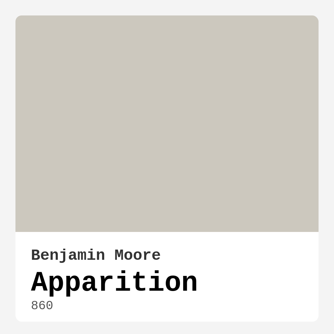
Color Preview & Key Details
| HEX Code | #CCC8BE |
| RGB | 204, 200, 190 |
| LRV | 57.29% |
| Undertone | Red |
| Finish Options | Eggshell, Matte, Satin |
Imagine stepping into your home and feeling a wave of calm wash over you. That’s the magic of color, and today, I want to introduce you to a stunning option that can help you achieve that serene atmosphere: Apparition by Benjamin Moore. This shade is more than just a paint color; it’s a soft, ethereal hue that can transform your space into a tranquil retreat.
Apparition, with its code 860, falls beautifully into the grey category, but it’s so much more than that. It boasts a delicate blend of warm and cool undertones, giving it a versatility that makes it perfect for any room in your home. The color’s warmth leans slightly towards a creamy beige understone, allowing it to harmonize effortlessly with various decor styles, from modern minimalist to cozy bohemian.
With an LRV (Light Reflectance Value) of 57.29%, Apparition reflects a good amount of light without feeling stark. This makes it an excellent choice for smaller spaces that need a little boost but still want to maintain an inviting, cozy feel. Under natural light, it glows softly, enhancing its inviting qualities. In artificial lighting, you’ll notice its warmth becoming more pronounced, creating an intimate vibe perfect for winding down after a long day.
When considering where to use Apparition, think about the spaces where you want to foster relaxation and calm. It’s an ideal candidate for your living room, bedroom, home office, or even a nursery. Picture a serene bedroom painted in Apparition, layered with soft linens and plush textures—immediately, you’ve created a sanctuary for rest. In a home office, it can stimulate creativity while keeping the atmosphere relaxed, helping you stay focused.
You might wonder how Apparition would look in your unique space. This color is incredibly adaptable, making it a fantastic backdrop for both light and dark furnishings. It pairs beautifully with white or cream trims for a crisp finish, or if you’re aiming for something bolder, consider using darker trims to create an eye-catching contrast that remains sophisticated.
One of the best things about Apparition is its ease of application. Whether you’re a seasoned DIYer or a beginner, this color goes on smoothly and offers a professional-looking finish with just one or two coats. Plus, it’s touch-up friendly, so if life happens and you find a scuff, you can easily remedy it without a paint job that takes all day.
In terms of maintenance, Apparition is wash-friendly. This means you can keep your walls looking fresh with a simple wipe down. It’s also low in VOC, making it an eco-conscious choice that won’t compromise indoor air quality. With its quick-drying properties and low odor, you can enjoy a hassle-free painting experience.
Now, let’s talk about some practical tips for using Apparition in your home. First, consider the natural light your rooms receive. This color does exceptionally well in bright spaces, but if you’re working with a room that doesn’t get much sunlight, be prepared to apply a couple of coats to achieve the desired depth.
Color pairing is crucial when using Apparition. While it can stand alone beautifully, it works best when combined with complimentary shades. Try matching it with deeper hues like Benjamin Moore’s 2127-60 or a rich navy to create a stunning contrast that feels sophisticated and welcoming.
If you’re looking for lighter shades to complement Apparition, consider shades like 2111-60 or OC-22, which can create a layered, harmonious palette. On the flip side, if you want to go darker, colors like HC-108 or 1622 can add depth and drama while maintaining that inviting feel. The key is to balance the overall look to keep the space feeling open and airy.
Using Apparition in a small room is absolutely a smart choice. Its light-reflective quality can make spaces feel larger while still maintaining a cozy atmosphere. Just keep in mind how much natural light the room gets, as this can affect how the color appears at different times of the day.
As you consider your decor style, Apparition shines in a variety of contexts. It fits seamlessly into modern, minimalist, Scandinavian, transitional, and even bohemian styles. The adaptability of this color allows it to be the perfect backdrop for your personal touches, whether it’s a statement piece of furniture or a gallery wall bursting with art.
If you’re still unsure about committing to this lovely hue, try it out in small doses first. An accent wall can be a great way to see how it feels in your space without going all in. This can help you visualize how Apparition interacts with your existing decor and furniture.
In summary, Apparition is a versatile, soft grey that can elevate your home’s aesthetic while creating a calm and inviting atmosphere. Its warm undertones, easy application, and excellent light reflectance make it a top choice for various rooms and decor styles. Whether you’re updating your living room, refreshing a bedroom, or creating a serene nursery, this color can adapt to your vision beautifully.
So, next time you’re contemplating a paint color for your project, consider inviting Apparition into your home. It’s more than just a color; it’s an experience—one that brings tranquility and elegance into your life. With the right planning and pairing, you can create a space that feels just right, a sanctuary that reflects your unique style and spirit. Happy painting!
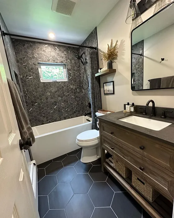
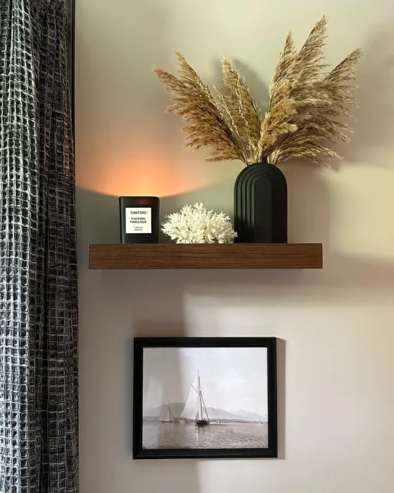
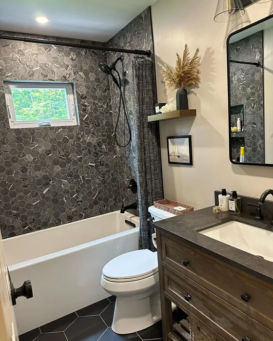
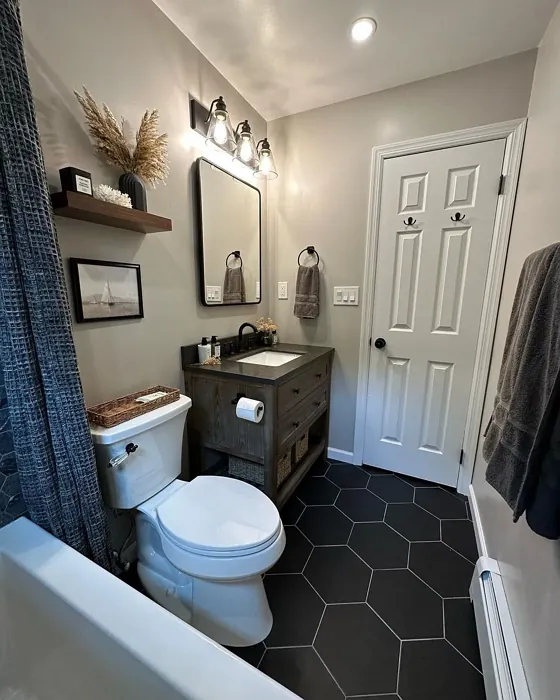
Real Room Photo of Apparition 860
Undertones of Apparition ?
Apparition has a subtle understone that leans towards a creamy beige, softening the overall effect and allowing it to harmonize with a wide range of colors. This makes it incredibly versatile for accenting with bolder shades or complementing softer palettes.
HEX value: #CCC8BE
RGB code: 204, 200, 190
Is Apparition Cool or Warm?
This shade sits comfortably in the balanced spectrum, offering both warmth and coolness. It can adapt to the lighting in your room, taking on a more inviting feel in warm light and a tranquil vibe in cooler light.
Understanding Color Properties and Interior Design Tips
Hue refers to a specific position on the color wheel, measured in degrees from 0 to 360. Each degree represents a different pure color:
- 0° represents red
- 120° represents green
- 240° represents blue
Saturation describes the intensity or purity of a color and is expressed as a percentage:
- At 0%, the color appears completely desaturated—essentially a shade of gray
- At 100%, the color is at its most vivid and vibrant
Lightness indicates how light or dark a color is, also expressed as a percentage:
- 0% lightness results in black
- 100% lightness results in white
Using Warm Colors in Interior Design
Warm hues—such as reds, oranges, yellows, warm beiges, and greiges—are excellent choices for creating inviting and energetic spaces. These colors are particularly well-suited for:
- Kitchens, living rooms, and bathrooms, where warmth enhances comfort and sociability
- Large rooms, where warm tones can help reduce the sense of emptiness and make the space feel more intimate
For example:
- Warm beige shades provide a cozy, inviting atmosphere, ideal for living rooms, bedrooms, and hallways.
- Warm greige (a mix of beige and gray) offers the warmth of beige with the modern appeal of gray, making it a versatile backdrop for dining areas, bedrooms, and living spaces.
However, be mindful when using warm light tones in rooms with limited natural light. These shades may appear muted or even take on an unpleasant yellowish tint. To avoid a dull or flat appearance:
- Add depth by incorporating richer tones like deep greens, charcoal, or chocolate brown
- Use textured elements such as curtains, rugs, or cushions to bring dimension to the space
Pro Tip: Achieving Harmony with Warm and Cool Color Balance
To create a well-balanced and visually interesting interior, mix warm and cool tones strategically. This contrast adds depth and harmony to your design.
- If your walls feature warm hues, introduce cool-colored accents such as blue or green furniture, artwork, or accessories to create contrast.
- For a polished look, consider using a complementary color scheme, which pairs colors opposite each other on the color wheel (e.g., red with green, orange with blue).
This thoughtful mix not only enhances visual appeal but also creates a space that feels both dynamic and cohesive.
Light Temperature Affects on Apparition
Natural Light
Natural daylight changes in color temperature as the sun moves across the sky. At sunrise and sunset, the light tends to have a warm, golden tone with a color temperature around 2000 Kelvin (K). As the day progresses and the sun rises higher, the light becomes cooler and more neutral. Around midday, especially when the sky is clear, natural light typically reaches its peak brightness and shifts to a cooler tone, ranging from 5500 to 6500 Kelvin. This midday light is close to what we perceive as pure white or daylight-balanced light.
These shifts in natural light can significantly influence how colors appear in a space, which is why designers often consider both the time of day and the orientation of windows when planning interior color schemes.
Artificial Light
When choosing artificial lighting, pay close attention to the color temperature, measured in Kelvin (K). This determines how warm or cool the light will appear. Lower temperatures, around 2700K, give off a warm, yellow glow often used in living rooms or bedrooms. Higher temperatures, above 5000K, create a cool, bluish light similar to daylight, commonly used in kitchens, offices, or task areas.
Use the slider to see how lighting temperature can affect the appearance of a surface or color throughout a space.


4800K
LRV of Apparition
With a Light Reflectance Value (LRV) of approximately 65, Apparition reflects enough light to brighten a space without feeling stark or harsh. This makes it a great choice for smaller rooms that need a boost without losing intimacy.
Detailed Review of Apparition
Additional Paint Characteristics
Ideal Rooms
Bedroom, Entryway, Home Office, Living Room, Nursery
Decor Styles
Bohemian, Minimalist, Modern, Scandinavian, Transitional
Coverage
Good (1–2 Coats), Touch-Up Friendly
Ease of Application
Beginner Friendly, Brush Smooth, Roller-Ready
Washability
Washable, Wipeable
VOC Level
Eco-Certified, Low VOC
Best Use
Accent Wall, Furniture, Interior Walls
Room Suitability
Bedroom, Entryway, Home Office, Living Room, Nursery
Tone Tag
Balanced, Cool, Neutral, Warm
Finish Type
Eggshell, Matte, Satin
Paint Performance
Easy Touch-Up, Low Odor, Quick Drying
Use Cases
Best for Modern Farmhouse, Best for Rentals, Classic Favorite
Mood
Calm, Inviting, Restful
Trim Pairing
Complements Brass Fixtures, Good with Wood Trim, Pairs with White Dove
Using Apparition is like inviting a gentle cloud into your home. The color has a unique ability to brighten up spaces while maintaining a soothing ambiance, making it ideal for areas where relaxation is key. When applied, it goes on smoothly, with an even finish that doesn’t require multiple coats in most cases. It’s versatile enough to be used in various rooms, from serene bedrooms to lively home offices, and pairs beautifully with both light and dark furnishings. Whether you’re aiming for a fresh, airy feel or a cozy, intimate atmosphere, Apparition delivers effortlessly. Just be prepared for a bit of planning on the trim colors to make the most of this lovely hue.
Pros & Cons of 860 Apparition
Pros
Cons
Colors that go with Benjamin Moore Apparition
FAQ on 860 Apparition
Can I use Apparition in a small room?
Absolutely! Apparition is a fantastic choice for small rooms due to its light-reflective quality. It helps to make spaces feel larger while maintaining a cozy atmosphere. Just be mindful of how much natural light the room receives, as that can affect the overall vibe.
What trim colors work best with Apparition?
For the best effect, pair Apparition with white or cream trims for a crisp finish. If you’re looking for a bolder look, consider darker trims, which can create a striking contrast while keeping the overall feel sophisticated.
Comparisons Apparition with other colors
Apparition 860 vs Repose Gray SW 7015
| Attribute | Apparition 860 | Repose Gray SW 7015 |
|---|---|---|
| Color Name | Apparition 860 | Repose Gray SW 7015 |
| Color | ||
| Hue | Grey | Grey |
| Brightness | Medium | Medium |
| RGB | 204, 200, 190 | 204, 201, 192 |
| LRV | 57.29% | 58% |
| Finish Type | Eggshell, Matte, Satin | Eggshell, Matte, Satin |
| Finish Options | Eggshell, Matte, Satin | Eggshell, Matte, Satin |
| Ideal Rooms | Bedroom, Entryway, Home Office, Living Room, Nursery | Bedroom, Dining Room, Hallway, Home Office, Living Room |
| Decor Styles | Bohemian, Minimalist, Modern, Scandinavian, Transitional | Contemporary, Farmhouse, Minimalist, Modern, Transitional |
| Coverage | Good (1–2 Coats), Touch-Up Friendly | Good (1–2 Coats), Touch-Up Friendly |
| Ease of Application | Beginner Friendly, Brush Smooth, Roller-Ready | Beginner Friendly, Brush Smooth, Fast-Drying, Roller-Ready |
| Washability | Washable, Wipeable | Highly Washable, Washable |
| Room Suitability | Bedroom, Entryway, Home Office, Living Room, Nursery | Bedroom, Dining Room, Hallway, Home Office, Living Room |
| Tone | Balanced, Cool, Neutral, Warm | Muted, Neutral, Warm |
| Paint Performance | Easy Touch-Up, Low Odor, Quick Drying | Low Odor, Quick Drying, Scuff Resistant |
Apparition 860 vs Light French Gray SW 0055
| Attribute | Apparition 860 | Light French Gray SW 0055 |
|---|---|---|
| Color Name | Apparition 860 | Light French Gray SW 0055 |
| Color | ||
| Hue | Grey | Grey |
| Brightness | Medium | Medium |
| RGB | 204, 200, 190 | 194, 192, 187 |
| LRV | 57.29% | 53% |
| Finish Type | Eggshell, Matte, Satin | Eggshell, Matte, Satin |
| Finish Options | Eggshell, Matte, Satin | Eggshell, Matte, Satin |
| Ideal Rooms | Bedroom, Entryway, Home Office, Living Room, Nursery | Bedroom, Dining Room, Home Office, Kitchen, Living Room |
| Decor Styles | Bohemian, Minimalist, Modern, Scandinavian, Transitional | Contemporary, Farmhouse, Modern, Scandinavian, Transitional |
| Coverage | Good (1–2 Coats), Touch-Up Friendly | Good (1–2 Coats), Touch-Up Friendly |
| Ease of Application | Beginner Friendly, Brush Smooth, Roller-Ready | Beginner Friendly, Brush Smooth, Roller-Ready |
| Washability | Washable, Wipeable | Highly Washable, Washable |
| Room Suitability | Bedroom, Entryway, Home Office, Living Room, Nursery | Bedroom, Dining Room, Home Office, Kitchen, Living Room |
| Tone | Balanced, Cool, Neutral, Warm | Balanced, Muted, Neutral, Warm |
| Paint Performance | Easy Touch-Up, Low Odor, Quick Drying | Easy Touch-Up, High Coverage, Low Odor |
Apparition 860 vs Wordly Gray SW 7043
| Attribute | Apparition 860 | Wordly Gray SW 7043 |
|---|---|---|
| Color Name | Apparition 860 | Wordly Gray SW 7043 |
| Color | ||
| Hue | Grey | Grey |
| Brightness | Medium | Medium |
| RGB | 204, 200, 190 | 206, 198, 187 |
| LRV | 57.29% | 58% |
| Finish Type | Eggshell, Matte, Satin | Eggshell, Satin |
| Finish Options | Eggshell, Matte, Satin | Eggshell, Flat, Satin |
| Ideal Rooms | Bedroom, Entryway, Home Office, Living Room, Nursery | Bedroom, Home Office, Kitchen, Living Room |
| Decor Styles | Bohemian, Minimalist, Modern, Scandinavian, Transitional | Minimalist, Modern, Scandi, Transitional |
| Coverage | Good (1–2 Coats), Touch-Up Friendly | Good (1–2 Coats) |
| Ease of Application | Beginner Friendly, Brush Smooth, Roller-Ready | Beginner Friendly, Brush Smooth, Fast-Drying, Roller-Ready |
| Washability | Washable, Wipeable | Highly Washable, Washable |
| Room Suitability | Bedroom, Entryway, Home Office, Living Room, Nursery | Bedroom, Dining Room, Home Office, Living Room |
| Tone | Balanced, Cool, Neutral, Warm | Muted, Neutral, Warm |
| Paint Performance | Easy Touch-Up, Low Odor, Quick Drying | Easy Touch-Up, Low Odor, Scuff Resistant |
Apparition 860 vs Illusive Green SW 9164
| Attribute | Apparition 860 | Illusive Green SW 9164 |
|---|---|---|
| Color Name | Apparition 860 | Illusive Green SW 9164 |
| Color | ||
| Hue | Grey | Grey |
| Brightness | Medium | Medium |
| RGB | 204, 200, 190 | 146, 148, 141 |
| LRV | 57.29% | 24% |
| Finish Type | Eggshell, Matte, Satin | Eggshell, Matte, Satin |
| Finish Options | Eggshell, Matte, Satin | Eggshell, Matte, Satin |
| Ideal Rooms | Bedroom, Entryway, Home Office, Living Room, Nursery | Bedroom, Dining Room, Home Office, Living Room, Nursery |
| Decor Styles | Bohemian, Minimalist, Modern, Scandinavian, Transitional | Coastal, Minimalist, Modern, Rustic, Scandinavian |
| Coverage | Good (1–2 Coats), Touch-Up Friendly | Good (1–2 Coats), Touch-Up Friendly |
| Ease of Application | Beginner Friendly, Brush Smooth, Roller-Ready | Beginner Friendly, Brush Smooth, Fast-Drying, Roller-Ready |
| Washability | Washable, Wipeable | Highly Washable, Washable, Wipeable |
| Room Suitability | Bedroom, Entryway, Home Office, Living Room, Nursery | Bedroom, Dining Room, Home Office, Living Room, Nursery |
| Tone | Balanced, Cool, Neutral, Warm | Balanced, Earthy, Muted |
| Paint Performance | Easy Touch-Up, Low Odor, Quick Drying | Easy Touch-Up, Low Odor, Quick Drying, Scuff Resistant |
Apparition 860 vs Fawn Brindle SW 7640
| Attribute | Apparition 860 | Fawn Brindle SW 7640 |
|---|---|---|
| Color Name | Apparition 860 | Fawn Brindle SW 7640 |
| Color | ||
| Hue | Grey | Grey |
| Brightness | Medium | Medium |
| RGB | 204, 200, 190 | 167, 160, 148 |
| LRV | 57.29% | 24% |
| Finish Type | Eggshell, Matte, Satin | Eggshell, Matte |
| Finish Options | Eggshell, Matte, Satin | Eggshell, Matte, Satin |
| Ideal Rooms | Bedroom, Entryway, Home Office, Living Room, Nursery | Bedroom, Dining Room, Hallway, Home Office, Living Room |
| Decor Styles | Bohemian, Minimalist, Modern, Scandinavian, Transitional | Bohemian, Minimalist, Modern Farmhouse, Transitional |
| Coverage | Good (1–2 Coats), Touch-Up Friendly | Good (1–2 Coats) |
| Ease of Application | Beginner Friendly, Brush Smooth, Roller-Ready | Brush Smooth, Fast-Drying, Roller-Ready |
| Washability | Washable, Wipeable | Stain Resistant, Washable |
| Room Suitability | Bedroom, Entryway, Home Office, Living Room, Nursery | Bedroom, Dining Room, Home Office, Living Room |
| Tone | Balanced, Cool, Neutral, Warm | Earthy, Neutral, Warm |
| Paint Performance | Easy Touch-Up, Low Odor, Quick Drying | Easy Touch-Up, Fade Resistant, Low Odor |
Apparition 860 vs Balanced Beige SW 7037
| Attribute | Apparition 860 | Balanced Beige SW 7037 |
|---|---|---|
| Color Name | Apparition 860 | Balanced Beige SW 7037 |
| Color | ||
| Hue | Grey | Grey |
| Brightness | Medium | Medium |
| RGB | 204, 200, 190 | 192, 178, 162 |
| LRV | 57.29% | 44% |
| Finish Type | Eggshell, Matte, Satin | Eggshell, Matte, Satin |
| Finish Options | Eggshell, Matte, Satin | Eggshell, Matte, Satin |
| Ideal Rooms | Bedroom, Entryway, Home Office, Living Room, Nursery | Bedroom, Dining Room, Home Office, Kitchen, Living Room |
| Decor Styles | Bohemian, Minimalist, Modern, Scandinavian, Transitional | Contemporary, Minimalist, Modern Farmhouse, Rustic, Transitional |
| Coverage | Good (1–2 Coats), Touch-Up Friendly | Good (1–2 Coats), Touch-Up Friendly |
| Ease of Application | Beginner Friendly, Brush Smooth, Roller-Ready | Beginner Friendly, Brush Smooth, Roller-Ready |
| Washability | Washable, Wipeable | Washable, Wipeable |
| Room Suitability | Bedroom, Entryway, Home Office, Living Room, Nursery | Bedroom, Dining Room, Hallway, Kitchen, Living Room |
| Tone | Balanced, Cool, Neutral, Warm | Balanced, Earthy, Warm |
| Paint Performance | Easy Touch-Up, Low Odor, Quick Drying | Easy Touch-Up, High Coverage, Low Odor |
Apparition 860 vs Mushroom SW 9587
| Attribute | Apparition 860 | Mushroom SW 9587 |
|---|---|---|
| Color Name | Apparition 860 | Mushroom SW 9587 |
| Color | ||
| Hue | Grey | Grey |
| Brightness | Medium | Medium |
| RGB | 204, 200, 190 | 208, 199, 183 |
| LRV | 57.29% | 24% |
| Finish Type | Eggshell, Matte, Satin | Eggshell, Satin |
| Finish Options | Eggshell, Matte, Satin | Eggshell, Flat, Matte, Satin |
| Ideal Rooms | Bedroom, Entryway, Home Office, Living Room, Nursery | Bedroom, Dining Room, Hallway, Home Office, Living Room |
| Decor Styles | Bohemian, Minimalist, Modern, Scandinavian, Transitional | Bohemian, Contemporary, Modern Farmhouse, Traditional |
| Coverage | Good (1–2 Coats), Touch-Up Friendly | Good (1–2 Coats) |
| Ease of Application | Beginner Friendly, Brush Smooth, Roller-Ready | Beginner Friendly, Brush Smooth, Roller-Ready |
| Washability | Washable, Wipeable | Highly Washable, Washable |
| Room Suitability | Bedroom, Entryway, Home Office, Living Room, Nursery | Bedroom, Dining Room, Home Office, Living Room |
| Tone | Balanced, Cool, Neutral, Warm | Earthy, Neutral, Warm |
| Paint Performance | Easy Touch-Up, Low Odor, Quick Drying | Easy Touch-Up, Long Lasting, Low Odor, Scuff Resistant |
Apparition 860 vs Silver Strand SW 7057
| Attribute | Apparition 860 | Silver Strand SW 7057 |
|---|---|---|
| Color Name | Apparition 860 | Silver Strand SW 7057 |
| Color | ||
| Hue | Grey | Grey |
| Brightness | Medium | Medium |
| RGB | 204, 200, 190 | 200, 203, 196 |
| LRV | 57.29% | 66% |
| Finish Type | Eggshell, Matte, Satin | Eggshell, Satin |
| Finish Options | Eggshell, Matte, Satin | Eggshell, Matte, Satin |
| Ideal Rooms | Bedroom, Entryway, Home Office, Living Room, Nursery | Bedroom, Dining Room, Hallway, Home Office, Living Room |
| Decor Styles | Bohemian, Minimalist, Modern, Scandinavian, Transitional | Coastal, Minimalist, Modern, Traditional, Transitional |
| Coverage | Good (1–2 Coats), Touch-Up Friendly | Good (1–2 Coats), Touch-Up Friendly |
| Ease of Application | Beginner Friendly, Brush Smooth, Roller-Ready | Beginner Friendly, Brush Smooth, Roller-Ready |
| Washability | Washable, Wipeable | Highly Washable, Washable |
| Room Suitability | Bedroom, Entryway, Home Office, Living Room, Nursery | Bathroom, Bedroom, Home Office, Kitchen, Living Room |
| Tone | Balanced, Cool, Neutral, Warm | Balanced, Neutral, Warm |
| Paint Performance | Easy Touch-Up, Low Odor, Quick Drying | Easy Touch-Up, High Coverage, Low Odor |
Apparition 860 vs Cadet SW 9143
| Attribute | Apparition 860 | Cadet SW 9143 |
|---|---|---|
| Color Name | Apparition 860 | Cadet SW 9143 |
| Color | ||
| Hue | Grey | Grey |
| Brightness | Medium | Medium |
| RGB | 204, 200, 190 | 145, 153, 156 |
| LRV | 57.29% | 12% |
| Finish Type | Eggshell, Matte, Satin | Eggshell, Matte, Satin |
| Finish Options | Eggshell, Matte, Satin | Eggshell, Matte, Satin |
| Ideal Rooms | Bedroom, Entryway, Home Office, Living Room, Nursery | Bathroom, Bedroom, Hallway, Home Office, Kitchen, Living Room |
| Decor Styles | Bohemian, Minimalist, Modern, Scandinavian, Transitional | Coastal, Industrial, Minimalist, Modern, Scandinavian |
| Coverage | Good (1–2 Coats), Touch-Up Friendly | Good (1–2 Coats), Touch-Up Friendly |
| Ease of Application | Beginner Friendly, Brush Smooth, Roller-Ready | Beginner Friendly, Brush Smooth, Roller-Ready |
| Washability | Washable, Wipeable | Washable, Wipeable |
| Room Suitability | Bedroom, Entryway, Home Office, Living Room, Nursery | Bathroom, Bedroom, Hallway, Home Office, Living Room |
| Tone | Balanced, Cool, Neutral, Warm | Balanced, Cool, Muted |
| Paint Performance | Easy Touch-Up, Low Odor, Quick Drying | Easy Touch-Up, High Coverage, Low Odor |
Apparition 860 vs Dovetail SW 7018
| Attribute | Apparition 860 | Dovetail SW 7018 |
|---|---|---|
| Color Name | Apparition 860 | Dovetail SW 7018 |
| Color | ||
| Hue | Grey | Grey |
| Brightness | Medium | Medium |
| RGB | 204, 200, 190 | 144, 138, 131 |
| LRV | 57.29% | 24% |
| Finish Type | Eggshell, Matte, Satin | Eggshell, Matte, Satin |
| Finish Options | Eggshell, Matte, Satin | Eggshell, Matte, Satin |
| Ideal Rooms | Bedroom, Entryway, Home Office, Living Room, Nursery | Bedroom, Dining Room, Hallway, Home Office, Living Room |
| Decor Styles | Bohemian, Minimalist, Modern, Scandinavian, Transitional | Minimalist, Modern Farmhouse, Rustic, Transitional |
| Coverage | Good (1–2 Coats), Touch-Up Friendly | Good (1–2 Coats), Touch-Up Friendly |
| Ease of Application | Beginner Friendly, Brush Smooth, Roller-Ready | Beginner Friendly, Brush Smooth, Roller-Ready |
| Washability | Washable, Wipeable | Washable, Wipeable |
| Room Suitability | Bedroom, Entryway, Home Office, Living Room, Nursery | Bedroom, Dining Room, Home Office, Living Room |
| Tone | Balanced, Cool, Neutral, Warm | Earthy, Neutral, Warm |
| Paint Performance | Easy Touch-Up, Low Odor, Quick Drying | Easy Touch-Up, Fade Resistant, Low Odor |
Official Page of Benjamin Moore Apparition 860