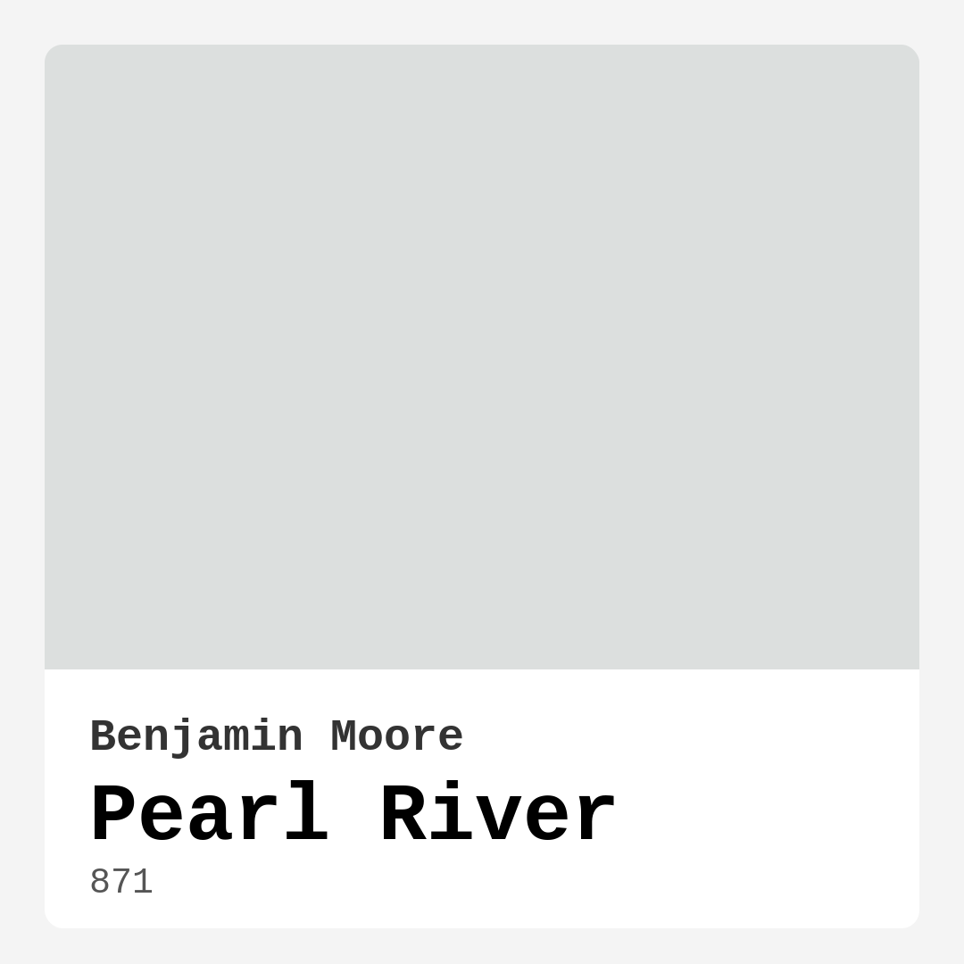
Color Preview & Key Details
| HEX Code | #DCDFDE |
| RGB | 220, 223, 222 |
| LRV | 73.11% |
| Undertone | Green |
| Finish Options | Eggshell, Flat, Satin |
Imagine walking into a room that instantly makes you exhale—soft, serene, and effortlessly elegant. The walls wrap around you like a gentle embrace, their color neither too cool nor too warm, just perfectly balanced. That’s the magic of Benjamin Moore’s Pearl River (871). It’s one of those rare paint colors that feels like it was designed to make any space feel like home, whether you’re going for modern minimalism, cozy transitional, or breezy coastal vibes.
Pearl River is a soft gray with a whisper of warmth, thanks to its subtle green undertones. It’s not stark or clinical; instead, it has a richness that keeps it from feeling flat. The LRV (Light Reflectance Value) of 73.11% means it reflects a lot of light, making rooms feel airy and bright without sacrificing coziness. If you’ve ever painted a room white only to realize it feels sterile, Pearl River is the antidote—it’s warm enough to be inviting but neutral enough to play well with almost any decor.
One of the best things about this color is its versatility. It works beautifully in living rooms, where it creates a calming backdrop for bold artwork or vibrant furniture. In bedrooms, it fosters a restful atmosphere, especially when paired with crisp white linens or natural wood tones. Kitchens and bathrooms? Absolutely. Pearl River’s durability and washability make it a practical choice for high-traffic areas, and its soft hue brings a spa-like tranquility to bathrooms.
Application is a breeze, even if you’re a DIY beginner. It’s roller-ready, brushes on smoothly, and dries quickly—usually with just one or two coats for full coverage. The finish options (Flat, Eggshell, Satin) let you tailor the look to your space. Prefer a matte, velvety feel? Go with Flat. Want a slight sheen that’s easy to clean? Eggshell or Satin are your friends. And because it’s low-VOC, you won’t have to deal with harsh fumes during or after painting.
Now, let’s talk undertones. Pearl River’s green base is subtle but significant. It’s what keeps the color from leaning too blue (cold) or too beige (muddy). This makes it incredibly adaptable—it’ll harmonize with warm woods, cool metals, and everything in between. But here’s a pro tip: Always test it in your space first. Paint a large swatch and observe it at different times of day. You’ll notice how it shifts, appearing lighter and creamier in daylight, then deepening into a softer gray as the sun sets.
Pairing it with other colors? Think of Pearl River as the ultimate team player. For trim, Benjamin Moore’s White Dove is a classic choice, offering a clean contrast. If you’re feeling bold, try a complementary red-hued accent (think terra cotta or dusty rose) to make the green undertones pop. For a monochromatic look, layer it with darker grays like Gray Owl or Repose Gray. And if you’re aiming for a coastal vibe, pair it with crisp whites and sandy neutrals.
A few things to keep in mind: Because it’s a light color, it might show dirt more easily in high-traffic areas, but its washability means a quick wipe-down will restore it. And while it usually covers well in two coats, darker or heavily patched walls might need an extra layer. But these are small trade-offs for a color that brings so much versatility and timeless appeal.
At the end of the day, Pearl River is more than just paint—it’s a mood. It’s calm without being boring, sophisticated without being fussy, and warm without being overwhelming. Whether you’re refreshing a rental, designing a modern farmhouse, or just craving a change, this color has a way of making spaces feel intentional and lived-in. So grab a sample, brush it on your walls, and see how it transforms your room into a place you’ll love coming home to.
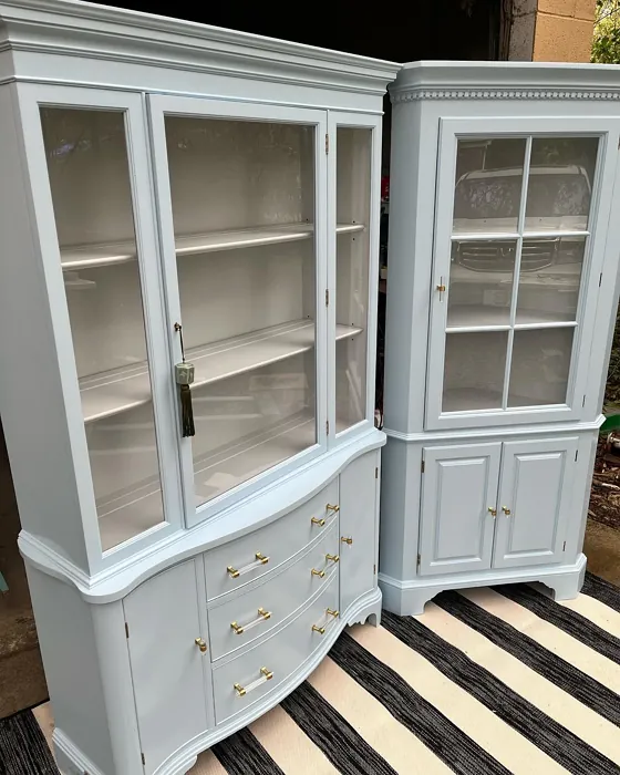
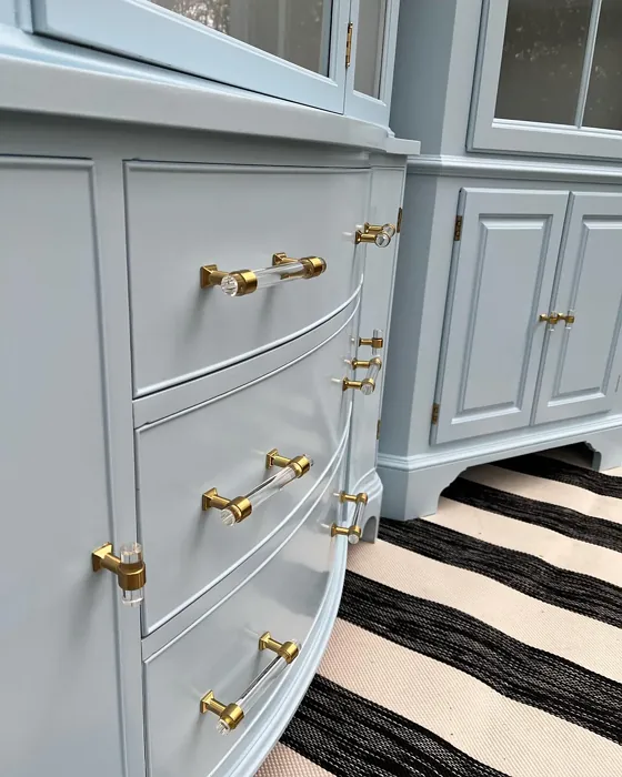
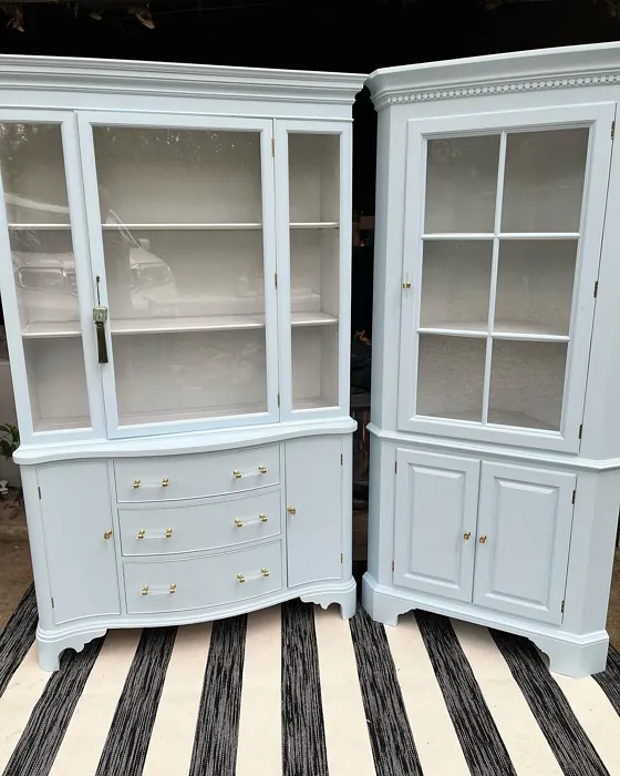
Real Room Photo of Pearl River 871
Undertones of Pearl River ?
The undertones of Pearl River are a key aspect of its character, leaning towards Green. These subtle underlying hues are what give the color its depth and complexity. For example, a gray with a blue undertone will feel cooler and more modern, while one with a brown undertone will feel warmer and more traditional. It’s essential to test this paint in your home and observe it next to your existing furniture, flooring, and decor to see how these undertones interact and reveal themselves throughout the day.
HEX value: #DCDFDE
RGB code: 220, 223, 222
Is Pearl River Cool or Warm?
Pearl River is predominantly warm, making it an inviting choice for spaces where comfort is key. Its warmth pairs well with both warm and cool accents, allowing for creative flexibility in your design.
Understanding Color Properties and Interior Design Tips
Hue refers to a specific position on the color wheel, measured in degrees from 0 to 360. Each degree represents a different pure color:
- 0° represents red
- 120° represents green
- 240° represents blue
Saturation describes the intensity or purity of a color and is expressed as a percentage:
- At 0%, the color appears completely desaturated—essentially a shade of gray
- At 100%, the color is at its most vivid and vibrant
Lightness indicates how light or dark a color is, also expressed as a percentage:
- 0% lightness results in black
- 100% lightness results in white
Using Warm Colors in Interior Design
Warm hues—such as reds, oranges, yellows, warm beiges, and greiges—are excellent choices for creating inviting and energetic spaces. These colors are particularly well-suited for:
- Kitchens, living rooms, and bathrooms, where warmth enhances comfort and sociability
- Large rooms, where warm tones can help reduce the sense of emptiness and make the space feel more intimate
For example:
- Warm beige shades provide a cozy, inviting atmosphere, ideal for living rooms, bedrooms, and hallways.
- Warm greige (a mix of beige and gray) offers the warmth of beige with the modern appeal of gray, making it a versatile backdrop for dining areas, bedrooms, and living spaces.
However, be mindful when using warm light tones in rooms with limited natural light. These shades may appear muted or even take on an unpleasant yellowish tint. To avoid a dull or flat appearance:
- Add depth by incorporating richer tones like deep greens, charcoal, or chocolate brown
- Use textured elements such as curtains, rugs, or cushions to bring dimension to the space
Pro Tip: Achieving Harmony with Warm and Cool Color Balance
To create a well-balanced and visually interesting interior, mix warm and cool tones strategically. This contrast adds depth and harmony to your design.
- If your walls feature warm hues, introduce cool-colored accents such as blue or green furniture, artwork, or accessories to create contrast.
- For a polished look, consider using a complementary color scheme, which pairs colors opposite each other on the color wheel (e.g., red with green, orange with blue).
This thoughtful mix not only enhances visual appeal but also creates a space that feels both dynamic and cohesive.
Light Temperature Affects on Pearl River
Natural Light
Natural daylight changes in color temperature as the sun moves across the sky. At sunrise and sunset, the light tends to have a warm, golden tone with a color temperature around 2000 Kelvin (K). As the day progresses and the sun rises higher, the light becomes cooler and more neutral. Around midday, especially when the sky is clear, natural light typically reaches its peak brightness and shifts to a cooler tone, ranging from 5500 to 6500 Kelvin. This midday light is close to what we perceive as pure white or daylight-balanced light.
These shifts in natural light can significantly influence how colors appear in a space, which is why designers often consider both the time of day and the orientation of windows when planning interior color schemes.
Artificial Light
When choosing artificial lighting, pay close attention to the color temperature, measured in Kelvin (K). This determines how warm or cool the light will appear. Lower temperatures, around 2700K, give off a warm, yellow glow often used in living rooms or bedrooms. Higher temperatures, above 5000K, create a cool, bluish light similar to daylight, commonly used in kitchens, offices, or task areas.
Use the slider to see how lighting temperature can affect the appearance of a surface or color throughout a space.


4800K
LRV of Pearl River
The Light Reflectance Value (LRV) of Pearl River is 73.11%, which places it in the Off‑White colors category. This means it reflect a lot of light. Understanding a paint’s LRV is crucial for predicting how it will look in your space. A higher LRV indicates a lighter color that reflects more light, making rooms feel larger and brighter. A lower LRV signifies a darker color that absorbs more light, creating a cozier, more intimate atmosphere. Always consider the natural and artificial lighting in your room when selecting a paint color based on its LRV.
Detailed Review of Pearl River
Additional Paint Characteristics
Ideal Rooms
Bathroom, Bedroom, Dining Room, Kitchen, Living Room
Decor Styles
Coastal, Modern, Scandinavian, Transitional
Coverage
Good (1–2 Coats)
Ease of Application
Beginner Friendly, Brush Smooth, Fast-Drying, Roller-Ready
Washability
Highly Washable, Washable
VOC Level
Low VOC
Best Use
Accent Wall, Interior Walls, Trim
Room Suitability
Bathroom, Bedroom, Kitchen, Living Room
Tone Tag
Muted, Neutral, Warm
Finish Type
Eggshell, Satin
Paint Performance
Easy Touch-Up, High Coverage, Low Odor, Quick Drying
Use Cases
Best for Modern Farmhouse, Best for Rentals, Classic Favorite
Mood
Calm, Cozy, Inviting
Trim Pairing
Complements Cool Trim, Pairs with White Dove, Works with Warm Trim
Pearl River is a remarkable paint that effortlessly combines elegance with versatility. Its soft gray hue has just enough warmth to avoid feeling cold or sterile, making it a go-to choice for many homeowners. When applied, it reflects light beautifully, creating a sense of spaciousness in rooms while maintaining a cozy vibe. This makes it an excellent choice for both large and small spaces alike. The application process is smooth, whether you’re using a brush or roller, and it dries evenly, providing a professional finish without the hassle. Overall, it’s a fantastic option for anyone looking to refresh their space with a modern yet timeless touch.
Pros & Cons of 871 Pearl River
Pros
Cons
Colors that go with Benjamin Moore Pearl River
FAQ on 871 Pearl River
Can Pearl River be used in high-traffic areas?
Absolutely! Pearl River’s durable finish makes it suitable for high-traffic areas. Its washability means that you can easily clean any scuffs or marks without damaging the surface, maintaining its beautiful look over time.
What undertones should I be aware of when choosing Pearl River?
Pearl River features warm beige undertones, which add depth and richness to its gray base. This makes it a fantastic option for blending with both warm and cool colors in your decor, ensuring it harmonizes beautifully with your existing palette.
Comparisons Pearl River with other colors
Pearl River 871 vs Moonmist SW 9144
| Attribute | Pearl River 871 | Moonmist SW 9144 |
|---|---|---|
| Color Name | Pearl River 871 | Moonmist SW 9144 |
| Color | ||
| Hue | Blue | Blue |
| Brightness | Light | Light |
| RGB | 220, 223, 222 | 201, 217, 224 |
| LRV | 73.11% | 65% |
| Finish Type | Eggshell, Satin | Eggshell, Satin |
| Finish Options | Eggshell, Flat, Satin | Eggshell, Flat, Matte, Satin |
| Ideal Rooms | Bathroom, Bedroom, Dining Room, Kitchen, Living Room | Bathroom, Bedroom, Home Office, Living Room, Nursery |
| Decor Styles | Coastal, Modern, Scandinavian, Transitional | Coastal, Minimalist, Modern, Scandinavian |
| Coverage | Good (1–2 Coats) | Good (1–2 Coats) |
| Ease of Application | Beginner Friendly, Brush Smooth, Fast-Drying, Roller-Ready | Beginner Friendly, Brush Smooth, Fast-Drying, Roller-Ready |
| Washability | Highly Washable, Washable | Washable, Wipeable |
| Room Suitability | Bathroom, Bedroom, Kitchen, Living Room | Bathroom, Bedroom, Home Office, Living Room |
| Tone | Muted, Neutral, Warm | Airy, Cool, Muted |
| Paint Performance | Easy Touch-Up, High Coverage, Low Odor, Quick Drying | High Coverage, Low Odor, Quick Drying |
Pearl River 871 vs North Star SW 6246
| Attribute | Pearl River 871 | North Star SW 6246 |
|---|---|---|
| Color Name | Pearl River 871 | North Star SW 6246 |
| Color | ||
| Hue | Blue | Blue |
| Brightness | Light | Light |
| RGB | 220, 223, 222 | 202, 208, 210 |
| LRV | 73.11% | 75% |
| Finish Type | Eggshell, Satin | Eggshell, Satin |
| Finish Options | Eggshell, Flat, Satin | Eggshell, Satin, Semi-Gloss |
| Ideal Rooms | Bathroom, Bedroom, Dining Room, Kitchen, Living Room | Bedroom, Hallway, Home Office, Living Room, Nursery |
| Decor Styles | Coastal, Modern, Scandinavian, Transitional | Coastal, Minimalist, Modern, Scandinavian |
| Coverage | Good (1–2 Coats) | Good (1–2 Coats) |
| Ease of Application | Beginner Friendly, Brush Smooth, Fast-Drying, Roller-Ready | Beginner Friendly, Brush Smooth, Roller-Ready |
| Washability | Highly Washable, Washable | Highly Washable, Washable |
| Room Suitability | Bathroom, Bedroom, Kitchen, Living Room | Bedroom, Home Office, Living Room, Nursery |
| Tone | Muted, Neutral, Warm | Airy, Balanced, Cool, Muted |
| Paint Performance | Easy Touch-Up, High Coverage, Low Odor, Quick Drying | Easy Touch-Up, Fade Resistant, Low Odor, Quick Drying |
Pearl River 871 vs Lullaby SW 9136
| Attribute | Pearl River 871 | Lullaby SW 9136 |
|---|---|---|
| Color Name | Pearl River 871 | Lullaby SW 9136 |
| Color | ||
| Hue | Blue | Blue |
| Brightness | Light | Light |
| RGB | 220, 223, 222 | 203, 212, 212 |
| LRV | 73.11% | 66% |
| Finish Type | Eggshell, Satin | Eggshell, Satin |
| Finish Options | Eggshell, Flat, Satin | Eggshell, Flat, Matte, Satin |
| Ideal Rooms | Bathroom, Bedroom, Dining Room, Kitchen, Living Room | Bedroom, Home Office, Living Room, Nursery |
| Decor Styles | Coastal, Modern, Scandinavian, Transitional | Bohemian, Coastal, Modern, Scandinavian |
| Coverage | Good (1–2 Coats) | Good (1–2 Coats), Touch-Up Friendly |
| Ease of Application | Beginner Friendly, Brush Smooth, Fast-Drying, Roller-Ready | Beginner Friendly, Brush Smooth, Roller-Ready |
| Washability | Highly Washable, Washable | Spot Clean Only, Washable |
| Room Suitability | Bathroom, Bedroom, Kitchen, Living Room | Bedroom, Home Office, Living Room, Nursery |
| Tone | Muted, Neutral, Warm | Airy, Cool, Muted |
| Paint Performance | Easy Touch-Up, High Coverage, Low Odor, Quick Drying | Easy Touch-Up, High Coverage, Low Odor |
Pearl River 871 vs Hinting Blue SW 6519
| Attribute | Pearl River 871 | Hinting Blue SW 6519 |
|---|---|---|
| Color Name | Pearl River 871 | Hinting Blue SW 6519 |
| Color | ||
| Hue | Blue | Blue |
| Brightness | Light | Light |
| RGB | 220, 223, 222 | 206, 217, 221 |
| LRV | 73.11% | 48% |
| Finish Type | Eggshell, Satin | Eggshell, Matte, Satin |
| Finish Options | Eggshell, Flat, Satin | Eggshell, Matte, Satin |
| Ideal Rooms | Bathroom, Bedroom, Dining Room, Kitchen, Living Room | Bedroom, Home Office, Kids Room, Living Room, Nursery |
| Decor Styles | Coastal, Modern, Scandinavian, Transitional | Coastal, Farmhouse, Minimalist, Modern, Scandinavian |
| Coverage | Good (1–2 Coats) | Good (1–2 Coats), Touch-Up Friendly |
| Ease of Application | Beginner Friendly, Brush Smooth, Fast-Drying, Roller-Ready | Beginner Friendly, Brush Smooth, Fast-Drying, Roller-Ready |
| Washability | Highly Washable, Washable | Washable, Wipeable |
| Room Suitability | Bathroom, Bedroom, Kitchen, Living Room | Bedroom, Home Office, Kids Room, Living Room, Nursery |
| Tone | Muted, Neutral, Warm | Airy, Balanced, Cool, Muted |
| Paint Performance | Easy Touch-Up, High Coverage, Low Odor, Quick Drying | Easy Touch-Up, Low Odor, Quick Drying |
Pearl River 871 vs Lauren's Surprise SW 6791
| Attribute | Pearl River 871 | Lauren's Surprise SW 6791 |
|---|---|---|
| Color Name | Pearl River 871 | Lauren's Surprise SW 6791 |
| Color | ||
| Hue | Blue | Blue |
| Brightness | Light | Light |
| RGB | 220, 223, 222 | 213, 229, 231 |
| LRV | 73.11% | 66% |
| Finish Type | Eggshell, Satin | Eggshell, Satin |
| Finish Options | Eggshell, Flat, Satin | Eggshell, Satin, Semi-Gloss |
| Ideal Rooms | Bathroom, Bedroom, Dining Room, Kitchen, Living Room | Bedroom, Home Office, Living Room, Nursery |
| Decor Styles | Coastal, Modern, Scandinavian, Transitional | Coastal, Farmhouse, Modern, Scandinavian |
| Coverage | Good (1–2 Coats) | Good (1–2 Coats), Touch-Up Friendly |
| Ease of Application | Beginner Friendly, Brush Smooth, Fast-Drying, Roller-Ready | Beginner Friendly, Brush Smooth, Roller-Ready |
| Washability | Highly Washable, Washable | Highly Washable, Washable |
| Room Suitability | Bathroom, Bedroom, Kitchen, Living Room | Bedroom, Home Office, Living Room, Nursery |
| Tone | Muted, Neutral, Warm | Balanced, Cool, Pastel |
| Paint Performance | Easy Touch-Up, High Coverage, Low Odor, Quick Drying | Easy Touch-Up, High Coverage, Low Odor |
Pearl River 871 vs Sky High SW 6504
| Attribute | Pearl River 871 | Sky High SW 6504 |
|---|---|---|
| Color Name | Pearl River 871 | Sky High SW 6504 |
| Color | ||
| Hue | Blue | Blue |
| Brightness | Light | Light |
| RGB | 220, 223, 222 | 220, 231, 232 |
| LRV | 73.11% | 66% |
| Finish Type | Eggshell, Satin | Eggshell, Matte, Satin |
| Finish Options | Eggshell, Flat, Satin | Eggshell, Matte, Satin |
| Ideal Rooms | Bathroom, Bedroom, Dining Room, Kitchen, Living Room | Bathroom, Bedroom, Home Office, Kitchen, Living Room |
| Decor Styles | Coastal, Modern, Scandinavian, Transitional | Coastal, Minimalist, Modern, Scandinavian |
| Coverage | Good (1–2 Coats) | Good (1–2 Coats), Touch-Up Friendly |
| Ease of Application | Beginner Friendly, Brush Smooth, Fast-Drying, Roller-Ready | Beginner Friendly, Brush Smooth, Fast-Drying, Roller-Ready |
| Washability | Highly Washable, Washable | Washable, Wipeable |
| Room Suitability | Bathroom, Bedroom, Kitchen, Living Room | Bathroom, Bedroom, Home Office, Kitchen, Living Room |
| Tone | Muted, Neutral, Warm | Airy, Cool, Muted |
| Paint Performance | Easy Touch-Up, High Coverage, Low Odor, Quick Drying | High Coverage, Low Odor, Quick Drying |
Pearl River 871 vs Tradewind SW 6218
| Attribute | Pearl River 871 | Tradewind SW 6218 |
|---|---|---|
| Color Name | Pearl River 871 | Tradewind SW 6218 |
| Color | ||
| Hue | Blue | Blue |
| Brightness | Light | Light |
| RGB | 220, 223, 222 | 194, 207, 207 |
| LRV | 73.11% | 66% |
| Finish Type | Eggshell, Satin | Eggshell, Satin |
| Finish Options | Eggshell, Flat, Satin | Eggshell, Matte, Satin |
| Ideal Rooms | Bathroom, Bedroom, Dining Room, Kitchen, Living Room | Bedroom, Dining Room, Home Office, Living Room, Nursery |
| Decor Styles | Coastal, Modern, Scandinavian, Transitional | Coastal, Minimalist, Modern, Scandinavian |
| Coverage | Good (1–2 Coats) | Good (1–2 Coats), Touch-Up Friendly |
| Ease of Application | Beginner Friendly, Brush Smooth, Fast-Drying, Roller-Ready | Beginner Friendly, Brush Smooth, Fast-Drying, Roller-Ready |
| Washability | Highly Washable, Washable | Washable, Wipeable |
| Room Suitability | Bathroom, Bedroom, Kitchen, Living Room | Bedroom, Home Office, Living Room, Nursery |
| Tone | Muted, Neutral, Warm | Airy, Cool, Muted, Soft |
| Paint Performance | Easy Touch-Up, High Coverage, Low Odor, Quick Drying | Easy Touch-Up, Low Odor, Quick Drying |
Pearl River 871 vs Glimmer SW 6476
| Attribute | Pearl River 871 | Glimmer SW 6476 |
|---|---|---|
| Color Name | Pearl River 871 | Glimmer SW 6476 |
| Color | ||
| Hue | Blue | Blue |
| Brightness | Light | Light |
| RGB | 220, 223, 222 | 224, 231, 226 |
| LRV | 73.11% | 69% |
| Finish Type | Eggshell, Satin | Eggshell, Matte, Satin |
| Finish Options | Eggshell, Flat, Satin | Eggshell, Matte, Satin |
| Ideal Rooms | Bathroom, Bedroom, Dining Room, Kitchen, Living Room | Bathroom, Bedroom, Home Office, Kitchen, Living Room, Nursery |
| Decor Styles | Coastal, Modern, Scandinavian, Transitional | Coastal, Farmhouse, Minimalist, Modern, Scandinavian |
| Coverage | Good (1–2 Coats) | Good (1–2 Coats), Touch-Up Friendly |
| Ease of Application | Beginner Friendly, Brush Smooth, Fast-Drying, Roller-Ready | Beginner Friendly, Brush Smooth, Fast-Drying, Roller-Ready |
| Washability | Highly Washable, Washable | Washable, Wipeable |
| Room Suitability | Bathroom, Bedroom, Kitchen, Living Room | Bathroom, Bedroom, Home Office, Living Room, Nursery |
| Tone | Muted, Neutral, Warm | Airy, Balanced, Cool |
| Paint Performance | Easy Touch-Up, High Coverage, Low Odor, Quick Drying | Easy Touch-Up, Fade Resistant, Low Odor, Quick Drying |
Pearl River 871 vs Misty SW 6232
| Attribute | Pearl River 871 | Misty SW 6232 |
|---|---|---|
| Color Name | Pearl River 871 | Misty SW 6232 |
| Color | ||
| Hue | Blue | Blue |
| Brightness | Light | Light |
| RGB | 220, 223, 222 | 205, 210, 210 |
| LRV | 73.11% | 64% |
| Finish Type | Eggshell, Satin | Eggshell, Matte |
| Finish Options | Eggshell, Flat, Satin | Eggshell, Matte, Satin |
| Ideal Rooms | Bathroom, Bedroom, Dining Room, Kitchen, Living Room | Bedroom, Home Office, Kitchen, Living Room, Nursery |
| Decor Styles | Coastal, Modern, Scandinavian, Transitional | Minimalist, Modern, Scandinavian, Transitional |
| Coverage | Good (1–2 Coats) | Good (1–2 Coats), Touch-Up Friendly |
| Ease of Application | Beginner Friendly, Brush Smooth, Fast-Drying, Roller-Ready | Beginner Friendly, Fast-Drying, Low Splatter |
| Washability | Highly Washable, Washable | Washable, Wipeable |
| Room Suitability | Bathroom, Bedroom, Kitchen, Living Room | Bedroom, Home Office, Kitchen, Living Room, Nursery |
| Tone | Muted, Neutral, Warm | Airy, Balanced, Cool |
| Paint Performance | Easy Touch-Up, High Coverage, Low Odor, Quick Drying | High Coverage, Low Odor, Quick Drying |
Pearl River 871 vs Mild Blue SW 6533
| Attribute | Pearl River 871 | Mild Blue SW 6533 |
|---|---|---|
| Color Name | Pearl River 871 | Mild Blue SW 6533 |
| Color | ||
| Hue | Blue | Blue |
| Brightness | Light | Light |
| RGB | 220, 223, 222 | 203, 213, 219 |
| LRV | 73.11% | 48% |
| Finish Type | Eggshell, Satin | Eggshell, Matte, Satin |
| Finish Options | Eggshell, Flat, Satin | Eggshell, Matte, Satin |
| Ideal Rooms | Bathroom, Bedroom, Dining Room, Kitchen, Living Room | Bedroom, Dining Room, Home Office, Living Room, Nursery |
| Decor Styles | Coastal, Modern, Scandinavian, Transitional | Coastal, Minimalist, Modern, Scandinavian |
| Coverage | Good (1–2 Coats) | Good (1–2 Coats), Touch-Up Friendly |
| Ease of Application | Beginner Friendly, Brush Smooth, Fast-Drying, Roller-Ready | Beginner Friendly, Brush Smooth, Fast-Drying, Roller-Ready |
| Washability | Highly Washable, Washable | Washable, Wipeable |
| Room Suitability | Bathroom, Bedroom, Kitchen, Living Room | Bedroom, Home Office, Living Room, Nursery |
| Tone | Muted, Neutral, Warm | Airy, Cool, Muted |
| Paint Performance | Easy Touch-Up, High Coverage, Low Odor, Quick Drying | Easy Touch-Up, Low Odor, Quick Drying |
Official Page of Benjamin Moore Pearl River 871