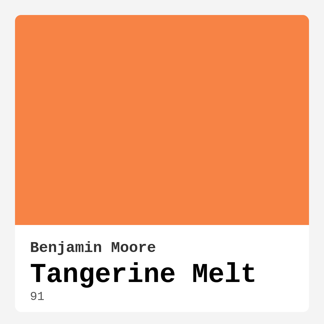
Color Preview & Key Details
| HEX Code | #F78345 |
| RGB | 247, 131, 69 |
| LRV | 34.95% |
| Undertone | Red |
| Finish Options | Matte, Satin, Semi-Gloss |
Imagine stepping into your home after a long day, greeted by a warm, welcoming glow that instantly brightens your mood. That’s the magic of color, and today, I want to introduce you to a shade that embodies vibrancy and energy: Tangerine Melt by Benjamin Moore. This luscious hue, with its cheerful undertones, can transform your space into a haven of warmth and comfort.
Tangerine Melt is not just a color; it’s an experience. With a hex code of #F78345, this medium-bright yellow-orange shade is perfect for those who crave a touch of playfulness without overwhelming their decor. Its lively disposition makes it ideal for various rooms in your home, from a lively kitchen to a cozy living room, and even a cheerful nursery.
One of the standout features of Tangerine Melt is its warm undertones, leaning subtly towards red. This characteristic adds depth, allowing the color to interact beautifully with other elements in your space. When paired thoughtfully, it creates a harmonious balance that can elevate your interior design. For instance, if you’re considering using it for an accent wall, imagine how stunning it would look alongside crisp white trim or natural wood features.
Now, let’s talk about the application process. One of the best things about Tangerine Melt is how beginner-friendly it is. If you’re a DIY enthusiast or just dipping your toes into the world of home decorating, this paint is roller-ready and brush smooth, making your application experience as seamless as possible. With good coverage, you’re likely to achieve a stunning finish with just one or two coats, allowing your space to shine without the hassle of multiple layers. Plus, it dries quickly, so you won’t be waiting around for hours before moving furniture back into place.
When considering this color, it’s essential to think about the size of your space. While Tangerine Melt is inviting and energizing, it can feel overpowering in a small room. If you’re thinking about using it in a confined area, I recommend balancing it with lighter decor and furnishings. This could mean using it as an accent wall, perhaps in your home office, while keeping the rest of the space light with whites or neutrals. This will maintain that airy feel while still allowing you to enjoy the warmth of the color.
The versatility of Tangerine Melt is one of its major strengths. It fits seamlessly into various decor styles, whether you’re leaning towards modern farmhouse, coastal vibes, or even a retro aesthetic. Its cheerful disposition can complement many accessories, making it a delightful backdrop for those pieces you love. Imagine how a bohemian tapestry would pop against this warm canvas, creating a vibrant focal point in your living room.
Lighting plays a crucial role in how any paint color appears in your home. With a Light Reflectance Value (LRV) of 34.95%, Tangerine Melt falls into the medium category, reflecting a good amount of light without feeling too bright. In natural light, it shines with a cheerful glow, brightening any room and creating an inviting atmosphere. Under artificial light, it maintains its warmth, offering a cozy ambiance perfect for evening gatherings or quiet nights in.
When you think about decorating with Tangerine Melt, don’t forget about its finishing options. Available in Matte, Satin, and Semi-Gloss, each finish provides a different aesthetic and functionality. A matte finish offers a soft, understated look, ideal for creating a calm and cozy environment. On the other hand, a semi-gloss finish adds a touch of sheen, making it not only visually appealing but also durable—great for high-traffic areas like kitchens and dining rooms.
If you’re thinking about how to accessorize with Tangerine Melt, consider complementary shades. Colors like soft greens or muted blues can create a stunning contrast, enhancing the vibrancy of Tangerine Melt while keeping the look balanced. These complementary colors can be introduced through decor elements such as pillows, artwork, or even furniture choices.
Now, let’s address some common questions. Can you use Tangerine Melt in smaller spaces? Absolutely! Just remember to balance it with lighter decor to avoid overwhelming the area. And if you’re concerned about application, rest assured that this paint is touch-up friendly and easy to clean, making it a practical choice for busy homes.
Throughout the years, I’ve seen countless transformations brought about by the right paint choice, and Tangerine Melt is no exception. It can energize a dull corner or make a vibrant space feel even more inviting. It’s a color that sparks joy and warmth, perfect for family gatherings or quiet moments with a book.
So, if you’re ready to embrace a little warmth and energy in your home, consider Tangerine Melt. It’s more than just a paint color; it’s an opportunity to create a space that exudes comfort and creativity. Whether you opt for a bold accent wall, a cheerful nursery, or an inviting kitchen, this shade can help you achieve a beautifully personalized environment that reflects your unique style and makes every day feel a little brighter.
Let your home tell your story, and with Tangerine Melt, you’re not just adding color; you’re inviting joy into your living space. Trust me, once you experience the vibrancy and warmth this color brings, you’ll wonder how you ever lived without it.
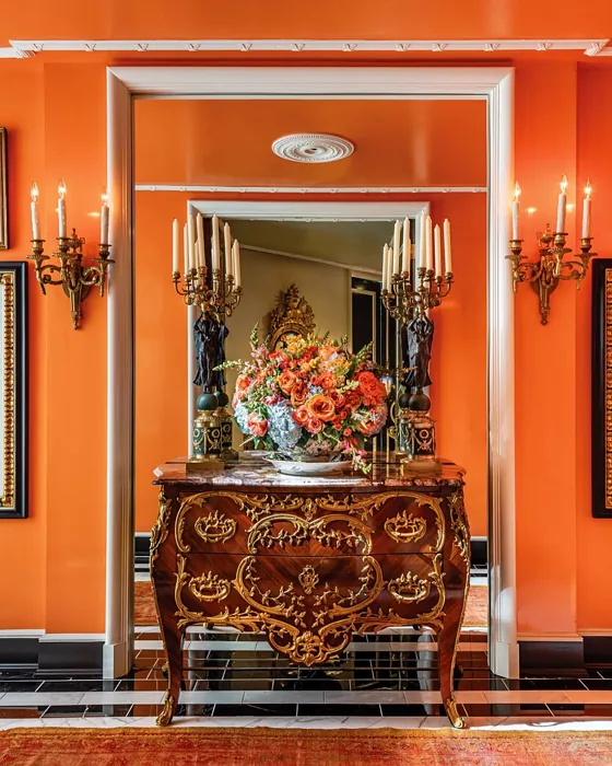
Real Room Photo of Tangerine Melt 91
Undertones of Tangerine Melt ?
The undertones of Tangerine Melt are a key aspect of its character, leaning towards Red. These subtle underlying hues are what give the color its depth and complexity. For example, a gray with a blue undertone will feel cooler and more modern, while one with a brown undertone will feel warmer and more traditional. It’s essential to test this paint in your home and observe it next to your existing furniture, flooring, and decor to see how these undertones interact and reveal themselves throughout the day.
HEX value: #F78345
RGB code: 247, 131, 69
Is Tangerine Melt Cool or Warm?
Tangerine Melt is considered a warm paint color. This characteristic plays a huge role in the overall feel of a room. Warm colors, like this one, tend to create a cozy, inviting, and energetic atmosphere, making them great for social spaces like living rooms and dining rooms. In contrast, cool colors often evoke a sense of calm and serenity, which is why they are popular in bedrooms and bathrooms. The warmth of Tangerine Melt means it will pair beautifully with corresponding decor elements.
Understanding Color Properties and Interior Design Tips
Hue refers to a specific position on the color wheel, measured in degrees from 0 to 360. Each degree represents a different pure color:
- 0° represents red
- 120° represents green
- 240° represents blue
Saturation describes the intensity or purity of a color and is expressed as a percentage:
- At 0%, the color appears completely desaturated—essentially a shade of gray
- At 100%, the color is at its most vivid and vibrant
Lightness indicates how light or dark a color is, also expressed as a percentage:
- 0% lightness results in black
- 100% lightness results in white
Using Warm Colors in Interior Design
Warm hues—such as reds, oranges, yellows, warm beiges, and greiges—are excellent choices for creating inviting and energetic spaces. These colors are particularly well-suited for:
- Kitchens, living rooms, and bathrooms, where warmth enhances comfort and sociability
- Large rooms, where warm tones can help reduce the sense of emptiness and make the space feel more intimate
For example:
- Warm beige shades provide a cozy, inviting atmosphere, ideal for living rooms, bedrooms, and hallways.
- Warm greige (a mix of beige and gray) offers the warmth of beige with the modern appeal of gray, making it a versatile backdrop for dining areas, bedrooms, and living spaces.
However, be mindful when using warm light tones in rooms with limited natural light. These shades may appear muted or even take on an unpleasant yellowish tint. To avoid a dull or flat appearance:
- Add depth by incorporating richer tones like deep greens, charcoal, or chocolate brown
- Use textured elements such as curtains, rugs, or cushions to bring dimension to the space
Pro Tip: Achieving Harmony with Warm and Cool Color Balance
To create a well-balanced and visually interesting interior, mix warm and cool tones strategically. This contrast adds depth and harmony to your design.
- If your walls feature warm hues, introduce cool-colored accents such as blue or green furniture, artwork, or accessories to create contrast.
- For a polished look, consider using a complementary color scheme, which pairs colors opposite each other on the color wheel (e.g., red with green, orange with blue).
This thoughtful mix not only enhances visual appeal but also creates a space that feels both dynamic and cohesive.
Light Temperature Affects on Tangerine Melt
Natural Light
Natural daylight changes in color temperature as the sun moves across the sky. At sunrise and sunset, the light tends to have a warm, golden tone with a color temperature around 2000 Kelvin (K). As the day progresses and the sun rises higher, the light becomes cooler and more neutral. Around midday, especially when the sky is clear, natural light typically reaches its peak brightness and shifts to a cooler tone, ranging from 5500 to 6500 Kelvin. This midday light is close to what we perceive as pure white or daylight-balanced light.
These shifts in natural light can significantly influence how colors appear in a space, which is why designers often consider both the time of day and the orientation of windows when planning interior color schemes.
Artificial Light
When choosing artificial lighting, pay close attention to the color temperature, measured in Kelvin (K). This determines how warm or cool the light will appear. Lower temperatures, around 2700K, give off a warm, yellow glow often used in living rooms or bedrooms. Higher temperatures, above 5000K, create a cool, bluish light similar to daylight, commonly used in kitchens, offices, or task areas.
Use the slider to see how lighting temperature can affect the appearance of a surface or color throughout a space.


4800K
LRV of Tangerine Melt
The Light Reflectance Value (LRV) of Tangerine Melt is 34.95%, which places it in the Medium colors category. This means it reflect a lot of light. Understanding a paint’s LRV is crucial for predicting how it will look in your space. A higher LRV indicates a lighter color that reflects more light, making rooms feel larger and brighter. A lower LRV signifies a darker color that absorbs more light, creating a cozier, more intimate atmosphere. Always consider the natural and artificial lighting in your room when selecting a paint color based on its LRV.
Detailed Review of Tangerine Melt
Additional Paint Characteristics
Ideal Rooms
Dining Room, Home Office, Kitchen, Living Room, Nursery
Decor Styles
Bohemian, Coastal, Contemporary, Modern Farmhouse, Retro
Coverage
Good (1–2 Coats), Touch-Up Friendly
Ease of Application
Beginner Friendly, Brush Smooth, Fast-Drying, Roller-Ready
Washability
Stain Resistant, Washable, Wipeable
VOC Level
Eco-Certified, Low VOC
Best Use
Accent Wall, Furniture, Interior Walls, Trim
Room Suitability
Dining Room, Home Office, Kitchen, Living Room, Nursery
Tone Tag
Bold, Warm
Finish Type
Satin, Semi-Gloss
Paint Performance
Easy Touch-Up, High Coverage, Low Odor, Quick Drying
Use Cases
Best for Modern Farmhouse, Best for Open Concept, Best for Small Spaces
Mood
Cozy, Energizing, Inviting
Trim Pairing
Complements Brass Fixtures, Good with Wood Trim, Pairs with White Dove
Tangerine Melt is a standout choice for anyone looking to inject a sense of warmth and vitality into their home. This paint provides excellent coverage, meaning you’ll likely achieve a stunning finish with just one or two coats. It works beautifully in a variety of settings, from a cozy living room to a vibrant kitchen, creating an inviting atmosphere that’s perfect for entertaining. The color is also versatile, pairing well with both modern and traditional decor styles. Its warm undertones help soften spaces, making them feel more welcoming. Just be mindful that brighter colors like this may require a bit more care during application to avoid streaks. Overall, Tangerine Melt is a delightful option for those wanting to brighten up their interiors.
Pros & Cons of 91 Tangerine Melt
Pros
Cons
Colors that go with Benjamin Moore Tangerine Melt
FAQ on 91 Tangerine Melt
Can I use Tangerine Melt in a small room?
Yes, you can use Tangerine Melt in a small room, but it’s essential to balance it with lighter decor and furnishings. While the color is vibrant and warm, it may feel overwhelming in a confined space. Consider using it as an accent wall or pairing it with whites and neutrals to maintain a light and airy feel.
What finishes are available for Tangerine Melt?
Tangerine Melt is available in several finishes, including Matte, Satin, and Semi-Gloss. Each finish offers a different look and feel, so consider your space and desired effect when selecting. Matte provides a soft, understated look, while Semi-Gloss adds a bit of sheen and durability, making it great for high-traffic areas.
Comparisons Tangerine Melt with other colors
Tangerine Melt 91 vs Hearts of Palm SW 6415
| Attribute | Tangerine Melt 91 | Hearts of Palm SW 6415 |
|---|---|---|
| Color Name | Tangerine Melt 91 | Hearts of Palm SW 6415 |
| Color | ||
| Hue | Yellow | Yellow |
| Brightness | Medium | Medium |
| RGB | 247, 131, 69 | 207, 194, 145 |
| LRV | 34.95% | 75% |
| Finish Type | Satin, Semi-Gloss | Eggshell, Matte, Satin |
| Finish Options | Matte, Satin, Semi-Gloss | Eggshell, Matte, Satin |
| Ideal Rooms | Dining Room, Home Office, Kitchen, Living Room, Nursery | Bathroom, Bedroom, Dining Room, Home Office, Kitchen, Living Room |
| Decor Styles | Bohemian, Coastal, Contemporary, Modern Farmhouse, Retro | Bohemian, Coastal, Eclectic, Modern Farmhouse, Tropical |
| Coverage | Good (1–2 Coats), Touch-Up Friendly | Good (1–2 Coats), Touch-Up Friendly |
| Ease of Application | Beginner Friendly, Brush Smooth, Fast-Drying, Roller-Ready | Beginner Friendly, Brush Smooth, Roller-Ready |
| Washability | Stain Resistant, Washable, Wipeable | Scrubbable, Washable |
| Room Suitability | Dining Room, Home Office, Kitchen, Living Room, Nursery | Bathroom, Bedroom, Dining Room, Home Office, Kitchen, Living Room |
| Tone | Bold, Warm | Earthy, Muted, Warm |
| Paint Performance | Easy Touch-Up, High Coverage, Low Odor, Quick Drying | Easy Touch-Up, Low Odor, Scuff Resistant |
Tangerine Melt 91 vs Blonde SW 6128
| Attribute | Tangerine Melt 91 | Blonde SW 6128 |
|---|---|---|
| Color Name | Tangerine Melt 91 | Blonde SW 6128 |
| Color | ||
| Hue | Yellow | Yellow |
| Brightness | Medium | Medium |
| RGB | 247, 131, 69 | 220, 189, 146 |
| LRV | 34.95% | 64% |
| Finish Type | Satin, Semi-Gloss | Eggshell, Satin |
| Finish Options | Matte, Satin, Semi-Gloss | Eggshell, Matte, Satin |
| Ideal Rooms | Dining Room, Home Office, Kitchen, Living Room, Nursery | Bedroom, Dining Room, Home Office, Kitchen, Living Room |
| Decor Styles | Bohemian, Coastal, Contemporary, Modern Farmhouse, Retro | Bohemian, Coastal, Modern Farmhouse, Scandinavian, Transitional |
| Coverage | Good (1–2 Coats), Touch-Up Friendly | Good (1–2 Coats), Touch-Up Friendly |
| Ease of Application | Beginner Friendly, Brush Smooth, Fast-Drying, Roller-Ready | Beginner Friendly, Fast-Drying, Roller-Ready |
| Washability | Stain Resistant, Washable, Wipeable | Highly Washable, Washable |
| Room Suitability | Dining Room, Home Office, Kitchen, Living Room, Nursery | Bedroom, Dining Room, Home Office, Kitchen, Living Room, Nursery |
| Tone | Bold, Warm | Earthy, Neutral, Warm |
| Paint Performance | Easy Touch-Up, High Coverage, Low Odor, Quick Drying | Easy Touch-Up, Fade Resistant, Low Odor, Quick Drying |
Tangerine Melt 91 vs Ruskin Room Green SW 0042
| Attribute | Tangerine Melt 91 | Ruskin Room Green SW 0042 |
|---|---|---|
| Color Name | Tangerine Melt 91 | Ruskin Room Green SW 0042 |
| Color | ||
| Hue | Yellow | Yellow |
| Brightness | Medium | Medium |
| RGB | 247, 131, 69 | 172, 161, 125 |
| LRV | 34.95% | 24% |
| Finish Type | Satin, Semi-Gloss | Eggshell, Matte |
| Finish Options | Matte, Satin, Semi-Gloss | Eggshell, Flat, Matte, Satin |
| Ideal Rooms | Dining Room, Home Office, Kitchen, Living Room, Nursery | Bedroom, Dining Room, Home Office, Living Room |
| Decor Styles | Bohemian, Coastal, Contemporary, Modern Farmhouse, Retro | Farmhouse, Modern, Rustic, Traditional |
| Coverage | Good (1–2 Coats), Touch-Up Friendly | Good (1–2 Coats), Touch-Up Friendly |
| Ease of Application | Beginner Friendly, Brush Smooth, Fast-Drying, Roller-Ready | Beginner Friendly, Brush Smooth, Roller-Ready |
| Washability | Stain Resistant, Washable, Wipeable | Scrubbable, Washable |
| Room Suitability | Dining Room, Home Office, Kitchen, Living Room, Nursery | Bedroom, Dining Room, Home Office, Living Room |
| Tone | Bold, Warm | Earthy, Muted, Warm |
| Paint Performance | Easy Touch-Up, High Coverage, Low Odor, Quick Drying | Easy Touch-Up, High Coverage, Low Odor |
Tangerine Melt 91 vs Bosc Pear SW 6390
| Attribute | Tangerine Melt 91 | Bosc Pear SW 6390 |
|---|---|---|
| Color Name | Tangerine Melt 91 | Bosc Pear SW 6390 |
| Color | ||
| Hue | Yellow | Yellow |
| Brightness | Medium | Medium |
| RGB | 247, 131, 69 | 192, 144, 86 |
| LRV | 34.95% | 60% |
| Finish Type | Satin, Semi-Gloss | Satin, Semi-Gloss |
| Finish Options | Matte, Satin, Semi-Gloss | Flat, Satin, Semi-Gloss |
| Ideal Rooms | Dining Room, Home Office, Kitchen, Living Room, Nursery | Bedroom, Dining Room, Home Office, Kitchen, Living Room |
| Decor Styles | Bohemian, Coastal, Contemporary, Modern Farmhouse, Retro | Modern Farmhouse, Rustic, Traditional, Transitional |
| Coverage | Good (1–2 Coats), Touch-Up Friendly | Good (1–2 Coats) |
| Ease of Application | Beginner Friendly, Brush Smooth, Fast-Drying, Roller-Ready | Beginner Friendly, Brush Smooth, Fast-Drying, Roller-Ready |
| Washability | Stain Resistant, Washable, Wipeable | Highly Washable, Washable |
| Room Suitability | Dining Room, Home Office, Kitchen, Living Room, Nursery | Bedroom, Dining Room, Home Office, Living Room |
| Tone | Bold, Warm | Balanced, Earthy, Warm |
| Paint Performance | Easy Touch-Up, High Coverage, Low Odor, Quick Drying | Easy Touch-Up, High Coverage, Low Odor, Quick Drying |
Tangerine Melt 91 vs Lemongrass SW 7732
| Attribute | Tangerine Melt 91 | Lemongrass SW 7732 |
|---|---|---|
| Color Name | Tangerine Melt 91 | Lemongrass SW 7732 |
| Color | ||
| Hue | Yellow | Yellow |
| Brightness | Medium | Medium |
| RGB | 247, 131, 69 | 200, 189, 152 |
| LRV | 34.95% | 48% |
| Finish Type | Satin, Semi-Gloss | Eggshell, Matte, Satin |
| Finish Options | Matte, Satin, Semi-Gloss | Eggshell, Matte, Satin |
| Ideal Rooms | Dining Room, Home Office, Kitchen, Living Room, Nursery | Bathroom, Bedroom, Home Office, Kitchen, Living Room, Nursery |
| Decor Styles | Bohemian, Coastal, Contemporary, Modern Farmhouse, Retro | Bohemian, Modern Farmhouse, Scandinavian, Transitional |
| Coverage | Good (1–2 Coats), Touch-Up Friendly | Good (1–2 Coats) |
| Ease of Application | Beginner Friendly, Brush Smooth, Fast-Drying, Roller-Ready | Beginner Friendly, Brush Smooth, Roller-Ready |
| Washability | Stain Resistant, Washable, Wipeable | Highly Washable, Washable |
| Room Suitability | Dining Room, Home Office, Kitchen, Living Room, Nursery | Bedroom, Home Office, Kitchen, Living Room |
| Tone | Bold, Warm | Earthy, Muted, Warm |
| Paint Performance | Easy Touch-Up, High Coverage, Low Odor, Quick Drying | Easy Touch-Up, Low Odor, Scuff Resistant |
Tangerine Melt 91 vs Garden Sage SW 7736
| Attribute | Tangerine Melt 91 | Garden Sage SW 7736 |
|---|---|---|
| Color Name | Tangerine Melt 91 | Garden Sage SW 7736 |
| Color | ||
| Hue | Yellow | Yellow |
| Brightness | Medium | Medium |
| RGB | 247, 131, 69 | 177, 165, 132 |
| LRV | 34.95% | 24% |
| Finish Type | Satin, Semi-Gloss | Eggshell, Matte, Satin |
| Finish Options | Matte, Satin, Semi-Gloss | Eggshell, Matte, Satin |
| Ideal Rooms | Dining Room, Home Office, Kitchen, Living Room, Nursery | Bedroom, Dining Room, Home Office, Kitchen, Living Room, Nursery |
| Decor Styles | Bohemian, Coastal, Contemporary, Modern Farmhouse, Retro | Bohemian, Cottage, Minimalist, Modern Farmhouse, Traditional |
| Coverage | Good (1–2 Coats), Touch-Up Friendly | Good (1–2 Coats), Touch-Up Friendly |
| Ease of Application | Beginner Friendly, Brush Smooth, Fast-Drying, Roller-Ready | Beginner Friendly, Brush Smooth, Roller-Ready |
| Washability | Stain Resistant, Washable, Wipeable | Highly Washable, Washable |
| Room Suitability | Dining Room, Home Office, Kitchen, Living Room, Nursery | Bedroom, Dining Room, Home Office, Kitchen, Living Room |
| Tone | Bold, Warm | Balanced, Earthy, Muted, Warm |
| Paint Performance | Easy Touch-Up, High Coverage, Low Odor, Quick Drying | Easy Touch-Up, Fade Resistant, Low Odor |
Tangerine Melt 91 vs Tassel SW 6369
| Attribute | Tangerine Melt 91 | Tassel SW 6369 |
|---|---|---|
| Color Name | Tangerine Melt 91 | Tassel SW 6369 |
| Color | ||
| Hue | Yellow | Yellow |
| Brightness | Medium | Medium |
| RGB | 247, 131, 69 | 198, 136, 74 |
| LRV | 34.95% | 45% |
| Finish Type | Satin, Semi-Gloss | Matte, Satin |
| Finish Options | Matte, Satin, Semi-Gloss | Matte, Satin, Semi-Gloss |
| Ideal Rooms | Dining Room, Home Office, Kitchen, Living Room, Nursery | Bedroom, Dining Room, Home Office, Living Room |
| Decor Styles | Bohemian, Coastal, Contemporary, Modern Farmhouse, Retro | Bohemian, Modern Farmhouse, Rustic, Transitional |
| Coverage | Good (1–2 Coats), Touch-Up Friendly | Good (1–2 Coats) |
| Ease of Application | Beginner Friendly, Brush Smooth, Fast-Drying, Roller-Ready | Beginner Friendly, Brush Smooth, Fast-Drying, Roller-Ready |
| Washability | Stain Resistant, Washable, Wipeable | Scrubbable, Washable |
| Room Suitability | Dining Room, Home Office, Kitchen, Living Room, Nursery | Bedroom, Dining Room, Home Office, Living Room |
| Tone | Bold, Warm | Earthy, Inviting, Warm |
| Paint Performance | Easy Touch-Up, High Coverage, Low Odor, Quick Drying | Easy Touch-Up, Low Odor, Quick Drying, Scuff Resistant |
Tangerine Melt 91 vs Sunflower SW 6678
| Attribute | Tangerine Melt 91 | Sunflower SW 6678 |
|---|---|---|
| Color Name | Tangerine Melt 91 | Sunflower SW 6678 |
| Color | ||
| Hue | Yellow | Yellow |
| Brightness | Medium | Medium |
| RGB | 247, 131, 69 | 227, 154, 51 |
| LRV | 34.95% | 75% |
| Finish Type | Satin, Semi-Gloss | Eggshell, Satin |
| Finish Options | Matte, Satin, Semi-Gloss | Eggshell, Satin, Semi-Gloss |
| Ideal Rooms | Dining Room, Home Office, Kitchen, Living Room, Nursery | Dining Room, Entryway, Home Office, Kitchen, Living Room |
| Decor Styles | Bohemian, Coastal, Contemporary, Modern Farmhouse, Retro | Bohemian, Eclectic, Modern Farmhouse, Traditional |
| Coverage | Good (1–2 Coats), Touch-Up Friendly | Good (1–2 Coats), Touch-Up Friendly |
| Ease of Application | Beginner Friendly, Brush Smooth, Fast-Drying, Roller-Ready | Beginner Friendly, Brush Smooth, Fast-Drying, Roller-Ready |
| Washability | Stain Resistant, Washable, Wipeable | Highly Washable, Washable |
| Room Suitability | Dining Room, Home Office, Kitchen, Living Room, Nursery | Dining Room, Entryway, Kitchen, Living Room |
| Tone | Bold, Warm | Bold, Earthy, Warm |
| Paint Performance | Easy Touch-Up, High Coverage, Low Odor, Quick Drying | Fade Resistant, High Coverage, Quick Drying |
Tangerine Melt 91 vs Bee's Wax SW 7682
| Attribute | Tangerine Melt 91 | Bee's Wax SW 7682 |
|---|---|---|
| Color Name | Tangerine Melt 91 | Bee's Wax SW 7682 |
| Color | ||
| Hue | Yellow | Yellow |
| Brightness | Medium | Medium |
| RGB | 247, 131, 69 | 234, 191, 134 |
| LRV | 34.95% | 50% |
| Finish Type | Satin, Semi-Gloss | Eggshell, Matte, Satin |
| Finish Options | Matte, Satin, Semi-Gloss | Eggshell, Matte, Satin |
| Ideal Rooms | Dining Room, Home Office, Kitchen, Living Room, Nursery | Bedroom, Dining Room, Entryway, Kitchen, Living Room |
| Decor Styles | Bohemian, Coastal, Contemporary, Modern Farmhouse, Retro | Bohemian, Coastal, Modern Farmhouse, Traditional, Transitional |
| Coverage | Good (1–2 Coats), Touch-Up Friendly | Good (1–2 Coats), Touch-Up Friendly |
| Ease of Application | Beginner Friendly, Brush Smooth, Fast-Drying, Roller-Ready | Beginner Friendly, Brush Smooth, Roller-Ready |
| Washability | Stain Resistant, Washable, Wipeable | Washable, Wipeable |
| Room Suitability | Dining Room, Home Office, Kitchen, Living Room, Nursery | Bedroom, Dining Room, Entryway, Kitchen, Living Room |
| Tone | Bold, Warm | Creamy, Earthy, Warm |
| Paint Performance | Easy Touch-Up, High Coverage, Low Odor, Quick Drying | Easy Touch-Up, High Coverage, Low Odor |
Tangerine Melt 91 vs Downing Straw SW 2813
| Attribute | Tangerine Melt 91 | Downing Straw SW 2813 |
|---|---|---|
| Color Name | Tangerine Melt 91 | Downing Straw SW 2813 |
| Color | ||
| Hue | Yellow | Yellow |
| Brightness | Medium | Medium |
| RGB | 247, 131, 69 | 202, 171, 125 |
| LRV | 34.95% | 48% |
| Finish Type | Satin, Semi-Gloss | Eggshell, Matte, Satin |
| Finish Options | Matte, Satin, Semi-Gloss | Eggshell, Matte, Satin |
| Ideal Rooms | Dining Room, Home Office, Kitchen, Living Room, Nursery | Bedroom, Dining Room, Home Office, Kitchen, Living Room |
| Decor Styles | Bohemian, Coastal, Contemporary, Modern Farmhouse, Retro | Contemporary, Eclectic, Modern Farmhouse, Rustic, Traditional |
| Coverage | Good (1–2 Coats), Touch-Up Friendly | Good (1–2 Coats), Touch-Up Friendly |
| Ease of Application | Beginner Friendly, Brush Smooth, Fast-Drying, Roller-Ready | Beginner Friendly, Brush Smooth, Roller-Ready |
| Washability | Stain Resistant, Washable, Wipeable | Washable, Wipeable |
| Room Suitability | Dining Room, Home Office, Kitchen, Living Room, Nursery | Bedroom, Dining Room, Home Office, Kitchen, Living Room |
| Tone | Bold, Warm | Earthy, Muted, Warm |
| Paint Performance | Easy Touch-Up, High Coverage, Low Odor, Quick Drying | Easy Touch-Up, High Coverage, Low Odor |
Official Page of Benjamin Moore Tangerine Melt 91