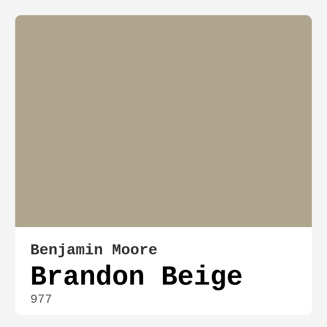
Color Preview & Key Details
| HEX Code | #AFA58F |
| RGB | 175, 165, 143 |
| LRV | 37.86% |
| Undertone | Red |
| Finish Options | Eggshell, Matte, Satin |
Have you ever walked into a room and instantly felt at home? There’s something magical about color that can transform a space from ordinary to extraordinary. One color that embodies this warmth and comfort is Brandon Beige by Benjamin Moore. This soft, inviting hue perfectly captures the essence of tranquility and is an ideal choice for anyone looking to create a cozy atmosphere in their home.
Brandon Beige, with its subtle blend of gray and tan undertones, serves as a versatile backdrop for any room. Imagine stepping into your living room, surrounded by this warm greige that wraps you in comfort. It’s a color that feels both modern and timeless, making it suitable for a variety of decor styles, from rustic farmhouse to sleek coastal aesthetics.
One of the standout features of Brandon Beige is its adaptability to different lighting conditions. Whether it’s basking in natural sunlight or basking in the glow of soft evening lamps, this color can shift slightly to enhance its inviting quality. During the day, it reflects light beautifully, brightening up your space without being too harsh. In the evening, it takes on a cozy, grounded feel, making it perfect for winding down after a long day.
Now, let’s talk application. You might be wondering how to best apply this lovely shade. Using a high-quality roller for larger surfaces will give you a smooth finish, while a brush is ideal for corners and edges. It’s crucial to prep your walls properly by cleaning and priming where necessary. Depending on the original wall color and the surface, you might need two coats for optimal coverage. Just remember to let the first coat dry completely before applying the second. This will ensure a uniform finish that showcases the beauty of Brandon Beige.
You may be concerned about using such a warm color in a small room. Rest assured, Brandon Beige can actually make a small space feel inviting without overwhelming it. Just keep an eye on your lighting conditions; in darker spaces, it may appear a bit deeper. Pair it with lighter furnishings or accents, and you’ll create a breathable, airy environment that doesn’t feel cramped.
Brandon Beige works brilliantly in various rooms throughout your home. From the living room to the bedroom, dining room, or even a home office, this hue creates a serene environment perfect for relaxation and productivity. Imagine hosting a dinner party with friends, the warm tones of Brandon Beige providing an inviting backdrop as you share laughter and stories over a delicious meal. It’s a color that fosters connection and warmth, bringing people together in a cozy atmosphere.
Another advantage of Brandon Beige is its washability. Life happens — spills, scuffs, and fingerprints are a part of daily living. With this paint, you won’t need to worry. It’s highly washable and scrubbable, making it an excellent choice for families and those who entertain frequently. Plus, with its low VOC levels, you can enjoy the peace of mind that comes with using a more eco-friendly product in your home.
For those concerned about coordinating colors and decor, Brandon Beige is remarkably versatile. It pairs beautifully with a range of colors, from rich, dark hues to bright, airy tones. Consider classic white trim for a clean contrast, or brass fixtures for a touch of elegance. The warm undertones of Brandon Beige lend themselves well to earthy palettes, making it easy to integrate into existing decor. You could even play with complementary shades like soft blues and greens to create a refreshing yet cohesive look.
With an LRV (Light Reflectance Value) of around 37.86%, Brandon Beige reflects a moderate amount of light, which means it’s effective in brightening up spaces without being too stark. This quality makes it a fantastic choice for darker rooms or areas that don’t get much natural light. It’s also worth noting that while it’s generally beginner-friendly to apply, achieving full coverage may require a couple of coats, especially if you’re covering a darker color.
For those looking to explore further, you might consider some lighter or darker shades that complement Brandon Beige. Colors like 861, CSP-175, and 1535 can provide beautiful transitions or accents, while darker shades like 1525 and CW-35 can add depth to your palette. Brandon Beige truly shines when combined with these complementary hues, creating a harmonious look throughout your home.
So, is Brandon Beige the right choice for your next project? If you’re after a warm, inviting atmosphere that adapts beautifully to varying light conditions, this color is a fantastic option. Its ability to create a cozy, grounded mood makes it ideal for living spaces where you want to feel relaxed and at home. With its neutral yet sophisticated tone, Brandon Beige offers the perfect backdrop for your personal style, allowing your decor to take center stage while still providing comfort and warmth.
In conclusion, Brandon Beige by Benjamin Moore is not just a paint color; it’s a pathway to creating a home that feels like a sanctuary. Its versatility, washability, and cozy vibe make it an ideal choice for anyone looking to enhance their interior spaces. So, grab that paintbrush and get ready to transform your home into a welcoming retreat. After all, the right color can change everything, and Brandon Beige just might be the perfect fit for your next project.
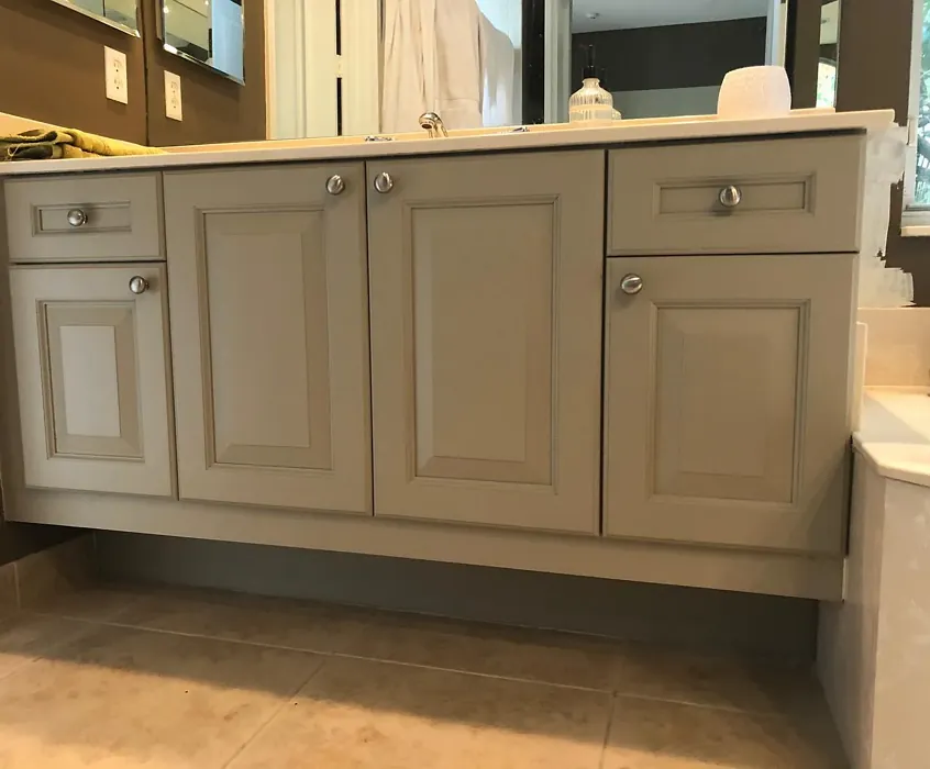
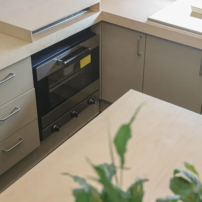
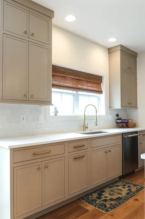
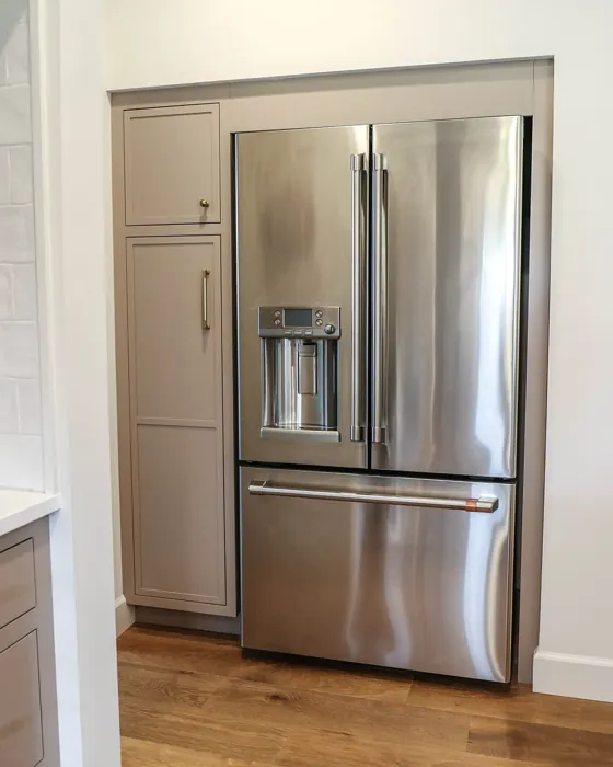
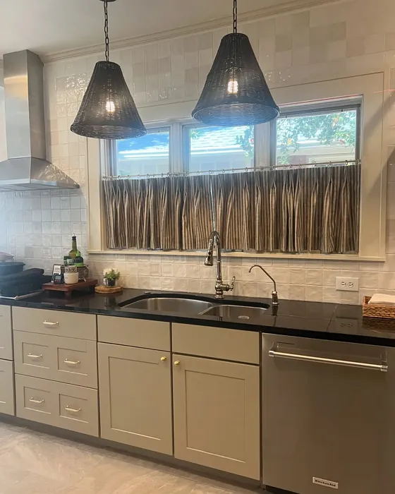
Real Room Photo of Brandon Beige 977


Undertones of Brandon Beige ?
Brandon Beige leans towards a soft gray undertone, offering a refined touch to its beige base. This subtle hint gives it depth and complexity, allowing it to work harmoniously with various colors in your space.
HEX value: #AFA58F
RGB code: 175, 165, 143
Is Brandon Beige Cool or Warm?
This color is predominantly warm, making it a comforting option for those looking to create a cozy atmosphere. The warmth invites a sense of relaxation and peace, perfect for living areas and bedrooms.
Understanding Color Properties and Interior Design Tips
Hue refers to a specific position on the color wheel, measured in degrees from 0 to 360. Each degree represents a different pure color:
- 0° represents red
- 120° represents green
- 240° represents blue
Saturation describes the intensity or purity of a color and is expressed as a percentage:
- At 0%, the color appears completely desaturated—essentially a shade of gray
- At 100%, the color is at its most vivid and vibrant
Lightness indicates how light or dark a color is, also expressed as a percentage:
- 0% lightness results in black
- 100% lightness results in white
Using Warm Colors in Interior Design
Warm hues—such as reds, oranges, yellows, warm beiges, and greiges—are excellent choices for creating inviting and energetic spaces. These colors are particularly well-suited for:
- Kitchens, living rooms, and bathrooms, where warmth enhances comfort and sociability
- Large rooms, where warm tones can help reduce the sense of emptiness and make the space feel more intimate
For example:
- Warm beige shades provide a cozy, inviting atmosphere, ideal for living rooms, bedrooms, and hallways.
- Warm greige (a mix of beige and gray) offers the warmth of beige with the modern appeal of gray, making it a versatile backdrop for dining areas, bedrooms, and living spaces.
However, be mindful when using warm light tones in rooms with limited natural light. These shades may appear muted or even take on an unpleasant yellowish tint. To avoid a dull or flat appearance:
- Add depth by incorporating richer tones like deep greens, charcoal, or chocolate brown
- Use textured elements such as curtains, rugs, or cushions to bring dimension to the space
Pro Tip: Achieving Harmony with Warm and Cool Color Balance
To create a well-balanced and visually interesting interior, mix warm and cool tones strategically. This contrast adds depth and harmony to your design.
- If your walls feature warm hues, introduce cool-colored accents such as blue or green furniture, artwork, or accessories to create contrast.
- For a polished look, consider using a complementary color scheme, which pairs colors opposite each other on the color wheel (e.g., red with green, orange with blue).
This thoughtful mix not only enhances visual appeal but also creates a space that feels both dynamic and cohesive.
Light Temperature Affects on Brandon Beige
Natural Light
Natural daylight changes in color temperature as the sun moves across the sky. At sunrise and sunset, the light tends to have a warm, golden tone with a color temperature around 2000 Kelvin (K). As the day progresses and the sun rises higher, the light becomes cooler and more neutral. Around midday, especially when the sky is clear, natural light typically reaches its peak brightness and shifts to a cooler tone, ranging from 5500 to 6500 Kelvin. This midday light is close to what we perceive as pure white or daylight-balanced light.
These shifts in natural light can significantly influence how colors appear in a space, which is why designers often consider both the time of day and the orientation of windows when planning interior color schemes.
Artificial Light
When choosing artificial lighting, pay close attention to the color temperature, measured in Kelvin (K). This determines how warm or cool the light will appear. Lower temperatures, around 2700K, give off a warm, yellow glow often used in living rooms or bedrooms. Higher temperatures, above 5000K, create a cool, bluish light similar to daylight, commonly used in kitchens, offices, or task areas.
Use the slider to see how lighting temperature can affect the appearance of a surface or color throughout a space.


4800K
LRV of Brandon Beige
With a Light Reflectance Value (LRV) of 52, Brandon Beige reflects a moderate amount of light, making it effective in brightening up spaces without being too stark or overpowering.
Detailed Review of Brandon Beige
Additional Paint Characteristics
Ideal Rooms
Bedroom, Dining Room, Home Office, Living Room
Decor Styles
Coastal, Modern Farmhouse, Rustic, Transitional
Coverage
Good (1–2 Coats), Touch-Up Friendly
Ease of Application
Beginner Friendly, Brush Smooth, Roller-Ready
Washability
Highly Washable, Scrubbable, Washable
VOC Level
Eco-Certified, Low VOC
Best Use
Accent Wall, Interior Walls, Trim
Room Suitability
Bedroom, Dining Room, Home Office, Living Room
Tone Tag
Earthy, Neutral, Warm
Finish Type
Eggshell, Satin
Paint Performance
Easy Touch-Up, High Coverage, Low Odor, Scuff Resistant
Use Cases
Best for Modern Farmhouse, Best for Rentals, Classic Favorite
Mood
Cozy, Grounding, Inviting
Trim Pairing
Complements Brass Fixtures, Good with Wood Trim, Pairs with White Dove
Brandon Beige is a fantastic choice for anyone who wants a warm, inviting atmosphere in their home. The color strikes a perfect balance, making it suitable for both modern and traditional decor styles. Whether you are painting an accent wall or an entire room, its soft tone helps to create a serene environment. One of its standout features is its ability to adapt to varying lighting, appearing slightly different in daylight compared to evening light. This adaptability makes it a great choice for spaces where natural light varies significantly throughout the day. Plus, it pairs beautifully with both dark and light furnishings, allowing for flexibility in your decor choices. Overall, Brandon Beige is a reliable go-to for homeowners looking to create a cozy yet sophisticated feel.
Pros & Cons of 977 Brandon Beige
Pros
Cons
Colors that go with Benjamin Moore Brandon Beige
FAQ on 977 Brandon Beige
What is the best way to apply Brandon Beige?
For the best results, use a high-quality roller for larger surfaces and a brush for corners and edges. Make sure to properly prep the walls by cleaning and priming where necessary. Depending on the surface and the original wall color, you might need two coats for optimal coverage. Always allow the first coat to fully dry before applying the second coat to achieve a uniform finish.
Can I use Brandon Beige in a small room?
Absolutely! While Brandon Beige is a warm and cozy color, it can make a small room feel inviting without being too overwhelming. Just be mindful of the lighting conditions; in darker spaces, it may appear slightly deeper. Pair it with lighter furnishings or accents to keep the room feeling airy and open.
Comparisons Brandon Beige with other colors
Brandon Beige 977 vs Accessible Beige SW 7036
| Attribute | Brandon Beige 977 | Accessible Beige SW 7036 |
|---|---|---|
| Color Name | Brandon Beige 977 | Accessible Beige SW 7036 |
| Color | ||
| Hue | Greige | Greige |
| Brightness | Medium | Medium |
| RGB | 175, 165, 143 | 209, 199, 184 |
| LRV | 37.86% | 58% |
| Finish Type | Eggshell, Satin | Eggshell, Matte, Satin |
| Finish Options | Eggshell, Matte, Satin | Eggshell, Matte, Satin |
| Ideal Rooms | Bedroom, Dining Room, Home Office, Living Room | Bedroom, Dining Room, Home Office, Kitchen, Living Room |
| Decor Styles | Coastal, Modern Farmhouse, Rustic, Transitional | Bohemian, Contemporary, Modern Farmhouse, Traditional, Transitional |
| Coverage | Good (1–2 Coats), Touch-Up Friendly | Good (1–2 Coats), Touch-Up Friendly |
| Ease of Application | Beginner Friendly, Brush Smooth, Roller-Ready | Beginner Friendly, Brush Smooth, Roller-Ready |
| Washability | Highly Washable, Scrubbable, Washable | Highly Washable, Washable |
| Room Suitability | Bedroom, Dining Room, Home Office, Living Room | Bedroom, Dining Room, Home Office, Kitchen, Living Room |
| Tone | Earthy, Neutral, Warm | Earthy, Neutral, Warm |
| Paint Performance | Easy Touch-Up, High Coverage, Low Odor, Scuff Resistant | Easy Touch-Up, Fade Resistant, High Coverage, Low Odor |
Brandon Beige 977 vs Jogging Path SW 7638
| Attribute | Brandon Beige 977 | Jogging Path SW 7638 |
|---|---|---|
| Color Name | Brandon Beige 977 | Jogging Path SW 7638 |
| Color | ||
| Hue | Greige | Greige |
| Brightness | Medium | Medium |
| RGB | 175, 165, 143 | 192, 185, 169 |
| LRV | 37.86% | 15% |
| Finish Type | Eggshell, Satin | Eggshell, Matte |
| Finish Options | Eggshell, Matte, Satin | Eggshell, Matte, Satin |
| Ideal Rooms | Bedroom, Dining Room, Home Office, Living Room | Bedroom, Dining Room, Hallway, Home Office, Kitchen, Living Room |
| Decor Styles | Coastal, Modern Farmhouse, Rustic, Transitional | Modern, Rustic, Scandinavian, Transitional |
| Coverage | Good (1–2 Coats), Touch-Up Friendly | Good (1–2 Coats), Touch-Up Friendly |
| Ease of Application | Beginner Friendly, Brush Smooth, Roller-Ready | Beginner Friendly, Brush Smooth, Fast-Drying, Roller-Ready |
| Washability | Highly Washable, Scrubbable, Washable | Washable, Wipeable |
| Room Suitability | Bedroom, Dining Room, Home Office, Living Room | Bedroom, Dining Room, Home Office, Living Room |
| Tone | Earthy, Neutral, Warm | Balanced, Earthy, Muted, Warm |
| Paint Performance | Easy Touch-Up, High Coverage, Low Odor, Scuff Resistant | Easy Touch-Up, Fade Resistant, Low Odor |
Brandon Beige 977 vs Antler Velvet SW 9111
| Attribute | Brandon Beige 977 | Antler Velvet SW 9111 |
|---|---|---|
| Color Name | Brandon Beige 977 | Antler Velvet SW 9111 |
| Color | ||
| Hue | Greige | Greige |
| Brightness | Medium | Medium |
| RGB | 175, 165, 143 | 192, 173, 150 |
| LRV | 37.86% | 6% |
| Finish Type | Eggshell, Satin | Eggshell, Matte |
| Finish Options | Eggshell, Matte, Satin | Eggshell, Matte, Satin |
| Ideal Rooms | Bedroom, Dining Room, Home Office, Living Room | Bedroom, Dining Room, Home Office, Living Room, Nursery |
| Decor Styles | Coastal, Modern Farmhouse, Rustic, Transitional | Contemporary, Modern Farmhouse, Rustic, Transitional |
| Coverage | Good (1–2 Coats), Touch-Up Friendly | Good (1–2 Coats) |
| Ease of Application | Beginner Friendly, Brush Smooth, Roller-Ready | Beginner Friendly, Brush Smooth, Fast-Drying, Roller-Ready |
| Washability | Highly Washable, Scrubbable, Washable | Scrubbable, Washable, Wipeable |
| Room Suitability | Bedroom, Dining Room, Home Office, Living Room | Bedroom, Dining Room, Home Office, Living Room |
| Tone | Earthy, Neutral, Warm | Earthy, Muted, Warm |
| Paint Performance | Easy Touch-Up, High Coverage, Low Odor, Scuff Resistant | Easy Touch-Up, High Coverage, Low Odor, Quick Drying |
Brandon Beige 977 vs Perfect Greige SW 6073
| Attribute | Brandon Beige 977 | Perfect Greige SW 6073 |
|---|---|---|
| Color Name | Brandon Beige 977 | Perfect Greige SW 6073 |
| Color | ||
| Hue | Greige | Greige |
| Brightness | Medium | Medium |
| RGB | 175, 165, 143 | 183, 171, 159 |
| LRV | 37.86% | 38% |
| Finish Type | Eggshell, Satin | Eggshell, Matte, Satin |
| Finish Options | Eggshell, Matte, Satin | Eggshell, Matte, Satin |
| Ideal Rooms | Bedroom, Dining Room, Home Office, Living Room | Bathroom, Bedroom, Dining Room, Entryway, Home Office, Kitchen, Living Room |
| Decor Styles | Coastal, Modern Farmhouse, Rustic, Transitional | Contemporary, Farmhouse, Modern, Traditional, Transitional |
| Coverage | Good (1–2 Coats), Touch-Up Friendly | Good (1–2 Coats), Touch-Up Friendly |
| Ease of Application | Beginner Friendly, Brush Smooth, Roller-Ready | Beginner Friendly, Brush Smooth, Roller-Ready |
| Washability | Highly Washable, Scrubbable, Washable | Highly Washable, Washable |
| Room Suitability | Bedroom, Dining Room, Home Office, Living Room | Bedroom, Dining Room, Home Office, Kitchen, Living Room |
| Tone | Earthy, Neutral, Warm | Muted, Neutral, Warm |
| Paint Performance | Easy Touch-Up, High Coverage, Low Odor, Scuff Resistant | Easy Touch-Up, Low Odor, Scuff Resistant |
Brandon Beige 977 vs Analytical Gray SW 7051
| Attribute | Brandon Beige 977 | Analytical Gray SW 7051 |
|---|---|---|
| Color Name | Brandon Beige 977 | Analytical Gray SW 7051 |
| Color | ||
| Hue | Greige | Greige |
| Brightness | Medium | Medium |
| RGB | 175, 165, 143 | 191, 182, 167 |
| LRV | 37.86% | 60% |
| Finish Type | Eggshell, Satin | Eggshell, Matte, Satin |
| Finish Options | Eggshell, Matte, Satin | Eggshell, Matte, Satin |
| Ideal Rooms | Bedroom, Dining Room, Home Office, Living Room | Bedroom, Dining Room, Hallway, Home Office, Living Room |
| Decor Styles | Coastal, Modern Farmhouse, Rustic, Transitional | Farmhouse, Modern, Scandinavian, Transitional |
| Coverage | Good (1–2 Coats), Touch-Up Friendly | Good (1–2 Coats) |
| Ease of Application | Beginner Friendly, Brush Smooth, Roller-Ready | Beginner Friendly, Brush Smooth, Roller-Ready |
| Washability | Highly Washable, Scrubbable, Washable | Highly Washable, Washable |
| Room Suitability | Bedroom, Dining Room, Home Office, Living Room | Bedroom, Dining Room, Home Office, Living Room |
| Tone | Earthy, Neutral, Warm | Balanced, Neutral, Warm |
| Paint Performance | Easy Touch-Up, High Coverage, Low Odor, Scuff Resistant | Easy Touch-Up, High Coverage, Low Odor |
Brandon Beige 977 vs Relaxed Khaki SW 6149
| Attribute | Brandon Beige 977 | Relaxed Khaki SW 6149 |
|---|---|---|
| Color Name | Brandon Beige 977 | Relaxed Khaki SW 6149 |
| Color | ||
| Hue | Greige | Greige |
| Brightness | Medium | Medium |
| RGB | 175, 165, 143 | 200, 187, 163 |
| LRV | 37.86% | 40% |
| Finish Type | Eggshell, Satin | Eggshell, Matte, Satin |
| Finish Options | Eggshell, Matte, Satin | Eggshell, Matte, Satin |
| Ideal Rooms | Bedroom, Dining Room, Home Office, Living Room | Bedroom, Dining Room, Home Office, Kitchen, Living Room |
| Decor Styles | Coastal, Modern Farmhouse, Rustic, Transitional | Contemporary, Modern Farmhouse, Rustic, Traditional |
| Coverage | Good (1–2 Coats), Touch-Up Friendly | Good (1–2 Coats), Touch-Up Friendly |
| Ease of Application | Beginner Friendly, Brush Smooth, Roller-Ready | Beginner Friendly, Brush Smooth, Roller-Ready |
| Washability | Highly Washable, Scrubbable, Washable | Washable, Wipeable |
| Room Suitability | Bedroom, Dining Room, Home Office, Living Room | Bedroom, Dining Room, Home Office, Living Room |
| Tone | Earthy, Neutral, Warm | Earthy, Muted, Warm |
| Paint Performance | Easy Touch-Up, High Coverage, Low Odor, Scuff Resistant | Easy Touch-Up, Low Odor, Scuff Resistant |
Brandon Beige 977 vs Sage SW 2860
| Attribute | Brandon Beige 977 | Sage SW 2860 |
|---|---|---|
| Color Name | Brandon Beige 977 | Sage SW 2860 |
| Color | ||
| Hue | Greige | Greige |
| Brightness | Medium | Medium |
| RGB | 175, 165, 143 | 179, 174, 149 |
| LRV | 37.86% | 24% |
| Finish Type | Eggshell, Satin | Eggshell, Matte, Satin |
| Finish Options | Eggshell, Matte, Satin | Eggshell, Matte, Satin |
| Ideal Rooms | Bedroom, Dining Room, Home Office, Living Room | Bathroom, Bedroom, Home Office, Kitchen, Living Room |
| Decor Styles | Coastal, Modern Farmhouse, Rustic, Transitional | Bohemian, Farmhouse, Modern, Rustic, Traditional |
| Coverage | Good (1–2 Coats), Touch-Up Friendly | Good (1–2 Coats), Touch-Up Friendly |
| Ease of Application | Beginner Friendly, Brush Smooth, Roller-Ready | Beginner Friendly, Brush Smooth, Roller-Ready |
| Washability | Highly Washable, Scrubbable, Washable | Highly Washable, Washable |
| Room Suitability | Bedroom, Dining Room, Home Office, Living Room | Bathroom, Bedroom, Dining Room, Kitchen, Living Room |
| Tone | Earthy, Neutral, Warm | Earthy, Muted, Warm |
| Paint Performance | Easy Touch-Up, High Coverage, Low Odor, Scuff Resistant | Easy Touch-Up, Fade Resistant, Low Odor |
Brandon Beige 977 vs Worn Khaki SW 9527
| Attribute | Brandon Beige 977 | Worn Khaki SW 9527 |
|---|---|---|
| Color Name | Brandon Beige 977 | Worn Khaki SW 9527 |
| Color | ||
| Hue | Greige | Greige |
| Brightness | Medium | Medium |
| RGB | 175, 165, 143 | 166, 156, 129 |
| LRV | 37.86% | 38% |
| Finish Type | Eggshell, Satin | Eggshell, Matte, Satin |
| Finish Options | Eggshell, Matte, Satin | Eggshell, Matte, Satin |
| Ideal Rooms | Bedroom, Dining Room, Home Office, Living Room | Bedroom, Dining Room, Hallway, Home Office, Kitchen, Living Room |
| Decor Styles | Coastal, Modern Farmhouse, Rustic, Transitional | Bohemian, Eclectic, Modern Farmhouse, Rustic, Transitional |
| Coverage | Good (1–2 Coats), Touch-Up Friendly | Good (1–2 Coats), Touch-Up Friendly |
| Ease of Application | Beginner Friendly, Brush Smooth, Roller-Ready | Beginner Friendly, Brush Smooth, Roller-Ready |
| Washability | Highly Washable, Scrubbable, Washable | Washable, Wipeable |
| Room Suitability | Bedroom, Dining Room, Home Office, Living Room | Bedroom, Dining Room, Home Office, Kitchen, Living Room |
| Tone | Earthy, Neutral, Warm | Earthy, Neutral, Warm |
| Paint Performance | Easy Touch-Up, High Coverage, Low Odor, Scuff Resistant | Easy Touch-Up, High Coverage, Low Odor, Quick Drying |
Brandon Beige 977 vs Smokey Taupe 983
| Attribute | Brandon Beige 977 | Smokey Taupe 983 |
|---|---|---|
| Color Name | Brandon Beige 977 | Smokey Taupe 983 |
| Color | ||
| Hue | Greige | Greige |
| Brightness | Medium | Medium |
| RGB | 175, 165, 143 | 205, 196, 181 |
| LRV | 37.86% | 54.53% |
| Finish Type | Eggshell, Satin | Eggshell, Matte, Satin |
| Finish Options | Eggshell, Matte, Satin | Eggshell, Matte, Satin |
| Ideal Rooms | Bedroom, Dining Room, Home Office, Living Room | Bedroom, Dining Room, Entryway, Home Office, Living Room |
| Decor Styles | Coastal, Modern Farmhouse, Rustic, Transitional | Contemporary, Minimalist, Modern Farmhouse, Rustic, Transitional |
| Coverage | Good (1–2 Coats), Touch-Up Friendly | Good (1–2 Coats), High Hide, Touch-Up Friendly |
| Ease of Application | Beginner Friendly, Brush Smooth, Roller-Ready | Beginner Friendly, Brush Smooth, Fast-Drying, Roller-Ready |
| Washability | Highly Washable, Scrubbable, Washable | Highly Washable, Stain Resistant, Washable |
| Room Suitability | Bedroom, Dining Room, Home Office, Living Room | Bedroom, Dining Room, Entryway, Home Office, Living Room |
| Tone | Earthy, Neutral, Warm | Balanced, Earthy, Muted, Warm |
| Paint Performance | Easy Touch-Up, High Coverage, Low Odor, Scuff Resistant | Easy Touch-Up, High Coverage, Low Odor, Quick Drying, Scuff Resistant |
Brandon Beige 977 vs Pashmina AF-100
| Attribute | Brandon Beige 977 | Pashmina AF-100 |
|---|---|---|
| Color Name | Brandon Beige 977 | Pashmina AF-100 |
| Color | ||
| Hue | Greige | Greige |
| Brightness | Medium | Medium |
| RGB | 175, 165, 143 | 187, 178, 161 |
| LRV | 37.86% | 44.20% |
| Finish Type | Eggshell, Satin | Eggshell, Matte, Satin |
| Finish Options | Eggshell, Matte, Satin | Eggshell, Matte, Satin |
| Ideal Rooms | Bedroom, Dining Room, Home Office, Living Room | Bedroom, Hallway, Home Office, Living Room |
| Decor Styles | Coastal, Modern Farmhouse, Rustic, Transitional | Bohemian, Modern, Rustic, Traditional |
| Coverage | Good (1–2 Coats), Touch-Up Friendly | Good (1–2 Coats), Touch-Up Friendly |
| Ease of Application | Beginner Friendly, Brush Smooth, Roller-Ready | Beginner Friendly, Brush Smooth, Roller-Ready |
| Washability | Highly Washable, Scrubbable, Washable | Scrubbable, Stain Resistant, Washable |
| Room Suitability | Bedroom, Dining Room, Home Office, Living Room | Bedroom, Dining Room, Home Office, Living Room |
| Tone | Earthy, Neutral, Warm | Earthy, Neutral, Warm |
| Paint Performance | Easy Touch-Up, High Coverage, Low Odor, Scuff Resistant | Easy Touch-Up, High Coverage, Low Odor, Scuff Resistant |
Official Page of Benjamin Moore Brandon Beige 977