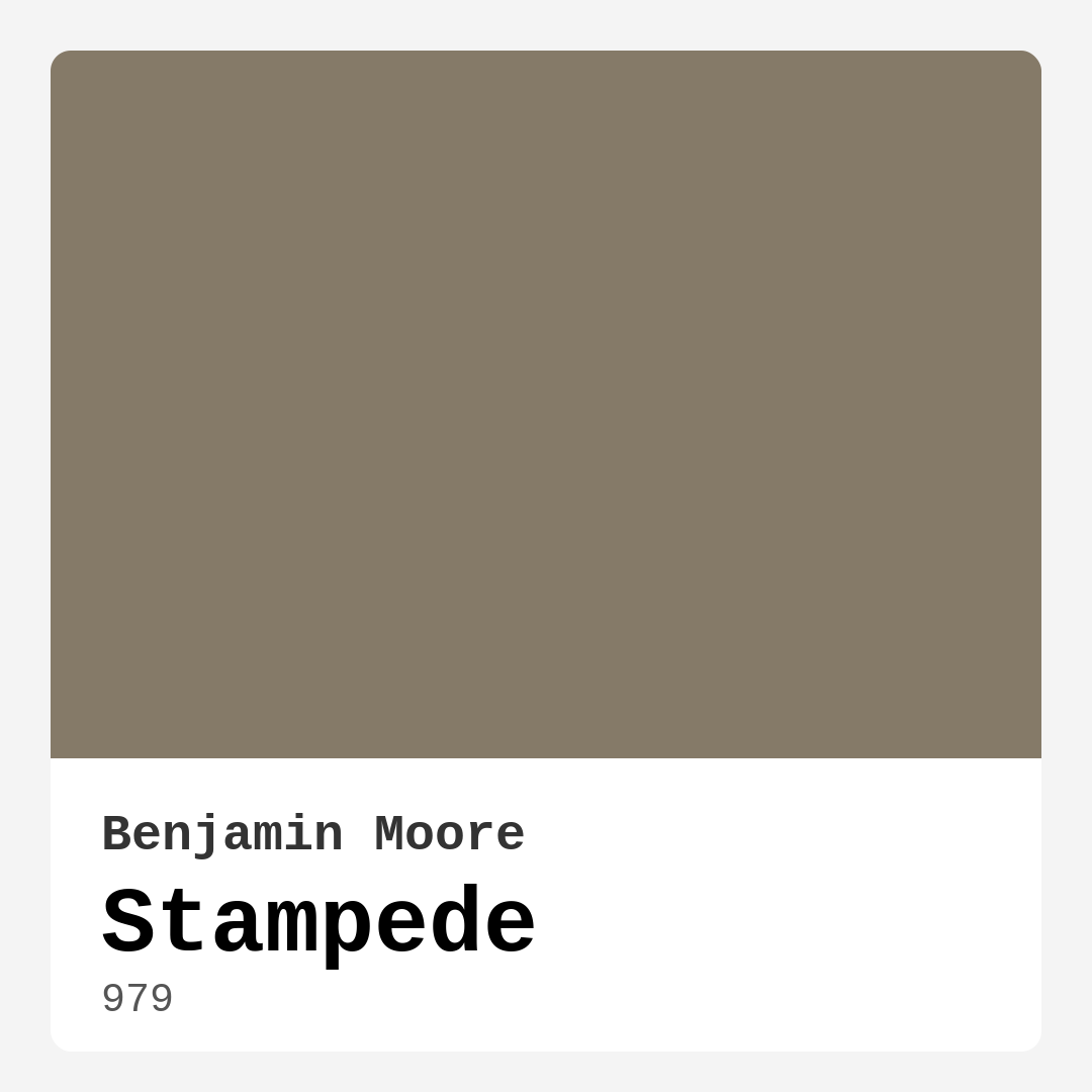
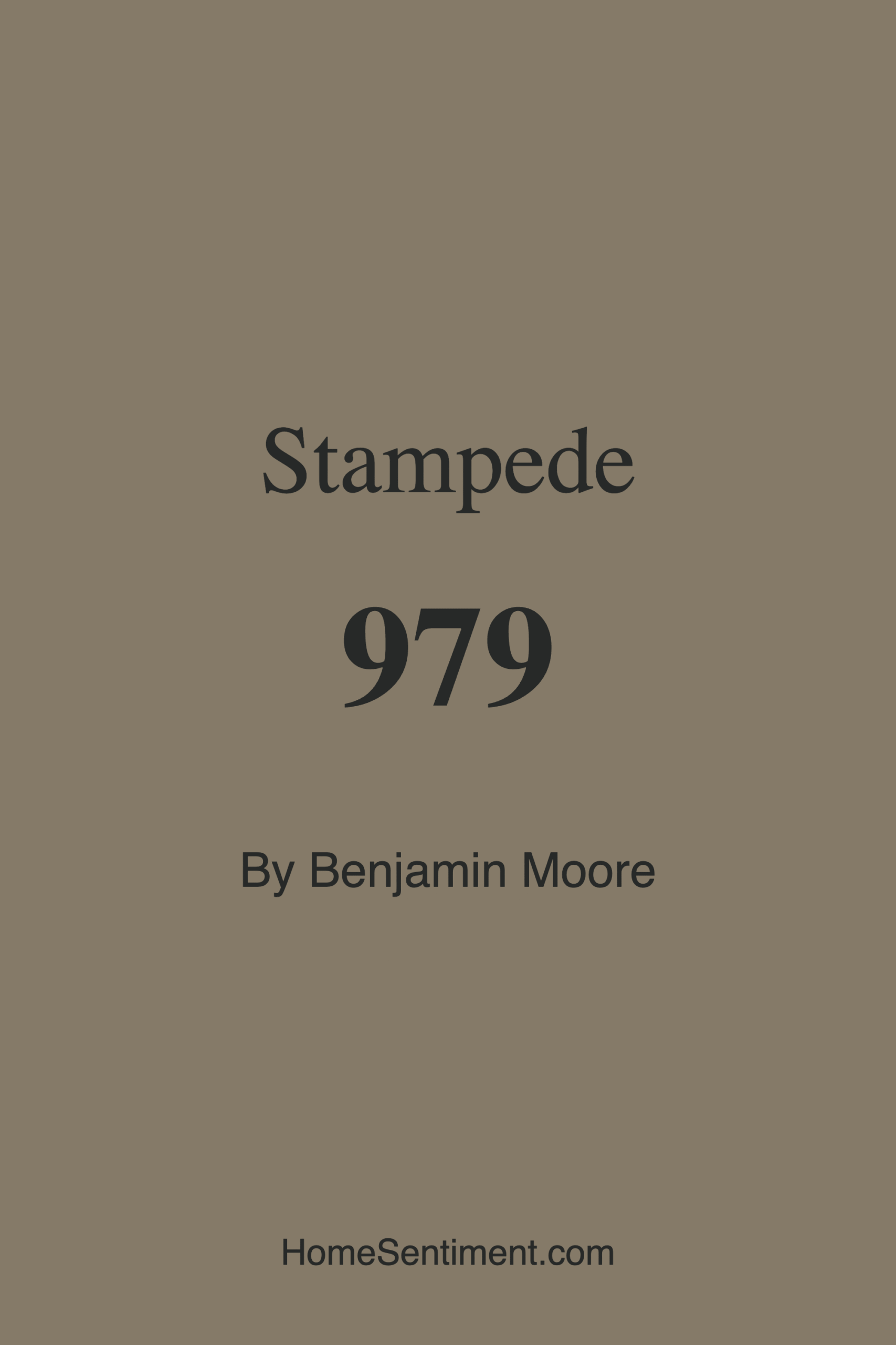
Color Preview & Key Details
| HEX Code | #857A68 |
| RGB | 133, 122, 104 |
| LRV | 20.32% |
| Undertone | Red |
| Finish Options | Eggshell, Matte, Satin |
If you’re searching for a paint color that effortlessly bridges the gap between warm and neutral, Benjamin Moore’s Stampede (979) might just be your perfect match. This rich, muted taupe—often described as a “greige” with a hint of warmth—brings a grounded, sophisticated feel to any space. Whether you’re refreshing a living room, designing a cozy bedroom, or updating kitchen cabinets, Stampede has the versatility to adapt while making a statement. Let’s dive into what makes this color so special and how you can use it to transform your home.
Stampede’s beauty lies in its balance. It’s not too gray, not too beige—just a beautifully blended mix of both, with subtle red undertones that add depth and warmth. These undertones give it a cozy, earthy vibe, making it ideal for creating inviting spaces. In natural light, the color comes alive, revealing its warm, sun-kissed qualities. Under artificial lighting, it holds its own, maintaining a welcoming ambiance without feeling flat or dull. That’s the magic of a well-balanced greige like Stampede—it adapts to its surroundings while keeping its character intact.
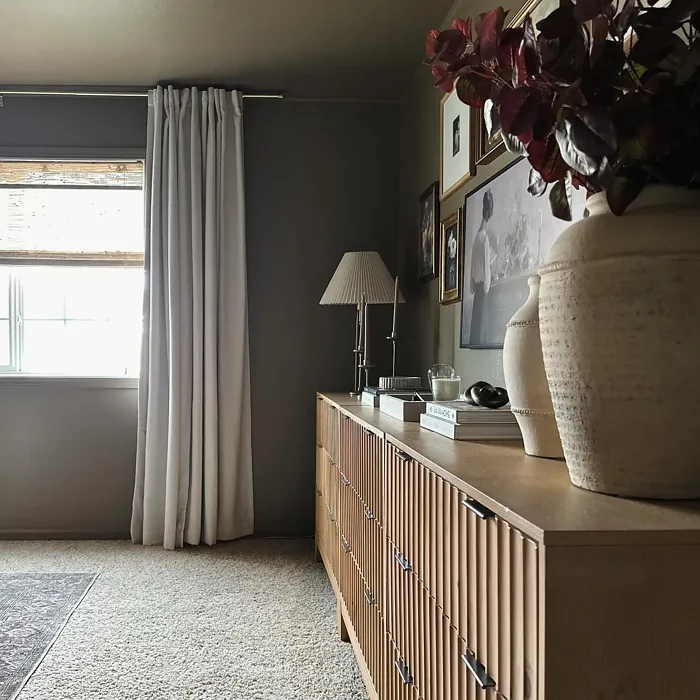
One of the standout features of Stampede is its versatility. It plays well with a variety of decor styles, from modern farmhouse to rustic, traditional, and even eclectic designs. Pair it with crisp white trim like Benjamin Moore’s White Dove for a clean, classic look, or layer it with deeper tones like navy or charcoal for a more dramatic effect. Because of its medium LRV (Light Reflectance Value) of 20.32%, it reflects a good amount of light, making it a great choice for rooms where you want warmth without sacrificing brightness. That said, in spaces with limited natural light, it can appear darker, so consider balancing it with lighter furnishings or accents to keep the room feeling open.
Application is a breeze with Stampede. Whether you’re a DIY beginner or a seasoned painter, you’ll appreciate how smoothly it goes on. It offers excellent coverage—usually one to two coats will do the trick—and it’s touch-up friendly, which is a lifesaver for busy households. The finish options (matte, satin, or eggshell) give you flexibility depending on the room’s needs. For walls, an eggshell or satin finish adds a subtle sheen that’s easy to clean, while matte works beautifully for ceilings or low-traffic areas where you want a softer look. And because it’s low-VOC and eco-certified, you can feel good about using it in your home.
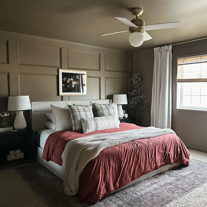
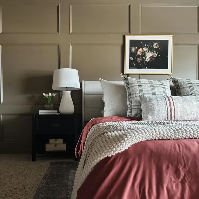
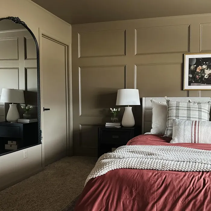
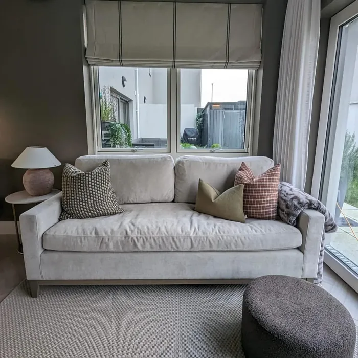
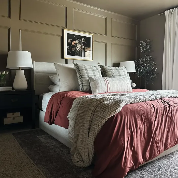
Wondering where Stampede works best? Let’s talk rooms. In a living room, it creates a warm, inviting backdrop that pairs effortlessly with leather furniture, woven textiles, or metallic accents. In a bedroom, it sets a serene, grounding mood—perfect for relaxation. For a home office, it strikes the right balance between professional and personal, making the space feel both focused and comfortable. And yes, it’s even a fantastic choice for kitchen cabinets. Its durability and wipeable finish make it practical for high-traffic areas, while its timeless hue ensures your kitchen won’t feel dated in a few years.
If you’re worried about committing to a darker shade, don’t be. Stampede’s warmth prevents it from feeling heavy or oppressive, even in smaller rooms. The key is to keep the rest of the space light and airy. Think creamy whites, soft linens, and plenty of natural textures to balance the depth of the color. And if you’re not ready to paint an entire room, consider an accent wall. Stampede makes a striking statement against lighter walls, adding dimension without overwhelming the space.
When it comes to pairing colors, Stampede is a team player. Its complementary shades—think soft blues, warm whites, and muted greens—enhance its natural elegance. For a harmonious palette, try pairing it with Benjamin Moore’s AF-570 (a soft blue-gray) or CW-660 (a warm white). These combinations create a layered, cohesive look that feels intentional and polished. And if you love contrast, deep charcoal or black accents can add a modern edge to Stampede’s warmth.
A few things to keep in mind: Because of its red undertones, Stampede can shift slightly depending on your lighting and surrounding colors. Always test a sample in your space before committing. Paint a large swatch and observe it at different times of day to see how it behaves. And remember, two coats will give you the richest, most even finish—so don’t skimp if you want the full effect.
At the end of the day, Stampede is more than just a paint color—it’s a mood. It’s the feeling of a cozy evening by the fire, the warmth of a well-loved book, the quiet elegance of a space that feels lived-in and intentional. Whether you’re refreshing a single room or reimagining your entire home, Stampede offers the perfect blend of sophistication and comfort. So grab a brush, roll up your sleeves, and get ready to fall in love with your walls all over again.
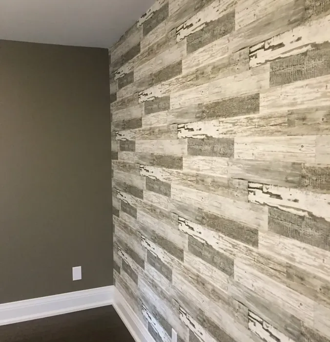
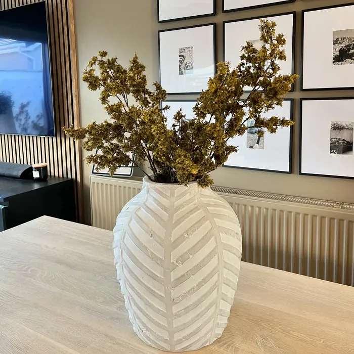
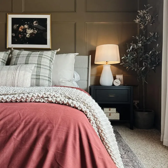
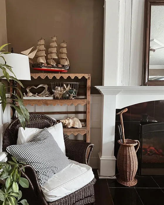
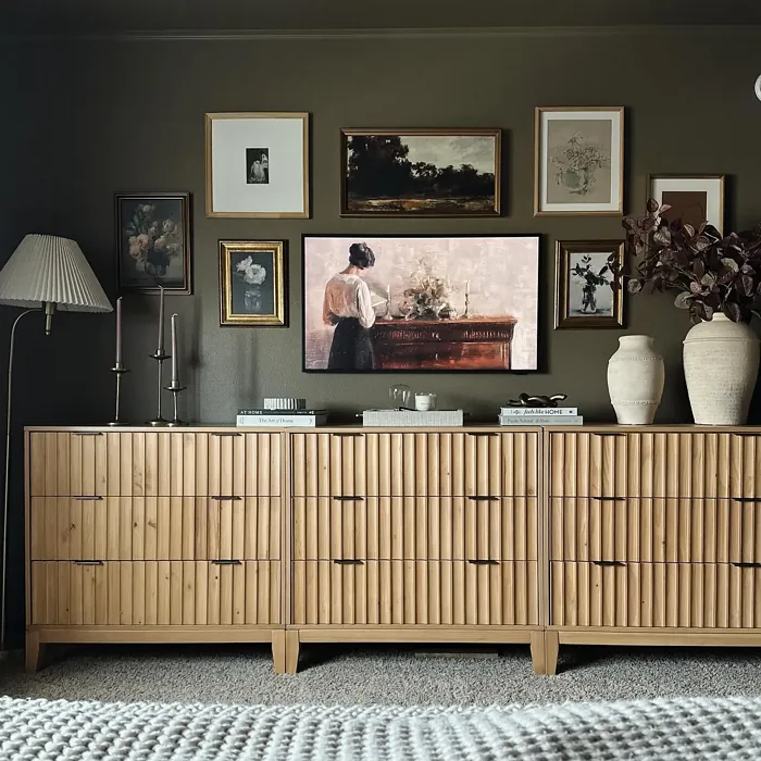
Real Room Photo of Stampede 979
Undertones of Stampede ?
The undertones of Stampede are a key aspect of its character, leaning towards Red. These subtle underlying hues are what give the color its depth and complexity. For example, a gray with a blue undertone will feel cooler and more modern, while one with a brown undertone will feel warmer and more traditional. It’s essential to test this paint in your home and observe it next to your existing furniture, flooring, and decor to see how these undertones interact and reveal themselves throughout the day.
HEX value: #857A68
RGB code: 133, 122, 104
Is Stampede Cool or Warm?
Stampede leans warm, making it perfect for creating cozy environments that feel welcoming and comfortable.
Understanding Color Properties and Interior Design Tips
Hue refers to a specific position on the color wheel, measured in degrees from 0 to 360. Each degree represents a different pure color:
- 0° represents red
- 120° represents green
- 240° represents blue
Saturation describes the intensity or purity of a color and is expressed as a percentage:
- At 0%, the color appears completely desaturated—essentially a shade of gray
- At 100%, the color is at its most vivid and vibrant
Lightness indicates how light or dark a color is, also expressed as a percentage:
- 0% lightness results in black
- 100% lightness results in white
Using Warm Colors in Interior Design
Warm hues—such as reds, oranges, yellows, warm beiges, and greiges—are excellent choices for creating inviting and energetic spaces. These colors are particularly well-suited for:
- Kitchens, living rooms, and bathrooms, where warmth enhances comfort and sociability
- Large rooms, where warm tones can help reduce the sense of emptiness and make the space feel more intimate
For example:
- Warm beige shades provide a cozy, inviting atmosphere, ideal for living rooms, bedrooms, and hallways.
- Warm greige (a mix of beige and gray) offers the warmth of beige with the modern appeal of gray, making it a versatile backdrop for dining areas, bedrooms, and living spaces.
However, be mindful when using warm light tones in rooms with limited natural light. These shades may appear muted or even take on an unpleasant yellowish tint. To avoid a dull or flat appearance:
- Add depth by incorporating richer tones like deep greens, charcoal, or chocolate brown
- Use textured elements such as curtains, rugs, or cushions to bring dimension to the space
Pro Tip: Achieving Harmony with Warm and Cool Color Balance
To create a well-balanced and visually interesting interior, mix warm and cool tones strategically. This contrast adds depth and harmony to your design.
- If your walls feature warm hues, introduce cool-colored accents such as blue or green furniture, artwork, or accessories to create contrast.
- For a polished look, consider using a complementary color scheme, which pairs colors opposite each other on the color wheel (e.g., red with green, orange with blue).
This thoughtful mix not only enhances visual appeal but also creates a space that feels both dynamic and cohesive.
Light Temperature Affects on Stampede
Natural Light
Natural daylight changes in color temperature as the sun moves across the sky. At sunrise and sunset, the light tends to have a warm, golden tone with a color temperature around 2000 Kelvin (K). As the day progresses and the sun rises higher, the light becomes cooler and more neutral. Around midday, especially when the sky is clear, natural light typically reaches its peak brightness and shifts to a cooler tone, ranging from 5500 to 6500 Kelvin. This midday light is close to what we perceive as pure white or daylight-balanced light.
These shifts in natural light can significantly influence how colors appear in a space, which is why designers often consider both the time of day and the orientation of windows when planning interior color schemes.
Artificial Light
When choosing artificial lighting, pay close attention to the color temperature, measured in Kelvin (K). This determines how warm or cool the light will appear. Lower temperatures, around 2700K, give off a warm, yellow glow often used in living rooms or bedrooms. Higher temperatures, above 5000K, create a cool, bluish light similar to daylight, commonly used in kitchens, offices, or task areas.
Use the slider to see how lighting temperature can affect the appearance of a surface or color throughout a space.


4800K
LRV of Stampede
The Light Reflectance Value (LRV) of Stampede is 20.32%, which places it in the Medium colors category. This means it reflect a lot of light. Understanding a paint’s LRV is crucial for predicting how it will look in your space. A higher LRV indicates a lighter color that reflects more light, making rooms feel larger and brighter. A lower LRV signifies a darker color that absorbs more light, creating a cozier, more intimate atmosphere. Always consider the natural and artificial lighting in your room when selecting a paint color based on its LRV.
Detailed Review of Stampede
Additional Paint Characteristics
Ideal Rooms
Bedroom, Dining Room, Home Office, Kitchen, Living Room
Decor Styles
Eclectic, Modern Farmhouse, Rustic, Traditional
Coverage
Good (1–2 Coats), Touch-Up Friendly
Ease of Application
Beginner Friendly, Brush Smooth, Roller-Ready
Washability
Washable, Wipeable
VOC Level
Eco-Certified, Low VOC
Best Use
Accent Wall, Cabinets, Interior Walls
Room Suitability
Bedroom, Dining Room, Home Office, Living Room
Tone Tag
Earthy, Muted, Warm
Finish Type
Eggshell, Matte, Satin
Paint Performance
Low Odor, Quick Drying, Scuff Resistant
Use Cases
Best for Rentals, Classic Favorite, Designer Favorite
Mood
Cozy, Grounding, Inviting
Trim Pairing
Complements Warm Trim, Matches Pure White, Pairs with White Dove
Stampede stands out with its unique blend of warmth and neutrality, making it a top choice for homeowners seeking a versatile paint. The color easily complements both light and dark furnishings, allowing for seamless integration into various decor styles. Application is a breeze, thanks to its smooth consistency that glides on effortlessly, providing good coverage with minimal effort. Expect a clean finish that enhances the overall aesthetic of your space without overwhelming it. Whether you’re painting an entire room or just an accent wall, Stampede delivers a beautiful result that feels both modern and classic. Overall, this paint is a fantastic choice for anyone looking to elevate their interior spaces with a touch of sophistication.
Pros & Cons of 979 Stampede
Pros
Cons
Colors that go with Benjamin Moore Stampede
FAQ on 979 Stampede
Can I use Stampede in a small room?
Absolutely! While Stampede is a warm color, it can work beautifully in small spaces. To enhance the feeling of openness, pair it with lighter accents and furnishings. This will create a cozy yet spacious ambiance that feels inviting and stylish.
Is Stampede suitable for kitchen cabinets?
Yes, Stampede is a great choice for kitchen cabinets! Its durable finish holds up well against daily wear and tear while offering a timeless look that complements various kitchen styles. Just ensure you use a suitable topcoat for added durability in high-traffic areas.
Comparisons Stampede with other colors
Stampede 979 vs Lauriston Stone SW 9593
| Attribute | Stampede 979 | Lauriston Stone SW 9593 |
|---|---|---|
| Color Name | Stampede 979 | Lauriston Stone SW 9593 |
| Color | ||
| Hue | Greige | Greige |
| Brightness | Dark | Dark |
| RGB | 133, 122, 104 | 134, 129, 114 |
| LRV | 20.32% | 48% |
| Finish Type | Eggshell, Matte, Satin | Eggshell, Matte, Satin |
| Finish Options | Eggshell, Matte, Satin | Eggshell, Matte, Satin |
| Ideal Rooms | Bedroom, Dining Room, Home Office, Kitchen, Living Room | Bathroom, Bedroom, Dining Room, Home Office, Kitchen, Living Room |
| Decor Styles | Eclectic, Modern Farmhouse, Rustic, Traditional | Minimalist, Modern, Rustic, Transitional |
| Coverage | Good (1–2 Coats), Touch-Up Friendly | Good (1–2 Coats), Touch-Up Friendly |
| Ease of Application | Beginner Friendly, Brush Smooth, Roller-Ready | Beginner Friendly, Brush Smooth, Roller-Ready |
| Washability | Washable, Wipeable | Highly Washable, Washable |
| Room Suitability | Bedroom, Dining Room, Home Office, Living Room | Bathroom, Bedroom, Dining Room, Kitchen, Living Room |
| Tone | Earthy, Muted, Warm | Earthy, Neutral, Warm |
| Paint Performance | Low Odor, Quick Drying, Scuff Resistant | Easy Touch-Up, Long Lasting, Low Odor |
Stampede 979 vs Adaptive Shade SW 7053
| Attribute | Stampede 979 | Adaptive Shade SW 7053 |
|---|---|---|
| Color Name | Stampede 979 | Adaptive Shade SW 7053 |
| Color | ||
| Hue | Greige | Greige |
| Brightness | Dark | Dark |
| RGB | 133, 122, 104 | 134, 126, 112 |
| LRV | 20.32% | 59% |
| Finish Type | Eggshell, Matte, Satin | Eggshell, Satin |
| Finish Options | Eggshell, Matte, Satin | Eggshell, Matte, Satin |
| Ideal Rooms | Bedroom, Dining Room, Home Office, Kitchen, Living Room | Bedroom, Dining Room, Home Office, Kitchen, Living Room |
| Decor Styles | Eclectic, Modern Farmhouse, Rustic, Traditional | Contemporary, Modern Farmhouse, Rustic, Transitional |
| Coverage | Good (1–2 Coats), Touch-Up Friendly | Good (1–2 Coats), Touch-Up Friendly |
| Ease of Application | Beginner Friendly, Brush Smooth, Roller-Ready | Beginner Friendly, Brush Smooth, Fast-Drying, Roller-Ready |
| Washability | Washable, Wipeable | Scrubbable, Stain Resistant, Washable |
| Room Suitability | Bedroom, Dining Room, Home Office, Living Room | Bedroom, Dining Room, Home Office, Living Room |
| Tone | Earthy, Muted, Warm | Earthy, Muted, Neutral, Warm |
| Paint Performance | Low Odor, Quick Drying, Scuff Resistant | Easy Touch-Up, Low Odor, Quick Drying, Scuff Resistant |
Official Page of Benjamin Moore Stampede 979