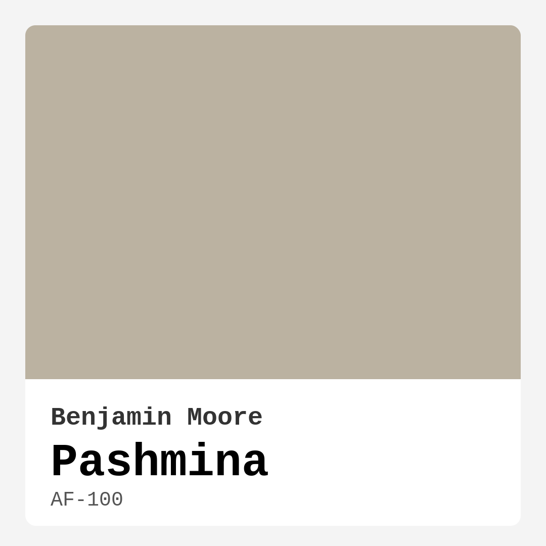
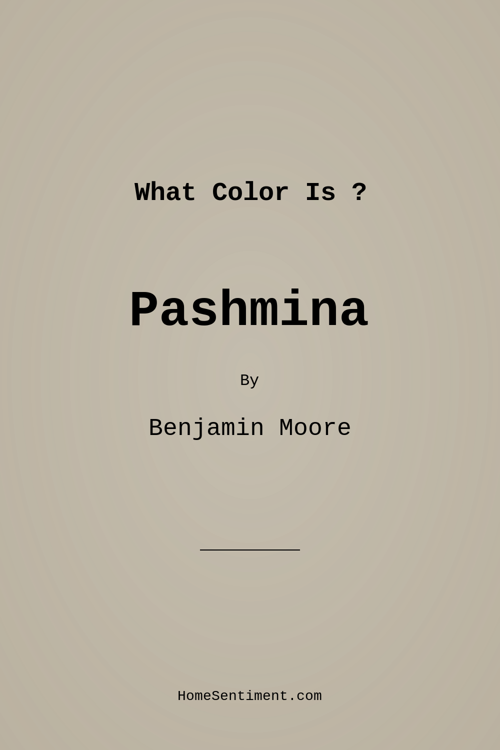
Color Preview & Key Details
| HEX Code | #BBB2A1 |
| RGB | 187, 178, 161 |
| LRV | 44.20% |
| Undertone | Red |
| Finish Options | Eggshell, Matte, Satin |
Picture this: you’re standing in your living room, the sunlight streaming through the windows, and you’re contemplating a refresh. You want something that feels warm, inviting, and effortlessly chic. You want a color that can adapt to your ever-changing decor style while also making your space feel cozy and lived-in. Enter Benjamin Moore’s Pashmina, a soft, warm taupe that’s here to transform your home into a sanctuary of comfort and style.
Pashmina is more than just a color; it’s an experience. With a hue tag of greige, it elegantly straddles the line between gray and beige, giving you that perfect neutral backdrop that’s anything but dull. Its medium brightness allows it to reflect a balanced amount of light, making it suitable for various settings, from sun-filled spaces to cozy corners bathed in softer lighting. The hex code #BBB2A1 captures this tone beautifully, showcasing its subtle warmth.
Now, let’s dive into what makes Pashmina such a fantastic choice. First off, it’s incredibly versatile. Whether your home leans toward modern minimalism, classic traditional, rustic charm, or even bohemian flair, Pashmina adapts effortlessly. It creates a seamless flow between different decor styles, allowing your furnishings and accents to shine. You can’t go wrong pairing it with a plush sofa or rustic wood furniture; it enhances and complements without overshadowing.
In terms of application, Pashmina is a dream. It goes on smoothly, whether you’re using a brush or a roller. Most people find that one coat provides decent coverage, but if you want to deepen the richness of the color, two coats will definitely give you that luxurious feel. It’s beginner-friendly, so if you’re thinking about tackling your painting project, you’ll find the process straightforward and satisfying. Plus, its washability and scrub resistance mean that your walls will stay looking fresh, even in high-traffic areas.
Let’s talk about light. Pashmina has a unique way of interacting with different lighting conditions. In bright, natural light, it showcases its taupe qualities, appearing soft and airy, perfect for a living room or dining area. However, in dimmer settings, it embraces a more grounded tone, making it ideal for bedrooms or cozy reading nooks. This adaptability helps maintain a consistent look throughout the day, ensuring that your space feels harmonious no matter the time.
One aspect to keep in mind is the presence of red undertones in Pashmina. This warmth creates an inviting atmosphere that can make a room feel more open and comfortable. However, it also means you’ll want to be careful with your color pairings. While it pairs beautifully with whites and cool tones, it’s wise to avoid overly bold colors that might clash. Instead, think about complementary shades like soft blues or muted greens to maintain that serene vibe.
For a small space, Pashmina works wonders. Its warm hue can make a room feel more expansive and welcoming. Pair it with lighter trims or accents to enhance the sense of space and light. This color truly shines in areas where comfort is key, such as a home office or a cozy bedroom. You’ll find that the warmth it brings creates a restful retreat from the hustle and bustle of the outside world.
Now, imagine Pashmina on your walls. It has a certain charm that speaks to a universal desire for homey comfort. Whether you choose a matte finish for a contemporary look or a satin sheen for added sophistication, you’re sure to love the result. It’s even low in VOCs, making it a healthier option for your home. You can breathe easy knowing that your beautiful walls won’t contribute to indoor air pollution.
Pashmina also lends itself well to touch-ups, so if you have kids or pets, this is a major plus. Life happens, and the occasional scuff or mark is inevitable. Thankfully, this color is easy to maintain, and you won’t have to paint an entire wall just to fix a small blemish.
As you consider your options, think about the mood you want to convey. Pashmina sets a cozy, inviting, and restful tone, making it perfect for creating a sanctuary-like environment. The warmth it offers can help foster connection and relaxation, making it ideal for spaces where you gather with family and friends.
When it comes to pairing Pashmina with trim, the options are plentiful. It works beautifully with crisp whites, such as Benjamin Moore’s White Dove, providing a fresh contrast that brightens your space. For a more dramatic look, consider complementary colors that lean into the cooler spectrum, enhancing the warmth of Pashmina while adding depth to your design.
As you stand in your freshly painted space, take a moment to appreciate how Pashmina wraps your rooms in warmth and character. Whether you’re hosting a dinner party, enjoying a quiet evening with a book, or simply basking in the glow of your well-lit home, this color will always be there, creating a harmonious backdrop to your life.
In conclusion, if you’re on the fence about which color to choose, Pashmina is a safe bet. Its adaptability, warmth, and subtle elegance make it a go-to for homeowners looking to create a space that feels both stylish and inviting. So go ahead, grab that paint can, and let Pashmina work its magic in your home. You won’t regret it.
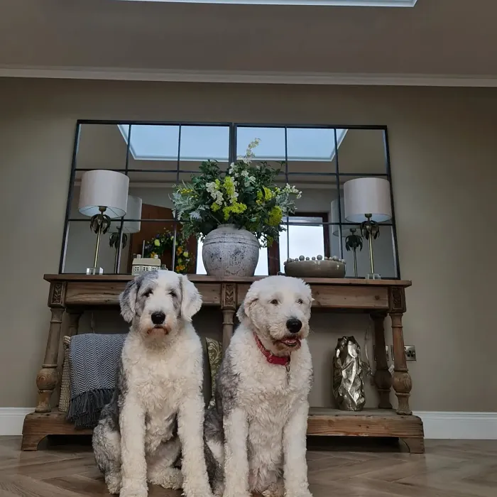
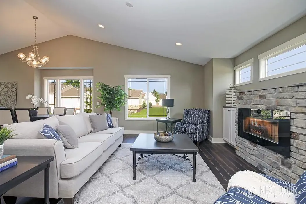
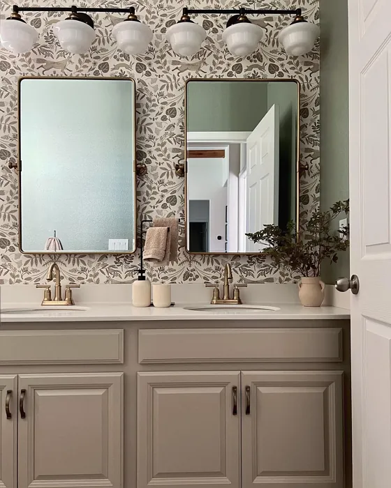
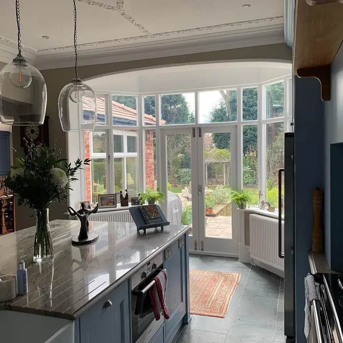
Real Room Photo of Pashmina AF-100
Undertones of Pashmina ?
This color features warm undertones, leaning slightly towards beige, which adds depth and softness to your walls. It’s a perfect choice for creating a welcoming atmosphere.
HEX value: #BBB2A1
RGB code: 187, 178, 161
Is Pashmina Cool or Warm?
Pashmina is firmly in the warm category, bringing a comforting feel to your home. Its warmth makes it an excellent choice for creating inviting spaces.
Understanding Color Properties and Interior Design Tips
Hue refers to a specific position on the color wheel, measured in degrees from 0 to 360. Each degree represents a different pure color:
- 0° represents red
- 120° represents green
- 240° represents blue
Saturation describes the intensity or purity of a color and is expressed as a percentage:
- At 0%, the color appears completely desaturated—essentially a shade of gray
- At 100%, the color is at its most vivid and vibrant
Lightness indicates how light or dark a color is, also expressed as a percentage:
- 0% lightness results in black
- 100% lightness results in white
Using Warm Colors in Interior Design
Warm hues—such as reds, oranges, yellows, warm beiges, and greiges—are excellent choices for creating inviting and energetic spaces. These colors are particularly well-suited for:
- Kitchens, living rooms, and bathrooms, where warmth enhances comfort and sociability
- Large rooms, where warm tones can help reduce the sense of emptiness and make the space feel more intimate
For example:
- Warm beige shades provide a cozy, inviting atmosphere, ideal for living rooms, bedrooms, and hallways.
- Warm greige (a mix of beige and gray) offers the warmth of beige with the modern appeal of gray, making it a versatile backdrop for dining areas, bedrooms, and living spaces.
However, be mindful when using warm light tones in rooms with limited natural light. These shades may appear muted or even take on an unpleasant yellowish tint. To avoid a dull or flat appearance:
- Add depth by incorporating richer tones like deep greens, charcoal, or chocolate brown
- Use textured elements such as curtains, rugs, or cushions to bring dimension to the space
Pro Tip: Achieving Harmony with Warm and Cool Color Balance
To create a well-balanced and visually interesting interior, mix warm and cool tones strategically. This contrast adds depth and harmony to your design.
- If your walls feature warm hues, introduce cool-colored accents such as blue or green furniture, artwork, or accessories to create contrast.
- For a polished look, consider using a complementary color scheme, which pairs colors opposite each other on the color wheel (e.g., red with green, orange with blue).
This thoughtful mix not only enhances visual appeal but also creates a space that feels both dynamic and cohesive.
Light Temperature Affects on Pashmina
Natural Light
Natural daylight changes in color temperature as the sun moves across the sky. At sunrise and sunset, the light tends to have a warm, golden tone with a color temperature around 2000 Kelvin (K). As the day progresses and the sun rises higher, the light becomes cooler and more neutral. Around midday, especially when the sky is clear, natural light typically reaches its peak brightness and shifts to a cooler tone, ranging from 5500 to 6500 Kelvin. This midday light is close to what we perceive as pure white or daylight-balanced light.
These shifts in natural light can significantly influence how colors appear in a space, which is why designers often consider both the time of day and the orientation of windows when planning interior color schemes.
Artificial Light
When choosing artificial lighting, pay close attention to the color temperature, measured in Kelvin (K). This determines how warm or cool the light will appear. Lower temperatures, around 2700K, give off a warm, yellow glow often used in living rooms or bedrooms. Higher temperatures, above 5000K, create a cool, bluish light similar to daylight, commonly used in kitchens, offices, or task areas.
Use the slider to see how lighting temperature can affect the appearance of a surface or color throughout a space.


4800K
LRV of Pashmina
The Light Reflectance Value (LRV) of Pashmina is around 45, indicating a balanced ability to reflect light while still providing a warm, enveloping ambiance.
Detailed Review of Pashmina
Additional Paint Characteristics
Ideal Rooms
Bedroom, Hallway, Home Office, Living Room
Decor Styles
Bohemian, Modern, Rustic, Traditional
Coverage
Good (1–2 Coats), Touch-Up Friendly
Ease of Application
Beginner Friendly, Brush Smooth, Roller-Ready
Washability
Scrubbable, Stain Resistant, Washable
VOC Level
Low VOC
Best Use
Accent Wall, Interior Walls, Trim
Room Suitability
Bedroom, Dining Room, Home Office, Living Room
Tone Tag
Earthy, Neutral, Warm
Finish Type
Eggshell, Matte, Satin
Paint Performance
Easy Touch-Up, High Coverage, Low Odor, Scuff Resistant
Use Cases
Best for Open Concept, Best for Rentals, Best for Small Spaces, Classic Favorite
Mood
Cozy, Inviting, Restful
Trim Pairing
Complements Cool Trim, Pairs with White Dove, Works with Warm Trim
Pashmina’s charm lies in its subtle warmth and adaptability. It’s perfect for creating a serene backdrop, making it ideal for spaces where comfort is key. The color glides on smoothly, and its finish options allow you to tailor the look to your preference — whether you want a matte finish for a contemporary vibe or a satin sheen for added sophistication. One coat often suffices, but for those looking for a deeper hue, two coats may enhance its richness. This paint performs well in various lighting, maintaining its integrity from daylight to evening glow, providing a consistent look throughout the day.
Pros & Cons of AF-100 Pashmina
Pros
Cons
Colors that go with Benjamin Moore Pashmina
FAQ on AF-100 Pashmina
How does Pashmina compare to other neutral colors?
Pashmina stands out from other neutrals with its warm undertones that create a cozy atmosphere. Unlike cooler grays or stark beiges, it offers a more inviting and sophisticated look. It’s perfect for those who want a versatile shade that can adapt to different styles and lighting without feeling too cold or sterile.
Is Pashmina suitable for small spaces?
Yes, Pashmina can work beautifully in small spaces. Its warm hue helps to create an inviting feel, making a room feel more open and comfortable. Pair it with lighter trims or accents to enhance the sense of space and light. Just be mindful of the lighting, as it may appear darker in smaller or dimly lit areas.
Comparisons Pashmina with other colors
Pashmina AF-100 vs Accessible Beige SW 7036
| Attribute | Pashmina AF-100 | Accessible Beige SW 7036 |
|---|---|---|
| Color Name | Pashmina AF-100 | Accessible Beige SW 7036 |
| Color | ||
| Hue | Greige | Greige |
| Brightness | Medium | Medium |
| RGB | 187, 178, 161 | 209, 199, 184 |
| LRV | 44.20% | 58% |
| Finish Type | Eggshell, Matte, Satin | Eggshell, Matte, Satin |
| Finish Options | Eggshell, Matte, Satin | Eggshell, Matte, Satin |
| Ideal Rooms | Bedroom, Hallway, Home Office, Living Room | Bedroom, Dining Room, Home Office, Kitchen, Living Room |
| Decor Styles | Bohemian, Modern, Rustic, Traditional | Bohemian, Contemporary, Modern Farmhouse, Traditional, Transitional |
| Coverage | Good (1–2 Coats), Touch-Up Friendly | Good (1–2 Coats), Touch-Up Friendly |
| Ease of Application | Beginner Friendly, Brush Smooth, Roller-Ready | Beginner Friendly, Brush Smooth, Roller-Ready |
| Washability | Scrubbable, Stain Resistant, Washable | Highly Washable, Washable |
| Room Suitability | Bedroom, Dining Room, Home Office, Living Room | Bedroom, Dining Room, Home Office, Kitchen, Living Room |
| Tone | Earthy, Neutral, Warm | Earthy, Neutral, Warm |
| Paint Performance | Easy Touch-Up, High Coverage, Low Odor, Scuff Resistant | Easy Touch-Up, Fade Resistant, High Coverage, Low Odor |
Pashmina AF-100 vs Jogging Path SW 7638
| Attribute | Pashmina AF-100 | Jogging Path SW 7638 |
|---|---|---|
| Color Name | Pashmina AF-100 | Jogging Path SW 7638 |
| Color | ||
| Hue | Greige | Greige |
| Brightness | Medium | Medium |
| RGB | 187, 178, 161 | 192, 185, 169 |
| LRV | 44.20% | 15% |
| Finish Type | Eggshell, Matte, Satin | Eggshell, Matte |
| Finish Options | Eggshell, Matte, Satin | Eggshell, Matte, Satin |
| Ideal Rooms | Bedroom, Hallway, Home Office, Living Room | Bedroom, Dining Room, Hallway, Home Office, Kitchen, Living Room |
| Decor Styles | Bohemian, Modern, Rustic, Traditional | Modern, Rustic, Scandinavian, Transitional |
| Coverage | Good (1–2 Coats), Touch-Up Friendly | Good (1–2 Coats), Touch-Up Friendly |
| Ease of Application | Beginner Friendly, Brush Smooth, Roller-Ready | Beginner Friendly, Brush Smooth, Fast-Drying, Roller-Ready |
| Washability | Scrubbable, Stain Resistant, Washable | Washable, Wipeable |
| Room Suitability | Bedroom, Dining Room, Home Office, Living Room | Bedroom, Dining Room, Home Office, Living Room |
| Tone | Earthy, Neutral, Warm | Balanced, Earthy, Muted, Warm |
| Paint Performance | Easy Touch-Up, High Coverage, Low Odor, Scuff Resistant | Easy Touch-Up, Fade Resistant, Low Odor |
Pashmina AF-100 vs Antler Velvet SW 9111
| Attribute | Pashmina AF-100 | Antler Velvet SW 9111 |
|---|---|---|
| Color Name | Pashmina AF-100 | Antler Velvet SW 9111 |
| Color | ||
| Hue | Greige | Greige |
| Brightness | Medium | Medium |
| RGB | 187, 178, 161 | 192, 173, 150 |
| LRV | 44.20% | 6% |
| Finish Type | Eggshell, Matte, Satin | Eggshell, Matte |
| Finish Options | Eggshell, Matte, Satin | Eggshell, Matte, Satin |
| Ideal Rooms | Bedroom, Hallway, Home Office, Living Room | Bedroom, Dining Room, Home Office, Living Room, Nursery |
| Decor Styles | Bohemian, Modern, Rustic, Traditional | Contemporary, Modern Farmhouse, Rustic, Transitional |
| Coverage | Good (1–2 Coats), Touch-Up Friendly | Good (1–2 Coats) |
| Ease of Application | Beginner Friendly, Brush Smooth, Roller-Ready | Beginner Friendly, Brush Smooth, Fast-Drying, Roller-Ready |
| Washability | Scrubbable, Stain Resistant, Washable | Scrubbable, Washable, Wipeable |
| Room Suitability | Bedroom, Dining Room, Home Office, Living Room | Bedroom, Dining Room, Home Office, Living Room |
| Tone | Earthy, Neutral, Warm | Earthy, Muted, Warm |
| Paint Performance | Easy Touch-Up, High Coverage, Low Odor, Scuff Resistant | Easy Touch-Up, High Coverage, Low Odor, Quick Drying |
Pashmina AF-100 vs Perfect Greige SW 6073
| Attribute | Pashmina AF-100 | Perfect Greige SW 6073 |
|---|---|---|
| Color Name | Pashmina AF-100 | Perfect Greige SW 6073 |
| Color | ||
| Hue | Greige | Greige |
| Brightness | Medium | Medium |
| RGB | 187, 178, 161 | 183, 171, 159 |
| LRV | 44.20% | 38% |
| Finish Type | Eggshell, Matte, Satin | Eggshell, Matte, Satin |
| Finish Options | Eggshell, Matte, Satin | Eggshell, Matte, Satin |
| Ideal Rooms | Bedroom, Hallway, Home Office, Living Room | Bathroom, Bedroom, Dining Room, Entryway, Home Office, Kitchen, Living Room |
| Decor Styles | Bohemian, Modern, Rustic, Traditional | Contemporary, Farmhouse, Modern, Traditional, Transitional |
| Coverage | Good (1–2 Coats), Touch-Up Friendly | Good (1–2 Coats), Touch-Up Friendly |
| Ease of Application | Beginner Friendly, Brush Smooth, Roller-Ready | Beginner Friendly, Brush Smooth, Roller-Ready |
| Washability | Scrubbable, Stain Resistant, Washable | Highly Washable, Washable |
| Room Suitability | Bedroom, Dining Room, Home Office, Living Room | Bedroom, Dining Room, Home Office, Kitchen, Living Room |
| Tone | Earthy, Neutral, Warm | Muted, Neutral, Warm |
| Paint Performance | Easy Touch-Up, High Coverage, Low Odor, Scuff Resistant | Easy Touch-Up, Low Odor, Scuff Resistant |
Pashmina AF-100 vs Analytical Gray SW 7051
| Attribute | Pashmina AF-100 | Analytical Gray SW 7051 |
|---|---|---|
| Color Name | Pashmina AF-100 | Analytical Gray SW 7051 |
| Color | ||
| Hue | Greige | Greige |
| Brightness | Medium | Medium |
| RGB | 187, 178, 161 | 191, 182, 167 |
| LRV | 44.20% | 60% |
| Finish Type | Eggshell, Matte, Satin | Eggshell, Matte, Satin |
| Finish Options | Eggshell, Matte, Satin | Eggshell, Matte, Satin |
| Ideal Rooms | Bedroom, Hallway, Home Office, Living Room | Bedroom, Dining Room, Hallway, Home Office, Living Room |
| Decor Styles | Bohemian, Modern, Rustic, Traditional | Farmhouse, Modern, Scandinavian, Transitional |
| Coverage | Good (1–2 Coats), Touch-Up Friendly | Good (1–2 Coats) |
| Ease of Application | Beginner Friendly, Brush Smooth, Roller-Ready | Beginner Friendly, Brush Smooth, Roller-Ready |
| Washability | Scrubbable, Stain Resistant, Washable | Highly Washable, Washable |
| Room Suitability | Bedroom, Dining Room, Home Office, Living Room | Bedroom, Dining Room, Home Office, Living Room |
| Tone | Earthy, Neutral, Warm | Balanced, Neutral, Warm |
| Paint Performance | Easy Touch-Up, High Coverage, Low Odor, Scuff Resistant | Easy Touch-Up, High Coverage, Low Odor |
Pashmina AF-100 vs Relaxed Khaki SW 6149
| Attribute | Pashmina AF-100 | Relaxed Khaki SW 6149 |
|---|---|---|
| Color Name | Pashmina AF-100 | Relaxed Khaki SW 6149 |
| Color | ||
| Hue | Greige | Greige |
| Brightness | Medium | Medium |
| RGB | 187, 178, 161 | 200, 187, 163 |
| LRV | 44.20% | 40% |
| Finish Type | Eggshell, Matte, Satin | Eggshell, Matte, Satin |
| Finish Options | Eggshell, Matte, Satin | Eggshell, Matte, Satin |
| Ideal Rooms | Bedroom, Hallway, Home Office, Living Room | Bedroom, Dining Room, Home Office, Kitchen, Living Room |
| Decor Styles | Bohemian, Modern, Rustic, Traditional | Contemporary, Modern Farmhouse, Rustic, Traditional |
| Coverage | Good (1–2 Coats), Touch-Up Friendly | Good (1–2 Coats), Touch-Up Friendly |
| Ease of Application | Beginner Friendly, Brush Smooth, Roller-Ready | Beginner Friendly, Brush Smooth, Roller-Ready |
| Washability | Scrubbable, Stain Resistant, Washable | Washable, Wipeable |
| Room Suitability | Bedroom, Dining Room, Home Office, Living Room | Bedroom, Dining Room, Home Office, Living Room |
| Tone | Earthy, Neutral, Warm | Earthy, Muted, Warm |
| Paint Performance | Easy Touch-Up, High Coverage, Low Odor, Scuff Resistant | Easy Touch-Up, Low Odor, Scuff Resistant |
Pashmina AF-100 vs Sage SW 2860
| Attribute | Pashmina AF-100 | Sage SW 2860 |
|---|---|---|
| Color Name | Pashmina AF-100 | Sage SW 2860 |
| Color | ||
| Hue | Greige | Greige |
| Brightness | Medium | Medium |
| RGB | 187, 178, 161 | 179, 174, 149 |
| LRV | 44.20% | 24% |
| Finish Type | Eggshell, Matte, Satin | Eggshell, Matte, Satin |
| Finish Options | Eggshell, Matte, Satin | Eggshell, Matte, Satin |
| Ideal Rooms | Bedroom, Hallway, Home Office, Living Room | Bathroom, Bedroom, Home Office, Kitchen, Living Room |
| Decor Styles | Bohemian, Modern, Rustic, Traditional | Bohemian, Farmhouse, Modern, Rustic, Traditional |
| Coverage | Good (1–2 Coats), Touch-Up Friendly | Good (1–2 Coats), Touch-Up Friendly |
| Ease of Application | Beginner Friendly, Brush Smooth, Roller-Ready | Beginner Friendly, Brush Smooth, Roller-Ready |
| Washability | Scrubbable, Stain Resistant, Washable | Highly Washable, Washable |
| Room Suitability | Bedroom, Dining Room, Home Office, Living Room | Bathroom, Bedroom, Dining Room, Kitchen, Living Room |
| Tone | Earthy, Neutral, Warm | Earthy, Muted, Warm |
| Paint Performance | Easy Touch-Up, High Coverage, Low Odor, Scuff Resistant | Easy Touch-Up, Fade Resistant, Low Odor |
Pashmina AF-100 vs Worn Khaki SW 9527
| Attribute | Pashmina AF-100 | Worn Khaki SW 9527 |
|---|---|---|
| Color Name | Pashmina AF-100 | Worn Khaki SW 9527 |
| Color | ||
| Hue | Greige | Greige |
| Brightness | Medium | Medium |
| RGB | 187, 178, 161 | 166, 156, 129 |
| LRV | 44.20% | 38% |
| Finish Type | Eggshell, Matte, Satin | Eggshell, Matte, Satin |
| Finish Options | Eggshell, Matte, Satin | Eggshell, Matte, Satin |
| Ideal Rooms | Bedroom, Hallway, Home Office, Living Room | Bedroom, Dining Room, Hallway, Home Office, Kitchen, Living Room |
| Decor Styles | Bohemian, Modern, Rustic, Traditional | Bohemian, Eclectic, Modern Farmhouse, Rustic, Transitional |
| Coverage | Good (1–2 Coats), Touch-Up Friendly | Good (1–2 Coats), Touch-Up Friendly |
| Ease of Application | Beginner Friendly, Brush Smooth, Roller-Ready | Beginner Friendly, Brush Smooth, Roller-Ready |
| Washability | Scrubbable, Stain Resistant, Washable | Washable, Wipeable |
| Room Suitability | Bedroom, Dining Room, Home Office, Living Room | Bedroom, Dining Room, Home Office, Kitchen, Living Room |
| Tone | Earthy, Neutral, Warm | Earthy, Neutral, Warm |
| Paint Performance | Easy Touch-Up, High Coverage, Low Odor, Scuff Resistant | Easy Touch-Up, High Coverage, Low Odor, Quick Drying |
Pashmina AF-100 vs Smokey Taupe 983
| Attribute | Pashmina AF-100 | Smokey Taupe 983 |
|---|---|---|
| Color Name | Pashmina AF-100 | Smokey Taupe 983 |
| Color | ||
| Hue | Greige | Greige |
| Brightness | Medium | Medium |
| RGB | 187, 178, 161 | 205, 196, 181 |
| LRV | 44.20% | 54.53% |
| Finish Type | Eggshell, Matte, Satin | Eggshell, Matte, Satin |
| Finish Options | Eggshell, Matte, Satin | Eggshell, Matte, Satin |
| Ideal Rooms | Bedroom, Hallway, Home Office, Living Room | Bedroom, Dining Room, Entryway, Home Office, Living Room |
| Decor Styles | Bohemian, Modern, Rustic, Traditional | Contemporary, Minimalist, Modern Farmhouse, Rustic, Transitional |
| Coverage | Good (1–2 Coats), Touch-Up Friendly | Good (1–2 Coats), High Hide, Touch-Up Friendly |
| Ease of Application | Beginner Friendly, Brush Smooth, Roller-Ready | Beginner Friendly, Brush Smooth, Fast-Drying, Roller-Ready |
| Washability | Scrubbable, Stain Resistant, Washable | Highly Washable, Stain Resistant, Washable |
| Room Suitability | Bedroom, Dining Room, Home Office, Living Room | Bedroom, Dining Room, Entryway, Home Office, Living Room |
| Tone | Earthy, Neutral, Warm | Balanced, Earthy, Muted, Warm |
| Paint Performance | Easy Touch-Up, High Coverage, Low Odor, Scuff Resistant | Easy Touch-Up, High Coverage, Low Odor, Quick Drying, Scuff Resistant |
Pashmina AF-100 vs Spanish Olive 1509
| Attribute | Pashmina AF-100 | Spanish Olive 1509 |
|---|---|---|
| Color Name | Pashmina AF-100 | Spanish Olive 1509 |
| Color | ||
| Hue | Greige | Greige |
| Brightness | Medium | Medium |
| RGB | 187, 178, 161 | 197, 195, 174 |
| LRV | 44.20% | 52.54% |
| Finish Type | Eggshell, Matte, Satin | Eggshell, Matte, Satin |
| Finish Options | Eggshell, Matte, Satin | Eggshell, Matte, Satin |
| Ideal Rooms | Bedroom, Hallway, Home Office, Living Room | Bedroom, Dining Room, Home Office, Kitchen, Living Room |
| Decor Styles | Bohemian, Modern, Rustic, Traditional | Bohemian, Contemporary, Modern Farmhouse, Rustic, Traditional |
| Coverage | Good (1–2 Coats), Touch-Up Friendly | Good (1–2 Coats), Touch-Up Friendly |
| Ease of Application | Beginner Friendly, Brush Smooth, Roller-Ready | Beginner Friendly, Brush Smooth, Roller-Ready |
| Washability | Scrubbable, Stain Resistant, Washable | Highly Washable, Washable |
| Room Suitability | Bedroom, Dining Room, Home Office, Living Room | Bathroom, Bedroom, Dining Room, Kitchen, Living Room |
| Tone | Earthy, Neutral, Warm | Earthy, Muted, Warm |
| Paint Performance | Easy Touch-Up, High Coverage, Low Odor, Scuff Resistant | Easy Touch-Up, Fade Resistant, Low Odor, Stain Resistant |
Official Page of Benjamin Moore Pashmina AF-100