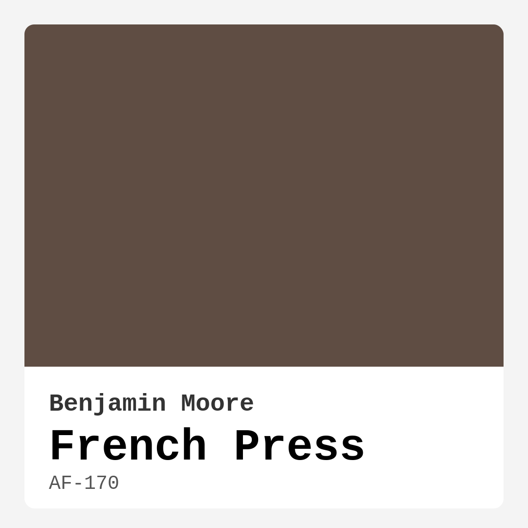
Color Preview & Key Details
| HEX Code | #5F4D43 |
| RGB | 95, 77, 67 |
| LRV | 9.89% |
| Undertone | Red |
| Finish Options | Eggshell, Matte, Satin |
If you’re searching for a paint color that wraps your home in warmth and sophistication, Benjamin Moore’s French Press (AF-170) might just be your perfect match. This deep, rich brown evokes the comforting aroma of freshly brewed coffee, creating an inviting atmosphere that’s hard to resist. Whether you’re redesigning your living room, bedroom, or home office, this shade brings a grounded, earthy elegance that works beautifully across a range of decor styles. Let’s dive into what makes French Press so special and how you can make it shine in your space.
French Press is a dark, warm brown with subtle red undertones that add depth and complexity. These undertones give it a cozy, almost velvety quality, making it ideal for spaces where you want to foster relaxation and connection. Unlike cooler neutrals, this hue feels lived-in and welcoming—perfect for modern farmhouse, rustic, or even industrial interiors. Its versatility means it pairs effortlessly with natural materials like wood, leather, and woven textiles, enhancing the organic vibe of your decor.
One of the standout features of French Press is its adaptability to different lighting conditions. In bright, natural light, the color reveals its full richness, showcasing those chocolatey, coffee-inspired tones. In lower light, it takes on a moodier, more intimate feel, making it a fantastic choice for bedrooms or cozy reading nooks. Just keep in mind that with an LRV (Light Reflectance Value) of 9.89%, it absorbs light rather than reflecting it, so it’s best suited for rooms with ample lighting or spaces where you want to create a snug, enveloping ambiance.
When it comes to application, French Press is beginner-friendly. It offers excellent coverage, often needing just one or two coats, and it’s touch-up friendly—a big plus if you’re doing the painting yourself. The finish you choose can dramatically affect the final look. A matte or eggshell finish enhances its warmth and softness, while a satin finish adds a subtle sheen for a more polished appearance. If you’re using it in high-traffic areas like a dining room or hallway, opt for a washable finish to keep it looking fresh.
Pairing French Press with the right trim and accents can elevate your design. Crisp white trim, like Benjamin Moore’s White Dove, creates a striking contrast that highlights the depth of the color. For a more organic look, pair it with wood trim or brass fixtures, which complement its warm undertones beautifully. If you’re feeling bold, try accenting with deep greens or muted blues—these complementary hues can make French Press pop while keeping the overall palette harmonious.
While this color is undeniably stunning, there are a few things to consider before committing. In smaller rooms or spaces with limited natural light, French Press can feel a bit heavy, so balance it with lighter furnishings or strategic lighting. It’s also worth noting that darker colors like this can show fingerprints or marks more easily, especially in high-touch areas. Choosing a durable, wipeable finish will help mitigate this.
If you love the idea of French Press but aren’t ready to go all-in, consider using it on an accent wall or a piece of furniture. A painted bookshelf or a statement door in this shade can add just the right amount of drama without overwhelming the room. And if you’re looking for lighter or darker alternatives, Benjamin Moore offers a range of shades that work well alongside it, from creamy beiges to deeper espresso tones.
At the end of the day, French Press is more than just a paint color—it’s a mood. It’s the feeling of sinking into a leather armchair with a good book, or gathering around a rustic dining table with friends. It’s warmth, depth, and timeless style rolled into one. If you’re craving a space that feels both sophisticated and lived-in, this could be the shade you’ve been searching for. Test it out in your home, see how it plays with your lighting and decor, and get ready to fall in love with the cozy, inviting atmosphere it creates.
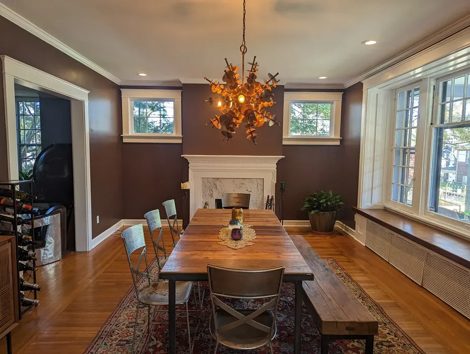
Real Room Photo of French Press AF-170
Undertones of French Press ?
The undertones of French Press are a key aspect of its character, leaning towards Red. These subtle underlying hues are what give the color its depth and complexity. For example, a gray with a blue undertone will feel cooler and more modern, while one with a brown undertone will feel warmer and more traditional. It’s essential to test this paint in your home and observe it next to your existing furniture, flooring, and decor to see how these undertones interact and reveal themselves throughout the day.
HEX value: #5F4D43
RGB code: 95, 77, 67
Is French Press Cool or Warm?
This color is definitely warm. Its earthy depth creates a cozy atmosphere, making it perfect for spaces where you want to unwind after a long day.
Understanding Color Properties and Interior Design Tips
Hue refers to a specific position on the color wheel, measured in degrees from 0 to 360. Each degree represents a different pure color:
- 0° represents red
- 120° represents green
- 240° represents blue
Saturation describes the intensity or purity of a color and is expressed as a percentage:
- At 0%, the color appears completely desaturated—essentially a shade of gray
- At 100%, the color is at its most vivid and vibrant
Lightness indicates how light or dark a color is, also expressed as a percentage:
- 0% lightness results in black
- 100% lightness results in white
Using Warm Colors in Interior Design
Warm hues—such as reds, oranges, yellows, warm beiges, and greiges—are excellent choices for creating inviting and energetic spaces. These colors are particularly well-suited for:
- Kitchens, living rooms, and bathrooms, where warmth enhances comfort and sociability
- Large rooms, where warm tones can help reduce the sense of emptiness and make the space feel more intimate
For example:
- Warm beige shades provide a cozy, inviting atmosphere, ideal for living rooms, bedrooms, and hallways.
- Warm greige (a mix of beige and gray) offers the warmth of beige with the modern appeal of gray, making it a versatile backdrop for dining areas, bedrooms, and living spaces.
However, be mindful when using warm light tones in rooms with limited natural light. These shades may appear muted or even take on an unpleasant yellowish tint. To avoid a dull or flat appearance:
- Add depth by incorporating richer tones like deep greens, charcoal, or chocolate brown
- Use textured elements such as curtains, rugs, or cushions to bring dimension to the space
Pro Tip: Achieving Harmony with Warm and Cool Color Balance
To create a well-balanced and visually interesting interior, mix warm and cool tones strategically. This contrast adds depth and harmony to your design.
- If your walls feature warm hues, introduce cool-colored accents such as blue or green furniture, artwork, or accessories to create contrast.
- For a polished look, consider using a complementary color scheme, which pairs colors opposite each other on the color wheel (e.g., red with green, orange with blue).
This thoughtful mix not only enhances visual appeal but also creates a space that feels both dynamic and cohesive.
Light Temperature Affects on French Press
Natural Light
Natural daylight changes in color temperature as the sun moves across the sky. At sunrise and sunset, the light tends to have a warm, golden tone with a color temperature around 2000 Kelvin (K). As the day progresses and the sun rises higher, the light becomes cooler and more neutral. Around midday, especially when the sky is clear, natural light typically reaches its peak brightness and shifts to a cooler tone, ranging from 5500 to 6500 Kelvin. This midday light is close to what we perceive as pure white or daylight-balanced light.
These shifts in natural light can significantly influence how colors appear in a space, which is why designers often consider both the time of day and the orientation of windows when planning interior color schemes.
Artificial Light
When choosing artificial lighting, pay close attention to the color temperature, measured in Kelvin (K). This determines how warm or cool the light will appear. Lower temperatures, around 2700K, give off a warm, yellow glow often used in living rooms or bedrooms. Higher temperatures, above 5000K, create a cool, bluish light similar to daylight, commonly used in kitchens, offices, or task areas.
Use the slider to see how lighting temperature can affect the appearance of a surface or color throughout a space.


4800K
LRV of French Press
The Light Reflectance Value (LRV) of French Press is 9.89%, which places it in the Dark colors category. This means it does not reflect light. Understanding a paint’s LRV is crucial for predicting how it will look in your space. A higher LRV indicates a lighter color that reflects more light, making rooms feel larger and brighter. A lower LRV signifies a darker color that absorbs more light, creating a cozier, more intimate atmosphere. Always consider the natural and artificial lighting in your room when selecting a paint color based on its LRV.
Detailed Review of French Press
Additional Paint Characteristics
Ideal Rooms
Bedroom, Dining Room, Home Office, Living Room
Decor Styles
Bohemian, Industrial, Modern Farmhouse, Rustic
Coverage
Good (1–2 Coats), Touch-Up Friendly
Ease of Application
Beginner Friendly, Brush Smooth, Roller-Ready
Washability
Washable, Wipeable
VOC Level
Low VOC
Best Use
Accent Wall, Furniture, Interior Walls
Room Suitability
Bedroom, Dining Room, Home Office, Living Room
Tone Tag
Deep, Earthy, Warm
Finish Type
Eggshell, Matte, Satin
Paint Performance
Easy Touch-Up, High Coverage, Low Odor
Use Cases
Best for Cozy Spaces, Best for Low Light Rooms, Best for Modern Farmhouse
Mood
Cozy, Grounding, Inviting
Trim Pairing
Complements Brass Fixtures, Good with Wood Trim, Pairs with White Dove
French Press is more than just a color; it’s an experience. This beautiful shade of brown offers a warm embrace that can transform your living space into a sanctuary. It pairs wonderfully with natural materials like wood and leather, enhancing the organic feel of your decor. Whether you’re painting an accent wall or refreshing your entire living room, French Press delivers a depth that captures attention without overwhelming the senses. In natural light, it reveals subtle undertones that shift slightly throughout the day, adding dimension to your walls. If you’re looking for a color that’s both versatile and rich, this one is a stellar choice that won’t disappoint.
Pros & Cons of AF-170 French Press
Pros
Cons
Colors that go with Benjamin Moore French Press
FAQ on AF-170 French Press
What types of finishes work best with French Press?
French Press looks stunning in a variety of finishes, but for a cozy and inviting look, consider using a matte or eggshell finish. These finishes enhance its warmth and richness while providing a soft texture. Satin can add a touch of sheen if you want a more polished look. Ultimately, your choice should reflect the mood you wish to create in your space.
Is French Press suitable for high-traffic areas?
Yes, French Press can be suitable for high-traffic areas, especially if you opt for a washable finish. Its darker tone can help hide minor scuffs and wear, but it’s important to choose a durable topcoat that enhances its washability. Consider using it in dining rooms or hallways where warmth and character are desired, but keep in mind that regular maintenance may be needed to keep it looking its best.
Comparisons French Press with other colors
French Press AF-170 vs Griffin SW 7026
| Attribute | French Press AF-170 | Griffin SW 7026 |
|---|---|---|
| Color Name | French Press AF-170 | Griffin SW 7026 |
| Color | ||
| Hue | Beige | Beige |
| Brightness | Dark | Dark |
| RGB | 95, 77, 67 | 111, 100, 89 |
| LRV | 9.89% | 24% |
| Finish Type | Eggshell, Matte, Satin | Eggshell, Matte |
| Finish Options | Eggshell, Matte, Satin | Eggshell, Matte, Satin |
| Ideal Rooms | Bedroom, Dining Room, Home Office, Living Room | Bathroom, Bedroom, Dining Room, Home Office, Living Room |
| Decor Styles | Bohemian, Industrial, Modern Farmhouse, Rustic | Contemporary, Modern, Rustic, Transitional |
| Coverage | Good (1–2 Coats), Touch-Up Friendly | Good (1–2 Coats), Touch-Up Friendly |
| Ease of Application | Beginner Friendly, Brush Smooth, Roller-Ready | Beginner Friendly, Brush Smooth, Roller-Ready |
| Washability | Washable, Wipeable | Washable, Wipeable |
| Room Suitability | Bedroom, Dining Room, Home Office, Living Room | Bedroom, Dining Room, Home Office, Living Room |
| Tone | Deep, Earthy, Warm | Earthy, Muted, Warm |
| Paint Performance | Easy Touch-Up, High Coverage, Low Odor | Easy Touch-Up, Fade Resistant, Low Odor |
French Press AF-170 vs Warm Stone SW 7032
| Attribute | French Press AF-170 | Warm Stone SW 7032 |
|---|---|---|
| Color Name | French Press AF-170 | Warm Stone SW 7032 |
| Color | ||
| Hue | Beige | Beige |
| Brightness | Dark | Dark |
| RGB | 95, 77, 67 | 136, 123, 108 |
| LRV | 9.89% | 58% |
| Finish Type | Eggshell, Matte, Satin | Eggshell, Matte, Satin |
| Finish Options | Eggshell, Matte, Satin | Eggshell, Matte, Satin |
| Ideal Rooms | Bedroom, Dining Room, Home Office, Living Room | Bedroom, Dining Room, Home Office, Kitchen, Living Room |
| Decor Styles | Bohemian, Industrial, Modern Farmhouse, Rustic | Contemporary, Modern Farmhouse, Rustic, Transitional |
| Coverage | Good (1–2 Coats), Touch-Up Friendly | Good (1–2 Coats), Touch-Up Friendly |
| Ease of Application | Beginner Friendly, Brush Smooth, Roller-Ready | Beginner Friendly, Brush Smooth, Roller-Ready |
| Washability | Washable, Wipeable | Washable, Wipeable |
| Room Suitability | Bedroom, Dining Room, Home Office, Living Room | Bedroom, Dining Room, Home Office, Living Room |
| Tone | Deep, Earthy, Warm | Earthy, Muted, Warm |
| Paint Performance | Easy Touch-Up, High Coverage, Low Odor | Easy Touch-Up, High Coverage, Low Odor, Quick Drying, Scuff Resistant |
French Press AF-170 vs Black Fox SW 7020
| Attribute | French Press AF-170 | Black Fox SW 7020 |
|---|---|---|
| Color Name | French Press AF-170 | Black Fox SW 7020 |
| Color | ||
| Hue | Beige | Beige |
| Brightness | Dark | Dark |
| RGB | 95, 77, 67 | 79, 72, 66 |
| LRV | 9.89% | 5% |
| Finish Type | Eggshell, Matte, Satin | Eggshell, Matte, Satin |
| Finish Options | Eggshell, Matte, Satin | Eggshell, Matte, Satin |
| Ideal Rooms | Bedroom, Dining Room, Home Office, Living Room | Bedroom, Dining Room, Hallway, Home Office, Living Room |
| Decor Styles | Bohemian, Industrial, Modern Farmhouse, Rustic | Bohemian, Industrial, Modern, Rustic, Transitional |
| Coverage | Good (1–2 Coats), Touch-Up Friendly | Good (1–2 Coats), Touch-Up Friendly |
| Ease of Application | Beginner Friendly, Brush Smooth, Roller-Ready | Brush Smooth, Fast-Drying, Roller-Ready |
| Washability | Washable, Wipeable | Washable, Wipeable |
| Room Suitability | Bedroom, Dining Room, Home Office, Living Room | Bedroom, Dining Room, Hallway, Home Office, Living Room |
| Tone | Deep, Earthy, Warm | Deep, Earthy, Warm |
| Paint Performance | Easy Touch-Up, High Coverage, Low Odor | Easy Touch-Up, High Coverage, Low Odor |
French Press AF-170 vs Anonymous SW 7046
| Attribute | French Press AF-170 | Anonymous SW 7046 |
|---|---|---|
| Color Name | French Press AF-170 | Anonymous SW 7046 |
| Color | ||
| Hue | Beige | Beige |
| Brightness | Dark | Dark |
| RGB | 95, 77, 67 | 129, 122, 110 |
| LRV | 9.89% | 22% |
| Finish Type | Eggshell, Matte, Satin | Eggshell, Matte, Satin |
| Finish Options | Eggshell, Matte, Satin | Eggshell, Matte, Satin |
| Ideal Rooms | Bedroom, Dining Room, Home Office, Living Room | Bathroom, Bedroom, Dining Room, Home Office, Living Room |
| Decor Styles | Bohemian, Industrial, Modern Farmhouse, Rustic | Industrial, Modern, Rustic, Transitional |
| Coverage | Good (1–2 Coats), Touch-Up Friendly | Good (1–2 Coats), Touch-Up Friendly |
| Ease of Application | Beginner Friendly, Brush Smooth, Roller-Ready | Beginner Friendly, Brush Smooth, Roller-Ready |
| Washability | Washable, Wipeable | Highly Washable, Washable |
| Room Suitability | Bedroom, Dining Room, Home Office, Living Room | Bedroom, Dining Room, Home Office, Living Room |
| Tone | Deep, Earthy, Warm | Balanced, Earthy, Muted |
| Paint Performance | Easy Touch-Up, High Coverage, Low Odor | Easy Touch-Up, Low Odor, Quick Drying |
French Press AF-170 vs Porpoise SW 7047
| Attribute | French Press AF-170 | Porpoise SW 7047 |
|---|---|---|
| Color Name | French Press AF-170 | Porpoise SW 7047 |
| Color | ||
| Hue | Beige | Beige |
| Brightness | Dark | Dark |
| RGB | 95, 77, 67 | 107, 100, 91 |
| LRV | 9.89% | 30% |
| Finish Type | Eggshell, Matte, Satin | Eggshell, Satin |
| Finish Options | Eggshell, Matte, Satin | Eggshell, Satin, Semi-Gloss |
| Ideal Rooms | Bedroom, Dining Room, Home Office, Living Room | Bedroom, Dining Room, Hallway, Home Office, Living Room |
| Decor Styles | Bohemian, Industrial, Modern Farmhouse, Rustic | Industrial, Modern, Scandinavian, Transitional |
| Coverage | Good (1–2 Coats), Touch-Up Friendly | Good (1–2 Coats) |
| Ease of Application | Beginner Friendly, Brush Smooth, Roller-Ready | Beginner Friendly, Brush Smooth, Fast-Drying, Roller-Ready |
| Washability | Washable, Wipeable | Highly Washable, Washable |
| Room Suitability | Bedroom, Dining Room, Home Office, Living Room | Bedroom, Dining Room, Home Office, Living Room |
| Tone | Deep, Earthy, Warm | Earthy, Muted, Warm |
| Paint Performance | Easy Touch-Up, High Coverage, Low Odor | Easy Touch-Up, Fade Resistant, High Coverage, Low Odor |
French Press AF-170 vs Virtual Taupe SW 7039
| Attribute | French Press AF-170 | Virtual Taupe SW 7039 |
|---|---|---|
| Color Name | French Press AF-170 | Virtual Taupe SW 7039 |
| Color | ||
| Hue | Beige | Beige |
| Brightness | Dark | Dark |
| RGB | 95, 77, 67 | 138, 122, 106 |
| LRV | 9.89% | 24% |
| Finish Type | Eggshell, Matte, Satin | Eggshell, Satin |
| Finish Options | Eggshell, Matte, Satin | Eggshell, Flat, Matte, Satin, Semi-Gloss |
| Ideal Rooms | Bedroom, Dining Room, Home Office, Living Room | Bedroom, Dining Room, Home Office, Living Room |
| Decor Styles | Bohemian, Industrial, Modern Farmhouse, Rustic | Contemporary, Modern Farmhouse, Scandinavian, Transitional |
| Coverage | Good (1–2 Coats), Touch-Up Friendly | Good (1–2 Coats), Touch-Up Friendly |
| Ease of Application | Beginner Friendly, Brush Smooth, Roller-Ready | Brush Smooth, Fast-Drying, Roller-Ready |
| Washability | Washable, Wipeable | Scrubbable, Washable |
| Room Suitability | Bedroom, Dining Room, Home Office, Living Room | Bedroom, Dining Room, Home Office, Living Room |
| Tone | Deep, Earthy, Warm | Earthy, Muted, Warm |
| Paint Performance | Easy Touch-Up, High Coverage, Low Odor | Easy Touch-Up, High Coverage, Low Odor |
French Press AF-170 vs Polished Mahogany SW 2838
| Attribute | French Press AF-170 | Polished Mahogany SW 2838 |
|---|---|---|
| Color Name | French Press AF-170 | Polished Mahogany SW 2838 |
| Color | ||
| Hue | Beige | Beige |
| Brightness | Dark | Dark |
| RGB | 95, 77, 67 | 67, 39, 34 |
| LRV | 9.89% | 6% |
| Finish Type | Eggshell, Matte, Satin | Matte, Satin |
| Finish Options | Eggshell, Matte, Satin | Eggshell, Matte, Satin |
| Ideal Rooms | Bedroom, Dining Room, Home Office, Living Room | Bedroom, Dining Room, Home Office, Living Room |
| Decor Styles | Bohemian, Industrial, Modern Farmhouse, Rustic | Bohemian, Contemporary, Industrial, Rustic, Traditional |
| Coverage | Good (1–2 Coats), Touch-Up Friendly | Good (1–2 Coats) |
| Ease of Application | Beginner Friendly, Brush Smooth, Roller-Ready | Beginner Friendly, Brush Smooth, Fast-Drying, Roller-Ready |
| Washability | Washable, Wipeable | Washable, Wipeable |
| Room Suitability | Bedroom, Dining Room, Home Office, Living Room | Bedroom, Dining Room, Hallway, Home Office, Living Room |
| Tone | Deep, Earthy, Warm | Deep, Earthy, Warm |
| Paint Performance | Easy Touch-Up, High Coverage, Low Odor | High Coverage, Low Odor, Stain Resistant |
French Press AF-170 vs Sealskin SW 7675
| Attribute | French Press AF-170 | Sealskin SW 7675 |
|---|---|---|
| Color Name | French Press AF-170 | Sealskin SW 7675 |
| Color | ||
| Hue | Beige | Beige |
| Brightness | Dark | Dark |
| RGB | 95, 77, 67 | 72, 66, 60 |
| LRV | 9.89% | 4% |
| Finish Type | Eggshell, Matte, Satin | Eggshell, Matte, Satin |
| Finish Options | Eggshell, Matte, Satin | Eggshell, Matte, Satin |
| Ideal Rooms | Bedroom, Dining Room, Home Office, Living Room | Bedroom, Dining Room, Home Office, Living Room |
| Decor Styles | Bohemian, Industrial, Modern Farmhouse, Rustic | Bohemian, Contemporary, Industrial, Modern, Rustic |
| Coverage | Good (1–2 Coats), Touch-Up Friendly | Good (1–2 Coats), Touch-Up Friendly |
| Ease of Application | Beginner Friendly, Brush Smooth, Roller-Ready | Beginner Friendly, Brush Smooth, Roller-Ready |
| Washability | Washable, Wipeable | Washable, Wipeable |
| Room Suitability | Bedroom, Dining Room, Home Office, Living Room | Bedroom, Dining Room, Home Office, Living Room |
| Tone | Deep, Earthy, Warm | Deep, Earthy, Warm |
| Paint Performance | Easy Touch-Up, High Coverage, Low Odor | Easy Touch-Up, Fade Resistant, High Coverage, Low Odor |
French Press AF-170 vs Muddled Basil SW 7745
| Attribute | French Press AF-170 | Muddled Basil SW 7745 |
|---|---|---|
| Color Name | French Press AF-170 | Muddled Basil SW 7745 |
| Color | ||
| Hue | Beige | Beige |
| Brightness | Dark | Dark |
| RGB | 95, 77, 67 | 90, 82, 67 |
| LRV | 9.89% | 12% |
| Finish Type | Eggshell, Matte, Satin | Eggshell, Matte |
| Finish Options | Eggshell, Matte, Satin | Eggshell, Matte, Satin |
| Ideal Rooms | Bedroom, Dining Room, Home Office, Living Room | Bedroom, Dining Room, Home Office, Living Room |
| Decor Styles | Bohemian, Industrial, Modern Farmhouse, Rustic | Bohemian, Contemporary, Industrial, Modern Farmhouse, Rustic |
| Coverage | Good (1–2 Coats), Touch-Up Friendly | Good (1–2 Coats) |
| Ease of Application | Beginner Friendly, Brush Smooth, Roller-Ready | Beginner Friendly, Brush Smooth, Fast-Drying, Roller-Ready |
| Washability | Washable, Wipeable | Washable, Wipeable |
| Room Suitability | Bedroom, Dining Room, Home Office, Living Room | Bedroom, Dining Room, Home Office, Living Room |
| Tone | Deep, Earthy, Warm | Earthy, Muted, Warm |
| Paint Performance | Easy Touch-Up, High Coverage, Low Odor | High Coverage, Low Odor, Quick Drying, Scuff Resistant |
French Press AF-170 vs Backdrop SW 7025
| Attribute | French Press AF-170 | Backdrop SW 7025 |
|---|---|---|
| Color Name | French Press AF-170 | Backdrop SW 7025 |
| Color | ||
| Hue | Beige | Beige |
| Brightness | Dark | Dark |
| RGB | 95, 77, 67 | 134, 122, 111 |
| LRV | 9.89% | 48% |
| Finish Type | Eggshell, Matte, Satin | Eggshell, Matte, Satin |
| Finish Options | Eggshell, Matte, Satin | Eggshell, Matte, Satin |
| Ideal Rooms | Bedroom, Dining Room, Home Office, Living Room | Bedroom, Dining Room, Home Office, Living Room |
| Decor Styles | Bohemian, Industrial, Modern Farmhouse, Rustic | Bohemian, Modern Farmhouse, Scandinavian, Transitional |
| Coverage | Good (1–2 Coats), Touch-Up Friendly | Good (1–2 Coats), Touch-Up Friendly |
| Ease of Application | Beginner Friendly, Brush Smooth, Roller-Ready | Beginner Friendly, Brush Smooth, Fast-Drying, Roller-Ready |
| Washability | Washable, Wipeable | Scrubbable, Washable |
| Room Suitability | Bedroom, Dining Room, Home Office, Living Room | Bedroom, Dining Room, Home Office, Living Room |
| Tone | Deep, Earthy, Warm | Earthy, Muted, Warm |
| Paint Performance | Easy Touch-Up, High Coverage, Low Odor | Easy Touch-Up, High Coverage, Low Odor, Stain Resistant |
Official Page of Benjamin Moore French Press AF-170