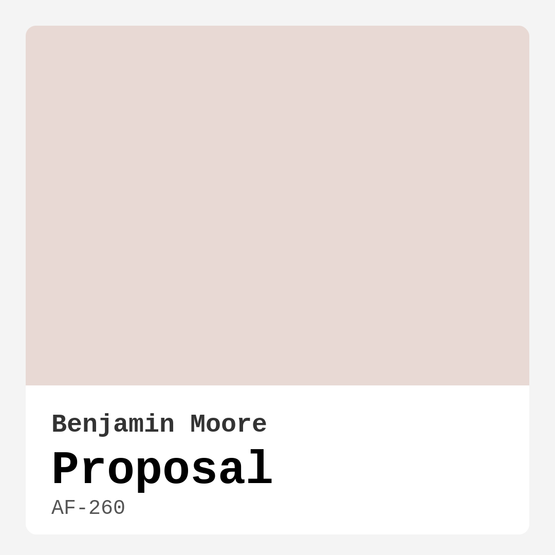
Color Preview & Key Details
| HEX Code | #E8D9D4 |
| RGB | 232, 217, 212 |
| LRV | 70.47% |
| Undertone | Red |
| Finish Options | Eggshell, Matte, Satin |
Imagine walking into a room that instantly makes you feel at ease—soft, warm, and effortlessly elegant. The walls wrap around you like a gentle hug, and the light seems to dance across them, creating a sense of calm. That’s the magic of Benjamin Moore’s Proposal (AF-260). This isn’t just another pink; it’s a sophisticated blend of muted warmth with just enough depth to make a statement without overwhelming your space. If you’ve been searching for a color that balances modern simplicity with timeless charm, let’s talk about why Proposal might be the perfect choice for your next project.
Proposal is one of those rare colors that feels both fresh and familiar. Its delicate pink-beige undertones give it a versatility that works in almost any room—whether you’re painting a cozy bedroom, a serene home office, or an inviting living room. With an LRV of 70.47%, it reflects plenty of light, making it ideal for smaller spaces that need a brightness boost. But don’t mistake its lightness for blandness; the subtle red undertone adds warmth, ensuring the color never feels cold or sterile. It’s the kind of hue that adapts to your decor, whether you lean toward modern minimalism, rustic farmhouse, or something in between.
One of the biggest strengths of Proposal is how it plays with light. In a sunlit room, it takes on an airy, almost ethereal quality, while in softer lighting, it deepens into a richer, more intimate tone. This chameleon-like quality means it’ll look different—and equally beautiful—at various times of the day. If you’re worried about committing to a color that might feel too bold or too flat, Proposal strikes that perfect middle ground. It’s soft enough to serve as a neutral backdrop but interesting enough to stand on its own.
When it comes to application, Proposal is as user-friendly as it gets. It’s beginner-friendly, roller-ready, and dries quickly, so you won’t be waiting around forever to see the final result. Most spaces will need just one or two coats for full coverage, and its touch-up-friendly formula means maintenance is a breeze. Whether you choose a matte finish for a velvety look, eggshell for a subtle sheen, or satin for a bit more polish, the color holds up beautifully. And because it’s low-VOC and eco-certified, you can breathe easy knowing it’s a safe choice for your home.
Now, let’s talk pairings. Proposal’s warm undertones make it incredibly flexible when it comes to coordinating with other colors and materials. For trim, classic whites like Benjamin Moore’s White Dove or Pure White create a crisp, clean contrast. If you’re feeling adventurous, brass fixtures or warm wood tones add a touch of elegance that plays off the color’s earthy side. And if you want to introduce a complementary pop, consider soft greens or deeper mauves—they’ll enhance Proposal’s warmth without clashing.
Of course, no color is without its considerations. While Proposal is incredibly versatile, it might not be the best fit if you’re going for an ultra-modern, high-contrast aesthetic. And because lighting can affect how it reads, it’s always a good idea to test a swatch in your space before committing. Paint a small section and observe it at different times of day to see how it interacts with your room’s natural and artificial light.
So, who is Proposal for? If you love the idea of a color that feels cozy but not heavy, elegant but not fussy, and versatile but not boring, this might be your match. It’s a designer favorite for a reason—it works in rentals, small spaces, and large rooms alike, creating a mood that’s calm, inviting, and just a little bit special. Whether you’re refreshing a single wall or transforming an entire home, Proposal is the kind of color you won’t tire of. It’s the quiet star of the palette, the one that makes everything around it look better.
At the end of the day, the best paint color is the one that makes you feel something when you walk into the room. Proposal has that quiet confidence—it doesn’t shout for attention, but it always leaves an impression. If you’re ready to give your walls a hue that’s as thoughtful and layered as your design vision, this might just be the perfect proposal.
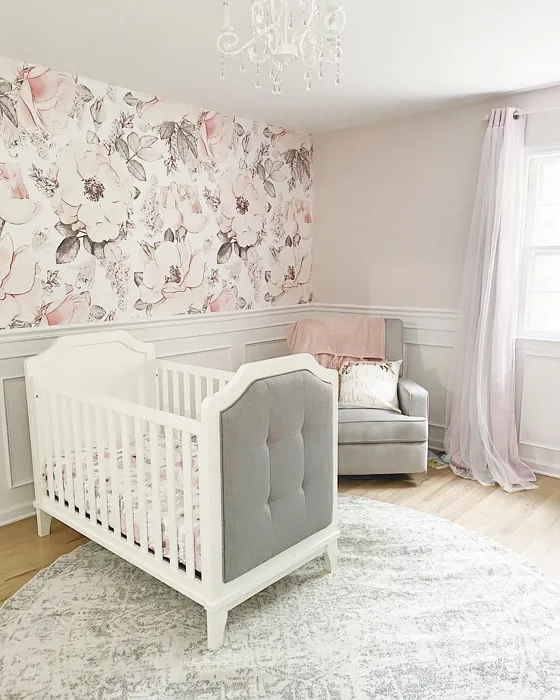
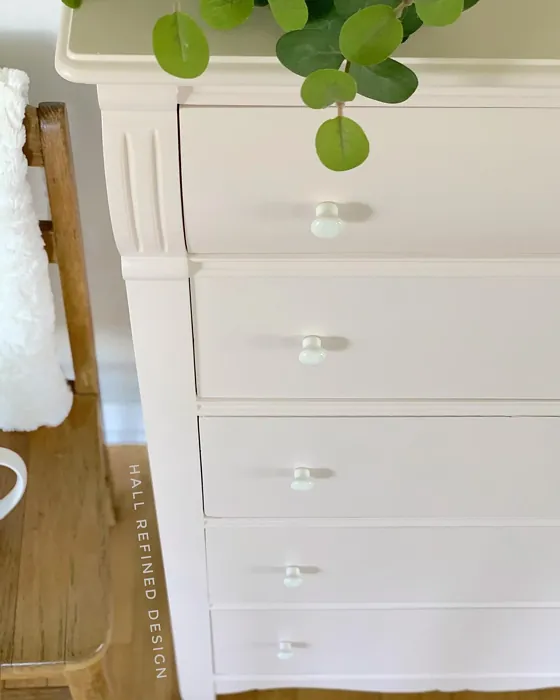
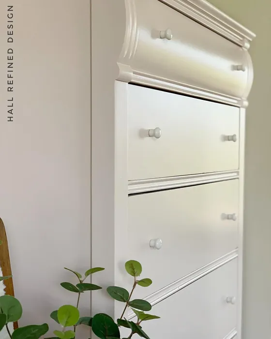
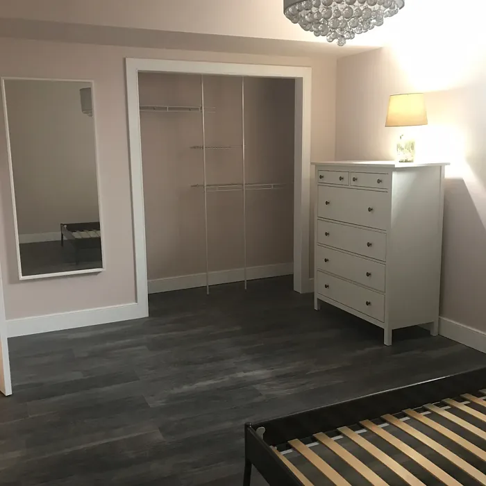
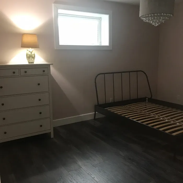
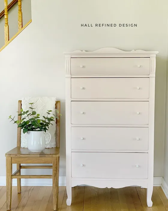
Real Room Photo of Proposal AF-260
Undertones of Proposal ?
The undertones of Proposal are a key aspect of its character, leaning towards Red. These subtle underlying hues are what give the color its depth and complexity. For example, a gray with a blue undertone will feel cooler and more modern, while one with a brown undertone will feel warmer and more traditional. It’s essential to test this paint in your home and observe it next to your existing furniture, flooring, and decor to see how these undertones interact and reveal themselves throughout the day.
HEX value: #E8D9D4
RGB code: 232, 217, 212
Is Proposal Cool or Warm?
This hue is decidedly warm, creating an inviting and cozy feel that makes spaces feel more welcoming and comfortable.
Understanding Color Properties and Interior Design Tips
Hue refers to a specific position on the color wheel, measured in degrees from 0 to 360. Each degree represents a different pure color:
- 0° represents red
- 120° represents green
- 240° represents blue
Saturation describes the intensity or purity of a color and is expressed as a percentage:
- At 0%, the color appears completely desaturated—essentially a shade of gray
- At 100%, the color is at its most vivid and vibrant
Lightness indicates how light or dark a color is, also expressed as a percentage:
- 0% lightness results in black
- 100% lightness results in white
Using Warm Colors in Interior Design
Warm hues—such as reds, oranges, yellows, warm beiges, and greiges—are excellent choices for creating inviting and energetic spaces. These colors are particularly well-suited for:
- Kitchens, living rooms, and bathrooms, where warmth enhances comfort and sociability
- Large rooms, where warm tones can help reduce the sense of emptiness and make the space feel more intimate
For example:
- Warm beige shades provide a cozy, inviting atmosphere, ideal for living rooms, bedrooms, and hallways.
- Warm greige (a mix of beige and gray) offers the warmth of beige with the modern appeal of gray, making it a versatile backdrop for dining areas, bedrooms, and living spaces.
However, be mindful when using warm light tones in rooms with limited natural light. These shades may appear muted or even take on an unpleasant yellowish tint. To avoid a dull or flat appearance:
- Add depth by incorporating richer tones like deep greens, charcoal, or chocolate brown
- Use textured elements such as curtains, rugs, or cushions to bring dimension to the space
Pro Tip: Achieving Harmony with Warm and Cool Color Balance
To create a well-balanced and visually interesting interior, mix warm and cool tones strategically. This contrast adds depth and harmony to your design.
- If your walls feature warm hues, introduce cool-colored accents such as blue or green furniture, artwork, or accessories to create contrast.
- For a polished look, consider using a complementary color scheme, which pairs colors opposite each other on the color wheel (e.g., red with green, orange with blue).
This thoughtful mix not only enhances visual appeal but also creates a space that feels both dynamic and cohesive.
Light Temperature Affects on Proposal
Natural Light
Natural daylight changes in color temperature as the sun moves across the sky. At sunrise and sunset, the light tends to have a warm, golden tone with a color temperature around 2000 Kelvin (K). As the day progresses and the sun rises higher, the light becomes cooler and more neutral. Around midday, especially when the sky is clear, natural light typically reaches its peak brightness and shifts to a cooler tone, ranging from 5500 to 6500 Kelvin. This midday light is close to what we perceive as pure white or daylight-balanced light.
These shifts in natural light can significantly influence how colors appear in a space, which is why designers often consider both the time of day and the orientation of windows when planning interior color schemes.
Artificial Light
When choosing artificial lighting, pay close attention to the color temperature, measured in Kelvin (K). This determines how warm or cool the light will appear. Lower temperatures, around 2700K, give off a warm, yellow glow often used in living rooms or bedrooms. Higher temperatures, above 5000K, create a cool, bluish light similar to daylight, commonly used in kitchens, offices, or task areas.
Use the slider to see how lighting temperature can affect the appearance of a surface or color throughout a space.


4800K
LRV of Proposal
The Light Reflectance Value (LRV) of Proposal is 70.47%, which places it in the Light colors category. This means it reflect most of the incident light. Understanding a paint’s LRV is crucial for predicting how it will look in your space. A higher LRV indicates a lighter color that reflects more light, making rooms feel larger and brighter. A lower LRV signifies a darker color that absorbs more light, creating a cozier, more intimate atmosphere. Always consider the natural and artificial lighting in your room when selecting a paint color based on its LRV.
Detailed Review of Proposal
Additional Paint Characteristics
Ideal Rooms
Bedroom, Dining Room, Home Office, Living Room, Nursery
Decor Styles
Bohemian, Farmhouse, Minimalist, Modern, Transitional
Coverage
Good (1–2 Coats), Touch-Up Friendly
Ease of Application
Beginner Friendly, Fast-Drying, Roller-Ready
Washability
Washable, Wipeable
VOC Level
Eco-Certified, Low VOC
Best Use
Accent Wall, Interior Walls, Large Spaces, Small Spaces
Room Suitability
Bedroom, Dining Room, Home Office, Living Room, Nursery
Tone Tag
Earthy, Muted, Soft, Warm
Finish Type
Eggshell, Matte, Satin
Paint Performance
Easy Touch-Up, Fade Resistant, High Coverage, Low Odor
Use Cases
Best for Rentals, Best for Small Spaces, Classic Favorite, Designer Favorite
Mood
Calm, Cozy, Inviting, Restful
Trim Pairing
Complements Brass Fixtures, Matches Pure White, Pairs with White Dove, Works with Warm Trim
Proposal is an exceptional choice for anyone looking to create a serene and welcoming atmosphere in their home. When applied, it offers a soft glow that brightens up the room without being overwhelming. It’s versatile enough to work in various settings, from a calming bedroom to an elegant living room. The color interacts beautifully with natural light, subtly changing its tone throughout the day, adding depth and character to your walls. Whether you’re aiming for a modern look or something more traditional, Proposal adapts seamlessly, making it a great pick for any decor style. Just a couple of coats will typically do the trick, and its touch-up friendly nature ensures maintenance is a breeze.
Pros & Cons of AF-260 Proposal
Pros
Cons
Colors that go with Benjamin Moore Proposal
FAQ on AF-260 Proposal
Can I use Proposal in a small room?
Absolutely! Proposal’s warm tones can make small rooms feel cozy rather than cramped. Its light reflectivity helps to brighten the space, creating an illusion of more room. Just be mindful of the lighting, as it may appear slightly different at different times of day.
What finishes work best with Proposal?
Proposal pairs beautifully with matte or eggshell finishes for a soft look but can also shine in satin if you want a bit more sheen. Consider using a matte finish for walls and a satin finish for trim to create contrast while maintaining a cohesive look.
Comparisons Proposal with other colors
Proposal AF-260 vs Malted Milk SW 6057
| Attribute | Proposal AF-260 | Malted Milk SW 6057 |
|---|---|---|
| Color Name | Proposal AF-260 | Malted Milk SW 6057 |
| Color | ||
| Hue | Pink | Pink |
| Brightness | Light | Light |
| RGB | 232, 217, 212 | 222, 202, 189 |
| LRV | 70.47% | 74% |
| Finish Type | Eggshell, Matte, Satin | Eggshell, Satin |
| Finish Options | Eggshell, Matte, Satin | Eggshell, Matte, Satin |
| Ideal Rooms | Bedroom, Dining Room, Home Office, Living Room, Nursery | Bedroom, Dining Room, Kitchen, Living Room, Nursery |
| Decor Styles | Bohemian, Farmhouse, Minimalist, Modern, Transitional | Coastal, Farmhouse, Modern, Scandinavian, Transitional |
| Coverage | Good (1–2 Coats), Touch-Up Friendly | Good (1–2 Coats), Touch-Up Friendly |
| Ease of Application | Beginner Friendly, Fast-Drying, Roller-Ready | Beginner Friendly, Brush Smooth, Fast-Drying, Roller-Ready |
| Washability | Washable, Wipeable | Washable, Wipeable |
| Room Suitability | Bedroom, Dining Room, Home Office, Living Room, Nursery | Bedroom, Dining Room, Kitchen, Living Room, Nursery |
| Tone | Earthy, Muted, Soft, Warm | Creamy, Neutral, Warm |
| Paint Performance | Easy Touch-Up, Fade Resistant, High Coverage, Low Odor | High Coverage, Low Odor, Quick Drying |
Proposal AF-260 vs Intimate White SW 6322
| Attribute | Proposal AF-260 | Intimate White SW 6322 |
|---|---|---|
| Color Name | Proposal AF-260 | Intimate White SW 6322 |
| Color | ||
| Hue | Pink | Pink |
| Brightness | Light | Light |
| RGB | 232, 217, 212 | 240, 225, 216 |
| LRV | 70.47% | 75% |
| Finish Type | Eggshell, Matte, Satin | Eggshell, Matte, Satin |
| Finish Options | Eggshell, Matte, Satin | Eggshell, Matte, Satin |
| Ideal Rooms | Bedroom, Dining Room, Home Office, Living Room, Nursery | Bedroom, Hallway, Home Office, Living Room, Nursery |
| Decor Styles | Bohemian, Farmhouse, Minimalist, Modern, Transitional | Farmhouse, Minimalist, Modern, Traditional |
| Coverage | Good (1–2 Coats), Touch-Up Friendly | Good (1–2 Coats) |
| Ease of Application | Beginner Friendly, Fast-Drying, Roller-Ready | Beginner Friendly, Brush Smooth, Roller-Ready |
| Washability | Washable, Wipeable | Highly Washable, Washable |
| Room Suitability | Bedroom, Dining Room, Home Office, Living Room, Nursery | Bedroom, Hallway, Living Room, Nursery |
| Tone | Earthy, Muted, Soft, Warm | Creamy, Muted, Warm |
| Paint Performance | Easy Touch-Up, Fade Resistant, High Coverage, Low Odor | Easy Touch-Up, Fade Resistant, Low Odor |
Proposal AF-260 vs Abalone Shell SW 6050
| Attribute | Proposal AF-260 | Abalone Shell SW 6050 |
|---|---|---|
| Color Name | Proposal AF-260 | Abalone Shell SW 6050 |
| Color | ||
| Hue | Pink | Pink |
| Brightness | Light | Light |
| RGB | 232, 217, 212 | 219, 199, 189 |
| LRV | 70.47% | 30% |
| Finish Type | Eggshell, Matte, Satin | Eggshell, Matte, Satin |
| Finish Options | Eggshell, Matte, Satin | Eggshell, Matte, Satin |
| Ideal Rooms | Bedroom, Dining Room, Home Office, Living Room, Nursery | Bedroom, Dining Room, Home Office, Living Room |
| Decor Styles | Bohemian, Farmhouse, Minimalist, Modern, Transitional | Coastal, Farmhouse, Minimalist, Modern, Traditional |
| Coverage | Good (1–2 Coats), Touch-Up Friendly | Good (1–2 Coats), Touch-Up Friendly |
| Ease of Application | Beginner Friendly, Fast-Drying, Roller-Ready | Beginner Friendly, Brush Smooth, Fast-Drying, Roller-Ready |
| Washability | Washable, Wipeable | Washable, Wipeable |
| Room Suitability | Bedroom, Dining Room, Home Office, Living Room, Nursery | Bedroom, Dining Room, Home Office, Living Room |
| Tone | Earthy, Muted, Soft, Warm | Balanced, Muted, Warm |
| Paint Performance | Easy Touch-Up, Fade Resistant, High Coverage, Low Odor | Easy Touch-Up, Fade Resistant, Low Odor, Quick Drying |
Proposal AF-260 vs White Truffle SW 6029
| Attribute | Proposal AF-260 | White Truffle SW 6029 |
|---|---|---|
| Color Name | Proposal AF-260 | White Truffle SW 6029 |
| Color | ||
| Hue | Pink | Pink |
| Brightness | Light | Light |
| RGB | 232, 217, 212 | 215, 200, 194 |
| LRV | 70.47% | 48% |
| Finish Type | Eggshell, Matte, Satin | Eggshell, Satin |
| Finish Options | Eggshell, Matte, Satin | Eggshell, Flat, Matte, Satin |
| Ideal Rooms | Bedroom, Dining Room, Home Office, Living Room, Nursery | Bedroom, Dining Room, Hallway, Kitchen, Living Room |
| Decor Styles | Bohemian, Farmhouse, Minimalist, Modern, Transitional | Eclectic, Farmhouse, Modern, Traditional |
| Coverage | Good (1–2 Coats), Touch-Up Friendly | Good (1–2 Coats), Touch-Up Friendly |
| Ease of Application | Beginner Friendly, Fast-Drying, Roller-Ready | Beginner Friendly, Brush Smooth, Roller-Ready |
| Washability | Washable, Wipeable | Washable, Wipeable |
| Room Suitability | Bedroom, Dining Room, Home Office, Living Room, Nursery | Bedroom, Dining Room, Hallway, Living Room |
| Tone | Earthy, Muted, Soft, Warm | Earthy, Neutral, Warm |
| Paint Performance | Easy Touch-Up, Fade Resistant, High Coverage, Low Odor | Easy Touch-Up, Low Odor, Scuff Resistant |
Proposal AF-260 vs Faint Coral SW 6329
| Attribute | Proposal AF-260 | Faint Coral SW 6329 |
|---|---|---|
| Color Name | Proposal AF-260 | Faint Coral SW 6329 |
| Color | ||
| Hue | Pink | Pink |
| Brightness | Light | Light |
| RGB | 232, 217, 212 | 238, 222, 213 |
| LRV | 70.47% | 66% |
| Finish Type | Eggshell, Matte, Satin | Eggshell, Matte, Satin |
| Finish Options | Eggshell, Matte, Satin | Eggshell, Matte, Satin |
| Ideal Rooms | Bedroom, Dining Room, Home Office, Living Room, Nursery | Bedroom, Dining Room, Hallway, Living Room, Nursery |
| Decor Styles | Bohemian, Farmhouse, Minimalist, Modern, Transitional | Bohemian, Coastal, Modern Farmhouse, Scandinavian, Vintage |
| Coverage | Good (1–2 Coats), Touch-Up Friendly | Good (1–2 Coats), Touch-Up Friendly |
| Ease of Application | Beginner Friendly, Fast-Drying, Roller-Ready | Beginner Friendly, Brush Smooth, Fast-Drying, Roller-Ready |
| Washability | Washable, Wipeable | Washable, Wipeable |
| Room Suitability | Bedroom, Dining Room, Home Office, Living Room, Nursery | Bedroom, Dining Room, Hallway, Living Room, Nursery |
| Tone | Earthy, Muted, Soft, Warm | Airy, Muted, Pastel, Warm |
| Paint Performance | Easy Touch-Up, Fade Resistant, High Coverage, Low Odor | Easy Touch-Up, Low Odor, Quick Drying |
Proposal AF-260 vs Romance SW 6323
| Attribute | Proposal AF-260 | Romance SW 6323 |
|---|---|---|
| Color Name | Proposal AF-260 | Romance SW 6323 |
| Color | ||
| Hue | Pink | Pink |
| Brightness | Light | Light |
| RGB | 232, 217, 212 | 235, 207, 195 |
| LRV | 70.47% | 69% |
| Finish Type | Eggshell, Matte, Satin | Eggshell, Matte |
| Finish Options | Eggshell, Matte, Satin | Eggshell, Flat, Matte, Satin |
| Ideal Rooms | Bedroom, Dining Room, Home Office, Living Room, Nursery | Bedroom, Dining Room, Living Room, Nursery |
| Decor Styles | Bohemian, Farmhouse, Minimalist, Modern, Transitional | Bohemian, Modern, Shabby Chic, Vintage |
| Coverage | Good (1–2 Coats), Touch-Up Friendly | Good (1–2 Coats), Touch-Up Friendly |
| Ease of Application | Beginner Friendly, Fast-Drying, Roller-Ready | Beginner Friendly, Brush Smooth, Fast-Drying, Roller-Ready |
| Washability | Washable, Wipeable | Washable, Wipeable |
| Room Suitability | Bedroom, Dining Room, Home Office, Living Room, Nursery | Bedroom, Dining Room, Living Room, Nursery |
| Tone | Earthy, Muted, Soft, Warm | Pastel, Soft, Warm |
| Paint Performance | Easy Touch-Up, Fade Resistant, High Coverage, Low Odor | Easy Touch-Up, Low Odor, Quick Drying |
Proposal AF-260 vs Innocence SW 6302
| Attribute | Proposal AF-260 | Innocence SW 6302 |
|---|---|---|
| Color Name | Proposal AF-260 | Innocence SW 6302 |
| Color | ||
| Hue | Pink | Pink |
| Brightness | Light | Light |
| RGB | 232, 217, 212 | 235, 209, 207 |
| LRV | 70.47% | 75% |
| Finish Type | Eggshell, Matte, Satin | Eggshell, Matte |
| Finish Options | Eggshell, Matte, Satin | Eggshell, Matte, Satin |
| Ideal Rooms | Bedroom, Dining Room, Home Office, Living Room, Nursery | Bedroom, Dining Room, Living Room, Nursery |
| Decor Styles | Bohemian, Farmhouse, Minimalist, Modern, Transitional | Bohemian, Modern Farmhouse, Scandinavian, Shabby Chic |
| Coverage | Good (1–2 Coats), Touch-Up Friendly | Good (1–2 Coats), Touch-Up Friendly |
| Ease of Application | Beginner Friendly, Fast-Drying, Roller-Ready | Beginner Friendly, Brush Smooth, Roller-Ready |
| Washability | Washable, Wipeable | Washable, Wipeable |
| Room Suitability | Bedroom, Dining Room, Home Office, Living Room, Nursery | Bedroom, Dining Room, Living Room, Nursery |
| Tone | Earthy, Muted, Soft, Warm | Pastel, Soft, Warm |
| Paint Performance | Easy Touch-Up, Fade Resistant, High Coverage, Low Odor | Easy Touch-Up, Fade Resistant, Low Odor |
Proposal AF-260 vs Angelic SW 6602
| Attribute | Proposal AF-260 | Angelic SW 6602 |
|---|---|---|
| Color Name | Proposal AF-260 | Angelic SW 6602 |
| Color | ||
| Hue | Pink | Pink |
| Brightness | Light | Light |
| RGB | 232, 217, 212 | 242, 220, 215 |
| LRV | 70.47% | 75% |
| Finish Type | Eggshell, Matte, Satin | Eggshell, Satin |
| Finish Options | Eggshell, Matte, Satin | Eggshell, Flat, Matte, Satin |
| Ideal Rooms | Bedroom, Dining Room, Home Office, Living Room, Nursery | Bedroom, Dining Room, Home Office, Living Room, Nursery |
| Decor Styles | Bohemian, Farmhouse, Minimalist, Modern, Transitional | Bohemian, Farmhouse, Modern, Transitional |
| Coverage | Good (1–2 Coats), Touch-Up Friendly | Good (1–2 Coats), Touch-Up Friendly |
| Ease of Application | Beginner Friendly, Fast-Drying, Roller-Ready | Beginner Friendly, Brush Smooth, Roller-Ready |
| Washability | Washable, Wipeable | Washable, Wipeable |
| Room Suitability | Bedroom, Dining Room, Home Office, Living Room, Nursery | Bedroom, Home Office, Living Room, Nursery |
| Tone | Earthy, Muted, Soft, Warm | Airy, Pastel, Warm |
| Paint Performance | Easy Touch-Up, Fade Resistant, High Coverage, Low Odor | Easy Touch-Up, Fade Resistant, Low Odor |
Proposal AF-260 vs Rosy Outlook SW 6316
| Attribute | Proposal AF-260 | Rosy Outlook SW 6316 |
|---|---|---|
| Color Name | Proposal AF-260 | Rosy Outlook SW 6316 |
| Color | ||
| Hue | Pink | Pink |
| Brightness | Light | Light |
| RGB | 232, 217, 212 | 235, 206, 203 |
| LRV | 70.47% | 45% |
| Finish Type | Eggshell, Matte, Satin | Eggshell, Matte, Satin |
| Finish Options | Eggshell, Matte, Satin | Eggshell, Matte, Satin |
| Ideal Rooms | Bedroom, Dining Room, Home Office, Living Room, Nursery | Bedroom, Home Office, Living Room, Nursery |
| Decor Styles | Bohemian, Farmhouse, Minimalist, Modern, Transitional | Bohemian, Cottage, Modern, Traditional |
| Coverage | Good (1–2 Coats), Touch-Up Friendly | Good (1–2 Coats), Touch-Up Friendly |
| Ease of Application | Beginner Friendly, Fast-Drying, Roller-Ready | Beginner Friendly, Brush Smooth, Roller-Ready |
| Washability | Washable, Wipeable | Scuff Resistant, Washable, Wipeable |
| Room Suitability | Bedroom, Dining Room, Home Office, Living Room, Nursery | Bedroom, Home Office, Living Room, Nursery |
| Tone | Earthy, Muted, Soft, Warm | Muted, Pastel, Warm |
| Paint Performance | Easy Touch-Up, Fade Resistant, High Coverage, Low Odor | High Coverage, Low Odor, Quick Drying |
Proposal AF-260 vs Demure SW 6295
| Attribute | Proposal AF-260 | Demure SW 6295 |
|---|---|---|
| Color Name | Proposal AF-260 | Demure SW 6295 |
| Color | ||
| Hue | Pink | Pink |
| Brightness | Light | Light |
| RGB | 232, 217, 212 | 232, 212, 213 |
| LRV | 70.47% | 50% |
| Finish Type | Eggshell, Matte, Satin | Eggshell, Matte |
| Finish Options | Eggshell, Matte, Satin | Eggshell, Matte, Satin |
| Ideal Rooms | Bedroom, Dining Room, Home Office, Living Room, Nursery | Bedroom, Home Office, Living Room, Nursery |
| Decor Styles | Bohemian, Farmhouse, Minimalist, Modern, Transitional | Minimalist, Modern, Shabby Chic, Transitional |
| Coverage | Good (1–2 Coats), Touch-Up Friendly | Good (1–2 Coats), Touch-Up Friendly |
| Ease of Application | Beginner Friendly, Fast-Drying, Roller-Ready | Beginner Friendly, Brush Smooth, Roller-Ready |
| Washability | Washable, Wipeable | Washable, Wipeable |
| Room Suitability | Bedroom, Dining Room, Home Office, Living Room, Nursery | Bedroom, Home Office, Living Room, Nursery |
| Tone | Earthy, Muted, Soft, Warm | Muted, Pastel, Warm |
| Paint Performance | Easy Touch-Up, Fade Resistant, High Coverage, Low Odor | Easy Touch-Up, Low Odor, Quick Drying |
Official Page of Benjamin Moore Proposal AF-260