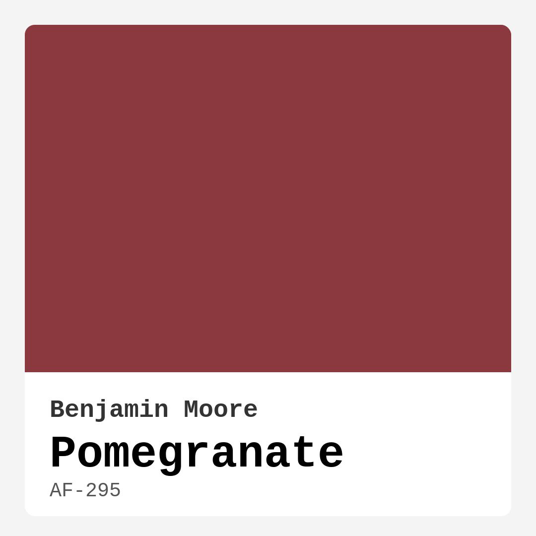
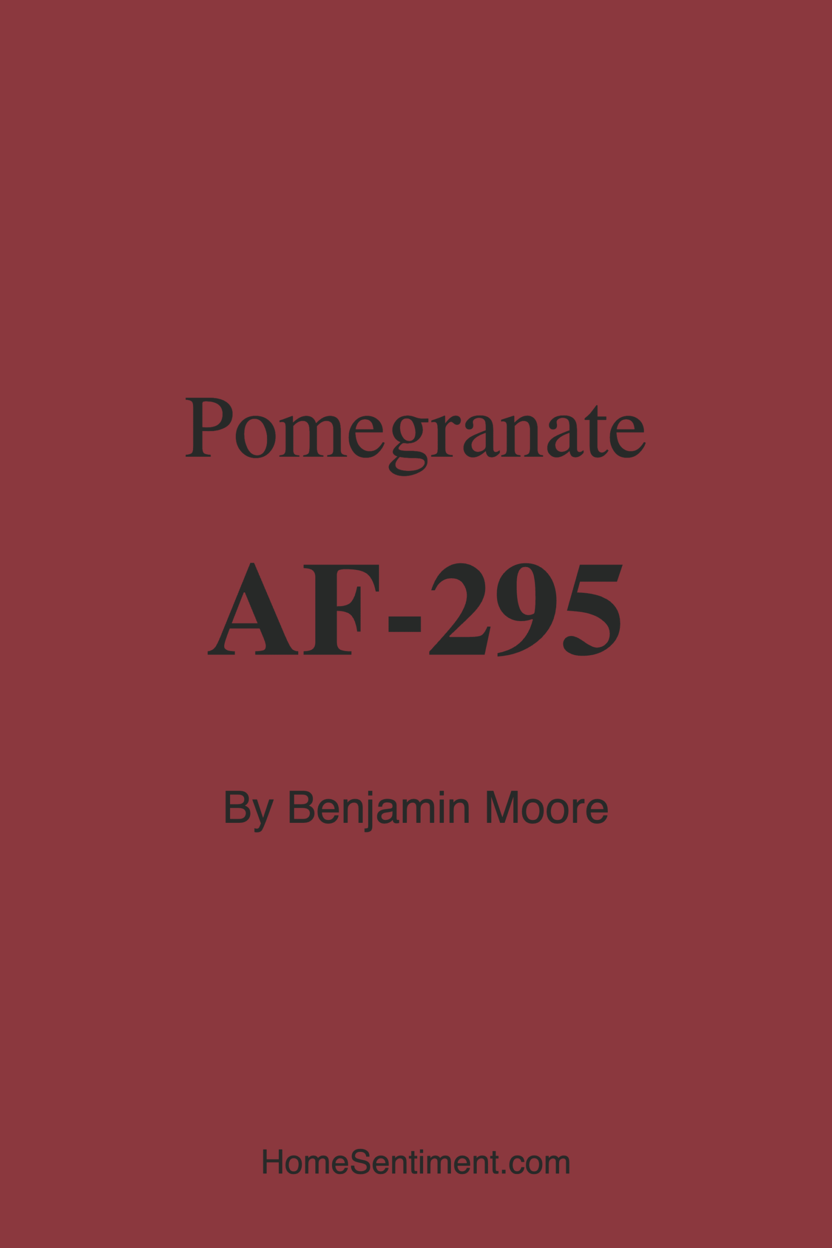
Color Preview & Key Details
| HEX Code | #8B383E |
| RGB | 139, 56, 62 |
| LRV | 10.14% |
| Undertone | Red |
| Finish Options | Eggshell, Matte, Satin, Semi-Gloss |
If you’re looking for a paint color that exudes warmth, sophistication, and a touch of drama, Benjamin Moore’s Pomegranate (AF-295) might just be your perfect match. This deep, rich red hue is more than just a bold statement—it’s a versatile shade that can transform a room into a cozy, inviting sanctuary. Whether you’re considering an accent wall or painting an entire space, Pomegranate brings a lush, vibrant energy that’s hard to ignore. Let’s dive into everything you need to know about this stunning color, from its undertones to the best ways to use it in your home.
First, let’s talk about the color itself. Pomegranate is a dark red with a warmth that makes it feel both luxurious and approachable. Its hex code (#8B383E) and RGB values (139, 56, 62) place it firmly in the realm of deep, moody reds, but it’s the undertones that really bring it to life. Unlike cooler reds that can feel stark or modern, Pomegranate leans into its warmth, making it ideal for creating a snug, intimate atmosphere. This is a color that pairs beautifully with wood tones, brass fixtures, and even rich greens, giving you plenty of flexibility when it comes to decor.
One of the standout features of Pomegranate is its Light Reflectance Value (LRV) of 10.14%, which means it absorbs far more light than it reflects. This makes it a fantastic choice for rooms where you want to cultivate a sense of coziness—think living rooms, dining rooms, or bedrooms. However, because it’s on the darker side, you’ll want to be mindful of lighting. In spaces with ample natural light, Pomegranate will appear vibrant and rich. In rooms with less light, it takes on a deeper, more muted tone, which can be incredibly romantic and moody. If you’re working with a smaller room, consider using it on a single accent wall paired with lighter neutrals to keep the space from feeling too closed in.
When it comes to application, Pomegranate is a dream to work with. Benjamin Moore’s formula offers excellent coverage, often requiring just one or two coats for a flawless finish. It’s also low-VOC and odor-free, making it a great choice for indoor projects where fumes might be a concern. The paint is available in multiple finishes—matte, eggshell, satin, and semi-gloss—so you can choose the level of sheen that best suits your space. A matte finish will give you a velvety, sophisticated look, while a semi-gloss can add a touch of glamour, especially on trim or doors.
Now, let’s talk about pairing Pomegranate with other colors. If you’re going for a classic, timeless look, pair it with crisp white trim like Benjamin Moore’s Simply White. The contrast between the deep red and bright white creates a striking, elegant effect. For a more modern vibe, try combining it with black accents or dark wood finishes. If you’re feeling adventurous, Pomegranate’s complementary hue is green, so incorporating emerald or olive tones through decor or textiles can create a dynamic, balanced palette. Metallic accents, especially brass or gold, also play beautifully with this warm red, adding a touch of luxury without overpowering the space.
Wondering which rooms are best suited for Pomegranate? It’s incredibly versatile. In a living room, it can create a dramatic backdrop for artwork or a statement fireplace. In a dining room, it sets the stage for intimate dinners and lively gatherings. Bedrooms painted in Pomegranate feel like a retreat—romantic, cozy, and deeply personal. Even entryways can benefit from this color, making a bold first impression the moment guests step inside. Just keep in mind that because it’s such a strong hue, it might not be the best fit for every space. If you prefer light, airy rooms or have a more minimalist aesthetic, you might want to use it sparingly or opt for a lighter shade from the same family.
As for decor styles, Pomegranate is a chameleon. It works seamlessly in traditional settings, where its richness enhances ornate furniture and classic details. In modern or contemporary spaces, it adds a pop of color that breaks up neutral palettes and adds depth. Bohemian and eclectic styles also benefit from Pomegranate’s warmth—think layered textiles, global-inspired patterns, and plenty of texture. The key is balance. If you’re going bold with the walls, keep furniture and accessories in check with neutral tones or let one or two standout pieces shine.
A few practical tips before you take the plunge: Always test the color in your space before committing. Paint a large swatch on the wall and observe it at different times of day to see how the light affects it. If you’re worried about the room feeling too dark, incorporate mirrors, light-colored furniture, or layered lighting to brighten things up. And don’t forget about the power of contrast—pairing Pomegranate with lighter shades or metallics can keep the space feeling dynamic and intentional.
At the end of the day, Pomegranate is for those who aren’t afraid to make a statement. It’s a color that demands attention but also rewards you with warmth, sophistication, and endless styling possibilities. Whether you’re refreshing a single room or reimagining your entire home, this deep red hue has the power to transform your space into something truly special. So go ahead—embrace the boldness, play with the drama, and let Pomegranate work its magic. Your walls will thank you.
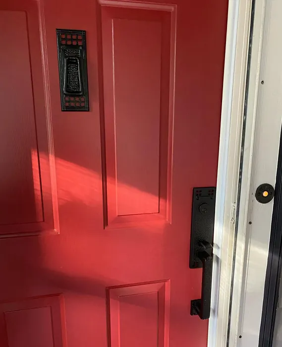
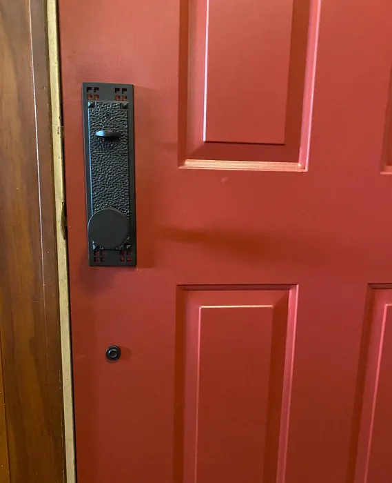
Real Room Photo of Pomegranate AF-295
Undertones of Pomegranate ?
The undertones of Pomegranate are a key aspect of its character, leaning towards Red. These subtle underlying hues are what give the color its depth and complexity. For example, a gray with a blue undertone will feel cooler and more modern, while one with a brown undertone will feel warmer and more traditional. It’s essential to test this paint in your home and observe it next to your existing furniture, flooring, and decor to see how these undertones interact and reveal themselves throughout the day.
HEX value: #8B383E
RGB code: 139, 56, 62
Is Pomegranate Cool or Warm?
Pomegranate is distinctly warm, with its deep red hue exuding a cozy and inviting vibe. This warmth is perfect for spaces where you want to create a welcoming and comforting atmosphere. The paint’s warm tones work beautifully in living rooms and dining rooms, where they can complement wooden furniture and warm metallics. The warmth also makes this color a great choice for bedrooms, adding a touch of romance and sophistication. Its ability to pair well with both traditional and modern decor styles further showcases its versatility.
Understanding Color Properties and Interior Design Tips
Hue refers to a specific position on the color wheel, measured in degrees from 0 to 360. Each degree represents a different pure color:
- 0° represents red
- 120° represents green
- 240° represents blue
Saturation describes the intensity or purity of a color and is expressed as a percentage:
- At 0%, the color appears completely desaturated—essentially a shade of gray
- At 100%, the color is at its most vivid and vibrant
Lightness indicates how light or dark a color is, also expressed as a percentage:
- 0% lightness results in black
- 100% lightness results in white
Using Warm Colors in Interior Design
Warm hues—such as reds, oranges, yellows, warm beiges, and greiges—are excellent choices for creating inviting and energetic spaces. These colors are particularly well-suited for:
- Kitchens, living rooms, and bathrooms, where warmth enhances comfort and sociability
- Large rooms, where warm tones can help reduce the sense of emptiness and make the space feel more intimate
For example:
- Warm beige shades provide a cozy, inviting atmosphere, ideal for living rooms, bedrooms, and hallways.
- Warm greige (a mix of beige and gray) offers the warmth of beige with the modern appeal of gray, making it a versatile backdrop for dining areas, bedrooms, and living spaces.
However, be mindful when using warm light tones in rooms with limited natural light. These shades may appear muted or even take on an unpleasant yellowish tint. To avoid a dull or flat appearance:
- Add depth by incorporating richer tones like deep greens, charcoal, or chocolate brown
- Use textured elements such as curtains, rugs, or cushions to bring dimension to the space
Pro Tip: Achieving Harmony with Warm and Cool Color Balance
To create a well-balanced and visually interesting interior, mix warm and cool tones strategically. This contrast adds depth and harmony to your design.
- If your walls feature warm hues, introduce cool-colored accents such as blue or green furniture, artwork, or accessories to create contrast.
- For a polished look, consider using a complementary color scheme, which pairs colors opposite each other on the color wheel (e.g., red with green, orange with blue).
This thoughtful mix not only enhances visual appeal but also creates a space that feels both dynamic and cohesive.
Light Temperature Affects on Pomegranate
Natural Light
Natural daylight changes in color temperature as the sun moves across the sky. At sunrise and sunset, the light tends to have a warm, golden tone with a color temperature around 2000 Kelvin (K). As the day progresses and the sun rises higher, the light becomes cooler and more neutral. Around midday, especially when the sky is clear, natural light typically reaches its peak brightness and shifts to a cooler tone, ranging from 5500 to 6500 Kelvin. This midday light is close to what we perceive as pure white or daylight-balanced light.
These shifts in natural light can significantly influence how colors appear in a space, which is why designers often consider both the time of day and the orientation of windows when planning interior color schemes.
Artificial Light
When choosing artificial lighting, pay close attention to the color temperature, measured in Kelvin (K). This determines how warm or cool the light will appear. Lower temperatures, around 2700K, give off a warm, yellow glow often used in living rooms or bedrooms. Higher temperatures, above 5000K, create a cool, bluish light similar to daylight, commonly used in kitchens, offices, or task areas.
Use the slider to see how lighting temperature can affect the appearance of a surface or color throughout a space.


4800K
LRV of Pomegranate
The Light Reflectance Value (LRV) of Pomegranate is 10.14%, which places it in the Medium Dark category. This means it reflects very little light. Understanding a paint’s LRV is crucial for predicting how it will look in your space. A higher LRV indicates a lighter color that reflects more light, making rooms feel larger and brighter. A lower LRV signifies a darker color that absorbs more light, creating a cozier, more intimate atmosphere. Always consider the natural and artificial lighting in your room when selecting a paint color based on its LRV.
Detailed Review of Pomegranate
Additional Paint Characteristics
Ideal Rooms
Bedroom, Dining Room, Entryway, Home Office, Living Room
Decor Styles
Bohemian, Eclectic, Modern, Traditional
Coverage
Good (1–2 Coats), High Hide, Self-Priming
Ease of Application
Brush Smooth, Fast-Drying, Low Splatter, Roller-Ready
Washability
Scrubbable, Stain Resistant, Washable
VOC Level
Low VOC, Odor-Free
Best Use
Accent Wall, Doors, Interior Walls, Large Spaces, Trim
Room Suitability
Bedroom, Dining Room, Entryway, Living Room
Tone Tag
Bold, Deep, Moody, Warm
Finish Type
Eggshell, Matte, Satin, Semi-Gloss
Paint Performance
Fade Resistant, High Coverage, Low Odor, Stain Resistant
Use Cases
Best for High Traffic Areas, Best for Low Light Rooms, Classic Favorite
Mood
Cozy, Inviting, Romantic, Sophisticated, Warm
Trim Pairing
Complements Brass Fixtures, Pairs with Simply White, Works with Warm Trim
The Pomegranate paint color is a standout choice for those looking to infuse their home with warmth and character. With its deep, rich red hue, this paint brings a sense of luxury and sophistication to any room. Ideal for creating accent walls or bold statements in living areas, the color’s warm undertones complement a variety of decor styles, from traditional to modern. This paint offers excellent coverage, often requiring just one to two coats for a flawless finish, making it both time and cost-efficient. Its versatility also extends to how well it pairs with different trim colors, ensuring seamless integration into existing design schemes. Whether you’re refreshing a single room or transforming an entire home, Pomegranate adds a touch of elegance and drama that won’t go unnoticed.
Pros & Cons of AF-295 Pomegranate
Pros
Cons
Colors that go with Benjamin Moore Pomegranate
FAQ on AF-295 Pomegranate
What decor styles does Pomegranate complement?
Pomegranate’s rich and warm red hue makes it a versatile choice that complements a wide range of decor styles. Its deep color works beautifully in traditional settings, enhancing classic wood furnishings and ornate decor. In modern and contemporary spaces, Pomegranate adds a pop of color that can break up monochromatic schemes and add interest. Its ability to pair well with metallic accents, such as brass or gold, makes it a favorite for bohemian and eclectic styles as well. Whether your home leans towards classic elegance or modern minimalism, Pomegranate can enhance the aesthetic with its bold and sophisticated appeal.
Can Pomegranate be used in smaller rooms?
Yes, Pomegranate can certainly be used in smaller rooms, but there are a few considerations to keep in mind. Its deep and rich hue can make a space feel more intimate and cozy, which is ideal for areas like bedrooms or reading nooks. However, because it absorbs more light than it reflects, it might make a small room feel even smaller if not balanced with appropriate lighting. To make the most of this color in smaller spaces, consider using it on an accent wall paired with lighter, neutral tones on the other walls. This approach can maintain the room’s coziness without overwhelming it. Additionally, incorporating elements like mirrors or light-colored furniture can help balance the effect and keep the space feeling open and inviting.
Comparisons Pomegranate with other colors
Pomegranate AF-295 vs Cavern Clay SW 7701
| Attribute | Pomegranate AF-295 | Cavern Clay SW 7701 |
|---|---|---|
| Color Name | Pomegranate AF-295 | Cavern Clay SW 7701 |
| Color | ||
| Hue | Red | Red |
| Brightness | Dark | Dark |
| RGB | 139, 56, 62 | 172, 107, 83 |
| LRV | 10.14% | 30% |
| Finish Type | Eggshell, Matte, Satin, Semi-Gloss | Eggshell, Matte, Satin |
| Finish Options | Eggshell, Matte, Satin, Semi-Gloss | Eggshell, Matte, Satin |
| Ideal Rooms | Bedroom, Dining Room, Entryway, Home Office, Living Room | Bedroom, Dining Room, Home Office, Kitchen, Living Room |
| Decor Styles | Bohemian, Eclectic, Modern, Traditional | Bohemian, Contemporary, Modern Farmhouse, Rustic, Transitional |
| Coverage | Good (1–2 Coats), High Hide, Self-Priming | Good (1–2 Coats), Touch-Up Friendly |
| Ease of Application | Brush Smooth, Fast-Drying, Low Splatter, Roller-Ready | Beginner Friendly, Brush Smooth, Roller-Ready |
| Washability | Scrubbable, Stain Resistant, Washable | Washable, Wipeable |
| Room Suitability | Bedroom, Dining Room, Entryway, Living Room | Bedroom, Dining Room, Home Office, Kitchen, Living Room |
| Tone | Bold, Deep, Moody, Warm | Earthy, Muted, Warm |
| Paint Performance | Fade Resistant, High Coverage, Low Odor, Stain Resistant | Easy Touch-Up, Low Odor, Scuff Resistant |
Pomegranate AF-295 vs Burgundy SW 6300
| Attribute | Pomegranate AF-295 | Burgundy SW 6300 |
|---|---|---|
| Color Name | Pomegranate AF-295 | Burgundy SW 6300 |
| Color | ||
| Hue | Red | Red |
| Brightness | Dark | Dark |
| RGB | 139, 56, 62 | 99, 51, 62 |
| LRV | 10.14% | 6% |
| Finish Type | Eggshell, Matte, Satin, Semi-Gloss | Eggshell, Matte, Satin |
| Finish Options | Eggshell, Matte, Satin, Semi-Gloss | Eggshell, Matte, Satin |
| Ideal Rooms | Bedroom, Dining Room, Entryway, Home Office, Living Room | Bedroom, Dining Room, Home Office, Living Room |
| Decor Styles | Bohemian, Eclectic, Modern, Traditional | Contemporary, Rustic, Traditional, Vintage |
| Coverage | Good (1–2 Coats), High Hide, Self-Priming | Good (1–2 Coats), Touch-Up Friendly |
| Ease of Application | Brush Smooth, Fast-Drying, Low Splatter, Roller-Ready | Beginner Friendly, Brush Smooth, Fast-Drying, Roller-Ready |
| Washability | Scrubbable, Stain Resistant, Washable | Washable, Wipeable |
| Room Suitability | Bedroom, Dining Room, Entryway, Living Room | Bedroom, Dining Room, Home Office, Living Room |
| Tone | Bold, Deep, Moody, Warm | Bold, Deep, Warm |
| Paint Performance | Fade Resistant, High Coverage, Low Odor, Stain Resistant | High Coverage, Low Odor, Quick Drying |
Pomegranate AF-295 vs Rookwood Red SW 2802
| Attribute | Pomegranate AF-295 | Rookwood Red SW 2802 |
|---|---|---|
| Color Name | Pomegranate AF-295 | Rookwood Red SW 2802 |
| Color | ||
| Hue | Red | Red |
| Brightness | Dark | Dark |
| RGB | 139, 56, 62 | 98, 47, 45 |
| LRV | 10.14% | 6% |
| Finish Type | Eggshell, Matte, Satin, Semi-Gloss | Eggshell, Matte, Satin |
| Finish Options | Eggshell, Matte, Satin, Semi-Gloss | Eggshell, Matte, Satin |
| Ideal Rooms | Bedroom, Dining Room, Entryway, Home Office, Living Room | Bedroom, Dining Room, Home Office, Living Room |
| Decor Styles | Bohemian, Eclectic, Modern, Traditional | Arts and Crafts, Modern Farmhouse, Rustic, Traditional |
| Coverage | Good (1–2 Coats), High Hide, Self-Priming | Good (1–2 Coats), Touch-Up Friendly |
| Ease of Application | Brush Smooth, Fast-Drying, Low Splatter, Roller-Ready | Beginner Friendly, Brush Smooth, Fast-Drying, Roller-Ready |
| Washability | Scrubbable, Stain Resistant, Washable | Washable, Wipeable |
| Room Suitability | Bedroom, Dining Room, Entryway, Living Room | Bedroom, Dining Room, Living Room |
| Tone | Bold, Deep, Moody, Warm | Deep, Earthy, Warm |
| Paint Performance | Fade Resistant, High Coverage, Low Odor, Stain Resistant | Easy Touch-Up, High Coverage, Low Odor |
Pomegranate AF-295 vs Spiced Cider SW 7702
| Attribute | Pomegranate AF-295 | Spiced Cider SW 7702 |
|---|---|---|
| Color Name | Pomegranate AF-295 | Spiced Cider SW 7702 |
| Color | ||
| Hue | Red | Red |
| Brightness | Dark | Dark |
| RGB | 139, 56, 62 | 176, 120, 92 |
| LRV | 10.14% | 20% |
| Finish Type | Eggshell, Matte, Satin, Semi-Gloss | Eggshell, Satin |
| Finish Options | Eggshell, Matte, Satin, Semi-Gloss | Eggshell, Satin, Semi-Gloss |
| Ideal Rooms | Bedroom, Dining Room, Entryway, Home Office, Living Room | Bedroom, Dining Room, Kitchen, Living Room |
| Decor Styles | Bohemian, Eclectic, Modern, Traditional | Modern Farmhouse, Rustic, Traditional, Transitional |
| Coverage | Good (1–2 Coats), High Hide, Self-Priming | Good (1–2 Coats), Touch-Up Friendly |
| Ease of Application | Brush Smooth, Fast-Drying, Low Splatter, Roller-Ready | Beginner Friendly, Brush Smooth, Roller-Ready |
| Washability | Scrubbable, Stain Resistant, Washable | Scrubbable, Washable |
| Room Suitability | Bedroom, Dining Room, Entryway, Living Room | Bedroom, Dining Room, Kitchen, Living Room |
| Tone | Bold, Deep, Moody, Warm | Earthy, Inviting, Warm |
| Paint Performance | Fade Resistant, High Coverage, Low Odor, Stain Resistant | Easy Touch-Up, High Coverage, Low Odor |
Pomegranate AF-295 vs Carnelian SW 7580
| Attribute | Pomegranate AF-295 | Carnelian SW 7580 |
|---|---|---|
| Color Name | Pomegranate AF-295 | Carnelian SW 7580 |
| Color | ||
| Hue | Red | Red |
| Brightness | Dark | Dark |
| RGB | 139, 56, 62 | 87, 62, 62 |
| LRV | 10.14% | 20% |
| Finish Type | Eggshell, Matte, Satin, Semi-Gloss | Eggshell, Satin |
| Finish Options | Eggshell, Matte, Satin, Semi-Gloss | Eggshell, Matte, Satin |
| Ideal Rooms | Bedroom, Dining Room, Entryway, Home Office, Living Room | Bedroom, Dining Room, Hallway, Home Office, Living Room |
| Decor Styles | Bohemian, Eclectic, Modern, Traditional | Bohemian, Modern Farmhouse, Rustic, Traditional |
| Coverage | Good (1–2 Coats), High Hide, Self-Priming | Good (1–2 Coats), Touch-Up Friendly |
| Ease of Application | Brush Smooth, Fast-Drying, Low Splatter, Roller-Ready | Beginner Friendly, Brush Smooth, Fast-Drying, Roller-Ready |
| Washability | Scrubbable, Stain Resistant, Washable | Washable, Wipeable |
| Room Suitability | Bedroom, Dining Room, Entryway, Living Room | Bedroom, Dining Room, Home Office, Living Room |
| Tone | Bold, Deep, Moody, Warm | Deep, Earthy, Warm |
| Paint Performance | Fade Resistant, High Coverage, Low Odor, Stain Resistant | Easy Touch-Up, Low Odor, Quick Drying |
Pomegranate AF-295 vs Sommelier SW 7595
| Attribute | Pomegranate AF-295 | Sommelier SW 7595 |
|---|---|---|
| Color Name | Pomegranate AF-295 | Sommelier SW 7595 |
| Color | ||
| Hue | Red | Red |
| Brightness | Dark | Dark |
| RGB | 139, 56, 62 | 93, 55, 54 |
| LRV | 10.14% | 6% |
| Finish Type | Eggshell, Matte, Satin, Semi-Gloss | Eggshell, Matte, Satin |
| Finish Options | Eggshell, Matte, Satin, Semi-Gloss | Eggshell, Matte, Satin |
| Ideal Rooms | Bedroom, Dining Room, Entryway, Home Office, Living Room | Bedroom, Dining Room, Home Office, Living Room |
| Decor Styles | Bohemian, Eclectic, Modern, Traditional | Modern, Rustic, Traditional, Transitional |
| Coverage | Good (1–2 Coats), High Hide, Self-Priming | Good (1–2 Coats), Touch-Up Friendly |
| Ease of Application | Brush Smooth, Fast-Drying, Low Splatter, Roller-Ready | Brush Smooth, Fast-Drying, Low Splatter, Roller-Ready |
| Washability | Scrubbable, Stain Resistant, Washable | Washable, Wipeable |
| Room Suitability | Bedroom, Dining Room, Entryway, Living Room | Bedroom, Dining Room, Home Office, Living Room |
| Tone | Bold, Deep, Moody, Warm | Deep, Earthy, Warm |
| Paint Performance | Fade Resistant, High Coverage, Low Odor, Stain Resistant | Easy Touch-Up, High Coverage, Low Odor, Scuff Resistant |
Pomegranate AF-295 vs Sun Dried Tomato SW 7585
| Attribute | Pomegranate AF-295 | Sun Dried Tomato SW 7585 |
|---|---|---|
| Color Name | Pomegranate AF-295 | Sun Dried Tomato SW 7585 |
| Color | ||
| Hue | Red | Red |
| Brightness | Dark | Dark |
| RGB | 139, 56, 62 | 105, 43, 43 |
| LRV | 10.14% | 20% |
| Finish Type | Eggshell, Matte, Satin, Semi-Gloss | Matte, Satin, Semi-Gloss |
| Finish Options | Eggshell, Matte, Satin, Semi-Gloss | Matte, Satin, Semi-Gloss |
| Ideal Rooms | Bedroom, Dining Room, Entryway, Home Office, Living Room | Dining Room, Home Office, Kitchen, Living Room |
| Decor Styles | Bohemian, Eclectic, Modern, Traditional | Industrial, Mediterranean, Modern Farmhouse, Rustic |
| Coverage | Good (1–2 Coats), High Hide, Self-Priming | Good (1–2 Coats), Touch-Up Friendly |
| Ease of Application | Brush Smooth, Fast-Drying, Low Splatter, Roller-Ready | Beginner Friendly, Brush Smooth, Roller-Ready |
| Washability | Scrubbable, Stain Resistant, Washable | Washable, Wipeable |
| Room Suitability | Bedroom, Dining Room, Entryway, Living Room | Dining Room, Home Office, Kitchen, Living Room |
| Tone | Bold, Deep, Moody, Warm | Bold, Earthy, Warm |
| Paint Performance | Fade Resistant, High Coverage, Low Odor, Stain Resistant | Easy Touch-Up, High Coverage, Low Odor |
Pomegranate AF-295 vs Rustic Red SW 7593
| Attribute | Pomegranate AF-295 | Rustic Red SW 7593 |
|---|---|---|
| Color Name | Pomegranate AF-295 | Rustic Red SW 7593 |
| Color | ||
| Hue | Red | Red |
| Brightness | Dark | Dark |
| RGB | 139, 56, 62 | 112, 50, 41 |
| LRV | 10.14% | 12% |
| Finish Type | Eggshell, Matte, Satin, Semi-Gloss | Matte, Satin |
| Finish Options | Eggshell, Matte, Satin, Semi-Gloss | Matte, Satin, Semi-Gloss |
| Ideal Rooms | Bedroom, Dining Room, Entryway, Home Office, Living Room | Bedroom, Dining Room, Hallway, Living Room |
| Decor Styles | Bohemian, Eclectic, Modern, Traditional | Country, Farmhouse, Rustic, Traditional |
| Coverage | Good (1–2 Coats), High Hide, Self-Priming | Good (1–2 Coats) |
| Ease of Application | Brush Smooth, Fast-Drying, Low Splatter, Roller-Ready | Beginner Friendly, Brush Smooth, Fast-Drying, Roller-Ready |
| Washability | Scrubbable, Stain Resistant, Washable | Washable, Wipeable |
| Room Suitability | Bedroom, Dining Room, Entryway, Living Room | Bedroom, Dining Room, Living Room |
| Tone | Bold, Deep, Moody, Warm | Deep, Earthy, Warm |
| Paint Performance | Fade Resistant, High Coverage, Low Odor, Stain Resistant | Easy Touch-Up, Low Odor, Quick Drying |
Pomegranate AF-295 vs Roycroft Copper Red SW 2839
| Attribute | Pomegranate AF-295 | Roycroft Copper Red SW 2839 |
|---|---|---|
| Color Name | Pomegranate AF-295 | Roycroft Copper Red SW 2839 |
| Color | ||
| Hue | Red | Red |
| Brightness | Dark | Dark |
| RGB | 139, 56, 62 | 123, 55, 40 |
| LRV | 10.14% | 12% |
| Finish Type | Eggshell, Matte, Satin, Semi-Gloss | Matte, Satin, Semi-Gloss |
| Finish Options | Eggshell, Matte, Satin, Semi-Gloss | Matte, Satin, Semi-Gloss |
| Ideal Rooms | Bedroom, Dining Room, Entryway, Home Office, Living Room | Bedroom, Dining Room, Entryway, Home Office, Living Room |
| Decor Styles | Bohemian, Eclectic, Modern, Traditional | Arts and Crafts, Eclectic, Farmhouse, Rustic, Traditional |
| Coverage | Good (1–2 Coats), High Hide, Self-Priming | Good (1–2 Coats), Touch-Up Friendly |
| Ease of Application | Brush Smooth, Fast-Drying, Low Splatter, Roller-Ready | Beginner Friendly, Brush Smooth, Roller-Ready |
| Washability | Scrubbable, Stain Resistant, Washable | Stain Resistant, Washable |
| Room Suitability | Bedroom, Dining Room, Entryway, Living Room | Bedroom, Dining Room, Entryway, Home Office, Living Room |
| Tone | Bold, Deep, Moody, Warm | Deep, Earthy, Warm |
| Paint Performance | Fade Resistant, High Coverage, Low Odor, Stain Resistant | Easy Touch-Up, High Coverage, Low Odor |
Pomegranate AF-295 vs Rookwood Dark Red SW 2801
| Attribute | Pomegranate AF-295 | Rookwood Dark Red SW 2801 |
|---|---|---|
| Color Name | Pomegranate AF-295 | Rookwood Dark Red SW 2801 |
| Color | ||
| Hue | Red | Red |
| Brightness | Dark | Dark |
| RGB | 139, 56, 62 | 75, 41, 41 |
| LRV | 10.14% | 6% |
| Finish Type | Eggshell, Matte, Satin, Semi-Gloss | Matte, Satin, Semi-Gloss |
| Finish Options | Eggshell, Matte, Satin, Semi-Gloss | Matte, Satin, Semi-Gloss |
| Ideal Rooms | Bedroom, Dining Room, Entryway, Home Office, Living Room | Bedroom, Dining Room, Home Office, Living Room |
| Decor Styles | Bohemian, Eclectic, Modern, Traditional | Farmhouse, Modern, Rustic, Traditional |
| Coverage | Good (1–2 Coats), High Hide, Self-Priming | Good (1–2 Coats) |
| Ease of Application | Brush Smooth, Fast-Drying, Low Splatter, Roller-Ready | Beginner Friendly, Brush Smooth, Roller-Ready |
| Washability | Scrubbable, Stain Resistant, Washable | Highly Washable, Washable |
| Room Suitability | Bedroom, Dining Room, Entryway, Living Room | Bedroom, Dining Room, Home Office, Living Room |
| Tone | Bold, Deep, Moody, Warm | Deep, Earthy, Warm |
| Paint Performance | Fade Resistant, High Coverage, Low Odor, Stain Resistant | Easy Touch-Up, High Coverage, Low Odor |
Official Page of Benjamin Moore Pomegranate AF-295