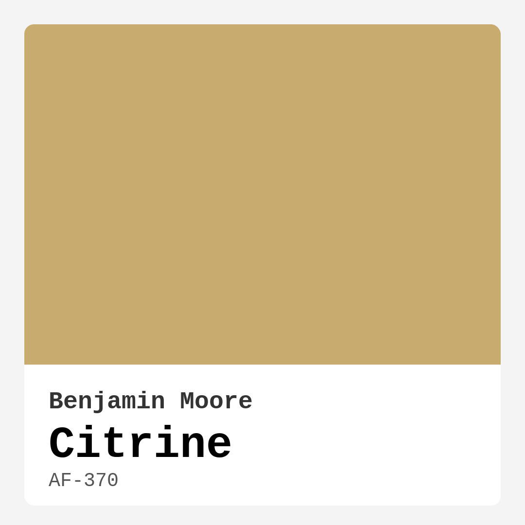
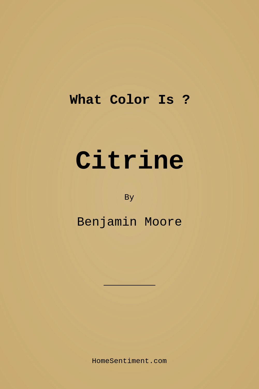
Color Preview & Key Details
| HEX Code | #C8AB6E |
| RGB | 200, 171, 110 |
| LRV | 40.53% |
| Undertone | Red |
| Finish Options | Eggshell, Matte, Satin |
Imagine stepping into a bright, welcoming room that feels like a warm embrace. That’s the kind of atmosphere you can create with Citrine by Benjamin Moore. This lovely shade, with its warm golden hue, radiates positivity and invites a sense of comfort and joy. If you’re considering a refresh for your home, let’s dive deep into why Citrine might just be the perfect color for your next project.
Citrine, with the color code AF-370, offers a delightful blend of warmth that captures the essence of sunshine. It’s a medium brightness color, which means it reflects about half of the light that hits it, creating a soft, inviting ambiance. The hex code #C8AB6E tells us that this shade leans toward yellow with subtle red undertones, giving it a richness that’s both earthy and vibrant. Whether you’re looking to brighten a living room, make a dining room feel more inviting, or add warmth to your kitchen, Citrine shines as a versatile choice.
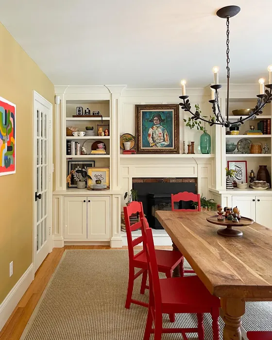
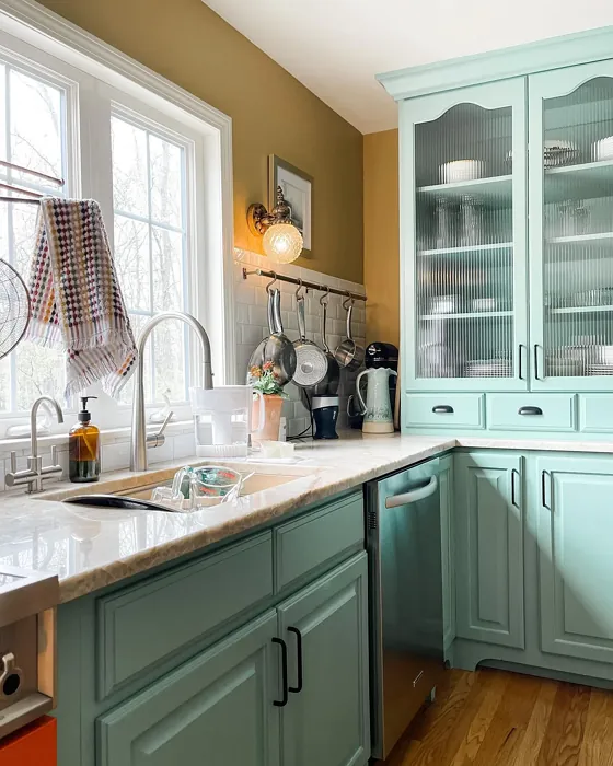
One of the best features of Citrine is its adaptability to various decor styles. Whether your home leans toward modern minimalism, rustic farmhouse charm, or traditional elegance, this color fits right in. Imagine Citrine on walls adorned with white trim—it’s a stunning combination that elevates the overall aesthetic of any space. It also pairs beautifully with brass fixtures, adding a touch of sophistication and warmth that enhances the room’s character.
When considering Citrine for smaller rooms, you might wonder if it can feel overwhelming. The answer is yes, it can, but only if used excessively. A thoughtful approach can transform a small space into a cozy haven. Applying Citrine on an accent wall, for instance, can provide that warm glow without making the room feel cramped. Pair it with lighter furniture and decor, and you’ll find that the color actually opens up the space, creating a cheerful atmosphere that feels both intimate and inviting.
One of my favorite aspects of Citrine is its finish options. You can choose from matte, eggshell, or satin finishes. For a modern touch, satin is excellent as it enhances the warmth of the color while providing a subtle sheen. Eggshell is another fantastic option, offering a classic look that’s easy to maintain. If you prefer a more understated aesthetic, matte finishes can also work well, although they may require more frequent touch-ups due to their absorbent nature. Consider the room’s lighting when making your choice; the finish can significantly affect how the color interacts with the light.
Speaking of lighting, Citrine is known for its light-reflective properties. In well-lit spaces, it appears more vibrant, almost glowing with warmth. In lower light situations, it offers a softer, muted glow that feels comforting and grounded. This quality makes Citrine an excellent choice for open-concept areas where you want to maintain continuity and flow throughout the space. Picture a cheerful dining room that seamlessly transitions into a cozy living area, all tied together by this inviting hue.
When it comes to practical application, Citrine is beginner-friendly. Its good coverage means you won’t need to stress about numerous coats, making it ideal for DIY projects. Most homeowners find that one or two coats do the trick, and its washability allows you to wipe away everyday smudges and stains with ease, keeping your walls looking fresh and vibrant.
However, like any paint color, Citrine comes with its considerations. In very small spaces, it can sometimes darken, leading to a feeling of constriction. To avoid this, you might want to balance it with lighter decor or limit its use to accent walls. Testing the paint in your home environment is crucial. Observe how it interacts with your existing furniture and decor throughout the day. The undertones, particularly the red, will reveal themselves differently depending on the surrounding elements and lighting, adding depth and complexity to the overall look.
Citrine’s versatility is one of its standout qualities. It complements a wide array of colors, from soft neutrals to rich, bold tones. If you’re looking to create a cohesive color palette, consider pairing Citrine with deeper shades like jade green or navy blue for a striking contrast. Alternatively, softer hues, like a pale lavender or muted grey, can create a serene and balanced space.
In terms of mood, Citrine radiates coziness and warmth. It invites connection, making it a natural fit for social spaces like living rooms and dining areas. Think about hosting family gatherings or cozy get-togethers with friends; this color will set the perfect backdrop for those cherished moments. It’s grounding yet uplifting, striking a balance that makes it suitable for a home office or creative space, too.
If you’re also considering complementary shades, colors like 2129-40 or 2127-60 work beautifully alongside Citrine. They can be used in adjacent rooms or as accents to enhance the warmth of the color in your home. The overall effect is harmonious and inviting, creating an environment that feels curated and thoughtful.
As you think about how to incorporate Citrine into your home, remember that it’s all about creating a space that reflects your personality and lifestyle. This color not only adds warmth and brightness but also serves as a canvas for your personal style. Whether you’re layering textures, mixing patterns, or simply enjoying the interaction of light and color throughout the day, Citrine can be the perfect partner in your design journey.
In conclusion, Citrine by Benjamin Moore is more than just a paint color; it’s a gateway to creating a joyful, inviting atmosphere in your home. Its warm, golden hue offers versatility across decor styles while maintaining a sense of comfort and positivity. As you embark on your next home project, consider the warmth of Citrine—it might just be the vibrant touch your space needs to feel complete. So grab that paintbrush, channel your inner designer, and let Citrine brighten up your world.
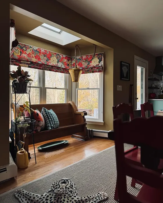
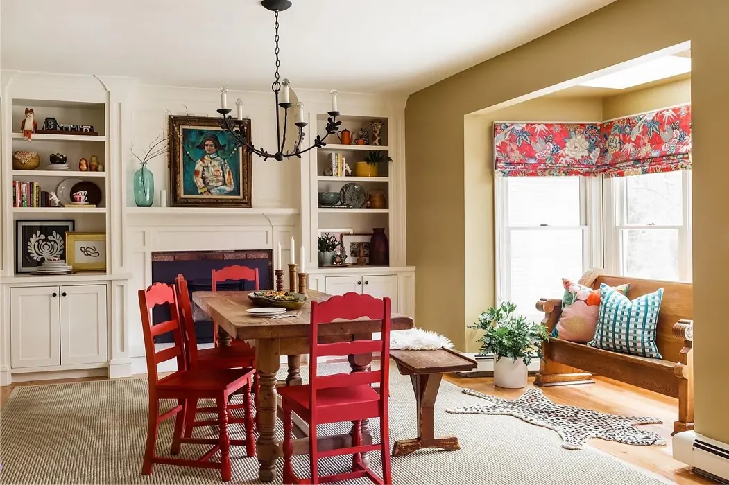
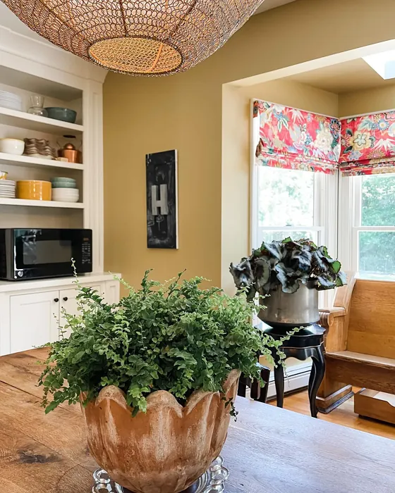
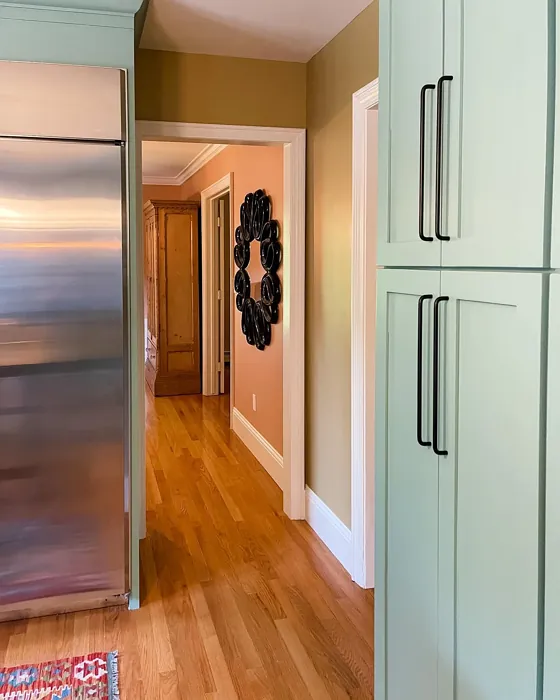
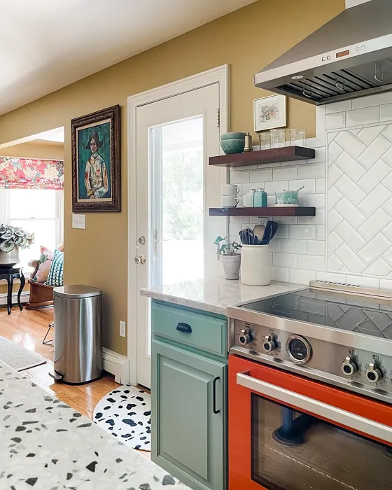
Real Room Photo of Citrine AF-370
Undertones of Citrine ?
The undertones of Citrine are a key aspect of its character, leaning towards Red. These subtle underlying hues are what give the color its depth and complexity. For example, a gray with a blue undertone will feel cooler and more modern, while one with a brown undertone will feel warmer and more traditional. It’s essential to test this paint in your home and observe it next to your existing furniture, flooring, and decor to see how these undertones interact and reveal themselves throughout the day.
HEX value: #C8AB6E
RGB code: 200, 171, 110
Is Citrine Cool or Warm?
Citrine is considered a warm paint color. This characteristic plays a huge role in the overall feel of a room. Warm colors, like this one, tend to create a cozy, inviting, and energetic atmosphere, making them great for social spaces like living rooms and dining rooms. In contrast, cool colors often evoke a sense of calm and serenity, which is why they are popular in bedrooms and bathrooms. The warmth of Citrine means it will pair beautifully with corresponding decor elements.
Understanding Color Properties and Interior Design Tips
Hue refers to a specific position on the color wheel, measured in degrees from 0 to 360. Each degree represents a different pure color:
- 0° represents red
- 120° represents green
- 240° represents blue
Saturation describes the intensity or purity of a color and is expressed as a percentage:
- At 0%, the color appears completely desaturated—essentially a shade of gray
- At 100%, the color is at its most vivid and vibrant
Lightness indicates how light or dark a color is, also expressed as a percentage:
- 0% lightness results in black
- 100% lightness results in white
Using Warm Colors in Interior Design
Warm hues—such as reds, oranges, yellows, warm beiges, and greiges—are excellent choices for creating inviting and energetic spaces. These colors are particularly well-suited for:
- Kitchens, living rooms, and bathrooms, where warmth enhances comfort and sociability
- Large rooms, where warm tones can help reduce the sense of emptiness and make the space feel more intimate
For example:
- Warm beige shades provide a cozy, inviting atmosphere, ideal for living rooms, bedrooms, and hallways.
- Warm greige (a mix of beige and gray) offers the warmth of beige with the modern appeal of gray, making it a versatile backdrop for dining areas, bedrooms, and living spaces.
However, be mindful when using warm light tones in rooms with limited natural light. These shades may appear muted or even take on an unpleasant yellowish tint. To avoid a dull or flat appearance:
- Add depth by incorporating richer tones like deep greens, charcoal, or chocolate brown
- Use textured elements such as curtains, rugs, or cushions to bring dimension to the space
Pro Tip: Achieving Harmony with Warm and Cool Color Balance
To create a well-balanced and visually interesting interior, mix warm and cool tones strategically. This contrast adds depth and harmony to your design.
- If your walls feature warm hues, introduce cool-colored accents such as blue or green furniture, artwork, or accessories to create contrast.
- For a polished look, consider using a complementary color scheme, which pairs colors opposite each other on the color wheel (e.g., red with green, orange with blue).
This thoughtful mix not only enhances visual appeal but also creates a space that feels both dynamic and cohesive.
Light Temperature Affects on Citrine
Natural Light
Natural daylight changes in color temperature as the sun moves across the sky. At sunrise and sunset, the light tends to have a warm, golden tone with a color temperature around 2000 Kelvin (K). As the day progresses and the sun rises higher, the light becomes cooler and more neutral. Around midday, especially when the sky is clear, natural light typically reaches its peak brightness and shifts to a cooler tone, ranging from 5500 to 6500 Kelvin. This midday light is close to what we perceive as pure white or daylight-balanced light.
These shifts in natural light can significantly influence how colors appear in a space, which is why designers often consider both the time of day and the orientation of windows when planning interior color schemes.
Artificial Light
When choosing artificial lighting, pay close attention to the color temperature, measured in Kelvin (K). This determines how warm or cool the light will appear. Lower temperatures, around 2700K, give off a warm, yellow glow often used in living rooms or bedrooms. Higher temperatures, above 5000K, create a cool, bluish light similar to daylight, commonly used in kitchens, offices, or task areas.
Use the slider to see how lighting temperature can affect the appearance of a surface or color throughout a space.


4800K
LRV of Citrine
The Light Reflectance Value (LRV) of Citrine is 40.53%, which places it in the Light Medium colors category. This means it reflect half of the incident light. Understanding a paint’s LRV is crucial for predicting how it will look in your space. A higher LRV indicates a lighter color that reflects more light, making rooms feel larger and brighter. A lower LRV signifies a darker color that absorbs more light, creating a cozier, more intimate atmosphere. Always consider the natural and artificial lighting in your room when selecting a paint color based on its LRV.
Detailed Review of Citrine
Additional Paint Characteristics
Ideal Rooms
Bedroom, Dining Room, Home Office, Kitchen, Living Room
Decor Styles
Farmhouse, Modern, Rustic, Traditional
Coverage
Good (1–2 Coats), Touch-Up Friendly
Ease of Application
Beginner Friendly, Brush Smooth, Roller-Ready
Washability
Washable, Wipeable
VOC Level
Eco-Certified, Low VOC
Best Use
Accent Wall, Furniture, Interior Walls
Room Suitability
Bedroom, Dining Room, Kitchen, Living Room
Tone Tag
Earthy, Inviting, Warm
Finish Type
Eggshell, Satin
Paint Performance
Easy Touch-Up, Low Odor, Scuff Resistant
Use Cases
Best for Open Concept, Best for Small Spaces
Mood
Cozy, Grounding, Inviting
Trim Pairing
Complements Brass Fixtures, Pairs with White Dove, Works with Warm Trim
Citrine stands out as a wonderful choice for anyone looking to brighten their living space. Its warm undertones offer a comforting glow, making it ideal for areas where relaxation and social interaction happen. Whether you’re painting an accent wall or an entire room, this color maintains its vibrancy and charm, creating an inviting environment.
One of the greatest strengths of Citrine is its versatility; it pairs well with neutral tones and rich colors alike, allowing for endless decor possibilities. Additionally, the finish options available, such as eggshell and satin, enhance the color’s warmth while providing a soft sheen that adds depth to your walls. Overall, if you’re seeking a color that radiates positivity, Citrine is definitely worth considering.
Pros & Cons of AF-370 Citrine
Pros
Cons
Colors that go with Benjamin Moore Citrine
FAQ on AF-370 Citrine
Is Citrine suitable for small rooms?
Absolutely! While Citrine is warm and can brighten up a small room, it’s best used in larger quantities or as an accent to avoid feeling overwhelming. When applied correctly, it can create a cozy, inviting atmosphere without making the space feel cramped. Pair it with lighter furnishings or decor to enhance its brightness.
What finishes work best with Citrine?
Citrine looks fantastic in a variety of finishes, but eggshell and satin are particularly recommended as they enhance the warmth of the color while providing a subtle sheen. Matte finishes can also work well for a more understated look, but they may require more touch-ups over time. Consider your space and lighting when making your choice!
Comparisons Citrine with other colors
Citrine AF-370 vs Hearts of Palm SW 6415
| Attribute | Citrine AF-370 | Hearts of Palm SW 6415 |
|---|---|---|
| Color Name | Citrine AF-370 | Hearts of Palm SW 6415 |
| Color | ||
| Hue | Yellow | Yellow |
| Brightness | Medium | Medium |
| RGB | 200, 171, 110 | 207, 194, 145 |
| LRV | 40.53% | 75% |
| Finish Type | Eggshell, Satin | Eggshell, Matte, Satin |
| Finish Options | Eggshell, Matte, Satin | Eggshell, Matte, Satin |
| Ideal Rooms | Bedroom, Dining Room, Home Office, Kitchen, Living Room | Bathroom, Bedroom, Dining Room, Home Office, Kitchen, Living Room |
| Decor Styles | Farmhouse, Modern, Rustic, Traditional | Bohemian, Coastal, Eclectic, Modern Farmhouse, Tropical |
| Coverage | Good (1–2 Coats), Touch-Up Friendly | Good (1–2 Coats), Touch-Up Friendly |
| Ease of Application | Beginner Friendly, Brush Smooth, Roller-Ready | Beginner Friendly, Brush Smooth, Roller-Ready |
| Washability | Washable, Wipeable | Scrubbable, Washable |
| Room Suitability | Bedroom, Dining Room, Kitchen, Living Room | Bathroom, Bedroom, Dining Room, Home Office, Kitchen, Living Room |
| Tone | Earthy, Inviting, Warm | Earthy, Muted, Warm |
| Paint Performance | Easy Touch-Up, Low Odor, Scuff Resistant | Easy Touch-Up, Low Odor, Scuff Resistant |
Citrine AF-370 vs Blonde SW 6128
| Attribute | Citrine AF-370 | Blonde SW 6128 |
|---|---|---|
| Color Name | Citrine AF-370 | Blonde SW 6128 |
| Color | ||
| Hue | Yellow | Yellow |
| Brightness | Medium | Medium |
| RGB | 200, 171, 110 | 220, 189, 146 |
| LRV | 40.53% | 64% |
| Finish Type | Eggshell, Satin | Eggshell, Satin |
| Finish Options | Eggshell, Matte, Satin | Eggshell, Matte, Satin |
| Ideal Rooms | Bedroom, Dining Room, Home Office, Kitchen, Living Room | Bedroom, Dining Room, Home Office, Kitchen, Living Room |
| Decor Styles | Farmhouse, Modern, Rustic, Traditional | Bohemian, Coastal, Modern Farmhouse, Scandinavian, Transitional |
| Coverage | Good (1–2 Coats), Touch-Up Friendly | Good (1–2 Coats), Touch-Up Friendly |
| Ease of Application | Beginner Friendly, Brush Smooth, Roller-Ready | Beginner Friendly, Fast-Drying, Roller-Ready |
| Washability | Washable, Wipeable | Highly Washable, Washable |
| Room Suitability | Bedroom, Dining Room, Kitchen, Living Room | Bedroom, Dining Room, Home Office, Kitchen, Living Room, Nursery |
| Tone | Earthy, Inviting, Warm | Earthy, Neutral, Warm |
| Paint Performance | Easy Touch-Up, Low Odor, Scuff Resistant | Easy Touch-Up, Fade Resistant, Low Odor, Quick Drying |
Citrine AF-370 vs Ruskin Room Green SW 0042
| Attribute | Citrine AF-370 | Ruskin Room Green SW 0042 |
|---|---|---|
| Color Name | Citrine AF-370 | Ruskin Room Green SW 0042 |
| Color | ||
| Hue | Yellow | Yellow |
| Brightness | Medium | Medium |
| RGB | 200, 171, 110 | 172, 161, 125 |
| LRV | 40.53% | 24% |
| Finish Type | Eggshell, Satin | Eggshell, Matte |
| Finish Options | Eggshell, Matte, Satin | Eggshell, Flat, Matte, Satin |
| Ideal Rooms | Bedroom, Dining Room, Home Office, Kitchen, Living Room | Bedroom, Dining Room, Home Office, Living Room |
| Decor Styles | Farmhouse, Modern, Rustic, Traditional | Farmhouse, Modern, Rustic, Traditional |
| Coverage | Good (1–2 Coats), Touch-Up Friendly | Good (1–2 Coats), Touch-Up Friendly |
| Ease of Application | Beginner Friendly, Brush Smooth, Roller-Ready | Beginner Friendly, Brush Smooth, Roller-Ready |
| Washability | Washable, Wipeable | Scrubbable, Washable |
| Room Suitability | Bedroom, Dining Room, Kitchen, Living Room | Bedroom, Dining Room, Home Office, Living Room |
| Tone | Earthy, Inviting, Warm | Earthy, Muted, Warm |
| Paint Performance | Easy Touch-Up, Low Odor, Scuff Resistant | Easy Touch-Up, High Coverage, Low Odor |
Citrine AF-370 vs Bosc Pear SW 6390
| Attribute | Citrine AF-370 | Bosc Pear SW 6390 |
|---|---|---|
| Color Name | Citrine AF-370 | Bosc Pear SW 6390 |
| Color | ||
| Hue | Yellow | Yellow |
| Brightness | Medium | Medium |
| RGB | 200, 171, 110 | 192, 144, 86 |
| LRV | 40.53% | 60% |
| Finish Type | Eggshell, Satin | Satin, Semi-Gloss |
| Finish Options | Eggshell, Matte, Satin | Flat, Satin, Semi-Gloss |
| Ideal Rooms | Bedroom, Dining Room, Home Office, Kitchen, Living Room | Bedroom, Dining Room, Home Office, Kitchen, Living Room |
| Decor Styles | Farmhouse, Modern, Rustic, Traditional | Modern Farmhouse, Rustic, Traditional, Transitional |
| Coverage | Good (1–2 Coats), Touch-Up Friendly | Good (1–2 Coats) |
| Ease of Application | Beginner Friendly, Brush Smooth, Roller-Ready | Beginner Friendly, Brush Smooth, Fast-Drying, Roller-Ready |
| Washability | Washable, Wipeable | Highly Washable, Washable |
| Room Suitability | Bedroom, Dining Room, Kitchen, Living Room | Bedroom, Dining Room, Home Office, Living Room |
| Tone | Earthy, Inviting, Warm | Balanced, Earthy, Warm |
| Paint Performance | Easy Touch-Up, Low Odor, Scuff Resistant | Easy Touch-Up, High Coverage, Low Odor, Quick Drying |
Citrine AF-370 vs Lemongrass SW 7732
| Attribute | Citrine AF-370 | Lemongrass SW 7732 |
|---|---|---|
| Color Name | Citrine AF-370 | Lemongrass SW 7732 |
| Color | ||
| Hue | Yellow | Yellow |
| Brightness | Medium | Medium |
| RGB | 200, 171, 110 | 200, 189, 152 |
| LRV | 40.53% | 48% |
| Finish Type | Eggshell, Satin | Eggshell, Matte, Satin |
| Finish Options | Eggshell, Matte, Satin | Eggshell, Matte, Satin |
| Ideal Rooms | Bedroom, Dining Room, Home Office, Kitchen, Living Room | Bathroom, Bedroom, Home Office, Kitchen, Living Room, Nursery |
| Decor Styles | Farmhouse, Modern, Rustic, Traditional | Bohemian, Modern Farmhouse, Scandinavian, Transitional |
| Coverage | Good (1–2 Coats), Touch-Up Friendly | Good (1–2 Coats) |
| Ease of Application | Beginner Friendly, Brush Smooth, Roller-Ready | Beginner Friendly, Brush Smooth, Roller-Ready |
| Washability | Washable, Wipeable | Highly Washable, Washable |
| Room Suitability | Bedroom, Dining Room, Kitchen, Living Room | Bedroom, Home Office, Kitchen, Living Room |
| Tone | Earthy, Inviting, Warm | Earthy, Muted, Warm |
| Paint Performance | Easy Touch-Up, Low Odor, Scuff Resistant | Easy Touch-Up, Low Odor, Scuff Resistant |
Citrine AF-370 vs Garden Sage SW 7736
| Attribute | Citrine AF-370 | Garden Sage SW 7736 |
|---|---|---|
| Color Name | Citrine AF-370 | Garden Sage SW 7736 |
| Color | ||
| Hue | Yellow | Yellow |
| Brightness | Medium | Medium |
| RGB | 200, 171, 110 | 177, 165, 132 |
| LRV | 40.53% | 24% |
| Finish Type | Eggshell, Satin | Eggshell, Matte, Satin |
| Finish Options | Eggshell, Matte, Satin | Eggshell, Matte, Satin |
| Ideal Rooms | Bedroom, Dining Room, Home Office, Kitchen, Living Room | Bedroom, Dining Room, Home Office, Kitchen, Living Room, Nursery |
| Decor Styles | Farmhouse, Modern, Rustic, Traditional | Bohemian, Cottage, Minimalist, Modern Farmhouse, Traditional |
| Coverage | Good (1–2 Coats), Touch-Up Friendly | Good (1–2 Coats), Touch-Up Friendly |
| Ease of Application | Beginner Friendly, Brush Smooth, Roller-Ready | Beginner Friendly, Brush Smooth, Roller-Ready |
| Washability | Washable, Wipeable | Highly Washable, Washable |
| Room Suitability | Bedroom, Dining Room, Kitchen, Living Room | Bedroom, Dining Room, Home Office, Kitchen, Living Room |
| Tone | Earthy, Inviting, Warm | Balanced, Earthy, Muted, Warm |
| Paint Performance | Easy Touch-Up, Low Odor, Scuff Resistant | Easy Touch-Up, Fade Resistant, Low Odor |
Citrine AF-370 vs Tassel SW 6369
| Attribute | Citrine AF-370 | Tassel SW 6369 |
|---|---|---|
| Color Name | Citrine AF-370 | Tassel SW 6369 |
| Color | ||
| Hue | Yellow | Yellow |
| Brightness | Medium | Medium |
| RGB | 200, 171, 110 | 198, 136, 74 |
| LRV | 40.53% | 45% |
| Finish Type | Eggshell, Satin | Matte, Satin |
| Finish Options | Eggshell, Matte, Satin | Matte, Satin, Semi-Gloss |
| Ideal Rooms | Bedroom, Dining Room, Home Office, Kitchen, Living Room | Bedroom, Dining Room, Home Office, Living Room |
| Decor Styles | Farmhouse, Modern, Rustic, Traditional | Bohemian, Modern Farmhouse, Rustic, Transitional |
| Coverage | Good (1–2 Coats), Touch-Up Friendly | Good (1–2 Coats) |
| Ease of Application | Beginner Friendly, Brush Smooth, Roller-Ready | Beginner Friendly, Brush Smooth, Fast-Drying, Roller-Ready |
| Washability | Washable, Wipeable | Scrubbable, Washable |
| Room Suitability | Bedroom, Dining Room, Kitchen, Living Room | Bedroom, Dining Room, Home Office, Living Room |
| Tone | Earthy, Inviting, Warm | Earthy, Inviting, Warm |
| Paint Performance | Easy Touch-Up, Low Odor, Scuff Resistant | Easy Touch-Up, Low Odor, Quick Drying, Scuff Resistant |
Citrine AF-370 vs Sunflower SW 6678
| Attribute | Citrine AF-370 | Sunflower SW 6678 |
|---|---|---|
| Color Name | Citrine AF-370 | Sunflower SW 6678 |
| Color | ||
| Hue | Yellow | Yellow |
| Brightness | Medium | Medium |
| RGB | 200, 171, 110 | 227, 154, 51 |
| LRV | 40.53% | 75% |
| Finish Type | Eggshell, Satin | Eggshell, Satin |
| Finish Options | Eggshell, Matte, Satin | Eggshell, Satin, Semi-Gloss |
| Ideal Rooms | Bedroom, Dining Room, Home Office, Kitchen, Living Room | Dining Room, Entryway, Home Office, Kitchen, Living Room |
| Decor Styles | Farmhouse, Modern, Rustic, Traditional | Bohemian, Eclectic, Modern Farmhouse, Traditional |
| Coverage | Good (1–2 Coats), Touch-Up Friendly | Good (1–2 Coats), Touch-Up Friendly |
| Ease of Application | Beginner Friendly, Brush Smooth, Roller-Ready | Beginner Friendly, Brush Smooth, Fast-Drying, Roller-Ready |
| Washability | Washable, Wipeable | Highly Washable, Washable |
| Room Suitability | Bedroom, Dining Room, Kitchen, Living Room | Dining Room, Entryway, Kitchen, Living Room |
| Tone | Earthy, Inviting, Warm | Bold, Earthy, Warm |
| Paint Performance | Easy Touch-Up, Low Odor, Scuff Resistant | Fade Resistant, High Coverage, Quick Drying |
Citrine AF-370 vs Bee's Wax SW 7682
| Attribute | Citrine AF-370 | Bee's Wax SW 7682 |
|---|---|---|
| Color Name | Citrine AF-370 | Bee's Wax SW 7682 |
| Color | ||
| Hue | Yellow | Yellow |
| Brightness | Medium | Medium |
| RGB | 200, 171, 110 | 234, 191, 134 |
| LRV | 40.53% | 50% |
| Finish Type | Eggshell, Satin | Eggshell, Matte, Satin |
| Finish Options | Eggshell, Matte, Satin | Eggshell, Matte, Satin |
| Ideal Rooms | Bedroom, Dining Room, Home Office, Kitchen, Living Room | Bedroom, Dining Room, Entryway, Kitchen, Living Room |
| Decor Styles | Farmhouse, Modern, Rustic, Traditional | Bohemian, Coastal, Modern Farmhouse, Traditional, Transitional |
| Coverage | Good (1–2 Coats), Touch-Up Friendly | Good (1–2 Coats), Touch-Up Friendly |
| Ease of Application | Beginner Friendly, Brush Smooth, Roller-Ready | Beginner Friendly, Brush Smooth, Roller-Ready |
| Washability | Washable, Wipeable | Washable, Wipeable |
| Room Suitability | Bedroom, Dining Room, Kitchen, Living Room | Bedroom, Dining Room, Entryway, Kitchen, Living Room |
| Tone | Earthy, Inviting, Warm | Creamy, Earthy, Warm |
| Paint Performance | Easy Touch-Up, Low Odor, Scuff Resistant | Easy Touch-Up, High Coverage, Low Odor |
Citrine AF-370 vs Downing Straw SW 2813
| Attribute | Citrine AF-370 | Downing Straw SW 2813 |
|---|---|---|
| Color Name | Citrine AF-370 | Downing Straw SW 2813 |
| Color | ||
| Hue | Yellow | Yellow |
| Brightness | Medium | Medium |
| RGB | 200, 171, 110 | 202, 171, 125 |
| LRV | 40.53% | 48% |
| Finish Type | Eggshell, Satin | Eggshell, Matte, Satin |
| Finish Options | Eggshell, Matte, Satin | Eggshell, Matte, Satin |
| Ideal Rooms | Bedroom, Dining Room, Home Office, Kitchen, Living Room | Bedroom, Dining Room, Home Office, Kitchen, Living Room |
| Decor Styles | Farmhouse, Modern, Rustic, Traditional | Contemporary, Eclectic, Modern Farmhouse, Rustic, Traditional |
| Coverage | Good (1–2 Coats), Touch-Up Friendly | Good (1–2 Coats), Touch-Up Friendly |
| Ease of Application | Beginner Friendly, Brush Smooth, Roller-Ready | Beginner Friendly, Brush Smooth, Roller-Ready |
| Washability | Washable, Wipeable | Washable, Wipeable |
| Room Suitability | Bedroom, Dining Room, Kitchen, Living Room | Bedroom, Dining Room, Home Office, Kitchen, Living Room |
| Tone | Earthy, Inviting, Warm | Earthy, Muted, Warm |
| Paint Performance | Easy Touch-Up, Low Odor, Scuff Resistant | Easy Touch-Up, High Coverage, Low Odor |
Official Page of Benjamin Moore Citrine AF-370