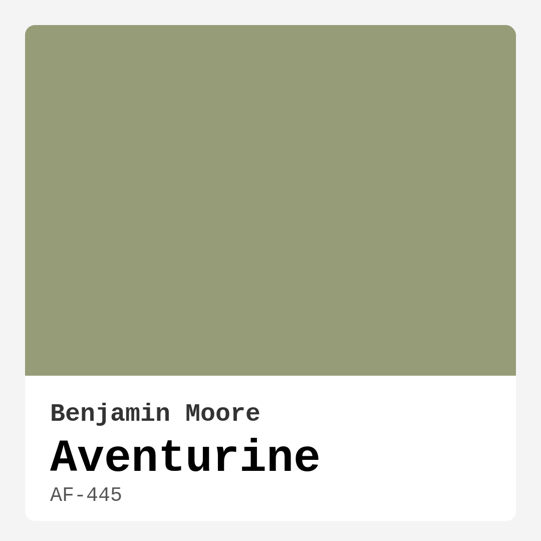
Color Preview & Key Details
| HEX Code | #979C78 |
| RGB | 151, 156, 120 |
| LRV | 31.55% |
| Undertone | Yellow |
| Finish Options | Eggshell, Matte, Satin |
Imagine walking into a room that instantly makes you feel at ease, a space that wraps you in warmth and tranquility. This is precisely the ambiance that Aventurine, a captivating green hue from Benjamin Moore, can create in your home. This beautiful color is more than just paint; it’s an experience, a connection to nature that beckons you to unwind and enjoy life’s simple pleasures.
Aventurine, with its earthy undertones and soothing presence, is an enchanting choice for any homeowner looking to elevate their space. The color code AF-445 perfectly encapsulates a muted yet vibrant green that harmonizes with various design styles, from modern farmhouse to minimalist and everything in between. Its warmth invites you in, while maintaining an elegant simplicity that feels fresh and grounded.
What makes Aventurine such a versatile option? For starters, it beautifully reflects a lot of light, which is crucial when you’re trying to create a welcoming atmosphere. With a Light Reflectance Value (LRV) of 31.55%, it sits comfortably in the medium category, meaning it doesn’t absorb too much light but rather enhances the brightness of a room. This quality is particularly beneficial in areas that receive ample sunlight, as Aventurine can showcase its fresh green character.
However, it’s important to remember that Aventurine can take on a deeper, more sophisticated tone in dim lighting. This dynamic nature allows for a room to feel alive and change throughout the day, adapting to the light and your mood. It makes you appreciate how colors can transform a space, breathing life into walls that may have felt dull or uninspired.
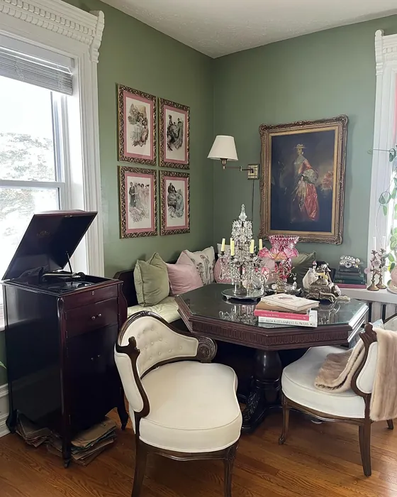
When considering where to apply Aventurine, the possibilities are extensive. It shines in living rooms, bedrooms, kitchens, dining areas, and even home offices. Imagine a cozy living room painted in this warm green, complemented by natural wood accents and soft textiles. It creates a calm, inviting environment, ideal for gatherings with friends or quiet evenings spent reading. In bedrooms, Aventurine fosters a serene atmosphere that promotes relaxation and a good night’s sleep.
For those who lean toward a more rustic or bohemian style, this color can serve as a perfect backdrop to showcase your unique decor. Its yellow undertone adds a touch of warmth that pairs beautifully with earthy tones and textures, allowing your furniture and accessories to pop against its muted green canvas.
Aventurine is beginner-friendly, making it an excellent choice for DIY enthusiasts. Its ease of application means you can achieve a smooth finish with minimal effort. Whether you’re using a roller or a brush, you’ll find that Aventurine glides on effortlessly, requiring just one or two coats for full coverage. This not only saves time but also makes it a practical option for those new to painting.
One of the standout features of Aventurine is its washability and durability. Being a low VOC and ultra-low VOC paint, it’s an eco-friendly choice that won’t compromise air quality. Plus, its wipeable surface means you can maintain that serene look without worrying about scuffs or marks ruining your hard work. Just imagine the relief of knowing your walls can withstand the wear and tear of daily life while still looking stunning.
While Aventurine has many advantages, it does have a few considerations to keep in mind. It may appear darker in low-light conditions, which means you should be mindful of the lighting in your space. If your room lacks natural light, pairing it with lighter furnishings can help maintain an open, airy feel. Additionally, while Aventurine is versatile, it might not be the best fit for overly vibrant or high-contrast decor styles, as it shines brightest in more muted settings.
If you’re contemplating using Aventurine in a small space, you’re in luck! This color can create an illusion of depth and openness, making it ideal for cozy rooms. Just ensure you have good lighting to showcase its beauty fully. In bathrooms, Aventurine can transform your space into a spa-like retreat. Its earthy tones promote relaxation, and with the right finish—like eggshell or satin—you’ll have a look that’s both stylish and practical.
One of the best ways to highlight Aventurine’s charm is to pair it with complementary shades. White Dove, for example, makes for a stunning trim that accentuates the warmth of Aventurine beautifully. Brass fixtures can also elevate the overall aesthetic, adding a touch of elegance that feels both modern and timeless.
In conclusion, Aventurine is a delightful choice for any homeowner looking to refresh their interiors with a color that embodies warmth, tranquility, and a deep connection to nature. Its unique ability to adapt to different lighting conditions and styles makes it a versatile option that can cater to various tastes and preferences. Whether you’re painting a calming bedroom or a lively living space, Aventurine will surely enhance your environment, making it a more inviting and beautiful place to be.
So, as you step back and admire your newly painted walls, you’ll feel the soothing embrace of Aventurine, reminding you that home is indeed where the heart is, and it’s been beautifully transformed.

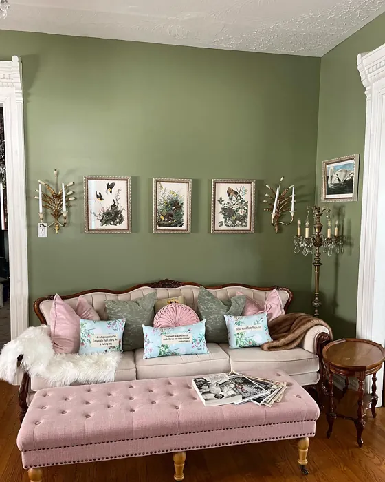
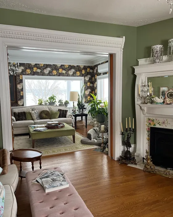
Real Room Photo of Aventurine AF-445
Undertones of Aventurine ?
The undertones of Aventurine are a key aspect of its character, leaning towards Yellow. These subtle underlying hues are what give the color its depth and complexity. For example, a gray with a blue undertone will feel cooler and more modern, while one with a brown undertone will feel warmer and more traditional. It’s essential to test this paint in your home and observe it next to your existing furniture, flooring, and decor to see how these undertones interact and reveal themselves throughout the day.
HEX value: #979C78
RGB code: 151, 156, 120
Is Aventurine Cool or Warm?
Aventurine is considered a warm paint color. This characteristic plays a huge role in the overall feel of a room. Warm colors, like this one, tend to create a cozy, inviting, and energetic atmosphere, making them great for social spaces like living rooms and dining rooms. In contrast, cool colors often evoke a sense of calm and serenity, which is why they are popular in bedrooms and bathrooms. The warmth of Aventurine means it will pair beautifully with corresponding decor elements.
Understanding Color Properties and Interior Design Tips
Hue refers to a specific position on the color wheel, measured in degrees from 0 to 360. Each degree represents a different pure color:
- 0° represents red
- 120° represents green
- 240° represents blue
Saturation describes the intensity or purity of a color and is expressed as a percentage:
- At 0%, the color appears completely desaturated—essentially a shade of gray
- At 100%, the color is at its most vivid and vibrant
Lightness indicates how light or dark a color is, also expressed as a percentage:
- 0% lightness results in black
- 100% lightness results in white
Using Warm Colors in Interior Design
Warm hues—such as reds, oranges, yellows, warm beiges, and greiges—are excellent choices for creating inviting and energetic spaces. These colors are particularly well-suited for:
- Kitchens, living rooms, and bathrooms, where warmth enhances comfort and sociability
- Large rooms, where warm tones can help reduce the sense of emptiness and make the space feel more intimate
For example:
- Warm beige shades provide a cozy, inviting atmosphere, ideal for living rooms, bedrooms, and hallways.
- Warm greige (a mix of beige and gray) offers the warmth of beige with the modern appeal of gray, making it a versatile backdrop for dining areas, bedrooms, and living spaces.
However, be mindful when using warm light tones in rooms with limited natural light. These shades may appear muted or even take on an unpleasant yellowish tint. To avoid a dull or flat appearance:
- Add depth by incorporating richer tones like deep greens, charcoal, or chocolate brown
- Use textured elements such as curtains, rugs, or cushions to bring dimension to the space
Pro Tip: Achieving Harmony with Warm and Cool Color Balance
To create a well-balanced and visually interesting interior, mix warm and cool tones strategically. This contrast adds depth and harmony to your design.
- If your walls feature warm hues, introduce cool-colored accents such as blue or green furniture, artwork, or accessories to create contrast.
- For a polished look, consider using a complementary color scheme, which pairs colors opposite each other on the color wheel (e.g., red with green, orange with blue).
This thoughtful mix not only enhances visual appeal but also creates a space that feels both dynamic and cohesive.
Light Temperature Affects on Aventurine
Natural Light
Natural daylight changes in color temperature as the sun moves across the sky. At sunrise and sunset, the light tends to have a warm, golden tone with a color temperature around 2000 Kelvin (K). As the day progresses and the sun rises higher, the light becomes cooler and more neutral. Around midday, especially when the sky is clear, natural light typically reaches its peak brightness and shifts to a cooler tone, ranging from 5500 to 6500 Kelvin. This midday light is close to what we perceive as pure white or daylight-balanced light.
These shifts in natural light can significantly influence how colors appear in a space, which is why designers often consider both the time of day and the orientation of windows when planning interior color schemes.
Artificial Light
When choosing artificial lighting, pay close attention to the color temperature, measured in Kelvin (K). This determines how warm or cool the light will appear. Lower temperatures, around 2700K, give off a warm, yellow glow often used in living rooms or bedrooms. Higher temperatures, above 5000K, create a cool, bluish light similar to daylight, commonly used in kitchens, offices, or task areas.
Use the slider to see how lighting temperature can affect the appearance of a surface or color throughout a space.


4800K
LRV of Aventurine
The Light Reflectance Value (LRV) of Aventurine is 31.55%, which places it in the Medium colors category. This means it reflect a lot of light. Understanding a paint’s LRV is crucial for predicting how it will look in your space. A higher LRV indicates a lighter color that reflects more light, making rooms feel larger and brighter. A lower LRV signifies a darker color that absorbs more light, creating a cozier, more intimate atmosphere. Always consider the natural and artificial lighting in your room when selecting a paint color based on its LRV.
Detailed Review of Aventurine
Additional Paint Characteristics
Ideal Rooms
Bathroom, Bedroom, Home Office, Kitchen, Living Room
Decor Styles
Bohemian, Contemporary, Minimalist, Modern Farmhouse, Rustic
Coverage
Good (1–2 Coats)
Ease of Application
Beginner Friendly, Brush Smooth, Fast-Drying, Roller-Ready
Washability
Washable, Wipeable
VOC Level
Low VOC, Ultra Low VOC
Best Use
Accent Wall, Interior Walls, Trim
Room Suitability
Bedroom, Dining Room, Home Office, Kitchen, Living Room
Tone Tag
Balanced, Earthy, Muted
Finish Type
Eggshell, Matte, Satin
Paint Performance
Easy Touch-Up, Fade Resistant, Low Odor
Use Cases
Best for Modern Farmhouse, Best for Small Spaces, Classic Favorite
Mood
Calm, Grounding, Inviting
Trim Pairing
Complements Brass Fixtures, Pairs with White Dove, Works with Warm Trim
Aventurine is a captivating shade that offers a perfect blend of warmth and coolness. It’s particularly effective in creating a calm atmosphere, making it ideal for relaxation spaces like bedrooms and living rooms. This green hue pairs beautifully with natural wood accents, adding a touch of organic charm to your decor. When applied, it provides excellent coverage, usually needing just one or two coats for a uniform finish. The matte and eggshell finishes enhance its subtle sophistication, allowing it to be both modern and timeless.
Pros & Cons of AF-445 Aventurine
Pros
Cons
Colors that go with Benjamin Moore Aventurine
FAQ on AF-445 Aventurine
Is Aventurine suitable for small spaces?
Absolutely! Aventurine can work beautifully in small spaces, lending them a sense of depth and tranquility. The muted green creates an illusion of openness while still maintaining a cozy atmosphere. Just be mindful of lighting, as it may darken in poorly lit areas. Pairing it with lighter furnishings can help brighten the space further.
Can I use Aventurine in a bathroom?
Yes, Aventurine is a great choice for bathrooms! Its earthy tones can create a spa-like environment, promoting relaxation. Just ensure that you choose a finish that can withstand humidity, such as eggshell or satin, to keep it looking fresh and clean.
Comparisons Aventurine with other colors
Aventurine AF-445 vs Acacia Haze SW 9132
| Attribute | Aventurine AF-445 | Acacia Haze SW 9132 |
|---|---|---|
| Color Name | Aventurine AF-445 | Acacia Haze SW 9132 |
| Color | ||
| Hue | Green | Green |
| Brightness | Medium | Medium |
| RGB | 151, 156, 120 | 150, 156, 146 |
| LRV | 31.55% | 30% |
| Finish Type | Eggshell, Matte, Satin | Eggshell, Satin |
| Finish Options | Eggshell, Matte, Satin | Eggshell, Matte, Satin |
| Ideal Rooms | Bathroom, Bedroom, Home Office, Kitchen, Living Room | Bedroom, Dining Room, Home Office, Living Room, Nursery |
| Decor Styles | Bohemian, Contemporary, Minimalist, Modern Farmhouse, Rustic | Bohemian, Coastal, Modern Farmhouse, Scandinavian |
| Coverage | Good (1–2 Coats) | Good (1–2 Coats), Touch-Up Friendly |
| Ease of Application | Beginner Friendly, Brush Smooth, Fast-Drying, Roller-Ready | Beginner Friendly, Brush Smooth, Roller-Ready |
| Washability | Washable, Wipeable | Washable, Wipeable |
| Room Suitability | Bedroom, Dining Room, Home Office, Kitchen, Living Room | Bedroom, Home Office, Living Room, Nursery |
| Tone | Balanced, Earthy, Muted | Balanced, Earthy, Muted |
| Paint Performance | Easy Touch-Up, Fade Resistant, Low Odor | Easy Touch-Up, High Coverage, Low Odor |
Aventurine AF-445 vs Evergreen Fog SW 9130
| Attribute | Aventurine AF-445 | Evergreen Fog SW 9130 |
|---|---|---|
| Color Name | Aventurine AF-445 | Evergreen Fog SW 9130 |
| Color | ||
| Hue | Green | Green |
| Brightness | Medium | Medium |
| RGB | 151, 156, 120 | 149, 151, 138 |
| LRV | 31.55% | 30% |
| Finish Type | Eggshell, Matte, Satin | Eggshell, Matte, Satin |
| Finish Options | Eggshell, Matte, Satin | Eggshell, Matte, Satin |
| Ideal Rooms | Bathroom, Bedroom, Home Office, Kitchen, Living Room | Bedroom, Dining Room, Home Office, Living Room, Nursery |
| Decor Styles | Bohemian, Contemporary, Minimalist, Modern Farmhouse, Rustic | Coastal, Modern Farmhouse, Rustic, Scandinavian, Transitional |
| Coverage | Good (1–2 Coats) | Good (1–2 Coats), Touch-Up Friendly |
| Ease of Application | Beginner Friendly, Brush Smooth, Fast-Drying, Roller-Ready | Beginner Friendly, Brush Smooth, Roller-Ready |
| Washability | Washable, Wipeable | Scrubbable, Washable |
| Room Suitability | Bedroom, Dining Room, Home Office, Kitchen, Living Room | Bedroom, Dining Room, Home Office, Living Room, Nursery |
| Tone | Balanced, Earthy, Muted | Balanced, Earthy, Muted |
| Paint Performance | Easy Touch-Up, Fade Resistant, Low Odor | Easy Touch-Up, Low Odor, Scuff Resistant |
Aventurine AF-445 vs Clary Sage SW 6178
| Attribute | Aventurine AF-445 | Clary Sage SW 6178 |
|---|---|---|
| Color Name | Aventurine AF-445 | Clary Sage SW 6178 |
| Color | ||
| Hue | Green | Green |
| Brightness | Medium | Medium |
| RGB | 151, 156, 120 | 172, 173, 151 |
| LRV | 31.55% | 24% |
| Finish Type | Eggshell, Matte, Satin | Eggshell, Matte |
| Finish Options | Eggshell, Matte, Satin | Eggshell, Matte, Satin |
| Ideal Rooms | Bathroom, Bedroom, Home Office, Kitchen, Living Room | Bathroom, Bedroom, Home Office, Kitchen, Living Room |
| Decor Styles | Bohemian, Contemporary, Minimalist, Modern Farmhouse, Rustic | Bohemian, Minimalist, Modern Farmhouse, Scandinavian, Traditional |
| Coverage | Good (1–2 Coats) | Good (1–2 Coats), Touch-Up Friendly |
| Ease of Application | Beginner Friendly, Brush Smooth, Fast-Drying, Roller-Ready | Beginner Friendly, Brush Smooth, Roller-Ready |
| Washability | Washable, Wipeable | Washable, Wipeable |
| Room Suitability | Bedroom, Dining Room, Home Office, Kitchen, Living Room | Bathroom, Bedroom, Home Office, Kitchen, Living Room |
| Tone | Balanced, Earthy, Muted | Cool, Earthy, Muted |
| Paint Performance | Easy Touch-Up, Fade Resistant, Low Odor | Easy Touch-Up, High Coverage, Low Odor |
Aventurine AF-445 vs Softened Green SW 6177
| Attribute | Aventurine AF-445 | Softened Green SW 6177 |
|---|---|---|
| Color Name | Aventurine AF-445 | Softened Green SW 6177 |
| Color | ||
| Hue | Green | Green |
| Brightness | Medium | Medium |
| RGB | 151, 156, 120 | 187, 188, 167 |
| LRV | 31.55% | 48% |
| Finish Type | Eggshell, Matte, Satin | Eggshell, Matte, Satin |
| Finish Options | Eggshell, Matte, Satin | Eggshell, Matte, Satin |
| Ideal Rooms | Bathroom, Bedroom, Home Office, Kitchen, Living Room | Bathroom, Bedroom, Dining Room, Home Office, Kitchen, Living Room, Nursery |
| Decor Styles | Bohemian, Contemporary, Minimalist, Modern Farmhouse, Rustic | Coastal, Farmhouse, Minimalist, Modern, Scandinavian |
| Coverage | Good (1–2 Coats) | Good (1–2 Coats), Touch-Up Friendly |
| Ease of Application | Beginner Friendly, Brush Smooth, Fast-Drying, Roller-Ready | Beginner Friendly, Brush Smooth, Fast-Drying, Roller-Ready |
| Washability | Washable, Wipeable | Washable, Wipeable |
| Room Suitability | Bedroom, Dining Room, Home Office, Kitchen, Living Room | Bathroom, Bedroom, Dining Room, Home Office, Kitchen, Living Room |
| Tone | Balanced, Earthy, Muted | Calm, Earthy, Muted |
| Paint Performance | Easy Touch-Up, Fade Resistant, Low Odor | Easy Touch-Up, Fade Resistant, Low Odor, Quick Drying |
Aventurine AF-445 vs Eventide SW 9643
| Attribute | Aventurine AF-445 | Eventide SW 9643 |
|---|---|---|
| Color Name | Aventurine AF-445 | Eventide SW 9643 |
| Color | ||
| Hue | Green | Green |
| Brightness | Medium | Medium |
| RGB | 151, 156, 120 | 163, 175, 172 |
| LRV | 31.55% | 24% |
| Finish Type | Eggshell, Matte, Satin | Eggshell, Matte, Satin |
| Finish Options | Eggshell, Matte, Satin | Eggshell, Matte, Satin |
| Ideal Rooms | Bathroom, Bedroom, Home Office, Kitchen, Living Room | Bedroom, Home Office, Kitchen, Living Room, Nursery |
| Decor Styles | Bohemian, Contemporary, Minimalist, Modern Farmhouse, Rustic | Coastal, Contemporary, Minimalist, Modern |
| Coverage | Good (1–2 Coats) | Good (1–2 Coats), Touch-Up Friendly |
| Ease of Application | Beginner Friendly, Brush Smooth, Fast-Drying, Roller-Ready | Beginner Friendly, Brush Smooth, Fast-Drying, Roller-Ready |
| Washability | Washable, Wipeable | Washable, Wipeable |
| Room Suitability | Bedroom, Dining Room, Home Office, Kitchen, Living Room | Bedroom, Home Office, Living Room, Nursery |
| Tone | Balanced, Earthy, Muted | Airy, Balanced, Cool, Muted |
| Paint Performance | Easy Touch-Up, Fade Resistant, Low Odor | Easy Touch-Up, High Coverage, Low Odor, Quick Drying |
Aventurine AF-445 vs Escape Gray SW 6185
| Attribute | Aventurine AF-445 | Escape Gray SW 6185 |
|---|---|---|
| Color Name | Aventurine AF-445 | Escape Gray SW 6185 |
| Color | ||
| Hue | Green | Green |
| Brightness | Medium | Medium |
| RGB | 151, 156, 120 | 171, 172, 159 |
| LRV | 31.55% | 48% |
| Finish Type | Eggshell, Matte, Satin | Eggshell, Matte |
| Finish Options | Eggshell, Matte, Satin | Eggshell, Matte, Satin |
| Ideal Rooms | Bathroom, Bedroom, Home Office, Kitchen, Living Room | Bathroom, Bedroom, Entryway, Home Office, Living Room |
| Decor Styles | Bohemian, Contemporary, Minimalist, Modern Farmhouse, Rustic | Minimalist, Modern, Scandinavian, Transitional |
| Coverage | Good (1–2 Coats) | Good (1–2 Coats) |
| Ease of Application | Beginner Friendly, Brush Smooth, Fast-Drying, Roller-Ready | Beginner Friendly, Brush Smooth, Roller-Ready |
| Washability | Washable, Wipeable | Highly Washable, Washable |
| Room Suitability | Bedroom, Dining Room, Home Office, Kitchen, Living Room | Bathroom, Bedroom, Home Office, Living Room |
| Tone | Balanced, Earthy, Muted | Cool, Muted, Neutral, Warm |
| Paint Performance | Easy Touch-Up, Fade Resistant, Low Odor | Easy Touch-Up, Low Odor, Scuff Resistant |
Aventurine AF-445 vs Coastal Plain SW 6192
| Attribute | Aventurine AF-445 | Coastal Plain SW 6192 |
|---|---|---|
| Color Name | Aventurine AF-445 | Coastal Plain SW 6192 |
| Color | ||
| Hue | Green | Green |
| Brightness | Medium | Medium |
| RGB | 151, 156, 120 | 159, 166, 148 |
| LRV | 31.55% | 66% |
| Finish Type | Eggshell, Matte, Satin | Eggshell, Satin |
| Finish Options | Eggshell, Matte, Satin | Eggshell, Satin, Semi-Gloss |
| Ideal Rooms | Bathroom, Bedroom, Home Office, Kitchen, Living Room | Bathroom, Bedroom, Home Office, Kitchen, Living Room |
| Decor Styles | Bohemian, Contemporary, Minimalist, Modern Farmhouse, Rustic | Bohemian, Coastal, Contemporary, Modern Farmhouse, Rustic |
| Coverage | Good (1–2 Coats) | Good (1–2 Coats) |
| Ease of Application | Beginner Friendly, Brush Smooth, Fast-Drying, Roller-Ready | Beginner Friendly, Brush Smooth, Fast-Drying, Roller-Ready |
| Washability | Washable, Wipeable | Scrubbable, Washable |
| Room Suitability | Bedroom, Dining Room, Home Office, Kitchen, Living Room | Bathroom, Bedroom, Dining Room, Home Office, Kitchen, Living Room |
| Tone | Balanced, Earthy, Muted | Cool, Earthy, Muted |
| Paint Performance | Easy Touch-Up, Fade Resistant, Low Odor | High Coverage, Low Odor, Quick Drying |
Aventurine AF-445 vs Contented SW 6191
| Attribute | Aventurine AF-445 | Contented SW 6191 |
|---|---|---|
| Color Name | Aventurine AF-445 | Contented SW 6191 |
| Color | ||
| Hue | Green | Green |
| Brightness | Medium | Medium |
| RGB | 151, 156, 120 | 189, 192, 179 |
| LRV | 31.55% | 45% |
| Finish Type | Eggshell, Matte, Satin | Eggshell, Matte, Satin |
| Finish Options | Eggshell, Matte, Satin | Eggshell, Matte, Satin |
| Ideal Rooms | Bathroom, Bedroom, Home Office, Kitchen, Living Room | Bedroom, Dining Room, Home Office, Kitchen, Living Room |
| Decor Styles | Bohemian, Contemporary, Minimalist, Modern Farmhouse, Rustic | Contemporary, Minimalist, Modern, Scandinavian, Transitional |
| Coverage | Good (1–2 Coats) | Good (1–2 Coats), Touch-Up Friendly |
| Ease of Application | Beginner Friendly, Brush Smooth, Fast-Drying, Roller-Ready | Beginner Friendly, Brush Smooth, Roller-Ready |
| Washability | Washable, Wipeable | Stain Resistant, Washable |
| Room Suitability | Bedroom, Dining Room, Home Office, Kitchen, Living Room | Bedroom, Dining Room, Home Office, Kitchen, Living Room |
| Tone | Balanced, Earthy, Muted | Muted, Neutral, Warm |
| Paint Performance | Easy Touch-Up, Fade Resistant, Low Odor | Easy Touch-Up, High Coverage, Low Odor |
Aventurine AF-445 vs Jade Dragon SW 9129
| Attribute | Aventurine AF-445 | Jade Dragon SW 9129 |
|---|---|---|
| Color Name | Aventurine AF-445 | Jade Dragon SW 9129 |
| Color | ||
| Hue | Green | Green |
| Brightness | Medium | Medium |
| RGB | 151, 156, 120 | 144, 152, 134 |
| LRV | 31.55% | 12% |
| Finish Type | Eggshell, Matte, Satin | Eggshell, Matte, Satin |
| Finish Options | Eggshell, Matte, Satin | Eggshell, Matte, Satin |
| Ideal Rooms | Bathroom, Bedroom, Home Office, Kitchen, Living Room | Bedroom, Dining Room, Home Office, Living Room, Nursery |
| Decor Styles | Bohemian, Contemporary, Minimalist, Modern Farmhouse, Rustic | Bohemian, Minimalist, Modern, Traditional, Transitional |
| Coverage | Good (1–2 Coats) | Good (1–2 Coats), Touch-Up Friendly |
| Ease of Application | Beginner Friendly, Brush Smooth, Fast-Drying, Roller-Ready | Beginner Friendly, Brush Smooth, Fast-Drying, Roller-Ready |
| Washability | Washable, Wipeable | Highly Washable, Stain Resistant, Washable |
| Room Suitability | Bedroom, Dining Room, Home Office, Kitchen, Living Room | Bedroom, Dining Room, Home Office, Living Room, Nursery |
| Tone | Balanced, Earthy, Muted | Balanced, Cool, Earthy, Muted |
| Paint Performance | Easy Touch-Up, Fade Resistant, Low Odor | Easy Touch-Up, Fade Resistant, Low Odor, Stain Resistant |
Aventurine AF-445 vs Underseas SW 6214
| Attribute | Aventurine AF-445 | Underseas SW 6214 |
|---|---|---|
| Color Name | Aventurine AF-445 | Underseas SW 6214 |
| Color | ||
| Hue | Green | Green |
| Brightness | Medium | Medium |
| RGB | 151, 156, 120 | 124, 142, 135 |
| LRV | 31.55% | 24% |
| Finish Type | Eggshell, Matte, Satin | Eggshell, Matte, Satin |
| Finish Options | Eggshell, Matte, Satin | Eggshell, Matte, Satin |
| Ideal Rooms | Bathroom, Bedroom, Home Office, Kitchen, Living Room | Bathroom, Bedroom, Dining Room, Hallway, Home Office, Living Room |
| Decor Styles | Bohemian, Contemporary, Minimalist, Modern Farmhouse, Rustic | Coastal, Eclectic, Farmhouse, Modern, Scandinavian |
| Coverage | Good (1–2 Coats) | Good (1–2 Coats), Touch-Up Friendly |
| Ease of Application | Beginner Friendly, Brush Smooth, Fast-Drying, Roller-Ready | Beginner Friendly, Brush Smooth, Fast-Drying, Roller-Ready |
| Washability | Washable, Wipeable | Highly Washable, Washable, Wipeable |
| Room Suitability | Bedroom, Dining Room, Home Office, Kitchen, Living Room | Bathroom, Bedroom, Dining Room, Home Office, Living Room |
| Tone | Balanced, Earthy, Muted | Balanced, Cool, Earthy, Muted |
| Paint Performance | Easy Touch-Up, Fade Resistant, Low Odor | Easy Touch-Up, Fade Resistant, High Coverage, Low Odor |
Official Page of Benjamin Moore Aventurine AF-445