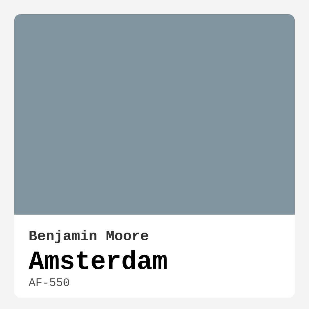
Color Preview & Key Details
| HEX Code | #81949D |
| RGB | 129, 148, 157 |
| LRV | 29.21% |
| Undertone | Blue |
| Finish Options | Eggshell, Matte, Satin |
Imagine walking into a room that feels like a gentle embrace, where the weight of the world seems to lift just a little. The walls are painted in a color that evokes the calm waters of serene canals, inviting you to unwind and recharge. This is the magic of Benjamin Moore’s Amsterdam — a muted blue-green that beautifully balances sophistication and tranquility.
Amsterdam, with its elegant hue, is a standout choice for anyone looking to refresh their space. Its unique blend of blue and green creates a soft yet striking aesthetic. This color leans slightly towards the green spectrum, providing an earthy quality that adds depth and richness to any room. It’s versatile enough to harmonize with a range of decor styles—from the clean lines of modern interiors to the cozy charm of Scandinavian designs.
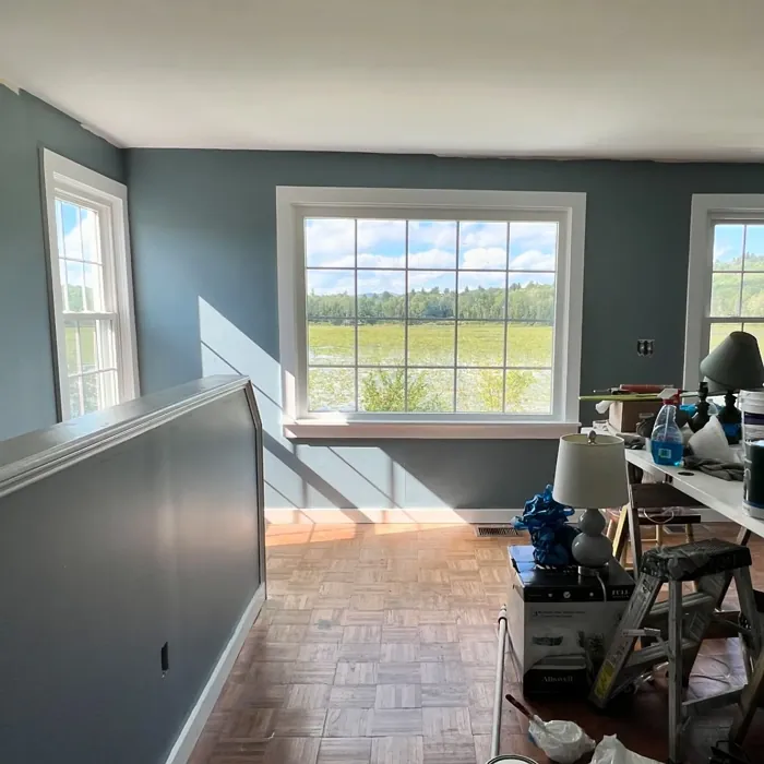
One of the most appealing aspects of Amsterdam is its ability to transform depending on the lighting in your space. In bright, natural light, it glows with a tranquil vibe, reflecting a serene nature that energizes without overwhelming. On the flip side, in lower light conditions, it takes on a deeper, moodier tone, creating an intimate and cozy atmosphere. This adaptability makes it perfect for spaces where you want to create a calm environment, such as bedrooms or home offices.
The Light Reflectance Value (LRV) of Amsterdam is around 29.21%, meaning it reflects a moderate amount of light. This characteristic ensures the color works well in both bright and dimly lit spaces. It won’t overpower smaller rooms, but it still provides a sense of openness that can make any area feel more inviting.
When it comes to application, Amsterdam is incredibly user-friendly, making it a great choice for DIY enthusiasts or first-time painters. It goes on smoothly with both brushes and rollers, and you’ll find that you can achieve a stunning finish with just one or two coats. Its washability and stain-resistant qualities mean that it’s practical for family homes as well, allowing for easy touch-ups if needed.
But let’s talk about decor. Amsterdam is not just a paint color; it’s a canvas for creativity. It pairs beautifully with natural materials and finishes, making it an ideal backdrop for wooden furniture or stone accents. If you’re incorporating brass fixtures or warm trims, Amsterdam complements those elements beautifully, creating a harmonious and inviting space.
Imagine a living room adorned in Amsterdam, with plush furniture, soft textiles, and an abundance of greenery. You could accentuate the color with artwork that includes warmer tones or go for a more monochromatic look with varying shades of blue. The options are endless!
In a bedroom, Amsterdam provides a restful retreat. You could pair it with soft whites and creams for a soothing palette or introduce deeper colors for a more dramatic effect. Think about a cozy reading nook bathed in this calming hue, where you can curl up with a good book and a cup of tea, surrounded by tranquility.
Now, while Amsterdam is a fantastic choice, it’s worth noting a few considerations. Although it’s versatile, it might not be the best option for high-traffic areas like hallways or entryways. Its muted nature could show wear and tear more easily in those busy spots, so if you’re looking for something more durable for those areas, you might want to consider a more robust color.
When comparing Amsterdam to other blues on the market, it stands out due to its earthy undertones. Unlike the sharper, more vibrant blues that can sometimes feel overwhelming, Amsterdam offers a subtle elegance. It’s perfect for those who want a softer, more sophisticated take on the classic blue.
Amsterdam’s coverage is impressive, so you’ll find that it’s touch-up friendly as well. When choosing a finish, you have options: matte, eggshell, or satin. Each finish has its charm, with matte offering a soft, chalky look, eggshell providing a slight sheen, and satin giving a bit more gloss while still being easy to maintain.
As you plan your project, consider how Amsterdam interacts with other colors in your home. For instance, it pairs beautifully with lighter shades such as White Dove for trim, creating a crisp contrast that brightens the space. If you’re feeling adventurous, try pairing it with complementary shades like CSP-415 or 2114-30 to create a dynamic and eye-catching aesthetic.
The mood that Amsterdam evokes is calm and restful, making it an excellent choice for spaces where relaxation is key. Whether you’re designing a serene bedroom, a tranquil bathroom, or a cozy living room, Amsterdam will help create that retreat-like atmosphere.
In conclusion, Benjamin Moore’s Amsterdam is a magnificent choice for anyone looking to bring a touch of elegance and tranquility to their home. Its muted blue-green hue adapts beautifully to various decor styles and lighting conditions, making it a versatile option for any space. Whether you’re opting for a modern, Scandinavian, coastal, or bohemian look, Amsterdam can fit right in, inviting you to create a sanctuary that reflects your personal style.
So, are you ready to transform your space with Amsterdam? Picture yourself surrounded by its calming beauty, enjoying the serene atmosphere it creates. It’s not just a color; it’s an experience waiting to happen.
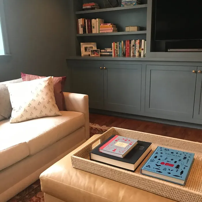
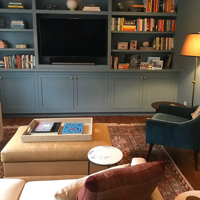
Real Room Photo of Amsterdam AF-550


Undertones of Amsterdam ?
The understone of Amsterdam leans slightly towards green, giving it an earthy quality that adds depth to its overall appearance. This undertone allows it to harmonize beautifully with natural materials like wood and stone, enhancing the organic feel of your space. You’ll find that it can shift in perception depending on the lighting, sometimes appearing more blue in brighter light and more green in subdued conditions.
HEX value: #81949D
RGB code: 129, 148, 157
Is Amsterdam Cool or Warm?
Amsterdam is primarily a cool color, but its muted quality gives it a balanced feel—neither too cold nor too warm. This makes it an excellent choice for creating a calming atmosphere without feeling overly sterile. It’s the kind of color that invites you in, providing a soothing backdrop for your daily activities.
Understanding Color Properties and Interior Design Tips
Hue refers to a specific position on the color wheel, measured in degrees from 0 to 360. Each degree represents a different pure color:
- 0° represents red
- 120° represents green
- 240° represents blue
Saturation describes the intensity or purity of a color and is expressed as a percentage:
- At 0%, the color appears completely desaturated—essentially a shade of gray
- At 100%, the color is at its most vivid and vibrant
Lightness indicates how light or dark a color is, also expressed as a percentage:
- 0% lightness results in black
- 100% lightness results in white
Using Warm Colors in Interior Design
Warm hues—such as reds, oranges, yellows, warm beiges, and greiges—are excellent choices for creating inviting and energetic spaces. These colors are particularly well-suited for:
- Kitchens, living rooms, and bathrooms, where warmth enhances comfort and sociability
- Large rooms, where warm tones can help reduce the sense of emptiness and make the space feel more intimate
For example:
- Warm beige shades provide a cozy, inviting atmosphere, ideal for living rooms, bedrooms, and hallways.
- Warm greige (a mix of beige and gray) offers the warmth of beige with the modern appeal of gray, making it a versatile backdrop for dining areas, bedrooms, and living spaces.
However, be mindful when using warm light tones in rooms with limited natural light. These shades may appear muted or even take on an unpleasant yellowish tint. To avoid a dull or flat appearance:
- Add depth by incorporating richer tones like deep greens, charcoal, or chocolate brown
- Use textured elements such as curtains, rugs, or cushions to bring dimension to the space
Pro Tip: Achieving Harmony with Warm and Cool Color Balance
To create a well-balanced and visually interesting interior, mix warm and cool tones strategically. This contrast adds depth and harmony to your design.
- If your walls feature warm hues, introduce cool-colored accents such as blue or green furniture, artwork, or accessories to create contrast.
- For a polished look, consider using a complementary color scheme, which pairs colors opposite each other on the color wheel (e.g., red with green, orange with blue).
This thoughtful mix not only enhances visual appeal but also creates a space that feels both dynamic and cohesive.
Light Temperature Affects on Amsterdam
Natural Light
Natural daylight changes in color temperature as the sun moves across the sky. At sunrise and sunset, the light tends to have a warm, golden tone with a color temperature around 2000 Kelvin (K). As the day progresses and the sun rises higher, the light becomes cooler and more neutral. Around midday, especially when the sky is clear, natural light typically reaches its peak brightness and shifts to a cooler tone, ranging from 5500 to 6500 Kelvin. This midday light is close to what we perceive as pure white or daylight-balanced light.
These shifts in natural light can significantly influence how colors appear in a space, which is why designers often consider both the time of day and the orientation of windows when planning interior color schemes.
Artificial Light
When choosing artificial lighting, pay close attention to the color temperature, measured in Kelvin (K). This determines how warm or cool the light will appear. Lower temperatures, around 2700K, give off a warm, yellow glow often used in living rooms or bedrooms. Higher temperatures, above 5000K, create a cool, bluish light similar to daylight, commonly used in kitchens, offices, or task areas.
Use the slider to see how lighting temperature can affect the appearance of a surface or color throughout a space.


4800K
LRV of Amsterdam
The Light Reflectance Value (LRV) of Amsterdam is around 30, which means it reflects a moderate amount of light. This characteristic makes it suitable for both bright and dimly lit spaces, ensuring that it doesn’t overpower smaller rooms while still offering a sense of openness.
Detailed Review of Amsterdam
Additional Paint Characteristics
Ideal Rooms
Bathroom, Bedroom, Dining Room, Home Office, Living Room
Decor Styles
Bohemian, Coastal, Modern, Scandinavian
Coverage
Good (1–2 Coats), Touch-Up Friendly
Ease of Application
Beginner Friendly, Brush Smooth, Roller-Ready
Washability
Stain Resistant, Washable
VOC Level
Eco-Certified, Low VOC
Best Use
Accent Wall, Bedroom, Interior Walls, Living Room
Room Suitability
Bathroom, Bedroom, Home Office, Living Room
Tone Tag
Balanced, Cool, Muted
Finish Type
Eggshell, Matte, Satin
Paint Performance
Easy Touch-Up, Low Odor, Scuff Resistant
Use Cases
Best for Low Light Rooms, Best for Rentals, Designer Favorite
Mood
Calm, Inviting, Restful
Trim Pairing
Complements Brass Fixtures, Pairs with White Dove, Works with Warm Trim
Amsterdam’s unique blend of blue and green provides a refreshing yet calming presence, making it a top choice for anyone looking to revitalize their living space. This color works exceptionally well in rooms where relaxation is key, such as bedrooms and bathrooms. With its excellent coverage, you can achieve a beautiful finish with just one or two coats, saving you time and effort. Additionally, Amsterdam pairs beautifully with both warm and cool tones, making it highly versatile for different decor styles. Whether you’re going for a modern look or something more eclectic, this paint is sure to impress.
Pros & Cons of AF-550 Amsterdam
Pros
Cons
Colors that go with Benjamin Moore Amsterdam
FAQ on AF-550 Amsterdam
Is Amsterdam suitable for high-traffic areas?
While Amsterdam is a beautiful choice for various spaces, it may not be the best option for high-traffic areas like hallways or entryways. Although it’s washable and stain-resistant, its muted tone may show wear and tear more easily in busy spots. If you’re looking for something durable for those areas, consider a more robust color or finish.
How does Amsterdam compare to other blues?
Amsterdam stands out from other blues due to its muted, earthy undertones, which give it a unique character. Unlike brighter blues that can feel sharp or overwhelming, Amsterdam offers a subtle elegance that fits well within a range of decor styles. It’s perfect for those looking for a softer, more sophisticated take on blue.
Comparisons Amsterdam with other colors
Amsterdam AF-550 vs Dutch Tile Blue SW 0031
| Attribute | Amsterdam AF-550 | Dutch Tile Blue SW 0031 |
|---|---|---|
| Color Name | Amsterdam AF-550 | Dutch Tile Blue SW 0031 |
| Color | ||
| Hue | Blue | Blue |
| Brightness | Medium | Medium |
| RGB | 129, 148, 157 | 154, 171, 171 |
| LRV | 29.21% | 24% |
| Finish Type | Eggshell, Matte, Satin | Eggshell, Matte, Satin |
| Finish Options | Eggshell, Matte, Satin | Eggshell, Flat, Matte, Satin |
| Ideal Rooms | Bathroom, Bedroom, Dining Room, Home Office, Living Room | Bathroom, Bedroom, Dining Room, Hallway, Home Office, Kitchen, Living Room |
| Decor Styles | Bohemian, Coastal, Modern, Scandinavian | Coastal, Modern Farmhouse, Scandinavian, Traditional, Transitional |
| Coverage | Good (1–2 Coats), Touch-Up Friendly | Good (1–2 Coats) |
| Ease of Application | Beginner Friendly, Brush Smooth, Roller-Ready | Beginner Friendly, Brush Smooth, Fast-Drying, Roller-Ready |
| Washability | Stain Resistant, Washable | Highly Washable, Washable |
| Room Suitability | Bathroom, Bedroom, Home Office, Living Room | Bathroom, Bedroom, Dining Room, Kitchen, Living Room |
| Tone | Balanced, Cool, Muted | Balanced, Cool, Muted |
| Paint Performance | Easy Touch-Up, Low Odor, Scuff Resistant | Easy Touch-Up, High Coverage, Low Odor, Quick Drying |
Amsterdam AF-550 vs Debonair SW 9139
| Attribute | Amsterdam AF-550 | Debonair SW 9139 |
|---|---|---|
| Color Name | Amsterdam AF-550 | Debonair SW 9139 |
| Color | ||
| Hue | Blue | Blue |
| Brightness | Medium | Medium |
| RGB | 129, 148, 157 | 144, 160, 166 |
| LRV | 29.21% | 30% |
| Finish Type | Eggshell, Matte, Satin | Eggshell, Matte, Satin |
| Finish Options | Eggshell, Matte, Satin | Eggshell, Matte, Satin |
| Ideal Rooms | Bathroom, Bedroom, Dining Room, Home Office, Living Room | Bedroom, Dining Room, Home Office, Living Room |
| Decor Styles | Bohemian, Coastal, Modern, Scandinavian | Coastal, Industrial, Modern, Transitional |
| Coverage | Good (1–2 Coats), Touch-Up Friendly | Good (1–2 Coats) |
| Ease of Application | Beginner Friendly, Brush Smooth, Roller-Ready | Beginner Friendly, Brush Smooth, Roller-Ready |
| Washability | Stain Resistant, Washable | Washable, Wipeable |
| Room Suitability | Bathroom, Bedroom, Home Office, Living Room | Bedroom, Dining Room, Home Office, Living Room |
| Tone | Balanced, Cool, Muted | Balanced, Cool, Muted |
| Paint Performance | Easy Touch-Up, Low Odor, Scuff Resistant | Easy Touch-Up, Low Odor, Quick Drying |
Amsterdam AF-550 vs Stardew SW 9138
| Attribute | Amsterdam AF-550 | Stardew SW 9138 |
|---|---|---|
| Color Name | Amsterdam AF-550 | Stardew SW 9138 |
| Color | ||
| Hue | Blue | Blue |
| Brightness | Medium | Medium |
| RGB | 129, 148, 157 | 166, 178, 181 |
| LRV | 29.21% | 30% |
| Finish Type | Eggshell, Matte, Satin | Eggshell, Satin |
| Finish Options | Eggshell, Matte, Satin | Eggshell, Matte, Satin |
| Ideal Rooms | Bathroom, Bedroom, Dining Room, Home Office, Living Room | Bathroom, Bedroom, Home Office, Living Room, Nursery |
| Decor Styles | Bohemian, Coastal, Modern, Scandinavian | Coastal, Farmhouse, Modern, Scandinavian |
| Coverage | Good (1–2 Coats), Touch-Up Friendly | Good (1–2 Coats) |
| Ease of Application | Beginner Friendly, Brush Smooth, Roller-Ready | Beginner Friendly, Brush Smooth, Roller-Ready |
| Washability | Stain Resistant, Washable | Highly Washable, Washable, Wipeable |
| Room Suitability | Bathroom, Bedroom, Home Office, Living Room | Bathroom, Bedroom, Home Office, Living Room |
| Tone | Balanced, Cool, Muted | Calm, Cool, Muted |
| Paint Performance | Easy Touch-Up, Low Odor, Scuff Resistant | Easy Touch-Up, High Coverage, Low Odor |
Amsterdam AF-550 vs Niebla Azul SW 9137
| Attribute | Amsterdam AF-550 | Niebla Azul SW 9137 |
|---|---|---|
| Color Name | Amsterdam AF-550 | Niebla Azul SW 9137 |
| Color | ||
| Hue | Blue | Blue |
| Brightness | Medium | Medium |
| RGB | 129, 148, 157 | 182, 195, 196 |
| LRV | 29.21% | 48% |
| Finish Type | Eggshell, Matte, Satin | Eggshell, Matte, Satin |
| Finish Options | Eggshell, Matte, Satin | Eggshell, Matte, Satin |
| Ideal Rooms | Bathroom, Bedroom, Dining Room, Home Office, Living Room | Bedroom, Home Office, Living Room, Nursery |
| Decor Styles | Bohemian, Coastal, Modern, Scandinavian | Coastal, Modern, Scandinavian, Transitional |
| Coverage | Good (1–2 Coats), Touch-Up Friendly | Good (1–2 Coats), Touch-Up Friendly |
| Ease of Application | Beginner Friendly, Brush Smooth, Roller-Ready | Beginner Friendly, Brush Smooth, Roller-Ready |
| Washability | Stain Resistant, Washable | Highly Washable, Washable |
| Room Suitability | Bathroom, Bedroom, Home Office, Living Room | Bedroom, Home Office, Living Room, Nursery |
| Tone | Balanced, Cool, Muted | Airy, Cool, Muted |
| Paint Performance | Easy Touch-Up, Low Odor, Scuff Resistant | Easy Touch-Up, Fade Resistant, Low Odor, Scuff Resistant |
Amsterdam AF-550 vs Rain SW 6219
| Attribute | Amsterdam AF-550 | Rain SW 6219 |
|---|---|---|
| Color Name | Amsterdam AF-550 | Rain SW 6219 |
| Color | ||
| Hue | Blue | Blue |
| Brightness | Medium | Medium |
| RGB | 129, 148, 157 | 171, 190, 191 |
| LRV | 29.21% | 50% |
| Finish Type | Eggshell, Matte, Satin | Eggshell, Matte, Satin |
| Finish Options | Eggshell, Matte, Satin | Eggshell, Matte, Satin |
| Ideal Rooms | Bathroom, Bedroom, Dining Room, Home Office, Living Room | Bathroom, Bedroom, Home Office, Living Room, Nursery |
| Decor Styles | Bohemian, Coastal, Modern, Scandinavian | Coastal, Minimalist, Modern, Scandinavian, Transitional |
| Coverage | Good (1–2 Coats), Touch-Up Friendly | Good (1–2 Coats), Touch-Up Friendly |
| Ease of Application | Beginner Friendly, Brush Smooth, Roller-Ready | Beginner Friendly, Brush Smooth, Fast-Drying, Roller-Ready |
| Washability | Stain Resistant, Washable | Scrubbable, Stain Resistant, Washable |
| Room Suitability | Bathroom, Bedroom, Home Office, Living Room | Bathroom, Bedroom, Home Office, Living Room, Nursery |
| Tone | Balanced, Cool, Muted | Balanced, Cool, Muted |
| Paint Performance | Easy Touch-Up, Low Odor, Scuff Resistant | Easy Touch-Up, Low Odor, Quick Drying, Stain Resistant |
Amsterdam AF-550 vs Morning at Sea SW 9634
| Attribute | Amsterdam AF-550 | Morning at Sea SW 9634 |
|---|---|---|
| Color Name | Amsterdam AF-550 | Morning at Sea SW 9634 |
| Color | ||
| Hue | Blue | Blue |
| Brightness | Medium | Medium |
| RGB | 129, 148, 157 | 130, 151, 155 |
| LRV | 29.21% | 50% |
| Finish Type | Eggshell, Matte, Satin | Eggshell, Matte |
| Finish Options | Eggshell, Matte, Satin | Eggshell, Matte, Satin |
| Ideal Rooms | Bathroom, Bedroom, Dining Room, Home Office, Living Room | Bathroom, Bedroom, Home Office, Living Room |
| Decor Styles | Bohemian, Coastal, Modern, Scandinavian | Coastal, Minimalist, Modern, Scandinavian |
| Coverage | Good (1–2 Coats), Touch-Up Friendly | Good (1–2 Coats), Touch-Up Friendly |
| Ease of Application | Beginner Friendly, Brush Smooth, Roller-Ready | Beginner Friendly, Brush Smooth, Roller-Ready |
| Washability | Stain Resistant, Washable | Washable, Wipeable |
| Room Suitability | Bathroom, Bedroom, Home Office, Living Room | Bathroom, Bedroom, Home Office, Living Room |
| Tone | Balanced, Cool, Muted | Airy, Cool, Muted |
| Paint Performance | Easy Touch-Up, Low Odor, Scuff Resistant | Easy Touch-Up, Fade Resistant, Low Odor |
Amsterdam AF-550 vs Sleepy Blue SW 6225
| Attribute | Amsterdam AF-550 | Sleepy Blue SW 6225 |
|---|---|---|
| Color Name | Amsterdam AF-550 | Sleepy Blue SW 6225 |
| Color | ||
| Hue | Blue | Blue |
| Brightness | Medium | Medium |
| RGB | 129, 148, 157 | 188, 203, 206 |
| LRV | 29.21% | 50% |
| Finish Type | Eggshell, Matte, Satin | Eggshell, Matte, Satin |
| Finish Options | Eggshell, Matte, Satin | Eggshell, Matte, Satin |
| Ideal Rooms | Bathroom, Bedroom, Dining Room, Home Office, Living Room | Bedroom, Home Office, Living Room, Nursery |
| Decor Styles | Bohemian, Coastal, Modern, Scandinavian | Coastal, Minimalist, Modern Farmhouse, Scandinavian |
| Coverage | Good (1–2 Coats), Touch-Up Friendly | Good (1–2 Coats) |
| Ease of Application | Beginner Friendly, Brush Smooth, Roller-Ready | Beginner Friendly, Brush Smooth, Fast-Drying, Roller-Ready |
| Washability | Stain Resistant, Washable | Highly Washable, Washable |
| Room Suitability | Bathroom, Bedroom, Home Office, Living Room | Bedroom, Home Office, Living Room, Nursery |
| Tone | Balanced, Cool, Muted | Airy, Cool, Muted |
| Paint Performance | Easy Touch-Up, Low Odor, Scuff Resistant | Easy Touch-Up, Low Odor, Quick Drying, Scuff Resistant |
Amsterdam AF-550 vs Lakeside SW 9683
| Attribute | Amsterdam AF-550 | Lakeside SW 9683 |
|---|---|---|
| Color Name | Amsterdam AF-550 | Lakeside SW 9683 |
| Color | ||
| Hue | Blue | Blue |
| Brightness | Medium | Medium |
| RGB | 129, 148, 157 | 173, 184, 192 |
| LRV | 29.21% | 24% |
| Finish Type | Eggshell, Matte, Satin | Eggshell, Matte, Satin |
| Finish Options | Eggshell, Matte, Satin | Eggshell, Matte, Satin |
| Ideal Rooms | Bathroom, Bedroom, Dining Room, Home Office, Living Room | Bathroom, Bedroom, Home Office, Living Room |
| Decor Styles | Bohemian, Coastal, Modern, Scandinavian | Coastal, Minimalist, Modern, Rustic |
| Coverage | Good (1–2 Coats), Touch-Up Friendly | Good (1–2 Coats) |
| Ease of Application | Beginner Friendly, Brush Smooth, Roller-Ready | Beginner Friendly, Brush Smooth, Roller-Ready |
| Washability | Stain Resistant, Washable | Scrubbable, Washable |
| Room Suitability | Bathroom, Bedroom, Home Office, Living Room | Bathroom, Bedroom, Home Office, Living Room |
| Tone | Balanced, Cool, Muted | Balanced, Cool, Muted |
| Paint Performance | Easy Touch-Up, Low Odor, Scuff Resistant | Easy Touch-Up, Fade Resistant, High Coverage, Low Odor |
Amsterdam AF-550 vs Upward SW 6239
| Attribute | Amsterdam AF-550 | Upward SW 6239 |
|---|---|---|
| Color Name | Amsterdam AF-550 | Upward SW 6239 |
| Color | ||
| Hue | Blue | Blue |
| Brightness | Medium | Medium |
| RGB | 129, 148, 157 | 191, 201, 208 |
| LRV | 29.21% | 75% |
| Finish Type | Eggshell, Matte, Satin | Eggshell, Satin |
| Finish Options | Eggshell, Matte, Satin | Eggshell, Flat, Satin |
| Ideal Rooms | Bathroom, Bedroom, Dining Room, Home Office, Living Room | Bedroom, Dining Room, Home Office, Living Room, Nursery |
| Decor Styles | Bohemian, Coastal, Modern, Scandinavian | Coastal, Minimalist, Modern, Scandinavian |
| Coverage | Good (1–2 Coats), Touch-Up Friendly | Good (1–2 Coats), Touch-Up Friendly |
| Ease of Application | Beginner Friendly, Brush Smooth, Roller-Ready | Beginner Friendly, Brush Smooth, Fast-Drying, Roller-Ready |
| Washability | Stain Resistant, Washable | Washable, Wipeable |
| Room Suitability | Bathroom, Bedroom, Home Office, Living Room | Bedroom, Home Office, Living Room, Nursery |
| Tone | Balanced, Cool, Muted | Cool, Crisp, Muted |
| Paint Performance | Easy Touch-Up, Low Odor, Scuff Resistant | High Coverage, Low Odor, Quick Drying |
Amsterdam AF-550 vs Aleutian SW 6241
| Attribute | Amsterdam AF-550 | Aleutian SW 6241 |
|---|---|---|
| Color Name | Amsterdam AF-550 | Aleutian SW 6241 |
| Color | ||
| Hue | Blue | Blue |
| Brightness | Medium | Medium |
| RGB | 129, 148, 157 | 152, 169, 183 |
| LRV | 29.21% | 24% |
| Finish Type | Eggshell, Matte, Satin | Eggshell, Matte, Satin |
| Finish Options | Eggshell, Matte, Satin | Eggshell, Matte, Satin |
| Ideal Rooms | Bathroom, Bedroom, Dining Room, Home Office, Living Room | Bathroom, Bedroom, Home Office, Kitchen, Living Room, Nursery |
| Decor Styles | Bohemian, Coastal, Modern, Scandinavian | Coastal, Minimalist, Modern, Scandinavian, Transitional |
| Coverage | Good (1–2 Coats), Touch-Up Friendly | Good (1–2 Coats), Touch-Up Friendly |
| Ease of Application | Beginner Friendly, Brush Smooth, Roller-Ready | Beginner Friendly, Brush Smooth, Fast-Drying, Roller-Ready |
| Washability | Stain Resistant, Washable | Scrubbable, Stain Resistant, Washable |
| Room Suitability | Bathroom, Bedroom, Home Office, Living Room | Bathroom, Bedroom, Home Office, Living Room, Nursery |
| Tone | Balanced, Cool, Muted | Airy, Balanced, Cool, Muted |
| Paint Performance | Easy Touch-Up, Low Odor, Scuff Resistant | Easy Touch-Up, Fade Resistant, Low Odor, Quick Drying |
Official Page of Benjamin Moore Amsterdam AF-550