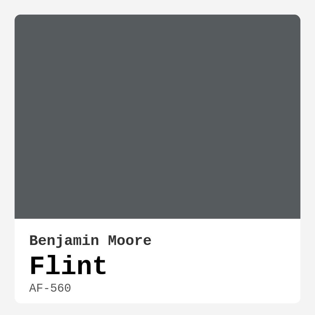
Color Preview & Key Details
| HEX Code | #565C5E |
| RGB | 86, 92, 94 |
| LRV | 11.96% |
| Undertone | Blue |
| Finish Options | Eggshell, Matte, Satin |
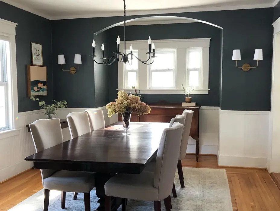
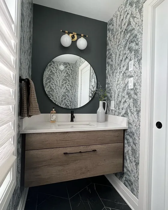
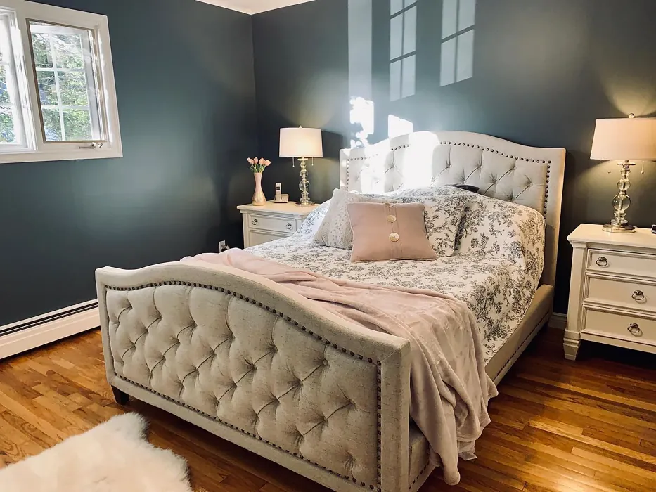
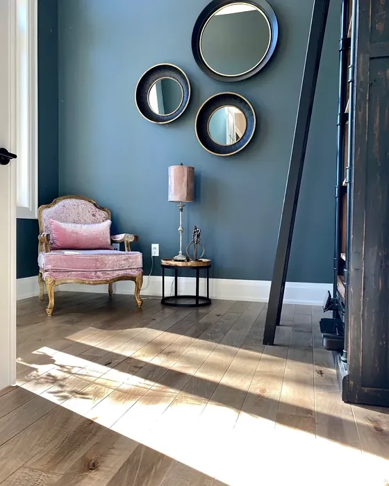
If you’re searching for a paint color that effortlessly balances sophistication and versatility, let me introduce you to Benjamin Moore’s Flint (AF-560). This isn’t just another gray—it’s a moody, layered shade with a quiet confidence that can transform any space into something special. Whether you’re refreshing a single room or reimagining your entire home, Flint has the depth and adaptability to make it work. But before you grab a brush, let’s dive into what makes this color so unique and how to use it to its full potential.
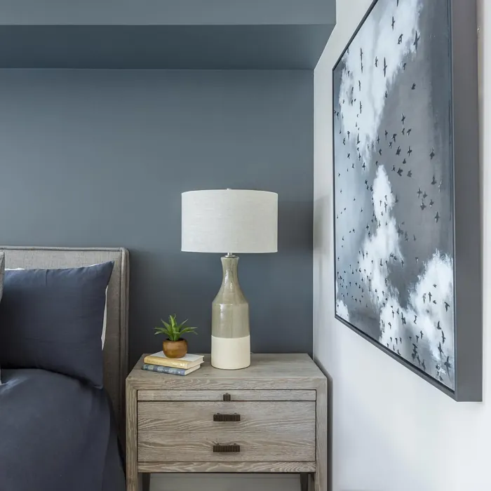
Flint is a medium-dark gray with a subtle blue undertone, giving it a cool yet grounded presence. Its LRV (Light Reflectance Value) of 11.96% means it absorbs more light than it reflects, creating a cozy, intimate atmosphere. This makes it perfect for rooms where you want to evoke calm and sophistication—think living rooms, bedrooms, or even a home office where focus and tranquility are key. But don’t let its darkness intimidate you. Flint’s muted quality keeps it from feeling overwhelming, especially when paired with the right lighting and decor.
One of the standout features of Flint is its chameleon-like ability to shift with the light. In bright, natural daylight, those blue undertones come forward, giving the color a crisp, modern edge. As the sun sets and artificial lighting takes over, Flint softens into a warmer, more enveloping shade. This dynamic quality makes it ideal for spaces where lighting changes throughout the day. If your room lacks natural light, Flint can still work—just balance it with warm-toned furniture, textiles, or wood accents to keep it from feeling too cool.
When it comes to application, Flint is a dream. It’s beginner-friendly, roller-ready, and dries quickly, so you won’t be stuck waiting around for hours between coats. Coverage is excellent—one or two coats should do the trick—and touch-ups blend seamlessly. Choose from Matte, Eggshell, or Satin finishes depending on your needs. Matte delivers a flat, contemporary look, while Eggshell and Satin add a subtle sheen, making them more durable for high-traffic areas. And because it’s low-VOC and eco-certified, you can breathe easy knowing it’s a healthier choice for your home.
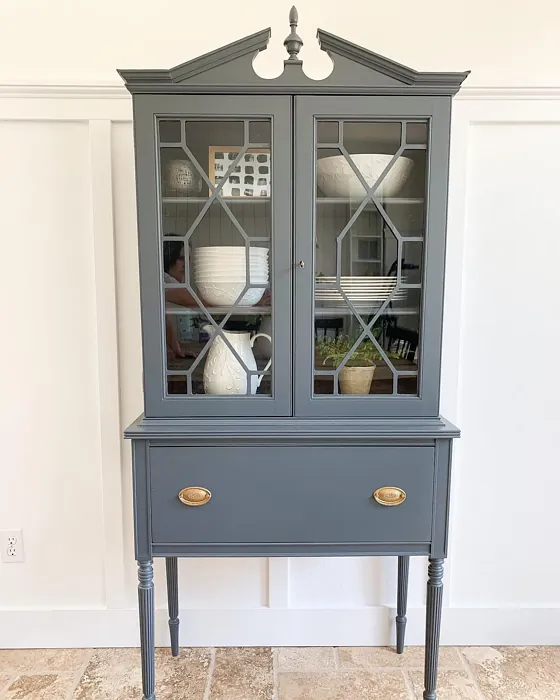
Now, let’s talk pairings. Flint’s cool undertones play beautifully with warm metals like brass or gold, adding a touch of luxury without overpowering the space. For trim, opt for a soft white like Benjamin Moore’s White Dove to keep the contrast elegant, not stark. If you’re feeling bold, try an accent wall in a complementary shade like CSP-415 (a warm taupe) or 2114-30 (a muted blush) to add dimension. And if you love Flint but want something lighter or darker for contrast, explore its sibling shades—CW-685 for a lighter touch or 2131-10 for deeper drama.
Flint shines in a variety of decor styles. In a modern or industrial space, it anchors the room with its sleek, moody vibe. Pair it with clean lines, metallic accents, and minimalist furniture for a polished look. For Scandinavian-inspired interiors, Flint’s muted quality works wonders alongside light woods, cozy textiles, and plenty of natural light. Even in a traditional setting, this color holds its own—just soften it with rich fabrics, vintage pieces, and warm lighting to keep it inviting.
Maintenance is a breeze, thanks to its washability. Whether it’s fingerprints in the hallway or the occasional splash in the dining room, Flint stands up to cleaning without losing its richness. And if you’re selling your home or styling a rental, this color is a designer favorite for good reason—it’s neutral enough to appeal to broad tastes but distinctive enough to leave a lasting impression.
So, is Flint the right choice for your project? If you’re after a color that’s equal parts sophisticated and adaptable, the answer is likely yes. Test it out in your space first—paint a large swatch and observe it at different times of day. Notice how it interacts with your furniture, flooring, and lighting. Because here’s the thing: Flint isn’t just a color you put on your walls. It’s a backdrop for your life, a shade that can make your home feel more intentional, more *you*. And that’s the magic of a great paint color—it doesn’t just change your walls. It changes the way you feel in a room. So go ahead, give Flint a try. You might just fall in love with the way it transforms your space.
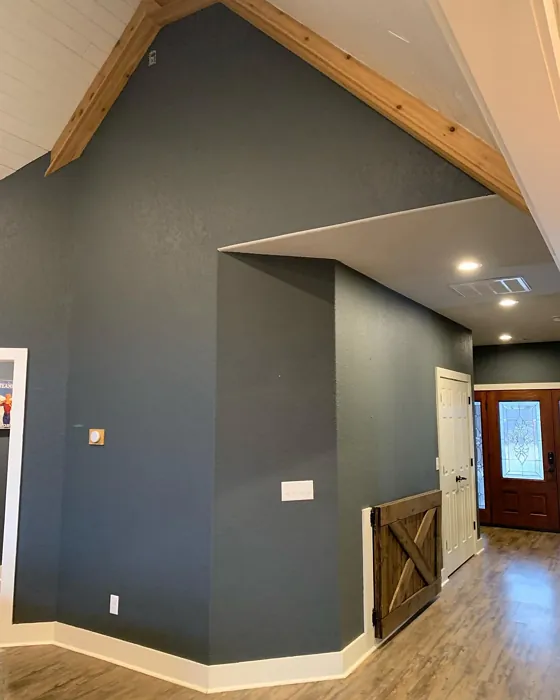
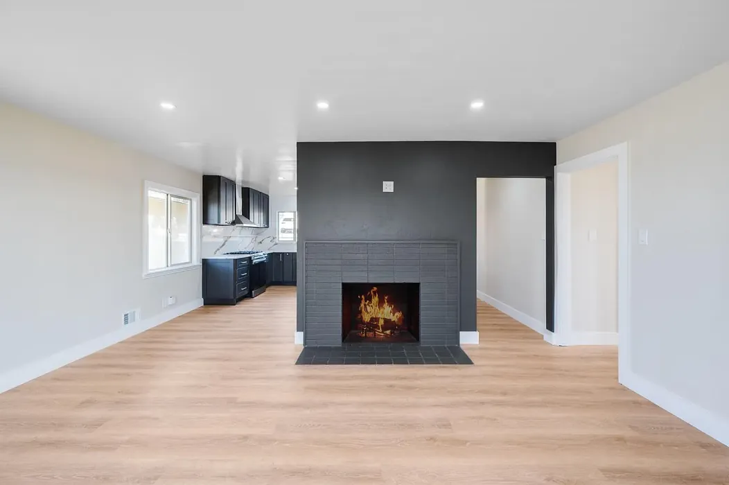
Real Room Photo of Flint AF-560

Undertones of Flint ?
The undertones of Flint are a key aspect of its character, leaning towards Blue. These subtle underlying hues are what give the color its depth and complexity. For example, a gray with a blue undertone will feel cooler and more modern, while one with a brown undertone will feel warmer and more traditional. It’s essential to test this paint in your home and observe it next to your existing furniture, flooring, and decor to see how these undertones interact and reveal themselves throughout the day.
HEX value: #565C5E
RGB code: 86, 92, 94
Is Flint Cool or Warm?
Flint leans toward the cooler side of the spectrum, but its balance allows it to harmonize beautifully with warm hues. This makes it a fantastic choice for those looking to integrate both warm and cool elements within their decor. It’s a color that invites exploration and creativity.
Understanding Color Properties and Interior Design Tips
Hue refers to a specific position on the color wheel, measured in degrees from 0 to 360. Each degree represents a different pure color:
- 0° represents red
- 120° represents green
- 240° represents blue
Saturation describes the intensity or purity of a color and is expressed as a percentage:
- At 0%, the color appears completely desaturated—essentially a shade of gray
- At 100%, the color is at its most vivid and vibrant
Lightness indicates how light or dark a color is, also expressed as a percentage:
- 0% lightness results in black
- 100% lightness results in white
Using Warm Colors in Interior Design
Warm hues—such as reds, oranges, yellows, warm beiges, and greiges—are excellent choices for creating inviting and energetic spaces. These colors are particularly well-suited for:
- Kitchens, living rooms, and bathrooms, where warmth enhances comfort and sociability
- Large rooms, where warm tones can help reduce the sense of emptiness and make the space feel more intimate
For example:
- Warm beige shades provide a cozy, inviting atmosphere, ideal for living rooms, bedrooms, and hallways.
- Warm greige (a mix of beige and gray) offers the warmth of beige with the modern appeal of gray, making it a versatile backdrop for dining areas, bedrooms, and living spaces.
However, be mindful when using warm light tones in rooms with limited natural light. These shades may appear muted or even take on an unpleasant yellowish tint. To avoid a dull or flat appearance:
- Add depth by incorporating richer tones like deep greens, charcoal, or chocolate brown
- Use textured elements such as curtains, rugs, or cushions to bring dimension to the space
Pro Tip: Achieving Harmony with Warm and Cool Color Balance
To create a well-balanced and visually interesting interior, mix warm and cool tones strategically. This contrast adds depth and harmony to your design.
- If your walls feature warm hues, introduce cool-colored accents such as blue or green furniture, artwork, or accessories to create contrast.
- For a polished look, consider using a complementary color scheme, which pairs colors opposite each other on the color wheel (e.g., red with green, orange with blue).
This thoughtful mix not only enhances visual appeal but also creates a space that feels both dynamic and cohesive.
Light Temperature Affects on Flint
Natural Light
Natural daylight changes in color temperature as the sun moves across the sky. At sunrise and sunset, the light tends to have a warm, golden tone with a color temperature around 2000 Kelvin (K). As the day progresses and the sun rises higher, the light becomes cooler and more neutral. Around midday, especially when the sky is clear, natural light typically reaches its peak brightness and shifts to a cooler tone, ranging from 5500 to 6500 Kelvin. This midday light is close to what we perceive as pure white or daylight-balanced light.
These shifts in natural light can significantly influence how colors appear in a space, which is why designers often consider both the time of day and the orientation of windows when planning interior color schemes.
Artificial Light
When choosing artificial lighting, pay close attention to the color temperature, measured in Kelvin (K). This determines how warm or cool the light will appear. Lower temperatures, around 2700K, give off a warm, yellow glow often used in living rooms or bedrooms. Higher temperatures, above 5000K, create a cool, bluish light similar to daylight, commonly used in kitchens, offices, or task areas.
Use the slider to see how lighting temperature can affect the appearance of a surface or color throughout a space.


4800K
LRV of Flint
The Light Reflectance Value (LRV) of Flint is 11.96%, which places it in the Medium Dark category. This means it reflects very little light. Understanding a paint’s LRV is crucial for predicting how it will look in your space. A higher LRV indicates a lighter color that reflects more light, making rooms feel larger and brighter. A lower LRV signifies a darker color that absorbs more light, creating a cozier, more intimate atmosphere. Always consider the natural and artificial lighting in your room when selecting a paint color based on its LRV.
Detailed Review of Flint
Additional Paint Characteristics
Ideal Rooms
Bedroom, Dining Room, Home Office, Living Room
Decor Styles
Industrial, Minimalist, Modern, Scandinavian
Coverage
Good (1–2 Coats), Touch-Up Friendly
Ease of Application
Beginner Friendly, Brush Smooth, Fast-Drying, Roller-Ready
Washability
Washable, Wipeable
VOC Level
Eco-Certified, Low VOC
Best Use
Accent Wall, Interior Walls, Open Concept Spaces
Room Suitability
Bedroom, Dining Room, Home Office, Living Room
Tone Tag
Balanced, Cool, Muted
Finish Type
Eggshell, Matte, Satin
Paint Performance
Easy Touch-Up, Low Odor, Quick Drying
Use Cases
Best for Rentals, Best for Selling Your Home, Designer Favorite
Mood
Calm, Inviting, Sophisticated
Trim Pairing
Complements Brass Fixtures, Matches Pure White, Pairs with White Dove
Flint is more than just a color; it’s an experience. It carries a depth that can change the mood of a room depending on the lighting. In natural light, Flint reveals its cooler undertones, offering a refreshing vibe, while in the evening, it transforms into a soothing backdrop, perfect for relaxation. Its adaptability makes it suitable for accent walls or entire rooms. If you’re considering this shade for a smaller space, be aware that its richness can create an intimate atmosphere, while larger areas will feel anchored and sophisticated. Application is smooth, requiring minimal touch-ups, making it a user-friendly option for DIY enthusiasts and professionals alike.
Pros & Cons of AF-560 Flint
Pros
Cons
Colors that go with Benjamin Moore Flint
FAQ on AF-560 Flint
What finishes are available for Flint?
Flint is available in several finishes, including Matte, Eggshell, and Satin. Each finish provides a different look and feel, allowing you to choose based on your room’s needs. The Matte finish offers a modern, flat appearance, while Eggshell and Satin add a slight sheen, making them ideal for areas that require a bit more durability.
Can Flint be used in rooms with low natural light?
Yes, Flint can be used in rooms with low natural light, but it’s essential to consider the overall color scheme. While it can create a cozy atmosphere, its cooler undertones may feel more pronounced in dim settings. Pairing Flint with warmer decor elements can help balance the coolness and create an inviting space.
Comparisons Flint with other colors
Flint AF-560 vs Night Owl SW 7061
| Attribute | Flint AF-560 | Night Owl SW 7061 |
|---|---|---|
| Color Name | Flint AF-560 | Night Owl SW 7061 |
| Color | ||
| Hue | Grey | Grey |
| Brightness | Dark | Dark |
| RGB | 86, 92, 94 | 99, 101, 95 |
| LRV | 11.96% | 24% |
| Finish Type | Eggshell, Matte, Satin | Eggshell, Matte, Satin |
| Finish Options | Eggshell, Matte, Satin | Eggshell, Matte, Satin |
| Ideal Rooms | Bedroom, Dining Room, Home Office, Living Room | Bedroom, Dining Room, Hallway, Home Office, Living Room |
| Decor Styles | Industrial, Minimalist, Modern, Scandinavian | Industrial, Minimalist, Modern, Rustic, Scandinavian |
| Coverage | Good (1–2 Coats), Touch-Up Friendly | Good (1–2 Coats), Touch-Up Friendly |
| Ease of Application | Beginner Friendly, Brush Smooth, Fast-Drying, Roller-Ready | Beginner Friendly, Brush Smooth, Fast-Drying, Roller-Ready |
| Washability | Washable, Wipeable | Scrubbable, Washable |
| Room Suitability | Bedroom, Dining Room, Home Office, Living Room | Bedroom, Dining Room, Home Office, Living Room |
| Tone | Balanced, Cool, Muted | Balanced, Deep, Earthy, Muted |
| Paint Performance | Easy Touch-Up, Low Odor, Quick Drying | Easy Touch-Up, Fade Resistant, High Coverage, Low Odor |
Flint AF-560 vs Urbane Bronze SW 7048
| Attribute | Flint AF-560 | Urbane Bronze SW 7048 |
|---|---|---|
| Color Name | Flint AF-560 | Urbane Bronze SW 7048 |
| Color | ||
| Hue | Grey | Grey |
| Brightness | Dark | Dark |
| RGB | 86, 92, 94 | 84, 80, 74 |
| LRV | 11.96% | 20% |
| Finish Type | Eggshell, Matte, Satin | Eggshell, Matte, Satin |
| Finish Options | Eggshell, Matte, Satin | Eggshell, Matte, Satin |
| Ideal Rooms | Bedroom, Dining Room, Home Office, Living Room | Bedroom, Dining Room, Home Office, Living Room |
| Decor Styles | Industrial, Minimalist, Modern, Scandinavian | Contemporary, Industrial, Modern, Rustic, Transitional |
| Coverage | Good (1–2 Coats), Touch-Up Friendly | Good (1–2 Coats) |
| Ease of Application | Beginner Friendly, Brush Smooth, Fast-Drying, Roller-Ready | Beginner Friendly, Brush Smooth, Roller-Ready |
| Washability | Washable, Wipeable | Highly Washable, Washable |
| Room Suitability | Bedroom, Dining Room, Home Office, Living Room | Bedroom, Dining Room, Home Office, Living Room |
| Tone | Balanced, Cool, Muted | Deep, Earthy, Warm |
| Paint Performance | Easy Touch-Up, Low Odor, Quick Drying | Easy Touch-Up, Fade Resistant, High Coverage, Low Odor |
Flint AF-560 vs Succulent SW 9650
| Attribute | Flint AF-560 | Succulent SW 9650 |
|---|---|---|
| Color Name | Flint AF-560 | Succulent SW 9650 |
| Color | ||
| Hue | Grey | Grey |
| Brightness | Dark | Dark |
| RGB | 86, 92, 94 | 97, 108, 100 |
| LRV | 11.96% | 30% |
| Finish Type | Eggshell, Matte, Satin | Eggshell, Matte, Satin |
| Finish Options | Eggshell, Matte, Satin | Eggshell, Matte, Satin |
| Ideal Rooms | Bedroom, Dining Room, Home Office, Living Room | Bathroom, Bedroom, Dining Room, Entryway, Kitchen, Living Room |
| Decor Styles | Industrial, Minimalist, Modern, Scandinavian | Bohemian, Contemporary, Eclectic, Minimalist, Modern Farmhouse |
| Coverage | Good (1–2 Coats), Touch-Up Friendly | Good (1–2 Coats), Touch-Up Friendly |
| Ease of Application | Beginner Friendly, Brush Smooth, Fast-Drying, Roller-Ready | Beginner Friendly, Brush Smooth, Roller-Ready |
| Washability | Washable, Wipeable | Highly Washable, Washable |
| Room Suitability | Bedroom, Dining Room, Home Office, Living Room | Bathroom, Bedroom, Dining Room, Kitchen, Living Room |
| Tone | Balanced, Cool, Muted | Cool, Earthy, Muted |
| Paint Performance | Easy Touch-Up, Low Odor, Quick Drying | Easy Touch-Up, Low Odor, Quick Drying, Scuff Resistant |
Flint AF-560 vs Grizzle Gray SW 7068
| Attribute | Flint AF-560 | Grizzle Gray SW 7068 |
|---|---|---|
| Color Name | Flint AF-560 | Grizzle Gray SW 7068 |
| Color | ||
| Hue | Grey | Grey |
| Brightness | Dark | Dark |
| RGB | 86, 92, 94 | 99, 101, 98 |
| LRV | 11.96% | 24% |
| Finish Type | Eggshell, Matte, Satin | Eggshell, Satin |
| Finish Options | Eggshell, Matte, Satin | Eggshell, Matte, Satin |
| Ideal Rooms | Bedroom, Dining Room, Home Office, Living Room | Bedroom, Dining Room, Home Office, Living Room |
| Decor Styles | Industrial, Minimalist, Modern, Scandinavian | Industrial, Modern, Rustic, Scandinavian |
| Coverage | Good (1–2 Coats), Touch-Up Friendly | Good (1–2 Coats), Touch-Up Friendly |
| Ease of Application | Beginner Friendly, Brush Smooth, Fast-Drying, Roller-Ready | Beginner Friendly, Brush Smooth, Roller-Ready |
| Washability | Washable, Wipeable | Washable, Wipeable |
| Room Suitability | Bedroom, Dining Room, Home Office, Living Room | Bedroom, Dining Room, Home Office, Living Room |
| Tone | Balanced, Cool, Muted | Balanced, Cool, Muted |
| Paint Performance | Easy Touch-Up, Low Odor, Quick Drying | Easy Touch-Up, High Coverage, Low Odor |
Flint AF-560 vs Iron Ore SW 7069
| Attribute | Flint AF-560 | Iron Ore SW 7069 |
|---|---|---|
| Color Name | Flint AF-560 | Iron Ore SW 7069 |
| Color | ||
| Hue | Grey | Grey |
| Brightness | Dark | Dark |
| RGB | 86, 92, 94 | 67, 67, 65 |
| LRV | 11.96% | 6% |
| Finish Type | Eggshell, Matte, Satin | Eggshell, Matte, Satin |
| Finish Options | Eggshell, Matte, Satin | Eggshell, Matte, Satin |
| Ideal Rooms | Bedroom, Dining Room, Home Office, Living Room | Bedroom, Dining Room, Entryway, Home Office, Living Room |
| Decor Styles | Industrial, Minimalist, Modern, Scandinavian | Contemporary, Industrial, Minimalist, Modern, Rustic |
| Coverage | Good (1–2 Coats), Touch-Up Friendly | Good (1–2 Coats), High Hide |
| Ease of Application | Beginner Friendly, Brush Smooth, Fast-Drying, Roller-Ready | Brush Smooth, Fast-Drying, Roller-Ready |
| Washability | Washable, Wipeable | Highly Washable, Washable |
| Room Suitability | Bedroom, Dining Room, Home Office, Living Room | Bedroom, Dining Room, Entryway, Home Office, Living Room |
| Tone | Balanced, Cool, Muted | Balanced, Deep, Muted, Warm |
| Paint Performance | Easy Touch-Up, Low Odor, Quick Drying | Easy Touch-Up, High Coverage, Low Odor |
Flint AF-560 vs Peppercorn SW 7674
| Attribute | Flint AF-560 | Peppercorn SW 7674 |
|---|---|---|
| Color Name | Flint AF-560 | Peppercorn SW 7674 |
| Color | ||
| Hue | Grey | Grey |
| Brightness | Dark | Dark |
| RGB | 86, 92, 94 | 88, 88, 88 |
| LRV | 11.96% | 10% |
| Finish Type | Eggshell, Matte, Satin | Eggshell, Matte, Satin |
| Finish Options | Eggshell, Matte, Satin | Eggshell, Matte, Satin |
| Ideal Rooms | Bedroom, Dining Room, Home Office, Living Room | Bedroom, Dining Room, Home Office, Living Room |
| Decor Styles | Industrial, Minimalist, Modern, Scandinavian | Contemporary, Industrial, Minimalist, Modern |
| Coverage | Good (1–2 Coats), Touch-Up Friendly | Good (1–2 Coats), Touch-Up Friendly |
| Ease of Application | Beginner Friendly, Brush Smooth, Fast-Drying, Roller-Ready | Beginner Friendly, Brush Smooth, Roller-Ready |
| Washability | Washable, Wipeable | Highly Washable, Washable |
| Room Suitability | Bedroom, Dining Room, Home Office, Living Room | Bedroom, Dining Room, Home Office, Living Room |
| Tone | Balanced, Cool, Muted | Balanced, Deep, Moody, Neutral |
| Paint Performance | Easy Touch-Up, Low Odor, Quick Drying | Easy Touch-Up, Low Odor, Quick Drying, Scuff Resistant |
Flint AF-560 vs Slate Tile SW 7624
| Attribute | Flint AF-560 | Slate Tile SW 7624 |
|---|---|---|
| Color Name | Flint AF-560 | Slate Tile SW 7624 |
| Color | ||
| Hue | Grey | Grey |
| Brightness | Dark | Dark |
| RGB | 86, 92, 94 | 96, 110, 116 |
| LRV | 11.96% | 15% |
| Finish Type | Eggshell, Matte, Satin | Eggshell, Matte, Satin |
| Finish Options | Eggshell, Matte, Satin | Eggshell, Matte, Satin |
| Ideal Rooms | Bedroom, Dining Room, Home Office, Living Room | Bathroom, Bedroom, Home Office, Kitchen, Living Room |
| Decor Styles | Industrial, Minimalist, Modern, Scandinavian | Industrial, Minimalist, Modern, Rustic |
| Coverage | Good (1–2 Coats), Touch-Up Friendly | Good (1–2 Coats) |
| Ease of Application | Beginner Friendly, Brush Smooth, Fast-Drying, Roller-Ready | Beginner Friendly, Brush Smooth, Fast-Drying, Roller-Ready |
| Washability | Washable, Wipeable | Scrubbable, Washable |
| Room Suitability | Bedroom, Dining Room, Home Office, Living Room | Bathroom, Bedroom, Kitchen, Living Room |
| Tone | Balanced, Cool, Muted | Balanced, Cool, Muted |
| Paint Performance | Easy Touch-Up, Low Odor, Quick Drying | Easy Touch-Up, High Coverage, Low Odor, Quick Drying |
Flint AF-560 vs Blustery Sky SW 9140
| Attribute | Flint AF-560 | Blustery Sky SW 9140 |
|---|---|---|
| Color Name | Flint AF-560 | Blustery Sky SW 9140 |
| Color | ||
| Hue | Grey | Grey |
| Brightness | Dark | Dark |
| RGB | 86, 92, 94 | 111, 132, 140 |
| LRV | 11.96% | 48% |
| Finish Type | Eggshell, Matte, Satin | Eggshell, Matte |
| Finish Options | Eggshell, Matte, Satin | Eggshell, Matte, Satin |
| Ideal Rooms | Bedroom, Dining Room, Home Office, Living Room | Bedroom, Dining Room, Home Office, Living Room, Nursery |
| Decor Styles | Industrial, Minimalist, Modern, Scandinavian | Coastal, Modern Farmhouse, Scandinavian, Transitional |
| Coverage | Good (1–2 Coats), Touch-Up Friendly | Good (1–2 Coats), Touch-Up Friendly |
| Ease of Application | Beginner Friendly, Brush Smooth, Fast-Drying, Roller-Ready | Beginner Friendly, Fast-Drying, Low Splatter, Roller-Ready |
| Washability | Washable, Wipeable | Washable, Wipeable |
| Room Suitability | Bedroom, Dining Room, Home Office, Living Room | Bedroom, Home Office, Living Room, Nursery |
| Tone | Balanced, Cool, Muted | Balanced, Cool, Muted |
| Paint Performance | Easy Touch-Up, Low Odor, Quick Drying | Easy Touch-Up, Fade Resistant, Low Odor, Quick Drying |
Flint AF-560 vs Gauntlet Gray SW 7019
| Attribute | Flint AF-560 | Gauntlet Gray SW 7019 |
|---|---|---|
| Color Name | Flint AF-560 | Gauntlet Gray SW 7019 |
| Color | ||
| Hue | Grey | Grey |
| Brightness | Dark | Dark |
| RGB | 86, 92, 94 | 120, 115, 110 |
| LRV | 11.96% | 24% |
| Finish Type | Eggshell, Matte, Satin | Eggshell, Matte, Satin |
| Finish Options | Eggshell, Matte, Satin | Eggshell, Matte, Satin |
| Ideal Rooms | Bedroom, Dining Room, Home Office, Living Room | Bedroom, Dining Room, Hallway, Home Office, Living Room |
| Decor Styles | Industrial, Minimalist, Modern, Scandinavian | Industrial, Modern, Rustic, Transitional |
| Coverage | Good (1–2 Coats), Touch-Up Friendly | Good (1–2 Coats), Touch-Up Friendly |
| Ease of Application | Beginner Friendly, Brush Smooth, Fast-Drying, Roller-Ready | Beginner Friendly, Brush Smooth, Roller-Ready |
| Washability | Washable, Wipeable | Scrubbable, Washable |
| Room Suitability | Bedroom, Dining Room, Home Office, Living Room | Bedroom, Dining Room, Home Office, Living Room |
| Tone | Balanced, Cool, Muted | Dusty, Earthy, Muted, Warm |
| Paint Performance | Easy Touch-Up, Low Odor, Quick Drying | Easy Touch-Up, High Coverage, Low Odor |
Flint AF-560 vs Cast Iron SW 6202
| Attribute | Flint AF-560 | Cast Iron SW 6202 |
|---|---|---|
| Color Name | Flint AF-560 | Cast Iron SW 6202 |
| Color | ||
| Hue | Grey | Grey |
| Brightness | Dark | Dark |
| RGB | 86, 92, 94 | 100, 100, 90 |
| LRV | 11.96% | 6% |
| Finish Type | Eggshell, Matte, Satin | Eggshell, Matte, Satin |
| Finish Options | Eggshell, Matte, Satin | Eggshell, Matte, Satin |
| Ideal Rooms | Bedroom, Dining Room, Home Office, Living Room | Bedroom, Dining Room, Hallway, Home Office, Kitchen, Living Room |
| Decor Styles | Industrial, Minimalist, Modern, Scandinavian | Contemporary, Farmhouse, Industrial, Minimalist, Modern |
| Coverage | Good (1–2 Coats), Touch-Up Friendly | Good (1–2 Coats), High Hide, Touch-Up Friendly |
| Ease of Application | Beginner Friendly, Brush Smooth, Fast-Drying, Roller-Ready | Beginner Friendly, Brush Smooth, Fast-Drying, Roller-Ready |
| Washability | Washable, Wipeable | Highly Washable, Washable, Wipeable |
| Room Suitability | Bedroom, Dining Room, Home Office, Living Room | Bedroom, Dining Room, Home Office, Kitchen, Living Room |
| Tone | Balanced, Cool, Muted | Balanced, Deep, Dusty, Earthy, Warm |
| Paint Performance | Easy Touch-Up, Low Odor, Quick Drying | Easy Touch-Up, High Coverage, Low Odor, Stain Resistant |
Official Page of Benjamin Moore Flint AF-560